What is Monaco Grand Prix (1929)?
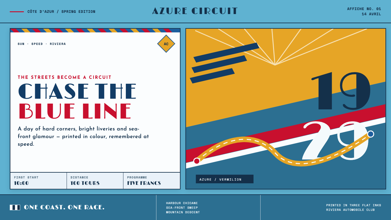
The Monaco Grand Prix turns speed into glamour — Riviera azure, racing red, sun gold, and giant Deco numerals cut across the page like a car taking the harbour corner.
Monaco Grand Prix (1929) in brief
The Monaco Grand Prix theme is a travel affiche built around the inaugural race held on 14 April 1929, when Antony Noghès turned the streets of Monte-Carlo into a circuit. Its visual language belongs to the golden age of Deco motorsport posters: flat colour planes, hard diagonals, streamlined lettering, and an image system that communicates sun, motion, place, and prestige almost instantly.
The composition treats the page as a Mediterranean sky. Riviera azure establishes the atmosphere, while a slash of harbour or coastline cuts through the field and creates a sense of altitude and direction. Racing red supplies the visual acceleration; sun gold adds the heat and glamour of the Côte d’Azur. The result is not a realistic scene but a compressed promise of travel and competition.
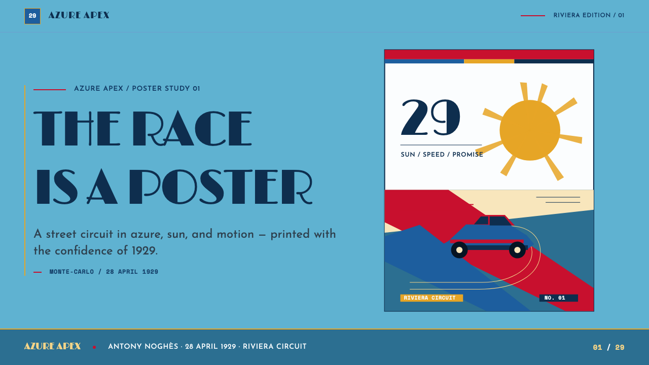
Everything should appear to have been printed as a single poster sheet. Colour blocks meet in clean seams, silhouettes remain legible, and the year functions as a geometric object rather than a caption. A Bugatti diving into a corner, a harbour reduced to angled planes, and a giant numeral can share the same visual authority because the theme values recognition over description. It is a race, a destination, and a spectacle arranged for one decisive glance.
Where does Monaco Grand Prix (1929) come from?
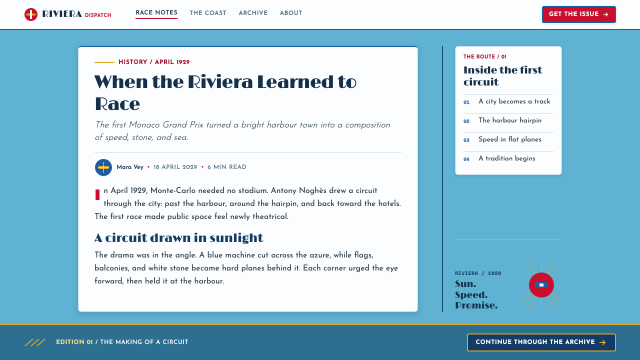
The historical starting point is April 1929 in Monte-Carlo, Monaco, on the French Riviera. Antony Noghès transformed existing streets into a circuit, making the city itself part of the spectacle. The race did not take place against a neutral backdrop: harbour edges, Mediterranean light, steep urban movement, and the compressed geography of Monte-Carlo all became part of its identity.
The theme draws from the period between 1929 and 1935, described here as the era of the inaugural Grand Prix de Monaco and the golden age of Deco motorsport affiches. Its regional character is inseparable from the Côte d’Azur. The Riviera is not merely a setting behind the racing car; it supplies the atmosphere that turns competition into destination culture, where speed shares the frame with sun, sea, travel, and social glamour.
Its visual ancestry combines Art Deco, French affiche lithography, Streamline Moderne, and motorsport iconography. These influences converge through reduction. A car becomes a directional silhouette; a harbour becomes a diagonal cut; a year becomes a monumental sign; colour becomes a shorthand for place and velocity. The system therefore feels historical without behaving like a museum reconstruction. It rebuilds the logic of a printed travel poster rather than reproducing one literal image.
The named figures attached to this material form a compact constellation around the theme: Antony Noghès, Géo Ham, Robert Falcucci, William Grover-Williams, and Ettore Bugatti. The design system keeps their presence within the same poster logic as the race itself. They are not treated as separate biography panels but as names within a world of circuit, machine, illustration, and spectacle — a world where the event, the vehicle, the driver, and the destination are designed to be remembered together.
What defines the Monaco Grand Prix (1929) look?
Riviera Color
The palette is led by Riviera azure, racing red, and sun gold, with light grounds that preserve the clarity of a printed travel sheet. Azure carries sky, sea, and distance; red marks velocity and competitive force; gold introduces heat, sunlight, and glamour. The colours should meet as decisive planes rather than dissolve into one another. A restrained dark tone may support lettering or silhouettes, but the visual argument belongs to the bright Mediterranean triad.
Hard Diagonals
Diagonal movement is the principal compositional engine. Harbour edges, road markings, car bodies, shadows, and typographic cuts should all suggest a trajectory through the frame. The diagonal does more than create drama: it converts a static sheet into an implied race course. Avoid timid horizontal stacking. The page should feel as though something has entered from one edge and is already accelerating toward another.
Deco Numerals
Numbers behave as architecture. The year, race number, or edition marker can become a large geometric mass that anchors the composition and competes with the vehicle for attention. Letterforms should be streamlined, confident, and broadly legible, with curves and strokes that imply polished metal, racing signage, and modern travel. Numerals are not metadata placed beside the image; they are part of the image's machinery.
Flat Lithographic Planes
The image should read like a lithographed poster assembled from clean, printable shapes. Flat planes establish the sky, harbour, roadway, car, and type without relying on gradients to explain form. Overlap is useful when it clarifies depth or direction, but surfaces should remain visibly designed. The charm comes from the seam between shapes — the moment when colour, silhouette, and geometry announce their own construction.
Streamlined Motion
Vehicles should be drawn as instruments of movement rather than as mechanical inventories. A low body, a sharp nose, a compressed silhouette, or a car diving into a corner can communicate speed more effectively than detailed rendering. The same principle applies to the surrounding environment: coastlines, buildings, and road surfaces should be simplified until their directional energy remains after descriptive detail has been removed.
Travel Glamour
The emotional register is brighter than pure racing aggression. Monaco is presented as a destination where competition, sunshine, harbour scenery, and social prestige overlap. The design should therefore retain air and visual pleasure even when the composition is forceful. The car is not only winning; it is arriving somewhere desirable. This balance between velocity and invitation is what separates the theme from a generic automotive poster.
Instant Recognition
Every major element should be understood before it is inspected. A viewer should recognize the Mediterranean atmosphere, the racing subject, the Deco period, and the sense of spectacle from the broad arrangement alone. This demands disciplined hierarchy: one dominant shape, one decisive directional gesture, one primary typographic statement, and supporting details that never compete with the first read.
Who shaped Monaco Grand Prix (1929)?
Antony Noghès is the initiating figure of the theme. In April 1929 he turned the streets of Monte-Carlo into a race circuit, making the city itself inseparable from the event. His place in the visual system is therefore infrastructural: he represents the decisive act that converts an urban landscape into a stage for speed, travel, and glamour.
Géo Ham belongs to the illustration culture surrounding the theme: a name associated here with the era's ability to compress racing spectacle into a single poster image. His inclusion reinforces the role of the artist as a translator of velocity, turning machines, roads, and atmosphere into clear graphic signals.
Robert Falcucci is presented as part of the poster-making constellation around the Monaco Grand Prix. In this system, his name supports the connection between French affiche tradition and motorsport imagery, where a destination is not described neutrally but heightened into an invitation to see, travel, and participate.
William Grover-Williams represents the human presence inside the machine-driven composition. His inclusion keeps the theme from becoming only a study of cars and colour. The race remains an event of people moving through a difficult urban circuit, surrounded by the visual promise of the Riviera.
Ettore Bugatti anchors the vehicle side of the constellation. In the theme's image language, the Bugatti is not a catalogue object but a graphic instrument: a compact silhouette, a sharp directional body, and a machine capable of turning the harbour curve into the main gesture of the poster.
How do you use Monaco Grand Prix (1929) today?
For presentation covers, use the theme as a travel poster before treating it as a race graphic. Let a broad azure field establish the Riviera atmosphere, then introduce one strong diagonal that suggests the circuit, harbour, or vehicle trajectory. A giant year or race marker can occupy a corner as a graphic mass, while the title remains clean and highly legible. Content slides should preserve the same logic with fewer elements: one directional gesture, one large numeral or label, and clear blocks of information that feel printed rather than enclosed in soft interface cards. Data slides can turn charts into course diagrams, using red for acceleration or competition, azure for environment, and gold for emphasis.
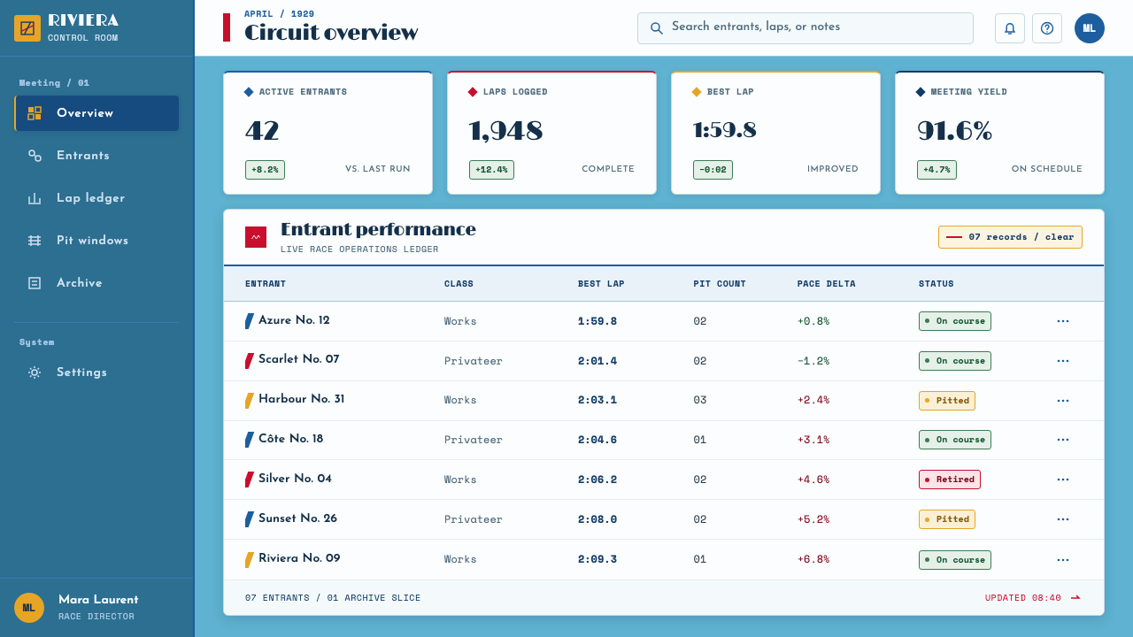
For web interfaces, the Monaco Grand Prix style works best for dashboards, event platforms, travel products, motorsport tools, and pricing pages that want energy without losing clarity. Keep the main surface light and let large colour fields organize sections. Use angular cards, decisive borders, and strong typographic labels instead of diffuse shadows or decorative flourishes. In a dashboard, the diagonal can guide attention from summary metrics toward detailed views; in pricing, each tier can feel like a lane or starting position, with one colour-led emphasis rather than a crowded festival of accents.
For editorial and marketing work, build the page like a sequence of printed affiches. A feature article can open with a large destination image or geometric harbour cut, followed by a narrow reading column and oversized section numerals. Pull quotes should behave like poster statements, not ornamental side notes. Marketing pages can alternate azure travel atmosphere with red action blocks and gold moments of prestige, while keeping the copy concise and immediately scannable. The strongest campaigns will sell a feeling of arrival: the product is not merely fast, it belongs somewhere desirable.
For event programs, launch pages, or cultural calendars, use the theme to connect place and occasion. A date can become a visual landmark, a route can become a slashing line, and a location name can sit with the authority of a race number. Images should be cropped boldly and treated as designed shapes rather than windows into a fully naturalistic scene. Repeated components can borrow the same poster vocabulary: strong numerals, clean colour fields, angled separators, and labels that remain readable at a glance.
The common mistake is confusing racing energy with visual noise. Adding every possible car silhouette, flag, stripe, colour, and metallic effect weakens the system. The theme depends on reduction: one dominant movement, a disciplined palette, a clear destination, and typography that behaves like part of the machine. Another frequent error is making the Riviera merely decorative. Azure, harbour cuts, and sun gold should establish place and atmosphere, not function as arbitrary decoration behind a generic automotive layout.
Monaco Grand Prix (1929) — FAQ
Is this a generic vintage racing style?
No. Its identity comes from the specific overlap of the 1929 Monaco Grand Prix, Monte-Carlo streets, the French Riviera, and the poster traditions of Art Deco, French affiche lithography, Streamline Moderne, and motorsport iconography. A generic vintage racing layout may borrow stripes or old lettering, but this theme must also communicate harbour geography, Mediterranean light, travel glamour, and the instant readability of a printed destination poster.
Can the theme work without showing a car?
Yes, if the composition still carries speed and place. A harbour slash, a road curve, a giant year, a directional shadow, or a compressed typographic block can imply the race without depicting a vehicle. The car is one powerful symbol, not the entire system. What cannot disappear is the relationship between movement, Riviera atmosphere, and poster-like spectacle.
Why are flat colour blocks important?
They preserve the logic of the printed affiche. Flat planes make the image immediately legible, expose the construction of the composition, and keep the relationship between sky, harbour, vehicle, and type graphic rather than naturalistic. Gradients can make the image feel more rendered, but they also soften the seams that give this theme its confidence and period character.
How should the palette be balanced?
Let azure establish the largest field, then use racing red as the principal movement or action signal. Sun gold should feel like a deliberate flash of light, prestige, or emphasis rather than a competing background. The three colours can coexist, but they should not all demand equal attention. The composition needs a lead colour, a directional colour, and a supporting accent.
Where does this style struggle?
It struggles when the product or message depends on softness, quiet intimacy, organic texture, or extensive descriptive detail. The style is built for spectacle, destination, movement, and quick recognition. It can therefore feel too forceful for contexts that require calm therapeutic warmth, delicate luxury, or a slow editorial mood. Its strongest applications are those where clarity and arrival matter as much as information.
Related design styles
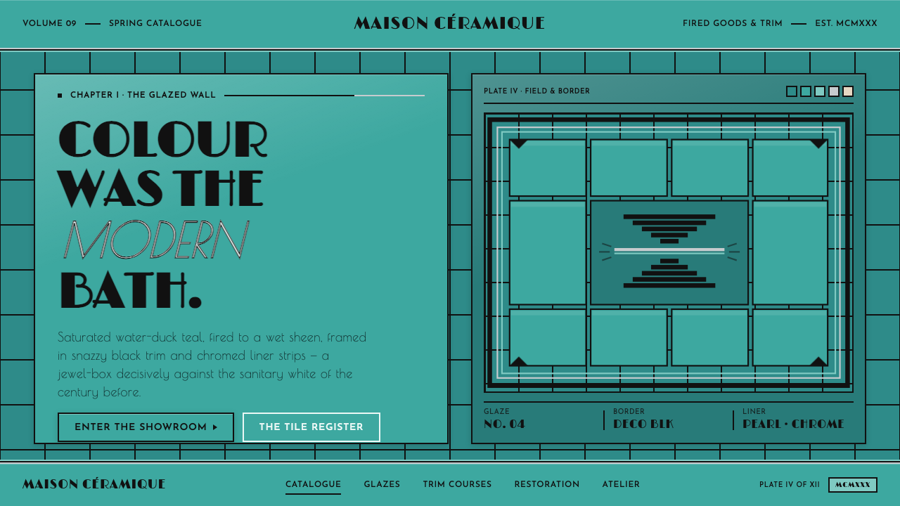 Art Deco Teal BathroomColour was the modern bath. Water-duck teal glaze, snazzy black trim, Limelig…
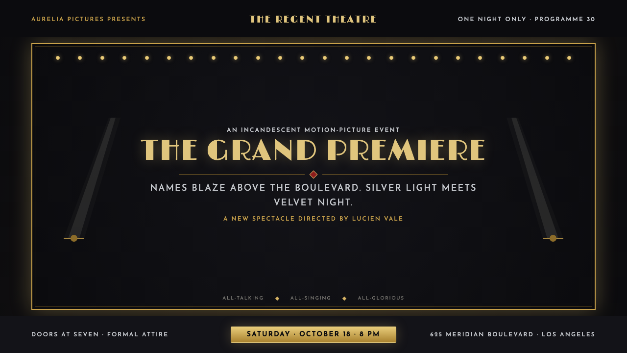 Hollywood Golden Age (1930)Black-and-gold spectacle commands the night. Marquee bulbs frame monumental D…
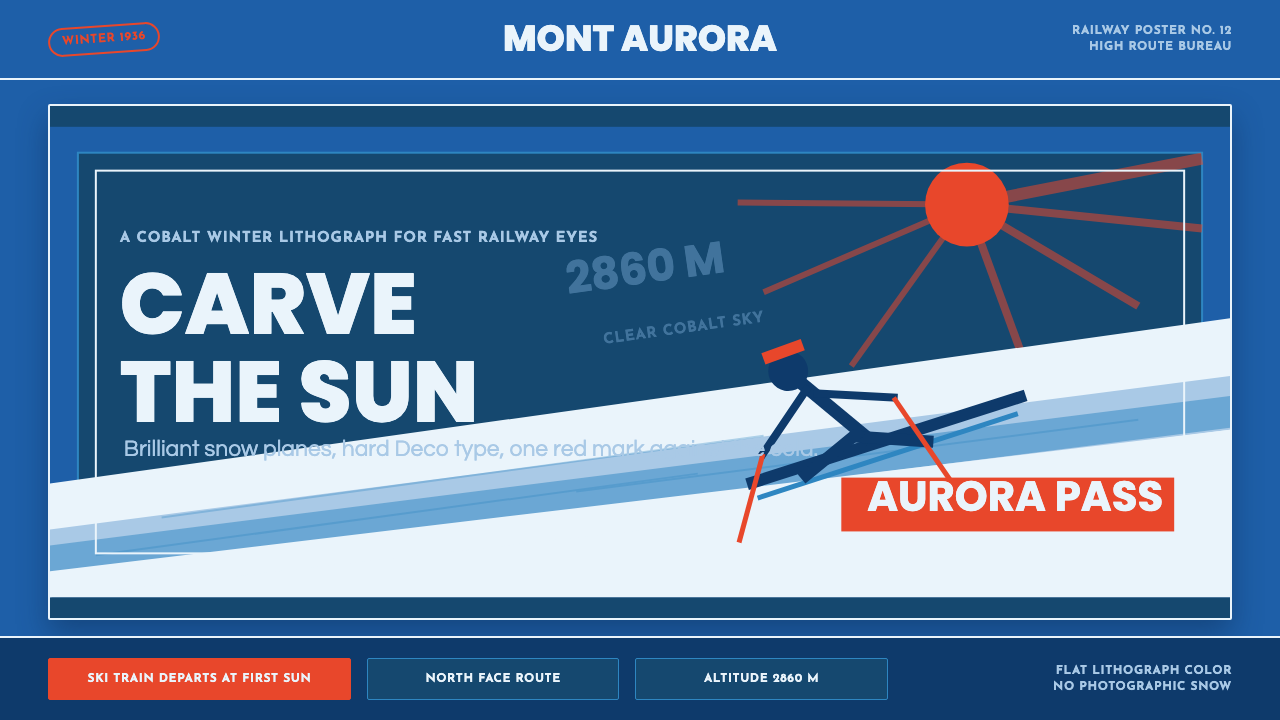 Alpine Ski PosterCold speed sells winter. Cobalt sky, snow planes, sun rays, and one resort-re…
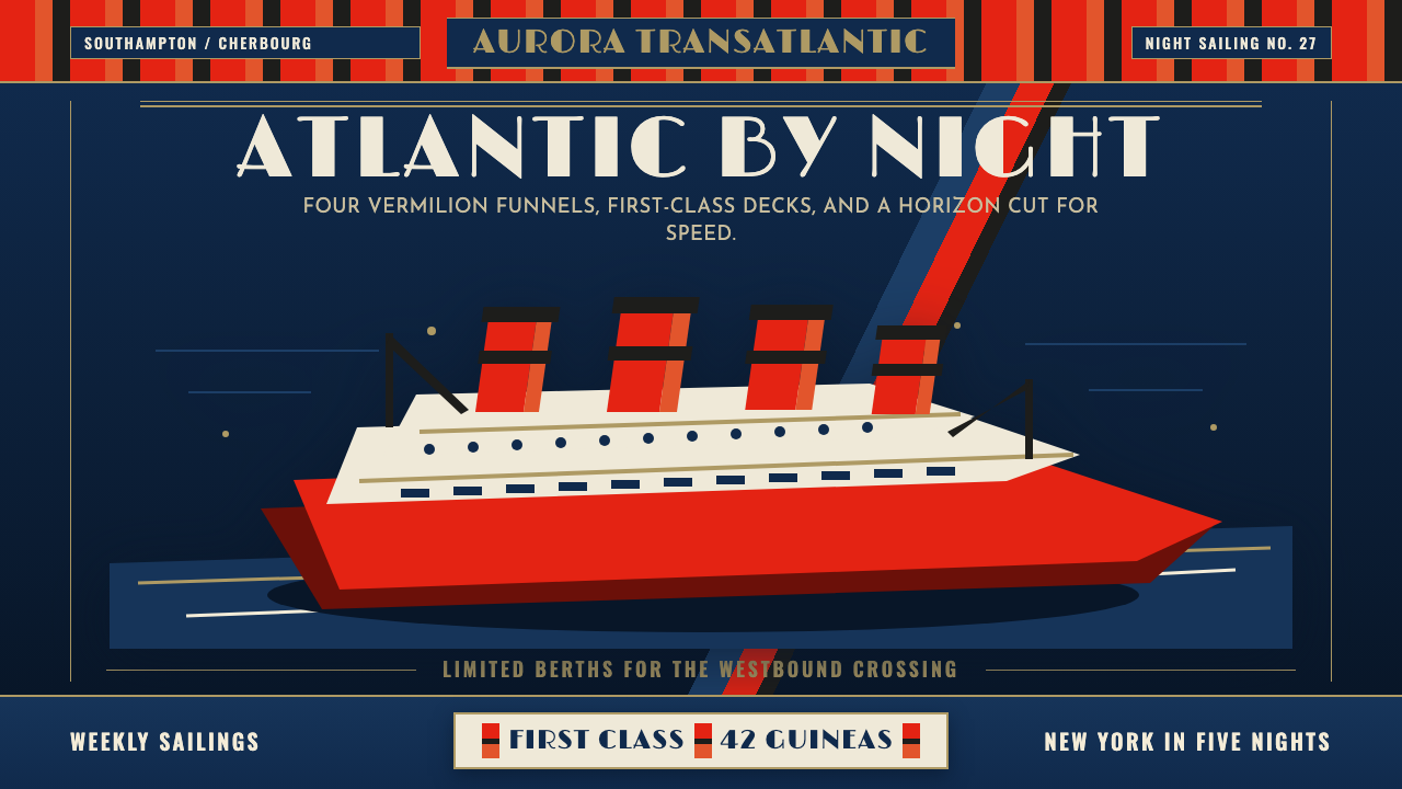 Cunard Liner PosterOceanic grandeur. Vermilion funnels, teak-gold caps, and a marine-blue poster…
 Queen — Bohemian Rhapsody (1975)Rock assumes the crown. Engraved gold, Roman capitals and a lone spotlight ru…
 Art Deco Jazz AgeJazz Age glamour. Sunburst rays, stepped ziggurats, gold on black — Chrysler…