What is Mexican Lucha Mask Graphic?
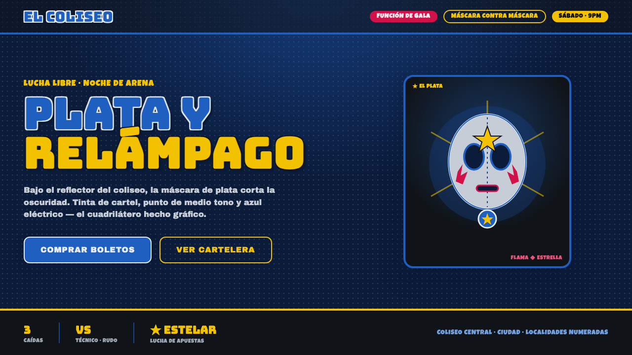
Mexican Lucha Mask Graphic turns arena-night darkness into comic-book spectacle: a silver-blue mask, halftone energy, hot appliqués, and lettering built to hit like a fight poster.
Mexican Lucha Mask Graphic in brief
Mexican Lucha Mask Graphic is a screen-ready visual language distilled from lucha libre culture, lucha comic books, and fight posters associated with the arenas of Mexico City. Its central image is the masked luchador: a laced silver-and-blue face emerging from deep arena-night darkness, caught by the implied beam of ring lights. The composition is direct, theatrical, and deliberately larger than life.
The style combines the drama of a coliseum poster with the texture of printed comics. A blue-black ground establishes the night; electric lucha blue and metallic silver pull the mask forward; hot pink-red flame-like appliqués and gold stars punctuate the field. Halftone texture makes the image feel printed, reproduced, and amplified rather than quietly rendered.
Its purpose is immediate recognition and heightened presence. Heavy display lettering, especially Bungee-like slabs, behaves as part of the performance: titles do not sit politely beside the image but arrive with it. The result is not a neutral sports identity or a polished luxury treatment. It is an arena announcement translated into a graphic system.
Where does Mexican Lucha Mask Graphic come from?
The visual source belongs to the golden age of lucha libre comics and fight posters, spanning 1950–1990. Its regional setting is Mexico, particularly the arenas of Mexico City, where the night-time coliseum supplies the style's defining dramatic condition: darkness around the ring, focused light above it, and a public image designed to be read with force.
The mask is the system's decisive emblem. The pre-approved vocabulary centers on the laced silver-and-blue masks associated with El Santo and his peers, with Blue Demon and Mil Máscaras also named as key figures. Rather than treating the face as a naturalistic portrait, the graphic treatment turns it into an icon made of bright planes, seams, contour, and reflected light.
Lucha comic books and fight posters supplied the language of exaggeration. Their visual world favors bold naming, concentrated contrast, stars, flame appliqués, and images that can declare a persona before a viewer has read much supporting copy. Halftone print graphics add another layer: the texture implies ink, reproduction, and the energetic grain of comics rather than seamless digital polish.
When this vocabulary moves onto a contemporary screen, its historical character should remain legible. Arena-night blue-black replaces neutral backdrop; silver-blue carries the mask; hot pink-red and gold act as spectacular accents; chunky display type preserves the poster voice. The aim is not archival imitation but a faithful continuation of the source material's theatrical graphic logic.
What defines the Mexican Lucha Mask Graphic look?
Arena-Night Ground
The background is a deep blue-black associated with the darkness of the coliseum at night. It is not empty negative space: it functions as the arena around the ring, allowing illuminated elements to feel staged and suspended. Keep the field broad and calm so the mask, lettering, and appliqués can arrive with maximum contrast.
Silver-Blue Mask
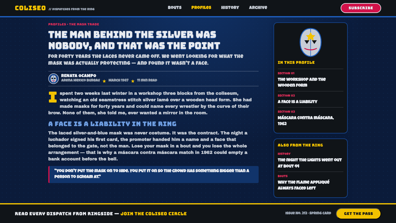
The laced silver-and-blue mask is the visual center. Silver suggests the metallic surface catching ring lights, while lucha blue provides the electric chromatic charge that distinguishes it from the night. Treat seams and laced edges as graphic evidence of construction and identity, not as incidental detail. The mask should read as a symbol before it reads as a face.
Comic Halftone
Halftone texture establishes the style's printed-comic character. It can occupy a broad field, break behind the mask, or collect around a spotlight-like burst, but it should never become a soft photographic filter. The dots add pressure and reproduction grain, making the composition feel like public graphics multiplied across posters and comic pages.
Appliqué Signals
Flames and stars are not generic decoration here. Hot pink-red appliqués create flare, heat, and movement against the dark field, while gold stars serve as compact bursts of triumph and spectacle. Use them as sharp signals around a focal mask or headline. Their power comes from interruption: a small vivid motif can change the emotional temperature of an otherwise dark composition.
Poster Lettering
Chunky display type carries the verbal force of a fight poster. Bungee-like slab forms are especially suited to names, event statements, and short declarations because their mass holds up against mask detail and halftone texture. Type should be bold, compact, and compositional. It is an equal performer in the frame, not a quiet caption added after the image is complete.
Spotlight Contrast
The style is lit from above in concept, even when no literal lamp is drawn. Bright silver, electric blue, and gold feel selected from darkness, while the blue-black field recedes around them. This creates a staged vertical drama: the visual focus is caught in a ring-light moment, not evenly illuminated across a neutral surface.
Who shaped Mexican Lucha Mask Graphic?
El Santo is the central named reference for the laced silver-and-blue mask vocabulary. In this graphic system, his association establishes the mask as an immediately legible lucha emblem rather than a generic costume detail. The emphasis is on the visual authority of silver, blue, lacing, and face-forward iconography.
Blue Demon is named among the key figures of the Mexican lucha context that informs the style. His inclusion reinforces that lucha-blue is not merely an arbitrary cool accent within the system; it belongs to a field of masked personas, arena drama, and bold public recognition.
Mil Máscaras completes the source material's trio of key figures. Within the design language, the name supports a plural understanding of lucha identity: the mask is a durable graphic protagonist, while stars, flames, lettering, and halftone give that protagonist the scale and theatrical setting of arena spectacle.
How do you use Mexican Lucha Mask Graphic today?
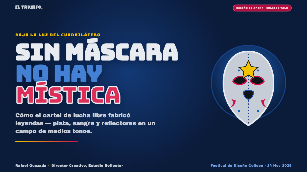
For presentation covers, begin with a single oversized mask or mask fragment pulled into a pool of silver-blue light against the arena-night field. Put the title in chunky display type with enough scale to compete with the image, then let one flame appliqué or gold star sharpen the composition. For content slides, reduce the mask to a recurring corner emblem or halftone watermark so the presentation remains readable while retaining its ring-side atmosphere.
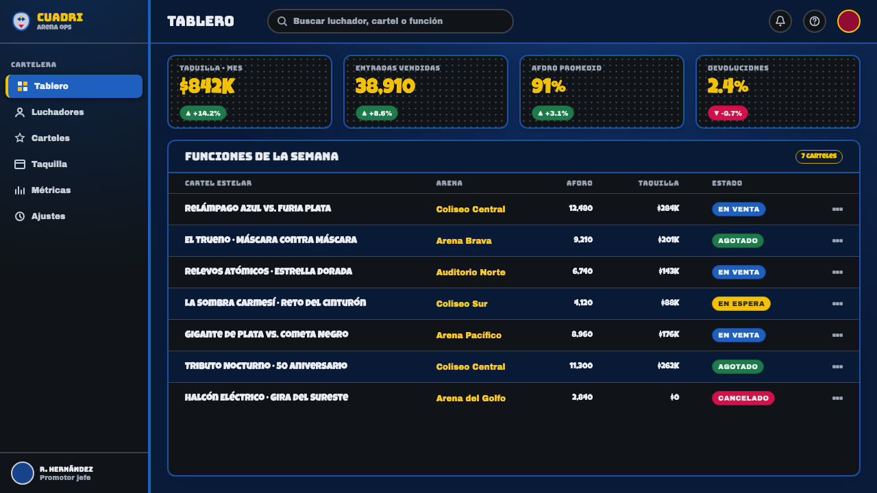
Data slides can use the system without turning every chart into costume. Keep the blue-black field disciplined, let silver and lucha blue establish the primary information structure, and reserve hot pink-red or gold for one decisive comparison, alert, or winning outcome. Halftone may frame a chart or occupy a transition panel, but the data marks themselves should remain clear enough to scan at arena-poster speed.
For web interfaces, the style is most persuasive in dashboards, event pages, member areas, and pricing experiences that benefit from theatrical hierarchy. Use the dark field to separate major sections, give a mask, star, or flame a clear focal role, and allow the display type to headline category names or offers. Interface controls should remain comparatively plain so the dramatic elements retain their impact and users can still orient themselves quickly.
For editorial and marketing work, treat each module like a small poster. A feature story can open with a mask crop and halftone field, then move into calmer text areas; campaign panels can use blue, silver, pink-red, and gold as a sequence of signals rather than a constant shower of accents. The common mistake is applying every motif at once: full mask, dense dots, flames, stars, and giant lettering in every block. The style needs darkness and restraint around its spectacle, or its visual punch becomes noise.
Mexican Lucha Mask Graphic — FAQ
Is this style only about using a lucha mask?
No. The mask is the central emblem, but the recognizable system depends on its setting: arena-night darkness, an implied overhead spotlight, metallic silver and lucha blue, comic halftone, hot appliqués, gold stars, and poster-like type. A mask placed on a neutral polished layout may reference the subject, but it does not yet create the graphic language.
How should halftone be used without making the layout hard to read?
Use halftone as atmosphere, framing, or a field behind the main subject rather than as a layer over every word and control. It is most effective where it helps the composition feel printed and energized: behind a mask, around a burst of light, or across a transition panel. Let critical text and information sit in calmer zones of the arena-night field.
Can the hot pink-red and gold accents be used everywhere?
They work best as moments of spectacle. Hot pink-red flame appliqués and gold stars gain force by cutting into the dark ground and silver-blue mask vocabulary. If they appear everywhere, the hierarchy collapses and the composition loses its sense of a spotlight finding one central event. Choose a focal statement, comparison, or action that deserves the flare.
Where does Mexican Lucha Mask Graphic work especially well?
It is strongest where a product, campaign, event, or editorial package needs public energy, named personas, dramatic hierarchy, and a poster-like first impression. It adapts naturally to presentation covers, event pages, dashboards, membership spaces, campaign modules, and bold editorial openings. It is less suitable when the intended voice must be quiet, neutral, or unobtrusive, because this system is built to announce itself.
Related design styles
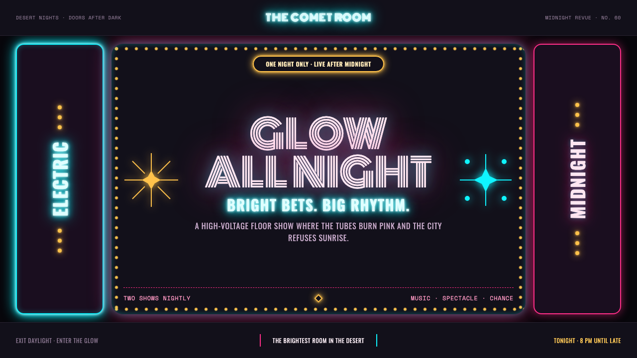 Las Vegas Neon (1960)Night refuses to dim. Hot-pink tubes, cyan bloom and amber bulbs turn black i…
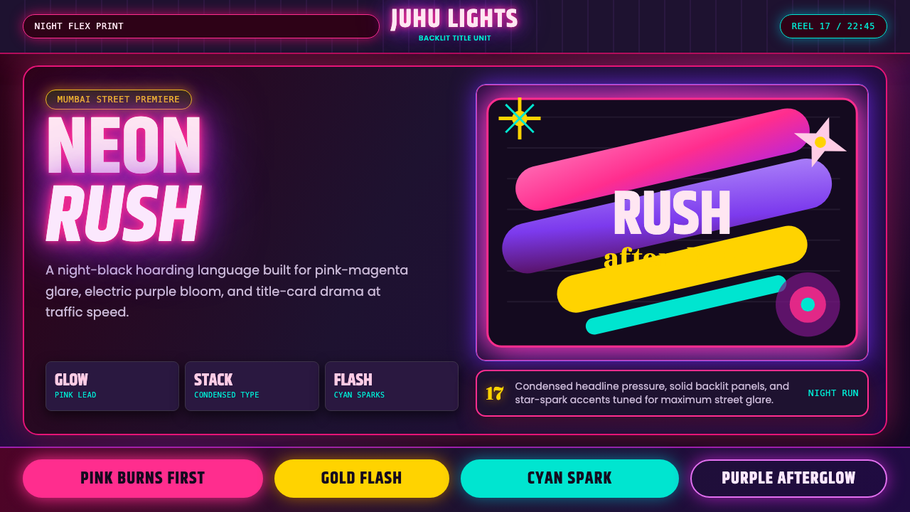 Bollywood Neon MumbaiMumbai pop burns bright. Khand stacks glow over night-black, with pink-purple…
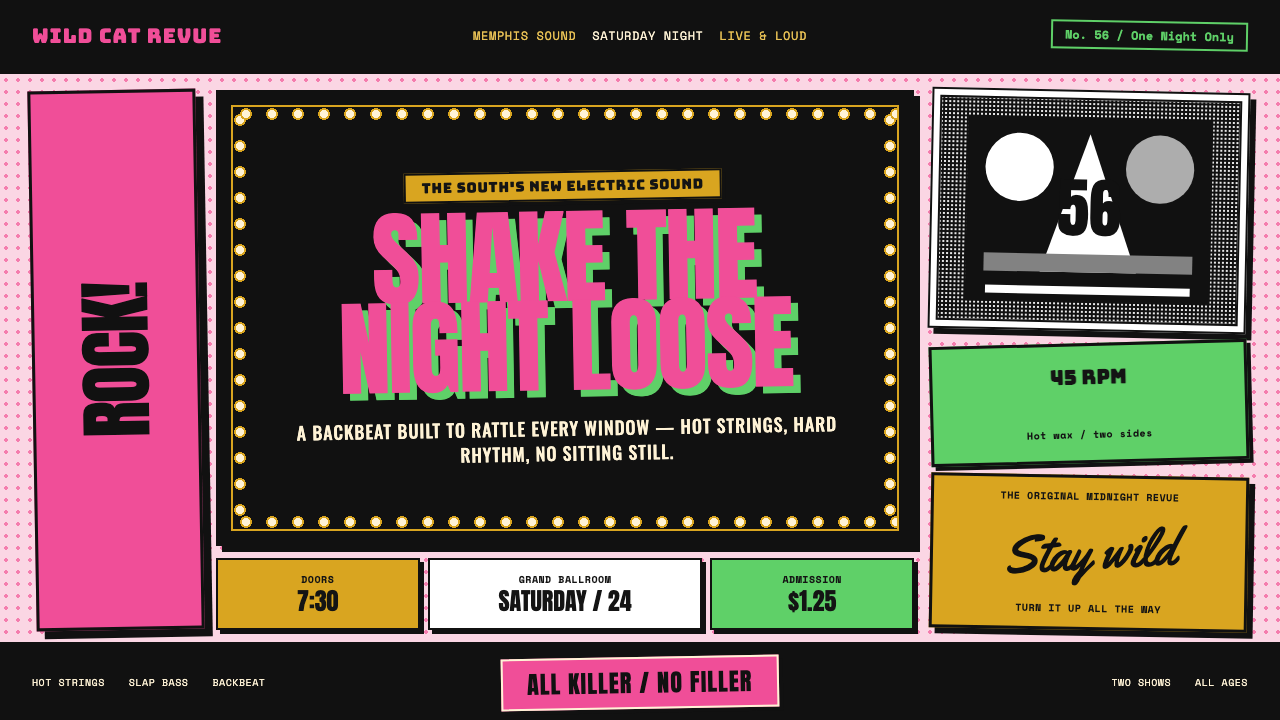 Elvis Presley (1956)Rock learned to shout. Bubblegum pink, acid green and jailhouse type land wit…
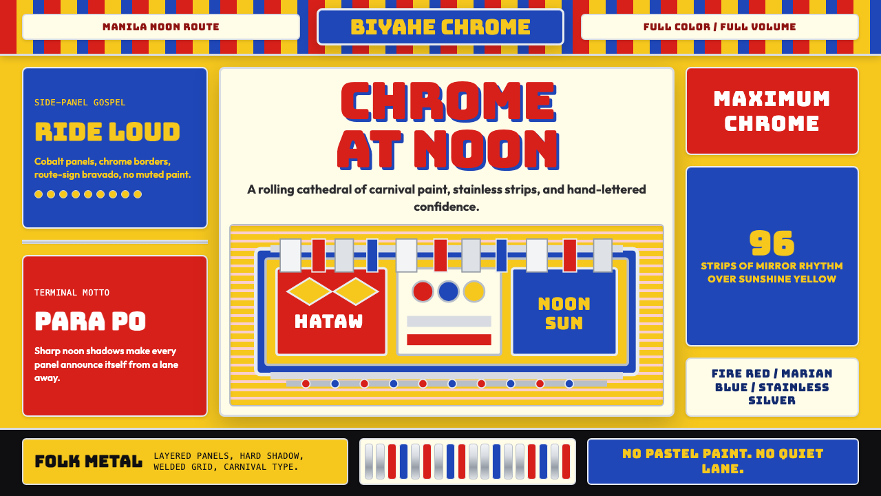 Filipino Jeepney (Chrome & Streamer)Maximalism has wheels. Sunshine yellow, chrome strips, Bungee route-sign type.
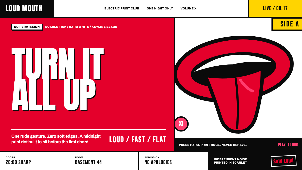 Rolling Stones Tongue (1971)Flat ink shouts loud. Scarlet curves, black keylines, and cropped poster scal…
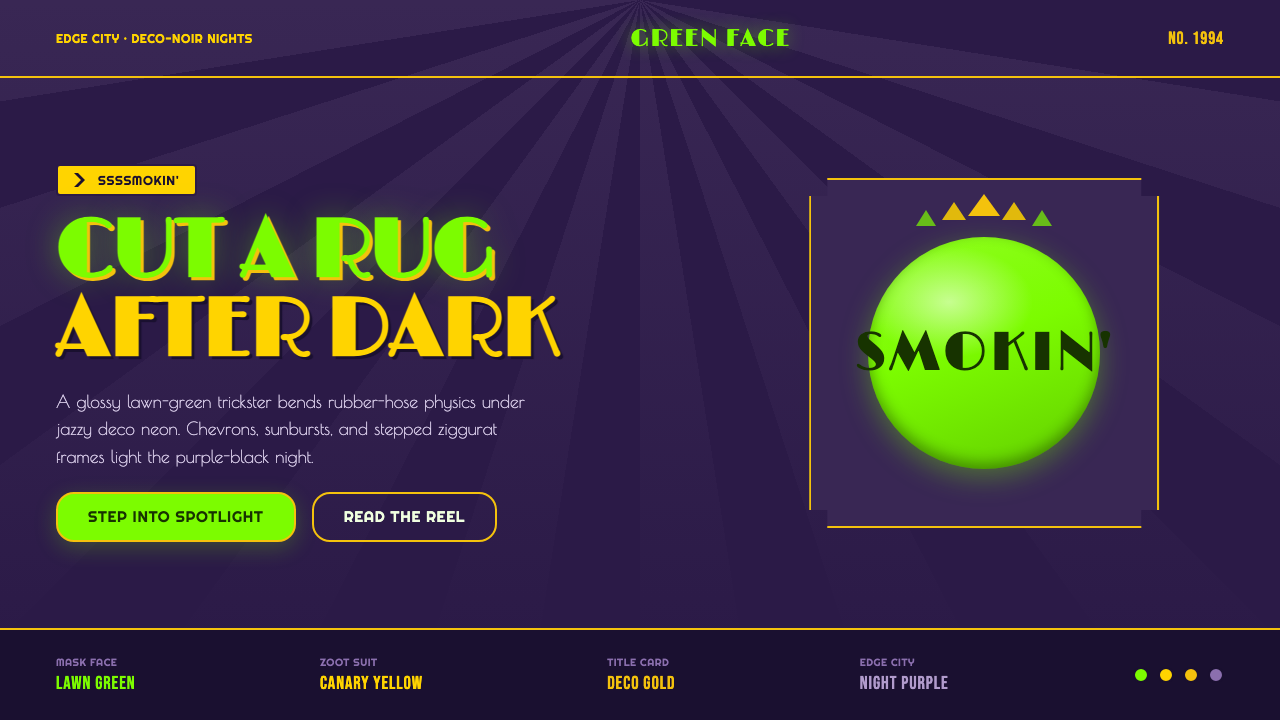 The Mask 1994 Green FaceLoud, theatrical, ssssmokin'. Lawn-green and canary-yellow scream against dec…