What is Cooper Black Display?
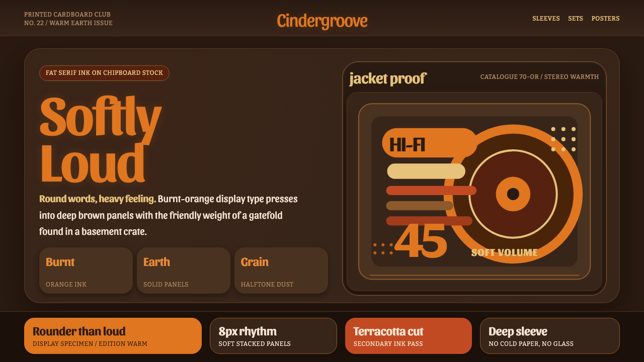
Cooper Black made heaviness feel friendly — a soft-edged voice that could fill a record sleeve, sell a product, and still sound unmistakably human.
Cooper Black Display in brief
Cooper Black Display is a dark, warm graphic system built around Oswald Cooper’s 1922 ultra-bold rounded serif. Its fat strokes, nearly closed bowls, and teardrop terminals give display lettering a generous physical presence: the words feel pressed, printed, and slightly swollen rather than merely typed.
The visual language rebuilds the atmosphere of late-60s and 70s record gatefolds. Burnt-orange lettering rests against deep chipboard brown, while halftone texture adds the warmth of ink absorbed into rough stock. The result is closer to a Pet Sounds jacket than a corporate deck: every panel should feel like a piece of printed cardboard.
This style is expressive without becoming glossy. Oversized soft display words establish the mood, earthy contrast keeps the composition grounded, and the dark background gives the orange ink room to glow. Its charm comes from the tension between visual mass and emotional softness — the type shouts softly.

Where does Cooper Black Display come from?
Cooper Black was designed and released by Oswald Cooper in 1922 in Chicago, within the tradition of American display and advertising type. Its defining construction is immediately physical: extremely heavy strokes, rounded serif forms, bowls that approach closure, and terminals shaped like small drops. These features make the face legible as a mass before the viewer reads it as language.
The typeface’s personality comes from the way its weight is softened. It is emphatic, but its rounded contours prevent that emphasis from becoming severe; it is dense, but the inflated shapes keep it approachable. That combination made Cooper Black especially suited to display lettering, where the words must operate simultaneously as message, image, and surface.
The face found a second life on late-60s and 70s record gatefolds. During its 1966–1972 sleeve heyday, burnt-orange lettering over deep earthy chipboard became a powerful visual shorthand for printed warmth. The color did not float above the material; it appeared absorbed into it, with halftone treatment reinforcing the sense of ink, paper, and mechanical reproduction.
By the 70s, Cooper Black had also become an advertising staple, while its visual associations extended into warm-earth graphic design. Cooper Black Display draws from that complete lineage: Chicago display type, pop record-sleeve lettering, dark kraft-toned grounds, and warm halftone ink. The system is historical in mood but designed to remain usable across contemporary panels and interfaces.
What defines the Cooper Black Display look?
Burnt-Orange Ink
Burnt orange is the system’s expressive voice. It should feel warm, printed, and slightly weathered rather than luminous or digital. Use it for the largest display words, key labels, and moments that need emotional lift. Its strength comes from restraint: when orange occupies every surface, it loses the character of ink and becomes ordinary decoration.
Rounded Serif Mass
Cooper Black carries visual mass through fat strokes and rounded serif details. The nearly closed bowls make letters read as compact shapes, while teardrop terminals keep those shapes from feeling mechanical. Display type should be allowed to dominate its surroundings. Its role is not quiet annotation; it is the object around which the rest of the composition organizes itself.
Deep Chipboard Ground
The ground should suggest deep kraft-toned chipboard: earthy, matte, and materially present. It is not a neutral black and not a polished brown. The background supplies the sleeve-like feeling of the system, giving the orange lettering a surface to sink into. Supporting panels should remain within this family of dark paper tones so the work feels assembled from a coherent printed object.
Halftone Warmth
Halftone texture introduces the memory of mechanical printing without turning the interface into a distressed prop. It works best as a quiet field behind type, a tonal interruption inside a panel, or a suggestion of ink spread near an image. The grain should support the material illusion and remain subordinate to the lettering; texture is atmosphere, not the subject.
Softly Oversized Display
Scale is the primary dramatic device. Headlines can become almost architectural, extending beyond a panel or sitting heavily against an open field. Because the letterforms are rounded, this enlargement feels buoyant rather than aggressive. Secondary copy should retreat into a calmer register, leaving the display words enough surrounding space to remain memorable and physically legible.
Sleeve-Like Composition
Compositions should feel framed and collected, as if each section belongs to a physical sleeve or printed insert. Strong blocks, generous breathing room, and deliberate cropping create that impression. Elements may sit close to an edge, but the pressure should feel intentional. Avoid the weightless modularity of a generic dashboard; the page needs the authority of a designed cover.
Friendly Darkness
The dark palette is not meant to signal luxury, futurism, or technical severity. Its purpose is to make the warm ink feel intimate. Rounded type, earthy surfaces, and soft contrast keep the darkness approachable. The emotional target is nostalgic and tactile: a well-loved sleeve, a printed advertisement, or a record found in a stack rather than a pristine digital product.

Who shaped Cooper Black Display?
Oswald Cooper is the sole named designer in this source lineage and the creator of the 1922 Cooper Black. His contribution is represented here through a display face that turns extreme typographic weight into warmth. The rounded construction, compact bowls, and teardrop terminals give the letters their distinctive ability to command attention without sounding hostile.
Cooper Black is the central visual actor rather than a neutral container for words. Its fat strokes create the system’s mass, while its softened contours make that mass feel welcoming. In this design language, the face should be treated as image and lettering at once: its silhouette, density, and rhythm carry meaning before the supporting copy begins.
Pop record-sleeve lettering supplied Cooper Black with its second life and its strongest cultural atmosphere in the approved source material. Burnt orange over deep chipboard brown turned typography into part of the physical jacket. This reference contributes the system’s intimacy, nostalgia, and belief that a title can be as tactile and memorable as an image.
Warm-earth graphic design names the broader visual field around the typeface: dark paper grounds, orange ink, halftone warmth, and an emphasis on printed material. It is less a separate historical person than a useful design lineage. In the system, it keeps Cooper Black from becoming a standalone retro trick by giving the letterforms a complete surface, mood, and production story.
How do you use Cooper Black Display today?
For slide covers, let Cooper Black become the event. Use a deep chipboard ground, place an oversized burnt-orange title with generous breathing room, and crop the lettering only when the crop strengthens the sense of a physical jacket. Supporting information should remain quiet and secondary. The cover should feel found, printed, and emotionally immediate before the audience has read every word.
For content and data slides, keep the sleeve logic but give information a clearer rhythm. Use strong panel blocks, compact supporting copy, and warm halftone fields as connective tissue. Charts should feel like printed diagrams rather than software widgets: earthy surfaces establish the field, orange marks the important reading path, and the display face appears where emphasis or chapter identity matters.
For web interfaces, the style suits dashboards and pricing pages that want to feel memorable, independent, and human. A dark paper-like background can hold dense information, while rounded display headings give each section a recognizable voice. Pricing tiers should be separated through panel treatment and restrained accent use, not a parade of competing colors. Controls and labels should stay legible and calm beside the expressive type.
For editorial and marketing work, Cooper Black Display is strongest when the page behaves like a cover, poster, or printed advertisement. Use large titles, earthy contrast, halftone warmth, and deliberate edge relationships. Editorial sections can pair a monumental heading with quieter reading text and broad surrounding space. Marketing campaigns can make the product name feel like a collectible mark, especially when every panel shares the same paper-and-ink atmosphere.
The common mistake is confusing nostalgia with random distress. Adding grain everywhere, forcing every heading into Cooper Black, or mixing several unrelated warm colors weakens the system. The material cues need hierarchy: display type carries the voice, the dark ground carries the paper, and halftone carries the memory of printing. When all elements perform loudly, the style loses its soft shout and becomes visual noise.

Cooper Black Display — FAQ
Is Cooper Black Display simply a retro font treatment?
No. The typeface is central, but the system depends on the relationship between rounded typographic mass, deep chipboard brown, burnt-orange ink, and halftone warmth. Remove that material relationship and Cooper Black can become a disconnected nostalgic gesture. The design works when lettering, surface, contrast, and composition all suggest the same printed sleeve.
Can this style work on a light background?
It can, but the approved system is defined by a dark kraft-toned ground. A light background would remove some of the chipboard intimacy and make the orange lettering feel more like a bright graphic accent than absorbed ink. If a light variation is necessary, preserve the rounded display mass, halftone restraint, and printed-material feeling so the result remains connected to the source lineage.
Is Cooper Black suitable for long reading text?
Its strongest role is display lettering. The extreme weight and compact forms are excellent for titles, labels, and short statements, but extended reading benefits from a quieter supporting treatment. Let Cooper Black establish the voice and hierarchy, then give longer copy a calmer register with generous surrounding space. This contrast keeps the expressive type memorable instead of exhausting.
How much halftone texture should be used?
Use enough to suggest ink and stock, but not enough to compete with the message. A restrained field behind a heading, a tonal shift within a panel, or a faint printed interruption is usually more convincing than a heavy texture applied to every surface. Halftone should deepen the paper illusion and support the burnt-orange lettering; it should never become a filter placed over the entire design.
What makes the style feel friendly despite its visual weight?
The friendliness comes from softened structure. Rounded serif contours, teardrop terminals, earthy color, and the tactile suggestion of printed cardboard keep the weight from becoming corporate or aggressive. The dark ground also behaves intimately rather than luxuriously: it feels like a familiar sleeve or advertisement. The balance is important — strong mass provides recognition, while softness provides welcome.
Related design styles
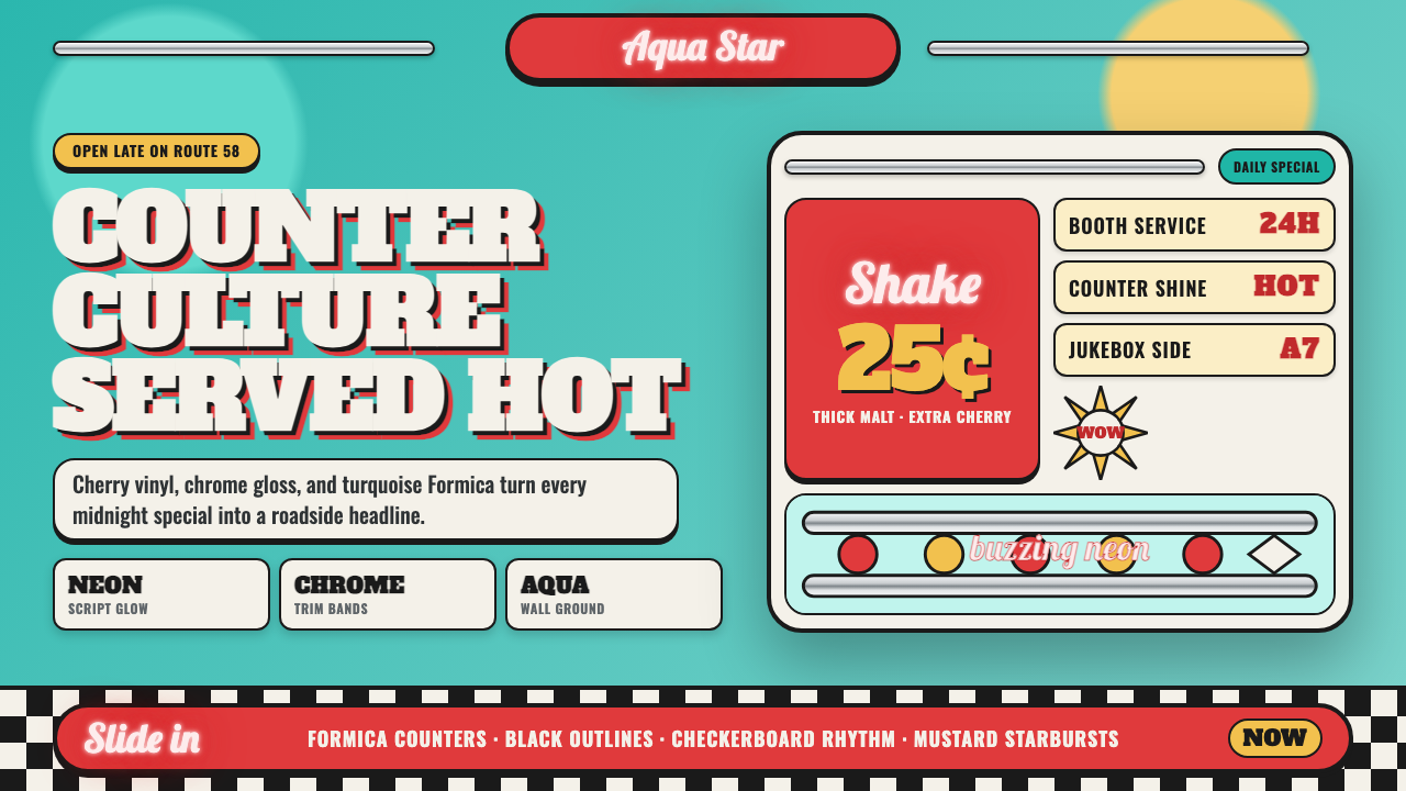 1950s Diner AquaRoadside optimism shouts. Aqua walls, cherry vinyl, chrome bands, and neon sc…
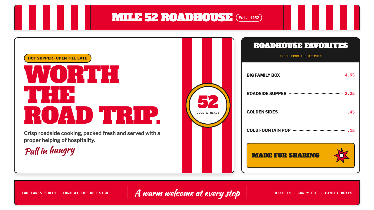 KFC Colonel (1952)Roadside appetite, turned up loud. Enamel red stripes and slab-serif shouts f…
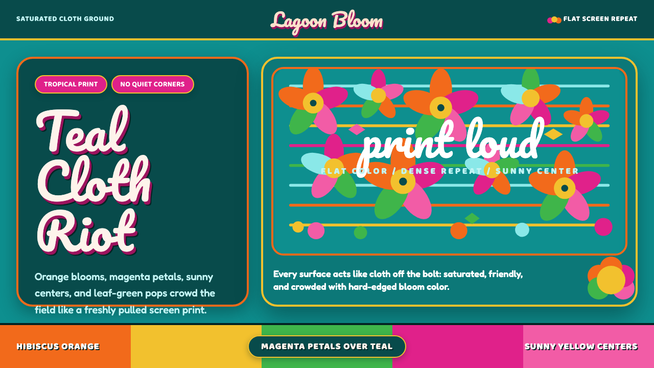 Fiji Bula Floral ShirtLoud cloth, zero quiet corners. Teal ground carries orange blooms and magenta…
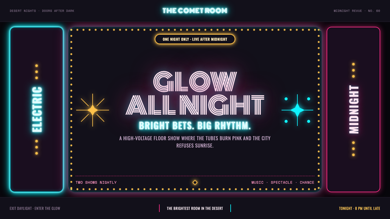 Las Vegas Neon (1960)Night refuses to dim. Hot-pink tubes, cyan bloom and amber bulbs turn black i…
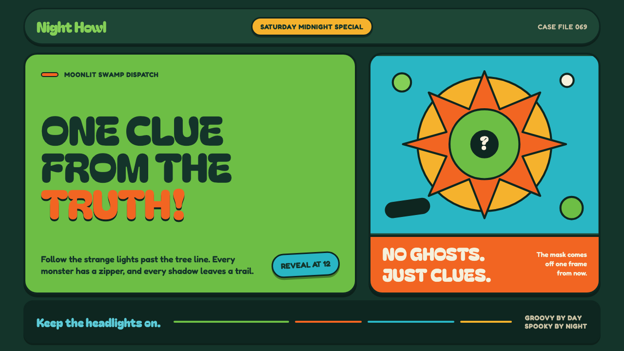 Mystery Machine (Scooby-Doo 1969)Groovy by day, spooky by night. Balloon type and acid-green panels hide the n…
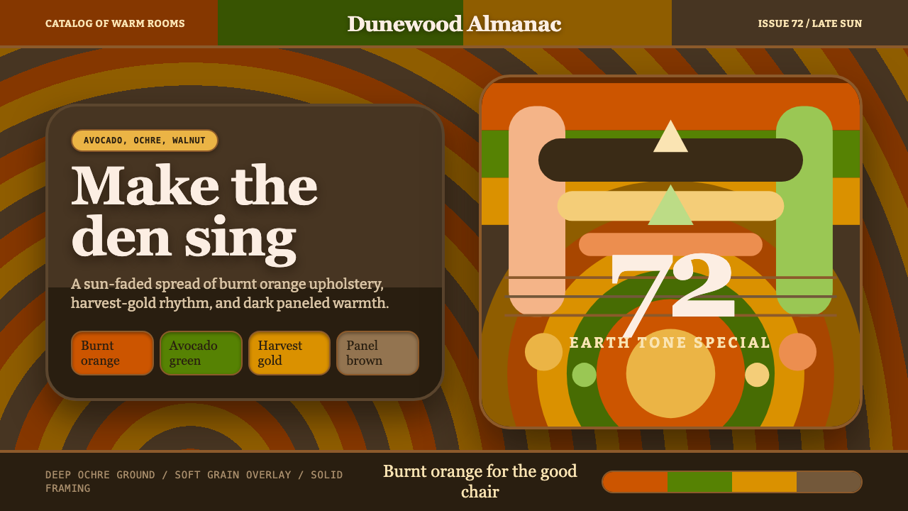 1970s Earth TonesWarm maximalism stays muddy. Bulbous slabs, avocado bands, and harvest-gold r…