What is KFC Colonel (1952)?
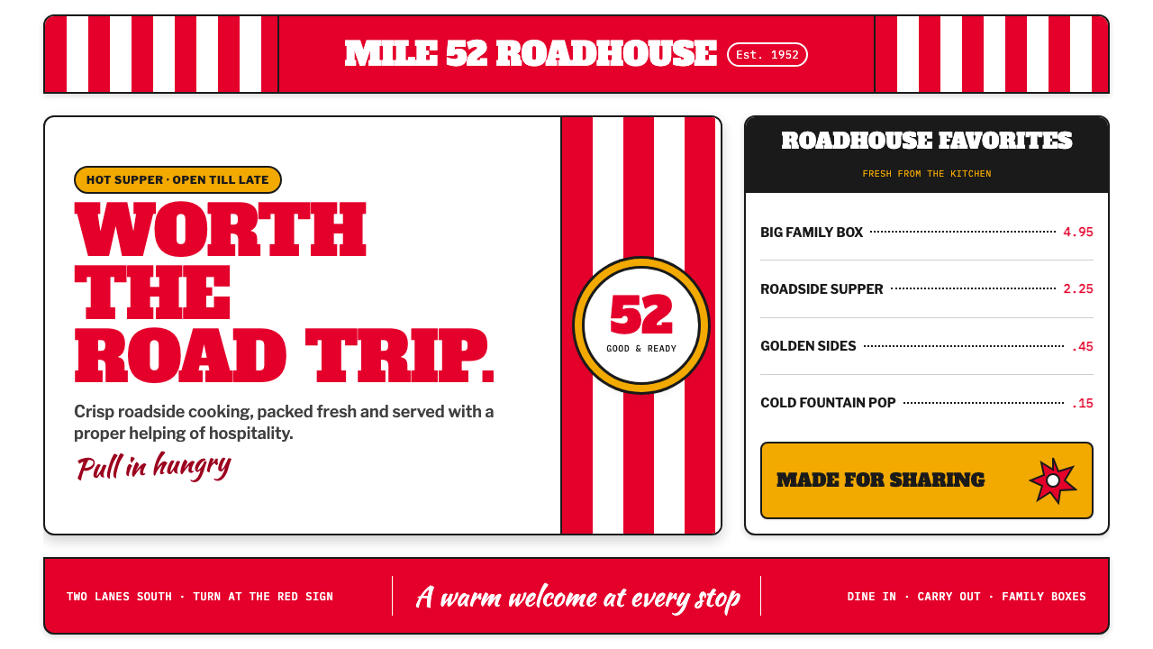
KFC Colonel turns the roadside stop into a smiling signal: red stripes, bold type, and fried-chicken confidence visible before the car has slowed.
KFC Colonel (1952) in brief
KFC Colonel is a roadside American franchise identity drawn from the visual language of the first franchised stand and the original bucket-and-Colonel era. Its ingredients are direct and public-facing: candy-striped red-and-white packaging, a circular Colonel badge, slab-serif headlines, a fountain-pen-like signature, and the promise of a pole sign that can catch the eye from the highway. It does not whisper about food. It announces it.
The style belongs to a world of enamel signs, diner menu boards, paper buckets, neon-lit stops, and businesses competing for attention along the road. Its visual energy comes from repetition and recognition. Vertical stripes establish a rhythm before the viewer has read a word; the Colonel’s face supplies a human welcome; oversized lettering converts hunger into an immediate decision. The result is commercial, friendly, and deliberately impossible to overlook.
Its appeal is not polished restraint but affectionate excess. Bright red feels like painted metal and roadside signage, white recalls cardboard and food-service paper, and a touch of warm gold suggests the appetizing glow of fried food. The identity carries a little kitsch without embarrassment. That quality is central: it makes a chain restaurant feel less like an abstract corporation and more like a familiar stop with a proprietor waiting at the counter.
Where does KFC Colonel (1952) come from?
The identity is rooted in the period from 1952 to 1962, identified in the source material as the era of the first franchised stand and the original bucket-and-Colonel identity. Its geography is equally important: Corbin, Kentucky, Salt Lake City, Utah, the American South, and the wider roadside United States. This was a visual environment built for movement, where a business had to communicate quickly to people arriving by car.
The source places the style at the intersection of American roadside vernacular, mid-century franchise branding, enamel and neon signage, and cartoon mascot marks. Those influences explain why the system is so emphatic. A roadside business cannot depend on close inspection; it needs a recognizable silhouette, durable color contrast, and a memorable character that remains legible amid traffic, distance, dusk, and competing signs.
Harland Sanders, Pete Harman, Dave Thomas, and Don Anderson are the key figures named for this identity. Within the style’s public language, the Colonel is more than a portrait: he is the point where personal signature, mascot, and brand assurance meet. The circular badge gives that figure the clarity of a seal, while the handwritten signature introduces a counterpoint to the forceful commercial lettering.
The historical vocabulary remains compelling because it records a formative moment in franchise branding. Repeated stripes and buckets make packaging perform like advertising; the sign performs like a landmark; the mascot performs like a greeter. Rather than separating logo, menu board, wrapper, and roadside marker into unrelated assets, the system makes them variations of one loud, edible, welcoming message.
What defines the KFC Colonel (1952) look?
Roadside Red and Paper White
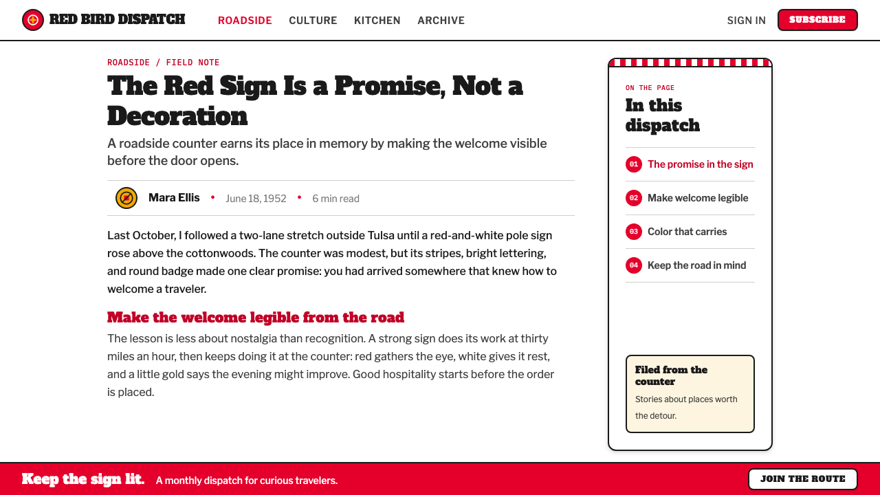
The palette is built around emphatic enamel-like red and cardboard white. Red carries the first burst of attention, while white creates the clean field that keeps the identity readable and food-service familiar. A restrained fry-oil gold can add appetite and warmth, but the essential contrast remains red against white: immediate, cheerful, and visible at a glance.
Candy-Stripe Rhythm
Vertical red-and-white stripes are not a background pattern added after the fact. They create the identity’s motion, recalling barber poles, roadside markers, and paper packaging wrapped around food. Repeated stripes can frame a composition, animate a bucket, or lead the eye toward a badge or headline. Their regularity makes the whole system feel active without becoming visually chaotic.
Slab-Serif Shout
The typography should feel like a menu board or a sign made to compete with the road. Heavy slab-serif forms give words a broad, sturdy presence, combining the authority of printed advertising with the blunt clarity of a storefront announcement. Headlines are meant to arrive before detail. Supporting copy should remain plain, compact, and subordinate to the main food, offer, or destination.
The Colonel as Welcome
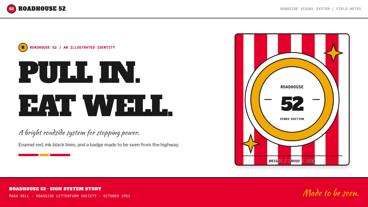
The goateed Colonel, typically held within a circular badge, gives the loud commercial system a personable center. The badge reads as a seal of recognition and a roadside face at once. It should feel open, smiling, and immediately identifiable rather than refined into an anonymous corporate symbol. The character humanizes repetition across packaging, signage, and menu-like surfaces.
Signature and Seal
A fountain-pen-like signature offers an expressive contrast to the rigid stripe and headline system. Where slab serif type is declarative, the signature feels personal; where the circular badge is official, the handwritten gesture feels improvised. Used together, they let the identity speak with both franchise consistency and the suggestion of a named host behind the counter.
Enamel, Cardboard, and Diner Surface
Material feeling matters even in digital adaptations. The style suggests painted enamel signs, sturdy paper buckets, printed menu boards, and the practical surfaces of a diner. It should feel flat, printed, and robust rather than glossy, atmospheric, or technologically sleek. Its charm comes from objects designed to be handled, carried, spotted, and used in public.
Who shaped KFC Colonel (1952)?
Harland Sanders is named in the source material as a key figure of the original KFC Colonel identity. The Colonel image gives the system its public personality: a recognizable human presence that turns packaging, signage, and promotional language into a direct welcome.
Pete Harman is identified as a key figure in the first franchised-stand era. His inclusion anchors the style in franchise branding rather than in a single isolated restaurant image, where repeated visual elements need to remain recognizable from one roadside stop to the next.
Dave Thomas appears among the key figures named for the identity. In this visual system, the importance lies in the durable relationship between food, character, packaging, and public recognition: each element reinforces the others instead of functioning as a separate decorative asset.
Don Anderson is also named as a key figure of the original identity. The period associated with these figures established a visual vocabulary in which a circular mascot mark, strong lettering, and striped packaging could work together as a unified roadside signal.
How do you use KFC Colonel (1952) today?
For presentation covers, use the style as a roadside announcement. Let a broad red-and-white stripe field or a circular Colonel-like badge establish the first impression, then place a short slab-serif title where it can read instantly. Keep the composition bold and frontal. The cover should feel like a sign seen from the approach, not like a delicate editorial page requiring prolonged attention.
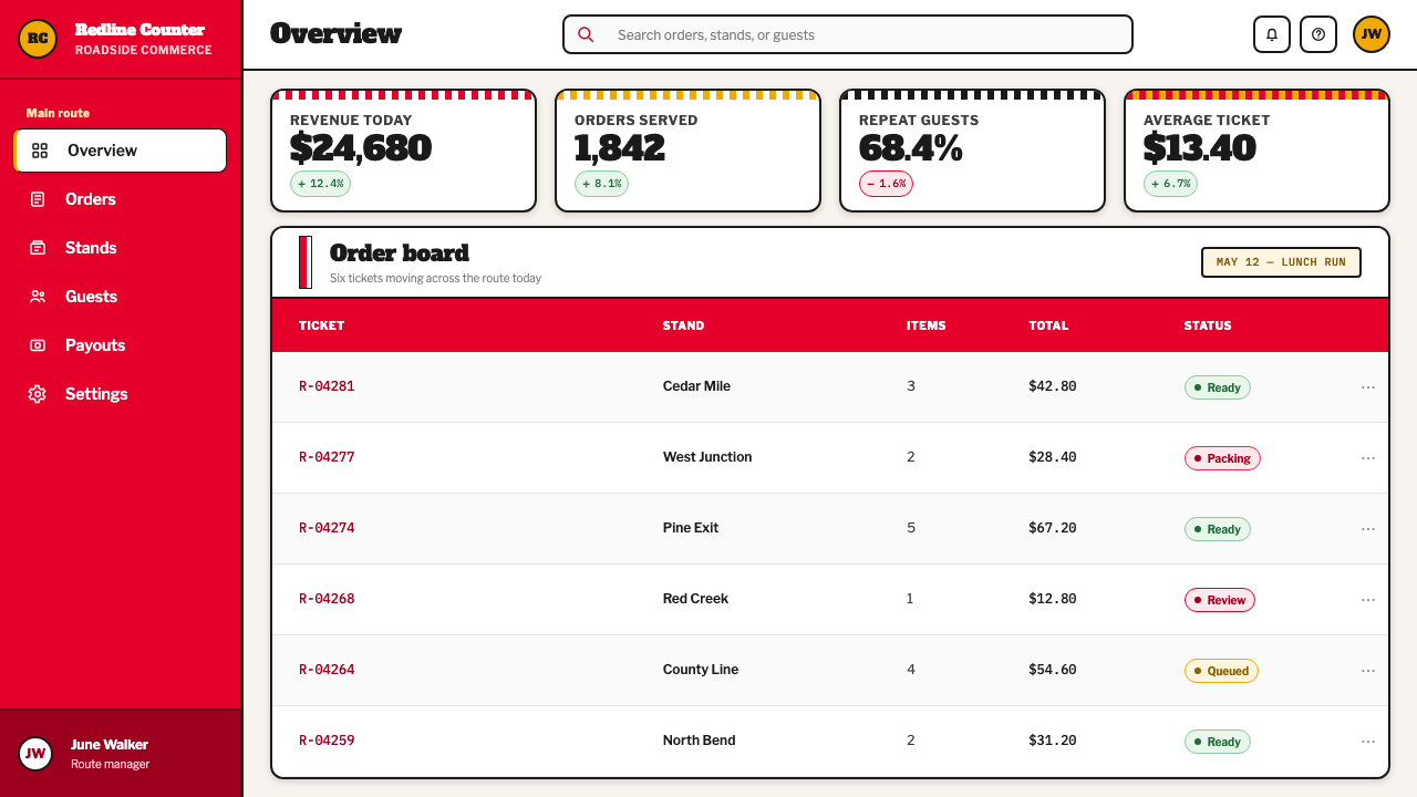
For content and data slides, turn the menu-board logic into hierarchy. Use large declarative section labels, clear blocks of supporting copy, and striped dividers only where they actively organize the page. Charts can borrow the palette’s appetite and contrast, but should remain practical: categories need readable labels, and the visual gesture must never bury the result. A badge can identify a key takeaway rather than decorate every corner.
For web interfaces, this language works best for promotional dashboards, loyalty experiences, ordering flows, location tools, and pricing or offer pages where speed and appetite matter. Use red-and-white contrast to establish action areas, reserve the circular character treatment for welcome states or recognizable status moments, and make primary calls to action feel as obvious as a roadside sign. Functional content should remain direct and easy to scan.
For editorial and marketing work, use it to build campaign pages, menu stories, event posters, product launches, and social assets with a cheerful franchise-memory quality. Pair the bold headline system with concise descriptions, food imagery or simple graphic cues, and a repeated stripe motif that carries the reader through the page. The best applications feel printed and public: they invite attention from a distance, then reward closer reading.
The common mistake is to reduce the style to generic retro decoration. Random stripes, distressed textures, diner clichés, and excessive mascot repetition can quickly make it feel like parody. Preserve the actual logic instead: red and white create recognition, slab-serif type makes the offer legible, the badge supplies welcome, and the signature supplies personality. If an element does not strengthen appetite, direction, or recognition, it should be removed.
KFC Colonel (1952) — FAQ
Is KFC Colonel simply a generic retro diner style?
No. It shares territory with diner and roadside nostalgia, but its identity is more specific: candy-striped packaging, a circular Colonel badge, slab-serif messaging, signature-like marks, and the visual demands of early franchise recognition. Generic retro styling often adds nostalgia as decoration. KFC Colonel uses nostalgia as a communication system for food, location, welcome, and recall.
Can the style work without the Colonel portrait?
Yes, if the rest of the recognition system remains coherent. Red-and-white stripes, bold slab-serif headlines, a circular seal-like form, and a signature gesture can preserve much of the roadside vocabulary. However, removing the character also removes the system’s most human element, so another clear welcoming device should take its place rather than leaving only anonymous stripes and type.
How should the style use food photography?
Food imagery should support the sign-like message rather than compete with it. Treat photography as a direct appetite cue, then give it a clear relationship to the headline, stripe field, or badge. Avoid making the image overly luxurious or atmospheric; the source vocabulary is practical, printed, and roadside-facing. The food should feel available, immediate, and proudly presented.
Does this aesthetic suit a dark interface?
It can, but a light paper-like ground is closer to the source material’s cardboard whites and red-and-white stripe language. A dark version should retain the feeling of a sign rather than becoming sleek nightlife branding. Keep the contrast decisive, let red remain the attention signal, and use pale elements to preserve the printed, friendly clarity that gives the style its appetite.
Where does KFC Colonel struggle as a design direction?
It struggles where quietness, luxury, abstraction, or solemnity are the primary values. The style is intentionally public, hungry, cheerful, and commercially direct; it can overpower products that need calm concentration or premium restraint. It is strongest when the product genuinely benefits from appetite, speed, public recognition, and the lively confidence of a roadside invitation.
Related design styles
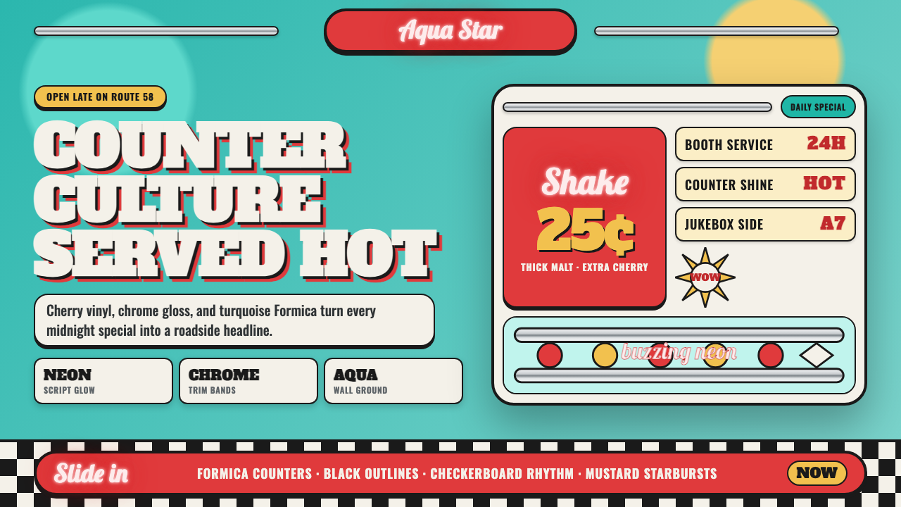 1950s Diner AquaRoadside optimism shouts. Aqua walls, cherry vinyl, chrome bands, and neon sc…
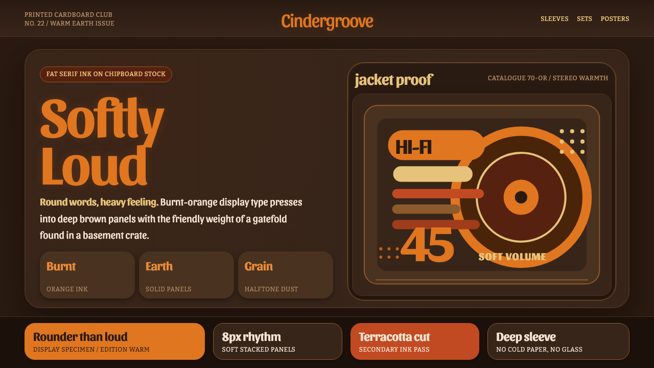 Cooper Black DisplayShouts softly. Burnt-orange Cooper type sinks into deep chipboard brown with…
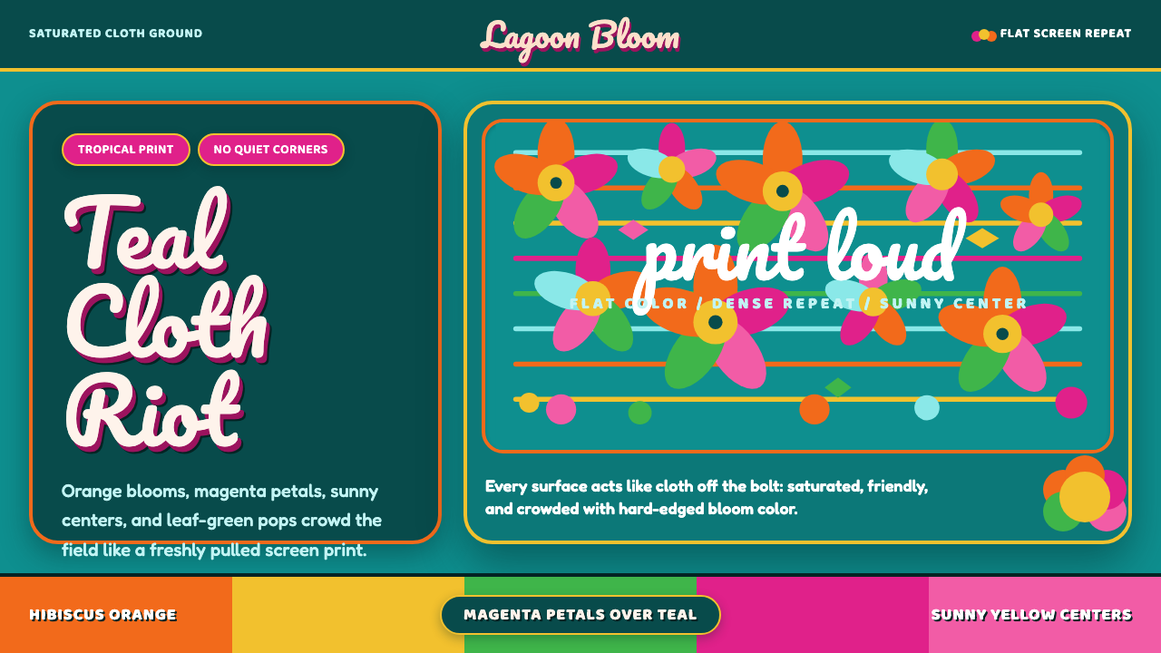 Fiji Bula Floral ShirtLoud cloth, zero quiet corners. Teal ground carries orange blooms and magenta…
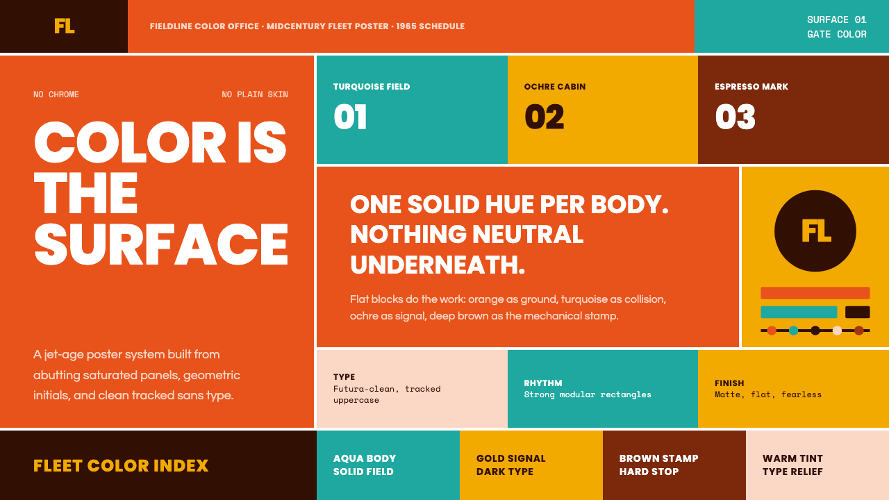 Braniff (Girard)Color becomes fuselage. Jellybean orange, turquoise blocks, and geometric san…
 Googie / Space Age (1960s)Tomorrow pulls in grinning. Atomic orange, space turquoise, tilted signs and…
 1950s Brush Script AdSells tomorrow in one swoop. Turkey red script, tan paper, starbursts, and ha…