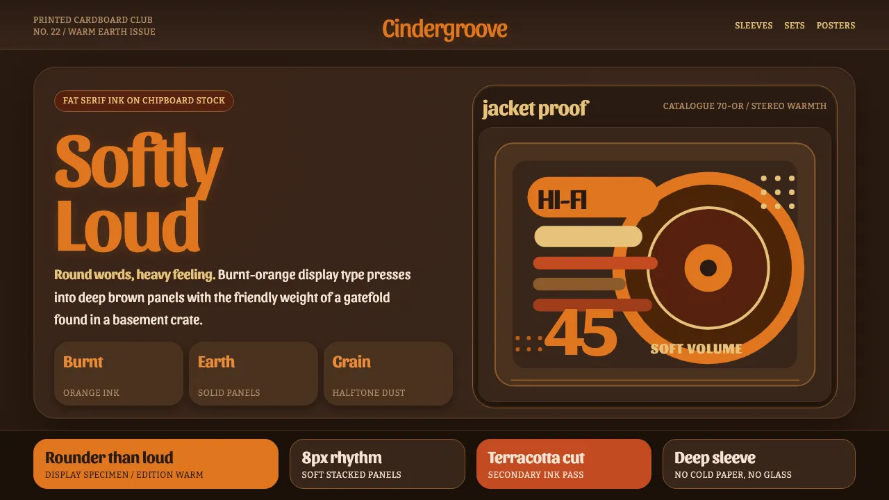
About Cooper Black Display
Cooper Black is Oswald Cooper's 1922 ultra-bold rounded serif — fat strokes, near-closed bowls, teardrop terminals — a face built to shout softly. It found its second life on late-60s and 70s record gatefolds, where burnt-orange lettering sat over deep, earthy chipboard stock. This system rebuilds that sleeve: a dark kraft-toned ground, oversized soft display words, and warm halftone ink. It reads like a Pet Sounds jacket, not a corporate deck — every panel is a piece of printed cardboard.
- Origin
- United States (Chicago)
- Era
- 1922 (release); 1966–1972 record-sleeve heyday; 70s advertising staple
- Key figures
- Oswald Cooper
- Movements
- American display/advertising type · 60s–70s pop record-sleeve lettering · warm-earth graphic design
Cooper Black Display design spec
Colors
Background
Surface
Primary
Secondary
Accent
Text
Typography
Cooper BlackHeadings
SansitaBody
BitterMono
Unlock for 1 credit
The other 11 sections — buttons, cards, spacing, motion, techniques and more — open once you unlock. Download the DESIGN.md or send it to your AI in one click. Unlock once, yours forever.
Sign up nowHave an account? Sign in
Styles similar to Cooper Black Display
Also inspired by print & type, with a close feel.
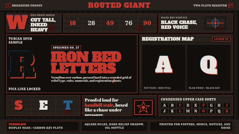 Wood Type SpecimenLoud proof-bed authority. Vermilion slab type locks into a black gridded press bed.
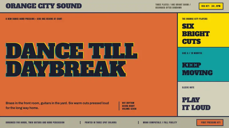 Highlife Record SleevePrint it loud. Hot orange fields and fat slab type keep the sleeve gloriously off-register.
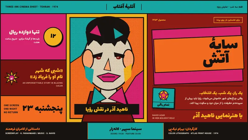 Iranian Film PosterCinema shouts in flat ink. Persian lettering clashes orange, turquoise and magenta on red.
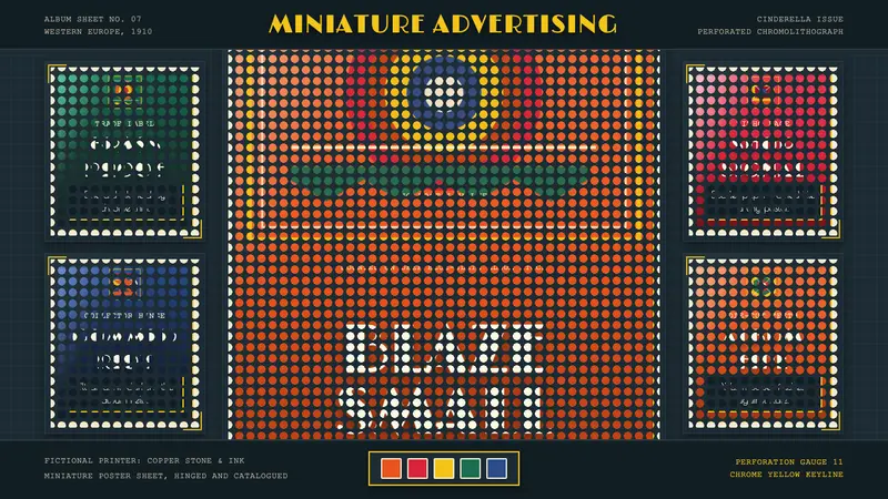 Poster Stamp (Cinderella)Blazes in miniature. Vermilion stamps, chrome keylines, and toothed edges on slate.