关于 Cooper Black Display
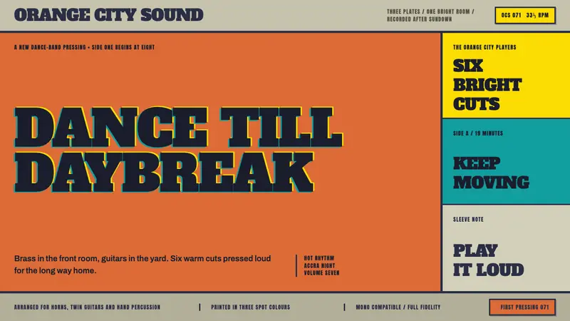
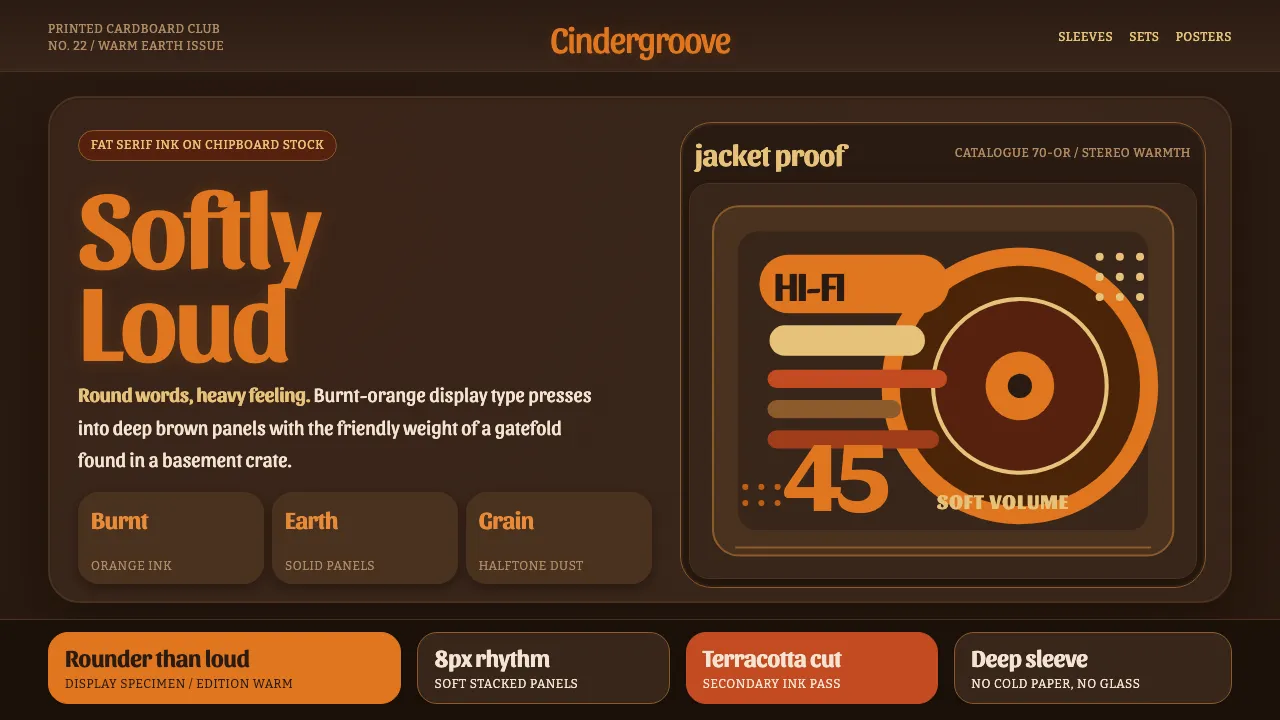
Cooper Black 是 Oswald Cooper 在 1922 年设计的超粗圆角衬线体:笔画肥厚、字碗几乎闭合、末端呈水滴状——一款用柔软方式发声的展示字体。它真正走红是在六七十年代的流行唱片封套上,暖橙色的大字母压在深色牛皮纸板的底子上。这套系统复刻的正是那张唱片封套:深土棕的底、柔软肥大的大字标题、带颗粒的暖色半调油墨。它看起来像《Pet Sounds》的对开封套,而不是一份企业幻灯——每一块面板都是一张印好的硬纸板。
- 来源
- 美国芝加哥
- 年代
- 1922 (release); 1966–1972 record-sleeve heyday; 70s advertising staple
- 代表人物
- Oswald Cooper
- 所属运动
- American display/advertising type · 60s–70s pop record-sleeve lettering · warm-earth graphic design
Cooper Black Display 的设计规格
和 Cooper Black Display 相似的风格
同样来自印刷与字体,气质相近。