What is El Chavo del Ocho?
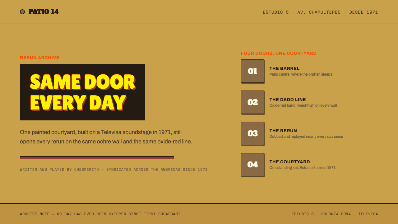
One courtyard, built on a Mexico City soundstage in 1971 and rerun for half a century, becomes a layout language: ochre plaster, an oxide-red dado line, numbered doors and a flat yellow title outlined in orange-red.
El Chavo del Ocho in brief
The El Chavo del Ocho style takes its look from the vecindad, the courtyard tenement where the Mexican television comedy of the same name takes place. The ingredients are specific: sun-baked ochre plaster walls with an oxide-red dado running along them, grey flagstone paving, brown doors with numbers on them, a wooden barrel in the middle of the patio, and, over it all, a flat yellow title card outlined in orange-red against black. The system turns that single set into a way of designing screens and pages.
It does so literally. The dado, the painted band along the lower part of a wall, becomes a horizontal rule that appears about a third of the way up any surface. Numerals live on door plates. Headlines sit in thick outlined blocks, like the title that opens every episode. Panels and cards are painted wood or chipped plaster rather than glass, so a button feels like a door and a container feels like a wall.
The overall character is bright, rough and hard-edged, with the particular patina of something that has been rerun for fifty years. Nothing is glossy or translucent. Colours are warm and slightly sun-faded, edges are square, outlines are thick, and the world has the stagey, built quality of a studio set. It is an unusually specific, human and affectionate style, closer to a stage designer’s drawing than a corporate system.

Where does El Chavo del Ocho come from?
The vecindad was built on Televisa’s Estudio 5, a soundstage on Avenida Chapultepec in Mexico City, in 1971. Its creator was Roberto Gómez Bolaños, known as Chespirito, who wrote the character of El Chavo and played him. Chavo is Mexican slang for a boy. The eight is usually traced to Canal 8, the Mexico City channel where the sketches first aired; inside the show it is also read as the number of the flat associated with him. The programme began in 1971 as sketches, became a weekly series on Televisa from 1973 to 1980, and has been syndicated ever since.
That long afterlife is the most important fact for the look. For the greater part of half a century the programme has been on Latin American television almost every day, and the vecindad has been seen so many times by so many generations that its walls, doors and barrel are shared memory. The opening is always the same: a black screen with the title in flat yellow letters outlined in orange-red. A design system built from such a thing inherits a very large audience that already knows what it is looking at.
The programme sits in three traditions named in the sources. It belongs to Mexican television comedy, with its broad performances, catchphrases and sketch-derived rhythm. It is a single-set studio sitcom, in which nearly everything happens in one courtyard, so the set works as a character in its own right. And it draws on silent-slapstick physical comedy, in which a gag must be visible from the other side of a room, without words. Each of these traditions rewards clear, bold, legible staging, and each shows up as a design principle: strong shapes, thick outlines and nothing hidden.
A vecindad is a form of urban housing found across Mexico: a row of modest homes opening onto a shared patio, with neighbours who cannot avoid one another. The set is a stage for that proximity. A painted dado traditionally guards the lower wall from scuffs, the numbered doors tell visitors which family lives where, and the barrel and flagstones turn the courtyard into a playground. This system takes those practical features and recasts them as layout devices, which is why the style feels so physical. It is a design that remembers where it came from.
What defines the El Chavo del Ocho look?
Ochre Walls
The field colour is a warm, sun-baked ochre, the colour of old plaster in a Mexican courtyard. It is faded rather than saturated, slightly dusty, and wide enough to serve as the page background without tiring the eye. Because it is a plaster colour, it behaves differently from a neutral white: everything placed on it feels attached to a wall rather than floating on a screen.
The Dado Line
An oxide-red band runs horizontally about a third of the way up any surface. It is the strongest structural device in the system, doing the job that a divider or header bar does in other designs, but with a physical reason: it is the painted lower wall of the courtyard. Sections, cards and screens are all subdivided by the same line, which gives the whole interface a steady horizon.
Door Plates and Numerals
Doors are brown, wooden and numbered, and the numbering is part of the language. Numerals appear on plates, as in list indices, step counters, prices and counts, and they carry the weight that icons carry elsewhere. A number on a door is a place; a number on a card is a position. The device gives the interface a built-in way to say which one, in which order, and where.
Outlined Title Blocks
Headlines are set as thick, flat blocks, in yellow letters outlined in orange-red, echoing the programme’s opening title. There is no gradient and no soft shadow: the letter shape is a solid yellow, the outline is a solid orange-red, and the contrast against a dark or plaster ground makes it readable from across a room. The title block is the loudest thing on any page, and it is used sparingly for that reason.
Painted Wood and Chipped Plaster
Surfaces are physical materials rather than glass. Cards read as painted wood panels, with a visible edge and a flat colour; containers can show a little wear, as if plaster had chipped at the corner. The effect is tactile and slightly worn. There is no translucency, blur or glossy highlight anywhere in the system, because nothing in a vecindad is transparent.
Flagstone Grey
Grey flagstones supply the system’s neutral. It is a cool, stony grey, used for floors, borders and secondary surfaces, and it relieves the heat of the ochre and the red without introducing a new hue. Placed beneath the warm colours, it makes them look warmer, and it grounds the layout the same way a paved patio grounds the set.
Bright, Rough, Hard-Edged
Corners are square, outlines are thick, and colour areas are flat. Nothing is soft, and nothing is hidden. This is the visual attitude of studio comedy, where everything must read clearly from a camera across the room, and of slapstick, where the gag depends on seeing the whole body. The roughness is part of the charm: the system looks made by hand, and a little careless on purpose.

Who shaped El Chavo del Ocho?
Writer and performer, and the creator of El Chavo. He wrote the programme, acted in it and played the title character himself, which is why the vecindad feels like the product of a single sensibility. The sketches begun in 1971 and the weekly series that followed turned a small comic world into a regional institution. The style’s strong, simple shapes, bold titles and physical humour follow directly from his approach to comedy.
Actor who played Don Ramón, the courtyard’s grumbling, perpetually unlucky tenant. His performances gave the set one of its most memorable physical presences, and the character’s relationship with the doors and the patio is part of why the architecture feels so alive. In design terms, he stands for the premise that a place becomes recognisable through the people who inhabit it.
Actress who played La Chilindrina, one of the best-known children in the courtyard. Her role is a reminder that the set was built for ensemble comedy, with many people sharing a small space and constantly crossing paths. The layout lessons are the same: a crowded patio must still be readable, so each person and each door needs a clear shape and a clear place.
Named among the key figures of this look, in the company of the show’s writer and two of its best-known performers, as part of the circle of people around the show’s production. His inclusion points to something designers should remember: a studio set is made by many hands, and its colours, textures and numbered doors were decisions as well as accidents. This system treats the vecindad as a piece of design and honours the craft behind it.
How do you use El Chavo del Ocho today?
The El Chavo del Ocho style is a nostalgia-and-warmth system. It suits subjects that want to feel familiar, communal and a little cheeky, and it asks you to commit to flat colour, thick outlines and a handmade attitude. Applying it correctly means using the courtyard as a metaphor: walls, bands, doors, numbers and titles, each doing the job it does in the set.
For presentation slides, the style works well for covers and for any deck that wants a human, playful tone. A cover can copy the opening card: a dark field with a big, outlined yellow title. Content slides should use the dado line as a divider, with a simple wall of ochre above and a band of oxide red below. Data slides can present figures on door plates, with numbers large and labels short. Charts should use flat, chunky shapes in the warm palette rather than thin lines.
For web interfaces, it suits entertainment sites, community platforms, food and neighbourhood brands, fan pages and educational products for general audiences. Use a plaster-coloured page, a dado band under the header, painted-wood cards with visible edges, and door-plate numerals for ordered lists and pricing steps. Buttons should read as solid painted panels, with a clear pressed state in place of glass-like hover effects. It is poorly suited to financial or clinical interfaces that need an air of precision or distance.
For editorial and marketing work, the style supports retrospective features, regional campaigns, event posters and packaging for products with a warm, domestic character. Headlines in the outlined block style carry a lot of weight, so a single one per page is usually enough. Photography should be warm and slightly desaturated, and illustrations should be flat and thick-lined. The voice that goes with the look is friendly, direct and humorous rather than polished.
The most common mistake is to smooth it: adding gradients, soft shadows or glassy cards removes the plaster and paint that make the system work. A second mistake is over-distressing, with fake grunge textures on every element that make the layout muddy and unreadable. The wear should be suggested, not simulated. A third mistake is to reach for the characters themselves. The system borrows the look of the set, not the figures, names or footage, which belong to their rights holders, and a convincing result comes from the architecture alone.

El Chavo del Ocho — FAQ
Is this an official design from the television programme?
No. It is a design system that reads the programme’s courtyard set as a layout language: ochre plaster, an oxide-red dado, numbered doors, flagstone grey and a flat outlined yellow title. It borrows the architecture of the set rather than its characters, logos or footage, which belong to their rights holders. Use it as inspiration for your own projects, not as a way of presenting your work as related to the programme.
What does the dado line actually do in a layout?
It is a horizontal band placed about a third of the way up a surface, and it plays the role that dividers, header bars and footers play elsewhere. Because the same line appears on cards, sections and whole screens, it gives the interface a consistent horizon and a recognisable rhythm. Use it to separate a lower zone of controls or details from an upper zone of content, and keep its colour constant across the design.
Can the style work on a dark background?
Partly. The programme’s opening card sits on black, and the outlined yellow title was made to be read on a dark ground, so title and cover pages can be dark. The rest of the language is plaster, wood and daylight, so most content pages work best on the ochre wall colour. Use black as a punctuation mark, for title cards and strong emphasis, rather than the default surface.
How do I keep it from looking childish or messy?
Restrain the palette to ochre, oxide red, flagstone grey, brown and the yellow-and-orange of the title, and keep every shape simple. Use thick outlines for titles and a thin hierarchy of type underneath. Limit the wear effects to edges and corners. A strong grid and generous spacing do the same job here as they do elsewhere: they let the bold elements be bold without turning into noise.
What kinds of projects suit it best?
Projects that want warmth, familiarity and humour: entertainment and fan sites, community and neighbourhood platforms, food and hospitality, event posters, children’s and family content, and any campaign aimed at a Latin American or Spanish-speaking audience that knows the programme. It is a poor fit for work that needs to look formal, minimal or expensive, because its roughness and bright colour carry associations of home and comedy.
Related design styles
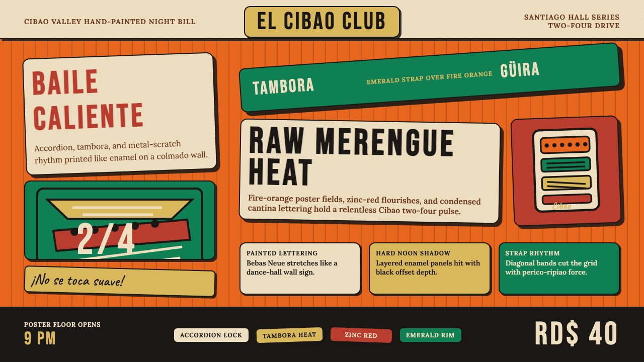 Dominican Merengue Perico RipiaoMaximalism keeps time. Fire-orange fields, Bebas Neue, and diagonal emerald s…
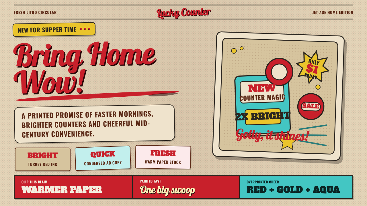 1950s Brush Script AdSells tomorrow in one swoop. Turkey red script, tan paper, starbursts, and ha…
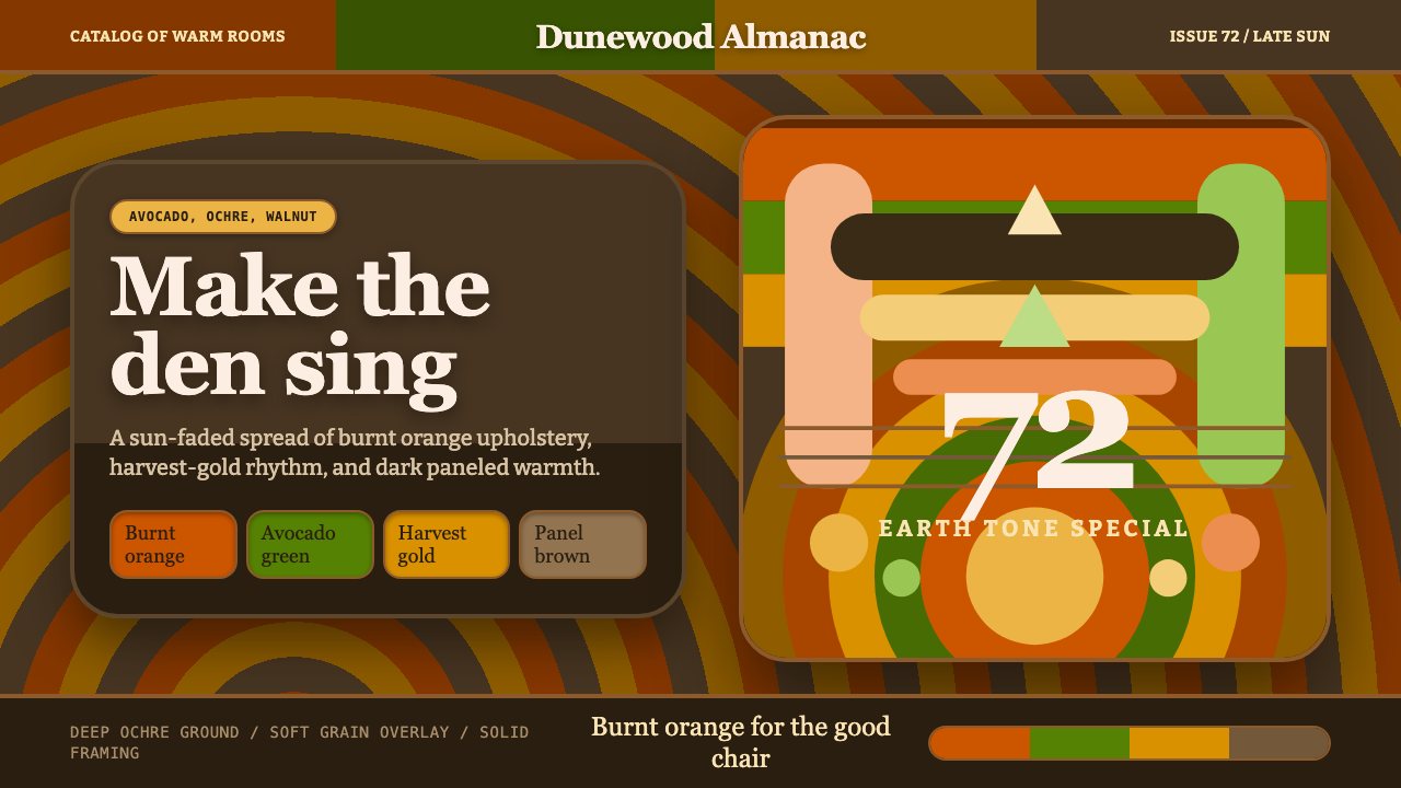 1970s Earth TonesWarm maximalism stays muddy. Bulbous slabs, avocado bands, and harvest-gold r…
 Cooper Black DisplayShouts softly. Burnt-orange Cooper type sinks into deep chipboard brown with…
 Dominican Bachata & Perico RipiaoPlainspoken warmth. Kraft stock, red clay serif, and typewriter credits carry…
 Ghanaian HighlifeMusic before words. Marigold ground, black keylines, red-green signboard bloc…