What is Amélie (Montmartre 2001)?
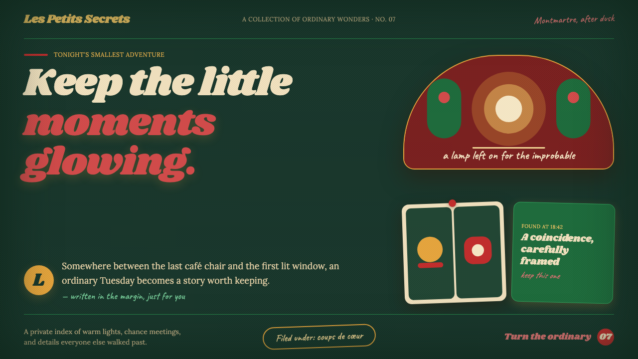
Amélie turns the everyday into a private spectacle: deep green rooms, carmine flashes, amber warmth, and the feeling that every small discovery deserves its own frame.
Amélie (Montmartre 2001) in brief
Amélie is a cinematic interface style drawn from the visual world of Montmartre in the 2001 film: saturated storybook green, lipstick-like red accents, cream-colored narration, and an amber cast that makes ordinary spaces feel preserved rather than merely observed. It is dark in mood without being severe. The darkness is verdant, warm, upholstered, and intimate; it resembles a café interior at dusk more than a neutral digital canvas.
The style treats an interface as a sequence of found keepsakes. Panels feel like rooms, cards resemble photo-booth strips or notes pinned to a wall, and rounded shapes recall old café mirrors. Rather than presenting information as an abstract system, it stages information as a collection of personal clues. A saved item, a recommendation, or a progress update can feel like evidence in a diary kept quietly for oneself.
Its visual logic depends on selective exaggeration. Green grounds establish the world, carmine marks moments of desire or recognition, and cream type carries the voice of reflection. Film grain and gentle material irregularity prevent the layout from becoming too polished. The result is whimsical realism: a designed environment that remains usable, but makes familiar actions feel slightly enchanted.
Where does Amélie (Montmartre 2001) come from?
The reference point is Amélie, released in 2001 and set in a Paris imagined through Montmartre nostalgia. Its locations include Montmartre, Café des Deux Moulins, and Canal Saint-Martin. The setting reaches backward toward postwar and 1970s associations while remaining a deliberately heightened film world, not a documentary reconstruction of Paris.
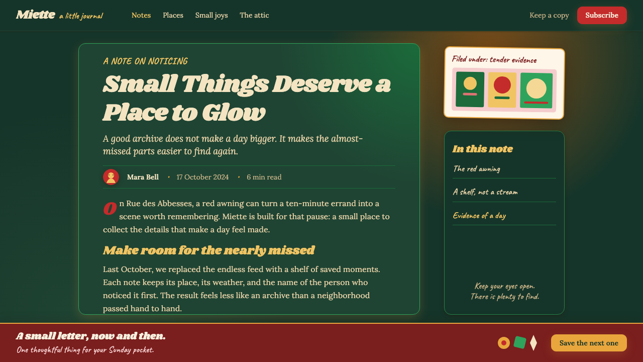
Bruno Delbonnel’s celebrated color grade is the style’s central visual source. Montmartre is pushed toward saturated green; red props punctuate the frame; amber warmth gathers the remaining tones into a coherent atmosphere. In interface terms, this is not a palette applied after layout. Color is the device that makes separate components feel as though they belong to the same remembered place.
The source material places the style within French whimsical realism and magical-realist cinema. That lineage explains why objects can carry emotional importance beyond their practical role. A card is not only a container, a button is not only a control, and a list is not only a list: each may become a small stage for attention, curiosity, and private ritual.
Jean-Pierre Jeunet, Bruno Delbonnel, Aline Bonetto, and Yann Tiersen are the key figures named for this world. Together, the reference is also an example of digital color-grading as authorship: mood is not left to accident or naturalism, but built through a sustained visual decision. A faithful interface adaptation should preserve that consistency of atmosphere rather than copying isolated motifs.
What defines the Amélie (Montmartre 2001) look?
Storybook Green
Verdant dark surfaces establish the frame. Green is not a neutral utility background; it gives the interface an enclosed, botanical, slightly theatrical atmosphere. Use it to make a page feel inhabited, as though information is being viewed inside a room rather than on an empty screen.
Carmine Recognition
Carmine accents identify coups-de-coeur: an action worth noticing, a saved object, a favorite, or a moment of emotional emphasis. Because the red is vivid against green and amber surroundings, it works best as a precise interruption rather than a broad field of decoration.
Cream Narration
Cream-colored type supplies the diary voice. It softens contrast without losing legibility and makes copy feel observed, remembered, or confided. Typography should feel literary and intimate, with headings acting as scene titles and supporting text carrying the pace of a quiet narration.
Rounded Keepsakes
Corners and silhouettes should round like aged café mirrors rather than resolve into sharp technical geometry. The softness is not generic friendliness. It suggests handling, memory, and wear, making components feel collected and cared for instead of manufactured for maximum efficiency.
Pinned Composition
Cards can behave like photo-booth strips pinned into a larger scene. Slightly layered groupings, framed images, and deliberate local emphasis give content a scrapbook quality. The composition must remain orderly enough to scan; the feeling is curated coincidence, not clutter.
Warm Film Surface
A faint film-grain character warms otherwise flat digital surfaces. It should be sensed before it is noticed, adding softness and a trace of material life without reducing text clarity or competing with content. The aim is cinematic presence, not distressed nostalgia.
Who shaped Amélie (Montmartre 2001)?
Jeunet is named as a key figure in the Amélie reference world. The interface style inherits a deliberately authored sense of place: ordinary environments are not neutral backdrops, but settings in which small gestures can acquire narrative importance.
Delbonnel’s celebrated color grade is the most direct visual foundation for the style. Saturated green, lipstick-red props, and amber warmth create a system in which color governs atmosphere, focus, and the emotional relation between objects.
Bonetto is listed among the key figures for the theme. Her presence in the reference set reinforces that this style is spatial as well as chromatic: its panels, frames, mirrors, and collected objects should imply a coherent lived-in world.
Tiersen is also named as a key figure. In design terms, the associated lesson is rhythm: the interface should unfold in small, memorable beats, allowing detail, pauses, and modest moments of recognition rather than forcing every element to compete at once.
How do you use Amélie (Montmartre 2001) today?
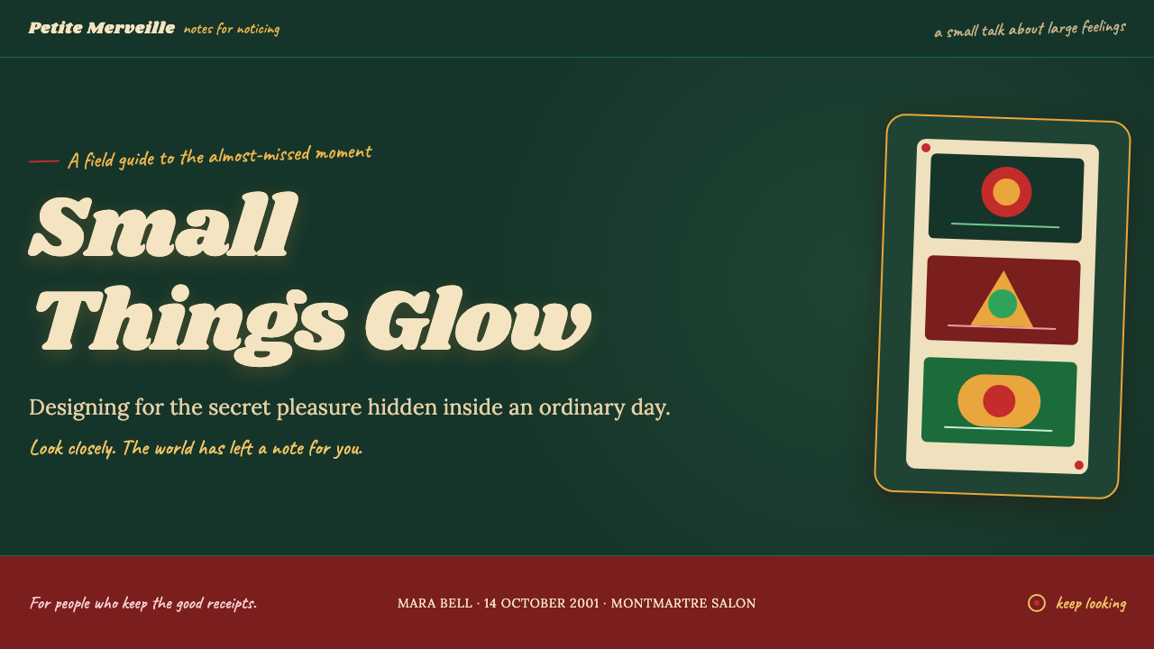
For presentation covers, build a single theatrical frame rather than a generic title page. Let a green field establish the room, introduce one carmine focal object or title detail, and set the main title in cream as a quiet declaration. On content slides, preserve a stable narration area and allow supporting cards to read like collected evidence. The emotional tone should support the subject, not obscure it.
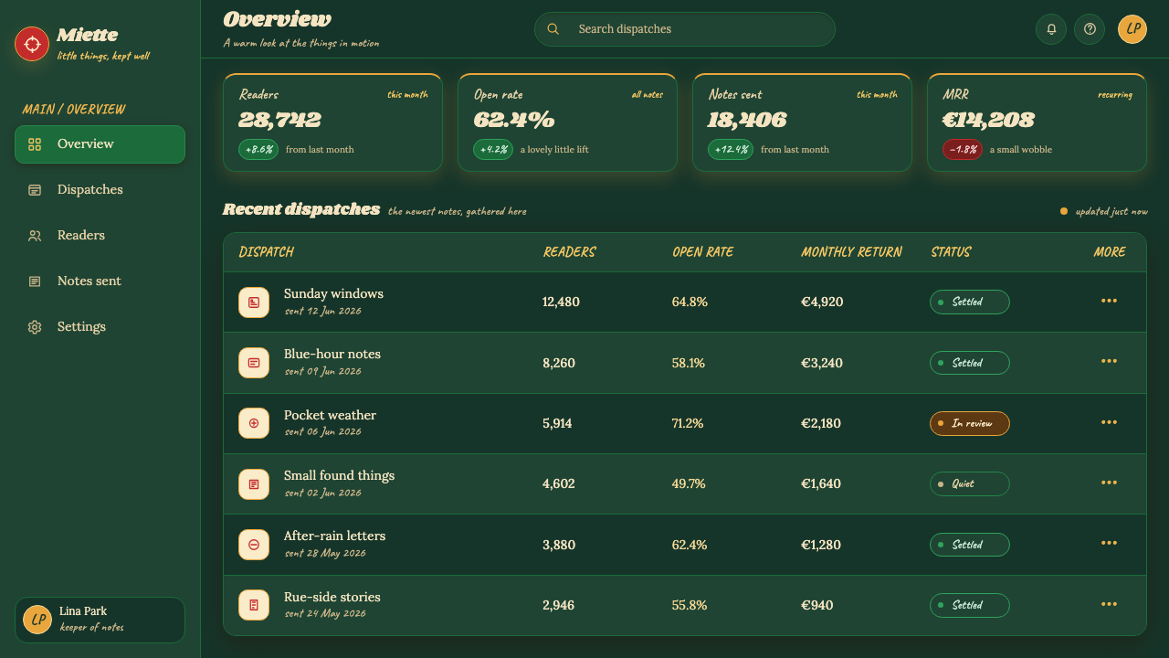
For data slides, use the style to make metrics feel observed rather than merely displayed. Keep the chart structure calm and readable, then reserve carmine for the one comparison, outlier, or decision that matters most. Green panels can group related measures, while cream labels keep the presentation warm. Avoid turning every series into an accent; the filmic effect depends on selective attention.
For web interfaces, this approach suits personal dashboards, collections, recommendation spaces, journals, and products that benefit from a sense of discovery. A dashboard can feel like a desk covered in meaningful fragments when its modules are carefully framed and grouped. Status, navigation, and controls still need predictable placement; whimsy should enrich orientation, never replace it.
For pricing pages and marketing work, use the style to tell a small story of value. Distinguish plans or offers through atmosphere and sequence rather than relentless visual pressure. Editorial pages can pair intimate cream reading text with framed images, short callouts, and generous pauses that make an article feel like a private notebook. The strongest marketing applications focus on a single memorable promise rather than a crowded collection of charms.
The common mistake is copying green, red, grain, and rounded cards without establishing a narrative hierarchy. When every panel is richly treated, nothing feels discovered; when every action is carmine, nothing feels important. Keep the base world calm, choose a few meaningful interruptions, and let the diary voice, rounded framing, and material warmth serve content that genuinely deserves attention.
Amélie (Montmartre 2001) — FAQ
Is this style simply a French vintage look?
No. Vintage cues are present, but the defining idea is cinematic authorship: green, red, amber warmth, rounded objects, and grain work together to make ordinary moments feel narratively charged. A generic retro treatment may borrow old-looking surfaces without creating that focused sense of attention.
Can the style work without photography?
Yes. Framed cards, rounded silhouettes, cream narration, selective red accents, and a warm green world can establish the mood without images. Photography can deepen the photo-booth reference, but the essential requirement is that components feel like meaningful objects within a scene.
Should every surface include film grain?
No. Grain is an atmospheric unifier, not a texture to display for its own sake. It should remain faint enough that reading, chart interpretation, and interaction are effortless. If users notice the grain before the information, it has become decoration rather than cinematic warmth.
Where should carmine red appear?
Use it for moments that deserve recognition: a primary choice, a favorite, a new discovery, or the key finding in a data view. It is most persuasive when surrounded by calmer green, amber, and cream surfaces. Broad red coverage weakens its emotional and navigational force.
What products are a poor fit for this approach?
It is a weak fit where strict neutrality, dense operational scanning, or highly restrained institutional presentation is the main requirement. The style asks users to linger and notice; products that must disappear into the background may need a quieter visual language. It works best when memory, discovery, and emotional attention are part of the product value.
Related design styles
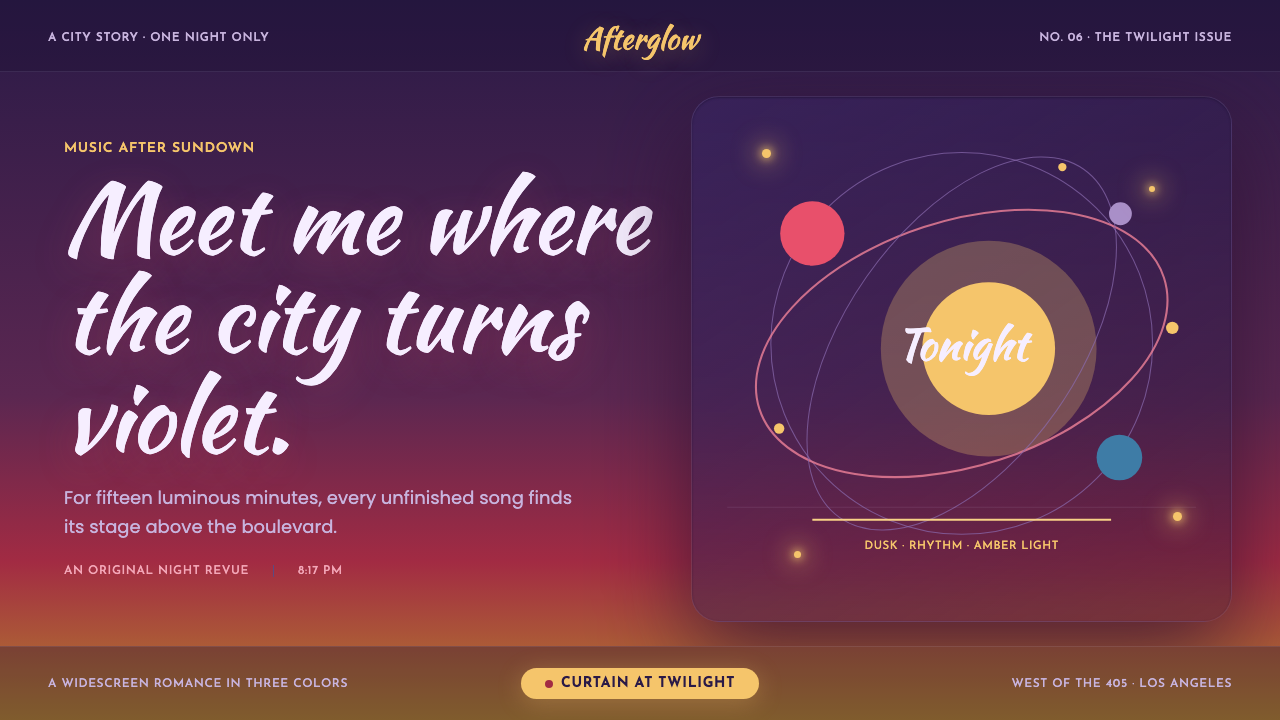 La La Land (2016)Twilight waits for a dance. Violet dusk, rose horizons and amber bulbs frame…
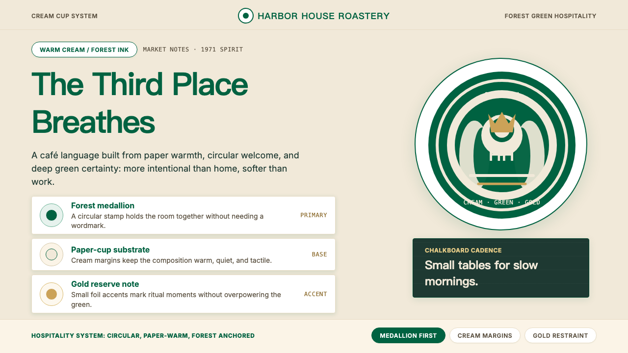 Starbucks (Siren)Hospitality becomes an emblem. Forest green medallion on cream paper, with re…
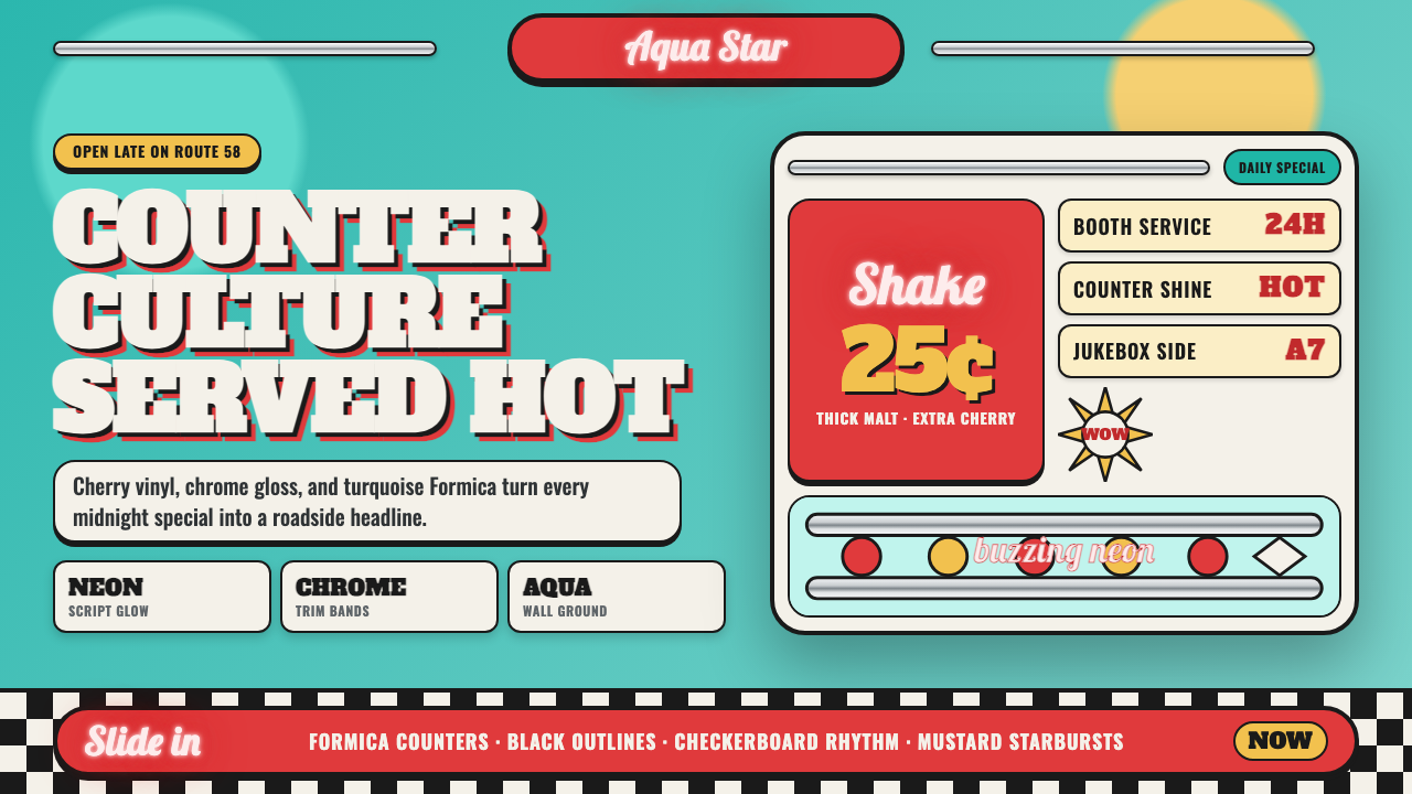 1950s Diner AquaRoadside optimism shouts. Aqua walls, cherry vinyl, chrome bands, and neon sc…
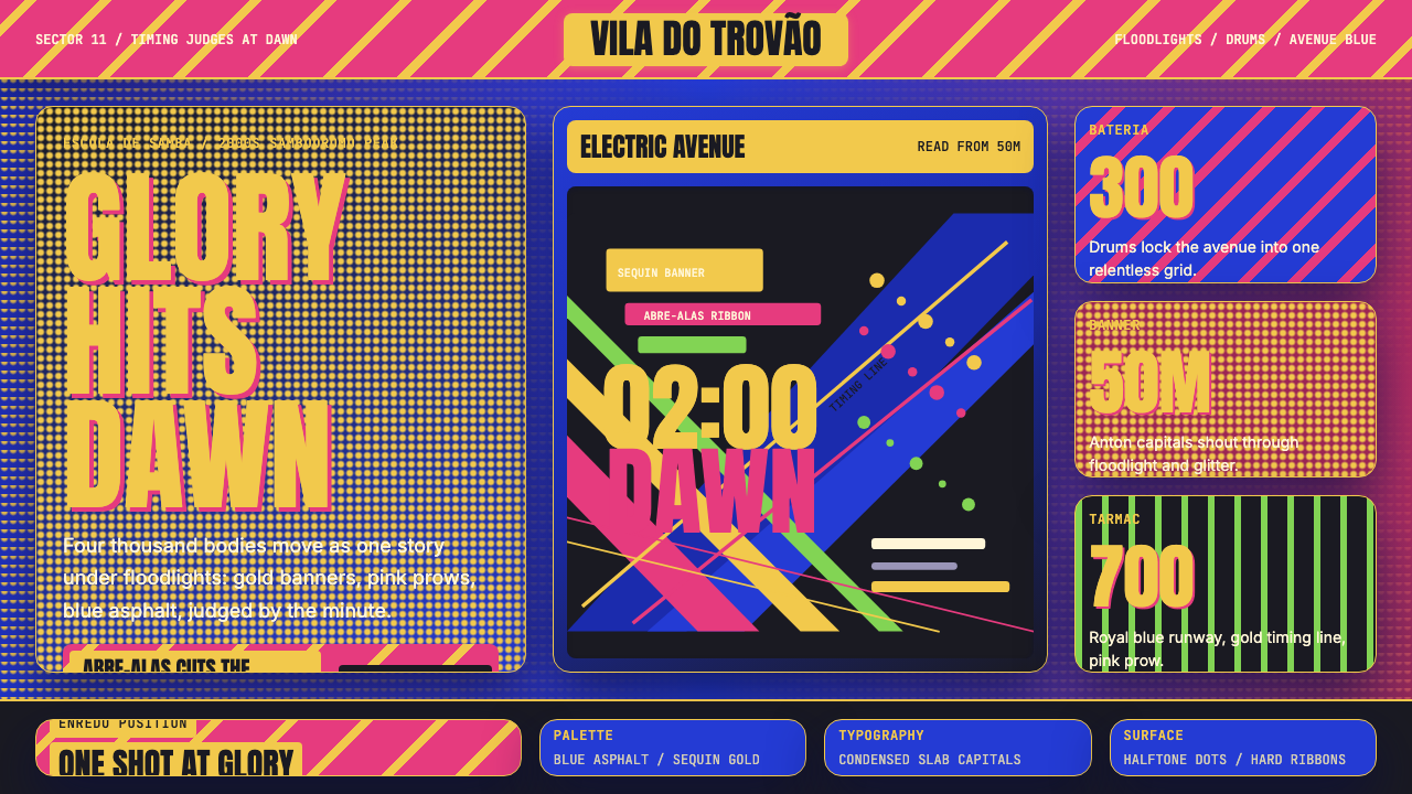 Brazilian Samba School (2000s Carnaval)Parade at floodlight volume. Royal blue asphalt, sequin gold type, pink ribbo…
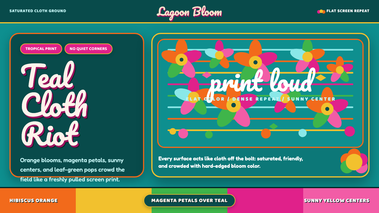 Fiji Bula Floral ShirtLoud cloth, zero quiet corners. Teal ground carries orange blooms and magenta…
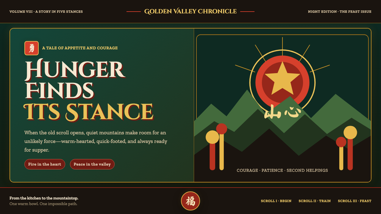 Kung Fu Panda (2008)Ancient calm meets comic momentum. Vermilion, gold and paper-cut peaks glow i…