What is Starbucks (Siren)?什么是 Starbucks (Siren)?
A twin-tailed Siren on forest green turned a cup of coffee into a global cultural institution — and proved that a single emblem, freed from words, can carry the warmth of an entire philosophy.森林绿底上那枚双尾海妖,将一杯咖啡升华为全球性的文化符号——并且证明了:一枚从文字中解放出来的徽章,足以承载一整套哲学的温度。
Starbucks (Siren) in briefStarbucks (Siren) 速览
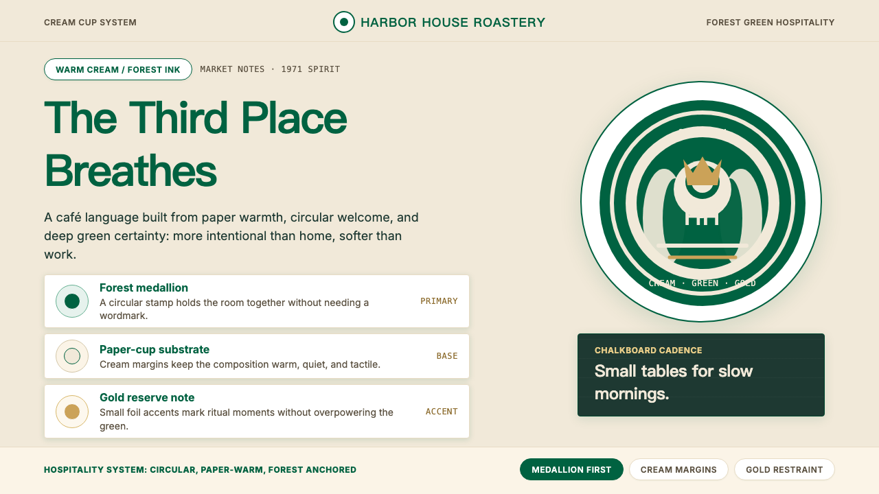
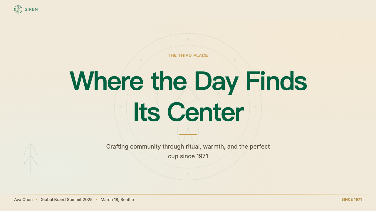
The Starbucks Siren identity is a hospitality-centered visual system built around a single iconic medallion: a twin-tailed mythological siren rendered in cream on a deep forest green ground. Since the 2011 rebrand removed the encircling wordmark entirely, the emblem stands alone — on cups, on storefronts, on packaging, on digital interfaces — as one of the most recognized marks in the world without a single letter of text.星巴克海妖视觉系统是一套以待客之道为核心的品牌体系,以单一标志性徽章为基础——深森林绿底面上,一枚奶油色双尾神话海妖图案。自2011年品牌焕新去除环绕文字标识以来,这枚徽章独立存在于纸杯、店面、包装与数字界面之上,成为全球最具辨识度的纯图形标志之一,一个字母也不需要。
The color logic of the system is deliberately organic rather than corporate. The dominant green is the color of aged copper, deep moss, and Pacific Northwest evergreens — grounding rather than aggressive, welcoming rather than commanding. Cream acts as the warm counterpart: the color of unbleached paper, steamed milk, and the inside of a well-worn notebook. Together, these two tones create an environment that reads as a place to pause rather than transact.这套系统的色彩逻辑是刻意有机的,而非公司化的。主色调的绿来自岁月铜绿、深邃苔藓与太平洋西北地区的常青树——它是落地的,而非进攻的;是欢迎的,而非命令的。奶油色作为温暖的对应:未漂白纸张的颜色,蒸奶的颜色,一本用旧笔记本内页的颜色。两种色调共同营造出一种环境,令人感到这是一处可以驻足的地方,而非交易的场所。
The overall aesthetic philosophy channels what founder Howard Schultz called the 'third place' — a space distinct from home and office, governed by ritual, warmth, and a sense of belonging. Every design decision in the Starbucks system, from the weight of the emblem's line work to the texture implied by chalkboard menus, serves that singular emotional brief: make the person holding this object feel, for a moment, like a regular.整体美学哲学传递的,正是创始人霍华德·舒尔茨所说的「第三空间」——一个有别于家与办公室的场所,由仪式感、温暖与归属感所支配。星巴克设计系统中的每一个决定,从徽章线条的粗细到粉笔菜单板暗示的质感,都服务于同一个情感提案:让拿着这件物品的人,在那一刻感觉自己是这里的常客。
See the Starbucks (Siren) design system查看 Starbucks (Siren) 完整设计系统
Where does Starbucks (Siren) come from?Starbucks (Siren) 从何而来?
Starbucks was founded in Seattle, Washington, in 1971 by three partners: Jerry Baldwin, Zev Siegl, and Gordon Bowker. The original store, at Pike Place Market, sold roasted coffee beans rather than prepared drinks. The name came from Starbuck, the calm and pragmatic first mate of the whaling ship in Herman Melville's Moby-Dick — chosen for its evocation of the maritime trading heritage of the Pacific Northwest. Graphic designer Terry Heckler, working with the founders, discovered a sixteenth-century Norse woodcut of a twin-tailed siren and adapted it for the brand's first logo. The siren — a figure of allure, mystery, and the sea — complemented the seafaring name perfectly.星巴克于1971年由杰里·鲍德温、泽夫·西格尔和戈登·鲍克三位合伙人在华盛顿州西雅图创立。位于派克市场的第一家门店销售的是烘焙咖啡豆,而非调制饮品。品牌名称取自赫尔曼·梅尔维尔《白鲸记》中那位沉稳务实的大副斯达巴克(Starbuck),因其唤起了太平洋西北地区的航海贸易传统而被选用。平面设计师特里·赫克勒在与创始人合作时,发现了一幅十六世纪挪威木刻版画,上面刻有一位双尾海妖,随即将其改编为品牌的第一个标志。海妖——魅力、神秘与大海的化身——与这个航海气息浓厚的品牌名称堪称绝配。
The original 1971 logo was a detailed brown illustration: the siren shown from the waist up, bare-chested, with two fish tails spreading to either side. When Howard Schultz joined the company in 1982 and subsequently acquired it in 1987, transforming it from a bean retailer into an espresso bar chain, the visual identity evolved alongside the business. The 1987 rebrand shifted the palette from brown to green — green tea, green money, green Pacific forests — and enclosed the siren in a circular badge with the full wordmark 'Starbucks Coffee' running around the perimeter. This format would persist, with minor refinements, for more than two decades.1971年最初的标志是一幅精细的棕色插图:海妖从腰部以上露出,袒胸,两条鱼尾向两侧展开。1982年霍华德·舒尔茨加入公司,并于1987年收购该公司,将其从咖啡豆零售商转型为浓缩咖啡连锁品牌,视觉形象也随之演进。1987年的品牌焕新将色调从棕色转为绿色——绿茶的绿、钱币的绿、太平洋松林的绿——并将海妖封入圆形徽章,外圈环绕「Starbucks Coffee」字样。这一形式经历小幅调整后延续逾二十年。
The pivotal transformation came in 2011, when Starbucks — by then a forty-year-old global company with thousands of locations — undertook a comprehensive identity overhaul in collaboration with the design consultancy Lippincott, with creative leadership from Connie Birdsall. The decision to remove the wordmark entirely was audacious: a bet that the siren had become sufficiently iconic to stand alone. The emblem was enlarged within its circular field, the linework was refined, and the siren's face was brought forward — more approachable, more contemporary, more directly meeting the viewer's gaze. The outer ring, the text, the star details were stripped away. What remained was a pure emblem, freed from the necessity of naming itself.决定性的变革发生在2011年。彼时的星巴克已是一家拥有四十年历史、遍布全球数千家门店的企业,在设计咨询公司利普顿(Lippincott)的合作下,由康妮·伯兹尔主导创意,展开全面的形象焕新。去除全部文字标识的决定十分大胆:这是一个赌注——赌海妖已足够标志性,可以独立存在。徽章在圆形视场内被放大,线条得到精炼,海妖的面部被推向前景——更易亲近,更具当代感,更直接地与观者目光相接。外圈、文字、星形细节被一一剥除。留下的是一枚纯粹的徽章,从自我命名的必要中解放出来。
The 2011 rebrand also signaled a broader strategic ambition: Starbucks was no longer positioning itself solely as a coffee company, and removing 'Coffee' from its visual identity was a deliberate statement of that expanded scope. The green-and-cream system that emerged from that redesign has since been applied across an extraordinary range of touchpoints — seasonal packaging, merchandise, digital interfaces, store architecture, and licensed products in dozens of countries — demonstrating that a single well-resolved emblem, paired with a committed color philosophy, can serve as the backbone of an entire experiential ecosystem.2011年的品牌焕新同时传递了更宏观的战略抱负:星巴克不再将自己单纯定位为一家咖啡公司,从视觉形象中去除「Coffee」字样,是对这一扩展格局的刻意声明。由此次焕新中诞生的绿色与奶油色系统,此后被应用于跨度极大的各类触点——季节性包装、周边商品、数字界面、门店建筑以及数十个国家的授权产品——证明了一枚经过充分打磨的徽章,加上一套坚定的色彩哲学,足以成为整个体验生态系统的骨干。
What defines the Starbucks (Siren) look?Starbucks (Siren) 的视觉特征是什么?
Color Philosophy色彩哲学
The system is anchored by two tones that work in careful opposition. The primary green is deep and slightly muted — closer to the forest floor than to the brightness of a traffic signal — giving it authority without aggression. Against it, cream provides warmth: the substrate reads as aged paper or natural linen, never as the sterile white of a medical environment. Gold enters only as a tertiary accent for premium or seasonal moments, never as a structural color. This disciplined trio produces an environment that feels earned rather than engineered.这套系统由两种色调精心对立地锚定。主体绿色深沉而略带哑光——更接近林地地表,而非交通信号灯的明亮——赋予它权威而不失亲和。奶油色与之对应,提供温度:底面读来如同岁月浸染的纸张或天然亚麻,绝不呈现医疗环境的冷白。金色仅作为第三级强调色出现于高端或季节性时刻,从不承担结构性职能。这种克制的三色组合营造出一种感觉是自然生长、而非刻意设计的环境。
The Siren Emblem海妖徽章
The siren figure is the entire communicative load-bearer of the identity. Post-2011, her face occupies the center of the composition with greater prominence than in any previous iteration — symmetrical, direct, meeting the viewer's gaze without evasion. The twin tails, arching upward to frame the composition, echo the circular form of the medallion itself, creating a self-contained visual world. The line weight is controlled so that the image reads cleanly at every scale from a tiny app icon to a building-sized mural — a requirement that shaped every refinement of the drawing.海妖形象是整个品牌形象唯一的传播载体。2011年之后,她的面部在构图中心占据比以往任何版本都更突出的位置——对称、直接,毫不回避地与观者目光相接。向上弓起以框定构图的双尾,呼应了徽章本身的圆形,构成一个自足的视觉世界。线条粗细经过控制,使图形在从小小应用图标到建筑尺度壁画的所有比例下都能清晰呈现——这一需求塑造了图案每一次细节的打磨。
Typography Register字体基调
The typeface system operates across two registers that map onto two emotional territories. The primary workhorse is a clean, humanist sans-serif — legible, contemporary, calibrated to feel neither cold nor casual. A secondary display face captures a handwritten, chalkboard energy: irregular baseline, varied stroke weight, the suggestion of chalk on slate. This second register is reserved for moments where the brand wants to feel spontaneous and personal — seasonal specials, handwritten notes, promotional headline moments — rather than institutional.字体系统在两种基调间运作,对应两片情感领域。主力字体是清晰的人文主义无衬线字体——易读、当代,拿捏于冷峻与随意之间。辅助展示字体捕捉的是手写粉笔板的能量:不规则基线、粗细变化的笔画、黑板上粉笔的联想。这第二种基调被保留给品牌希望呈现自发性与个人感的时刻——季节特供、手写便签、促销标题——而非机构感时刻。
Tactile Materiality触感材质感
Unlike many brand systems that exist primarily as flat screen experiences, the Starbucks visual language is explicitly designed around physical objects that people hold and touch. The paper cup is the primary canvas; its slightly rough matte surface, the way a sleeve prints, the heft of corrugated cardboard are all implicit references within the digital expression of the brand. This means textures suggesting craft paper, rough chalk, or natural linen appear in the visual system as qualitative references — the brand feels grounded in the material world even on a glass screen.与许多主要存在于平面屏幕体验中的品牌系统不同,星巴克的视觉语言是专门围绕人们手持与触摸的实体对象而设计的。纸杯是主要的画布;它略带粗粝的哑光表面、杯套的印刷质感、瓦楞纸板的重量——这些都是品牌数字表达中的隐性参照。这意味着暗示工艺纸、粗粉笔或天然亚麻的质感在视觉系统中作为定性参照存在——即便在玻璃屏幕上,品牌也让人感到与物质世界有所关联。
Seasonal Expressiveness季节性表达力
The Starbucks system is unusually elastic in its seasonal dimension. While the core green-cream-gold palette and the siren emblem remain stable anchors, the surrounding illustration language, packaging patterns, and accent colors shift dramatically with each seasonal campaign. Holiday red, autumnal terracotta, spring blush — these seasonal guests are introduced as layers over the stable foundation, never replacing it. This structure allows the brand to feel alive and timely without ever sacrificing the core recognition that makes each seasonal cup feel unmistakably like a Starbucks cup.星巴克体系在季节维度上具有不寻常的弹性。核心的绿色、奶油色、金色色调与海妖徽章始终作为稳定锚点,而周边的插图语言、包装图案与强调色则随每个季节营销活动大幅变化。节日红、秋季赤陶色、春日浅粉——这些季节性「访客」以叠层的方式引入稳固的基底之上,从不取代它。这一结构使品牌感觉生动而应时,同时又从不牺牲核心辨识度——正是这种辨识度让每一只季节限定杯在第一眼就让人认出是星巴克。
The Third-Place Atmosphere第三空间氛围
Every design choice in the system serves an atmospheric goal that is harder to name than to feel: the sense that this is a place where you are known, where time moves slightly differently, where a ritual of order-and-wait is quietly meaningful. Warmth in the color temperature, legibility in the typography, approachability in the siren's gaze — these are not accidental properties but designed intentions. The visual system is, in a precise sense, an interior design language translated into two dimensions: it is meant to produce the same emotional response whether you are inside a store or holding a takeaway cup on a street.这套系统中的每一个设计决定,都服务于一种难以命名却易于感知的氛围目标:这是一个你被认识的地方,时间在这里流动得略有不同,点单与等待的仪式在静静地被赋予意义。色温上的温暖、字体排印上的易读性、海妖目光中的亲和力——这些都不是偶然属性,而是刻意为之的设计意图。这套视觉系统在精确意义上是被转化为二维的室内设计语言:无论你是身处门店之内,还是在街头手捧一只外带杯,它都旨在产生同样的情感回应。
Restraint in Gold金色的克制
Gold in the Starbucks system functions as a marker of premium moments — loyalty tier signifiers, holiday foil sleeves, special-edition packaging — rather than as an ambient warmth tone. This restraint is essential: deploying gold broadly would push the system toward luxury-hotel opulence and away from the neighborhood-café approachability that is the brand's true register. When gold does appear, it is used with deliberate sparingness, so that its presence genuinely signals something elevated.星巴克体系中的金色是高端时刻的标记——会员等级标识、节日烫金杯套、特别版包装——而非环境性的暖调。这种克制至关重要:若广泛使用金色,整套系统将滑向豪华酒店式的奢华,远离品牌真正基调所在的邻里咖啡馆亲和感。当金色出现时,总是经过刻意的节制,使其存在感真正标示着某种升格。
See the Starbucks (Siren) design system查看 Starbucks (Siren) 完整设计系统
Who shaped Starbucks (Siren)?谁塑造了 Starbucks (Siren)?
Schultz joined Starbucks in 1982 and, after a formative trip to Milan's espresso bars, acquired the company in 1987 and transformed it from a bean retailer into a café chain. His concept of the 'third place' — a social environment distinct from home and work — became the philosophical spine of the brand's visual and experiential identity. Every design decision about warmth, welcome, and ritual in the Starbucks system traces back to the customer experience ambition that Schultz articulated and relentlessly enforced.舒尔茨于1982年加入星巴克,在一次对米兰浓缩咖啡吧的印象深刻的考察之后,于1987年收购该公司,将其从咖啡豆零售商改造为咖啡连锁品牌。他提出的「第三空间」概念——一个有别于家与办公室的社交环境——成为品牌视觉与体验形象的哲学脊梁。星巴克体系中关于温暖、欢迎与仪式感的每一个设计决定,都可以追溯到舒尔茨所阐明并坚持不懈地贯彻的顾客体验抱负。
The Seattle-based graphic designer who co-created the original 1971 Starbucks identity, including the discovery and adaptation of the twin-tailed siren figure from a sixteenth-century Norse woodcut. Heckler's foundational choice of the siren — mysterious, maritime, mythological — established the brand's depth of character from its very first iteration. His work set the iconographic vocabulary that all subsequent designers inherited and refined.西雅图平面设计师,与创始人共同创作了1971年的原始星巴克形象,包括从十六世纪挪威木刻版画中发现并改编双尾海妖图案。赫克勒对海妖形象的奠基性选择——神秘、航海、充满神话色彩——从品牌第一个版本起便确立了其人格深度。他的工作奠定了图形词汇,此后所有设计师都在这个基础上继承与精炼。
Creative director at Lippincott who led the visual direction of the landmark 2011 rebrand — the project that removed the wordmark and freed the siren to stand alone. Birdsall's creative leadership navigated the audacious decision to strip identifying text from one of the world's most commercially valuable logos, while ensuring the refined emblem gained in presence and personality what it lost in verbal reinforcement. The result has been widely studied as a case study in brand confidence.利普顿(Lippincott)创意总监,主导了2011年里程碑式品牌焕新的视觉方向——正是那个去除文字标识、让海妖独立存在的项目。伯兹尔的创意领导力引领了一个大胆的决定:从全球最具商业价值的标志之一上剥去识别性文字,同时确保精炼后的徽章在失去文字强化的同时,在存在感与个性上有所增益。这一成果被广泛研究为品牌自信的经典案例。
The New York-based brand consultancy that partnered with Starbucks on the 2011 global identity overhaul. Lippincott's role extended beyond logo refinement to encompass the broader design language — how the emblem would live across packaging, digital platforms, store environments, and merchandise at global scale. Their work on the Starbucks system is a reference point in contemporary brand strategy for its handling of the tension between simplification and recognition.总部位于纽约的品牌咨询公司,与星巴克合作完成了2011年全球形象焕新。利普顿的工作不仅限于标志精炼,还涵盖更广泛的设计语言——徽章如何在全球范围内的包装、数字平台、门店环境与商品上存活。他们在星巴克体系上的工作,因其对简化与辨识度之间张力的处理,成为当代品牌战略的参照基准。
The original 1971 Pike Place Market location in Seattle is not a person but a place that shaped the brand's identity as profoundly as any individual. The market's character — fishmongers, handmade goods, the smell of roasting coffee, the texture of an urban neighborhood market — became an implicit reference for the tactile and sensory qualities that the Starbucks visual system consistently reaches toward: craft, provenance, materiality, and the particular warmth of a place with genuine local character.1971年西雅图派克市场的初始门店不是一个人,而是一个场所,它对品牌形象的塑造不亚于任何个人。市场的气质——鱼贩、手工商品、烘豆香气、都市街区市场的质感——成为星巴克视觉系统始终指向的触觉与感官品质的隐性参照:工艺感、来源感、物质性,以及一个具有真实本地气质的场所所特有的温度。
How do you use Starbucks (Siren) today?今天怎么用 Starbucks (Siren)?
The Starbucks Siren system is one of the most study-worthy hospitality brand languages available to designers, because its success is not accidental — it is the result of a clear and internally consistent set of decisions about color temperature, emblem treatment, and the emotional priority of warmth over efficiency. Applying its principles requires understanding what each element is actually doing: the deep green is not just brand-differentiation; it is a spatial anchor that slows the visual pace. The cream is not just background; it is an invitation.星巴克海妖系统是设计师可供研习的最具价值的待客品牌语言之一,因为它的成功并非偶然——它是一套清晰且内部自洽的决定的结果,这些决定涉及色温、徽章处理方式,以及将温暖置于效率之上的情感优先级。应用其原则,需要理解每个元素实际上在做什么:深绿色不只是品牌差异化的工具,它是一个让视觉节奏放慢的空间锚点;奶油色不只是背景,它是一种邀请。
For presentation slides, the system offers a compelling alternative to the cold blue-white corporate default. A cover slide in this register uses a deep green field with cream lettering at generous scale, and a single emblem or illustrative element centered or placed in deliberate asymmetry. The effect is immediately warmer and more distinctive than a white-ground-with-logo layout. Content slides benefit from the cream ground: body text in dark charcoal rather than pure black, section headers in the deep green as colored text or as a colored band, and data elements — charts, tables — given a light cream or warm white field so they feel like physical documents rather than screen readouts. Data slides should use the primary green and its lighter siblings to color bar chart segments or line strokes, reserving cream for the background field and the space between data elements.在演示文稿中,这套系统为冷蓝-白色的企业默认配色提供了引人注目的替代方案。这种基调的封面页以深绿色底面为主体,以充裕尺寸的奶油色字体呈现文字,配以单个徽章或插图元素居中或刻意不对称地放置。效果比白底加标志的版式立刻温暖且更具个性。内容页得益于奶油色底面:正文使用深炭色而非纯黑,章节标题以深绿色作为彩色文字或彩色色带,数据元素——图表、表格——置于浅奶油或暖白底面,使其感觉像实体文件而非屏幕读数。数据页应以主体绿及其较浅的衍生色为柱状图柱条或折线图线条着色,将奶油色保留给背景底面与数据元素之间的留白。
For web interfaces, this style is well-suited to scenarios where emotional warmth is a strategic priority alongside functional clarity — membership portals, loyalty dashboards, premium subscription landing pages, hospitality booking tools. A pricing page in this system uses a cream or warm-off-white base, with the primary green reserved for the recommended tier card background and call-to-action buttons. Secondary information — feature lists, footnotes, comparison details — sits in a quieter warm gray derived from the cream tone, ensuring the hierarchy is clear without the starkness of a purely monochrome system. Navigation elements should be typographic and unhurried: generous spacing, medium-weight humanist letterforms, no icons competing with the wordmark.对于网页界面,这种风格尤其适合情感温暖是战略优先级(同时兼顾功能清晰度)的场景——会员门户、积分仪表板、高端订阅落地页、酒店预订工具。这套系统的定价页以奶油色或暖调近白色为底,将主体绿保留给推荐套餐的卡片背景与行动召唤按钮。次级信息——功能列表、脚注、对比详情——落在一种从奶油色调衍生的安静暖灰上,确保层级清晰而不带纯单色系统的生硬感。导航元素应当是字体性的、从容不迫的:充裕间距、中等字重的人文主义字形,无图标与文字标识竞争。
For editorial and marketing work, the style's strongest application is in contexts where craft, origin, and sensory experience are part of the message. A feature article layout in this system uses a warm-tinted background field rather than pure white, places pull-quotes in the deep green as colored text blocks, and uses illustrated or textured secondary elements — a hand-drawn border detail, a chalkboard-style section marker — to give the page a layered, physical quality. Marketing covers and social cards work best with the full boldness of the green-cream pairing: a large illustrated element (siren-style or botanical) on a forest green ground, with cream headline type set at a size that commands the composition.对于编辑和营销内容,这种风格最强的应用场景是工艺感、来源感与感官体验是信息一部分的语境。这套系统的专题文章版式以暖调底面色场(而非纯白)为基础,将引用语以深绿色文字色块呈现,并使用插图或纹理性辅助元素——手绘边框细节、粉笔板风格章节标记——赋予页面层次感与实体质感。营销封面与社交媒体卡片在充分展现绿色与奶油色搭配的大胆感时效果最佳:在森林绿底面上配以大型插图元素(海妖风格或植物学风格),奶油色标题字以主导构图的尺寸呈现。
A common mistake when working with this visual language is using the green too broadly at high saturation, so that the palette becomes fatiguing rather than welcoming. The system's warmth depends on the cream playing an active spatial role — it should occupy at least as much compositional area as the green, often more. A second common error is reaching for generic 'coffee shop' clichés (steam curl graphics, bean silhouettes, generic serif type) rather than letting the siren emblem carry the brand's character on its own. The Starbucks system earns its strength from restraint: the emblem, the two tones, the measured warmth of the typefaces. Adding more typically subtracts.使用这套视觉语言时最常见的错误,是在高饱和度下过度铺展绿色,使色板从令人愉悦变为令人疲倦。这套系统的温暖感依赖于奶油色在构图中发挥主动的空间作用——它占据的构图面积应当至少与绿色相当,通常更多。第二个常见错误是借用「咖啡馆」的陈词滥调(蒸汽卷曲图形、咖啡豆轮廓、通用衬线字体),而不是让海妖徽章独立承载品牌个性。星巴克体系的力量来自克制:徽章、两种色调、字体的有节制的温暖。添加更多,往往只会减少。
See the Starbucks (Siren) design system查看 Starbucks (Siren) 完整设计系统
Starbucks (Siren) — FAQStarbucks (Siren) · 常见问题
Why did Starbucks remove its own name from the logo in 2011?星巴克为什么在2011年将自己的名字从标志中去掉?
The decision had two interlocking rationales. First, it was a statement of brand confidence: after forty years, the siren emblem had become sufficiently recognized globally that the text had become redundant rather than clarifying. Second, it was a strategic signal: by removing 'Coffee' from the wordmark, Starbucks explicitly freed itself to expand beyond coffee into tea, juice, food, and other categories without the visual identity creating contradiction. The bet paid off — the siren is now recognized in markets where no one can read Latin script, demonstrating that pure iconographic recognition can transcend language entirely.这一决定有两个相互关联的理由。其一,这是品牌自信的宣言:经过四十年,海妖徽章在全球已足够广为人知,文字已从澄清意义变为多余。其二,这是一个战略信号:通过从文字标识中去除「Coffee」,星巴克明确释放了自己向茶饮、果汁、食品等其他品类扩展的自由,不让视觉形象造成矛盾。这一赌注得到了验证——海妖如今在没有人能辨读拉丁字母的市场中同样被认出,证明了纯粹的图形识别度可以完全超越语言。
Is the Starbucks visual system appropriate for products outside the food and beverage category?星巴克的视觉系统适用于食品饮料以外的产品类别吗?
The green-cream-siren system is so specifically associated with Starbucks that literal application outside the brand's own universe is not possible — you would simply be copying a proprietary identity. However, the underlying principles — warm hospitality color temperature, emblem-centered identity with minimal text dependency, tactile materiality references, and seasonal expressiveness over a stable core — are highly transferable. A hotel brand, a wellness product, a specialty food retailer, or a membership service can apply these principles to arrive at a system with similar warmth and distinctiveness without replicating the specific tokens.绿色-奶油色-海妖体系与星巴克的关联如此专属,以至于在品牌自身领域之外的字面应用不可行——那将只是在复制一套专有形象。然而,其背后的原则——温暖的待客色温、以徽章为核心的形象(对文字依赖极少)、触觉材质参照,以及在稳定核心之上的季节性表达力——具有高度的可移植性。酒店品牌、健康产品、特色食品零售商或会员服务,都可以运用这些原则建立一套具有类似温暖感与辨识度的系统,而无需复制其具体设计令牌。
How does this system handle dark mode or dark-background contexts?这套系统如何处理深色模式或深色背景的情境?
The Starbucks system is inherently a light-ground identity — its warmth depends significantly on the cream substrate and the way it provides relief against the deep green. A true dark-mode inversion is possible but requires care: on a very dark ground, the deep green loses its spatial depth and can read as flat; cream type remains legible but loses the 'paper' warmth association it carries on a light ground. The most successful dark-context application inverts the primary relationship — cream or warm white becomes the foreground element (emblem, type) against a near-black or very dark green ground — while reintroducing small cream surface areas as card backgrounds or field fills to preserve the two-tone interplay that gives the system its character.星巴克体系本质上是浅色底面的形象系统——它的温暖感在很大程度上依赖于奶油色底面,以及它在深绿色映衬下提供的视觉缓释。真正的深色模式反转是可行的,但需要谨慎:在极深的底面上,深绿色会失去空间深度,可能读来扁平;奶油色文字保持可读性,但失去了在浅色底面上携带的「纸张」温暖联想。最成功的深色情境应用是反转主次关系——奶油色或暖白色成为前景元素(徽章、文字),置于接近纯黑或非常深的绿色底面之上——同时将小面积奶油色区域作为卡片背景或字段填充重新引入,以保留赋予系统个性的双色调相互作用。
What makes the Siren emblem work at such a wide range of scales?是什么让海妖徽章在如此宽泛的尺寸范围内都有效?
The 2011 refinement was precisely calibrated with scale performance in mind. Several decisions contribute: the siren's face is treated as the primary focal element, so at small sizes (app icon, embossed sleeve) the eyes and central face remain readable even as the tail and floral details become impressionistic. The line weight is consistent enough that it holds at large scale without appearing crude, and fine enough that it reproduces at small scale without filling in. The circular framing creates a strong silhouette that is recognizable as a shape even when the internal detail is not legible. And the high contrast between cream figure and deep green field means the emblem retains clarity across lighting conditions, surface textures, and reproduction methods that would defeat a more complex or lower-contrast mark.2011年的精炼工作在设计之初就将尺寸适应性纳入精确考量。多个决定共同促成了这一点:海妖面部被作为主要焦点元素处理,因此在小尺寸(应用图标、压纹杯套)下,即使尾部与花卉细节变得印象化,双眼与中心面部依然可读。线条粗细的一致性确保了它在大尺寸下不显粗陋,在小尺寸下不至于填死。圆形框架创造出强烈的轮廓剪影,即便内部细节无法辨读,形状本身依然可识。奶油色图案与深绿色底面之间的高对比度,意味着徽章在各种光照条件、表面质感和复制方式下都能保持清晰——这些情境足以让更复杂或低对比度的标志失效。
Can this system work for a startup or small brand, or does it require the scale of a global company to function?这套系统适合初创公司或小品牌使用吗?还是说它需要全球公司的规模才能有效?
The principles are entirely scale-independent. What makes the Starbucks system work — a committed two-tone palette, a single memorable emblem, a clear emotional brief centered on a specific kind of welcome, and the discipline to say no to visual complexity — are practices available to any brand at any size. In fact, the system's restraint is arguably more achievable for a small brand than for a large one: a startup can enforce strict visual discipline without the organizational complexity of managing hundreds of touchpoints across dozens of markets. The challenge for a small brand is not scale but commitment: the system's warmth requires patience, because it accumulates through consistent repetition rather than dramatic single executions.这些原则完全与规模无关。让星巴克体系奏效的因素——坚定的双色调色板、单一令人难忘的徽章、以特定欢迎方式为核心的清晰情感提案,以及对视觉复杂性说「不」的自律——对任何规模的品牌都是可及的实践。事实上,这套系统的克制对小品牌而言可能比对大公司更容易实现:初创公司可以贯彻严格的视觉纪律,而无需管理数十个市场中数百个触点的组织复杂性。小品牌面临的挑战不是规模,而是承诺:这套系统的温暖需要耐心,因为它积累于持续一致的重复,而非单次戏剧性的表达。
Related design styles相关设计风格
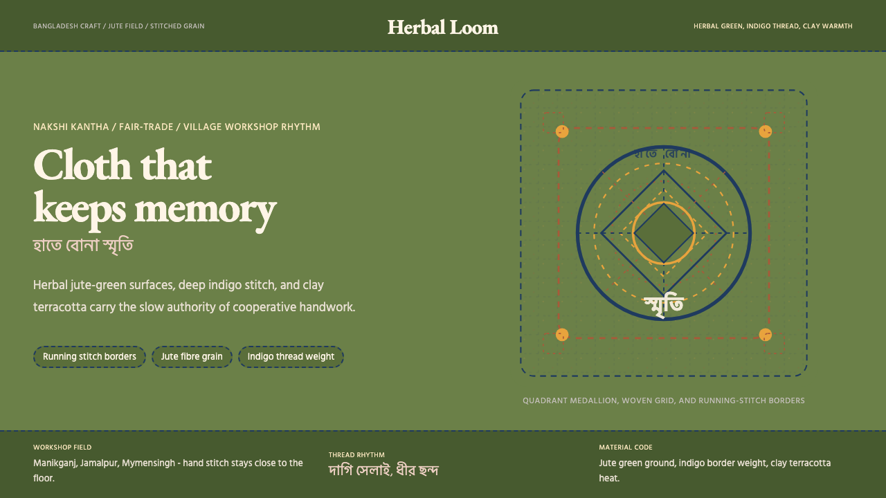 Bangladeshi Jute CraftMemory stays stitched. Jute green, indigo borders, terracotta warmth.记忆被缝进画面。黄麻绿、靛蓝虚线、陶土暖调。
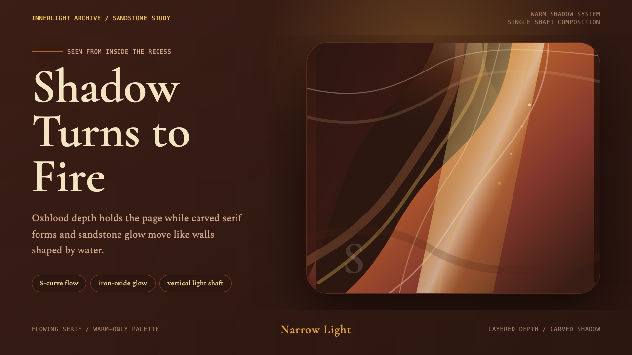 Antelope Slot CanyonGlows from shadow. Oxblood ground, sandstone S-curves, and one warm gold shaf…从阴影中发光:酒红褐底、砂岩 S 曲线与金色光柱。
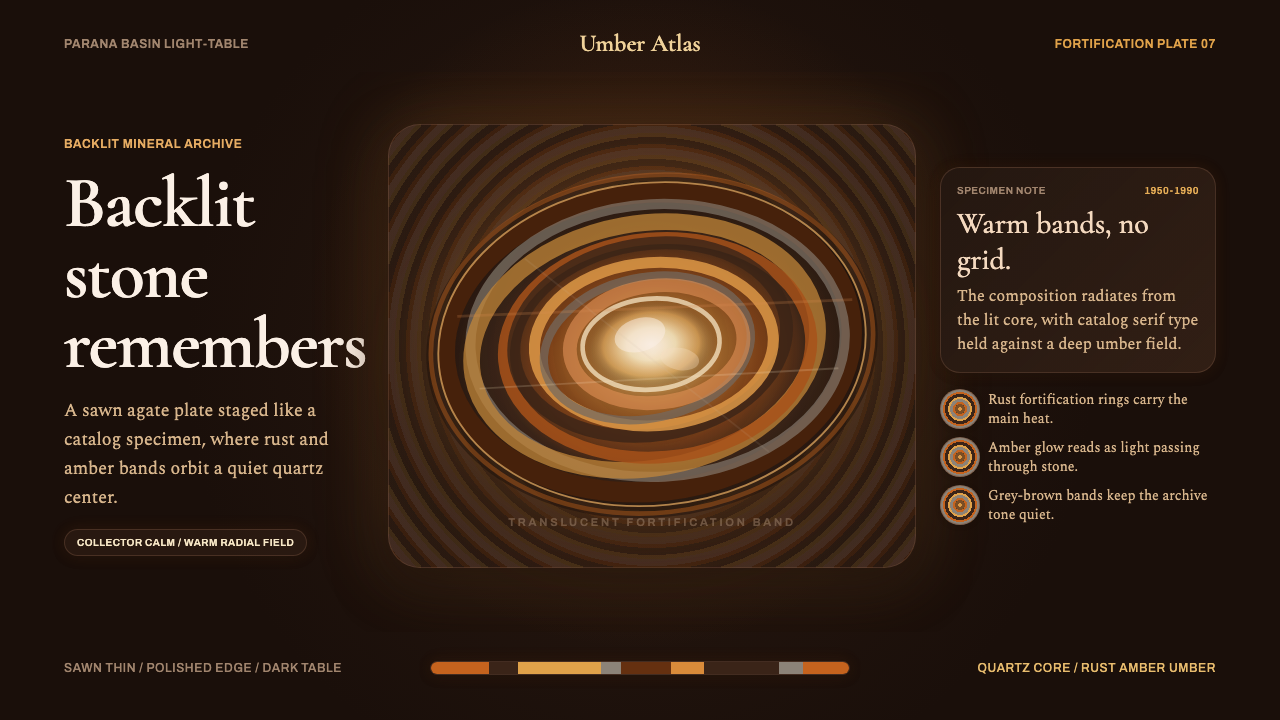 Banded Agate SliceCollector-calm glow. Rust and amber rings orbit a quartz core on near-black b…收藏级静光:近黑棕底上,锈红与琥珀环带围绕石英核心。
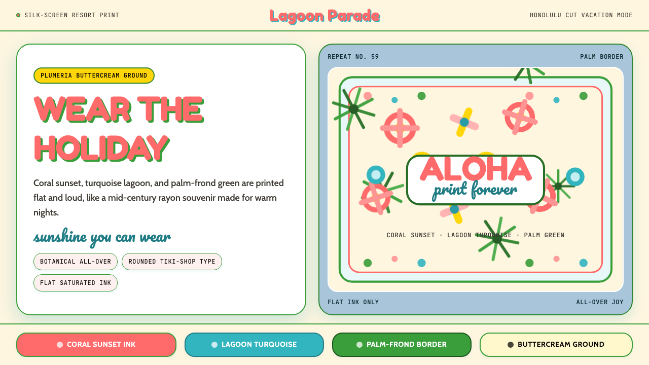 Hawaiian Aloha ShirtThe shirt is the holiday. Buttercream ground, coral Fredoka type, and flat tr…穿上就是假期。奶油底、珊瑚 Fredoka 字与热带平面印花。
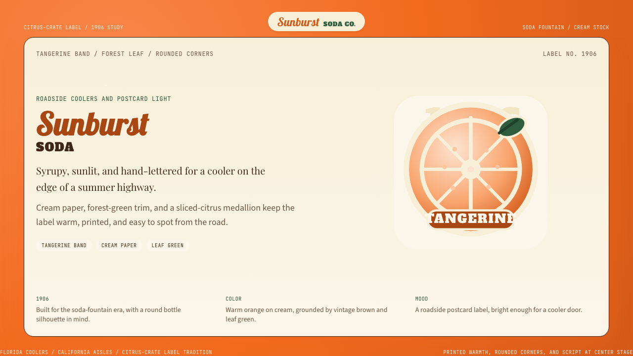 Orange Crush Soda (1906)Syrupy nostalgia. Tangerine, cream, and script make it a postcard label.糖浆般怀旧。橘红、奶油纸与手写体把标签变成明信片。
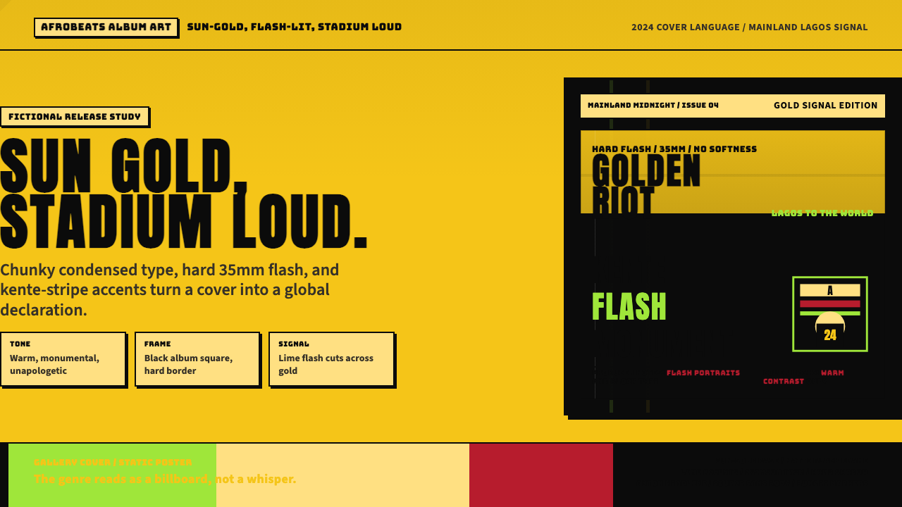 Afrobeats Album Art 2024Sun-gold and stadium loud. Anton type, kente stripes, and hard flash drive th…太阳金和体育场级大字。肯特条纹与硬闪光撑起封面。