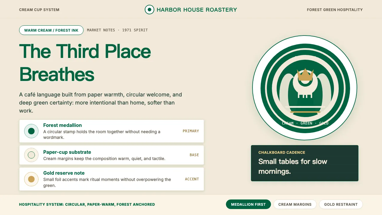
About Starbucks (Siren)
Starbucks distilled fifty years of café culture into a single twin-tailed Siren on forest green. The 2011 rebrand stripped the wordmark away, letting the medallion breathe alone on cream paper cups, chalkboard menus, and foil-stamped seasonal sleeves. Every touchpoint channels Howard Schultz's "third place" — warmer than an office, more intentional than home.
This system translates that hospitality into tokens: deep #006241 green anchors every primary action, cream #F1E9D9 provides the paper-cup substrate, and gold accents mark premium moments. Typography stays within the Sodo Sans family for 95% of needs, with Lander Display reserved for chalkboard-energy headlines.
- Origin
- Seattle, Washington, USA
- Era
- 1971 founded; current Siren-only mark since 2011
- Key figures
- Howard Schultz · Terry Heckler · Connie Birdsall · Lippincott
- Movements
- Third-place café culture · Specialty coffee branding · Modern hospitality industrial systems
Starbucks (Siren) design spec
Colors
Typography
The other 11 sections — buttons, cards, spacing, motion, techniques and more — open once you unlock. Download the DESIGN.md or send it to your AI in one click. Unlock once, yours forever.
Sign up nowStyles similar to Starbucks (Siren)
Also inspired by brands & products, with a close feel.
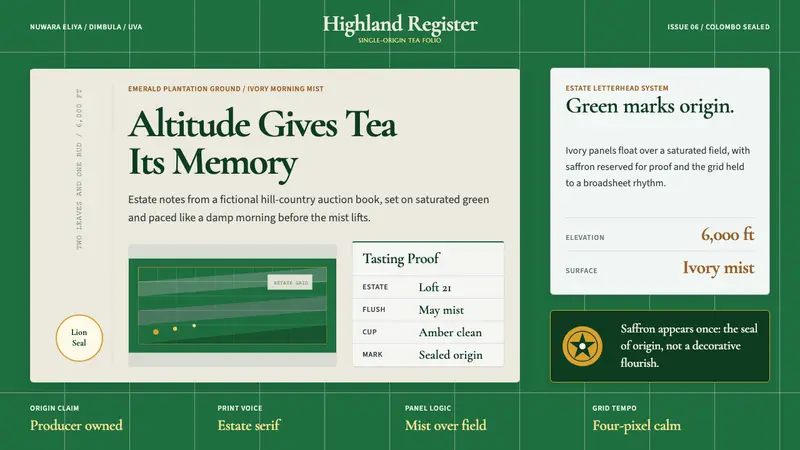 Sri Lanka Ceylon Tea ModernProvenance is emerald. Ivory mist panels and one saffron seal make origin feel official.
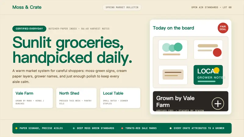 Whole Foods MarketFarmer’s-market polish. Moss green on butcher-paper cream, white cards, grower notes.
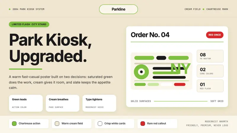 Shake Shack (Green-Chartreuse)Friendly premium, never loud. Chartreuse on warm cream with tight modernist type.
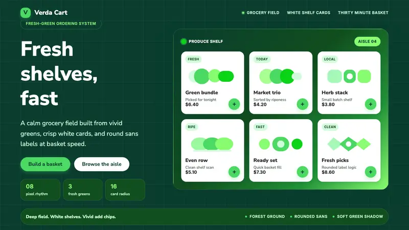 Cornershop AppProduce-fresh and calm. Forest green field, white shelf cards, vivid green accents.