What is Kung Fu Panda (2008)?
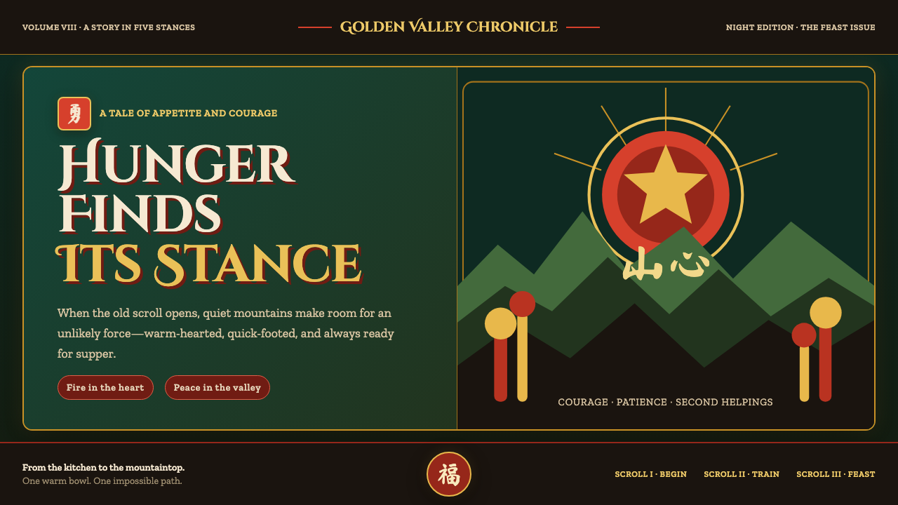
Kung Fu Panda lets ancient stillness and comic momentum share one glowing world: jade-shadowed bamboo, vermilion lacquer, gold ornament, and a hungry hero in flight.
Kung Fu Panda (2008) in brief
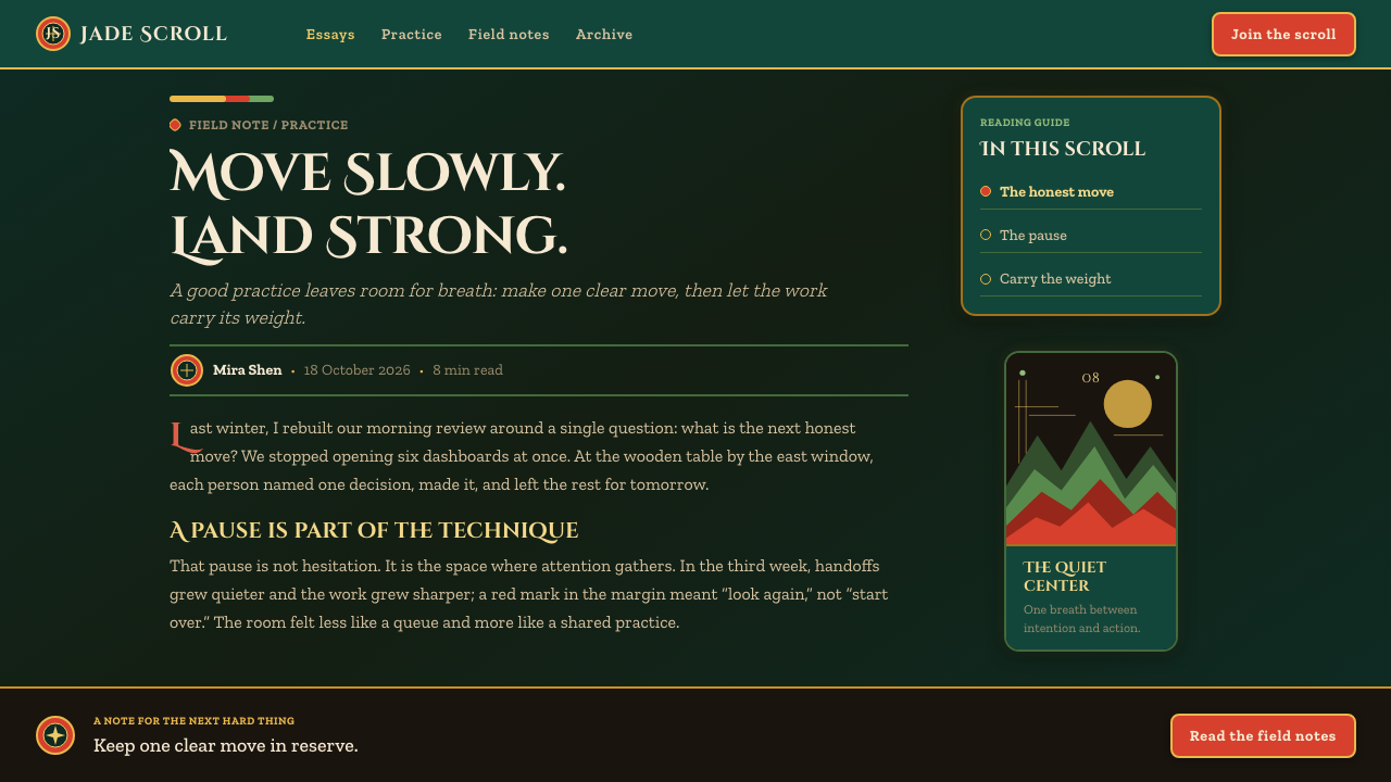
Kung Fu Panda is a visual language built from a deliberate meeting of Chinese classical-art references and DreamWorks stylized CG. Its world moves between a two-dimensional ink-scroll dream and the richly modeled Valley of Peace, yet the change of medium never feels like a break. Both spaces are joined by deep jade greens, vermilion architectural accents, warm gold details, layered mountains, and a sense that the landscape itself is performing alongside the characters.
The style fuses two apparently opposite moods. Wuxia energy gives the image kicks, leaps, chases, and sudden changes in scale; hand-scroll landscape painting gives it repose, distance, and a measured unfolding of space. A hero may be framed as a bold silhouette against a glowing sky, but the surrounding peaks still recede in quiet washes. Action interrupts calm without destroying it.
Just as important is the film’s coziness. This is not an austere museum version of classical imagery. The Valley of Peace is warmed by noodle-shop abundance, steamed buns, embroidered surfaces, temple color, and the tangible pleasure of food. The result is ornate but welcoming: an old painted scroll seems to open into a comic adventure, then makes room for warmth, appetite, and spectacle.
Where does Kung Fu Panda (2008) come from?
Kung Fu Panda was released in 2008 after production at DreamWorks Animation from 2005 to 2008. Made in Glendale, California, it approached Chinese visual culture through a Western animation studio’s affectionate, highly stylized lens. Its identity comes not from reproducing one historical artifact, but from bringing several traditions into a coherent animated world.
Chinese hand-scroll landscape painting provides the film’s spatial imagination. Landscapes unfold rather than simply sit behind the action: mountain forms stack into the distance, receding through soft atmospheric layers, while broad vistas give a scene room to breathe. The effect is especially clear when the image treats terrain as a sequence of revealed planes rather than a single naturalistic view.
Jianzhi paper-cut folk art informs the more graphic side of the language. Torn-paper mountain silhouettes and simplified ornamental shapes make darkness readable as layered form, not empty absence. This flat, cut-out sensibility is particularly useful in the ink-scroll dream material, where silhouette, edge, and negative space can carry as much meaning as modeled detail.
The production’s core visual vocabulary was shaped around wuxia cinema, Chinese landscape painting, paper-cut art, and DreamWorks stylized CG. Mark Osborne, John Stevenson, Raymond Zibach, and Nicolas Marlet are key figures associated with that production context. Their shared challenge was to make calm landscape atmosphere, gold-rich ornament, expressive characters, and fast martial movement feel like parts of one world.
What defines the Kung Fu Panda (2008) look?
Jade Night
Dark jade-green bamboo depths establish the film’s emotional ground. They create enclosure, mystery, and cool air around warmer objects, allowing lacquer, lantern-like gold, and character silhouettes to emerge with unusual clarity. Darkness is rarely blank; it is built from overlapping foliage, mountain planes, and receding cut-paper shapes.
Vermilion and Gold
Vermilion carries architectural force: temple lacquer, beams, gates, and focal surfaces gain ceremonial warmth from it. Gold is used differently. It catches the eye as embroidery, ornament, or a warm glint against darkness, making detail feel precious without turning every surface into display. Together they give the world festive gravity.
Hand-Scroll Space
Composition behaves like an unrolling hand-scroll. Mountains are stacked in receding washes, foreground and distance remain visibly separate, and broad empty intervals give the eye a path through the scene. Instead of treating depth as a single realistic tunnel, the style presents landscape as successive, legible layers.
Paper-Cut Silhouette
Torn-paper peaks and strong silhouettes turn landscape into graphic rhythm. Edges matter more than surface realism, especially where mountains disappear into night or a character crosses a bright horizon. The paper-cut influence makes forms feel designed and emblematic, while preserving the folk-art directness of a shape recognized at a glance.
Kung-Fu Motion
The quiet landscape is activated by wuxia kineticism. Leaps, strikes, and airborne poses are treated as compositional events: the body becomes a clean silhouette, a diagonal interrupts horizontal calm, and the surrounding valley exaggerates the scale of movement. Comedy keeps this athletic grandeur from becoming solemn.
Noodle-Shop Warmth
Food and domestic abundance prevent the style from becoming purely monumental. Steam from buns can read like a decorative brushstroke, while the promise of noodles and shared meals brings the grand landscape down to human appetite. This contrast is central: the world is ancient in mood, but immediately lived in.

Who shaped Kung Fu Panda (2008)?
Osborne is one of the key figures named in the film’s production context. Kung Fu Panda’s visual identity depends on the sustained balance between broad comedy, martial momentum, and an environment whose atmosphere remains calm even when the action accelerates.
Stevenson is identified among the key figures behind the production. The finished visual language shows how character-driven comic energy can inhabit a setting shaped by temple color, layered peaks, bamboo darkness, and the slow spatial logic of an unrolled landscape.
Zibach belongs to the group of key figures associated with Kung Fu Panda’s visual development. The film’s look is notable for making ornamental richness serve a larger atmosphere: gold and lacquer brighten the scene, but layered landscape and silhouette keep the image structurally legible.
Marlet is also named among the production’s key figures. The style’s character-world relationship is unusually close: expressive, comic figures are never detached from their surroundings, because color, silhouette, material detail, and action all speak the same visual language.
How do you use Kung Fu Panda (2008) today?
For presentation covers, use the style as a framed moment of arrival. Let a dark jade landscape establish depth, then place one vermilion architectural or graphic anchor against it. A gold-like detail can guide attention toward the title, while a single leaping silhouette supplies motion. Keep the composition spacious enough that the title feels revealed by the landscape rather than placed on top of it.
Content slides should borrow the hand-scroll principle. Organize information in successive visual planes: a clear heading in the near field, supporting points in a quieter middle layer, and restrained mountain or bamboo forms at the edge of the composition. Data slides work best when charts remain clean and readable, with the darker landscape used as atmosphere rather than as a pattern behind every label.
For web interfaces, the approach suits dashboards, story-led homepages, and pricing pages that need a sense of occasion without losing hierarchy. Use deep green darkness to define the canvas, reserve vermilion for decisive moments, and use warm gold ornament as a sparing guide to value, status, or attention. Cards and panels should feel like layered scenic planes, not generic floating containers.
For editorial and marketing work, pair sweeping landscape scenes with tactile details: a temple edge, bamboo depth, an embroidered glint, steam rising from food, or a paper-cut horizon. Copy should alternate between calm descriptive space and short, energetic interruptions, echoing the rhythm between landscape stillness and kung-fu movement. The visual system is especially effective for stories about craft, appetite, training, travel, or transformation.
The common mistake is treating the style as an indiscriminate pile of Chinese motifs. Its strength lies in disciplined contrast: cool darkness against warm lacquer, spacious landscape against a sudden action pose, ornamental detail against graphic silhouette, and ancient calm against comedy. If every surface is gold, every scene is busy, or every element moves at once, the hand-scroll clarity and Valley of Peace warmth disappear.
Kung Fu Panda (2008) — FAQ
Is Kung Fu Panda’s style primarily ink painting or three-dimensional animation?
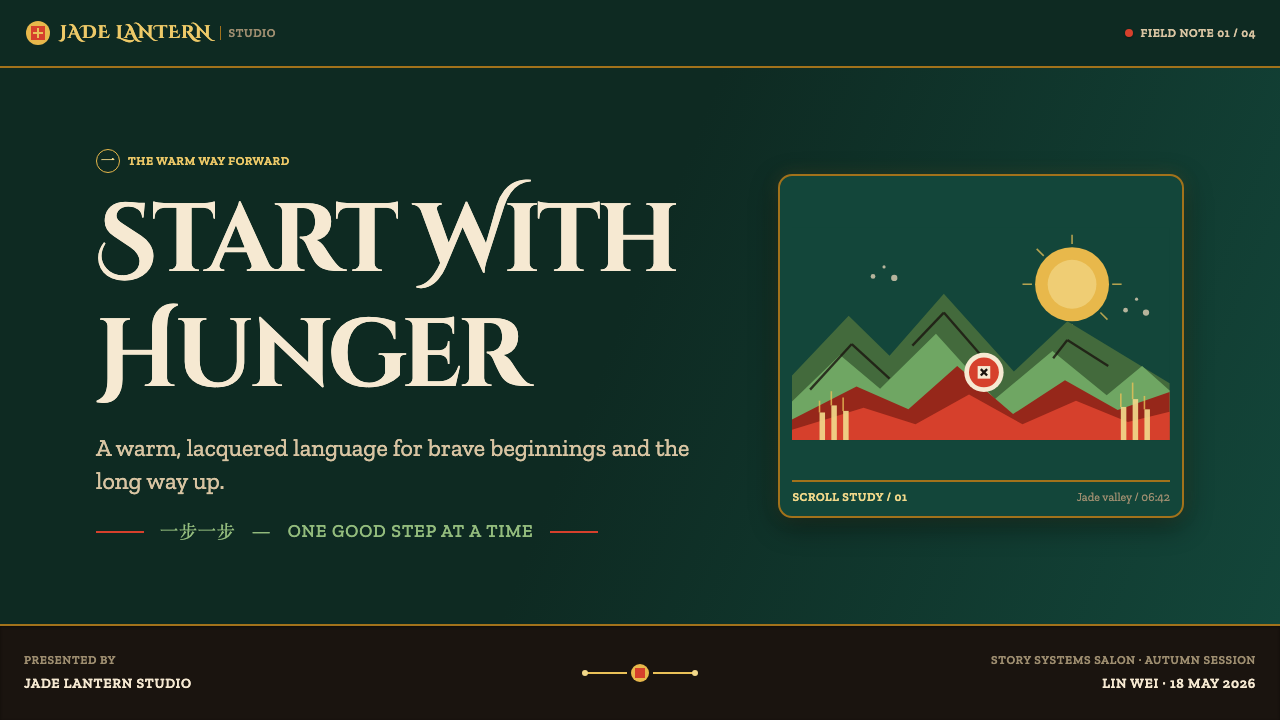
It is deliberately both. The film pairs a two-dimensional ink-scroll dream with a lush three-dimensional Valley of Peace, then makes them feel related through the same jade-green, vermilion, gold, layered-mountain, and silhouette vocabulary. The important lesson is not to imitate one medium literally, but to preserve the shared visual grammar across media.
Why does the dark palette still feel warm and inviting?
The darkness is balanced by vermilion lacquer, gold-leaf-like ornament, glowing sunset space, and the domestic warmth of food. Deep jade greens create the cool enclosure that makes those warmer notes visible. The noodle-shop sensibility matters as much as the temple and mountain imagery: appetite gives the grand visual world an everyday human center.
How should photography or illustration be handled in this style?
Favor images that can be read in layers: a clear foreground shape, a receding mountain or bamboo field, and a controlled warm focal point. Cropping should emphasize silhouette, movement, and scenic depth rather than incidental realism. Graphic treatments can borrow the paper-cut logic, but should retain breathing room and avoid burying the subject beneath ornament.
Where does this style work best, and where can it struggle?
It works well where a project needs narrative scale, energetic charm, and a balance of ceremonial beauty with everyday warmth: story campaigns, entertainment pages, food-led experiences, learning material, and transformation narratives. It can struggle in dense utility interfaces if scenery overwhelms labels or controls. In those contexts, keep the landscape at the perimeter and let functional information remain the brightest, clearest part of the composition.
Related design styles
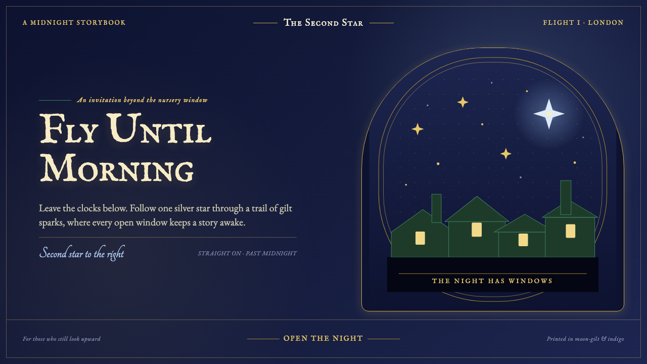 Peter Pan Neverland (1904)Enchantment glints, never shouts. Midnight navy holds gilt sparks and Edwardi…
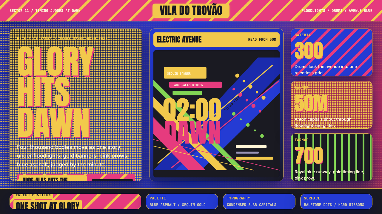 Brazilian Samba School (2000s Carnaval)Parade at floodlight volume. Royal blue asphalt, sequin gold type, pink ribbo…
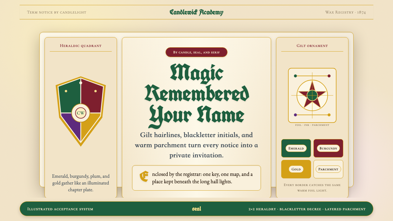 Harry Potter IllustratedMagic arrives by parchment. Emerald, burgundy and gilt borders frame blacklet…
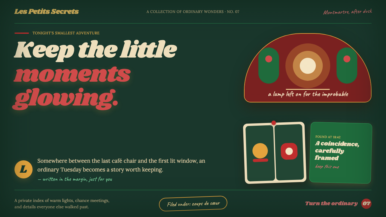 Amélie (Montmartre 2001)Ordinary moments glow like secrets. Storybook green, carmine accents, and cre…
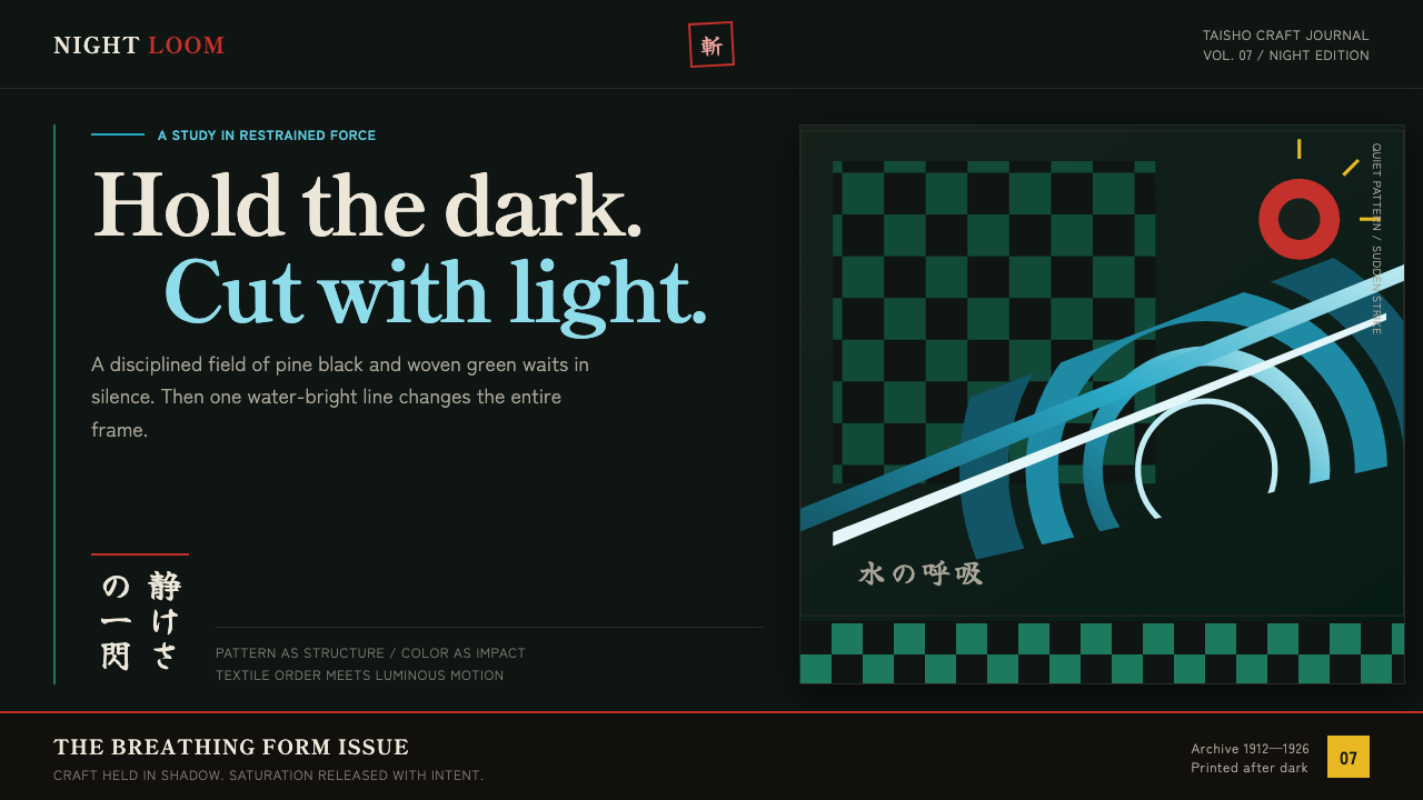 Demon Slayer (2019)Quiet craft, sudden force. Pine-black checks split beneath a water-teal strik…
 Hoi An Lantern YellowGlows after dark. Saffron serif type, lacquer black, and geometric lantern fr…