What is Hoi An Lantern Yellow?
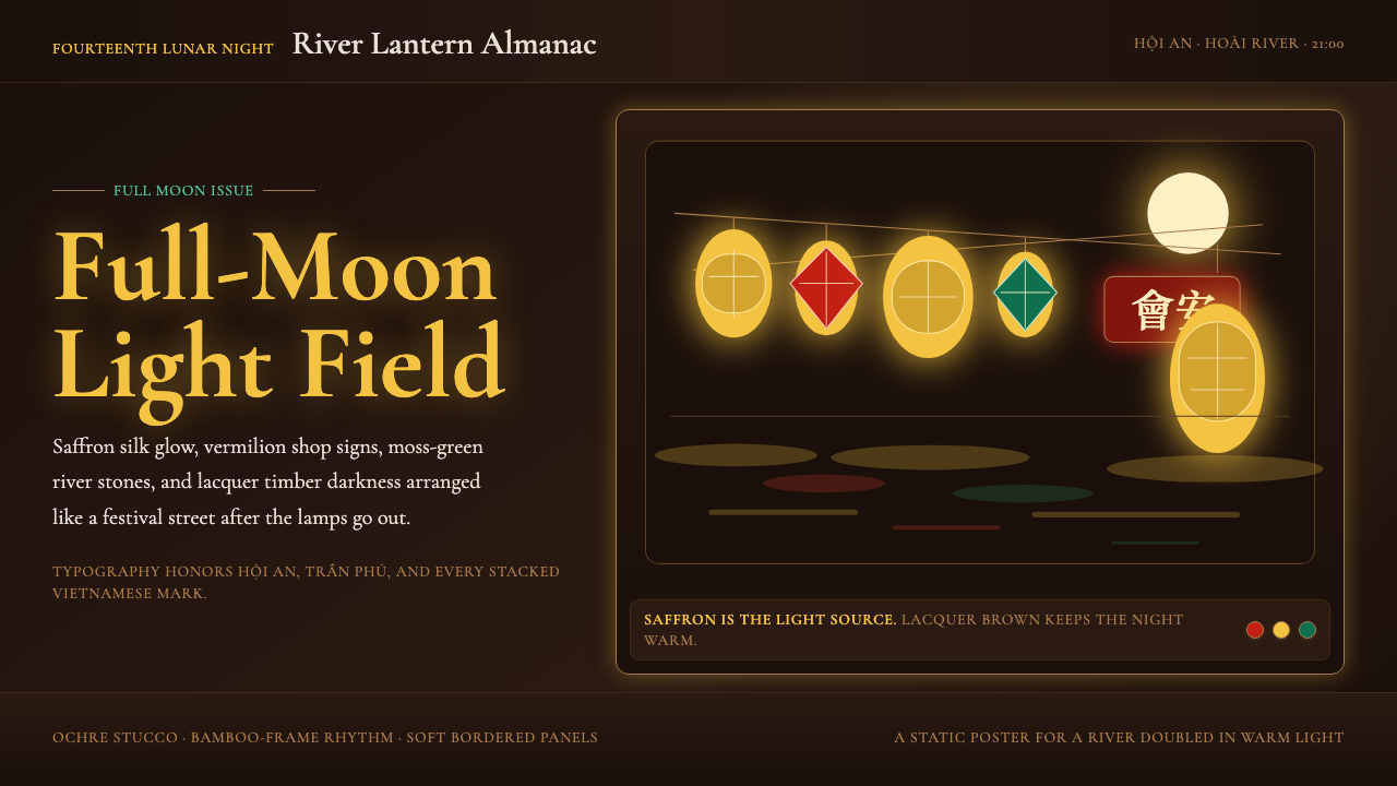
Hội An's ancient trading port glows after dark with saffron silk lanterns, lacquer-black eaves, and four centuries of layered cultural memory compressed into a single luminous palette.
Hoi An Lantern Yellow in brief
Hoi An Lantern Yellow is a design style rooted in the visual world of Hội An, a UNESCO World Heritage trading town on the central coast of Vietnam. The aesthetic draws from the famous lantern festivals held on the fourteenth night of each lunar month, when the town extinguishes its electric lights and the Hoài River reflects thousands of glowing silk lanterns in shades of saffron, amber, and vermilion. The result is a palette that is simultaneously historical, festive, and deeply atmospheric.
As a design language, the style is dark-ground and luminous: deep lacquer black and warm brown form the substrate, while saturated warm yellows and golden oranges appear as sources of light rather than flat fills. Vermilion red and emerald green appear as accent notes drawn from painted shop signs and river-stone moss. The overall effect is that of candlelight or lantern glow — warm, directed, and rich rather than broad or ambient.
The style is distinguished by its treatment of ornament as meaningful rather than decorative. Geometric lantern frames — hexagonal, octagonal, cylindrical — appear as structural motifs. Serif typography that properly renders Vietnamese diacritical marks is central to the system, honoring the visual complexity of the quốc ngữ script. The result is a style that feels both rooted in a specific place and time and immediately transferable to contemporary digital and print contexts.
Where does Hoi An Lantern Yellow come from?
Hội An's visual character was built over roughly four centuries of overlapping trade and migration. From the late sixteenth century onward, the town served as one of Southeast Asia's most active deepwater ports, drawing Japanese and Chinese merchants who established permanent communities. The Japanese built their covered bridge — still the town's most recognizable landmark — while Chinese merchant families constructed guild halls and ancestral temples whose rooflines, carved wooden screens, and red-lantern decorations established the baseline visual vocabulary that Hội An's contemporary design identity still draws upon.
A second layer arrived with French colonial administration in the late nineteenth century. French engineers and administrators introduced ochre stucco facades, shuttered windows, and covered arcades that ran the length of the merchant street. Rather than replacing the existing Chinese-Japanese hybrid architecture, French buildings were inserted into the urban fabric, producing the layered streetscape that visitors and photographers still find so distinctive: a single block might include a Fujian guild-hall roof, a Cantonese carved-wood facade, and a French colonial arcade in immediate succession.
The third and defining layer came in the 1990s, following the town's designation as a UNESCO World Heritage Site candidate (formally inscribed in 1999). The lantern festival — the monthly full-moon celebration of turning off electric lights and floating paper and silk lanterns — was revived and formalized as both a cultural preservation effort and a tourism draw. Kazimierz Kwiatkowski, the Polish architect who worked closely with Vietnamese partners including Hoàng Đạo Kính on the UNESCO restoration process, helped establish conservation principles that kept the town's historic facades intact while allowing commercial activity to continue. His approach created the physical framework within which the lantern aesthetic flourished as a living visual system rather than a static museum piece.
Contemporary Vietnamese designer Nguyễn Hà and craftspeople like Thái Văn Lung have worked to codify and extend the lantern-making tradition, ensuring that the visual conventions of lantern construction — the bamboo armature, the proportion of frame to silk, the relationship between warm yellows and vermilion trim — remained legible as a design system rather than fading into pure souvenir craft. By the 2010s and 2020s, the Hội An lantern aesthetic had become widely recognizable in Vietnamese graphic design, hospitality branding, and tourism visual identity, appearing in contexts far removed from the original festival setting while retaining its essential qualities of warm luminosity and geometric structure.
What defines the Hoi An Lantern Yellow look?
Color
The palette is organized around the tension between darkness and warmth. A deep lacquer black — the color of aged timber beams and starless river water — serves as the primary ground, while warm saffron yellow and golden amber glow against it as lantern-light sources rather than surface fills. Vermilion red appears in painted shop signs and festival banners, emerald green in the river-stone moss and decorative tilework. The palette is saturated and warm-toned throughout; cool grays and desaturated neutrals are largely absent. Color relationships are read as light against dark rather than hue against hue.
Light and Luminosity
Luminosity is the style's most defining quality: elements that carry the warm yellow and amber tones should feel as though they emit light rather than reflect it. This is achieved through strong value contrast — placing warm saturated tones against very deep grounds — rather than through literal glow effects. The visual logic is that of a lantern in a dark alley: the light source is small, warm, and surrounded by deep shadow. Highlights are concentrated and directional rather than ambient.
Geometric Lantern Forms
The hexagonal, octagonal, and cylindrical forms of traditional silk lanterns provide a recurring structural motif. These shapes appear in layout dividers, icon framing, pattern elements, and border treatments. Unlike purely decorative filigree, the lantern geometry carries structural meaning — it organizes space and signals enclosure in the same way that a physical lantern organizes light within its frame. Bamboo armature lines — thin parallel curves and diagonal lattices — appear as texture and pattern elements, adding a sense of handcraft without compromising visual clarity.
Typography and Diacritics
Serif typefaces with full support for Vietnamese diacritical marks are central to the system. The quốc ngữ romanization of Vietnamese includes a complex stack of tone marks and vowel modifications that many Latin typefaces handle poorly or not at all; the Hội An aesthetic insists on proper rendering as a form of cultural respect and visual care. Letterforms should carry weight and warmth appropriate to the lantern palette — elegant but not spindly, detailed but not fussy. For non-Vietnamese contexts, the same serif warmth and weight should be preserved.
Layered Cultural Texture
The historic trading-port character of Hội An means the style carries references from multiple visual traditions simultaneously: Chinese carved-wood screen patterns, Japanese covered-bridge proportions, French colonial ochre and shuttered facades, and distinctively Vietnamese craft traditions. These references appear as subtle texture in pattern work and ornamental detail rather than explicit quotation. The layering is not eclectic but integrated — as the town itself integrates its architectural history into a coherent streetscape.
Warmth and Festivity Without Kitsch
The style operates in territory — warm yellows, festive reds, decorative lanterns — that could easily tip into tourist-market kitsch. What prevents this is the discipline of the dark ground and the structural use of geometric form. The warmth is earned through contrast rather than accumulation; using fewer warm elements at higher saturation against a deep ground produces a sense of genuine richness rather than surface decoration. Restraint in quantity allows intensity of quality.
Pattern and Surface Ornament
Unlike purely modernist styles, Hội An Lantern Yellow welcomes ornament — but only when it is structurally grounded. Border patterns derived from Chinese carved-wood screens, repeating lantern-frame tessellations, and Vietnamese floral motifs all appear as pattern elements in this style. The key discipline is that ornament should reinforce structure rather than substitute for it: a patterned border should define and contain a layout zone, not simply add visual texture to an otherwise undefined space.
Who shaped Hoi An Lantern Yellow?
Kwiatkowski was the Polish architect who led UNESCO's conservation and restoration work in Hội An from the early 1980s until his death in 1997. Working in close collaboration with Vietnamese conservators, he developed the restoration principles that preserved the town's layered architectural heritage — Japanese, Chinese, French colonial — without freezing it into a static museum. His work created the physical and methodological framework within which the lantern festival revival became possible, and he is widely credited with saving the physical fabric that gives the visual style its authentic ground.
A leading Vietnamese architect and heritage conservationist who collaborated closely with Kwiatkowski on the Hội An UNESCO restoration project. Kính brought deep knowledge of Vietnamese architectural traditions and helped ensure that the conservation work was grounded in local material practices and craft knowledge. His partnership with Kwiatkowski is emblematic of the broader cultural fusion that defines Hội An's character, and his advocacy for the town's heritage designation helped secure the UNESCO inscription that catalyzed the visual identity's global recognition.
A contemporary Vietnamese craftsperson and designer associated with the preservation and modernization of the Hội An lantern-making tradition. Working within the town's active lantern workshop community, Nguyễn Hà has been instrumental in ensuring that the proportional and chromatic conventions of silk lantern construction — the relationship between frame geometry, silk tension, and color weight — remain codified as a transmissible craft vocabulary. This work has made the visual conventions legible to contemporary graphic designers adapting the style for digital and print applications.
A craftsperson and lantern-maker whose work embodies the living artisan tradition of Hội An's workshop district. Figures like Thái Văn Lung represent the continuity between the festival practice and its visual outputs — the specific chromatic decisions about which yellows warm toward orange and which cool toward gold, the structural logic of the bamboo armature, the weight and translucency of silk relative to the lantern's intended viewing distance. These embodied craft decisions are the source material from which the design style's color and structural principles derive.
How do you use Hoi An Lantern Yellow today?
Hội An Lantern Yellow is one of the most atmospherically specific styles in the design library — it carries a strong sense of place, time, and occasion. Applying it correctly means leaning into that specificity rather than diffusing it. The dark ground is not optional; it is the structural basis of the luminosity effect. Removing it and applying the warm yellows to a light background produces a result that reads as generic Southeast Asian festival branding rather than the specific visual world of Hội An at night.
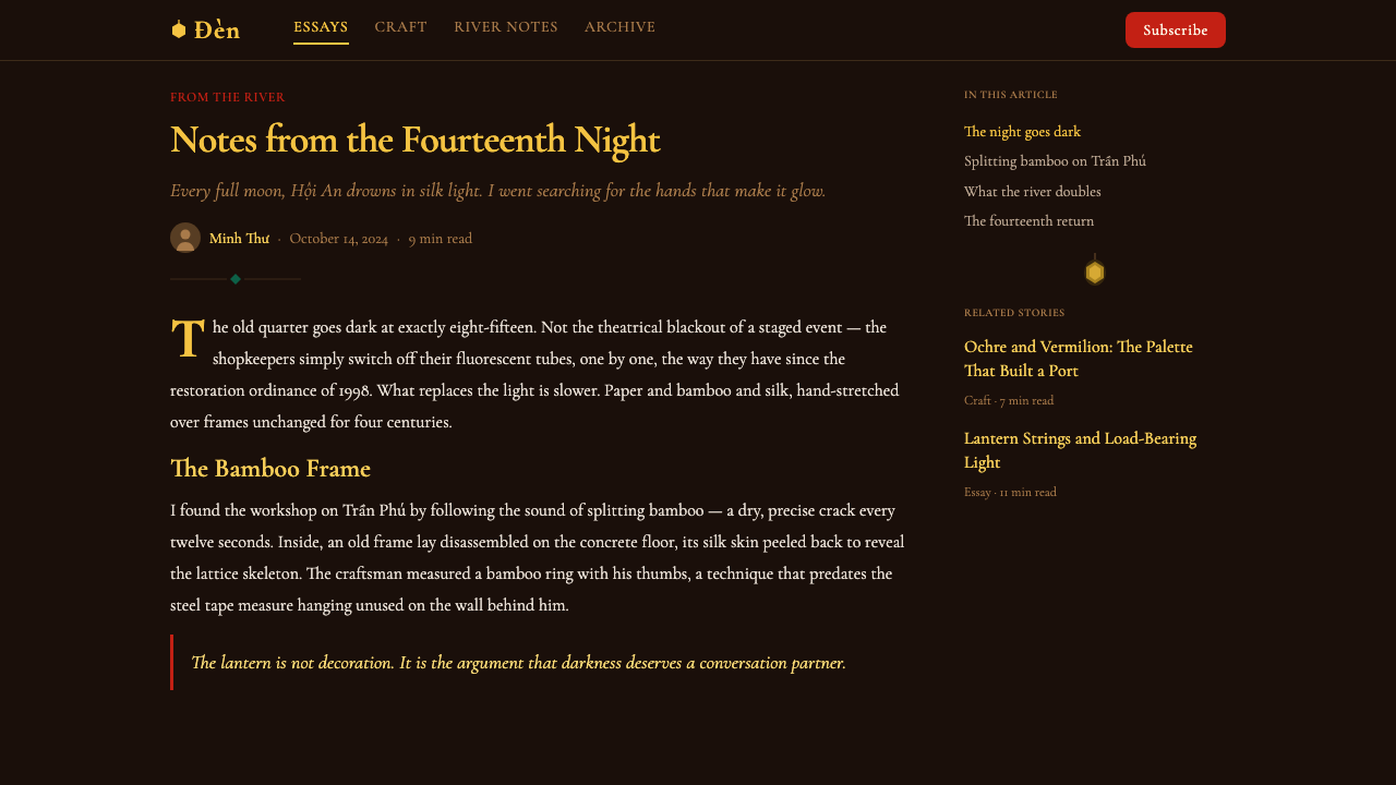
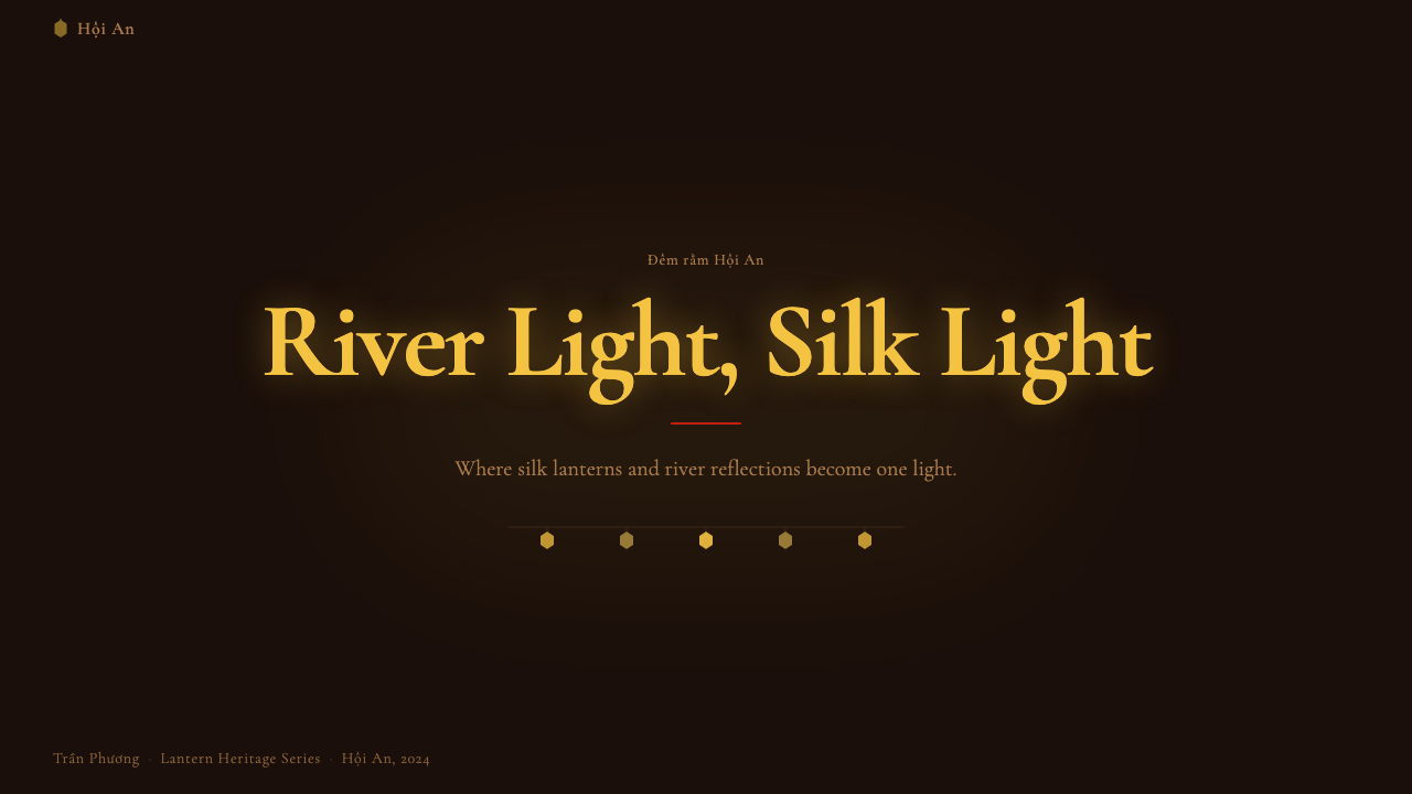
For presentation slides, the style works exceptionally well for cover pages and section dividers where atmosphere and brand impression take priority over information density. A cover built on a deep lacquer-black ground, with the title set in warm-weight serif type and a single geometric lantern motif positioned asymmetrically, creates immediate visual distinctiveness. Content slides benefit from a restrained version of the palette: a near-black or very deep warm brown background, with body text in a warm near-white and key terms or callouts highlighted in saffron yellow. Data slides translate well if the primary data series is rendered in the warm amber-gold, with secondary series in desaturated warm tones — the dark ground ensures legibility even with a warm palette.
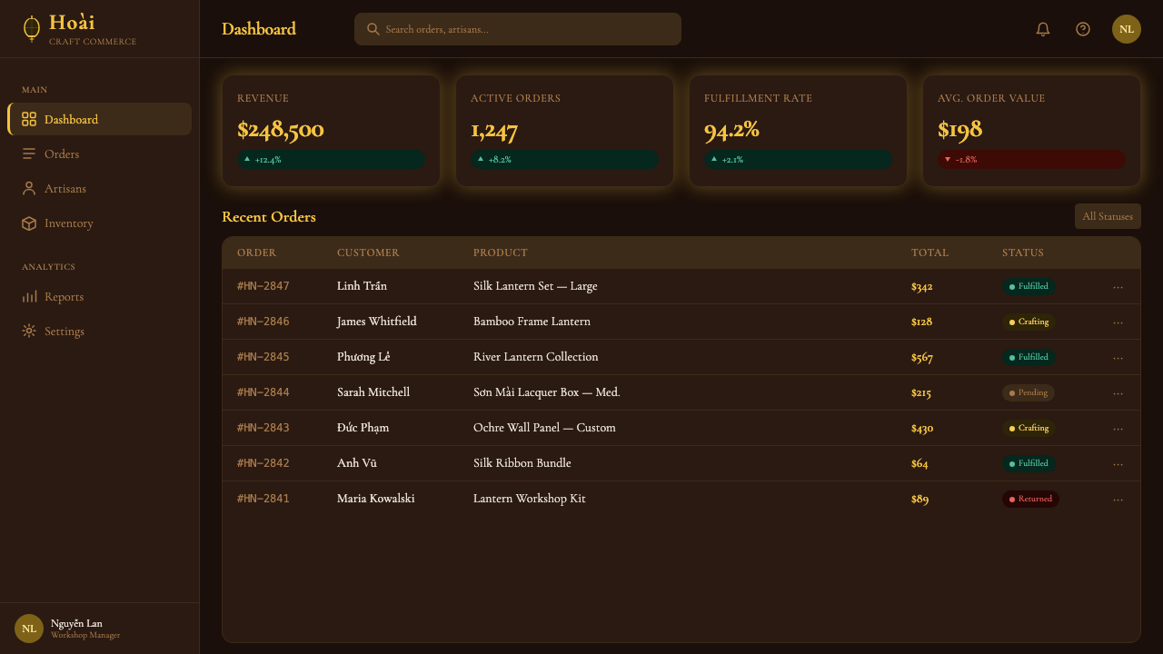
For web interfaces, the style is best suited to experience and hospitality brands — boutique accommodation, food and beverage, cultural tourism, artisan retail — where warmth, sensory richness, and a sense of occasion are brand values. Dashboards and analytical tools are not natural homes for this style; the warm dark palette creates emotional associations more appropriate to an evening experience than to a work tool. On web, the critical decision is maintaining sufficient luminance contrast for accessibility while preserving the dark-ground character: the saffron yellow against deep black has strong inherent contrast, but care is needed with intermediate warm tones used for body text.
For editorial and marketing work, the style supports long-form storytelling contexts particularly well. A Hội An Lantern Yellow layout for a travel or cultural magazine might use a full-bleed deep-ground opener, with body text set in warm-toned serif type in a narrower column measure, and pull quotes or section titles illuminated in saffron. Marketing pages for hospitality brands can use the full expressive range: full-width atmospheric imagery treated with warm color grading, geometric lantern-form dividers between sections, and a carefully controlled hierarchy that puts warm accent color only on primary calls to action.
A common mistake is applying the warm yellow generously across many interface elements in an attempt to create a 'warm' feeling. Authentic lantern luminosity works through contrast and concentration: a small area of intense warm yellow against a very dark ground is far more effective than a broad warm-yellow wash over a light ground. The same error manifests in over-ornamenting: adding too many lantern-frame motifs, pattern borders, and decorative details simultaneously produces visual noise rather than the refined, purposeful richness of the original source. Use ornament as punctuation — one strong geometric frame in a layout, not five competing borders.
Hoi An Lantern Yellow — FAQ
Is this style only appropriate for Vietnamese or Asian contexts?
No — but it requires conscious handling in non-Vietnamese contexts. The style's core principles, warm luminosity against a deep ground, geometric structural ornament, rich warm palette, are universal design values that translate well across cultures and product types. What changes in non-Vietnamese contexts is the removal of culture-specific markers: Vietnamese diacritical typography, explicit lantern-form motifs, and references to specific architectural elements from the Hội An streetscape. A brand using this style in a non-Vietnamese context might lean into its qualities of warmth, craft, and luminous richness without visual signals that would feel borrowed or appropriated. The atmospheric qualities travel; the explicit cultural citations require more care.
How does Hội An Lantern Yellow differ from other warm dark-palette styles?
Several other styles use warm palettes on dark grounds — Art Deco gold-on-black, Baroque candlelit richness, Japanese lacquerware aesthetics, and various luxury brand vocabularies among them. What distinguishes Hội An Lantern Yellow is the combination of geometric lantern structure, festive communal context, and the specific warmth of silk-filtered saffron light. Unlike gold-on-black Art Deco, which reads as cool metropolitan luxury, this style reads as warm communal celebration. Unlike Japanese lacquerware, which is restrained and asymmetric, this style welcomes more ornament and festive density. The key marker is the quality of the warm tone itself: not metallic gold, not amber wood, but the specific warm yellow of candlelight through thin colored silk.
Can the style work in light-mode interfaces?
It can, but the result requires careful reinterpretation rather than a straightforward palette inversion. On a light ground, the saffron and amber tones shift from feeling like glowing light sources to feeling like warm pigment fills — still pleasant, but without the luminous quality that makes the dark-ground version distinctive. A successful light-mode interpretation might use a warm ivory or aged-parchment ground rather than pure white, keep the warm yellows concentrated in accent roles rather than large fills, and introduce warm dark brown in place of full black. This produces a less dramatically atmospheric result but one that reads as warm, artisan, and culturally rich without requiring the dark ground.
How should this style handle photography and imagery?
Photography in Hội An Lantern Yellow contexts should be treated with warm color grading that shifts the overall tone toward amber and away from cool blues or neutral grays. High contrast is appropriate — shadows should be deep and rich rather than lifted to preserve detail in the shadow areas. Images should feel atmospheric rather than documentary: motion blur on moving lanterns, shallow depth of field that blurs architectural backgrounds into warm out-of-focus light, and a general preference for evening or night photography over daylight imagery all reinforce the style's essential character. When photography must be daylight-sourced, warm golden-hour light provides the most compatible visual character.
Is this a style for dark mode, or something else?
It is emphatically not a dark mode in the contemporary sense. Contemporary dark modes reduce eye strain in low-light environments by replacing white with near-black and keeping accent colors relatively muted. Hội An Lantern Yellow does the opposite: it intensifies the warm accent colors to their highest saturation specifically because they are placed against a dark ground. The effect is not quieter or less stimulating than a light-mode design — it is more dramatic and more atmospheric. Think of it as the difference between a dark room with the lights dimmed and a dark room with a lantern burning: the lantern-room feels vivid and warm, not reduced.
Related design styles
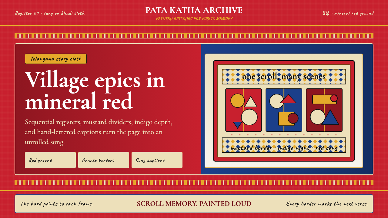 Andhra Cheriyal Scroll PaintingSaturated oral memory. Mineral red registers, mustard diamonds, and serif son…
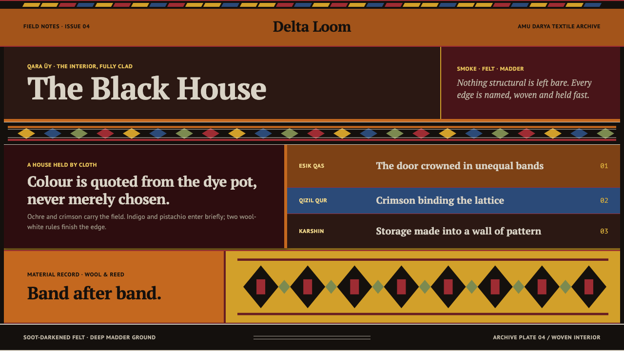 Karakalpak Yurt InteriorNo surface is left bare. Ochre, crimson and indigo bands wrap a smoke-darkene…
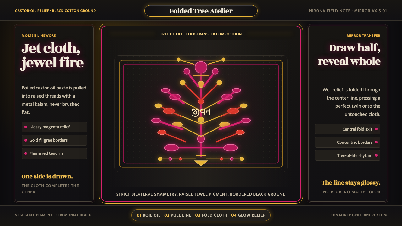 Kutch Rogan Castor-Oil PaintingGlossy symmetry holds the dark. Magenta castor-oil lines mirror across black…
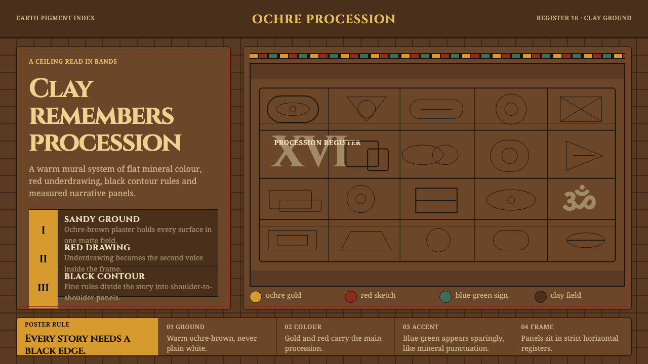 Lepakshi Vijayanagara CeilingEarth remembers in registers. Ochre gold, red underdrawing and black rules ma…
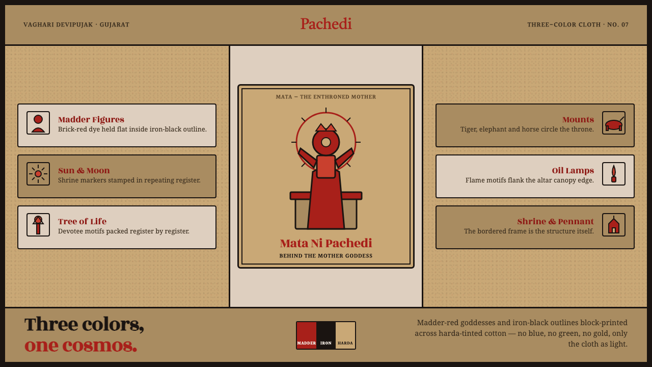 Mata Ni Pachedi Temple ClothThree colors, one cosmos. Madder-red goddesses, iron-black outlines, harda-ti…
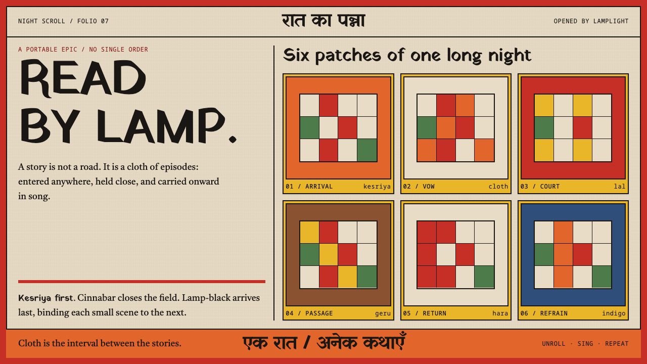 Phad Scroll PaintingAn epic refuses a single order. Kesriya cells and cinnabar rules open by lamp…