What is Harry Potter Illustrated?什么是 Harry Potter Illustrated?
Magic arrives on parchment — blackletter headings, gilt hairline borders, and a candlelit palette that makes every page feel like an acceptance letter found you.魔法随羊皮纸抵达——哥特黑体标题、金箔细线边框,以及让每一页都像一封入学通知书的烛光配色。
Harry Potter Illustrated in briefHarry Potter Illustrated 速览
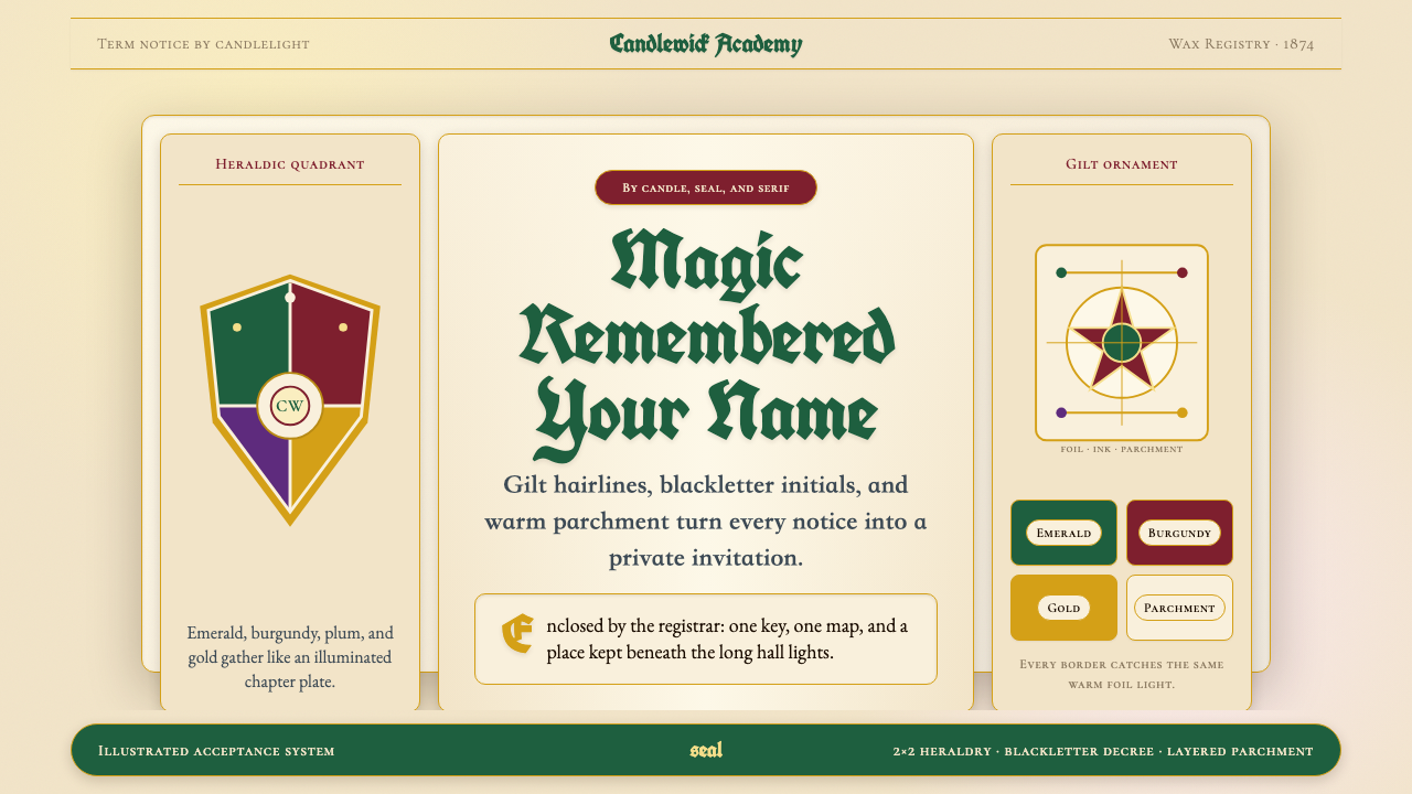
Harry Potter Illustrated is a visual design style rooted in the distinctive aesthetic of the Harry Potter publishing universe — an aesthetic built from Victorian engraved heraldry, Edwardian adventure-book illustration, and the warm candlelit atmosphere of Hogwarts itself. It is defined by blackletter headings that recall acceptance-letter calligraphy, parchment-toned backgrounds that feel worn by owl post, gilt ornamental borders, and a palette anchored in deep emerald, rich burgundy, and warm gold that never strays into cold or synthetic territory.哈利·波特插图风格是一套根植于哈利·波特出版宇宙独特美学的视觉设计体系——这一美学融合了维多利亚时代的雕版纹章、爱德华时代冒险插画书的传统,以及霍格沃茨本身的烛光暖调氛围。它的标志性元素包括:令人联想到入学通知书手写字体的哥特式黑体标题、仿佛被猫头鹰邮递磨旧的羊皮纸色底面、镀金装饰边框,以及以深翡翠绿、浓酒红和暖金色为核心、永远不偏向冷调或合成感的配色体系。
The style is not mere nostalgia or pastiche. It represents a coherent visual system — one in which every typographic and compositional decision reinforces a sense of hidden history and arcane legitimacy. Heraldic quadrant compositions, four-house color coding, aged-paper textures, and ornate corner flourishes all work together to produce a reading experience that feels simultaneously official and enchanted. When applied to contemporary design problems, the style brings warmth, narrative authority, and a sense that the artifact itself was crafted rather than generated.这种风格并非单纯的怀旧或仿作,而是一套连贯的视觉系统——其中每一个排版与构图决策都在强化一种隐秘历史感和神秘正统感。纹章四分构图、四学院色彩编码、做旧纸张质感与繁复的角落花饰相互配合,共同创造出一种同时兼具官方权威与魔法魅力的阅读体验。当这种风格被应用于当代设计课题时,它带来的是温暖感、叙事权威性,以及一种「这件作品是被精心制作的,而非被批量生成的」内在气质。
What distinguishes the Harry Potter Illustrated style from generic 'fantasy' aesthetics is its specificity. The candlelight warmth is precise — amber and gold rather than orange. The parchment is yellowed and patinated rather than simply beige. The blackletter headings feel institutional rather than merely decorative. The heraldry is four-part, color-coded, and internally consistent. Every element has a referent in the original illustrated editions, from Thomas Taylor's 1997 Bloomsbury cover to Jim Kay's lavish full-illustration volumes, and that specificity is what gives the style its recognizability and emotional weight.将哈利·波特插图风格与泛泛的奇幻美学区别开来的,是它的高度特异性。烛光暖调是精准的——是琥珀金而非橙色。羊皮纸色是泛黄而有包浆感的,而非简单的米色。哥特黑体标题传递的是机构感而非单纯装饰性。纹章是四分、色彩编码且内部一致的。每个元素都能在原版插图版中找到对应——从托马斯·泰勒1997年为布鲁姆斯伯里绘制的封面,到吉姆·凯华丽的全彩插图卷——正是这种特异性赋予了该风格可识别性与情感重量。
See the Harry Potter Illustrated design system查看 Harry Potter Illustrated 完整设计系统
Where does Harry Potter Illustrated come from?Harry Potter Illustrated 从何而来?
The visual language of Harry Potter was established before the books became a global phenomenon. When Bloomsbury commissioned Thomas Taylor to illustrate the first UK edition of Harry Potter and the Philosopher's Stone in 1997, the brief called for something that felt grounded in British tradition — not generic fantasy, but a world that could have quietly existed alongside Victorian and Edwardian England. Taylor's cover introduced the now-iconic imagery of a boy in robes at a railway platform, rendered in a warm, pen-and-ink style that recalled illustrated adventure stories from a century earlier. That first cover set the tonal baseline: earthy and warm, institutional in its weight, handcrafted in feel.哈利·波特的视觉语言早在这套书成为全球现象之前便已确立。1997年,布鲁姆斯伯里委托托马斯·泰勒为英国初版《哈利·波特与魔法石》绘制插图时,创作要求是呈现一种植根于英国传统的风格——不是泛泛的奇幻感,而是一个可以在维多利亚时代与爱德华时代的英国悄然共存的世界。泰勒的封面带来了如今已成标志的图像:一个穿着长袍的男孩站在铁路站台,以温暖的钢笔素描风格呈现,令人联想到一个世纪前的冒险故事插图书。那第一张封面奠定了整体的基调:朴实而温暖,字重上带有机构感,手工制作的质感。
For the American editions, Scholastic turned to Mary GrandPré, whose illustrations carried a softer, more luminous quality while retaining the essential warmth and the suggestion of an older, richer visual world. GrandPré's chapter headings and cover compositions introduced Americans to the series through imagery that blended art nouveau organic line with the structural clarity of golden-age book illustration. Her visual vocabulary — arched doorways, candlelit interiors, robed figures caught mid-gesture — became the dominant popular image of the series for nearly two decades.在美国版方面,学者出版社选择了玛丽·葛兰普蕾,她的插图带有更柔和、更发光的气质,同时保留了那种对古老而丰富的视觉世界的本质暖意与暗示。葛兰普蕾的章节题图与封面构图,以一种融合了新艺术运动有机线条与黄金时代书籍插图结构清晰度的图像语言,将美国读者引入这套系列。她的视觉词汇——拱形门廊、烛光室内、半道定格的长袍人物——成为将近二十年间该系列最广为人知的大众形象。
The most systematic elaboration of the Harry Potter aesthetic came with Jim Kay's illustrated editions, beginning with Philosopher's Stone in 2015 for Bloomsbury. Kay, a former Natural History Museum artist, approached the commission with the rigor of a Victorian naturalist-illustrator: hand-rendered pencil underdrawings, layered watercolor washes, meticulous architectural detail, and a compositional language borrowed directly from nineteenth-century book arts. His palette — deep forest greens, candlelit ambers, dungeon greys — was more muted and complex than either Taylor's or GrandPré's, lending the world a texture of genuine age rather than storybook brightness.哈利·波特美学最为系统化的阐释,来自吉姆·凯于2015年开始为布鲁姆斯伯里出版的插图版,自《魔法石》始。凯曾是自然历史博物馆的艺术家,他以维多利亚时代博物学插图师的严谨态度接受了这一委托:手绘铅笔底稿、层叠水彩晕染、精密的建筑细节,以及直接借鉴十九世纪书籍艺术的构图语言。他的色板——深邃的森林绿、烛光琥珀色、地牢灰——比泰勒或葛兰普蕾的都更为沉静复杂,赋予了这个世界一种真实岁月感的质地,而非故事书式的明艳亮丽。
A distinct tributary of the aesthetic was developed by MinaLima, the graphic design studio founded by Miraphora Mina and Eduardo Lima, who served as the films' graphic designers from the first production onward. MinaLima created the in-world printed ephemera — the Daily Prophet, Hogwarts acceptance letters, Ministry of Magic decrees — that gave the wizarding world its typographic identity. Their work drew heavily on Edwardian and Victorian newspaper typography, blackletter display fonts, ornamental rule borders, and heraldic layouts. When MinaLima began producing illustrated editions of their own in 2020, they brought this in-world typographic system directly to book design, resulting in layouts where every page spread feels like a designed artifact from within the story.这套美学的另一条重要支流,由MinaLima发展而来。这家平面设计工作室由米拉福拉·米纳与爱德华多·利马创立,从第一部电影起便担任系列影业的平面设计师。MinaLima创造了魔法世界中的印刷纸品——《预言家日报》、霍格沃茨入学通知书、魔法部法令——为巫师世界建立了排版身份。他们的工作大量借鉴爱德华时代与维多利亚时代的报纸排版、哥特式展示字体、装饰性横线边框与纹章布局。2020年,当MinaLima开始出版自己的插图版时,他们将这套世界内部的排版体系直接引入书籍设计,使每一个跨页都如同一件来自故事世界内部的设计作品。
What defines the Harry Potter Illustrated look?Harry Potter Illustrated 的视觉特征是什么?
Palette色彩体系
The color system is anchored in a quartet of house-coded hues — deep emerald, rich burgundy, warm gold, and cool cobalt — deployed against parchment-yellow or aged-ivory backgrounds. Gold functions as the universal accent, appearing as border gilding, ornament highlights, and typographic detail rather than as a background fill. The overall warmth of the palette is consistent: even the cooler tones, such as the slate grey used for stone or iron, are warmed slightly to keep them within the candlelit register. Cool blues and pure whites are used sparingly, and synthetic or fluorescent tones are entirely absent.色彩体系以四种学院色为核心——深翡翠绿、浓酒红、暖金色与沉静的钴蓝——铺展于羊皮纸黄或做旧象牙白的底面之上。金色作为通用强调色贯穿始终,以边框镀金、装饰高光与排版细节的形式出现,而非用作背景填充。整体色调的暖意保持一致:即便是更偏冷的色调,如用于石材或铁器的石板灰,也略微加暖以使其保持在烛光色域之内。冷蓝色与纯白色被节制使用,合成感或荧光色调完全缺席。
Typography字体排印
Headings use blackletter or blackletter-adjacent display forms — letterforms with the angular, compressed weight of historical calligraphy, evoking the hand of a learned scribe rather than a type designer. These heavy display forms are typically set in deep tones or gilded finishes and reserved for titles, section headings, and pull quotes. Body text shifts to a humanist serif or old-style roman that reads comfortably at length while retaining the warmth and slight irregularity of letterpress-era typography. The hierarchy between heading and body is dramatic, with heading forms several times the visual weight of running text — no intermediate weights bridge the gap, which gives layouts an archival authority.标题使用哥特黑体或近似哥特黑体的展示字形——字母具有历史手写体的棱角、压缩与分量感,令人联想到博学书法家的笔迹而非字体设计师的产物。这些粗重展示字形通常以深沉色调或镀金效果呈现,保留给标题、章节标题与引用语。正文切换为人文主义衬线体或老式罗马体,能舒适地支撑长篇阅读,同时保留活字印刷时代字体的温度与轻微不规则感。标题与正文之间的层级对比鲜明,标题字形的视觉重量数倍于正文行——两者之间无中间字重过渡,赋予版面一种档案权威感。
Heraldic Composition纹章构图
Page and slide compositions are frequently organized around heraldic conventions: a central shield or emblem flanked by supporting devices, a four-quadrant layout distributing content by house or category, or a symmetrical vertical axis with ornamental top and bottom anchors. This compositional logic is inherited directly from European heraldic tradition, where the arrangement of elements within a shield carried specific meaning. In design applications, it translates to layouts that feel ordered by protocol rather than arbitrary grid logic — there is always an implied reason why content occupies a particular zone.页面与幻灯片构图频繁围绕纹章惯例组织:居中的盾徽或徽章两侧配以支撑图案,四分布局按学院或类别分配内容,或以装饰性顶部与底部锚点强化垂直对称轴。这种构图逻辑直接继承自欧洲纹章传统——在那里,盾徽内元素的排布承载着特定含义。应用于设计时,它产生出一种感觉由礼仪而非随机网格逻辑规定的版面——内容占据某一区域,总有隐含的理由。
Ornamental Borders and Rules装饰边框与横线
The style makes extensive use of ruled borders, corner ornaments, and decorative dividers — elements that in most contemporary design systems would be considered excess. Here they are structurally meaningful: a gilt hairline border signals that the enclosed content is complete and official; a decorative rule between sections marks a transition with the formality of a sealed envelope; corner flourishes anchor the reading field and prevent the page from feeling uncontained. The ornament vocabulary draws from botanical engraving, Celtic knotwork, and architectural molding profiles, all filtered through a Victorian sensibility that celebrates handcraft and accumulated detail.这种风格大量使用直线边框、角落装饰与分隔花饰——在大多数当代设计体系中这些元素会被视为多余。但在此处它们具有结构意义:金色细线边框标示着所框内容的完整性与官方性质;章节之间的装饰横线以封蜡信封般的正式感标记过渡;角落花饰锚定阅读区域,防止页面产生无边界的漂浮感。装饰词汇汲取自植物雕版、凯尔特结绳与建筑线脚,均经过维多利亚时代的感性过滤——那个时代推崇手工技艺与累积细节。
Texture and Surface质感与底面
Backgrounds are never clean digital white. Parchment textures — with their slight grain, uneven ink absorption, and softly yellowed tone — are the canonical ground for this aesthetic. The texture is subtle rather than theatrical: it should read as age rather than costume. Ink or watercolor washes applied over textured paper create a layered depth that neither flat digital color nor high-resolution photography fully replicates. In digital applications, this surface quality is approximated through warm neutral grounds and restrained use of noise or grain, always in service of making the design feel handled rather than rendered.背景从不是纯净的数字白色。羊皮纸质感——带有轻微颗粒感、不均匀的吸墨效果与柔和泛黄的色调——是这套美学的标准底面。质感是内敛而非夸张的:它应当被读解为岁月感,而非戏服感。水墨或水彩晕染覆盖于纹理纸面之上,产生一种层叠深度,这是平面数字色彩或高清摄影都无法完全复制的。在数字应用中,这种表面质量通过暖中性底色与克制的噪点或颗粒来近似,目的始终是让设计感觉是被触碰过的,而非被渲染出来的。
Illustrative Detail插图细节
Where illustration appears, it favors the pen-and-ink hatching and watercolor wash tradition of nineteenth-century natural history and adventure publishing. Cross-hatching builds shadow and volume without photographic gradation; fine linework captures architectural and botanical detail with a precision that feels encyclopedic. Figures, creatures, and objects are often rendered with a slightly elevated viewpoint and careful attention to texture — scales, feathers, fabric weave — that suggests scientific observation applied to magical subjects. Illustration is never purely decorative: every depicted element earns its place by revealing something about the subject that words alone cannot.凡出现插图之处,均倾向于十九世纪自然史与冒险出版传统中的钢笔线描与水彩晕染。交叉排线在无需摄影渐变的情况下建立阴影与体积感;精细线条以一种近乎百科全书式的精确感捕捉建筑与植物细节。人物、生物与物件的描绘往往带有略微俯仰的视角,并对质感——鳞片、羽毛、织物纹理——给予细致关注,仿佛是将科学观察应用于魔法主题。插图从不纯粹是装饰性的:每一个被描绘的元素都以揭示文字单独无法传达的信息来赢得自己的位置。
Warmth as System Logic暖调作为系统逻辑
Across all elements — palette, texture, illustration, border treatment — a consistent warmth functions as the unifying system logic. This warmth is not simply a color temperature setting but a value that governs material choices: the gold is warm-toned rather than cool silver; the green is forest and moss rather than cyan or lime; the parchment leans amber rather than grey. The effect is that even large information-dense layouts feel intimate rather than institutional, as though the information was assembled by candlelight rather than processed under fluorescent office lighting. Cold or purely neutral tones signal discontinuity — they read as intrusions from outside the world.贯穿所有元素——配色、质感、插图、边框处理——一致的暖调作为统一的系统逻辑运作。这种暖意并非简单的色温设置,而是一种支配材料选择的价值观:金色偏暖调而非冷银色;绿色是森林绿与苔藓绿而非青色或荧光绿;羊皮纸色倾向琥珀而非灰调。效果是:即便是大型的信息密集版面也感觉亲密而非机构化,仿佛这些信息是在烛光下汇集的,而非在荧光灯办公室里处理出来的。冷调或纯中性色调会发出不连续的信号——它们被读解为来自这个世界之外的入侵。
See the Harry Potter Illustrated design system查看 Harry Potter Illustrated 完整设计系统
Who shaped Harry Potter Illustrated?谁塑造了 Harry Potter Illustrated?
Taylor created the original UK cover art for Harry Potter and the Philosopher's Stone in 1997, establishing the visual baseline for the entire series before it had found its audience. Working in a warm, pen-influenced style drawn from British children's book illustration tradition, his cover introduced the palette of earthy tones, the robed-figure motif, and a compositional restraint that signaled a real world adjacent to rather than entirely separate from everyday Britain. Taylor's influence on the style is foundational precisely because his work preceded the franchise's commercial machinery — it defined the aesthetic in its most artisan form.泰勒于1997年创作了英国版《哈利·波特与魔法石》的原始封面艺术,在这套书尚未找到读者之前,便为整个系列确立了视觉基准。他以一种温暖的、受钢笔插图影响的风格创作,这种风格源自英国儿童书插画传统。他的封面带来了土色调色板、长袍人物母题,以及一种暗示这是与日常英国相邻而非完全分离的现实世界的构图克制。泰勒对这种风格的影响是奠基性的,恰恰因为他的作品先于这个特许经营的商业机器——它在最具手工艺性的形态中定义了这套美学。
GrandPré illustrated the American editions published by Scholastic from 1997 onward, creating the chapter headings and cover compositions that introduced the series to North American readers. Her style synthesizes art nouveau organic line — soft, gestural, flowing — with the structural clarity of golden-age American editorial illustration. Her palette ran warmer and more luminous than Taylor's, with stronger contrast between highlighted and shadowed areas. GrandPré's visual language became so embedded in the American reading experience that for many readers it remains the definitive visual interpretation of the characters and settings.葛兰普蕾从1997年起为学者出版社出版的美国版绘制插图,创作了将系列介绍给北美读者的章节题图与封面构图。她的风格融合了新艺术运动的有机线条——柔和、手势性、流动感——与美国黄金时代编辑插画的结构清晰度。她的色板比泰勒更温暖、更发光,高光与阴影区域之间的对比更为强烈。葛兰普蕾的视觉语言深深嵌入美国读者的阅读体验,对许多读者而言,它至今仍是对这些角色与场景最具权威性的视觉诠释。
Kay was commissioned by Bloomsbury beginning in 2015 to produce fully illustrated editions of the series, starting with Philosopher's Stone. A former Natural History Museum staff artist, Kay brought a naturalist's methodology to the project: extensive research into period architecture and costuming, hand-rendered underdrawings built up through layered watercolor, and a palette that favored muted complexity over storybook saturation. His illustrated editions are the most comprehensive articulation of the style's visual vocabulary — every creature, interior, and landscape treated with the same observational rigor that a Victorian naturalist might bring to a new species.凯从2015年起受布鲁姆斯伯里委托,为系列制作全插图版,从《魔法石》开始。曾任自然历史博物馆驻馆艺术家的凯,以博物学家的方法论投入这一项目:对时代建筑与服饰进行深入研究,以层叠水彩手绘底稿,采用偏向沉静复杂度而非故事书饱和度的色板。他的插图版是这种风格视觉词汇最完整的阐释——每一个生物、室内场景与风景,都以维多利亚时代博物学家对待新物种般的观察严谨性来处理。
The design studio of Miraphora Mina and Eduardo Lima served as the graphic designers for the Harry Potter film productions from the beginning, responsible for every piece of in-world printed ephemera: the Daily Prophet, the Hogwarts acceptance letter, Ministry of Magic documents, Diagon Alley shop signs, and hundreds of other props. Their work established the typographic identity of the wizarding world — blackletter display fonts, Edwardian newspaper column structures, ornamental rule borders, and officially stamped formality. From 2020, MinaLima began producing their own illustrated editions of the books, bringing the in-world graphic system directly to page design in a way that makes each spread feel designed from within the story.由米拉福拉·米纳与爱德华多·利马组成的设计工作室,从系列影业一开始便担任平面设计师,负责世界内部所有印刷纸品:《预言家日报》、霍格沃茨入学通知书、魔法部文件、对角巷商店招牌,以及数百件其他道具。他们的工作确立了巫师世界的排版身份——哥特展示字体、爱德华时代报纸分栏结构、装饰性横线边框与盖章式的正式感。从2020年起,MinaLima开始出版自己的书籍插图版,将世界内部的平面体系直接引入页面设计,使每一个跨页都感觉是从故事内部设计出来的。
How do you use Harry Potter Illustrated today?今天怎么用 Harry Potter Illustrated?
Harry Potter Illustrated is among the more demanding styles to apply well, because its coherence depends on maintaining warmth and heraldic logic across every element simultaneously. A layout that gets the palette right but uses a clean geometric sans-serif for headings will feel like a costume rather than a world. Applying the style correctly means committing to its full vocabulary: blackletter or old-style display headings, parchment-toned grounds, ruled and ornamented borders, illustrative touches in ink-wash tradition, and a palette that stays warm and house-coded from cover to last slide.哈利·波特插图风格是较难应用得好的风格之一,因为它的连贯性取决于同时在每个元素上维持暖意与纹章逻辑。一个调色板做对了但标题使用简洁几何无衬线字体的版面,感觉像戏服而非一个世界。正确应用这种风格意味着全面投入其完整词汇:哥特或老式风格展示标题、羊皮纸色底面、有规则与装饰的边框、水墨晕染传统中的插图触感,以及从封面到最后一张幻灯片都保持温暖且学院色彩编码的配色。
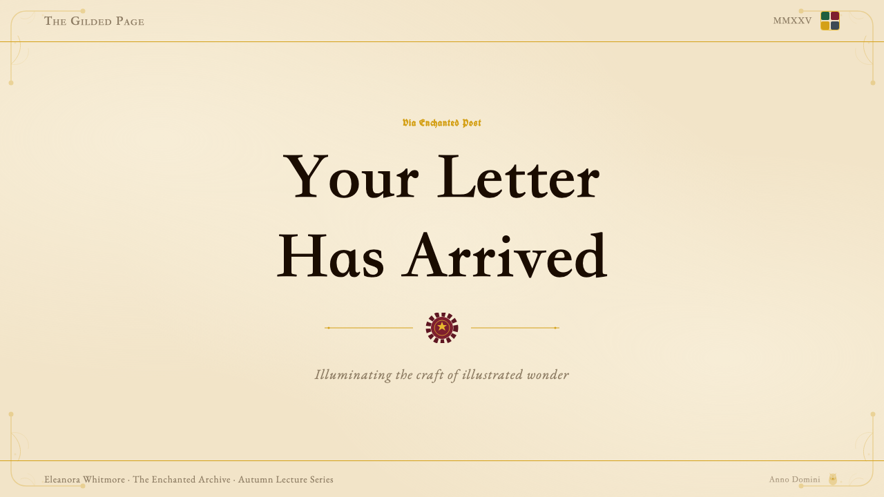
For presentation slides, the style works most powerfully on cover pages and section dividers, where the full heraldic vocabulary can deploy without competing with dense information. A cover slide benefits from a symmetrical or four-quadrant composition with a central crest or emblem, blackletter title lettering, and a gilt border framing the field. Content slides require more restraint: a parchment ground, old-style serif body text, and a ruled border is sufficient — adding full ornamental treatment to every content slide creates visual fatigue. Data slides translate well when charts and graphs are colored using the house palette and presented against aged-paper backgrounds, giving quantitative information the weight of an official wizarding registry rather than a corporate dashboard.在演示文稿中,这种风格在封面页与章节分隔页上最为有力——全套纹章词汇可以在不与密集信息竞争的情况下充分展开。封面幻灯片适合使用对称或四分构图,以居中纹章或徽章为核心,哥特体标题文字,以及金色边框框定区域。内容页需要更多克制:羊皮纸底色、老式衬线正文、线条边框便已足够——对每张内容页都施以全套装饰处理会造成视觉疲劳。数据页在用学院色板为图表着色、并将其呈现于做旧纸张背景上时,效果很好——使定量信息具有魔法部官方档案的重量感,而非企业仪表板的感觉。
For web interfaces, the style is best suited to landing pages, event sites, and marketing microsites where narrative immersion is the goal rather than functional utility. A Harry Potter Illustrated web layout uses warm parchment-tone section backgrounds alternating with deep emerald or burgundy fields, blackletter headings for section titles, old-style serif for body copy, and gilt or warm gold accents for interactive elements and calls to action. Navigation should feel archival rather than utilitarian — wordmarks in display type, bordered dropdown menus, no flat-color button fields. Dashboards and data-heavy interfaces are not natural territory for this style: the warmth and ornament that make it immersive in narrative contexts compete with the clarity demands of functional UI.对于网页界面,这种风格最适合着陆页、活动网站与营销微站——目标是叙事沉浸感而非功能实用性。哈利·波特插图风格的网页版面,以暖羊皮纸色章节背景与深翡翠绿或酒红色区块交替排布,章节标题使用哥特黑体,正文使用老式衬线体,交互元素与行动号召使用镀金或暖金色强调。导航应感觉像档案馆而非工具界面——展示字体文字标识、带边框的下拉菜单、无平面色彩按钮色块。仪表板与数据密集界面不是这种风格的自然领地:在叙事语境中制造沉浸感的暖意与装饰,会与功能性UI的清晰度需求产生竞争。
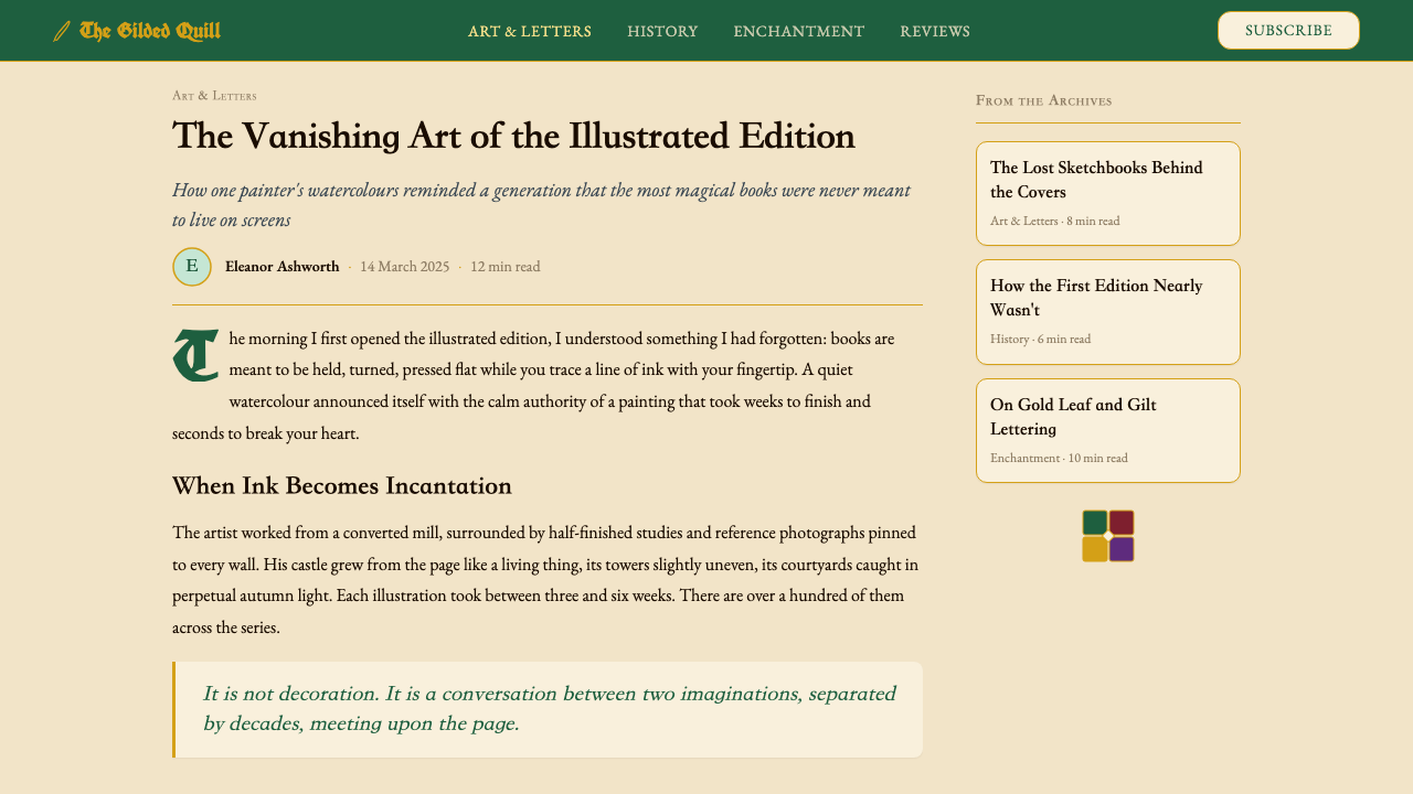
For editorial and marketing work, the style carries strong authority in contexts that call for celebrating heritage, craft, or special occasion. A Harry Potter Illustrated editorial layout gives body text a slightly narrower measure within a generous page, frames pull quotes with ornamental rules, and uses drop caps in blackletter or old-style roman to open sections. Marketing pages work well when the style's poster-like qualities are embraced: full-width alternating sections in deep emerald and parchment, with gilt accents marking calls to action and blackletter headings announcing each benefit or feature. Promotional materials — invitations, event programs, certificates — are natural territory where the full ornamental treatment can be applied without restraint.对于编辑与营销内容,这种风格在需要颂扬传承、工艺或特殊场合的语境中承载着强烈的权威感。哈利·波特插图风格的编辑版面,在宽裕的页面内给正文略微收窄的行宽,以装饰性横线框住引用语,并在章节开头使用哥特或老式罗马体首字下沉。营销页面在拥抱这种风格的海报式品质时效果显著:深翡翠绿与羊皮纸色全宽交替章节,以金色强调标记行动号召,以哥特标题宣告每个功能亮点。促销材料——邀请函、活动节目单、证书——是可以毫无保留地施以全套装饰处理的自然领地。
A common mistake when applying this style is over-emphasizing the gothic and medieval associations at the expense of the warmth. Layouts that lean too heavily on blackletter type, deep saturated backgrounds, and dense ornament without sufficient parchment ground and gilt detail will read as generically 'dark fantasy' rather than specifically Harry Potter Illustrated. The style's emotional register is warm invitation, not gothic menace. Equally, attempting to modernize the style by introducing geometric sans-serifs, flat icon systems, or clean neutral backgrounds destroys its coherence entirely — the style either commits to its full vocabulary or it reads as an inconsistent hybrid.应用这种风格时最常见的错误,是过度强调哥特与中世纪联想,以牺牲暖意为代价。过重依赖哥特黑体、深饱和背景与繁密装饰、却缺乏足够的羊皮纸底面与金色细节的版面,会被读解为泛泛的「暗色奇幻」而非特定的哈利·波特插图风格。这种风格的情感基调是温暖的邀请,而非哥特式威胁。同样,试图通过引入几何无衬线字体、平面图标体系或简洁中性背景来将这种风格现代化,会彻底破坏其连贯性——这种风格要么全面投入其完整词汇,要么被读解为一种不一致的混搭。
See the Harry Potter Illustrated design system查看 Harry Potter Illustrated 完整设计系统
Harry Potter Illustrated — FAQHarry Potter Illustrated · 常见问题
Is this style only appropriate for Harry Potter-themed content?这种风格只适合哈利·波特主题的内容吗?
Not at all. The visual system works for any content that benefits from a sense of heritage, arcane authority, handcrafted warmth, or ceremonial formality. Luxury brand launches, academic institution communications, fantasy gaming materials, collector edition packaging, heritage travel campaigns, and special event invitations are all natural applications where the style's vocabulary translates without any explicit Harry Potter reference. What matters is the underlying aesthetic logic — warmth, heraldic order, aged surfaces, blackletter display type — not the specific intellectual property. The style is particularly effective when the product or service wants to signal that it belongs to a tradition worth taking seriously.完全不是。这套视觉系统适用于任何能从传承感、神秘权威、手工温度或仪式正式感中获益的内容。奢侈品牌发布、学术机构传播、奇幻游戏材料、收藏版包装、遗产旅行推广与特别活动邀请函,都是可以自然应用这种风格词汇的场景,无需任何明确的哈利·波特指涉。重要的是底层美学逻辑——暖意、纹章秩序、做旧表面、哥特展示字体——而非具体知识产权。当产品或服务想要传达「它属于一个值得认真对待的传统」时,这种风格尤为有效。
How does this style differ from general Victorian or Gothic design?这种风格与一般的维多利亚或哥特设计有何不同?
Victorian design encompasses a very wide range — from dense chromolithography to restrained Arts and Crafts work — and Gothic design proper tends toward darkness, severity, and ecclesiastical weight. Harry Potter Illustrated occupies a specific subset: the warm, illustrated adventure-book tradition that reached its peak in late-Victorian and Edwardian publishing. The distinguishing characteristics are warmth rather than darkness, heraldic four-part structure rather than flowing organic ornament, and a consistent candlelit register that prevents the palette from tipping into the dramatic or theatrical. Where Gothic design might feel like a cathedral, Harry Potter Illustrated feels like a well-loved library — authoritative but welcoming, old but not cold.维多利亚设计涵盖极宽的范围——从密集的彩色石印到克制的工艺美术运动作品——而正宗的哥特设计倾向于黑暗、严肃与教堂式的分量。哈利·波特插图风格占据的是一个特定的子集:温暖的、插画式冒险书传统,这一传统在维多利亚晚期与爱德华时代出版业达到巅峰。其区别性特征是暖意而非黑暗、纹章四分结构而非流动的有机装饰,以及一致的烛光色域——它防止配色倾向于戏剧性或舞台感。如果说哥特设计感觉像一座大教堂,哈利·波特插图风格感觉则像一个珍爱的图书馆——权威但亲切,古老但不冷漠。
Can the style work in a digital-first context without feeling anachronistic?这种风格能在数字原生语境中使用而不显得过时吗?
Yes, provided the translation is done with intent rather than literal imitation. The style does not require scanned textures or hand-lettering to function digitally — it requires warm palette choices, old-style or display serif headings, ruled borders, and a compositional logic that feels heraldic rather than grid-optimized. Many successful applications of heritage styles in digital contexts work precisely because the designer understood which visual cues carry the emotional meaning (warmth, ruled borders, display typography) and which are period-specific production artifacts that can be adapted or omitted (actual parchment grain, physical ink variation). The goal is to evoke the emotional register of the style, not to simulate its production method.可以,前提是翻译是有意图的,而非字面模仿。这种风格在数字环境中运作,并不需要扫描纹理或手写字体——它需要温暖的配色选择、老式或展示衬线标题、线条边框,以及一种感觉由纹章逻辑而非网格优化驱动的构图逻辑。许多成功将传承风格引入数字语境的案例,恰恰是因为设计师理解了哪些视觉线索承载情感意义(暖意、线条边框、展示排版),哪些是特定时代的生产工艺产物、可以被适应或省略(真实羊皮纸颗粒感、物理墨水变化)。目标是唤起这种风格的情感基调,而非模拟其生产方式。
What is the most common failure mode when using this style?使用这种风格时最常见的失败模式是什么?
The most common failure is applying the surface markers — blackletter headings and parchment background — while ignoring the system logic that makes those choices cohere. A layout with a blackletter title, a clean white background, a geometric icon set, and sans-serif body text is not Harry Potter Illustrated; it is a collection of mismatched signals. The style requires internal consistency: if the heading is blackletter, the body should be old-style serif; if the background is parchment, the borders should be ruled and ornamented; if the color is house-coded, it should be deployed consistently across related elements. Partial application produces pastiche rather than style.最常见的失败是应用了表面标记——哥特黑体标题与羊皮纸背景——却忽视了使这些选择相互连贯的系统逻辑。一个带哥特标题、简洁白色背景、几何图标集与无衬线正文的版面,不是哈利·波特插图风格;它是一堆不匹配信号的集合。这种风格需要内部一致性:如果标题是哥特黑体,正文就应该是老式衬线体;如果背景是羊皮纸色,边框就应该是有规则与装饰的;如果色彩是学院色编码的,就应该在相关元素之间一致地部署。部分应用产生的是仿作,而非风格。
How should gold be used in this style without feeling excessive?如何在这种风格中使用金色而不显得过度?
Gold should function as the accent and finishing element, not as a dominant field or background color. Its proper territory is fine-line borders, corner ornaments, typographic highlights on dark backgrounds, and small heraldic details — the equivalent of gilt lettering on the spine of a leather-bound book rather than the cover material itself. When gold is used as a large background fill or as the primary heading color against a parchment ground, it tends to feel gaudy and loses the precision that makes it feel precious. The rule is that gold earns its effect through restraint: a thin gilt border on an otherwise simple spread will carry more visual authority than a gold-saturated layout where nothing is left to accent.金色应作为强调与收尾元素使用,而非主导色块或背景色。其适当领域是细线边框、角落装饰、深色背景上的排版高光与小型纹章细节——相当于皮面精装书书脊上的镀金字母,而非封面材料本身。当金色被用作大面积背景填充或羊皮纸底面上的主标题色时,往往显得俗丽,失去了使其显得珍贵的那种精准感。规则是:金色通过克制赢得效果——在一个本已简洁的跨页上用一条细金线边框,比在一个金色饱和到无物可作强调的版面上,承载更多的视觉权威。
Related design styles相关设计风格
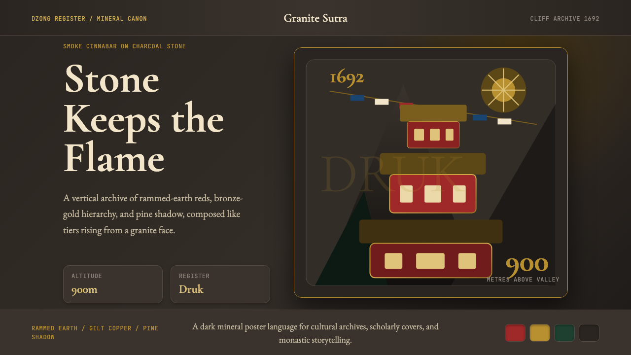 Bhutanese Tiger's Nest Cliff MonasterySacred altitude, mineral-dark. Cinnabar tiers and bronze rules climb charcoal…神圣垂直感。朱砂层台与青铜线条攀上炭灰花岗岩。
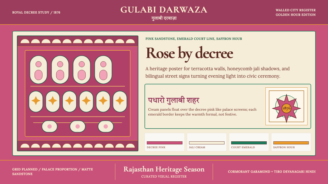 Jaipur Pink City RajasthanRoyal warmth, ordered by decree. Pink sandstone, cream jali, emerald borders.王室暖意由法令定色:粉砂岩底、奶油贾利格、翡翠边框。
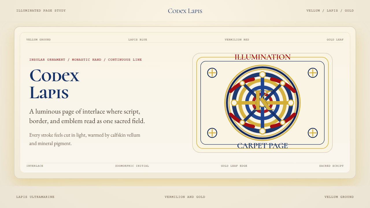 Book of Kells Celtic (800)Sacred and precise. Vellum cream, lapis, vermilion, and gold knotwork.神圣而精密。奶油羊皮底上铺陈青金石、朱砂与金色缠结纹。
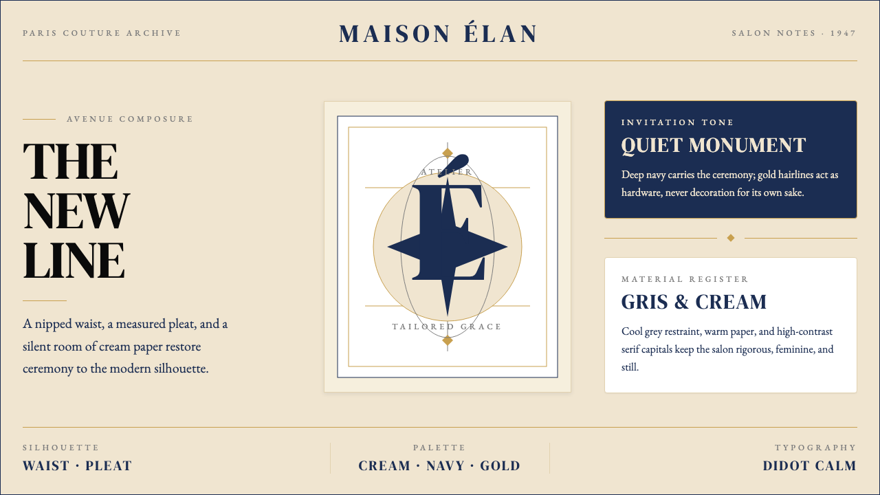 Dior New Look (1947)Couture speaks softly. Cream ground, navy Didot capitals, and gold hairlines…高级订制低声发言:米白底、海军蓝Didot大写与金色发丝线稳住全场。
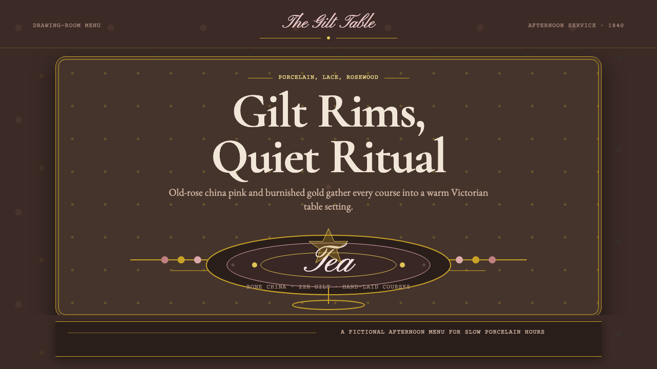 English Afternoon TeaOrnament is the ritual. Old-rose porcelain, gilt rims, and script rest on ros…装饰即仪式。旧玫瑰瓷粉、鎏金边与花体字落在玫瑰木暗底。
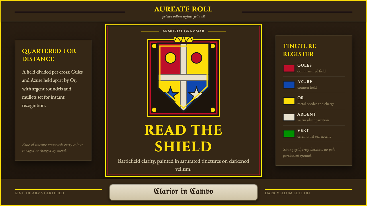 Heraldic BlazonCommand at a glance. Gules, Azure and Or quartering lock into a gilt shield o…一眼即权威。深羊皮纸上,红蓝金分割锁成镀金盾徽。