What is Demon Slayer (2019)?
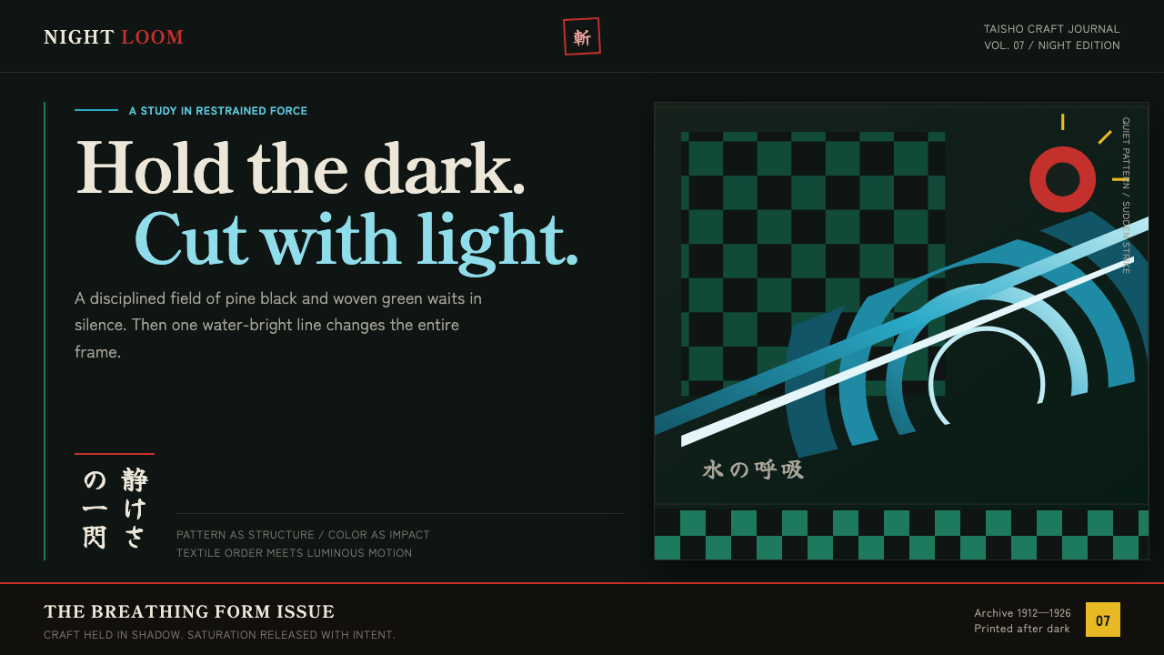
Quiet craft holds the frame; then a water-teal strike cuts through pine-black night.
Demon Slayer (2019) in brief
Demon Slayer draws its design language from the 2019 ufotable anime: Taisho-period Japan rendered through near-black grounds, pine-green ichimatsu checks, and water effects that curl with the graphic force of a Hokusai print set alight. Its central image is the green-and-black checkered haori, a square grid that functions simultaneously as costume, textile pattern, and compositional structure.
The style is built on contrast between restraint and release. Dark fields, repeated checks, and flat decorative motifs establish a disciplined surface; teal water-breathing crests, red-and-white hanafuda earrings, and Zenitsu-gold lightning interrupt it with concentrated force. Color does not fill the background or soften the atmosphere. It arrives as an event, like an effect animation entering a held frame.
This is not simply historical Japan with digital polish. The visual system places Taisho-era mountain villages and the Asakusa–Yoshiwara cityscape inside a contemporary compositing sensibility. Textile regularity, ukiyo-e-like waves, and sudden luminous effects make each scene feel composed before it feels animated: pattern creates tension, darkness creates silence, and the strike supplies the release.
Where does Demon Slayer (2019) come from?
The source manga ran from 2016 to 2020, while the anime run covered 2019 to 2021. Its fictional world is set in Taisho-period Japan, spanning 1912 to 1926. That setting gives the style its historical stage: mountain villages, urban streets, textiles, hanging ornaments, and a period atmosphere that can support both quiet domestic detail and heightened action.
The anime is associated with ufotable in Tokyo, and its visual identity is inseparable from the source material’s description of digital sakuga compositing. Rather than presenting action as a separate layer pasted over an illustration, the system lets effects transform the whole composition. Water curls into sculptural crests; lightning fractures darkness; luminous color appears as a force that changes the reading of the frame.
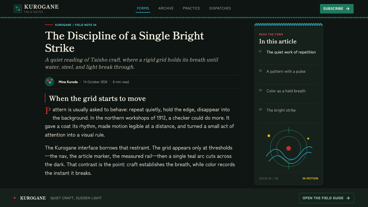
Ichimatsu textile pattern supplies the system’s most durable structural idea. The green-and-black checkered haori is not a minor reference or a decorative trim. Its repeated square units establish rhythm, division, and recognition at a glance. Because the pattern is rigid and legible, it can withstand the irregular movement of water, smoke, or light without the composition losing its center.
The stated movements around the theme explain the resulting hybrid: shonen battle manga provides sudden conflict and release; ufotable digital sakuga compositing provides heightened effect imagery; ichimatsu pattern provides textile order; and Taisho-roman revival supplies the period atmosphere. The most useful reading is not historical reconstruction but deliberate collision. Decorative flatness and digital bloom are allowed to coexist because each has a different job in the frame.
What defines the Demon Slayer (2019) look?
Near-Black Ground
The background behaves like a held breath. Pine-black fields suppress visual noise and make empty space feel intentional rather than unfinished. The dark ground is not merely a dramatic backdrop; it is the condition that lets every later accent read as a sudden arrival.
Ichimatsu Structure
Green-and-black checks are the load-bearing motif. Their repeated squares create a firm, textile-like grid that can serve as clothing, panel division, framing device, or visual anchor. The pattern should feel woven and deliberate, never like a generic checkerboard placed for retro decoration.
Effect Color
Teal water, red and white ornamental detail, and gold lightning are used as concentrated forces. Their role is to direct attention and mark a shift in energy. Large passive fields of bright color weaken the style, because the palette depends on color feeling earned by movement or impact.
Water as Linework
Water-breathing crests are not soft naturalistic waves. They curl, cut, and stack like decorative linework with physical momentum. Their Hokusai-like quality comes from clear contour, repeated motion, and a willingness to let water become graphic form rather than transparent atmosphere.
Textile Flatness
Traditional decorative discipline keeps the image from becoming diffuse. Checks, ornaments, and costume-like surfaces read as flat, bounded areas with crisp identity. Even when digital effects bloom above them, the underlying forms remain legible as patterned planes rather than dissolving into texture.
Sudden Force
The style’s drama comes from interruption. A calm dark field and controlled pattern establish one tempo; a slash of water or lightning breaks it. The strongest compositions preserve enough silence before the strike that the effect feels decisive, not continuously loud.
Who shaped Demon Slayer (2019)?
Gotouge appears in the source material’s key-figure list alongside the manga origin of the theme. In a design reading, that origin matters because the system must preserve the tension between quiet character-bearing pattern and sudden shonen battle release.
Sotozaki is named among the key figures connected to the anime-era theme. The useful visual lesson is the balance implied by the source material: period atmosphere and composed darkness must remain present even when action effects become the frame’s dominant event.
Matsushima is included in the theme’s key-figure list. The system’s visual identity depends on recognizable, bounded motifs—checks, earrings, water crests, and lightning—so that intensity never erases silhouette and pattern recognition.
Kajiura is named in the supplied key-figure list. Within this article’s visual framework, the relevant principle is pacing: quiet craft establishes expectation, while the abrupt teal or gold intervention provides the memorable change in state.
Shiina is also identified as a key figure in the supplied material. The theme’s structure rewards coordinated contrast: repetitive textile order should remain calm enough for an energetic effect accent to feel singular and consequential.
How do you use Demon Slayer (2019) today?
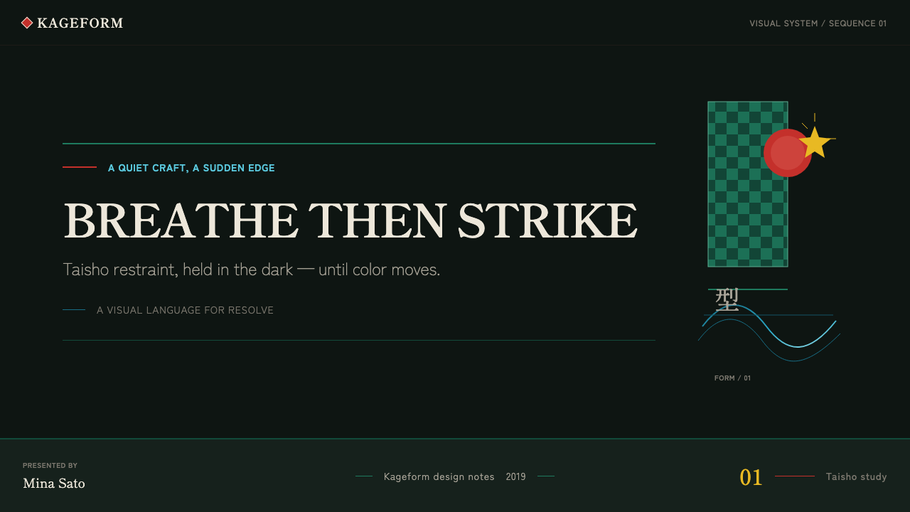
For presentation covers, begin with a pine-black field and let a cropped ichimatsu block establish the frame. Keep the title calm, clear, and secondary to one decisive visual event: a teal crest crossing an edge, a gold fracture, or a small red-and-white ornament. The cover should feel as though stillness existed before the action entered it.
Content slides benefit from the grid logic of the haori. Use repeated square divisions to align headings, notes, and images, but avoid turning every surface into pattern. A controlled dark panel, one quiet textile reference, and a restrained accent can carry a full section. The check pattern is strongest when it organizes information rather than competing with it.
For data slides, treat effects as annotations rather than chart decoration. Teal can mark a flow, gold can identify an exception or decisive change, and red-and-white detail can establish a limited point of focus. Keep the data field sober and legible, then use a single curved crest or sharp fracture to explain where attention should move.
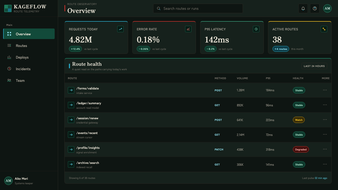
In web interfaces, this style suits dashboards, command surfaces, and pricing pages that benefit from a cinematic sense of hierarchy. Near-black panels create depth through contrast, while checkered modules can distinguish structured areas such as navigation, plan comparison, or status groups. Interactive emphasis should arrive sparingly, with water-like motion or lightning-like highlights reserved for meaningful change rather than routine decoration.
For editorial and marketing work, let the system alternate between silence and impact. An article can use dark breathing room around a narrow text column, a textile block for section identity, and one saturated effect image at a turning point. The common mistake is applying teal, gold, red, water, lightning, and checks everywhere at once. That produces noise. The authentic principle is sequence: restraint first, force second, and darkness always available to restore the frame.
Demon Slayer (2019) — FAQ
Is this style just a dark anime aesthetic?
No. Darkness is structural, but the identity comes from the relationship between near-black space, ichimatsu order, Taisho-era decorative references, and tightly rationed action color. Removing the checks and the held stillness leaves a generic dark action look rather than this specific system.
Can the ichimatsu check be used as a full-page background?
It can, but it usually works better as a structural zone than as constant wallpaper. The pattern needs dark breathing room and plain surfaces around it so that its textile rhythm remains readable. If it fills every area, it loses its role as a recognizable anchor.
How should water and lightning be differentiated?
Use water as a curving guide for flow, continuity, and directional movement. Use lightning as a sharp break for alert, climax, or decisive transition. Both are effect colors, but water gathers and carries the eye while lightning interrupts it.
Where does this style struggle?
It struggles when a product needs a consistently soft, casual, or low-intensity tone. The system depends on contrast and deliberate buildup, so applying its strikes to routine messages makes every state feel overdramatic. It is strongest where meaningful transitions, clear hierarchy, and a controlled sense of force are appropriate.
Related design styles
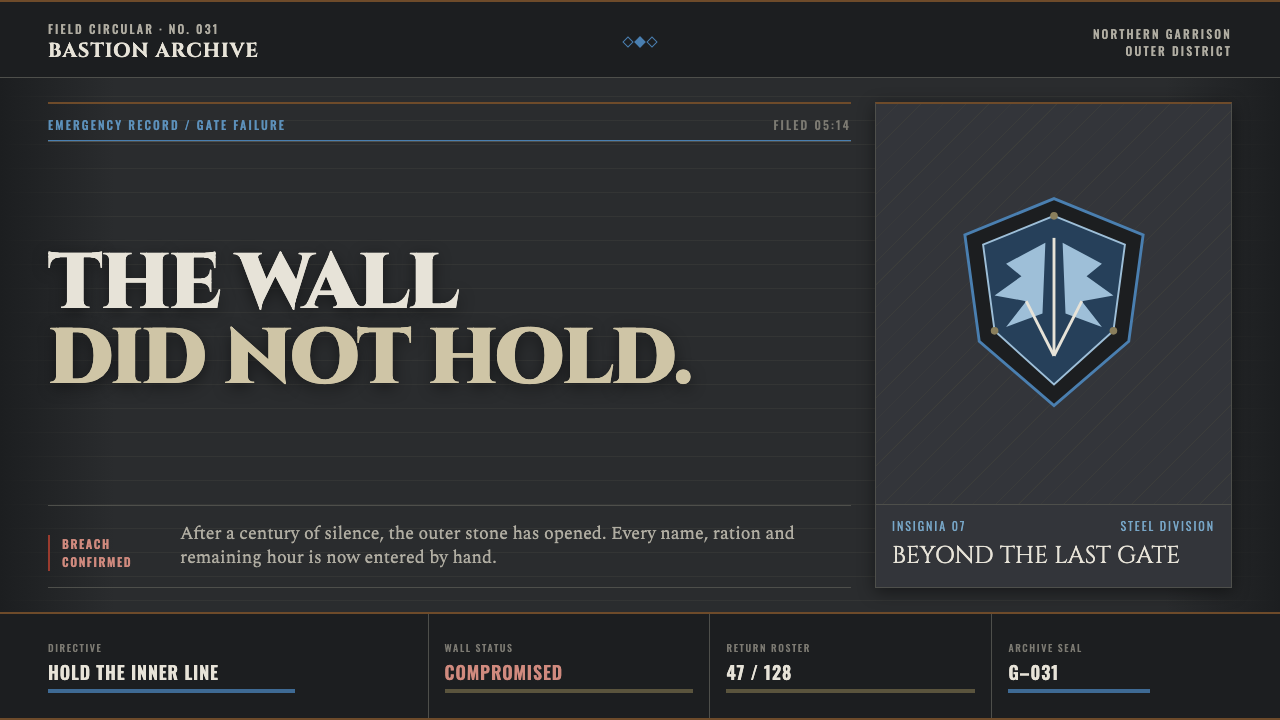 Attack on Titan (2013)Dread becomes duty. Stone-gray bands, engraved caps and one steel-blue crest…
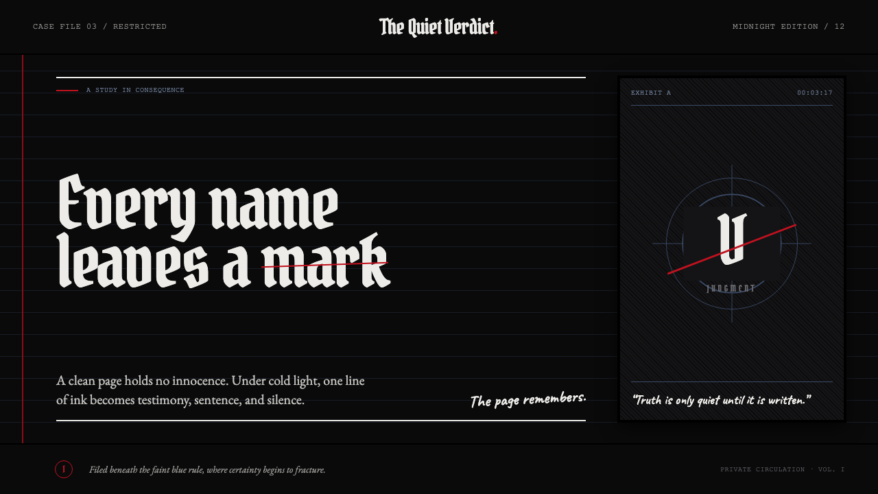 Death Note (2003)Silence becomes judgment. Bone-white blackletter and blue rules break under o…
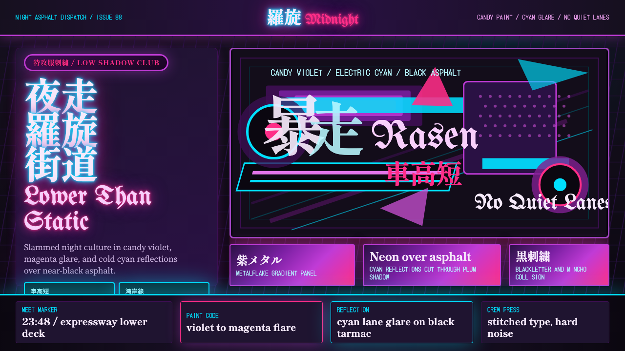 JDM BosozokuNight culture shouts. Candy violet, cyan neon, and stacked Mincho-blackletter…
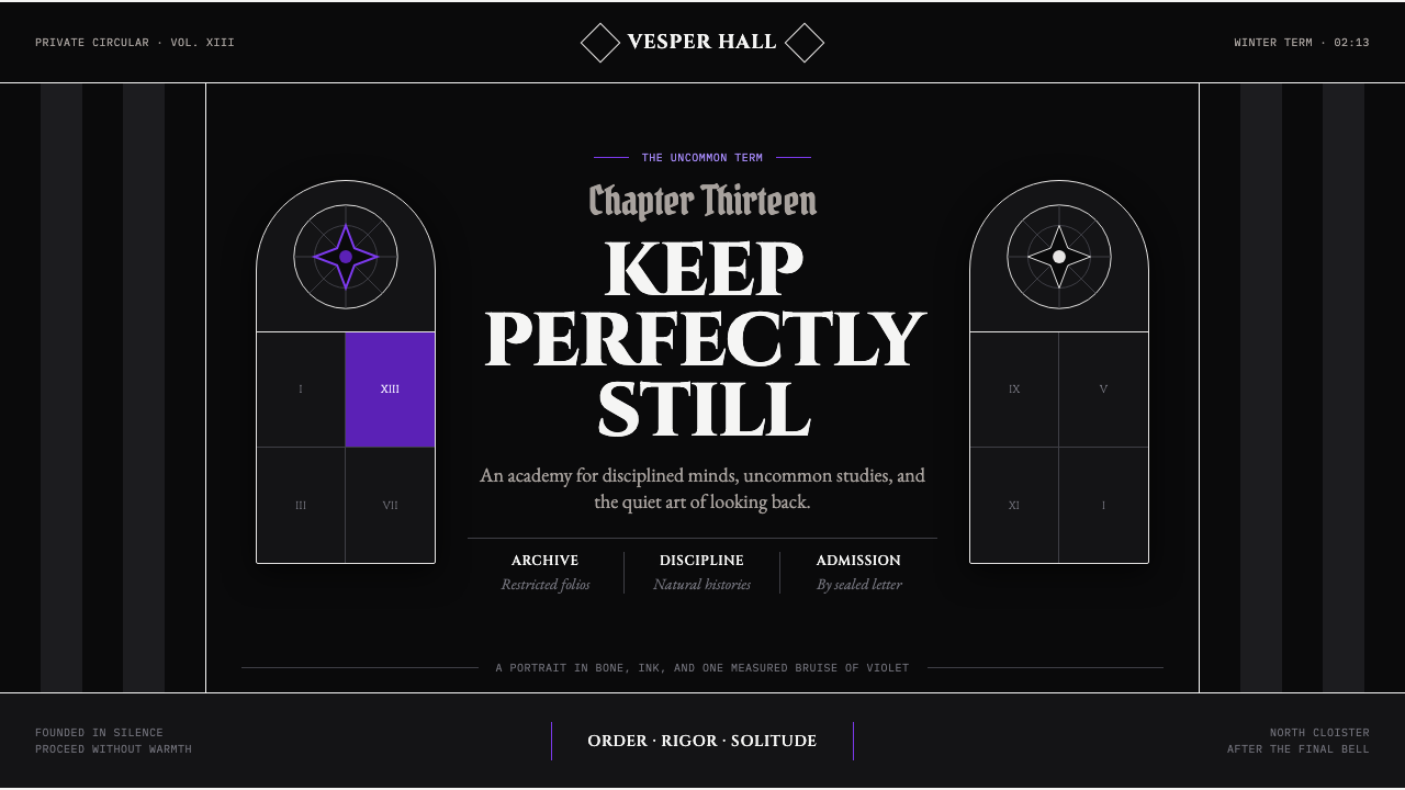 Wednesday — Nevermore AcademyCold symmetry cuts deepest. Bone-white capitals and hard stripes yield to one…
 Cuban OSPAAAL Tricontinental PosterUrgency from scarcity. Cyan, gold and red slam over black in blunt silkscreen…
 Disco ElysiumNoir rot glows from within. Amber Caslon type cuts through varnish-dark umber.