What is OSPAAAL Tricontinental?
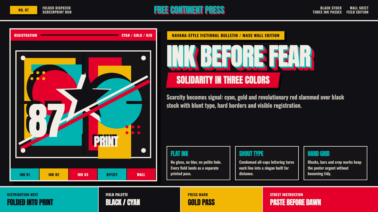
OSPAAAL turned scarcity into urgency: cyan, gold, and revolutionary red struck hard across black in silkscreen blocks made for walls, not galleries.
OSPAAAL Tricontinental in brief
OSPAAAL — the Organization of Solidarity with the Peoples of Africa, Asia and Latin America — developed one of the twentieth century’s most electrically direct graphic languages in Havana. Its posters joined Third-World solidarity graphics with political silkscreen poster art, carrying anti-colonial and anti-imperialist messages through a visual system that was immediate, reproducible, and impossible to ignore.
The style was shaped by material scarcity. Havana’s ink shortage and the limitations of silkscreen production restricted artists to two or three flat colours per run. Instead of disguising that constraint, designers made it visible: cyan, gold, and revolutionary red were laid over a strong black field, while silhouettes, posterized photography, and blunt slab type replaced delicate tonal nuance.
OSPAAAL Tricontinental work feels urgent because every element behaves like a public declaration. The colour blocks are broad, the edges are decisive, the imagery is simplified for rapid recognition, and the typography appears to shout rather than converse. These were mass-produced political objects, folded into Tricontinental magazine and mailed to more than 87 countries.

Where does OSPAAAL Tricontinental come from?
OSPAAAL was founded in Havana, Cuba, in 1966. Its purpose and visual identity were inseparable: solidarity among the peoples of Africa, Asia, and Latin America required communication that could travel widely and remain legible outside elite cultural institutions. The poster became the natural instrument because it could occupy a wall, accompany a publication, and speak through image and colour before a viewer had read every word.
The organization’s graphic language emerged under practical pressure. An ink shortage in Havana met the restricted palette of silkscreen printing, which allowed only two or three flat colours to be built up in a run. This condition encouraged a decisive visual economy. Designers worked with black grounds, hard overprints, strong silhouettes, and simplified photographic imagery because these forms survived reproduction and retained their force at a distance.
Tricontinental magazine became the distribution vehicle for the work. Posters were folded into issues and mailed to more than 87 countries, giving the images a circulation far beyond Havana. Their international reach shaped the style’s insistence on immediate recognition: a bold figure, a compressed message, and a limited set of colours had to carry political meaning across different languages and local contexts.
Poster production reached its peak from 1967 to 1990. During this period, figures including Alfredo Rostgaard, Olivio Martínez, and Rafael Enríquez were associated with the OSPAAAL tradition. The resulting work was not polished for gallery contemplation. It was urgent, mass-produced, and defiantly unpolished: a visual language designed to make solidarity visible in public space.
What defines the OSPAAAL Tricontinental look?
Black Field
Black is not a neutral background in OSPAAAL work. It gives the overprinted colours maximum force and turns each figure into a high-contrast signal. The black field also creates a sense of night, conflict, and concentrated pressure without requiring realistic scenery. Space is compressed so that the message occupies the viewer’s full attention.
Restricted Colour
Cyan, gold, and revolutionary red appear as broad, flat interventions rather than a continuous spectrum. Their power comes from contrast and placement, not subtle modulation. A single colour may define a figure, while another cuts across it as an overprint or directional accent. The palette feels political because it behaves like a system of signals.
Silkscreen Flatness
Silkscreen production gives the style its blunt physical character. Colour sits on the surface in visible blocks, with hard boundaries and little interest in smooth transitions. Registration and overlap can remain perceptible, reinforcing the sense that the image was made by hand under real production constraints. The result is direct, tactile, and unapologetically reproducible.
Posterized Imagery
Photography is reduced into graphic evidence rather than presented as a naturalistic scene. Tonal information is compressed into silhouettes, stark areas, and recognisable contours. Faces, bodies, and objects become symbols that can be understood quickly. This treatment gives the image the authority of a photograph and the speed of an emblem at the same time.
Shouting Slab Type
Typography is heavy, blunt, and built for distance. Slab-like forms hold their shape beside large silhouettes and solid colour blocks, while short messages can operate almost as visual objects. Lettering is not a quiet caption beneath the image; it is another mass in the composition, competing for attention and strengthening the poster’s public address.
Visible Overprint
The meeting of colours is part of the image’s meaning. Cyan, gold, and red do not merely decorate separate zones; they collide, overlap, and sharpen one another against black. Overprint creates movement without animation and depth without realistic modelling. It makes the political message feel assembled in public, layer by layer.
Urgent Mass Address
OSPAAAL graphics are designed to be encountered rather than studied. Their scale of gesture, compressed imagery, and limited palette support instant reading in a public environment. Roughness is functional: it signals speed, collective production, and distance from luxury print culture. The poster does not ask for leisurely appreciation; it demands recognition and response.

Who shaped OSPAAAL Tricontinental?
Alfredo Rostgaard is identified in the source material as one of the designers who shaped OSPAAAL’s graphic language. His significance within this tradition lies in the move away from nuance toward bold silhouettes, posterized photography, and forceful slab type. The work associated with his name demonstrates how a restricted silkscreen palette could become an expressive advantage rather than a production defect.
Olivio Martínez is named alongside Rostgaard as a designer working within the OSPAAAL poster tradition. The source connects this design practice to Havana’s ink shortage and to a deliberate embrace of flat colour, simplified imagery, and direct communication. Martínez therefore belongs to a visual culture where technical limitation, political purpose, and public readability are treated as one design problem.
Rafael Enríquez is identified among the key figures of the OSPAAAL tradition. The approved material does not provide a separate biography, but his inclusion matters because the movement was larger than any single signature. OSPAAAL’s visual force came from a shared method: black fields, restricted overprints, compressed imagery, and posters built to circulate through Tricontinental magazine.
How do you use OSPAAAL Tricontinental today?
For presentation slides, use the style as a communication engine. A cover can place a large black field behind a single cut-out figure or posterized image, with cyan, gold, or revolutionary red entering as a hard overprint. Content slides should keep one blunt message in command, supported by compact blocks of text and strong silhouettes. Data slides can treat bars, symbols, and directional marks as flat printed forms rather than polished interface objects.
For web dashboards and pricing pages, OSPAAAL can make hierarchy feel immediate and public-facing. Use near-black structural surfaces, reserve the vivid colours for alerts, active states, and meaningful distinctions, and let cards or panels read as solid printed blocks. The interface should feel assembled from signals: short labels, decisive contrast, and imagery reduced to recognisable silhouettes. Excessive softness or decorative polish will weaken the style’s material honesty.
For editorial and marketing work, the style suits campaigns that need collective energy, political clarity, or a sense of movement across borders. Magazine covers, posters, event announcements, and campaign landing pages can use oversized imagery, compressed headlines, and visible colour collisions. A narrow palette helps the message travel as a unified identity, while rough edges and imperfect-looking overlaps preserve the sense of human production.
For image-led storytelling, treat photography as raw material for graphic transformation. Crop decisively, reduce tonal complexity, and allow the subject to become a symbol before adding colour blocks that organize attention. The strongest compositions make the image and message inseparable: the silhouette carries recognition, the typography carries the declaration, and the overprint supplies motion and emphasis.
The common mistake is to imitate only the surface ingredients: black, bright colours, rough texture, and oversized type. OSPAAAL is not simply a distressed poster filter. Its logic depends on scarcity, compression, direct address, and disciplined colour restraint. Adding every available colour, softening every edge, or surrounding the message with ornamental detail turns a forceful communication system into a decorative retro style.

OSPAAAL Tricontinental — FAQ
What does OSPAAAL Tricontinental refer to?
It refers to the graphic tradition developed by OSPAAAL, the Organization of Solidarity with the Peoples of Africa, Asia and Latin America, and circulated through Tricontinental magazine. The posters joined Third-World solidarity graphics with political silkscreen production, carrying anti-colonial and anti-imperialist messages to an international audience.
Why is the black field so important?
Black gives the restricted overprinted colours maximum contrast and turns simplified imagery into an immediate signal. It also creates concentrated dramatic pressure without relying on realistic scenery. In the system’s visual logic, black is the ground that lets cyan, gold, and revolutionary red strike with full force.
Was the limited palette a stylistic choice or a technical necessity?
It was both. Havana’s ink shortage and the limits of silkscreen printing restricted production to two or three flat colours per run. OSPAAAL designers transformed that material constraint into a consistent language of hard blocks, visible overprints, and high-contrast silhouettes. Scarcity became part of the style’s identity.
How should photography be adapted for this style?
Photography should be compressed into posterized shapes rather than preserved as a naturalistic scene. Reduce tonal nuance, emphasize contours, and let faces, bodies, or objects function as recognisable symbols. The image should retain enough presence to feel real, but enough simplification to work immediately beside flat colour and shouting type.
What distinguishes authentic OSPAAAL influence from retro decoration?
Authentic influence follows the underlying communication logic: scarcity, compression, strong contrast, restricted colour, and direct public address. Retro decoration copies the black background and vivid palette but adds softness, multiple competing colours, ornamental detail, or polished effects. The first makes the message more forceful; the second turns the language into surface styling.
Related design styles
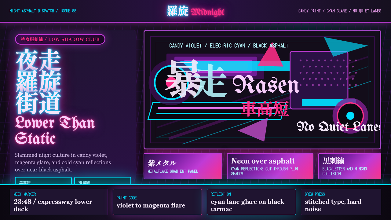 JDM BosozokuNight culture shouts. Candy violet, cyan neon, and stacked Mincho-blackletter…
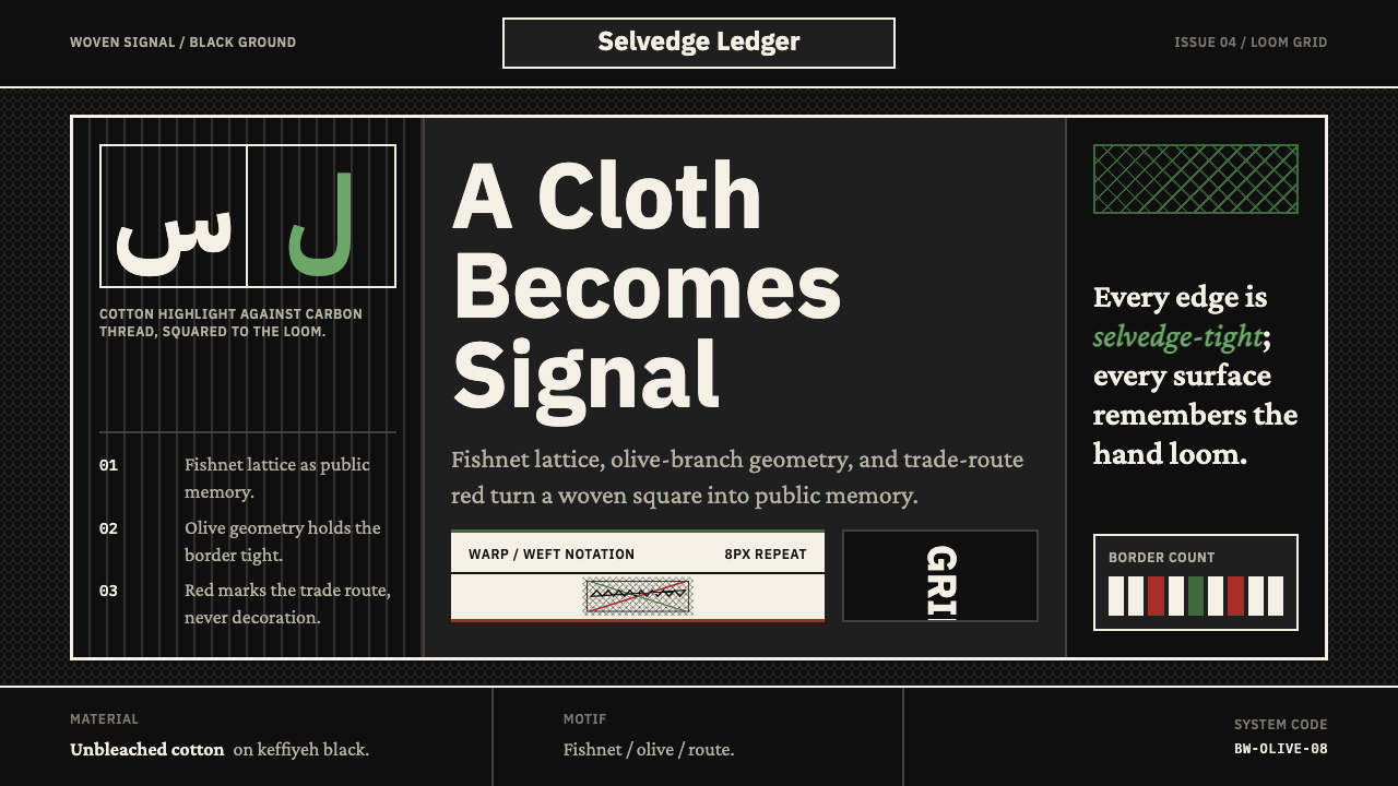 Levantine Keffiyeh Black & WhitePolitical textile, not ornament. Cotton type and fishnet lattice cut through…
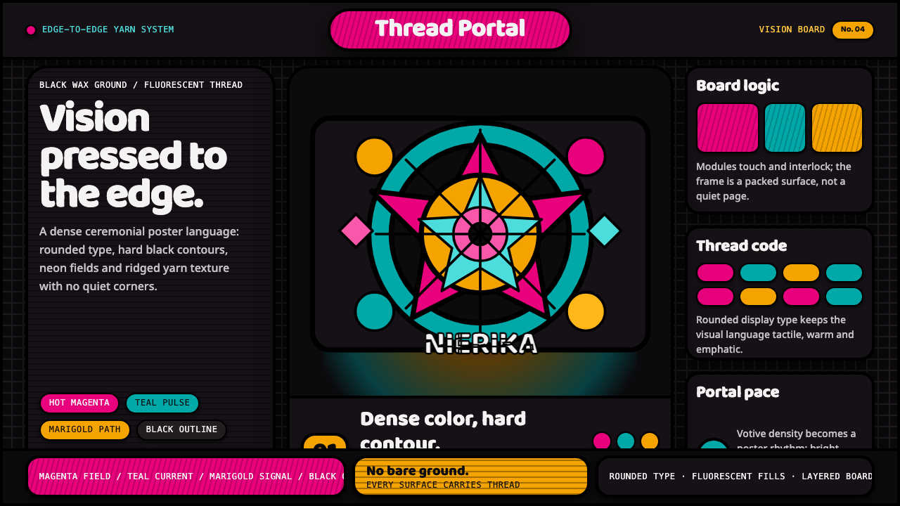 Huichol Yarn NierikaCeremonial density glows. Neon yarn colors lock into black-contoured, edge-to…
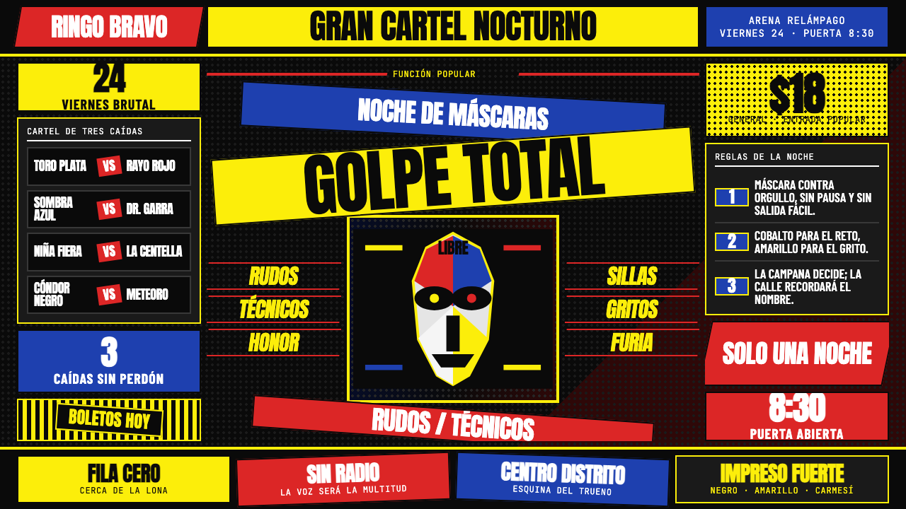 Lucha Libre PosterStreet-poster voltage. Yellow Anton banners, crimson diagonals, cobalt grids…
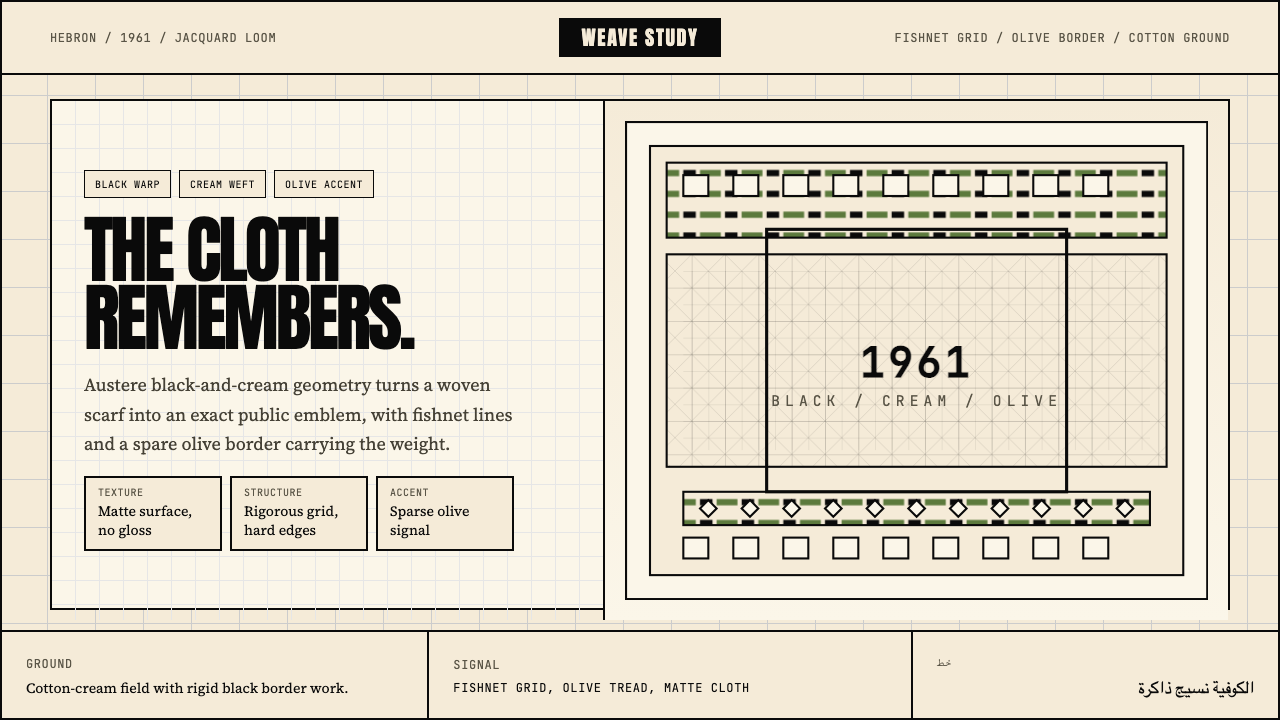 Palestinian Keffiyeh GridMemory in black and cream. Fishnet grid, olive border, and austere Anton type.
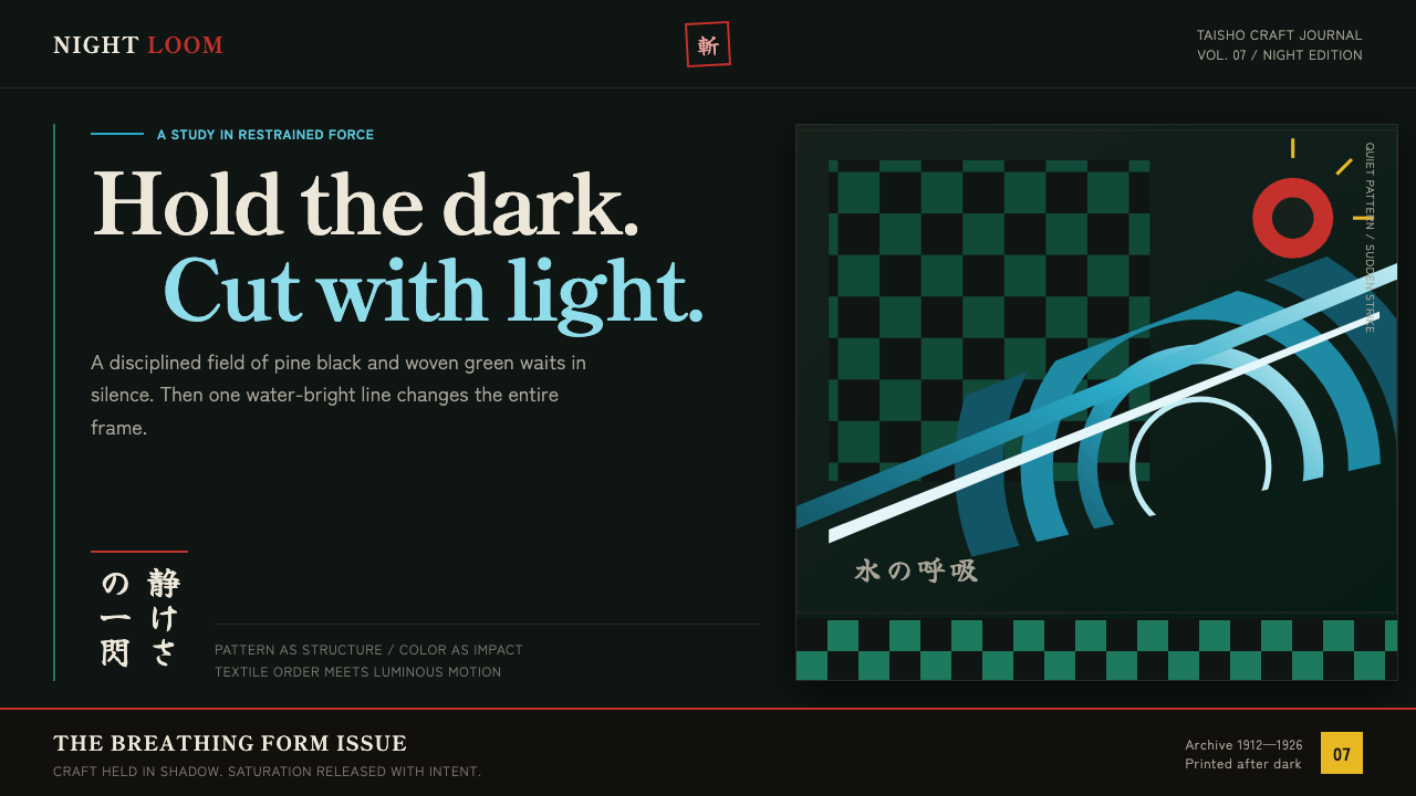 Demon Slayer (2019)Quiet craft, sudden force. Pine-black checks split beneath a water-teal strik…