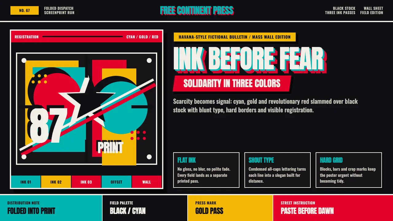
About OSPAAAL Tricontinental
OSPAAAL — the Organization of Solidarity with the Peoples of Africa, Asia and Latin America — turned a Havana ink shortage into one of the twentieth century's most electric graphic languages. Silkscreen presses limited artists to two or three flat colours per run, so designers like Alfredo Rostgaard and Olivio Martínez leaned into bold silhouettes, posterized photography and shouting slab type instead of nuance. Folded into every issue of Tricontinental magazine and mailed to more than 87 countries, these posters carried anti-colonial and anti-imperialist messages on a strong black field with cyan, gold and revolutionary red overprints. The style reads as urgent, mass-produced and defiantly unpolished — propaganda built for the wall, not the gallery.
- Origin
- Havana, Cuba
- Era
- OSPAAAL founded 1966; peak poster production 1967–1990
- Key figures
- Alfredo Rostgaard · Olivio Martínez · Rafael Enríquez
- Movements
- Third-World solidarity graphics · political silkscreen poster art
OSPAAAL Tricontinental design spec
Colors
Typography
The other 11 sections — buttons, cards, spacing, motion, techniques and more — open once you unlock. Download the DESIGN.md or send it to your AI in one click. Unlock once, yours forever.
Sign up nowStyles similar to OSPAAAL Tricontinental
Also inspired by print & type, with a close feel.
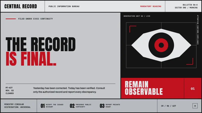 Orwell 1984 (Ministry Propaganda)Authority never blinks. Monumental black type and rationed red ink command a cold gray grid.
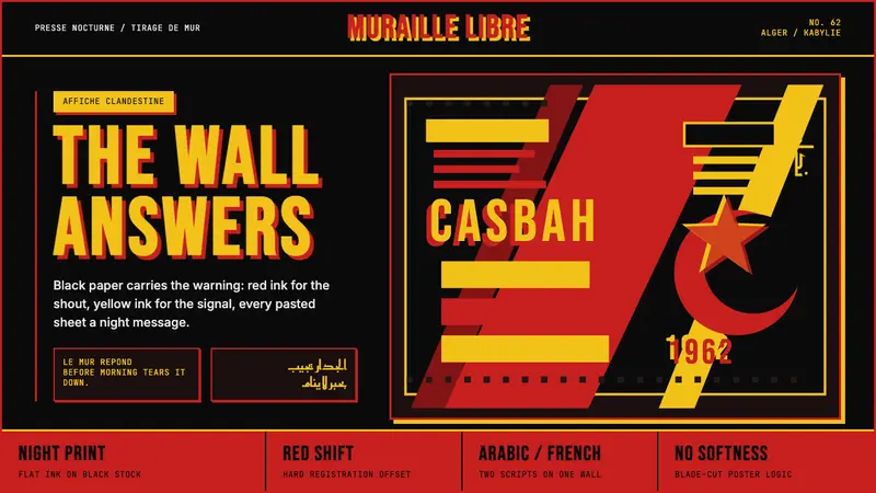 Algerian Casbah Poster (1954–1962)Every surface is a manifesto. Blood red, warning yellow, and stencil type hit black newsprint.
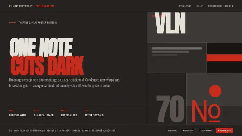 Lithuanian Poster ArtMonochrome plus one red. Charcoal photogravure field, warped Anton type, a lone red cuts the dark.
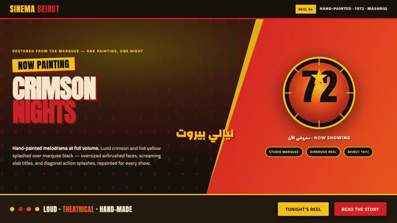 Lebanese Film PosterMelodrama at full volume. Lurid crimson and hot yellow on marquee black, slab titles screaming.