What is Attack on Titan (2013)?
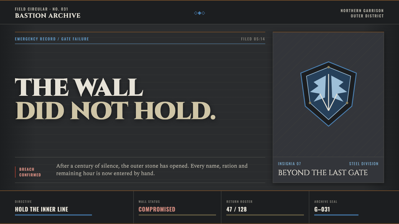
Attack on Titan turns dread into duty: stone-gray records, engraved authority, and a single blue crest held against catastrophe.
Attack on Titan (2013) in brief
Attack on Titan is a dark, fortress-bound visual language drawn from Wit Studio’s 2013 anime adaptation: a world enclosed by colossal walls, organized through wall-stone gray, khaki military drab, worn leather, and the blue-and-white Wings of Freedom crest. It feels less like entertainment branding than a garrison ledger assembled during a siege.
Its central mood is administrative dread. Titles read as if carved into masonry; rules, dividers, labels, and narrow records suggest casualty lists, supply inventories, patrol reports, and emergency notices. The design does not dramatize fear with chaos. It makes fear procedural, turning every page into evidence that survival has become an institution.
Color is deliberately scarce. Gray establishes the wall and the archive, khaki carries the physical weight of maneuver gear and military labor, steel-blue marks allegiance and resolve, and oxidized red is reserved for alarms, losses, or immediate danger. The restraint matters: an accent does not decorate the composition; it interrupts it like a flare over a breached district.
Where does Attack on Titan (2013) come from?
The visual world begins with Attack on Titan’s manga debut in 2009 and became especially legible through Wit Studio’s 2013 anime season. Its setting is defined by siege and enclosure: people live behind immense walls, and the wall is not merely a backdrop but the organizing fact behind safety, authority, memory, and panic.
The source places the franchise in Tokyo, Japan, and identifies dark seinen fantasy, post-apocalyptic military drama, and siege or walled-city imagery as its governing traditions. Together, those traditions explain why the style favors records, uniforms, insignia, stone, and emergency signals over decorative spectacle.
Hajime Isayama, Tetsuro Araki, Kyoji Asano, and Hiroyuki Sawano are named as key figures in the source material. In this design language, their shared context is best understood not as a set of isolated motifs but as a coherent atmosphere: monumental threat, military obligation, and a fragile collective identity held together under pressure.
The franchise runs to 2021, but the 2013 anime season supplies the clearest stylistic anchor for this interpretation. It is the image of a walled civilization at the instant its confidence fractures: old stone, disciplined ranks, clipped documentation, and a crest that must carry more hope than the surrounding world can comfortably support.
What defines the Attack on Titan (2013) look?
Wall-Stone Palette
The dominant field is desaturated and mineral: gray stone, dust, worn paper, weathered fabric, and khaki leather. These tones should feel accumulated rather than freshly selected, as if every surface has absorbed patrol routes, smoke, and years of containment. Bright color must remain exceptional so the environment retains its oppressive weight.
Engraved Authority
Display type should read as monumental and physically imposed, carrying the pressure of an inscription on fortification stone. The effect comes from blunt mass, restrained spacing, and a sense of compression rather than elegance. Supporting text is quieter and more bureaucratic, allowing the headline to function as a command, verdict, or memorial.
Military Ledger
Hairline rules, labels, stamps, segmented fields, and compact metadata create the sense of a maintained archive. Information is not casually placed; it appears assigned, verified, and filed. This gives pages a disciplined rhythm while making absence meaningful: an empty field can feel like an unanswered report from beyond the wall.
Crest as Oath
The blue-and-white Wings of Freedom crest is the system’s emotional center. It should be used as an insignia, seal, or institutional marker rather than repeated as wallpaper. Its value lies in concentration: against the drained surroundings, the crest becomes a visible promise of movement, loyalty, and a world beyond enclosure.
Rationed Alarm Color
Oxidized red belongs to consequence. Use it for casualties, breaches, warnings, prohibited actions, or a moment demanding immediate attention. It should never become a general-purpose accent. When red appears too often, danger becomes decorative; when it is withheld, a single red mark can make the whole composition feel suddenly unsafe.
Cracked Material Memory
Cracked stone and abraded texture should suggest history without becoming picturesque. The surface is not antique ornament; it is evidence of a structure under stress. Keep texture subordinate to legibility, appearing at edges, background bands, seals, and large quiet fields where it can imply age, scale, and damage without obscuring information.
Who shaped Attack on Titan (2013)?
Named in the source as a key figure, Isayama is inseparable from the franchise’s 2009 manga debut. The style’s persistent image of humanity organized beneath colossal walls begins with that foundational world: dread is spatial, and every visual system must answer the pressure of enclosure.
Araki is listed as a key figure for the 2013 anime context. Within this style reference, that context matters because the first Wit Studio season establishes the siege-fortress atmosphere as an immediate visual experience: wall, regiment, crest, signal, and rupture.
Asano appears among the source material’s key figures. His inclusion locates this theme within the specific 2013 anime interpretation rather than an abstract military fantasy. The result is a visual archive shaped by the franchise’s particular combination of human vulnerability, disciplined service, and immense physical barriers.
Sawano is also named as a key figure in the approved material. In the style system, his presence reinforces an atmosphere of escalation and collective resolve: the visual language should feel prepared for a report to become an alarm, and for an emblem to become a rallying point.
How do you use Attack on Titan (2013) today?
For presentation covers, treat the page as a fortress notice. Establish a broad stone-gray field or band, place one monumental title with the force of an engraved warning, and let a restrained crest or signal mark carry the only concentrated color. The cover should announce stakes before it explains subject matter.
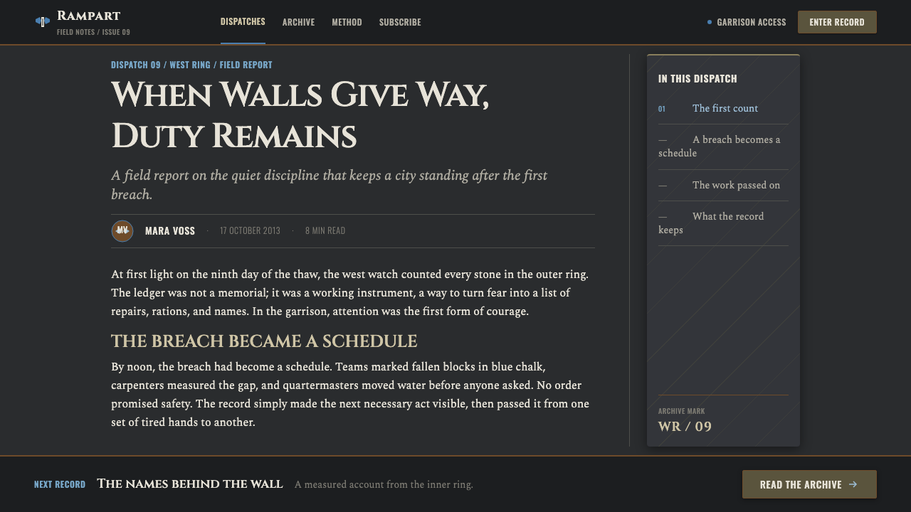
Content slides should behave like a field archive. Use ruled divisions, compact labels, and strong typographic hierarchy to separate orders, observations, names, and conclusions. On data slides, charts should feel operational rather than ornamental: subdued structural tones carry the baseline, while steel-blue identifies the protected unit or intended direction and red identifies a breach, loss, or exception.
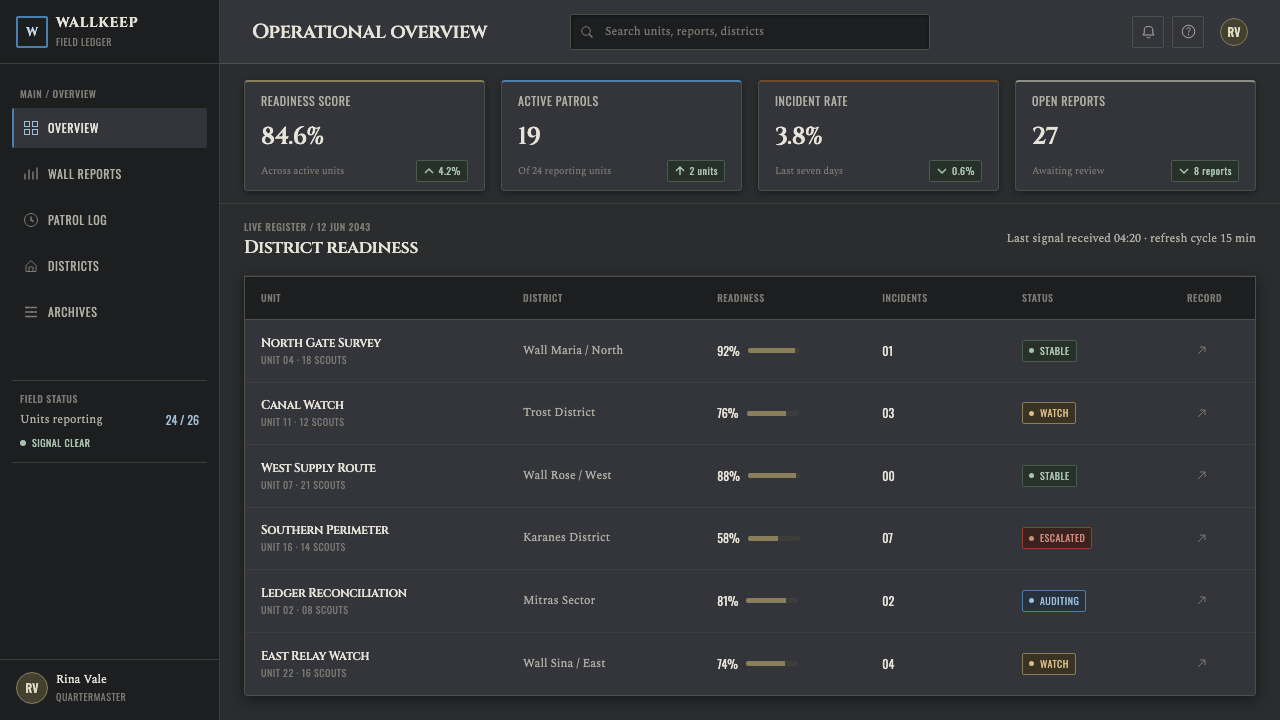
For web interfaces, this approach suits dashboards, operational consoles, incident pages, and pricing pages that need gravity rather than friendliness. Build hierarchy through broad background bands, disciplined records, bordered panels, and clear status indicators. Reserve the crest language for identity, verified states, or membership, so it retains institutional weight instead of becoming a decorative icon.
Editorial and marketing pages can use the style to frame a serious narrative. Let long-form copy occupy calm archive-like fields, use stone-textured breaks to establish chapters, and place short notices or casualty-style callouts in the margins. Campaign material should focus on duty, protection, endurance, and collective stakes; it should not imitate military paperwork so completely that reading becomes labor.
The common mistake is overusing damage, red alarms, and the Wings of Freedom crest. Cracks everywhere become theatrical wallpaper, red everywhere loses urgency, and repeated insignia becomes merchandise rather than oath. The style succeeds through controlled pressure: a largely quiet record suddenly disturbed by one breach, one signal, or one unmistakable mark of allegiance.

Attack on Titan (2013) — FAQ
Is this style simply a generic military aesthetic?
No. Military references are important, but the defining condition is enclosure. The wall, the archive, and the sense that every resource is finite distinguish it from a generic uniform-and-insignia treatment. The visual system should communicate a population living under siege, not an organization displaying power without vulnerability.
Can the Wings of Freedom crest be used as a repeated pattern?
It can, but doing so weakens its role. The crest is strongest when it behaves like a seal, unit marker, or official stamp placed at consequential moments. Repetition is more suitable for a restrained border, an archival reference field, or a secondary surface than for the primary visual field.
How should red be handled in an Attack on Titan-inspired layout?
Treat it as an emergency resource. Red should identify an alarm, casualty, breach, forbidden condition, or irreversible change. If it is used for ordinary links, decoration, and every call to action, it stops feeling like danger and breaks the visual discipline that makes the style effective.
Does the style require cracked textures on every surface?
No. Texture should imply the age and stress of the wall, not compete with content. Use it in broad quiet areas, chapter transitions, seals, and background bands. Clean ledger fields are equally important because they create the order against which damage becomes visible.
Related design styles
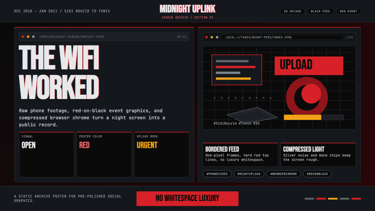 Tunisian Jasmine Revolution (2010)Raw urgency wins. Red browser grids and mono hashtags compress 3am protest in…
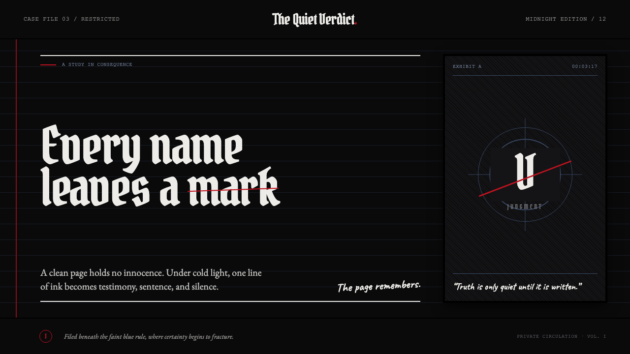 Death Note (2003)Silence becomes judgment. Bone-white blackletter and blue rules break under o…
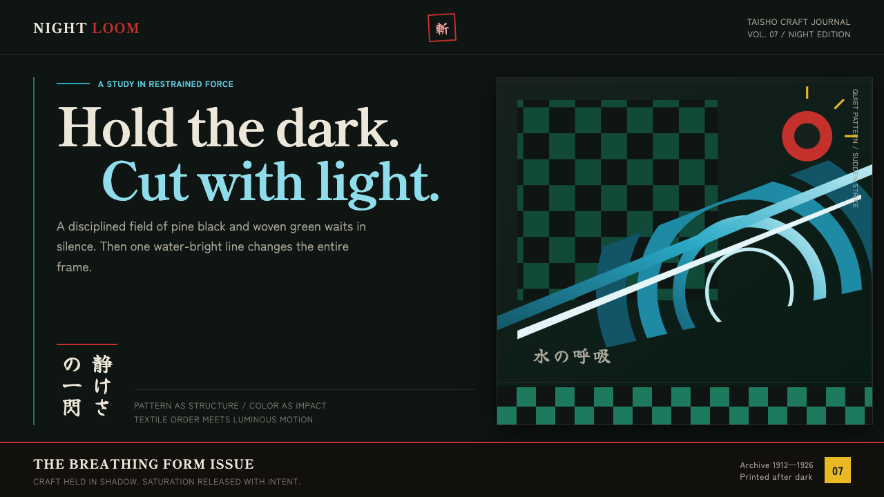 Demon Slayer (2019)Quiet craft, sudden force. Pine-black checks split beneath a water-teal strik…
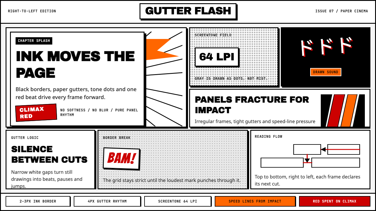 Manga Panel LayoutCinema in ink. Black panels, screentone dots, speed lines, and one red strike.
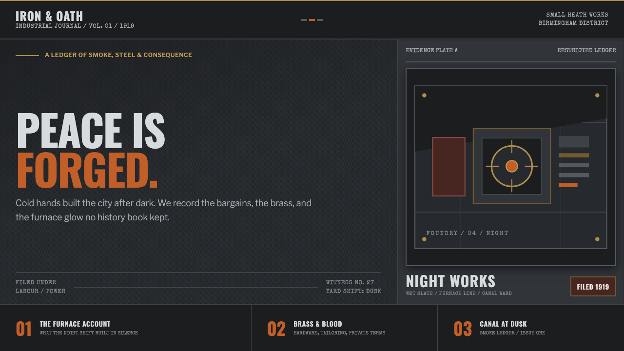 Peaky Blinders (1919)Industrial menace, struck alive. Cold slate grids meet one rare furnace-orang…
 Amores Perros New WaveRaw street cinema. Crushed black, sodium amber, Oswald credits, heavy 35mm gr…