What is Amores Perros New Wave?
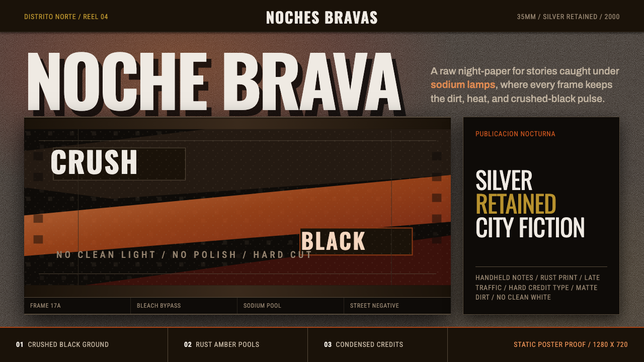
Crushed black, sodium amber, and heavy 35mm grain — the raw street cinema that launched Mexico's Nuevo Cine and never once tried to look clean.
Amores Perros New Wave in brief
Amores Perros (2000) is a design system distilled from the visual language of Alejandro González Iñárritu's debut feature film, which launched the Mexican Nuevo Cine movement and rebuilt the visual grammar of Latin American cinema around a specific technical process: bleach-bypass film development. This process retains silver in the film emulsion during processing, producing crushed black shadows, desaturated color, and a coarse, heavy grain that reads as raw and unpolished rather than glossy.
The style's identity is built around embracing imperfection as an aesthetic value. Color is pulled from the specific palette of Mexico City's sodium-vapor streetlights — a desaturated amber and rust tone rather than a clean, saturated warmth — and the overall look carries a handheld, documentary-style rawness, as if every frame was captured on the move rather than composed and lit in a controlled studio setting.
Typography follows the same anti-polish logic: stark, plain condensed lettering used for titles and credits, with no embellishment, no serif flourish, nothing that would suggest a big-budget studio production. The overall effect is intentionally gritty — grain, contrast, and a sense of urban grime are treated as essential ingredients rather than flaws to be corrected.

Where does Amores Perros New Wave come from?
Amores Perros premiered in 2000 as the debut feature of director Alejandro González Iñárritu, who worked in advertising and radio production in Mexico City before turning to film. The film's fragmented, triptych narrative structure — three interlocking stories connected by a single car crash — matched a visual approach equally committed to breaking from the polished conventions of mainstream commercial cinema, both Mexican and Hollywood, that had dominated screens in the preceding decades.
Cinematographer Rodrigo Prieto shot the film almost entirely handheld on 35mm stock across real Mexico City locations, deliberately avoiding the smooth dolly and crane work associated with big-budget productions. Prieto's key technical decision was to push the footage through bleach-bypass processing, sometimes called silver retention — a laboratory technique that skips or partially skips the bleaching step in film development, leaving silver halide crystals in the emulsion alongside the color dye layers.
This bleach-bypass process produces a distinctive visual signature: blacks crush toward near-total darkness, color saturation drops noticeably, contrast increases, and grain becomes markedly heavier and more visible than in conventionally processed film. Prieto and Iñárritu used this technique specifically to evoke the texture of Mexico City itself — its sodium-vapor streetlighting casting a desaturated amber-rust glow, its dense urban grit and visible wear, rendered with a rawness that matched the film's unflinching subject matter of class conflict, violence, and desperation.
The film's success — critical acclaim internationally, an Academy Award nomination for Best Foreign Language Film, and recognition as the breakthrough work of the Nuevo Cine Mexicano movement of roughly 1990 to 2010 — established this bleach-bypass, handheld, sodium-amber visual language as a recognized cinematic style in its own right, influential well beyond Mexican cinema and cited widely as a benchmark for gritty, documentary-inflected narrative filmmaking in the decades that followed.
What defines the Amores Perros New Wave look?
Color
The palette is desaturated amber and rust, pulled directly from sodium-vapor streetlight color temperature, set against crushed near-black shadow. Nothing in the system reads as clean or fully saturated — every color carries a slightly muddied, bleach-bypass quality.
Typography
Titles and credits use stark, plain condensed lettering with no serif ornament or decorative flourish — type that reads as functional and unpretentious rather than designed for glamour, matching the film's own unpolished credit sequences.
Heavy Grain
A coarse, visible grain texture should overlay all imagery, simulating the silver-retained density of bleach-bypass 35mm film. This grain is not subtle — it should be present enough to signal a deliberate technical and aesthetic choice, not an incidental artifact.
Crushed Blacks
Dark tones should read as crushed toward near-total darkness rather than retaining soft shadow detail — a direct visual signature of bleach-bypass processing that gives the style its high-contrast, unforgiving quality.
Handheld Rawness
Imagery and layout should evoke the quality of handheld, documentary-style capture rather than smooth, controlled studio composition — a sense of movement and immediacy rather than staged perfection.
Urban Grit and Wear
Surfaces and textures should carry visible signs of wear and urban grime — nothing pristine or freshly painted. This grit reinforces the style's commitment to raw, unflinching street-level realism.
Anti-Polish Discipline
Every design decision should actively resist the smooth, glossy conventions of mainstream commercial visual language — no gradient sheen, no glamorous lighting, no clean typography. Imperfection is the governing aesthetic principle, applied consistently rather than as an occasional accent.

Who shaped Amores Perros New Wave?
Director of Amores Perros, whose debut feature launched the Nuevo Cine Mexicano movement and established a fragmented, triptych narrative structure paired with an equally unflinching, unpolished visual language that rejected mainstream commercial cinema's smooth conventions.
Cinematographer who shot Amores Perros almost entirely handheld on 35mm and pushed the footage through bleach-bypass processing, producing the crushed blacks, desaturated amber-rust color, and heavy grain that define this style's core visual signature.
How do you use Amores Perros New Wave today?
Applying this style well starts with fully committing to imperfection as a design principle — grain, crushed shadow, and desaturated color should be applied consistently and deliberately, never treated as an occasional filter effect layered thinly over an otherwise clean design.
For presentation slides, the style makes a striking cover treatment with a heavily grained, high-contrast image and stark condensed title type set directly over crushed shadow, evoking a film credit sequence rather than a corporate title slide. Content slides should keep typography plain and unadorned, letting grain texture and desaturated amber tones carry the visual mood rather than decorative color accents.
For web interfaces, the style suits entertainment, documentary, or culturally-rooted storytelling platforms where raw authenticity is a desired brand quality — hero imagery can carry heavy grain overlay and crushed-black treatment, with sodium-amber accent tones reserved for key interactive states. The style resists clean, corporate dashboard contexts where clarity and polish are the primary goals.
For editorial and marketing contexts, the style rewards full-bleed, grain-heavy imagery paired with stark condensed headline type, evoking the urgency and rawness of street-level documentary photography. Captions and body text should stay plain and functional, avoiding any typographic flourish that would contradict the anti-polish sensibility.
A common mistake is applying grain and desaturation as a light, subtle filter rather than committing fully to the heavy, high-contrast bleach-bypass look, which results in a diluted, generic 'vintage film' effect rather than this specific style's raw intensity. Another mistake is pairing the gritty visual treatment with polished, decorative typography, which contradicts the plain, unpretentious lettering the style depends on.

Amores Perros New Wave — FAQ
What exactly is bleach-bypass processing, and why does it matter to this style?
Bleach-bypass, also called silver retention, is a film-development technique that skips or partially skips the bleaching step, leaving silver halide crystals in the emulsion alongside the color layer. This produces crushed blacks, reduced color saturation, increased contrast, and heavier grain — the specific technical process behind every visual characteristic that defines this style. It matters because the look is not a generic 'gritty filter' but the direct result of a real, identifiable film-processing decision.
Is this the same as a generic 'gritty urban' or 'grunge' design style?
Related but more specific. Generic grunge styles often layer texture and distress marks decoratively over an otherwise clean design. This style is rooted in one precise film-processing technique and one specific city's streetlight color temperature — Mexico City's sodium-vapor amber-rust — giving it a more disciplined, technically grounded identity than a loosely applied 'gritty' mood.
Can this style work with brighter, more saturated colors?
It resists this. The desaturation itself is a direct consequence of the bleach-bypass process the style is built around — brightening or saturating the palette would contradict the core technical reference and make the style read as generic urban grit rather than this specific cinematographic tradition.
What kind of imagery pairs well with this style?
Street photography, handheld documentary-style footage, and imagery showing visible urban wear and sodium-lit night scenes reinforce the style's identity. Polished studio photography or brightly lit, evenly exposed imagery works against the grain and should be avoided.
Does this style suit calm, corporate, or minimal product contexts?
Not naturally. The style's entire identity is built around raw imperfection, high contrast, and urban grit — qualities that work directly against the clean, controlled, reassuring visual language most corporate and minimal products aim for. It suits contexts where raw authenticity, cultural specificity, or documentary-style storytelling are the desired values instead.
Related design styles
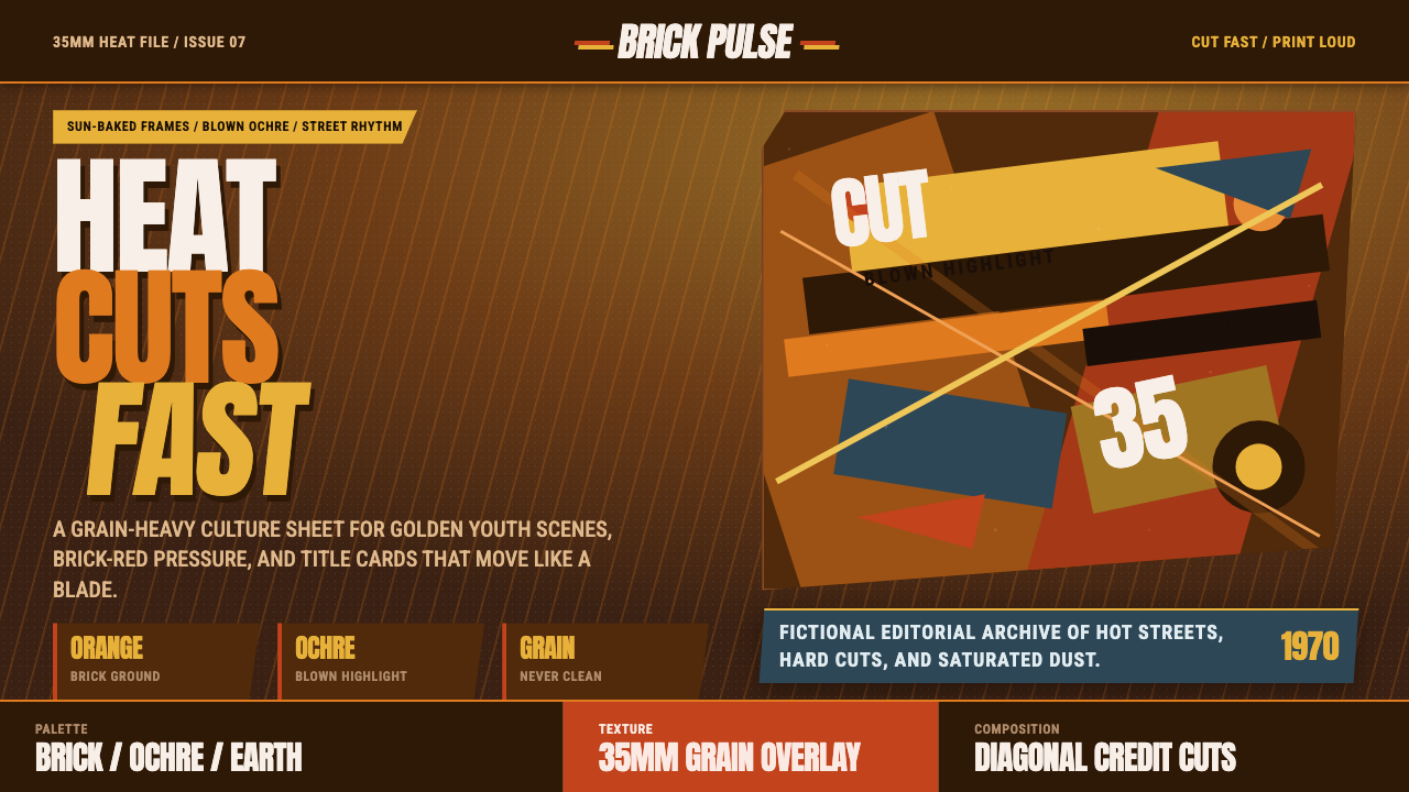 City of God FavelaHeat refuses polish. Orange brick, ochre glare, diagonal cuts, and grain do t…
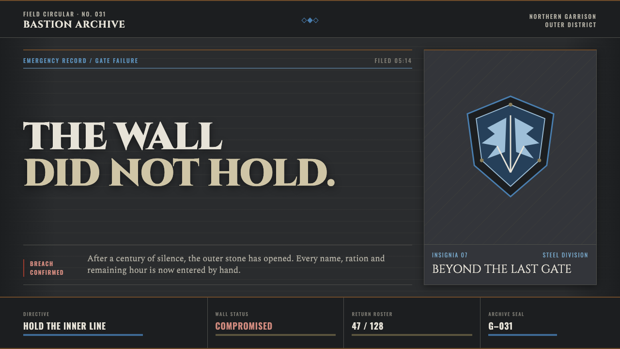 Attack on Titan (2013)Dread becomes duty. Stone-gray bands, engraved caps and one steel-blue crest…
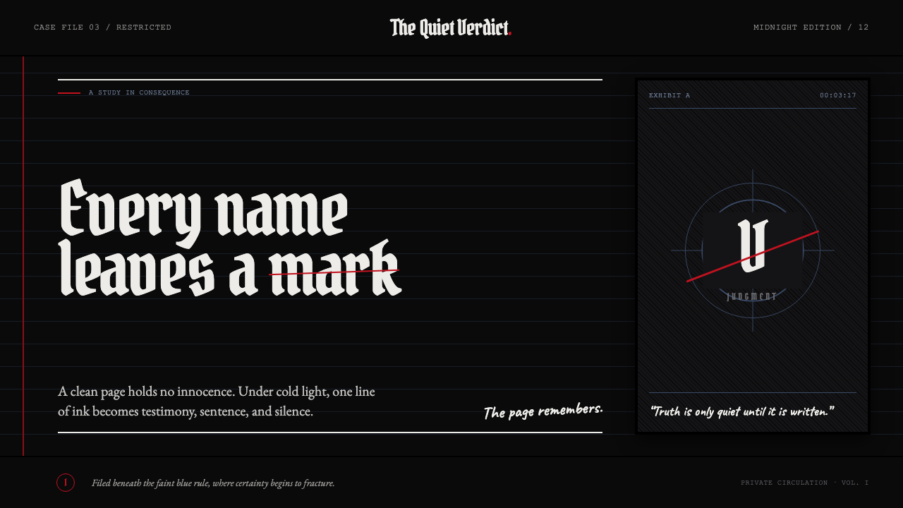 Death Note (2003)Silence becomes judgment. Bone-white blackletter and blue rules break under o…
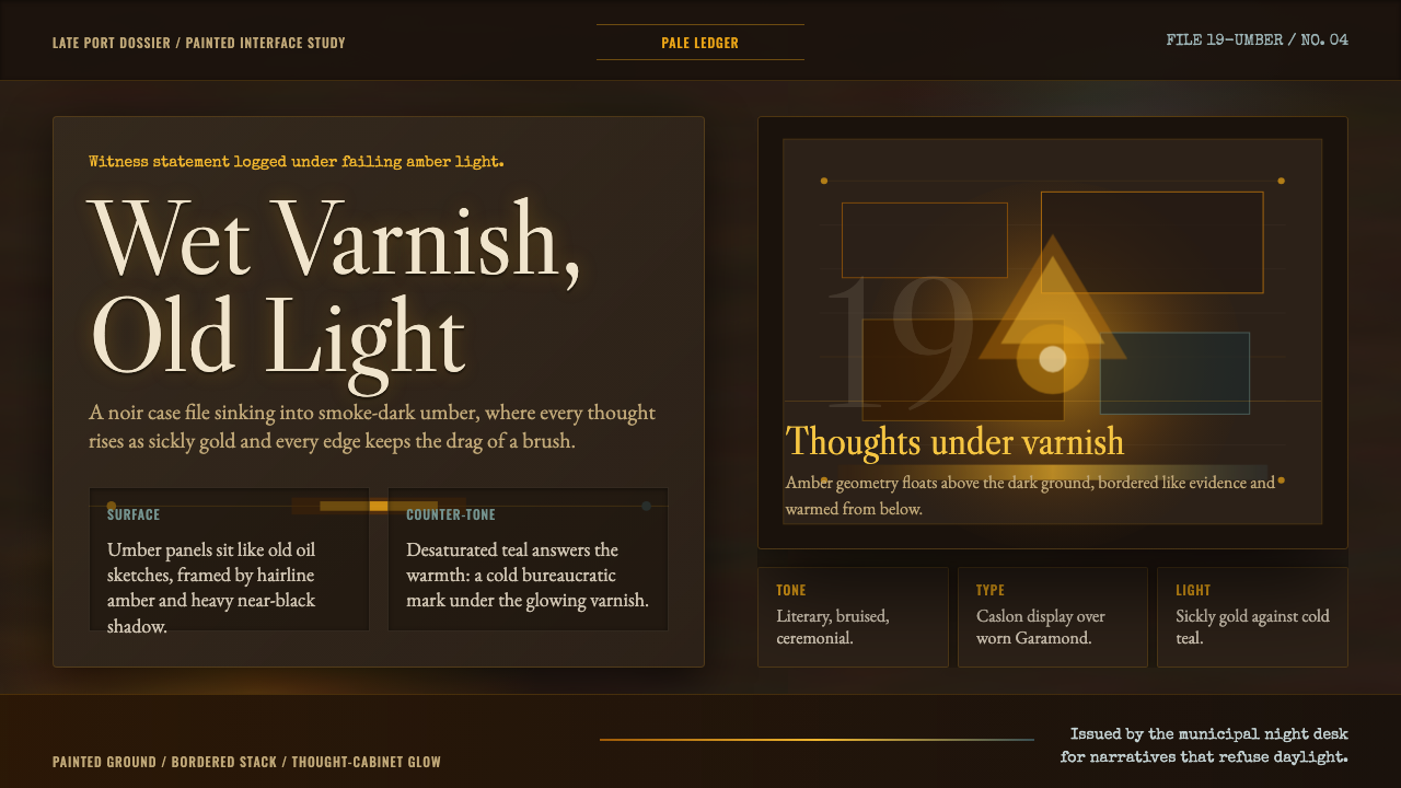 Disco ElysiumNoir rot glows from within. Amber Caslon type cuts through varnish-dark umber.
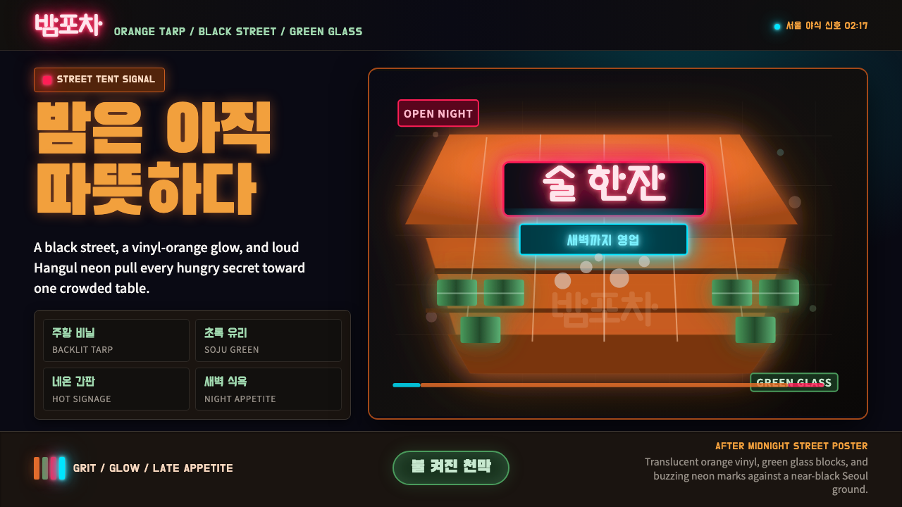 Pojangmacha Soju TentNight appetite glows. Orange tarp panels burn over black, cut by Hangul neon…
 Belizean Garifuna PuntaNight rhythm burns. Indigo fields, flame-orange serif type, and flag stripes…