What is City of God Favela?
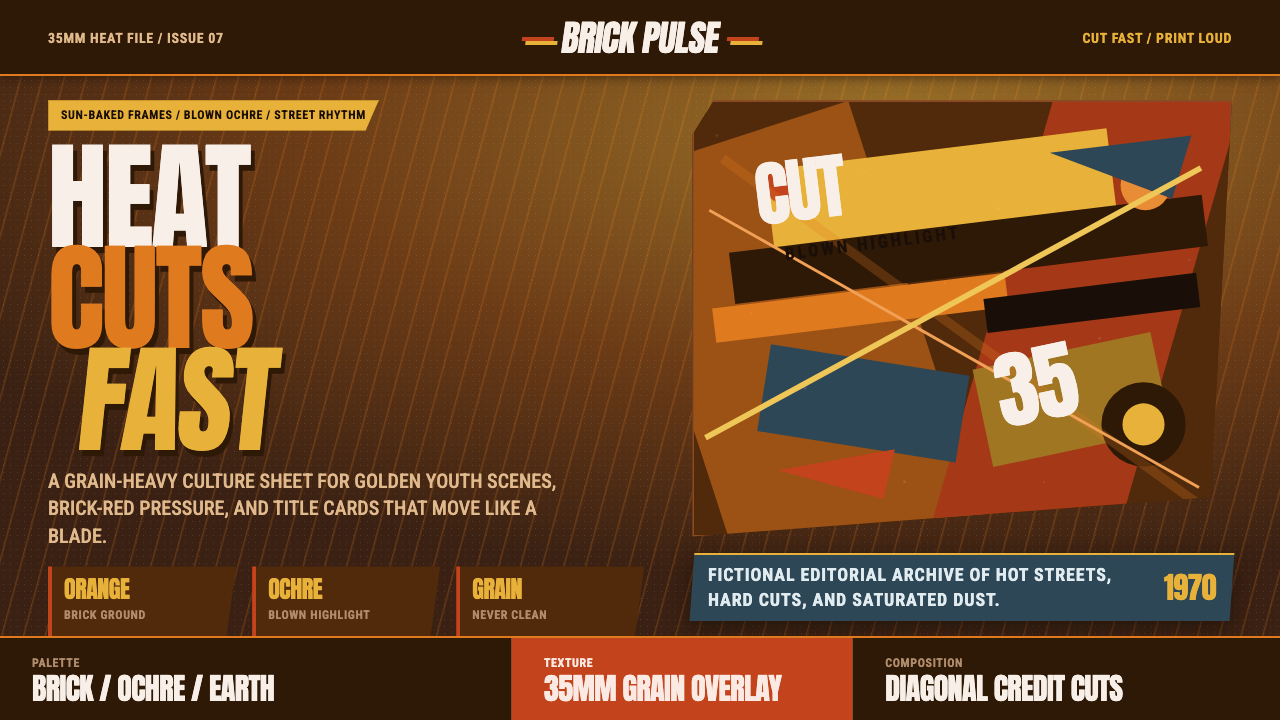
City of God renders youth and violence as blinding tropical light — hot orange brick, blown-out ochre highlights, and a film grain so persistent it becomes part of the palette, all cut together with the percussive rhythm of a knife being sharpened.
City of God Favela in brief
City of God Favela is a hot, high-contrast visual system built on sun-baked orange brick and dusty earth tones, with highlights allowed to blow out into pure, glaring white-ochre rather than being tamed or protected. Film grain sits over every surface, treated as a defining texture rather than a flaw to be cleaned up. Nothing in this system is calm or evenly lit — the light itself feels aggressive, the way equatorial sun looks on unshaded concrete and brick at midday.
The palette carries a narrative logic, not just a mood. Early, youth-driven sequences run golden, saturated, and warm — color as adrenaline, as the thrill of a life that still feels like an adventure. As the story darkens, the grading cools and desaturates, pulling warmth and saturation out of the frame the way violence pulls hope out of a life. The same design system is built to hold both temperatures, using the shift between them as its own storytelling device.
Motion and rhythm are as central to the system as color. Title and credit graphics move in fast, diagonal, almost percussive cuts, echoing a specific kind of urgency — the same rhythm as a blade being drawn quickly across a sharpening stone. This is a kinetic graphic language, built from sharp angles and rapid rhythm rather than smooth, composed transitions, and it refuses the polish that most design systems reach for by default.
Where does City of God Favela come from?
Cidade de Deus — City of God — is a real neighborhood on the western edge of Rio de Janeiro, built in the 1960s as a state housing project intended to relocate residents displaced from central favelas and flood-prone areas. Over the following decades, official neglect and economic marginalization left the district underserved, and by the 1980s it had become one of the districts most associated with the cocaine trade and the armed conflict between rival factions that came with it. That decades-long arc — from a resettlement project to a synonym for urban violence — is the historical spine that director Fernando Meirelles' 2002 film dramatizes.
The film, based on Paulo Lins' novel drawing on his own upbringing in the neighborhood, follows several generations of characters across roughly the 1960s to the 1980s, and its visual grammar was built specifically to carry that time span. Cinematographer César Charlone developed a grading approach where the look of the image itself tracks the story's arc: golden, high-saturation warmth for the earlier, more youthfully reckless chapters, shifting toward cooler, thinner, more desaturated color as the cocaine trade escalates the violence in later decades. The image ages and hardens the way the characters do.
That aesthetic sits in a clear lineage with Cinema Novo, the Brazilian film movement that emerged in the 1960s around directors committed to socially conscious, low-budget, formally inventive filmmaking that turned its camera on poverty and inequality rather than looking away from it. City of God updates that commitment with a more kinetic, internationally fluent visual language — fast diagonal cuts, freeze-frames, and a documentary-adjacent handheld immediacy — and is widely counted among the films that define the 2000s Brazilian new wave, a generation of Brazilian cinema that carried Cinema Novo's social seriousness into a more commercially and technically ambitious register.
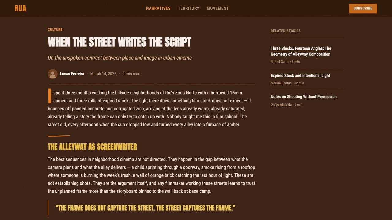
City of God earned major international critical recognition in the years following its release, including several Academy Award nominations, and its visual style — sun-blown highlights, hot orange-and-ochre grading, ever-present grain, and kinetic title design — became an internationally recognized shorthand for a specific kind of unglamorized, high-energy urban realism, referenced well beyond Brazilian cinema in photography, documentary filmmaking, and design work depicting heat, youth, and precarious urban life.
What defines the City of God Favela look?
Color Grading
The system holds two temperatures tied directly to story. Early and youth-driven sequences run golden, saturated, and warm; as the narrative darkens, the grading cools and desaturates. This isn't a fixed palette so much as a designed trajectory — a system meant to be applied across a warm-to-cool arc rather than held at one static setting throughout.
Ground & Materials
Orange brick and dusty, sun-baked earth are treated as the system's literal ground materials, not just its color references. Surfaces should read as exposed to heat and weather — worn, unshaded, slightly bleached by sun — rather than clean or protected. This grounds the palette in a specific physical place rather than leaving it as an abstract warm color scheme.
Blown Highlights
Light is allowed to overexpose into pure glare rather than being held back and protected the way most polished design treats brightness. This produces a harsh, high-contrast quality — a sense of light that is too strong to look at directly — which reads as authentic tropical midday sun rather than a controlled studio glow.
Film Grain
Grain is ever-present across every surface and is treated as a load-bearing texture, not an artifact to be smoothed away. It signals unpolished, documentary-adjacent authenticity — footage that feels handled and real rather than digitally pristine — and its consistent presence is part of what keeps the hot palette from feeling clean or commercial.
Kinetic Title Rhythm
Title and credit graphics move in fast, diagonal, percussive cuts rather than smooth fades or gentle slides — a rhythm built to feel urgent, almost like a blade being sharpened. This kinetic quality extends the film's editing energy into the graphic design layer itself, so titles feel like part of the story's pulse rather than a neutral wrapper around it.
Handheld Immediacy
Framing favors tight, urgent proximity over composed, symmetrical stillness — the sense of a camera caught up in the action rather than observing it from a careful distance. Applied to design, this translates into layouts that feel close and immediate rather than airy and detached, with elements pushed toward the edges of the frame rather than centered and calm.
Who shaped City of God Favela?
The director of City of God, credited with translating Paulo Lins' novel into a kinetic, visually aggressive film language — fast cuts, freeze-frames, a documentary-adjacent immediacy — that broke from more restrained, classically composed crime cinema and became internationally influential in its own right.
The film's cinematographer, responsible for the grading approach that ties color temperature directly to the story's emotional arc — golden warmth for the earlier, youth-driven chapters, cooling and desaturating as the narrative darkens. That structural use of color is one of the most widely studied aspects of the film's visual design.
City of God's social seriousness and willingness to turn the camera on poverty and inequality descends directly from Cinema Novo, the 1960s Brazilian film movement built around low-budget, formally inventive, socially engaged filmmaking. The later film updates that lineage's commitments with a far more kinetic, internationally fluent visual style.
City of God is widely counted among the films that defined a broader wave of internationally acclaimed Brazilian cinema in the 2000s, one that carried Cinema Novo's social conscience into a more commercially ambitious, technically polished, and globally distributed register.
The broader design tradition of fast, rhythmic, percussively cut title and credit sequences — as distinct from smooth, restrained title design — is a defining influence on this system's graphic layer, translating the film's editing energy directly into type and transition motion.
How do you use City of God Favela today?
This style reads as raw, urgent, and high-energy rather than composed or institutional, which makes it a strong choice for storytelling that wants to feel authentic and lived-in rather than polished. It transfers well to anything built around heat, youth, urban life, or documentary-adjacent realism, and it works against products that need to feel calm, orderly, or conservatively trustworthy.
On presentation slides, a cover works well as a full-bleed, grain-covered image in the hot orange-and-ochre grading, with the title cut in on a fast diagonal rather than fading in gently. Content slides should keep the grain and warm palette consistent rather than switching to a cleaner, corporate treatment for readability — legibility should come from strong contrast and confident scale, not from stripping the texture out. Data slides can put the system's own warm-to-cool arc to work: a timeline or trajectory chart that visually cools and desaturates as it progresses reads as native to this style in a way a neutral bar chart never will.
For web interfaces, the style suits documentary and journalism platforms, music and youth-culture brands, and streaming or media products that want to signal heat, urgency, and unpolished authenticity. It is a poor match for finance, healthcare, or enterprise software, where the same grain and blown-out contrast that reads as authentic here will instead read as chaotic or untrustworthy — calm, orderly contexts need a different visual argument entirely.
In editorial and marketing work, the style is especially strong for long-form journalism, music culture, and documentary-adjacent marketing. Section breaks can use the same fast, diagonal, kinetic-cut logic as the film's title design instead of a plain horizontal rule, and photography should be graded warm-to-hot with grain intact rather than left in a neutral, unretouched state.
The most common mistake is flattening the grain out of the system — a version with clean, grain-free color loses the documentary authenticity the whole style depends on and starts to look like a generic warm Instagram filter instead. A second common error is applying warmth without the high-contrast, blown-highlight quality that gives the palette its heat; a gentle, evenly lit warm tone reads as cozy rather than sun-scorched. A third is using the diagonal kinetic cuts purely as decoration, disconnected from any real sense of urgency or rhythm, which turns a motivated design device into empty flair.

City of God Favela — FAQ
Is this just a generic 'warm color grading' look?
No. Plenty of styles use warm color grading, but this system pairs that warmth with a specific narrative-tied structure — a designed shift from golden saturation toward cooler desaturation — plus ever-present grain and blown, harsh highlights rather than soft, protected ones. A generic orange filter with none of those other elements is not this style; the temperature arc, the grain, and the blown light have to work together.
Can this style work in a clean, minimal layout?
Not without losing what makes it distinctive. Minimal layouts typically rely on generous negative space, restrained color, and untextured surfaces — all things this style actively resists. The heat, grain, and blown highlights need density and contrast to read properly; stripped down to a clean, minimal treatment, the system loses its sense of place and starts to look like a generic warm palette rather than this specific one.
How do you suggest film grain and heat without literal analog film effects?
Treat grain as a consistent, subtle texture applied across every surface rather than an occasional overlay on photography alone, and push contrast so highlights genuinely blow out rather than staying gently bright. Warmth should feel aggressive and saturated rather than soft — closer to direct midday sun than to a golden-hour glow. The combination of persistent texture, hard contrast, and confident saturation reads as this style even without any literal film-simulation effect.
What kinds of products suit this style, and which don't?
It suits documentary and journalism platforms, music and youth-culture brands, and any storytelling product that benefits from feeling urgent, real, and unpolished. It struggles in finance, healthcare, and enterprise contexts, where the same grain and hard contrast that read as authenticity here instead read as chaos or a lack of professionalism — those categories need calm and order, which this style is deliberately not offering.
How does this relate to generic 'gritty' or grunge design trends?
They share a surface interest in texture and imperfection, but this style is far more specific. Generic grunge design borrows scratches, noise, and distress marks as an abstract aesthetic with no particular reference point. This system is grounded in a specific place, a specific film's narrative structure, and a specific lineage running through Cinema Novo and the Brazilian new wave — the heat, the grain, and the warm-to-cool arc all carry meaning tied to that source rather than functioning as decoration borrowed from a broader trend.
Related design styles
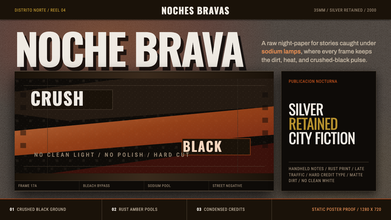 Amores Perros New WaveRaw street cinema. Crushed black, sodium amber, Oswald credits, heavy 35mm gr…
 Attack on Titan (2013)Dread becomes duty. Stone-gray bands, engraved caps and one steel-blue crest…
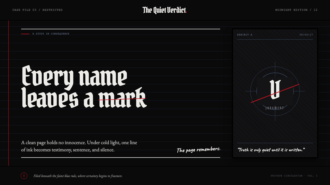 Death Note (2003)Silence becomes judgment. Bone-white blackletter and blue rules break under o…
 Disco ElysiumNoir rot glows from within. Amber Caslon type cuts through varnish-dark umber.
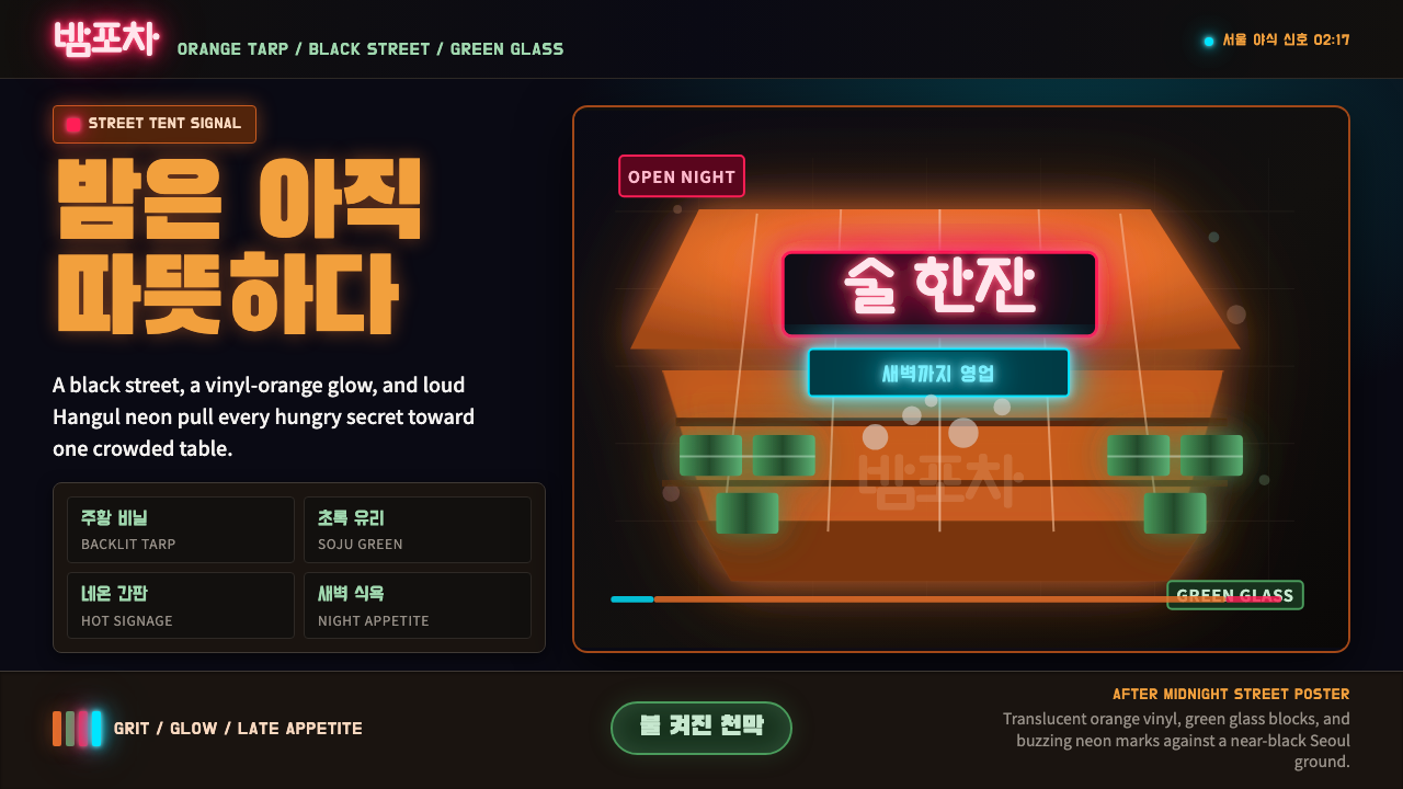 Pojangmacha Soju TentNight appetite glows. Orange tarp panels burn over black, cut by Hangul neon…
 Belizean Garifuna PuntaNight rhythm burns. Indigo fields, flame-orange serif type, and flag stripes…