What is Persona 5?
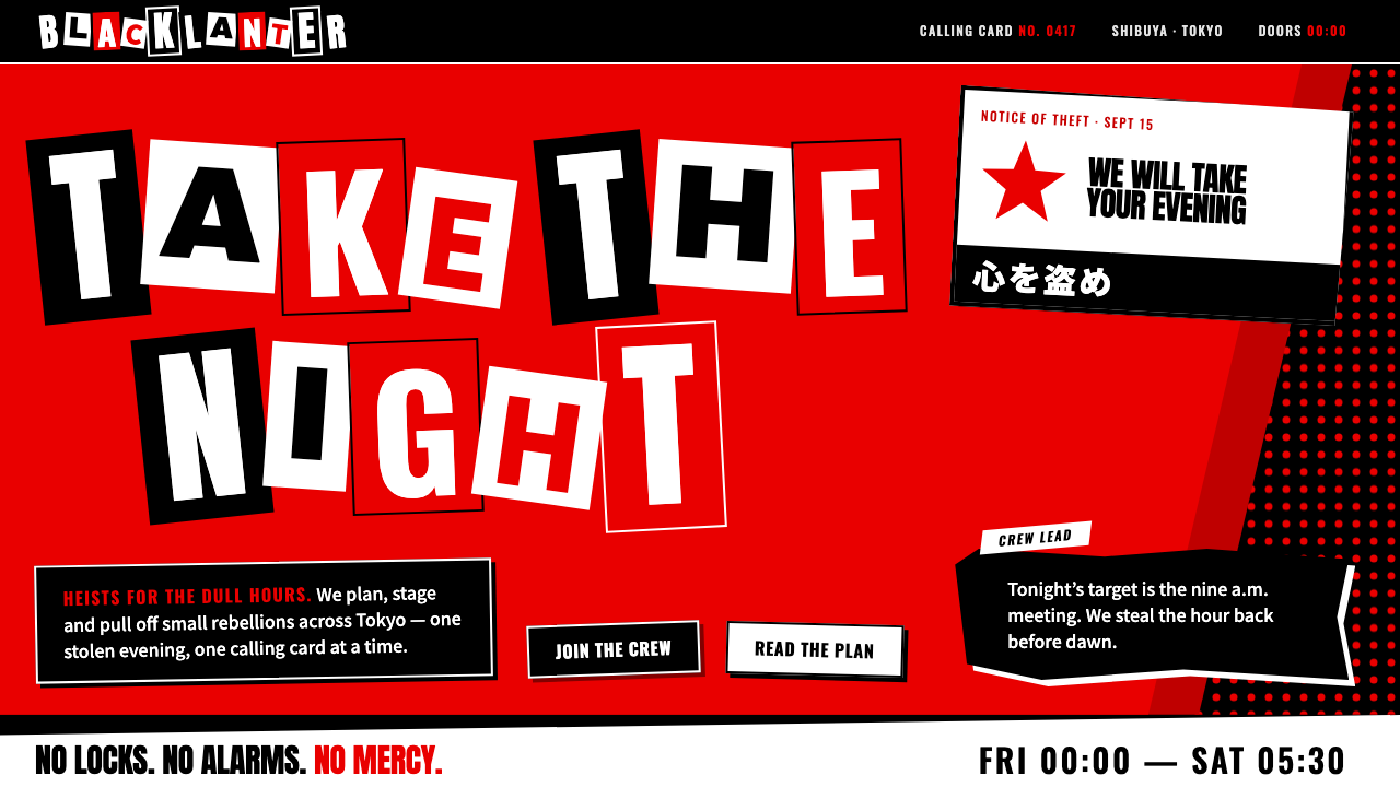
Persona 5 proved that a menu can be an act of rebellion: black, blood red and white paper cut-outs, all tilted off level and slashing across the screen.
Persona 5 in brief
The Persona 5 interface is the user-interface language of Atlus's 2016 role-playing game about a group of Tokyo high-school students who lead double lives as the Phantom Thieves of Hearts, stealing the distorted desires of corrupt adults. It is widely regarded as the most quoted game interface of its decade, and designers who have never played the game can still recognise it from a single screenshot.
The look is built from almost nothing: a black ground, one blood red, and white cut-outs. Menu words tilt and overlap, panels have jagged, sawtooth edges like torn paper, and titles are assembled letter by letter from clipped typefaces in the manner of a ransom note. Nothing is soft. Fills are flat, like inks on a print run, shadows are hard and offset, corners are never rounded, and transitions do not fade; they slash in on the diagonal.
The key idea is attitude as system. Every element on screen behaves as though it was cut out and pasted by someone in a hurry who nevertheless knew exactly what they were doing. That tension between apparent chaos and tight control is what separates a convincing Persona 5 style from a merely messy one.

Where does Persona 5 come from?
Persona 5 was released in Japan in September 2016 and worldwide in April 2017, with an expanded edition, Persona 5 Royal, following in October 2019. It was developed at Atlus under the direction of Katsura Hashino, who led the series, and its themes of rebellion against stifling authority, hidden identities and the freedom to change one's own heart were mirrored in its interface from the first menu onward.
The visual concept was driven by Shigenori Soejima, the series' long-time art director and character designer, whose work on earlier Persona games had already established a stylish, pop-inflected look. Persona 5 pushed that sensibility much further. Masayoshi Sutoh, working on user-interface design, is credited with much of the animated menu language that gives the game its restless energy, where every screen seems to arrive with a flourish and leave with a cut. The soundtrack by Shoji Meguro, with its jazz and acid-jazz flavours, completed the effect, and the interface and music were designed to feel like one gesture.
Three traditions feed the style. The first is the Japanese role-playing game itself, a genre with a long history of menu-heavy play in which the interface is on screen for hours, so a distinctive menu becomes a signature. The second is punk zine and ransom-note collage, the cut-and-paste lettering of fanzines, protest posters and anonymous letters, which supplies the mismatched, clipped letterforms and the sense of something made by hand in a hurry. The third is the gentleman-thief picaresque, the romantic tradition of the elegant outlaw, which explains why the rebellion is so well dressed.
Because the setting is contemporary Tokyo, the design also borrows from the everyday graphic noise of the city: shop signs, magazines, train advertisements. But it filters all of it through a strict colour discipline, which is the reason the result feels unified rather than cluttered. Since its release, the interface has been imitated, parodied and used as a teaching example in game-design courses, and it has influenced everything from music-streaming promotions to fashion lookbooks.
What defines the Persona 5 look?
Color
A near-total black ground, one saturated blood red and white. That is the entire palette. Red is used as a weapon, slashed across panels, selection bars and titles, while white is reserved for cut-out blocks and the most important text. Because there is no third hue, the contrast always reads at once, even at a glance in a dark room.
Typography
Titles are built like ransom notes, each letter drawn from a different clipped typeface, sometimes on its own white or red tile, always slightly rotated. Body and menu text is heavy, condensed and high in contrast. The rule is variety within control: letters may disagree with each other, but they never disagree with the palette.
Shape and angle
Nothing is level and nothing is rounded. Panels have jagged, sawtooth or torn edges, rectangles are cut into slanted polygons, and text sits on tilted baselines. Zero-radius corners and diagonal cuts provide the sense of speed and aggression, as though each element had been struck with a blade.
Surface and shadow
Fills are flat, like print inks laid down in a single pass, with no gradients or glows. Shadows are hard and offset, as if a second paper layer sat behind the first. The effect is a stack of cut paper rather than a lit three-dimensional scene.
Motion
Transitions do not dissolve; they slash. Elements wipe in along a diagonal, snap to position, and leave with an equally decisive cut. Motion is quick, rhythmic and tied to the music, and it exists to make every selection feel like an event.
Layering and density
Screens are dense but legible. Several tilted layers overlap, yet the hierarchy is always clear because the most important item sits on white or red against the black. The density is part of the rebellion: it refuses the tidy, spacious look of corporate interfaces.

Who shaped Persona 5?
Director and producer of the Persona series at Atlus. He steered Persona 5 toward themes of rebellion and personal freedom, and insisted that the interface should express those ideas rather than merely serve as a functional layer.
Art director and character designer of the series. His pop-inflected, high-contrast illustration style defined the look of Persona 5 and gave the interface its attitude of stylish defiance.
User-interface designer credited with much of the game's animated menu language, in which screens arrive and leave with diagonal cuts and quick, rhythmic transitions.
Composer of the soundtrack. His jazz-flavoured, high-energy music is inseparable from the interface; the menus are choreographed to the beat, which is why the style feels like a performance and not just a layout.
How do you use Persona 5 today?
For slides, start with the cover. A black ground, a title assembled from mismatched cut-out letters on white and red tiles, and a single red slash behind it will do more than any photograph. Content slides should keep the dark ground with white text, using red only to mark the one item that matters. Tilt a few elements slightly, but keep the main text block close to level so that the audience can still read it.
For data slides, treat each chart as a cut-out. Place a white panel with an angled edge against the black, use red for the key series and white or pale tones for the rest, and keep labels in heavy, high-contrast type. A single bold number set large inside a torn-edge block works far better here than a dense table.
For web interfaces such as dashboards and pricing pages, the style suits games, music, entertainment, streetwear and youth-culture products. A pricing page can show each tier as a tilted white block against black, with the recommended tier picked out in red. Navigation can use slanted selection bars and diagonal wipes, but keep forms and long text on calm, level surfaces, since reading is the first thing the style puts at risk.
For editorial and marketing work, the style excels at event posters, launch teasers, festival lineups and zine-like covers. Ransom-note headlines, a restricted palette and sharp offset shadows give a campaign an immediate personality. Pair every loud element with one quiet, readable block so that the viewer always knows where to rest the eye.
The most common mistake is to treat the style as permission for chaos. Persona 5 is tightly controlled: three colours, hard edges, consistent angles. Adding extra hues, soft shadows, rounded corners or gradients turns it into generic grunge. A second mistake is to tilt everything, including long paragraphs; tilt headings and decorative blocks, and leave body text readable.

Persona 5 — FAQ
What is the Persona 5 UI style?
It is the interface language of Atlus's 2016 role-playing game: a black ground, one blood red and white cut-outs, with tilted menu words, sawtooth panel edges, ransom-note titles, flat fills, hard offset shadows, square corners and transitions that slash in on the diagonal. It expresses rebellion through strict, consistent rules.
Why does the style use only black, red and white?
Restraint is what makes the loudness work. With only three colours, every contrast is immediate and the interface stays readable even when elements overlap at odd angles. Adding more hues would dilute the punk-poster effect and make the layout feel arbitrary rather than deliberate.
Is it the same as grunge or punk graphic design?
It borrows from punk zine collage but is far more disciplined. Classic grunge tends to favour texture, noise and muddy layering, whereas Persona 5 uses clean flat fills, crisp edges and a three-colour system. It looks rebellious precisely because it is so controlled.
Can I use it for a serious business product?
Rarely as a whole, but elements can be borrowed. The full style suits entertainment, music, fashion and youth-oriented brands. For a business product, use it in small doses, such as a campaign page or a feature highlight, and keep the core interface calmer and level for long reading and data entry.
How do I keep text readable when everything is tilted?
Tilt only headings, tiles and decorative blocks, and keep paragraphs level. Place body text on solid white or black panels with strong contrast, limit line length, and use red only for emphasis, never for long passages. Control is what keeps the rebellion legible.
Related design styles
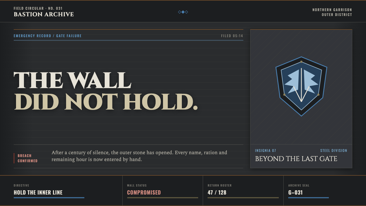 Attack on Titan (2013)Dread becomes duty. Stone-gray bands, engraved caps and one steel-blue crest…
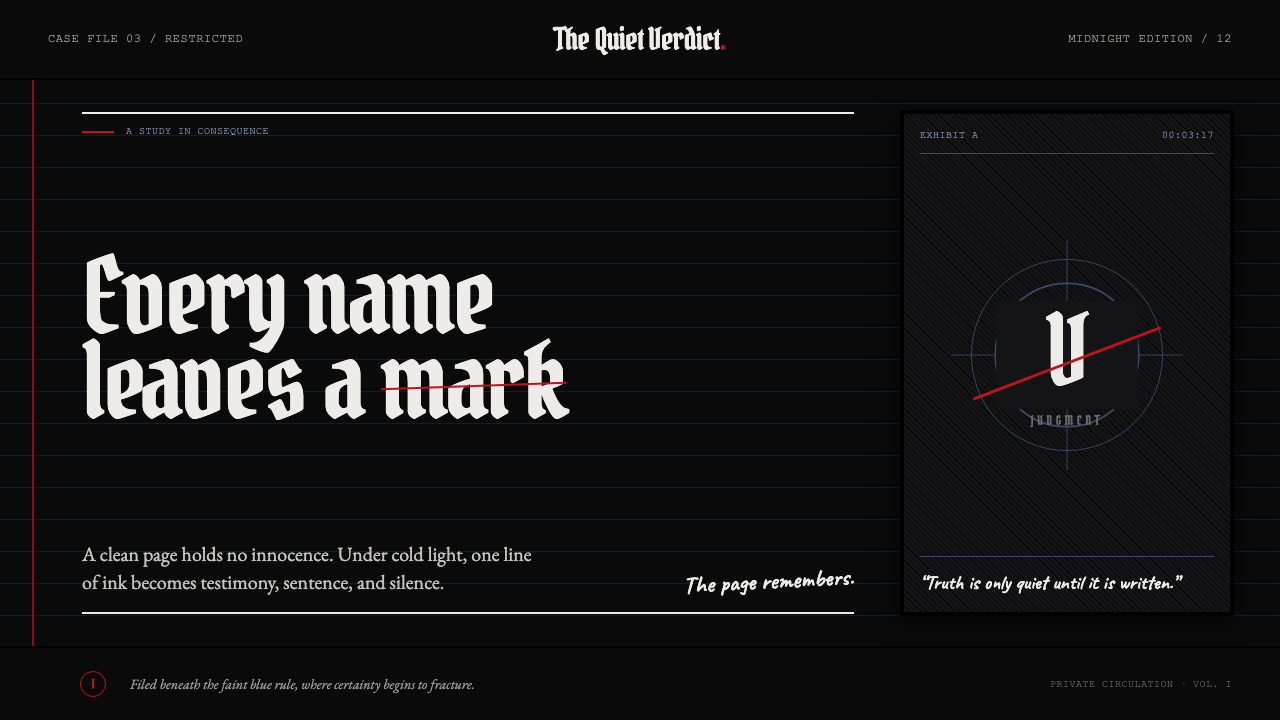 Death Note (2003)Silence becomes judgment. Bone-white blackletter and blue rules break under o…
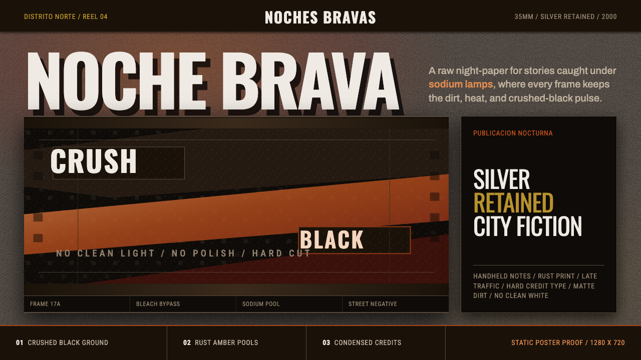 Amores Perros New WaveRaw street cinema. Crushed black, sodium amber, Oswald credits, heavy 35mm gr…
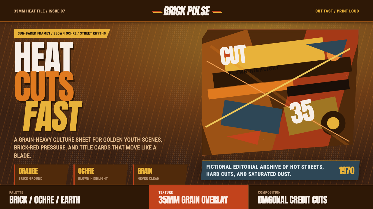 City of God FavelaHeat refuses polish. Orange brick, ochre glare, diagonal cuts, and grain do t…
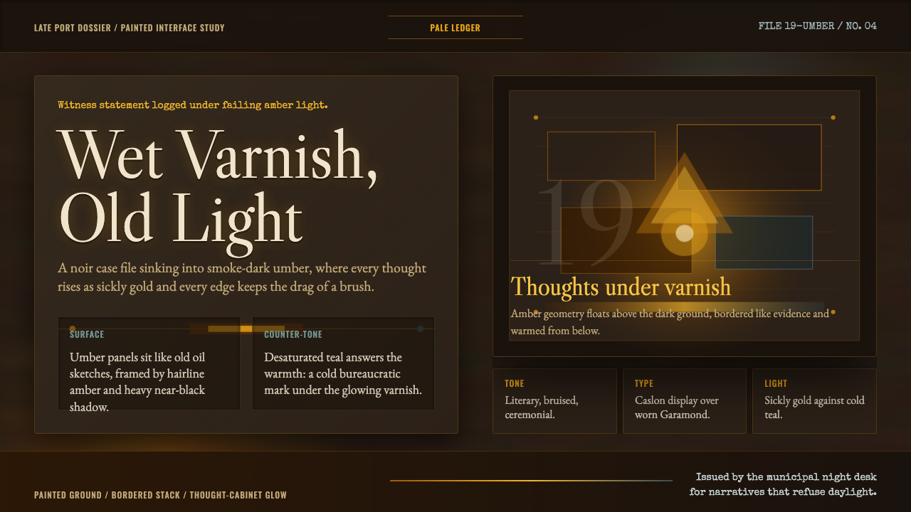 Disco ElysiumNoir rot glows from within. Amber Caslon type cuts through varnish-dark umber.
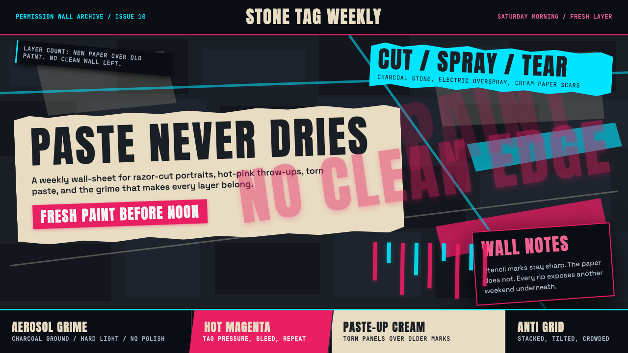 Melbourne Laneway Stencil (Hosier Lane)Permission-wall maximalism. Magenta tags slash charcoal bluestone and cream p…