What is Death Note (2003)?
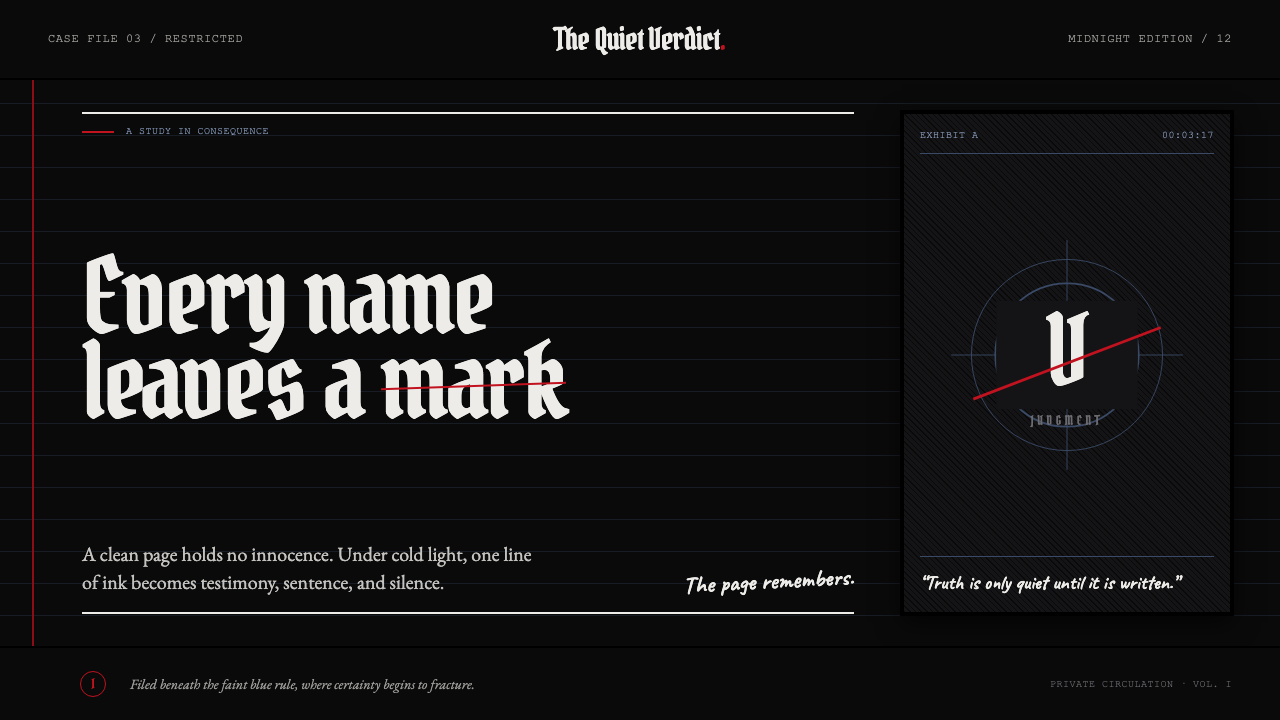
Silence becomes judgment: bone-white blackletter and blue notebook rules fracture beneath a single red strike.
Death Note (2003) in brief
Death Note is a dark visual language drawn from the coldest, most operatic register of mid-2000s manga. Bone-white marks emerge from near-black voids; cross-hatched shadow builds pressure rather than atmosphere; blackletter title cards make language feel ceremonial and severe. The notebook’s faint blue rules supply the only dependable grid.
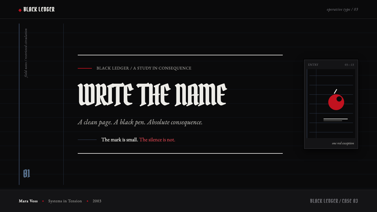
Its palette is an argument through restraint. Black and bone-white establish the world, while blue appears as a cool trace of order. Red is the sole chromatic interruption: an apple, a droplet, or a crossed-out name. It is punctuation, never a decorative field, so each appearance reads as a verdict.
The resulting mood is judicial, monastic, and quietly monstrous. A teenager’s desk is lit as though it were a courtroom. The style treats a ruled page under a spotlight as its governing image: dense, painstaking ink where consequence gathers, then cold emptiness everywhere else. A clean page and a black pen become dangerous objects.
Where does Death Note (2003) come from?
Death Note belongs to a 2003–2006 manga serialization and a 2006–2007 anime adaptation. Its public context is Tokyo: the manga is associated with Shueisha’s Weekly Shōnen Jump, while the adaptation is associated with Madhouse. Those production facts frame the style as an image system that moved between printed page and animated screen without abandoning its central tension between writing and judgment.
The supplied record names Tsugumi Ohba, Takeshi Obata, Tetsurō Araki, and Yoshihisa Hirano among its key figures. Their presence matters here as the authorized creative constellation behind a work whose identity cannot be separated into image, dramatic intensity, and sound-like rhythm. The article’s visual vocabulary should therefore remain focused on the approved material: dark-fantasy character design, gothic manga inking, and psychological shōnen pressure.
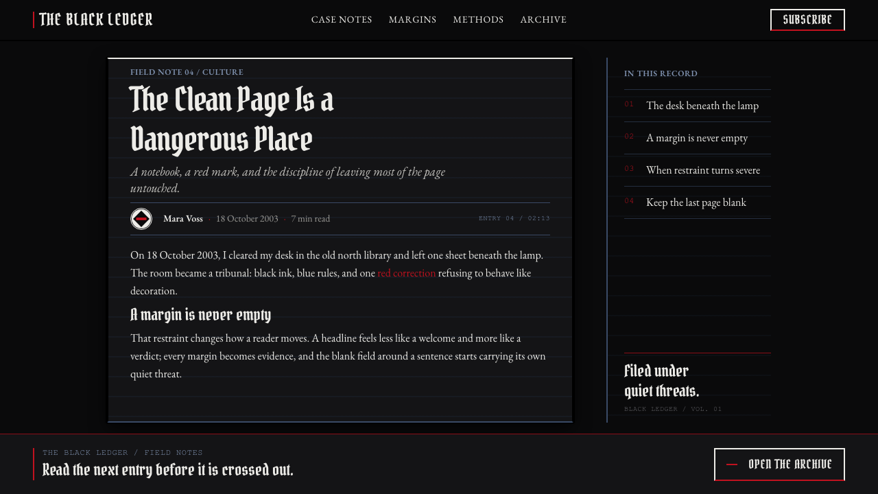
Rather than treating darkness as simple decoration, this system organizes it as evidence. Near-black fields isolate pale marks; ruled paper turns writing into a procedural act; cross-hatching makes shadow feel accumulated and deliberate. The result is not generalized horror imagery. It is a controlled visual environment in which language, recordkeeping, and attention take on the gravity of judgment.
What defines the Death Note (2003) look?
Near-Black Void
The background behaves like a sealed chamber rather than an empty canvas. Pale ink must earn its visibility against it, which makes isolated text, hands, objects, and facial planes feel exposed under examination.
Bone-White Ink
White is not soft illumination. It is a stark mark against darkness, used to cut forms free and to give typography, paper, and highlights an almost forensic clarity.
Blue Ruled Order
Faint blue notebook rules provide the system’s quiet structure. They imply procedure, repetition, and a record that can be read back, while staying too restrained to become a decorative pattern.
Red as Punctuation
Red belongs to events, not surfaces. An apple, droplet, or crossed-out name interrupts the monochrome field with the force of a correction, accusation, or irreversible decision.
Cross-Hatched Pressure
Cross-hatching is dense where tension must gather and absent where silence must remain. It gives shadow a worked, physical density instead of dissolving it into soft cinematic atmosphere.
Blackletter Judgment
Blackletter title treatment makes language feel inherited, formal, and punitive. It is most effective as a threshold or declaration, not as an all-purpose reading face, because its severity needs surrounding silence.
Who shaped Death Note (2003)?
The supplied source identifies Tsugumi Ohba as a key figure in Death Note. Within this style system, the crucial idea is that written language is never neutral: names, lines, and records carry narrative consequence and visual weight.
The supplied source identifies Takeshi Obata as a key figure. The approved visual language foregrounds gothic manga inking, cross-hatched shadow, bone-white marks, and dark-fantasy character presence rather than ornamental excess.
The supplied source identifies Tetsurō Araki among the key figures connected to the 2006–2007 anime adaptation. The adaptation belongs to the same controlled contrast system: darkness holds the frame while a small marked event acquires outsized consequence.
The supplied source identifies Yoshihisa Hirano as a key figure. In an educational application of this theme, that credit supports treating the aesthetic as a complete dramatic register, where visual restraint, interruption, and suspense work together.
How do you use Death Note (2003) today?
For presentation covers, begin with a near-black field and one bone-white title treated as a declaration. Let a blue ruled fragment establish the page’s order, then reserve red for a single consequential interruption. The cover should feel less like a poster and more like evidence placed beneath a lamp.
For content slides, use the notebook rule as a subtle alignment guide and keep the reading field disciplined. Dense explanatory text belongs in clearly bounded areas; surrounding emptiness should remain cold and purposeful. Blackletter can mark a chapter opening or warning, while the main reading voice should stay plainly legible.
For data slides, translate the theme into contrast and procedural clarity rather than theatrical decoration. Use pale marks against darkness to distinguish categories, blue rules to orient reading, and red only for the finding that changes the interpretation. A crossed line can signal exclusion or finality when the meaning is explicit.
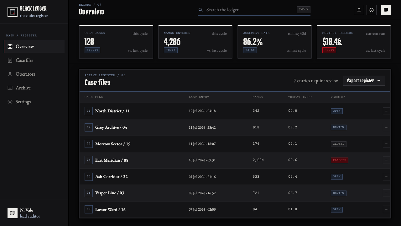
For web interfaces, this language suits dashboards, analytical surfaces, and pricing contexts that benefit from scrutiny, consequence, and clear hierarchy. Keep the interface grounded in dark voids and pale information, using the ruled motif to organize tables, records, or comparisons. Red should identify decisive states, not every clickable element.
For editorial and marketing work, make writing itself the central visual object: a headline, a rule, a marked name, and a large area of silence can carry more tension than illustration. The common mistake is overusing red, gothic type, and hatching at once. Once every element announces danger, nothing feels consequential; reserve intensity for the actual turning point.
Death Note (2003) — FAQ
Is this simply a black-and-red horror style?
No. The system depends on a much narrower relationship: near-black space, bone-white ink, faint blue notebook rules, and red as a rare punctuation mark. Its force comes from recordkeeping, isolation, and judgment, not from using dark colors to create generic horror.
Can red be used for buttons, labels, and every alert?
That would weaken the theme. In the source language, red marks an apple, a droplet, or a crossed-out name: it signals an event with consequence. Use it only where the interface or composition needs the viewer to recognize a decisive break.
How should blackletter be used without harming readability?
Treat it as a ceremonial title treatment or a threshold marker. It can introduce a section, name a decisive moment, or frame an opening statement. Keep sustained explanatory reading in a straightforward, highly legible voice so that blackletter retains its judicial severity.
Does the notebook rule need to be visibly present everywhere?
No. It is a layout law, not wallpaper. A faint fragment, a restrained line rhythm, or an orderly record-like structure can be enough to imply the notebook. If rules become dominant patterning, the page loses the cold emptiness that makes the system tense.
Related design styles
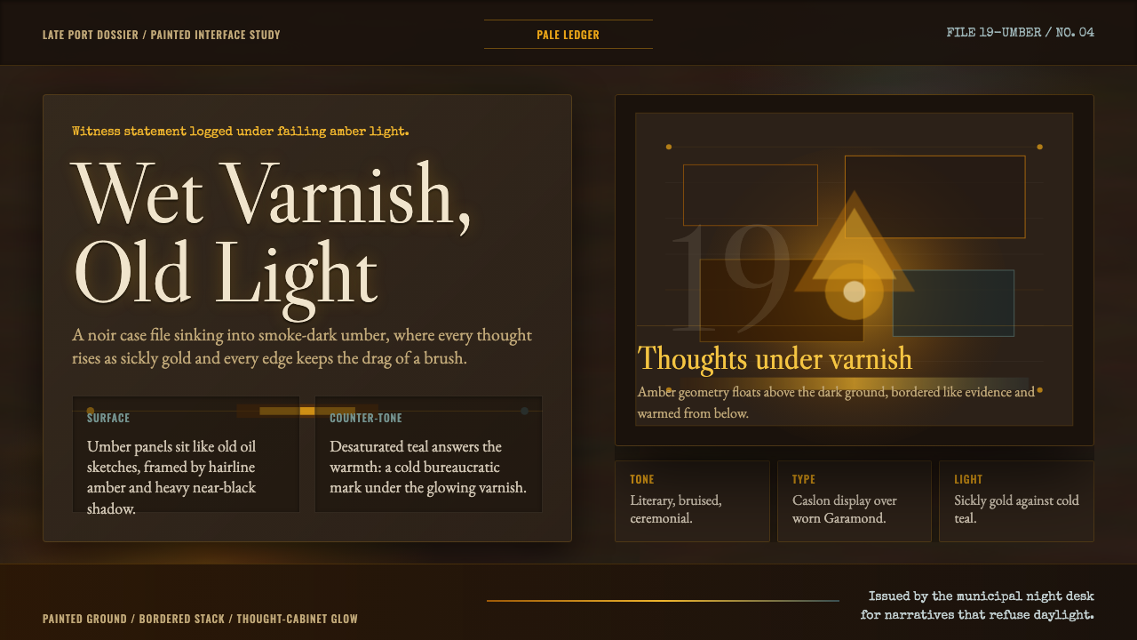 Disco ElysiumNoir rot glows from within. Amber Caslon type cuts through varnish-dark umber.
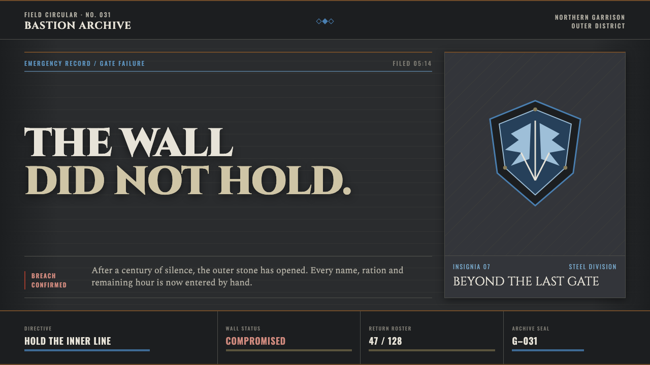 Attack on Titan (2013)Dread becomes duty. Stone-gray bands, engraved caps and one steel-blue crest…
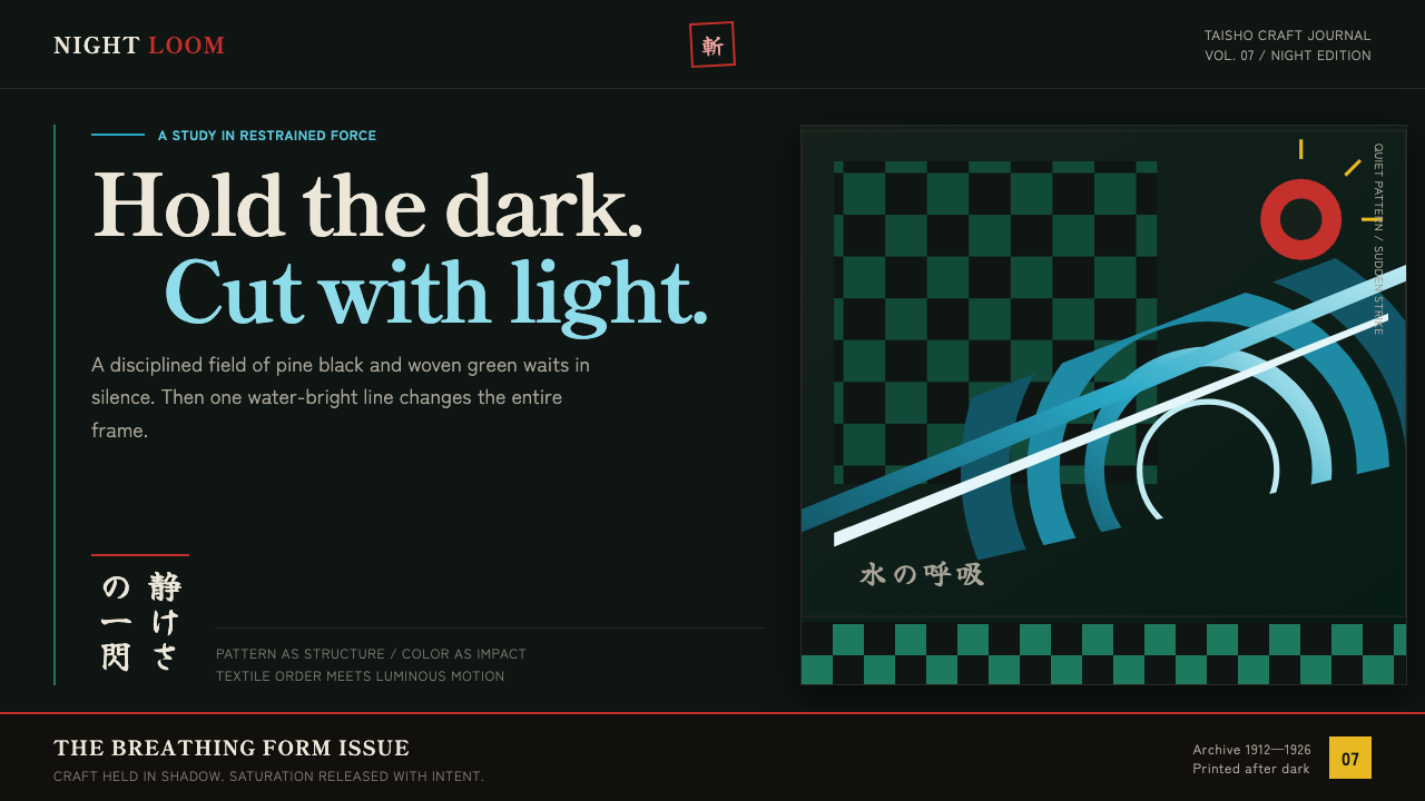 Demon Slayer (2019)Quiet craft, sudden force. Pine-black checks split beneath a water-teal strik…
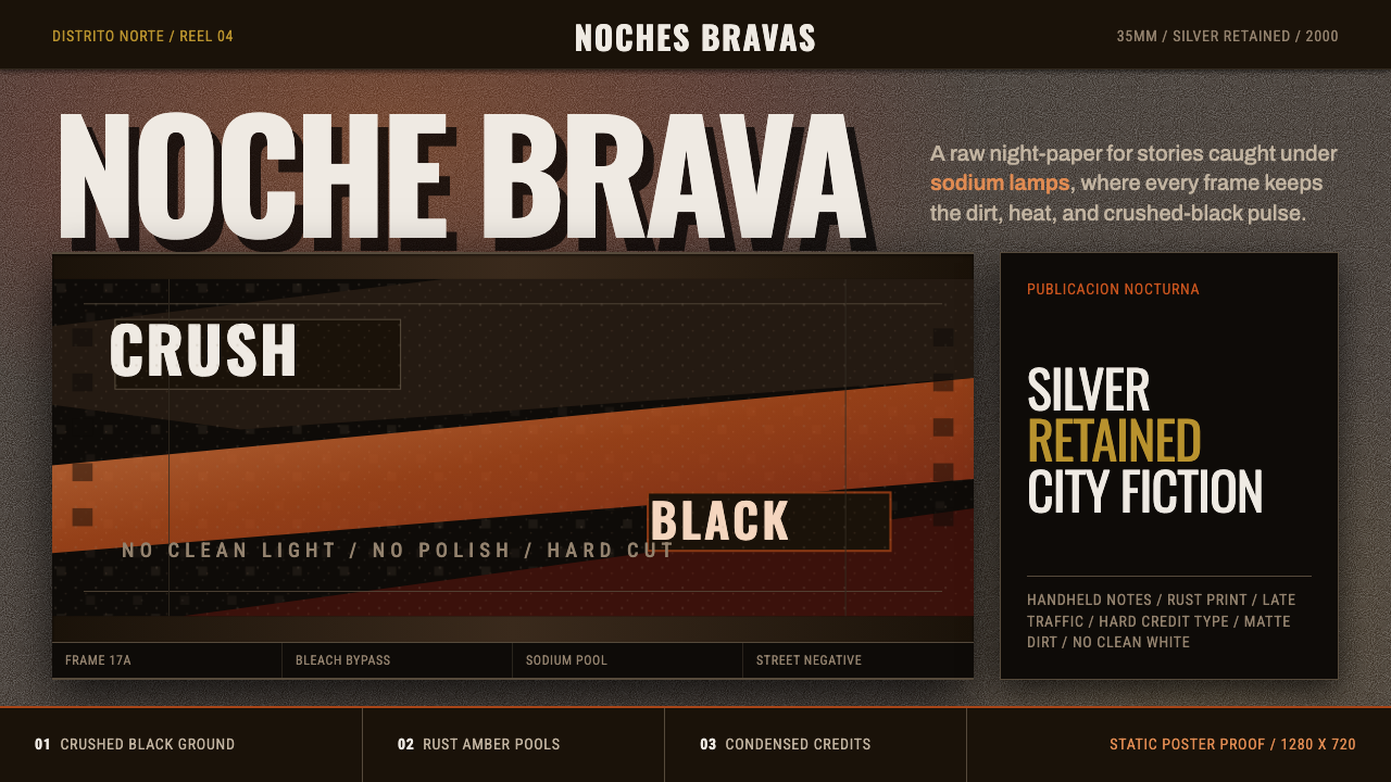 Amores Perros New WaveRaw street cinema. Crushed black, sodium amber, Oswald credits, heavy 35mm gr…
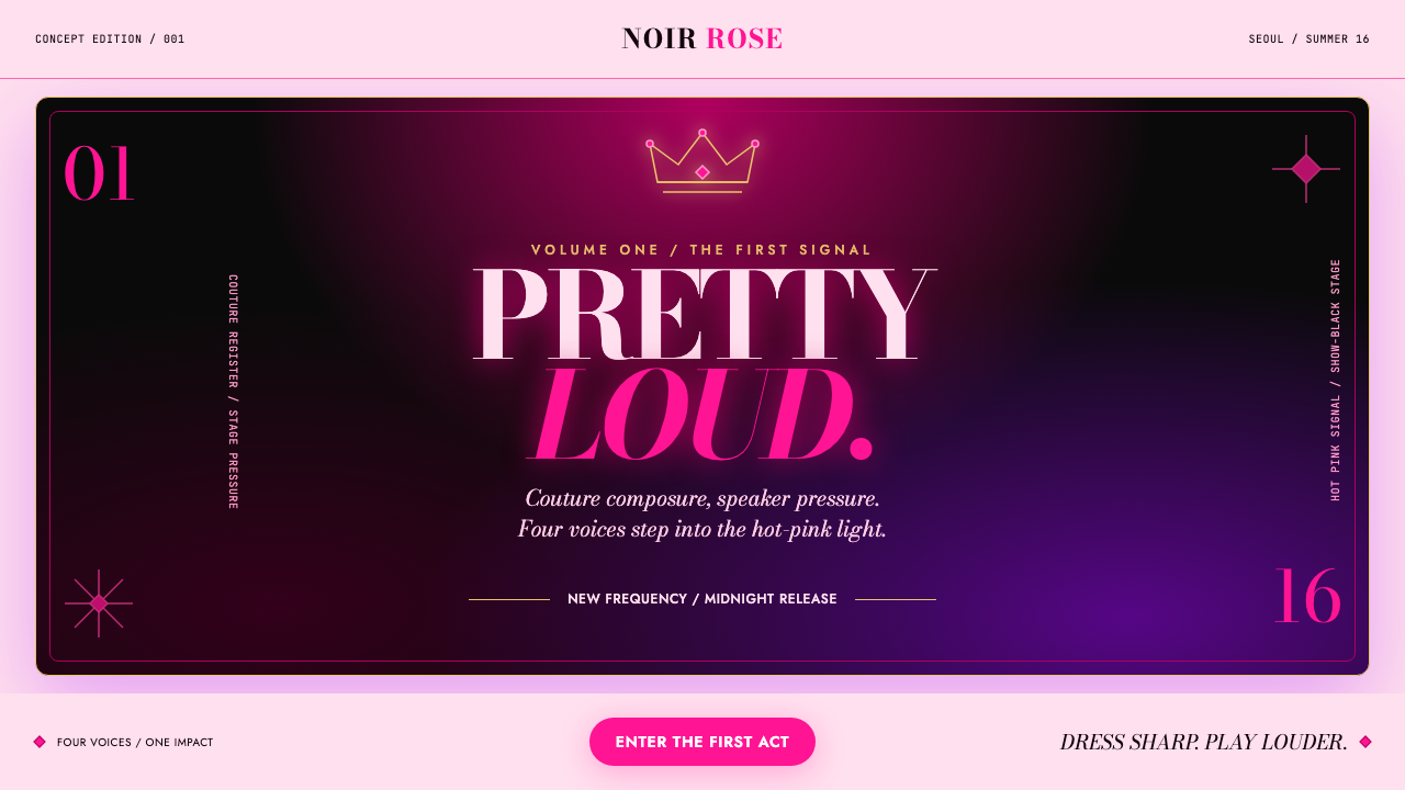 BLACKPINK (2016 Debut Era)Couture hits at full volume. Hot pink, show-black and Bodoni lock onto a spot…
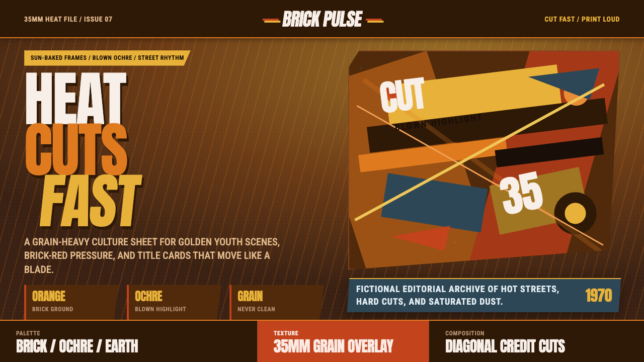 City of God FavelaHeat refuses polish. Orange brick, ochre glare, diagonal cuts, and grain do t…