What is BLACKPINK (2016 Debut Era)?
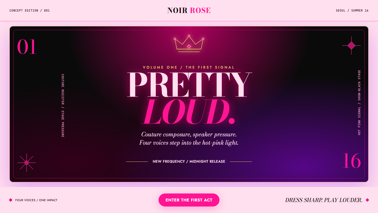
BLACKPINK’s 2016 debut era turns hot pink, show-black, couture serif type, and a floating crown into an entrance that feels less like a campaign and more like a spotlight switching on.
BLACKPINK (2016 Debut Era) in brief
BLACKPINK 2016 Debut Era is a visual style drawn from the group’s arrival in August 2016: a debut concept-photo sensibility expanded into a reusable design system. Its central collision is immediate and theatrical. Shocking magenta pink lands against pure show-black, creating an image that is glamorous, forceful, and impossible to read as neutral. A jewelled crown floats above the composition as a literal crest, giving the system a clear focal symbol without making the layout feel ceremonial or traditional.
The style treats the page like a stage before a performance. Backgrounds carry the glow of concert LED screens rather than the quiet depth of a gallery wall. Black creates the void around the performers; pink breaks that void with volume and attitude. A restrained LED purple can extend the electronic atmosphere, while champagne gold supplies a small note of polish. The palette is deliberately narrow, so each color arrives with a distinct job instead of blending into general decoration.
Typography supplies the couture register. Bodoni-style serif lettering brings sharp contrast, editorial poise, and a fashion-image sensibility to titles and names. It is not used to make the composition delicate. Against the black field and luminous pink accents, the serif becomes more dramatic: polished enough for a fashion credit, loud enough for a stage reveal. Calls to action gain soft pink halos, making interaction feel like an illuminated event rather than a quiet utility.
Where does BLACKPINK (2016 Debut Era) come from?
The style belongs to BLACKPINK’s 2016–2017 debut era, framed by the August 2016 release of Square One and the November 2016 release of Square Two. It is rooted in Seoul, South Korea, within YG Entertainment. Rather than treating an idol debut image as a disposable promotional asset, this visual language reads it as a complete identity proposition: a group can arrive with a crest, a stage atmosphere, a fashion register, and a color collision already intact.
Its cultural frame is third-generation K-pop, where the visual world around a release can be as memorable as the release title itself. Within idol concept-photo culture, styling, symbols, photography, typography, and atmosphere work together to establish a recognizable era. The BLACKPINK debut-era system concentrates that logic into a few highly legible signals: crown above, black field below, pink interruption across the image, and editorial lettering carrying the name.
The source material also places the look within hip-hop-meets-couture styling. That pairing explains the productive tension at the center of the system. Couture contributes polish, controlled silhouette, jewellery, and high-fashion typography. Hip-hop contributes force, attitude, volume, and an unwillingness to soften the contrast. The result is neither a conventional luxury identity nor an underground graphic identity; it is luxury amplified for a pop-stage scale.
Teddy Park, Seo Hyun-seung, Yang Hyun-suk, Jennie, and Rosé are named as key figures for this era. Their presence marks the style as collective rather than anonymous: it belongs to a defined debut moment, a defined entertainment context, and a defined group image. For contemporary designers, that specificity matters. The system works best when it preserves the sense of an intentional arrival instead of reducing the era to generic pink-and-black fashion decoration.
What defines the BLACKPINK (2016 Debut Era) look?
Hot Pink Against Show-Black
The defining contrast is hot magenta pink against pure show-black. Black acts as a stage void that absorbs surrounding noise; pink arrives as an interruption with maximum visibility and emotional charge. The relationship should feel slammed together, not gently coordinated. Pink is strongest when it appears as a deliberate strike, a luminous edge, or a concentrated focal area rather than a soft background wash.
Spotlight Axis
Composition is organized around a vertical feeling of arrival: crest above, name or subject in the spotlight, supporting information held lower or farther away. This does not require literal stage photography. It means that every element should appear to face the same imagined beam. Empty black space is active space, making the central image, title, or crown feel exposed, elevated, and ready for an audience.
Couture Serif
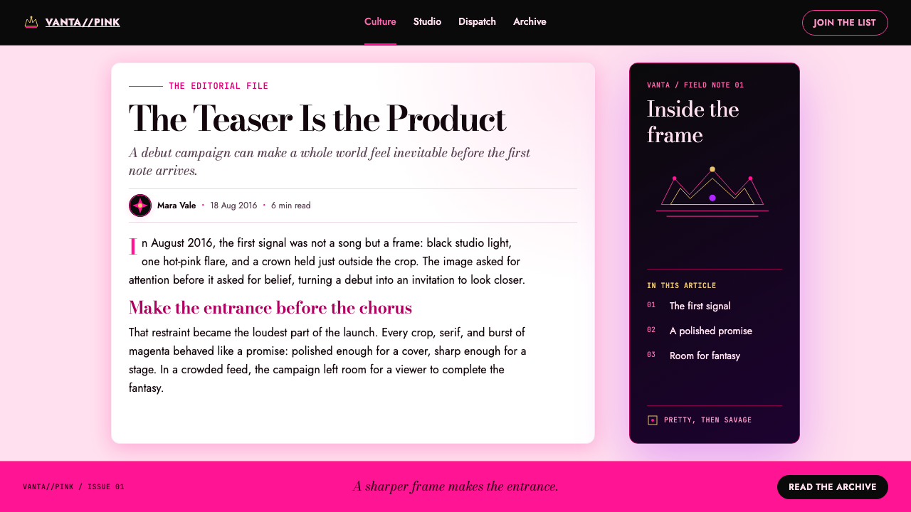
Bodoni provides the couture voice: refined, high-contrast, and visibly editorial. It should carry the most ceremonial language in the system, including titles, names, campaign statements, and selected labels. Its elegance is made sharper by the surrounding darkness and neon-like glow. Avoid overfilling the page with decorative serif text; the type becomes more luxurious when it is given room to stand alone.
LED Glow
The background should suggest an LED screen at concert scale: illuminated, synthetic, and poised to project rather than recede. Soft pink halos around calls to action translate this atmosphere into interface behavior. LED purple may deepen the electronic mood, but it should remain a supporting note. Glow is not a substitute for hierarchy; it is an atmospheric layer that makes already-clear focal points feel live.
Crown as Crest
The jewelled crown is a crest, not a random luxury ornament. It works best near the top of the composition, where it establishes hierarchy before any copy is read. Because it is so explicit, it should not be repeated everywhere. A single crown can make a whole layout feel branded; repeated crowns turn the symbol into wallpaper and weaken its role as a moment of elevation.
Pretty Savage Restraint
The style’s attitude is loud, but its ingredient list is short. Hot pink, black, a trace of LED purple, champagne gold, crown detail, couture type, and glow are enough. Its confidence comes from refusing extra decoration once those elements are active. The contrast carries the spectacle. Adding unrelated textures, busy patterns, or many competing accents makes the result look noisy rather than powerful.
Who shaped BLACKPINK (2016 Debut Era)?
Teddy Park is named among the key figures of BLACKPINK’s 2016–2017 debut era. Within this style record, that association anchors the visual system to a specific group arrival rather than treating it as a detached fashion mood.
Seo Hyun-seung is identified as a key figure for the era. The debut-era style should therefore retain the tightly staged relationship between concept image, performance-scale atmosphere, and a clearly controlled visual identity.
Yang Hyun-suk is included among the era’s key figures. His inclusion situates the look in the YG Entertainment context of Seoul, South Korea, where the debut identity was formed.
Jennie is named as a key figure of the debut era. The visual system’s poised, fashion-forward directness is most useful when it supports a subject who reads as present and commanding rather than merely decorative.
Rosé is named among the key figures for the era. Her inclusion reinforces that the crown, spotlight, typography, and color collision belong to a group image with individual presence inside it.
How do you use BLACKPINK (2016 Debut Era) today?
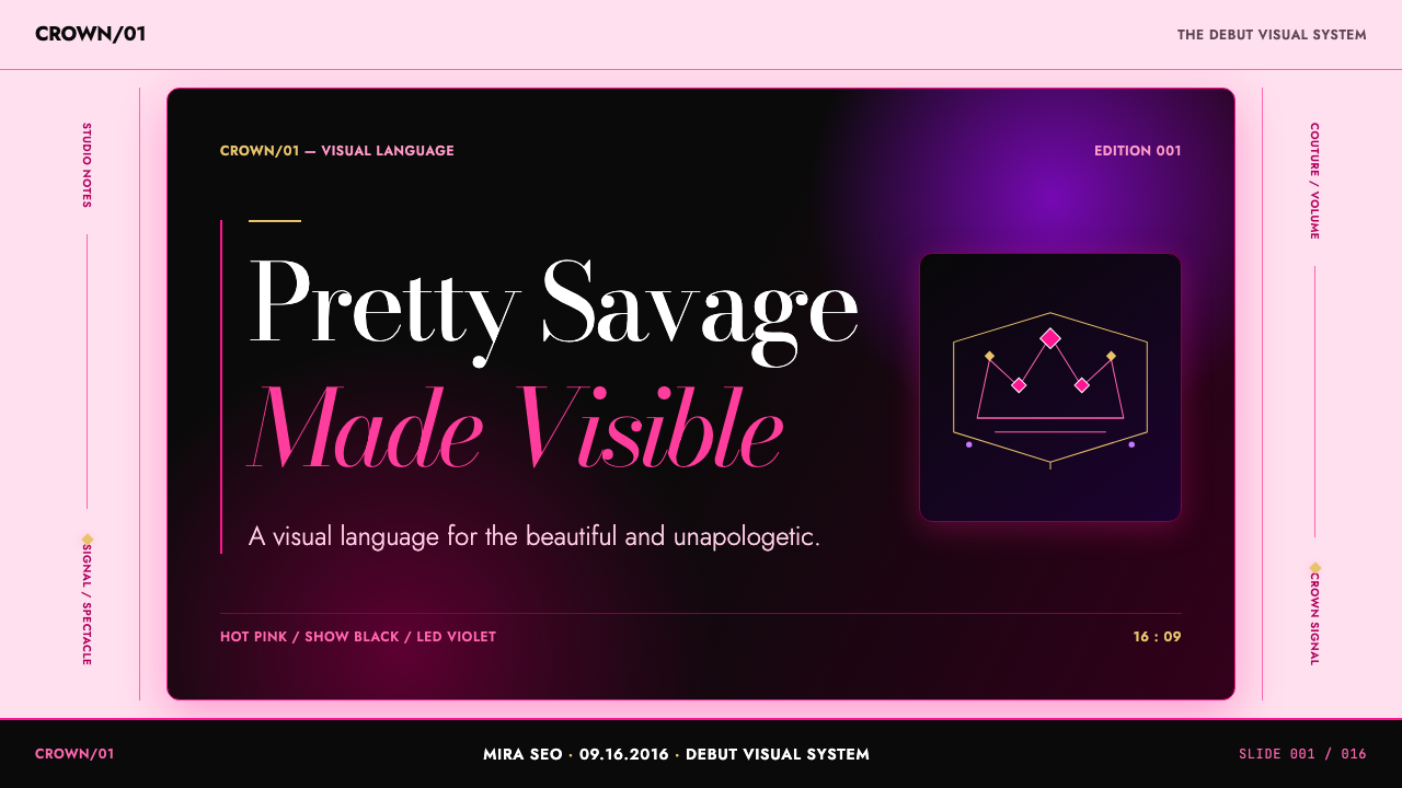
For presentation covers, use the spotlight axis as the whole composition. Let a crown-like crest, a single subject image, or a large title establish the upper focal point against a show-black field. Hot pink should enter as a decisive graphic event, not as a full decorative coating. Couture serif type can carry the title, while the remaining information stays sparse enough for the cover to feel like an announcement rather than a report.
For content slides, preserve the drama while making reading easy. Hold headlines in the couture serif register and place explanatory copy in a quieter supporting treatment. Use black space to separate ideas instead of filling every gap with dividers. A thin pink glow or a restrained purple accent can identify a section, quote, or action point. The slide should still feel stage-lit, but the audience must know where to look first and what to read next.
For data slides, translate the system into strong contrast and clear emphasis. Treat a highlighted result as the pink focal point, with other information held in show-black, pale neutral space, or subdued supporting tones. Use the crown motif only to mark a true headline achievement or top-level statement. Data does not need to imitate a music poster; it needs the same confidence, hierarchy, and immediate visual hit.
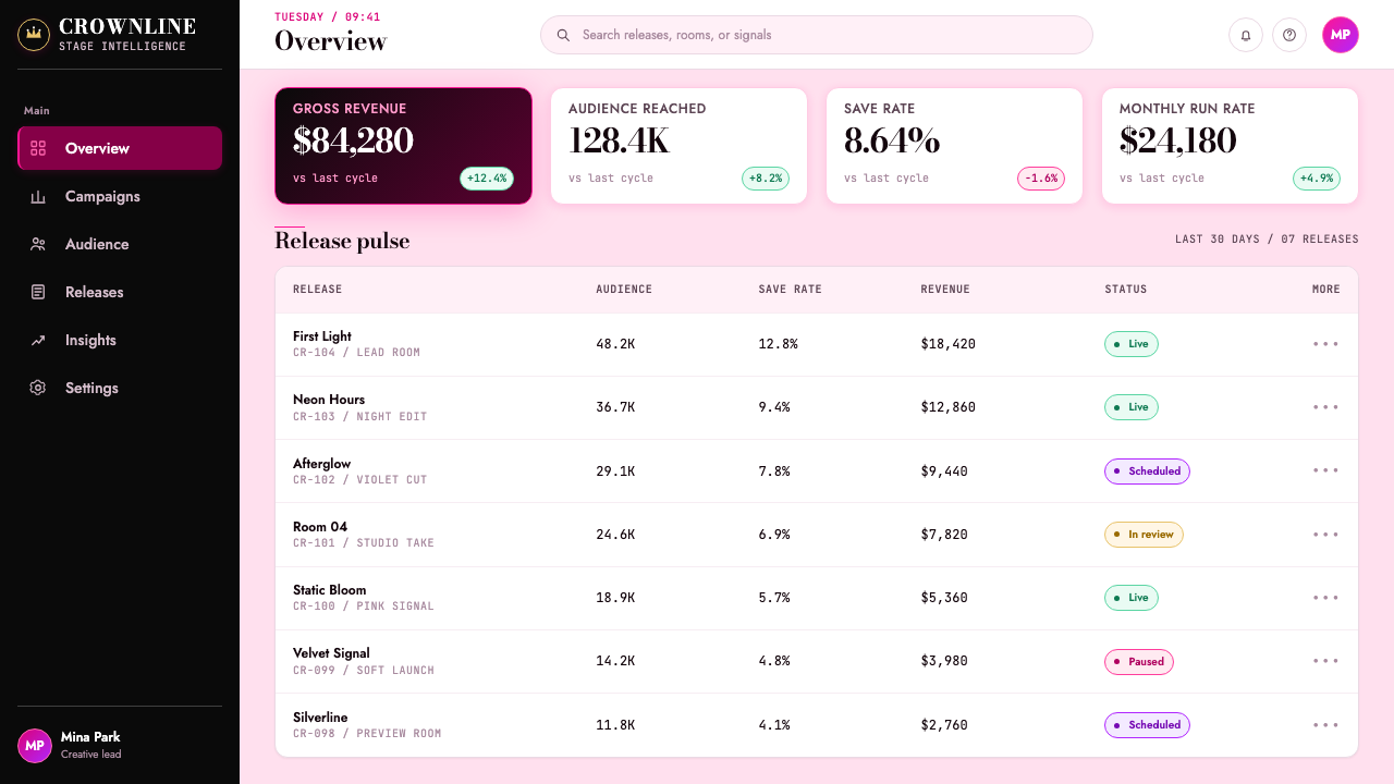
For web interfaces, this direction suits launch pages, membership experiences, media hubs, artist dashboards, and pricing pages that need a premium performance atmosphere. Keep navigation and practical content highly legible against the dark stage field. Use pink halos around important actions, not around every control. A pricing tier or dashboard state can take the spotlight through a concentrated pink treatment, while the rest of the interface remains composed and quiet enough to operate.
A common mistake is to confuse the style with pink luxury decoration. The debut-era system depends on collision, restraint, and hierarchy: black must create real negative space, pink must arrive with purpose, the crown must remain special, and Bodoni must feel editorial rather than ornamental. Filling every surface with glow, jewellery, purple, or serif flourishes dilutes the pretty-savage tension. The strongest version is controlled enough to let a small number of loud decisions dominate.
BLACKPINK (2016 Debut Era) — FAQ
Is this style simply a pink-and-black luxury look?
No. Pink and black are the most visible ingredients, but the system depends on their staged relationship: show-black creates distance and silence, hot pink creates the interruption, and the crown establishes a crest-like focal point. Couture serif type and LED-like glow complete the performance atmosphere. Without hierarchy and restraint, the same colors become generic fashion decoration rather than a BLACKPINK debut-era reference.
Can the style work on a light background?
It can, but the defining show-black stage atmosphere will be reduced. A light version works best as a selective editorial variation, with black still providing substantial visual mass and hot pink held as a concentrated accent. If the page becomes mostly pale and softly decorative, it loses the concert-screen intensity that gives the original system its force.
How should Bodoni be used without making the interface difficult to read?
Use it as a voice of emphasis rather than the default voice for everything. It is effective for titles, names, large statements, and selected premium labels because its couture contrast makes those moments feel deliberate. Practical navigation, explanatory content, and dense operational information should remain visually calmer. The contrast between expressive display type and quiet supporting text is part of the style’s hierarchy.
When should the crown appear?
Use the crown as a crest at moments that need immediate recognition: a cover, launch hero, opening slide, or a top-level identity panel. Keep it singular or very sparse. Repetition weakens the symbol because it changes a focal emblem into a background pattern. The crown is most effective when it arrives before the viewer has fully entered the composition.
What is the quickest way to make this style feel inauthentic?
Treating every element as a chance to be loud. The source palette already contains spectacle: hot pink, show-black, LED purple, champagne gold, crown detail, couture type, and soft glow. If all of them compete everywhere, there is no spotlight axis left. Preserve a dominant focal point, let black space stay open, and give each accent a specific reason to exist.
Related design styles
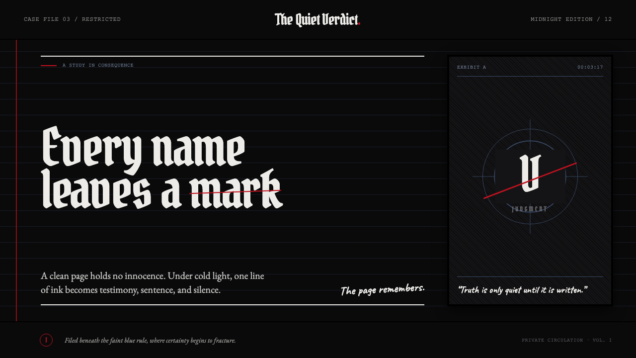 Death Note (2003)Silence becomes judgment. Bone-white blackletter and blue rules break under o…
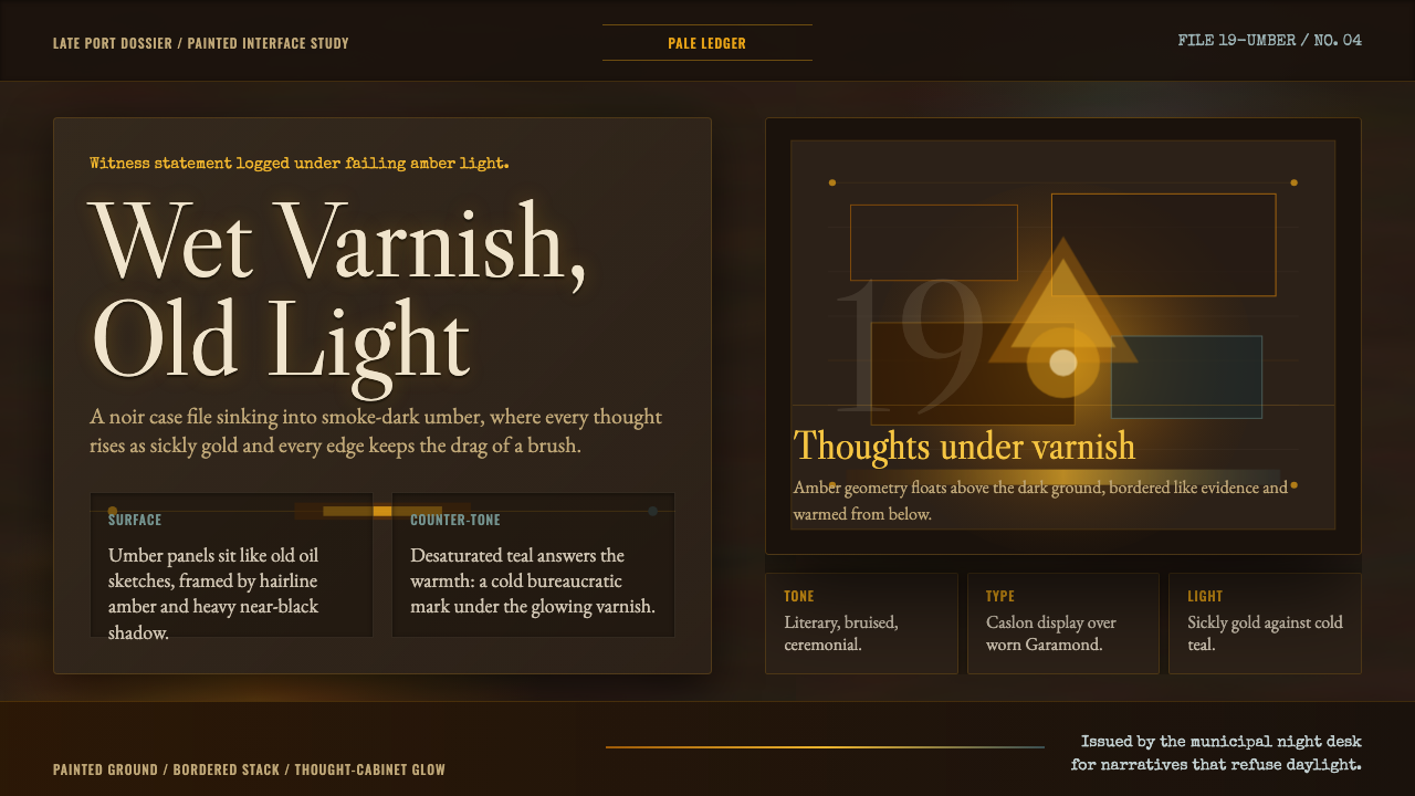 Disco ElysiumNoir rot glows from within. Amber Caslon type cuts through varnish-dark umber.
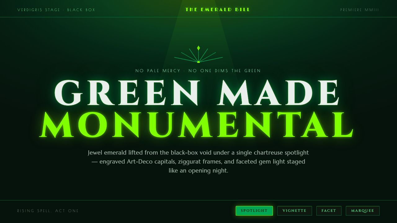 Wicked Elphaba EmeraldGreen made monumental. Jewel emerald spotlit on a black-box void, in engraved…
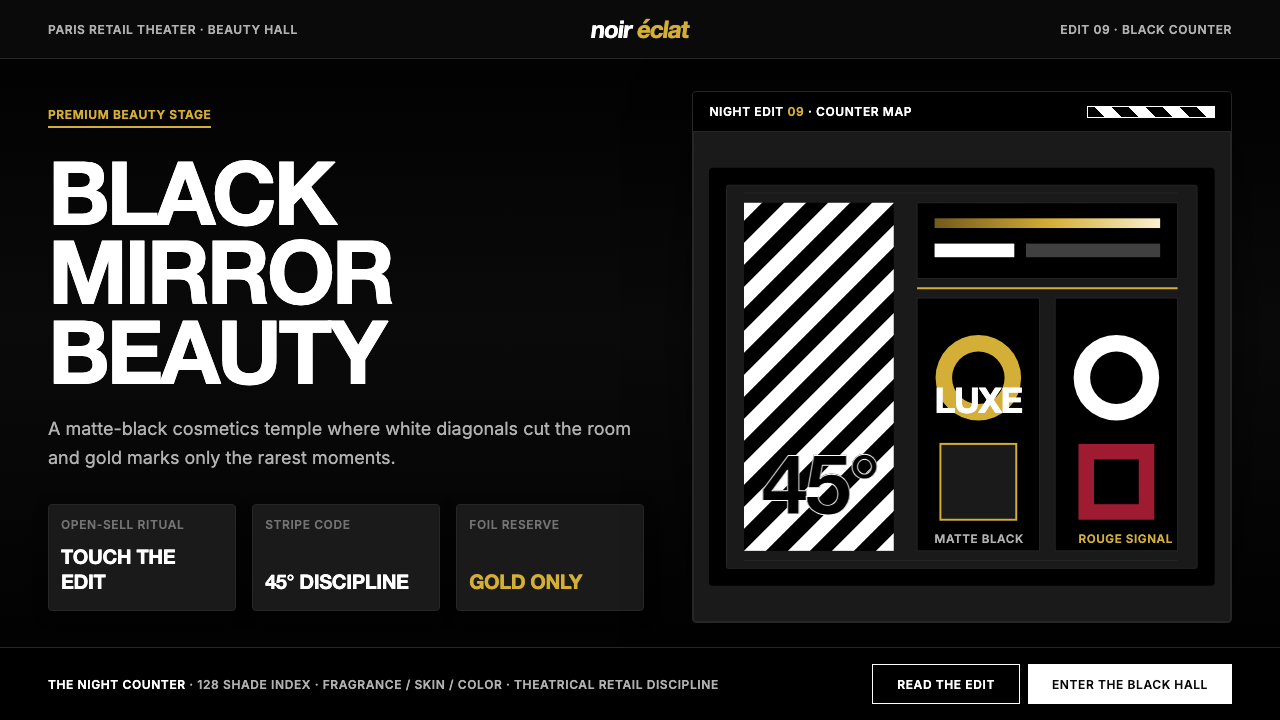 SephoraBlack is the stage. White 45° stripes and restrained gold foil make cosmetics…
 Tasmanian MONA Museum (2011)Hostile luxury underground. Pitch black, sandstone hairlines, magenta editori…
 Attack on Titan (2013)Dread becomes duty. Stone-gray bands, engraved caps and one steel-blue crest…