Design style guide设计风格指南
What is Tasmanian MONA Museum (2011)?什么是 Tasmanian MONA Museum (2011)?
MONA is the anti-museum — a subterranean gallery carved into Tasmanian sandstone by a professional gambler, where pitch-black voids, rust-warm metal, and magenta provocations make institutional design look polite by comparison.MONA是反博物馆——一座由职业赌徒凿入塔斯马尼亚砂岩中的地下画廊,漆黑的虚空、暖锈色的金属与品红色的挑衅,让一切机构设计都显得过于彬彬有礼。
Tasmanian MONA Museum (2011) in briefTasmanian MONA Museum (2011) 速览
The Museum of Old and New Art, which opened in Hobart, Tasmania, in January 2011, is one of the most deliberately antagonistic cultural institutions ever designed. Its visual identity does not invite — it challenges. Where conventional museum branding reaches for restraint and civic legibility, MONA reaches for the darkness of a cave, the weight of geological time, and the confrontational wit of its founder's exhibition wall labels, which routinely mock the conventions of art-world commentary.2011年1月在塔斯马尼亚霍巴特开幕的古今艺术博物馆,是有史以来设计最刻意具有对抗性的文化机构之一。它的视觉识别不是邀请,而是挑战。传统博物馆品牌追求克制与公民可读性,MONA则径直走向洞穴的黑暗、地质时间的重量,以及创始人展览墙标文字的对抗性机智——那些文字惯于嘲讽艺术世界评论的一切陈规。
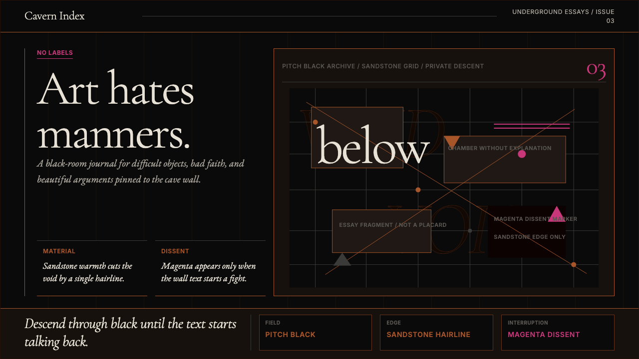
MONA's aesthetic vocabulary runs on opposites held in tension: vast black voids against single hairline traces in the warm tone of the surrounding sandstone; silence punctuated by magenta provocations; the ancient and the contemporary occupying the same underground space. The result is a visual system that feels both immovable — rooted in Triassic rock — and willfully transgressive, as though the museum is daring you to take offence.MONA的美学词汇建立在对立的张力之上:巨大的黑色虚空与周围砂岩暖色调中仅一根细线的痕迹;沉默被品红色的挑衅所打断;古代与当代共同栖居于同一地下空间。结果是一套视觉系统,既感觉不可撼动——扎根于三叠纪岩石——又充满蓄意的越轨,仿佛博物馆在挑衅你去感到冒犯。
At its core, the MONA aesthetic is an argument about what cultural authority looks like when it refuses all the usual markers of cultural authority. There are no grand marble facades, no gilt lettering, no cream-coloured walls offering neutral ground for art to speak. Instead the space descends underground, offers darkness as its primary welcome, and uses the friction between minimal restraint and editorial aggression as its defining visual character.在核心处,MONA美学是一个关于文化权威在拒绝所有惯常文化权威标志时呈现何种面貌的论题。没有宏伟的大理石门廊,没有镀金字母,没有奶油色墙壁为艺术提供中性背景。代之以向地下延伸的空间,以黑暗作为主要欢迎姿态,并以极简克制与编辑侵略性之间的摩擦作为其决定性视觉性格。
See the Tasmanian MONA Museum (2011) design system →查看 Tasmanian MONA Museum (2011) 完整设计系统 →
Where does Tasmanian MONA Museum (2011) come from?Tasmanian MONA Museum (2011) 从何而来?
MONA emerged from the singular vision of David Walsh, a Hobart-born professional gambler who built a fortune through mathematical card-counting and betting systems. Walsh is not an art-world insider; he is a self-described outsider who came to art through obsessive personal collecting, drawn to works that deal with sex, death, and time — themes he describes as the only subjects serious enough to justify a museum. His personal collection, assembled over decades, became the core of what would eventually open as MONA.MONA源于大卫·沃尔什的独特愿景。这位出生于霍巴特的职业赌徒通过数学算牌与博彩系统积累了一笔财富。沃尔什不是艺术世界的内部人士;他自称局外人,通过强迫性的个人收藏走进艺术,被那些关于性、死亡与时间的作品所吸引——他将这些主题描述为唯一严肃到足以证明建一座博物馆之必要的主题。他数十年间积累的私人藏品最终成为MONA的核心。
The building itself was designed by Nonda Katsalidis, the Melbourne-based architect, on Walsh's Moorilla Estate winery property at Berridale, a peninsula jutting into the Derwent River north of Hobart. Katsalidis excavated three levels into the sandstone cliff, creating 8,000 square metres of gallery space that descends from ground level into the rock. The decision to go underground was not simply an engineering choice — it was an aesthetic and philosophical one. The descent underground places the visitor in a fundamentally different relationship to light, to orientation, and to institutional expectation.建筑本身由墨尔本建筑师南达·卡萨里迪斯设计,选址于沃尔什在贝里代尔的莫里拉酒庄庄园——一处延伸入霍巴特以北德文特河中的半岛。卡萨里迪斯在砂岩崖壁中向下开凿了三层空间,创造了8000平方米的画廊面积,从地面向下深入岩石。向下延伸的决定不仅仅是工程选择——它同时是美学与哲学选择。地下的下沉使观众与光线、方向感以及机构期待之间形成了根本不同的关系。
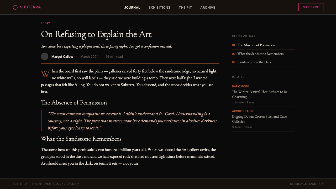
The museum's identity was shaped by creative director Leigh Carmichael and designer Mark Fraser, working in close collaboration with Walsh's curatorial instincts. Walsh's own voice — irreverent, intellectually confrontational, deliberately vulgar at times — runs through the institution's entire communications strategy. The wall labels, which Walsh writes himself or commissions in his register, are called 'Art Wanks': a label that signals in advance that the institution will not perform reverence for its own collection.博物馆的视觉识别由创意总监利·卡迈克尔与设计师马克·弗雷泽塑造,两人与沃尔什的策展直觉密切合作。沃尔什自己的声音——不敬、智识上具有对抗性、有时刻意粗俗——贯穿了机构的全部传播策略。那些由沃尔什亲自撰写或以他的语气委托他人撰写的墙标文字被称为「艺术装腔」:这个标签预先宣告,该机构不会对自己的藏品表演崇敬。
The 2017 opening of the Pharos wing — named for the ancient lighthouse of Alexandria — brought new gallery space and refined the visual system. The Pharos extension reinforced the institution's commitment to darkness as atmosphere, to geological material as texture, and to the contrast between the prehistoric substrate of the building site and the contemporary and ancient artworks housed within it. By this point the MONA visual language had cohered into a recognizable and widely imitated set of principles that extends well beyond museum design into editorial, hospitality, and digital interface design.2017年法洛斯翼楼的开放——以亚历山大港的古代灯塔命名——带来了新的画廊空间,也精炼了视觉系统。法洛斯扩建强化了机构对黑暗作为氛围、地质材料作为质感,以及建筑基址史前基底与馆内当代和古代艺术品之间对比的承诺。至此,MONA视觉语言已凝聚为一套可辨识且被广泛借鉴的原则,其影响远超博物馆设计,延伸至编辑出版、餐饮酒店与数字界面设计。
What defines the Tasmanian MONA Museum (2011) look?Tasmanian MONA Museum (2011) 的视觉特征是什么?
Dominant Darkness统治性的黑暗
The ground note of the MONA system is an uncompromising near-black that functions as the primary surface for almost all visual communication. This is not the dark-mode convention of contemporary interface design, which uses dark backgrounds for energy efficiency or aesthetic preference. It is something more philosophical: darkness as the natural state of underground space, darkness as the condition that makes all other visual elements feel like they have been excavated into visibility rather than placed on top of a surface.MONA系统的基调是一种毫不妥协的近黑色,作为几乎所有视觉传播的主要底面。这不是当代界面设计为省电或美学偏好而采用的深色模式惯例,而是某种更具哲学意味的东西:黑暗作为地下空间的自然状态,黑暗作为一种条件——让所有其他视觉元素感觉像是从黑暗中被发掘出来,而非被放置于某个表面之上。
Sandstone Hairline Traces砂岩细线痕迹
Against the dominant black, MONA deploys extremely fine lines in the warm, earth-toned register of Tasmanian sandstone. These hairlines — so thin they read almost as cracks or geological veining rather than designed marks — serve a dual function. They provide structural delineation in layouts and interfaces without breaking the overall darkness of the surface, and they carry the literal material of the building site into the graphic language of the institution. The effect is of something etched rather than printed.在统治性的黑色之上,MONA运用塔斯马尼亚砂岩暖调的极细线条。这些发丝般的细线——细到几乎像裂缝或地质纹理而非设计标记——承担双重功能:在版面与界面中提供结构性划定,同时不破坏整体黑暗感;并将建筑基址的真实材料带入机构的图形语言。效果是被蚀刻的,而非被印刷的。
Magenta Provocation品红色挑衅
The primary chromatic event in the MONA system is magenta: a color chosen not for its conventionally pleasing qualities but for its confrontational intensity. Against black, magenta reads almost aggressively — it cannot be ignored, it will not recede, and it has none of the cultural associations of institutional blues or civic greens. It arrives in the system as an editorial accent, as a highlight for text that Walsh particularly wants you to notice, as a marker of the institution's refusal to be mistaken for a conventional cultural venue.MONA系统中主要的色彩事件是品红色:选择这种颜色并非因为其惯常的令人愉悦品质,而是因为其对抗性的强度。在黑色背景上,品红色几乎带有攻击性——无法被忽视,不会退缩,也没有机构蓝或公民绿的任何文化联想。它在系统中作为编辑强调色出现,标示沃尔什特别希望你注意的文字,标记这家机构拒绝被误认为普通文化场所的决心。
Corten-Register Warmth耐候钢色的暖意
The only warmth in the MONA system comes from a color register drawn from oxidized steel and aged sandstone — the rust-browns and amber-ochres associated with Corten weathering steel, which was used extensively in the building's construction. This warmth is not decorative; it is material. It refers directly to the building's physical fabric and to geological time. The presence of this warmth prevents the visual system from reading as cold corporate darkness and instead grounds it in something organic, durable, and site-specific.MONA系统中唯一的暖意来自氧化钢铁与风化砂岩色调——与耐候钢锈蚀相关的锈棕与琥珀赭色,这种材料在建筑建造中大量使用。这种暖意不是装饰性的,而是材料性的。它直接指向建筑的物质构造与地质时间。这种暖意的存在,使视觉系统不会被解读为冷漠的企业黑暗,而是将其锚定于某种有机的、耐久的、场所特定的东西。
Dense Italic Editorial Typography密集意大利体编辑排版
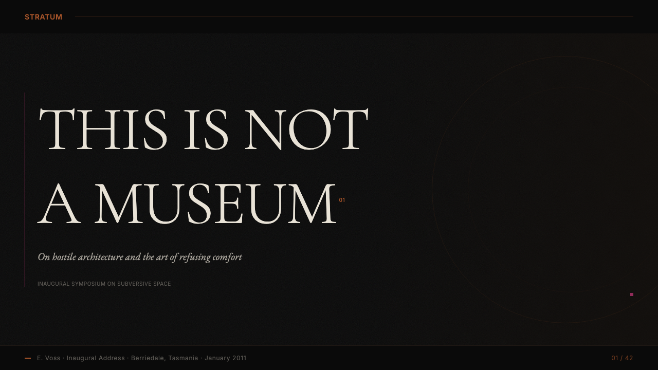
Where most museum typography reaches for authoritative upright roman letterforms, MONA's editorial voice consistently favors italic serif type, set with a density that recalls academic journals or the tightly argued prose of a philosophical polemic. The italic leans — a literal inclination that mirrors the institution's posture of irreverence. Text appears not as caption but as argument; not as label but as commentary. The typographic density is part of the message: MONA assumes an engaged reader, not a passive viewer.大多数博物馆排版追求权威的直立罗马字体,MONA的编辑声音则始终偏爱意大利体衬线字,排版密度让人想起学术期刊或哲学论战中紧密论证的散文。意大利体向前倾斜——一种字面上的倾斜,镜像了机构不敬的姿态。文字呈现为论点而非说明,为评注而非标签。排版密度本身就是信息的一部分:MONA假定的是一位投入的读者,而非被动的观看者。
Asymmetric Composition with Deliberate Imbalance蓄意失衡的非对称构图
MONA layouts are asymmetric not in the modernist sense — where asymmetry is a form of dynamic balance — but in a more confrontational sense, where elements are placed to create productive tension or even discomfort. A headline may crowd into a corner; an image may be cropped in a way that refuses conventional framing; whitespace — where it appears — is not generous breathing room but deliberate void. The overall effect is compositional anxiety held just short of chaos.MONA版面的非对称性不是现代主义意义上的——在那里非对称是一种动态平衡——而是更具对抗性的:元素的放置制造建设性的张力乃至不适。标题可能拥挤进一个角落;图像可能以拒绝惯常取景的方式被裁切;留白(若出现)不是慷慨的呼吸空间,而是蓄意的虚空。整体效果是刚好停在混乱边缘的构图焦虑。
Anti-Institutional Voice as Visual Element作为视觉元素的反机构声音
Perhaps MONA's most distinctive design feature is one that operates primarily through language rather than form: the institution's own voice — irreverent, self-aware, sometimes scabrous — functions as a visual element in its own right. The tone of text in the space, on the app, in print materials, and on signage is so consistent and so different from institutional norms that it becomes part of the system's visual identity as surely as the color palette. The words and the design are inseparable.MONA最具特色的设计特征或许是一个主要通过语言而非形式运作的元素:机构自身的声音——不敬的、自我意识的、有时粗粝的——本身就是一个视觉元素。空间内、应用程序中、印刷材料上与指示牌上的文字语气如此一贯、如此有别于机构规范,以至于它像色板一样确凿地成为系统视觉识别的一部分。文字与设计不可分割。
See the Tasmanian MONA Museum (2011) design system →查看 Tasmanian MONA Museum (2011) 完整设计系统 →
Who shaped Tasmanian MONA Museum (2011)?谁塑造了 Tasmanian MONA Museum (2011)?
Walsh is the founder, primary funder, and curatorial spirit of MONA. His personal philosophy — that art should provoke rather than reassure, and that the museum as an institution has historically been a mechanism for social control rather than liberation — drives every aspect of the institution's design and communication. Walsh writes or personally commissions the wall labels and is the editorial voice behind MONA's communications. His willingness to be publicly self-critical, self-mocking, and confrontational within his own institution is what gives the MONA brand its particular edge: it is a brand built on the character of a single, highly idiosyncratic individual rather than on any conventional institutional positioning.沃尔什是MONA的创始人、主要资助者与策展精神。他的个人哲学——艺术应当挑衅而非安抚,博物馆作为机构在历史上一直是社会控制而非解放的机制——驱动着机构设计与传播的每一个方面。沃尔什亲自撰写或委托撰写墙标文字,是MONA传播的编辑声音。他在自己机构内公开自我批评、自我嘲讽与对抗的意愿,正是赋予MONA品牌独特锋芒之所在:这是一个建立在单一高度特立独行个体性格之上的品牌,而非建立在任何惯常机构定位之上。
The Melbourne architect responsible for the building's form, Katsalidis resolved the central design challenge of MONA: how to create an art museum inside a cliff without subordinating the architecture to the demands of conventional gallery white-cube thinking. His decision to descend through three levels into the sandstone, and to allow the raw geological material of the excavated walls to remain visible and textural, was the gesture that made everything else in the MONA aesthetic possible. The building is not a neutral container; it is the first and most permanent artwork in the collection.负责建筑形体的墨尔本建筑师卡萨里迪斯,解决了MONA的核心设计难题:如何在峭壁内创建一座艺术博物馆,同时不使建筑臣服于传统画廊白盒思维的要求。他向下穿越三层进入砂岩的决定,以及让开凿墙壁的原始地质材料保持可见与质感的姿态,使MONA美学中的一切其他元素成为可能。这座建筑不是一个中性容器;它是藏品中第一件也是最持久的艺术品。
As creative director, Carmichael was responsible for translating Walsh's curatorial instincts and personal voice into a coherent visual and communications system. The challenge was considerable: maintaining the rawness and irreverence that Walsh insisted on while producing a system legible enough to function across print, digital, wayfinding, and hospitality contexts. Carmichael's solution was to let the tension between darkness and provocation do the structural work, and to keep typographic and color constraints tight enough that the variability in tone reads as intentional character rather than inconsistency.作为创意总监,卡迈克尔负责将沃尔什的策展直觉与个人声音转化为连贯的视觉与传播系统。这项挑战相当艰巨:在保持沃尔什所坚持的原始感与不敬之余,产出一套足够清晰、能在印刷、数字、导视与餐饮酒店语境中正常运作的系统。卡迈克尔的解决方案是让黑暗与挑衅之间的张力承担结构性工作,并将排版与色彩约束保持得足够严格,使语气上的变化读起来像是蓄意的性格,而非不一致。
Fraser worked as the primary designer giving form to the MONA visual identity, operating within the framework established by Carmichael and Walsh. His contribution was in the specific graphic choices that make the system distinctive at a micro level: the weight and placement of hairlines, the specific rendering of the magenta accent, the treatment of typography in a way that serves the institution's editorial voice without compromising legibility. The result is a visual identity that appears simple but contains a precise set of calibrations that are difficult to imitate without understanding the underlying philosophy.弗雷泽作为主要设计师,在卡迈克尔与沃尔什建立的框架内,赋予MONA视觉识别以具体形态。他的贡献在于使系统在微观层面具有独特性的具体图形选择:细线的粗细与位置、品红强调色的具体呈现、排版处理方式——以服务机构编辑声音而不损害可读性为原则。结果是一套看似简单、实则包含一套精确校准的视觉识别——若不理解其底层哲学,则难以模仿。
Varenne served as MONA's founding curator, responsible for shaping the early exhibition program that established what kind of art institution MONA would be. His curatorial choices — emphasizing works that deal with mortality, sexuality, time, and taboo — gave coherence to Walsh's eclectic collection and confirmed that the darkness of the architecture was not merely aesthetic but thematic. A curator always shapes the visual environment of a museum through selection; at MONA, Varenne's selections defined the emotional register that the design language would need to sustain.瓦朗纳担任MONA首任策展人,负责塑造确立MONA是何种艺术机构的早期展览项目。他的策展选择——强调处理死亡、性欲、时间与禁忌的作品——使沃尔什的折中藏品获得了连贯性,并确认了建筑的黑暗不仅是美学的,更是主题性的。策展人总是通过选择来塑造博物馆的视觉环境;在MONA,瓦朗纳的选择定义了设计语言需要承载的情感音域。
How do you use Tasmanian MONA Museum (2011) today?今天怎么用 Tasmanian MONA Museum (2011)?
The MONA aesthetic is one of the most coherent dark-luxury systems to have emerged from a cultural institution, and its influence on editorial, hospitality, and digital design has been substantial. Applying it successfully requires grasping what the system is actually doing: using darkness not as atmosphere but as philosophy, using color provocation not as branding but as editorial argument, and letting the tension between restraint and aggression do the compositional work.MONA美学是从文化机构中涌现的最连贯的暗调奢华系统之一,其对编辑出版、餐饮酒店与数字设计的影响相当深远。成功应用它需要把握系统实际上在做什么:将黑暗用作哲学而非氛围,将色彩挑衅用作编辑论点而非品牌标识,让克制与侵略性之间的张力承担构图工作。
For presentation slides and editorial materials, the MONA system works powerfully on cover pages and section dividers. A cover built on a deep black ground, with a title in dense italic serif type and a single magenta accent — perhaps on a pull quote or a key phrase — immediately establishes a register of serious, confrontational intelligence. Content pages should resist the temptation to introduce warmth or relief through light backgrounds; the system's logic depends on maintaining the primary darkness throughout, punctuated only by the occasional hairline or accent color. Data and diagram slides benefit from treating the information graphically as geological strata — horizontal bands of varying density on a dark ground, with the magenta reserved for the single most important data point.在演示文稿与编辑材料中,MONA系统在封面与分节页上发挥强大效果。以深黑色为底、标题使用密集意大利体衬线字、配以单一品红强调色——或许落在引言或关键词组上——能立即建立起严肃、具有对抗性智识的基调。内容页应抵制通过浅色背景引入温暖或喘息的诱惑;系统的逻辑依赖于始终保持主导的黑暗,仅以偶尔的细线或强调色加以点缀。数据与图表页面受益于将信息图形化处理为地质层理——深色底面上密度各异的水平带状,品红色保留给单一最重要的数据点。
For web and digital interfaces, the MONA approach suits editorial platforms, cultural institutions, artist portfolios, and any context where the audience is self-selecting and intellectually engaged. The system does not serve e-commerce contexts well — it is too confrontational for casual browsing, and the darkness works against the legibility demands of dense product grids. Where it works: a dark-mode dashboard where the primary actions are highlighted in a warm oxidized-steel accent rather than a conventional blue; an editorial publication where headlines are italic serif on black and body text appears in a slightly warmer near-white; a cultural organization's landing page where the absence of decorative imagery makes the typography itself the event.对于网页与数字界面,MONA方式适合编辑平台、文化机构、艺术家作品集,以及任何受众具有自我选择性与智识投入度的语境。该系统不适合电商语境——它对随意浏览而言过于对抗性,黑暗也不利于密集产品网格的可读性要求。它有效之处在于:以暖调氧化钢色而非惯常蓝色突出主要操作的深色仪表板;标题以黑底意大利体衬线、正文以略暖的近白色呈现的编辑出版物;一家文化机构的落地页面,其中装饰图像的缺席使排版本身成为事件。
For hospitality and physical space applications — the context in which MONA's identity was originally developed — the system's most powerful elements are tactile and material rather than graphic. The principle of using the building's own geological material as the warmth source translates into any context where the finishes, textures, and materials of a physical environment can be allowed to provide contrast to a dominant darkness. A hospitality brand deploying this approach would lean on stone, aged metal, and leather rather than paint or fabric for its warm tones, and would let the graphic vocabulary be austere and editorial rather than welcoming.对于餐饮酒店与实体空间应用——MONA视觉识别最初诞生的语境——系统中最强大的元素是触觉性与材料性的,而非图形性的。以建筑自身的地质材料作为暖色来源这一原则,在任何实体环境的饰面、质感与材料能够被允许与主导黑暗形成对比的语境中均可转化运用。采用这种方式的餐饮品牌会依赖石材、老化金属与皮革提供暖调,而非依赖油漆或织物,并让图形词汇保持朴素而编辑化,而非欢迎姿态。
A common mistake when applying the MONA system is to treat the magenta accent as a general-purpose highlight color and use it frequently across layouts. The system's power comes from the restraint with which the accent appears — when it is everywhere, it loses its confrontational quality and becomes decoration. The magenta should feel like an interruption: rare, deliberate, and pointed. Similarly, the editorial density of the typography only functions in contrast to extensive dark voids; if the darkness is relieved too frequently by content, the system collapses into a generic dark editorial aesthetic without the underground specificity that gives MONA its character.应用MONA系统时一个常见错误是将品红强调色视为通用高亮色并在版面中频繁使用。系统的力量来自强调色出现时的克制——当它无处不在时,它失去了对抗性品质,沦为装饰。品红色应当感觉像是一次中断:罕见的、蓄意的、指向性强的。同样,排版的编辑密度只有在对比大面积的黑暗虚空时才能发挥作用;如果黑暗过于频繁地被内容所消解,系统就会坍塌为一种普通的深色编辑美学,失去赋予MONA性格的那种地下的特殊性。
See the Tasmanian MONA Museum (2011) design system →查看 Tasmanian MONA Museum (2011) 完整设计系统 →
Tasmanian MONA Museum (2011) — FAQTasmanian MONA Museum (2011) · 常见问题
What makes MONA's aesthetic different from generic dark-mode design?MONA的美学与普通深色模式设计有何不同?
Generic dark-mode design uses darkness as a surface preference — a way to reduce eye strain, signal sophistication, or differentiate from a light-mode default. MONA's darkness is conceptual: it is the darkness of underground space, of geological time, of a space that has been excavated rather than built. The difference shows up in the details. Generic dark mode typically uses near-dark greys and introduces warmth through blue or purple accents; it softens edges and uses gradient overlays freely. MONA's system is harsher and more principled: the black is near-absolute, the warmth comes from geological material rather than chromatic choice, and the magenta accent is used with a deliberateness that signals argument rather than mood.普通深色模式设计将黑暗用作表面偏好——一种减轻视觉疲劳、传递精致感或与浅色默认形成差异化的方式。MONA的黑暗是概念性的:那是地下空间的黑暗,地质时间的黑暗,一个被开凿而非建造的空间的黑暗。差异体现在细节中。普通深色模式通常使用近深灰并通过蓝色或紫色强调引入暖意;它柔化边缘并自由使用渐变叠加。MONA的系统更为苛刻且更有原则:黑色近乎绝对,暖意来自地质材料而非色彩选择,品红强调色的使用带有一种传递论点而非营造情绪的蓄意。
Is the MONA visual system suited to brands that want to appear approachable and friendly?MONA视觉系统适合希望显得平易近人、友好的品牌吗?
No, and that is the point. The MONA aesthetic is deliberately built on the refusal of approachability as a design value. It assumes a willing, curious, and intellectually engaged audience; it actively filters out those who prefer comfort and reassurance. For brands whose success depends on reducing friction in customer acquisition — consumer products, retail, family services, health applications — this system is entirely wrong. For brands whose differentiation depends on projecting intellectual confidence, editorial authority, or deliberate exclusivity — certain cultural institutions, specialist publishers, luxury hospitality, high-end creative services — it works because it signals that the institution is not trying to please everyone.不,这正是关键所在。MONA美学刻意建立于拒绝将平易近人视为设计价值之上。它假定受众是主动的、好奇的、智识上投入的;它主动筛滤掉那些更偏爱舒适与安抚的人。对于成功依赖于降低客户获取摩擦的品牌——消费品、零售、家庭服务、健康应用——这套系统完全不适合。对于差异化依赖于投射智识自信、编辑权威或蓄意排他性的品牌——某些文化机构、专业出版商、奢华餐饮、高端创意服务——它之所以有效,是因为它传递出机构并非试图取悦所有人的信号。
How does the MONA identity handle digital wayfinding and navigation?MONA视觉识别如何处理数字导视与导航?
MONA's approach to wayfinding — both physical and digital — treats navigation as an editorial act rather than a service function. In the physical museum, the visitor is deliberately disoriented by the underground descent and the absence of conventional signage clarity; finding works is part of the experience rather than a friction to be eliminated. Digitally, this translates into interfaces where the navigation is typographic and dense rather than icon-based and open, where primary actions are indicated by the magenta accent rather than by conventional button affordances, and where the overall experience of use carries some of the productive difficulty of the physical space.MONA对导视的处理方式——无论是实体还是数字——将导航视为编辑行为而非服务功能。在实体博物馆中,地下下沉与惯常指示牌清晰度的缺失刻意使访客迷失方向;找到作品是体验的一部分,而非需要消除的摩擦。在数字层面,这转化为:导航是排版性、密集性的,而非基于图标、开放性的;主要操作由品红强调色而非惯常按钮视觉暗示标示;整体使用体验带有实体空间那种建设性困难的某些特质。
Can the MONA system work in a light-background version?MONA系统能以浅色背景版本运作吗?
Technically possible, practically ill-advised. The MONA visual system's coherence depends on the darkness as a founding condition, not as a stylistic option. On a light background, the magenta accent loses its confrontational weight — it becomes merely unusual rather than aggressive. The sandstone hairlines, which work against black because they read as cracks in a solid dark surface, lose their geological specificity against a light ground and become conventional fine lines. The dense italic type, which works against darkness because it suggests text being illuminated rather than printed, reads very differently against white. You could technically apply the color relationships and typographic choices to a light-background system, but you would be borrowing the surface features of MONA without its animating logic.技术上可行,实践上不明智。MONA视觉系统的连贯性依赖于黑暗作为奠基条件,而非风格选项。在浅色背景上,品红强调色失去其对抗性分量——它变得仅仅是不寻常的,而非具有侵略性的。砂岩细线在黑色背景上之所以有效,是因为它们被解读为实心黑暗表面的裂缝;在浅色底面上则失去其地质特殊性,沦为惯常细线。密集意大利体在黑暗背景上之所以有效,是因为它暗示文字正在被照亮而非被印刷;在白色背景上则传递截然不同的感受。你可以在技术上将色彩关系与排版选择应用到浅色背景系统,但你只是借用了MONA的表面特征而没有其驱动逻辑。
What is the relationship between MONA's design and the art it houses?MONA的设计与其所展藏的艺术之间是什么关系?
Unusual among cultural institutions, MONA's design is not neutral toward its collection — it takes a position. The darkness, the provocation, the density, the refusal of institutional warmth all express curatorial choices: that this is art dealing with mortality, sexuality, time, and taboo; that it will not be softened for a general audience; that the experience of encountering it should carry some of the discomfort of confronting difficult truths. Most museum design tries to step aside so the art can speak; MONA's design speaks in the same register as the art, which is why the two cannot be separated without diminishing both.在文化机构中罕见的是,MONA的设计对其藏品并非保持中立——它持有立场。黑暗、挑衅、密度、对机构温暖的拒绝,都表达了策展选择:这里的艺术涉及死亡、性欲、时间与禁忌;它不会为大众受众而被柔化;与它相遇的体验应带有直面困难真相时某种程度的不适。大多数博物馆设计试图退让以让艺术自己说话;MONA的设计则以与艺术相同的音域说话,这正是为何两者无法分离而不同时损伤双方的原因。
Related design styles相关设计风格
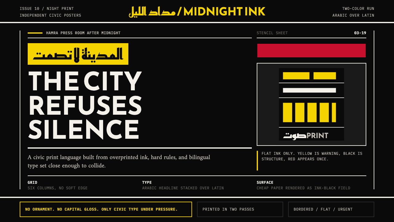 Beirut Indie Graphic DesignCivic type as protest. Sulfur yellow Arabic blocks collide with ink-black pos…公民字体即抗议:硫磺黄阿文块撞上墨黑海报网格。
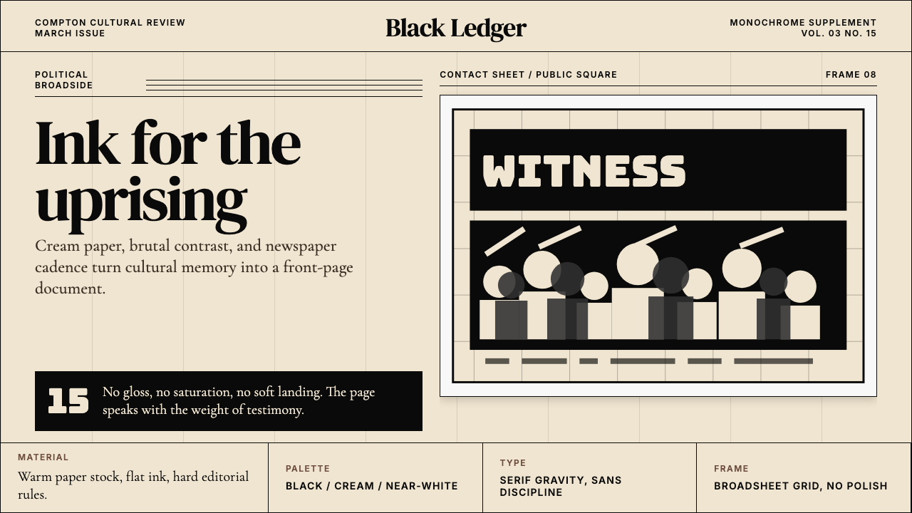 Kendrick — To Pimp a ButterflyPolitical weight, printed cold. Cream paper, hard serif type, monochrome crow…政治重量冷静落纸。米黄纸、硬衬线与黑白群像几何。
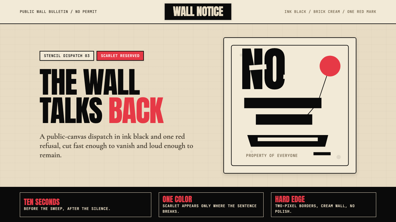 Banksy Stencil GraffitiProtest is reduced to a cut mark. Anton black on brick cream, one scarlet red…抗议被压成剪影。砖墙奶油底、Anton黑字,一点猩红打断。
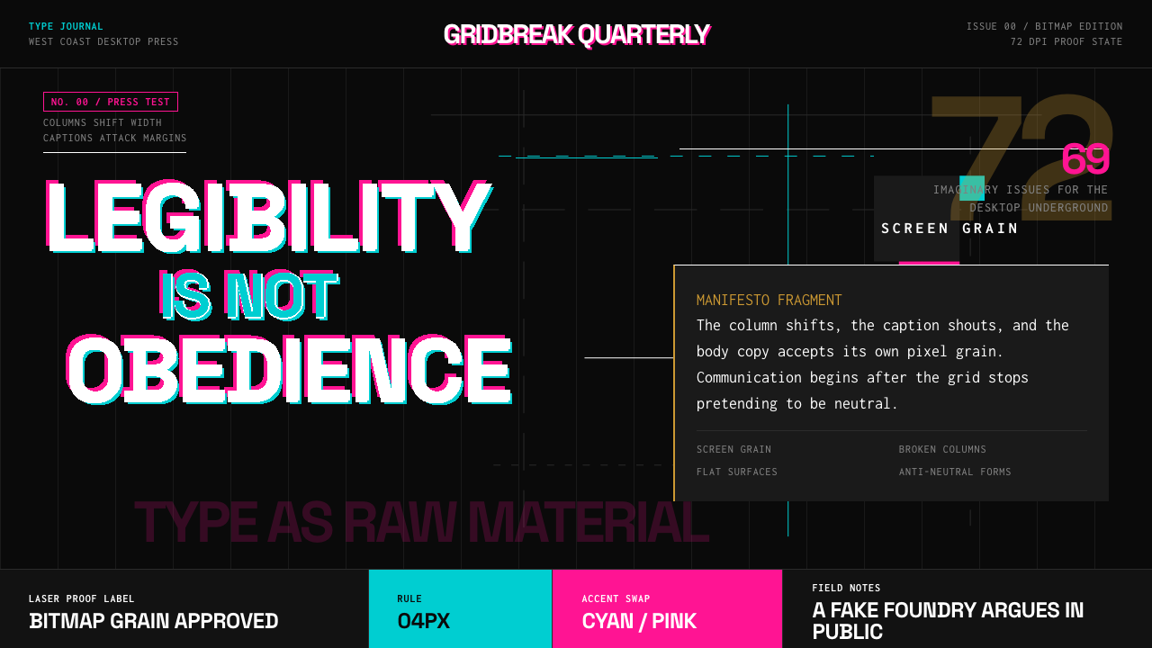 Emigre Magazine (1984–2005)Defies the tidy grid. Cyan, ochre, and hot-pink bitmap type collides on black.拒绝整齐网格:黑底上的青色、赭色与热粉像素字相撞。
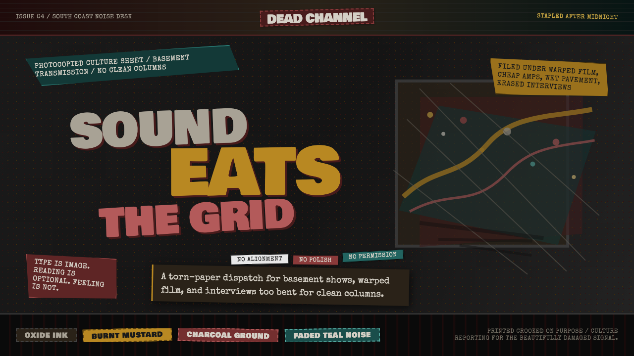 Grunge (Carson 1993)Carson's anti-rules, photocopied. Oxblood on charcoal, distressed type, delib…大卫·卡森颠覆现代主义排版的粗粝美学:暗红与焦黄、炭灰底、刻意打破的网格、油墨…
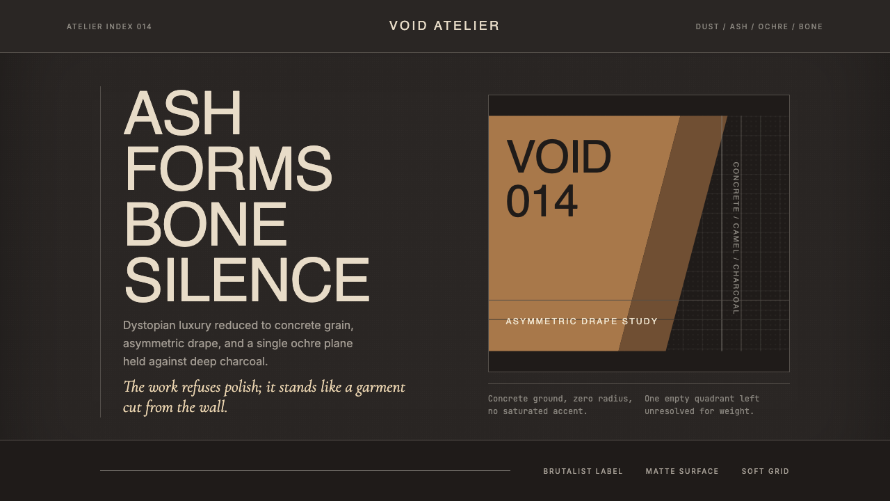 Rick Owens DarkstarRestraint has gravity. Charcoal concrete, bone type, and one ochre drape hold…克制自带重力:炭灰混凝土、骨白字、单片赭色垂坠定住画面。