About Tasmanian MONA Museum (2011)
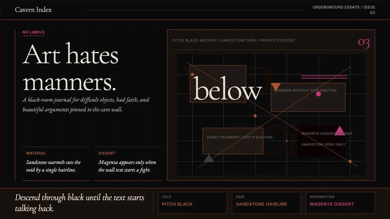
MONA is the anti-museum — a subterranean gallery carved into Triassic sandstone, funded by a professional gambler, and designed to mock every convention of institutional art display. Its visual identity runs on pitch-black voids, corten-steel rust as the sole warmth, and magenta provocations that read like Walsh's confrontational "Art Wank" wall-label prose rendered in pixels.
The aesthetic is deliberately hostile to polite gallery minimalism. Dense editorial typography in italic serif, asymmetric compositions, and 1px sandstone hairlines on black-on-black surfaces create a brand that feels like descending into a Tasmanian cave where someone pinned irreverent essays next to priceless antiquities.
- Origin
- Hobart, Tasmania, Australia
- Era
- 2011–present (opened 21 January 2011; identity refined through 2017 Pharos wing)
- Key figures
- David Walsh · Nonda Katsalidis · Leigh Carmichael · Mark Fraser
- Movements
- anti-museum experience curation · billionaire-private-museum movement · Australian contemporary-art collecting
Tasmanian MONA Museum (2011) design spec
Colors
Typography
The other 11 sections — buttons, cards, spacing, motion, techniques and more — open once you unlock. Download the DESIGN.md or send it to your AI in one click. Unlock once, yours forever.
Sign up nowStyles similar to Tasmanian MONA Museum (2011)
Also inspired by architecture & places, with a close feel.
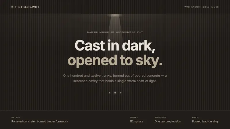 Bruder Klaus Field ChapelCast in dark, opened to sky. Charcoal concrete, board-burned striation, one warm oculus shaft.
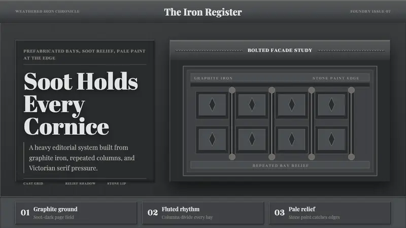 Cast Iron SoHo FacadesIron remembers the city. Graphite bays, Didone type, and pale stone-paint edges cast relief.
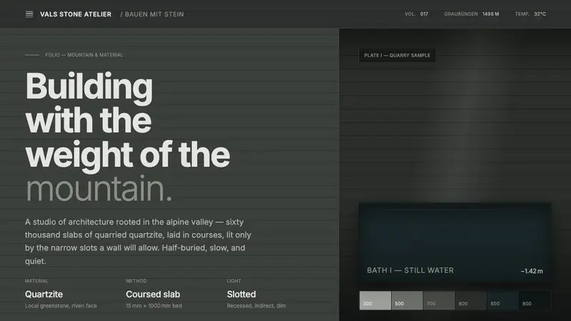 Zumthor Thermal BathsArchitecture as atmosphere. Greenish-slate stone, stratified courses, dim light from a single slot.
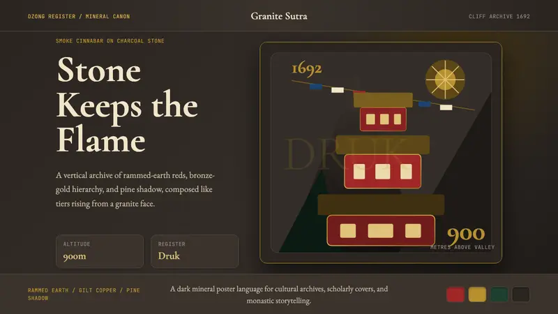 Bhutanese Tiger's Nest Cliff MonasterySacred altitude, mineral-dark. Cinnabar tiers and bronze rules climb charcoal granite.