What is Rick Owens Darkstar?什么是 Rick Owens Darkstar?
Rick Owens built a complete post-apocalyptic luxury universe out of dust, bone, and concrete — and its gravity translates directly into interface design.瑞克·欧文斯用灰尘、骨灰与混凝土构建了一座完整的末世奢华宇宙——而它的重力感可以直接转译为界面设计语言。
Rick Owens Darkstar in briefRick Owens Darkstar 速览
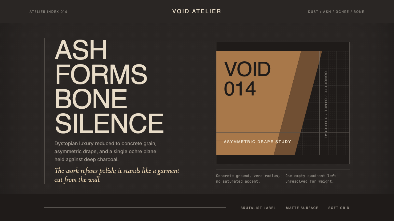
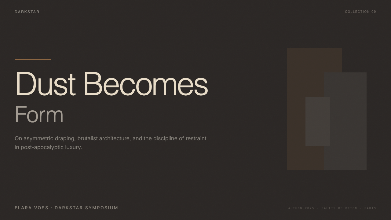
Rick Owens Darkstar is a visual design language distilled from one of contemporary fashion's most singular aesthetic universes. Where most luxury aesthetics pursue warmth, polish, or aspiration, Owens pursues the opposite: austerity, weight, and deliberate discomfort. The palette is compressed to a narrow band of deep charcoal, bare concrete grey, warm bone white, and a single accent of ochre-camel — the precise colors of ash, dried earth, and bleached skeleton. Nothing is saturated. Nothing reflects light easily.Rick Owens Darkstar 是从当代时尚界最独特的美学宇宙之一提炼出的视觉设计语言。大多数奢侈品美学追求温暖、光泽或向往感,而 Owens 追求的恰恰相反:严苛、重量与刻意的不适感。色板被压缩在极窄的范围内——深炭灰、裸露的混凝土灰、温暖的骨白,以及单一的赭土驼色点缀——这正是灰烬、干燥土地与漂白骨骼的颜色。没有任何饱和色,没有任何容易反光的表面。
The system's governing mood is what critics have called dystopian glamour — a contradiction held in tension. The materials feel severe and post-industrial, yet everything is executed with the precision of haute couture. Sharp right-angle corners replace any softness. Asymmetric compositions replace conventional balance. A fine film of atmospheric grain overlays every surface, suggesting weathering and time rather than digital polish. The effect is neither minimalism nor brutalism exactly, but something in between: restrained, grave, and charged with the kind of gravity that comes from refusal.这套系统的主导气质被评论界称为「末世魅惑」——一种在张力中并存的矛盾。材质感觉严酷而后工业,但一切又以高级定制的精度执行。锋利的直角取代了所有柔软,非对称构图取代了传统意义上的平衡。一层细腻的大气颗粒感笼罩每一个表面,暗示风化与时间的痕迹,而非数字时代的光滑。最终效果既非极简主义,亦非粗野主义,而是介于两者之间的某种东西:克制、肃穆,带着一种来自拒绝本身的重力。
In interface terms, Darkstar is a dark-mode design system where darkness is not merely a preference but a statement. The background is not simply black — it is the deep charcoal of unfinished concrete, with enough warmth to avoid coldness. Type sits in bone white rather than pure white, a distinction that removes clinical harshness. The single ochre accent appears rarely, like a drape of camel-colored fabric catching light in an otherwise colorless room. Grain texture is used as an atmospheric layer, not as decoration. Every element earns its presence by contributing to an overall mood of considered severity.落到界面设计上,Darkstar 是一套以黑暗为声明而非偏好的深色模式设计系统。背景不是简单的黑色——它是未完成混凝土的深炭灰,带有足够的暖意以避免冷漠。文字落在骨白而非纯白之上,这个细微差别消除了临床式的刺眼感。单一的赭色点缀极少出现,如同一片驼色织物垂落在否则无色的房间里,承接一束光线。颗粒纹理作为氛围层使用,而非装饰。每一个元素都必须以对整体「沉思式严苛」气氛的贡献来证明自己存在的必要。
See the Rick Owens Darkstar design system查看 Rick Owens Darkstar 完整设计系统
Where does Rick Owens Darkstar come from?Rick Owens Darkstar 从何而来?
Rick Owens was born in 1962 in Porterville, California, a small city in the Central Valley that he has described as aesthetically impoverished — strip malls, flat light, a landscape without drama. He moved to Los Angeles in his twenties, enrolled briefly at Otis College of Art and Design, and then spent years working as a pattern cutter in the downtown Los Angeles garment district, learning construction by hand rather than through formal design education. He launched his own label in 1994, initially selling through a single boutique in Los Angeles's Silver Lake neighborhood. The brand's earliest pieces showed what would become permanent obsessions: asymmetric draping, leather treated to look ancient, and a palette that refused the bright California sunlight entirely.瑞克·欧文斯1962年出生于加州波特维尔——中央谷地的一座小城,他曾描述那里在美学上极度贫乏:购物带、平淡的光线、毫无戏剧性的地景。二十多岁时他搬到洛杉矶,短暂就读于奥蒂斯艺术与设计学院,随后在洛杉矶市中心的服装区花了数年时间做版型师,以双手而非正式设计教育来学习服装结构。1994年他创立了自己的品牌,最初通过洛杉矶银湖区的一家精品店发售。最早期的作品已经显示出日后成为永久执念的特征:非对称垂坠、被处理得像古物一样的皮革,以及一套彻底拒绝加州明亮阳光的色板。
The move to Paris in 2003 marked a transformation in scale and international recognition, but not in aesthetic direction. Owens found the city's architecture — Haussmann stone, bare concrete parking structures, industrial banlieue — congenial to his sensibility. His Paris flagship store, designed with his wife and creative collaborator Michèle Lamy, featured bare poured-concrete walls, totemic furniture in bone and grey, and lighting calibrated to eliminate flattery. The store became as discussed as the clothes: a total environment that made clear Owens was not designing garments to be worn in ordinary life but objects belonging to a self-contained world. Lamy's influence on the aesthetic is difficult to overstate — her personal style, part shaman and part punk aristocrat, shaped the brand's visual language as much as Owens's technical mastery.2003年迁往巴黎标志着规模与国际认可度的跃升,但美学方向没有改变。欧文斯发现这座城市的建筑——奥斯曼式石材、裸露的混凝土停车场、工业化的郊区——与他的感性极为相投。他的巴黎旗舰店由他与妻子兼创意合伙人米歇尔·拉米共同设计:裸露的浇筑混凝土墙、骨白与灰色的图腾式家具,以及精心调校以消除一切讨好感的照明。这家店引发的讨论不亚于服装本身——它是一个完整的环境,清楚地表明欧文斯设计的不是日常生活中穿着的服装,而是属于一个自足世界的物件。拉米对这套美学的影响难以高估——她个人风格中萨满与朋克贵族并存的气质,与欧文斯的技术精湛一同塑造了品牌的视觉语言。
The Geobasket sneaker, introduced in 2014 and now one of the brand's most recognized objects, crystallized the Darkstar visual language in product form: an exaggerated sole that reads almost architecturally, an upper in bleached or deep-dyed leather, proportions that are simultaneously athletic and sculptural. Around the same period, the runway shows — staged at the Palais-Royal, on the salt flats of Venice's Lido, on stacked human performers — began attracting the kind of cultural commentary usually reserved for conceptual art. Owens was not making fashion that responded to trend cycles; he was building a mythology.2014年推出的 Geobasket 球鞋如今已成为品牌最具辨识度的产品之一,将 Darkstar 视觉语言凝结为具体的物件形态:近乎建筑感的夸张鞋底,漂白或深染皮革的鞋面,同时兼具运动性与雕塑感的比例。大约在同一时期,在皇家宫殿、威尼斯丽都盐滩、由叠放的真人表演者构成的舞台上举行的走秀,开始引发通常只属于观念艺术的文化评论。欧文斯做的不是响应潮流周期的时装;他在构建一套神话体系。
The design system now called Darkstar represents the current phase of that mythology — roughly 2022 to 2024 in its most refined expression — applied to digital and graphic surfaces. The key insight of its translation from fashion to interface is that the aesthetic's power comes not from any single element but from the compression of everything into a narrow tonal range, punctuated by extreme restraint in accent color. Where other dark-mode systems reach for drama through contrast, Darkstar achieves it through atmosphere: the sensation of standing in a room where the light is low, the walls are concrete, and everything that exists has earned the right to be there.现在被称为 Darkstar 的设计系统,代表了这套神话在大约2022至2024年间最为精炼的表达——被应用于数字与图形表面。将它从时装转译到界面的关键洞察在于:这套美学的力量不来自任何单一元素,而来自将一切压缩进极窄音调范围的过程,以及在点缀色上的极度克制。其他深色模式系统通过对比度来制造戏剧感,Darkstar 则通过氛围来实现:那种身处一个光线昏暗、四壁皆为混凝土的房间的感受——凡存在之物,皆已赢得存在的资格。
What defines the Rick Owens Darkstar look?Rick Owens Darkstar 的视觉特征是什么?
Palette色板
The color range is intentionally compressed to near-monochrome: deep charcoal functions as the primary field, warm bone white serves as the typographic and structural foreground, and bare concrete grey mediates between the two. A single ochre-camel tone — the color of desert earth or aged linen — is the system's only true accent, used with extreme restraint, typically once per composition. No saturated colors, no blue, no green. Darkness here is not black but a deeply warmed dark grey that recalls unfinished poured concrete.色彩范围被刻意压缩至近乎单色:深炭灰作为主要底面,温暖的骨白作为字体与结构的前景,裸混凝土灰在两者之间居间过渡。单一的赭土驼色——沙漠土地或陈年亚麻的颜色——是整套系统唯一真正意义上的点缀色,使用极度克制,通常每个构图中仅出现一次。没有饱和色,没有蓝,没有绿。这里的「黑暗」不是黑色,而是带有深沉暖意的深灰,令人想起未完工的浇筑混凝土。
Typography字体排印
Type is set in austere sans-serif forms — monumental, neutral, with no humanist warmth or geometric showiness. Letterforms are chosen for their architectural quality: they stand like slabs rather than flow like handwriting. Hierarchy is communicated through dramatic scale contrast rather than through color or weight variation: a headline can occupy multiple times the vertical space of supporting text, and that gap is treated as deliberate architecture. Sparse use of a refined serif — selected for editorial gravity rather than warmth — appears occasionally as a counterpoint in long-form content.字体采用严肃的无衬线形式——纪念碑式、中性,不带人文主义的温度,也没有几何风格的张扬。字形因其建筑质感而被选用:它们像石板一样矗立,而非如书写一样流动。层级通过戏剧性的尺度对比来传达,而非依靠色彩或字重变化:标题可以占据正文数倍的纵向空间,而这一距离被当作刻意的建筑结构处理。精炼的衬线字体偶尔少量出现,作为长篇内容中的对位元素,选用标准是编辑性的庄重感,而非温暖感。
Corners and Geometry转角与几何
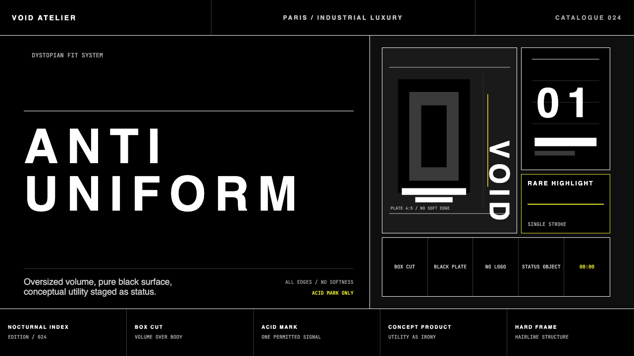
Every container, button, card, and panel maintains hard right-angle corners with no rounding whatsoever. This is not an oversight but a philosophical position: rounded corners imply approachability and consumer friendliness, which are values the system explicitly rejects. Shapes tend toward the rectilinear and slab-like. Proportions lean toward the elongated and narrow, or the massively wide — extremes that avoid the neutral centre. Asymmetry is structural, not decorative: layouts are weighted toward one side and balanced through emptiness on the other.所有容器、按钮、卡片与面板均保持硬直角,没有任何圆角处理。这不是疏忽,而是一种哲学立场:圆角暗示亲和力与消费者友好性——正是这套系统明确拒绝的价值观。形状倾向于矩形与石板感,比例偏向拉长且窄细,或极宽阔——两种极端都回避中性的居中状态。非对称是结构性的,而非装饰性的:版面向一侧倾斜,以另一侧的虚空来取得平衡。
Grain and Atmosphere颗粒感与氛围
A fine layer of grain or noise is applied as a surface treatment across backgrounds and sometimes large typographic elements. This is not retro affectation — it serves a precise function: it destroys the plastic perfection of pure digital surfaces and introduces a material quality associated with aged paper, concrete, and analogue film. The grain level is calibrated to be perceptible without calling attention to itself — it should read as texture rather than effect. Combined with the compressed palette, it gives every surface the quality of something that has existed in the world rather than been generated.细腻的颗粒或噪点层作为表面处理,覆盖在背景上,有时也覆盖在大型排版元素之上。这不是复古的卖弄——它服务于一个精确的功能:破坏纯数字表面的塑料式完美感,引入一种与陈年纸张、混凝土和模拟胶片相关联的物质质量。颗粒程度被校准为可感知但不引人注目——它应当被读取为质感而非效果。与压缩的色板结合,它赋予每个表面一种曾存在于真实世界而非被生成的质感。
Shadow and Depth阴影与深度
Shadows in the Darkstar system are minimal, dark, and rarely present. When depth is needed, it is suggested through layering of slightly different dark tones rather than through cast shadows with blur. Where a shadow does appear, it is hard-edged — a thin slice of absolute darkness at one edge of an element — suggesting the cool darkness between slabs of stone rather than soft light falling on a rounded object. Glow effects, inner shadows, and diffuse drop shadows are all absent; they belong to a vocabulary of warmth and approachability that the system rejects.Darkstar 系统中的阴影极简、深沉,且极少出现。当需要深度感时,通过略有差异的深色调叠加来暗示,而非通过带有模糊的投影。若阴影真的出现,它是硬边的——元素某一侧的一条绝对黑暗细线——令人联想到石板之间的阴凉缝隙,而非柔和光线落在弧面物体上的效果。发光效果、内阴影和弥散投影一律缺席;它们属于温暖与亲和力的视觉词汇,而这套系统拒绝那种词汇。
Spacing and Negative Space间距与留白
Space is used generously and deliberately, but not in the manner of luxury minimalism where emptiness signals expense. In Darkstar, negative space functions more like the silence between architectural masses — it creates weight by contrast, making the elements that do appear feel monumental rather than sparse. Margins are wide, line spacing is generous, and elements rarely crowd each other. The net effect is a layout that breathes heavily, as though measured not in design units but in footsteps through an empty room.留白被慷慨而刻意地运用,但其方式不同于以空旷感暗示高价的奢侈极简主义。在 Darkstar 中,负空间更像是建筑体量之间的静默——它通过对比制造重量,令出现的元素感觉纪念碑式而非稀疏。页边距宽阔,行距宽裕,元素之间几乎不拥挤。最终效果是一种深沉呼吸的版面,仿佛其量度单位不是设计单位,而是穿过空旷房间的脚步。
Accent Economy点缀色经济
The ochre-camel accent is the system's single chromatic departure, and its power depends entirely on restraint. Used too frequently, it becomes decoration; used at the right moment — a single active button state, one highlighted data point, a pull-quote in editorial content — it carries the weight of an entire color vocabulary. The principle is similar to the way a single draped textile changes the reading of a concrete room: everything around it becomes the context, and the accent becomes the event. The temptation to add a second accent color must be resisted; a second accent dissolves the system's compression.赭土驼色点缀色是整套系统唯一真正的色彩偏离,而它的力量完全依赖于克制。使用过于频繁,它就沦为装饰;在正确的时刻使用——单个激活状态的按钮、一个被高亮的数据点、编辑内容中的一段引语——它承载着整个色彩词汇的重量。这个原理类似于一块垂坠织物改变混凝土房间整体读感的方式:周围的一切成为语境,而点缀色成为事件。必须抵制添加第二种点缀色的诱惑;第二种点缀色会瓦解整套系统的压缩性。

See the Rick Owens Darkstar design system查看 Rick Owens Darkstar 完整设计系统
Who shaped Rick Owens Darkstar?谁塑造了 Rick Owens Darkstar?
Born in 1962 in Porterville, California, Owens trained as a pattern cutter rather than as a formal design student, which gave his work an unusual grounding in construction and material before concept. He launched his label in Los Angeles in 1994 and relocated to Paris in 2003, where his shows and stores became as culturally significant as the garments themselves. Owens has described his aesthetic as rooted in a desire to escape the brightness of California — a turning away from sunshine toward shadow, dust, and weight. His furniture line, runway productions, and architectural installations demonstrate that the Darkstar visual language is not a fashion aesthetic repurposed for other media but a coherent worldview expressed consistently across every scale.欧文斯1962年出生于加州波特维尔,接受的是版型师训练而非正式的设计教育,这使他的作品在形成概念之前就有了对结构与材料的异常深厚的根基。他于1994年在洛杉矶创立品牌,2003年迁往巴黎,他的走秀与门店在文化层面的重要性开始不亚于服装本身。欧文斯曾描述他的美学植根于一种逃离加州明亮阳光的渴望——一种从阳光转向阴影、灰尘与重量的背离。他的家具系列、走秀制作与建筑装置证明,Darkstar 视觉语言不是被挪用至其他媒介的时装美学,而是一种在每个尺度上都表达一致的完整世界观。
Lamy — artist, performer, and Owens's wife and creative partner since the mid-1990s — is the second intelligence behind the Darkstar aesthetic. Her personal visual language, which draws on West African textiles, punk iconography, shamanic ritual objects, and Parisian avant-garde performance, provided a human dimension and a ritual charge that Owens's architectural severity alone might have lacked. The Paris flagship's atmosphere — somewhere between a cathedral, a bunker, and an art installation — is as much Lamy's creation as Owens's. Her presence in the brand's visual world ensures that Darkstar reads as inhabited rather than merely constructed: a world someone actually lives in, however extreme.拉米——艺术家、表演者,自1990年代中期起成为欧文斯的妻子与创意伙伴——是 Darkstar 美学背后的第二智识。她个人的视觉语言汇聚了西非纺织品、朋克图像、萨满仪式器物与巴黎先锋表演,为欧文斯单纯建筑式的严苛注入了人文维度与仪式感。巴黎旗舰店的氛围——介于大教堂、地堡与艺术装置之间——是拉米与欧文斯共同的创造。她在品牌视觉世界中的存在确保了 Darkstar 被读取为「有人居住的」而非仅仅「被构建的」:一个真实有人生活其中的世界,无论多么极端。
The Australian model, artist, and frequent Rick Owens runway figure, Susman embodied a specific type that became central to Darkstar's human face: the figure who belongs to no particular era or cultural category, whose dress and bearing suggest a mythology rather than a trend. His recurring presence in Owens's presentations — sometimes performing rather than simply walking — helped establish that Darkstar is a total identity system, not a garment collection. The aesthetic has always been about a certain kind of person as much as a certain kind of object.澳大利亚模特、艺术家,也是 Rick Owens 走秀的常客。苏斯曼体现了一种特定类型,成为 Darkstar 人物形象的核心:一个不属于任何特定时代或文化类别的形象,其着装与举止暗示的是一套神话而非一种潮流。他在欧文斯发布上的反复出现——有时是在表演而非单纯地走秀——有助于确立 Darkstar 是一套完整的身份系统,而非一个服装系列。这套美学始终与其说是关于某种物件,不如说是关于某种人。
Pitt's adoption of Rick Owens as a primary wardrobe reference — extensively documented in press coverage from the late 2010s through the 2020s — served as an unusually effective cultural transmission mechanism for the Darkstar visual language. Where fashion insiders had followed Owens for years, Pitt's association brought the aesthetic to audiences who had no prior relationship with avant-garde fashion, demonstrating that Darkstar's severity could read as charismatic rather than alienating when worn with conviction. This crossover effect is relevant for designers: Darkstar translates to contexts with broad audiences when the commitment to the system is total.皮特将 Rick Owens 作为主要衣橱参照的选择——在2010年代末至2020年代的媒体报道中被广泛记录——成为 Darkstar 视觉语言异常有效的文化传播机制。时尚圈内部人士关注欧文斯已多年,但皮特的引介将这套美学带到了此前与先锋时装毫无关联的受众面前,证明了 Darkstar 的严苛感在以充分信念穿着时,可以被读取为魅力而非疏离。这种跨界效应对设计师而言值得关注:当对系统的承诺是彻底的,Darkstar 可以在受众广泛的语境中成立。
The physical stores — in Paris, New York, Los Angeles, Tokyo, Milan, and Seoul — are not mere retail environments but the primary three-dimensional expression of the Darkstar language. Designed under Owens's and Lamy's direction, they establish the material conditions from which every other application of the aesthetic is derived: bare poured concrete, totemic furniture in bleached wood and bone, lighting that reveals rather than flatters, absence of conventional display logic. Understanding the stores is essential to applying Darkstar to digital surfaces correctly, because the stores establish the answer to the most fundamental question: what is this space for, and who is supposed to feel at home here?在巴黎、纽约、洛杉矶、东京、米兰与首尔的实体门店,不仅仅是零售环境,而是 Darkstar 语言最主要的三维表达。在欧文斯与拉米的指导下设计,这些店面确立了这套美学所有其他应用的物质条件:裸露的浇筑混凝土、漂白木材与骨质的图腾式家具、揭示而非讨好的照明、对传统陈列逻辑的缺席。理解这些门店对于正确地将 Darkstar 应用于数字表面至关重要,因为它们确立了最根本问题的答案:这个空间为何而存在,谁应该在这里感到自在?
How do you use Rick Owens Darkstar today?今天怎么用 Rick Owens Darkstar?
Applying Darkstar to designed surfaces requires internalizing its governing principle before touching any individual element: this is a system built on compression and refusal. The charcoal-bone-ochre palette works not because each color is beautiful in isolation but because the extreme tonal narrowness forces every relationship to be meaningful. Adding a color outside the system — even a neutral grey-blue — immediately deflates the atmosphere. Similarly, rounding a single corner, softening a single shadow, or introducing any element that signals approachability will shift the register from severity to merely dark. Commit to the system entirely or do not apply it at all.将 Darkstar 应用于设计表面,在触碰任何单一元素之前,需要先将其核心原则内化:这是一套建立在压缩与拒绝之上的系统。炭灰—骨白—赭色的色板之所以有效,不是因为每种颜色单独看来都美,而是因为极度的色调窄度迫使每一种关系都必须是有意义的。在系统之外添加任何颜色——哪怕是一种中性的灰蓝——都会立刻消解氛围。同样,圆化任何一个转角、柔化任何一个阴影,或引入任何传递亲和力信号的元素,都会将整体基调从严苛滑向仅仅「深色」。要么彻底承诺于这套系统,要么根本不要应用它。
For presentation slides, Darkstar is exceptionally well-suited to high-stakes contexts where authority and gravitas are desired: investor decks for fashion or culture brands, architectural pitch presentations, portfolio work for photographers, directors, or artists. A cover slide benefits from extreme compositional austerity: a single short title in bone white, perhaps a sub-heading in charcoal, set against a deep charcoal ground with a grain overlay, and one ochre element — a ruled line, a single word — placed asymmetrically. Content slides should treat text as architecture: wide margins, generous leading, no decorative dividers, section changes marked by a shift in tonal weight rather than a visual ornament. Data slides take on an almost diagrammatic quality — when every element is stripped to necessity, a well-proportioned chart becomes sculpture.在演示文稿领域,Darkstar 非常适合权威感与庄重感是核心需求的高风险场景:时尚或文化品牌的投资人提案、建筑事务所的竞标陈述、摄影师或导演的作品集展示。封面页受益于极度的构图简约:骨白的短标题,或许有一行炭色副标题,置于带有颗粒叠加的深炭灰底面上,以及一个非对称放置的赭色元素——一条刻度线、一个单词。内容页应将文字当作建筑处理:宽页边距、宽裕的行距、无装饰分隔线,章节切换通过色调重量的转变而非视觉装饰来标记。数据页呈现出近乎图表式的品质——当一切被剥至必要之物,比例精准的图表即成为雕塑。
For web interfaces, Darkstar suits products where the audience has already demonstrated cultural literacy — portfolio sites, independent editorial platforms, high-end fashion e-commerce, architecture or design studio sites, and creative tool interfaces. The approach: establish a deep charcoal background as the global surface, use bone white for all primary text, and reach for ochre only for primary calls to action or active states. Hard-edged cards with no border radius replace rounded containers. Navigation is typographic and sparse. Imagery, where present, should be high-contrast and desaturated, treated as objects placed on the surface rather than windows into scenes. For dashboard or data-rich interfaces, the system's tonal compression actually aids scannability: differentiation through brightness and weight instead of hue.在网页界面领域,Darkstar 适合受众已表现出文化素养的产品:作品集网站、独立编辑平台、高端时装电商、建筑或设计工作室网站,以及创意工具界面。方法:以深炭灰背景作为全局表面,所有主要文字用骨白,赭色仅留给主要行动号召或激活状态。无圆角的硬边卡片替代圆角容器,导航字体化且稀疏。图像(若有)应高对比度且去饱和,被当作放置在表面上的物件而非进入场景的窗口。对于仪表板或数据密集型界面,系统的色调压缩实际上有助于可扫描性:通过亮度与字重而非色相来区分层级。
For editorial and marketing contexts, Darkstar carries an immediate editorial authority. A magazine layout in this system uses the grain overlay as a unifying surface across both text and image zones, breaks columns asymmetrically, and places full-bleed photography with no frame or caption — letting the image exist in the space the way a painting exists in a room. Marketing pages work through understatement rather than persuasion: claims stated once, briefly, in large bone-white type on charcoal ground, with no supporting imagery, no testimonials, no visual noise. The ochre accent, if used, marks the single action the page is designed to prompt — a link, a purchase, a sign-up — and appears nowhere else.在编辑与营销场景中,Darkstar 具有即时的编辑权威感。采用这套系统的杂志版面将颗粒叠加作为统一表面跨越文字与图像区域,非对称地打破分栏,并以无边框、无图说的方式放置满版出血摄影——让图像在空间中存在,如同一幅画存在于房间中。营销页面通过轻描淡写而非说服来运作:主张只陈述一次,简短,以大号骨白字体置于炭灰底面上,无配套图像,无用户证言,无视觉噪音。赭色点缀色(若使用)标记页面设计所要触发的唯一行动——一个链接、一次购买、一次注册——并在任何其他地方都不再出现。
A common mistake when applying Darkstar is treating it as simply a dark mode with fashion-forward associations. Dark mode is a preference; Darkstar is a position. The most frequent failure is softness that creeps in through small decisions: a border-radius that is almost nothing but not zero, a shadow that almost has no blur but technically does, a second neutral that is introduced as a background variant but registers as a new color. Each concession individually seems minor; together they dissolve the system's compression and produce a result that is merely moody rather than genuinely austere. The test: if removing an element would be felt as a loss rather than a simplification, it has probably earned its place. If its removal would go unnoticed or even feel like relief, it should not be there.应用 Darkstar 时最常见的错误是将它当作带有时装前沿联想的深色模式。深色模式是一种偏好;Darkstar 是一种立场。最常见的失败是通过细小决策渗入的柔软感:一个几乎为零但并非真正零的圆角,一个几乎没有模糊但技术上仍有模糊的阴影,一种作为背景变体引入但被感知为新颜色的第二中性色。每次让步单独看来都微不足道;加在一起,它们瓦解了系统的压缩性,产出的结果只是「有情绪感」而非真正严苛。检验标准:如果移除某个元素会被感受为一种损失而非简化,它可能已经赢得了自己的位置。如果它的消失不会被注意到,甚至会带来一种解脱感,它就不应该在那里。
See the Rick Owens Darkstar design system查看 Rick Owens Darkstar 完整设计系统
Rick Owens Darkstar — FAQRick Owens Darkstar · 常见问题
Is Darkstar only appropriate for fashion brands, or can it cross into other industries?Darkstar 只适合时尚品牌,还是可以跨越到其他行业?
The system travels well beyond fashion whenever the product or context shares its core values: gravity, authority, deliberate difficulty, and the rejection of mass-market friendliness. Architecture studios, high-end furniture and object brands, independent film and music projects, premium photography or video platforms, and certain categories of financial or professional services — particularly those positioning themselves as discerning rather than accessible — can all absorb the language authentically. Where it fails is in any context that needs to communicate warmth, inclusivity, playfulness, or sensory delight. A children's education product, a food delivery app, a social platform built on community — these all require a visual language that is the opposite of Darkstar's governing values.只要产品或语境与 Darkstar 的核心价值共享,这套系统便能远超时尚行业:庄重、权威、刻意的难度,以及对大众市场友好性的拒绝。建筑工作室、高端家具与器物品牌、独立电影与音乐项目、优质摄影或视频平台,以及某些类别的金融或专业服务——尤其是那些将自身定位为「挑剔」而非「易近」的品牌——都可以真实地承接这种语言。它失效的地方,是任何需要传递温暖、包容性、趣味感或感官愉悦的场景。儿童教育产品、外卖应用、建立在社群基础上的社交平台——这些都需要与 Darkstar 核心价值恰好相反的视觉语言。
How does Darkstar differ from other dark-mode or brutalist design aesthetics?Darkstar 与其他深色模式或粗野主义设计美学有何不同?
Most dark-mode systems are inverted light-mode systems: the same design logic, the same rounded corners, the same warm shadows, simply applied to a dark background. Darkstar is not an inversion — it is a different design logic built for darkness from the beginning. The distinction from brutalism is tonal: brutalist web design tends toward raw, deliberately unfinished surfaces, often with intentional ugliness as a statement. Darkstar is severe but not crude — it has the precision of haute couture even as it refuses decoration. Think of brutalism as concrete poured without care versus Darkstar as concrete poured with extreme care but left bare: both refuse polish, but only one is meticulous.大多数深色模式系统是浅色模式系统的反转:相同的设计逻辑、相同的圆角、相同的暖阴影,只是应用于深色背景上。Darkstar 不是反转——它是从一开始就为黑暗构建的不同设计逻辑。与粗野主义的区别在于基调:粗野主义网页设计倾向于原始、刻意未完工的表面,常以刻意的丑陋作为声明。Darkstar 严苛但不粗糙——它在拒绝装饰的同时拥有高级定制的精度。可以这样理解:粗野主义是随意浇筑的混凝土,Darkstar 是极度用心浇筑却保持裸露的混凝土——两者都拒绝抛光,但只有一个是讲究的。
The ochre accent seems very specific — can it be substituted with another color?赭色点缀色看起来非常具体——可以用其他颜色替代吗?
The ochre-camel tone is not arbitrary — it is derived from the physical materials of the Owens universe: camel-hide leather, desert sand, aged linen, bone. Its warmth is what prevents the dark palette from becoming purely cold, and its earthiness keeps it from reading as a conventional accent color. A substitution is possible but must meet the same criteria: warm rather than cool, desaturated rather than vivid, and associated with natural or aged materials rather than technology or energy. A terracotta, a very deep rust, or a bleached leather tone could serve the same function. Cool colors — electric blue, emerald green, any neon — are incompatible and should not be attempted: they import an entirely different value system into the palette.赭土驼色并非任意选择——它源于欧文斯物质宇宙中的实体材料:驼皮、沙漠沙地、陈年亚麻、骨质。它的暖意防止深色板变得纯粹冷漠,而它的土质感阻止它被读取为传统意义上的点缀色。替换是可能的,但必须满足相同标准:暖而非冷,去饱和而非鲜艳,与自然或陈旧材料而非科技或能量相关联。赤土色、非常深的锈红色,或漂白皮革色调都可以发挥相同功能。冷色——电蓝、翠绿、任何霓虹色——均不相容,不应尝试:它们会将一套完全不同的价值系统引入色板。
How should photography be treated when used within the Darkstar system?在 Darkstar 系统中使用摄影作品时应如何处理?
Photography in Darkstar functions like sculpture in a gallery: each image is a discrete object placed in space, not a background or a texture. Practically, this means images are cropped to strong geometric proportions, often unusually narrow or wide, placed with deliberate asymmetry, and treated to reduce their internal color range — desaturation, high contrast, and a slight cooling of any warm tones so that the image reads in the same tonal family as the rest of the surface. Images should not be given frames, strokes, or rounded corners. They exist on the background the way a slab of stone would: with mass, without apology. Lifestyle photography — people smiling, products in context, aspirational interiors lit warmly — is almost always incompatible; the system wants images that are closer to documents or records than advertisements.在 Darkstar 中,摄影的功能如同画廊中的雕塑:每张图像是放置在空间中的独立物件,而非背景或纹理。在实操层面,这意味着图像被裁切至强烈的几何比例——通常异常狭长或极宽——以刻意的非对称方式放置,并经过处理以降低内部色彩范围:去饱和、高对比度,以及对任何暖色调的轻微冷却,使图像与表面其余部分处于同一色调家族中。图像不应有边框、描边或圆角。它们在背景上的存在方式就像一块石板:有重量,无需道歉。生活方式摄影——微笑的人、在语境中的产品、暖光照射的向往感室内场景——几乎总是不相容的;这套系统需要的图像更接近文件或记录,而非广告。
Can Darkstar work for body text and long reading experiences, or is it too intense for sustained use?Darkstar 能用于正文和长篇阅读体验吗,还是说它太过强烈难以持续使用?
Long-form reading in Darkstar is achievable but requires specific adjustments. The key challenge is that bone white on deep charcoal, while comfortable for short text encounters, can cause eye fatigue over extended reading if the contrast is too high or the type too small. The solution is not to soften the aesthetic but to calibrate it: reduce the contrast between background and type slightly by warming both rather than reducing brightness, use generous leading and moderate line measure to reduce visual density, and set body text at a size that does not require the reader to strain. The grain overlay should be subtle enough at body text sizes not to break letterforms. The result, when done well, reads as a serious editorial publication rather than a web page — a quality that suits the kind of long-form content the Darkstar audience actually seeks.在 Darkstar 中进行长篇阅读是可行的,但需要特定的调整。核心挑战在于:骨白置于深炭灰上,虽然在短文本接触中舒适,但如果对比度过高或字号过小,长时间阅读会造成视觉疲劳。解决方案不是软化美学,而是校准它:通过同时加暖背景与文字(而非降低亮度)来略微降低两者之间的对比度,使用宽裕的行距与适度的行宽来降低视觉密度,并以不需要读者费力的字号设置正文。颗粒叠加在正文字号下应足够微妙,不至于破坏字形。做得好时,最终效果读来如同一本严肃的编辑出版物而非网页——这种品质恰好适合 Darkstar 受众真正寻求的那类长篇内容。
Related design styles相关设计风格
 Balenciaga (Demna era)Threatening restraint. Black grids, white hairlines, spaced sans at brutal sc…危险的克制。黑底网格、白色发丝线与巨型宽字距无衬线制造压迫。
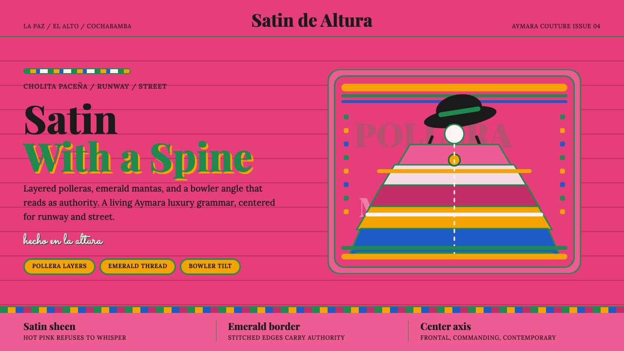 Bolivian Cholita FashionUnapologetic satin power. Hot pink fields, emerald stitches, centered pollera…拒绝低语的缎面力量。亮粉底、翡翠绣线与居中波列拉轴线。
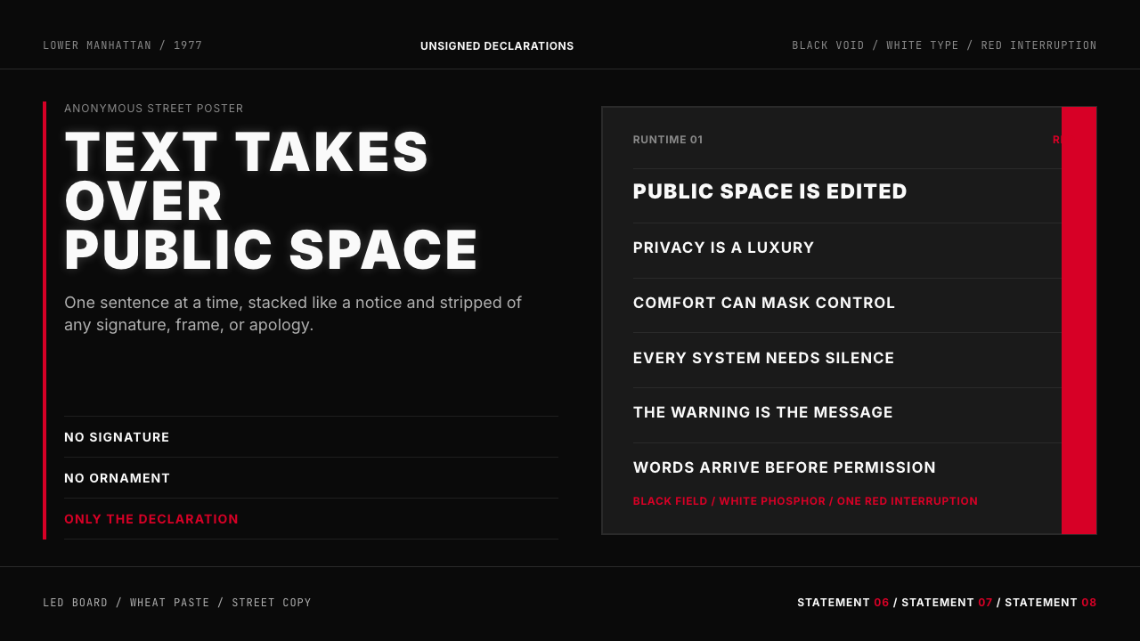 Jenny Holzer Truisms (1977)Austere declarations. White all-caps on black, cut by a single red warning.克制宣言。黑底白字,全大写排成LED板,红色只作警示。
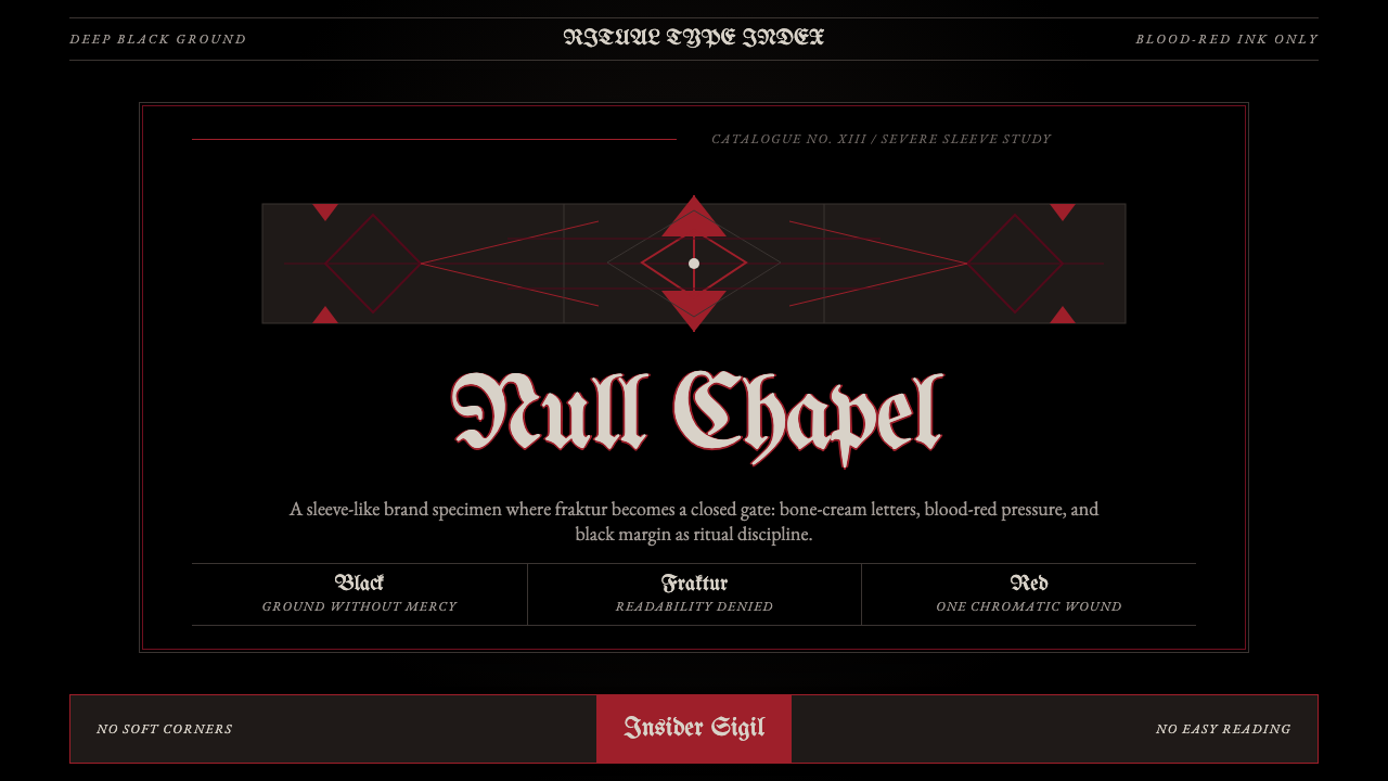 Death Metal BlackletterUnreadable by design. Bone fraktur on black, cut by one blood-red geometric s…以难读划界:黑底骨色哥特字,被一道血红几何符印切开。
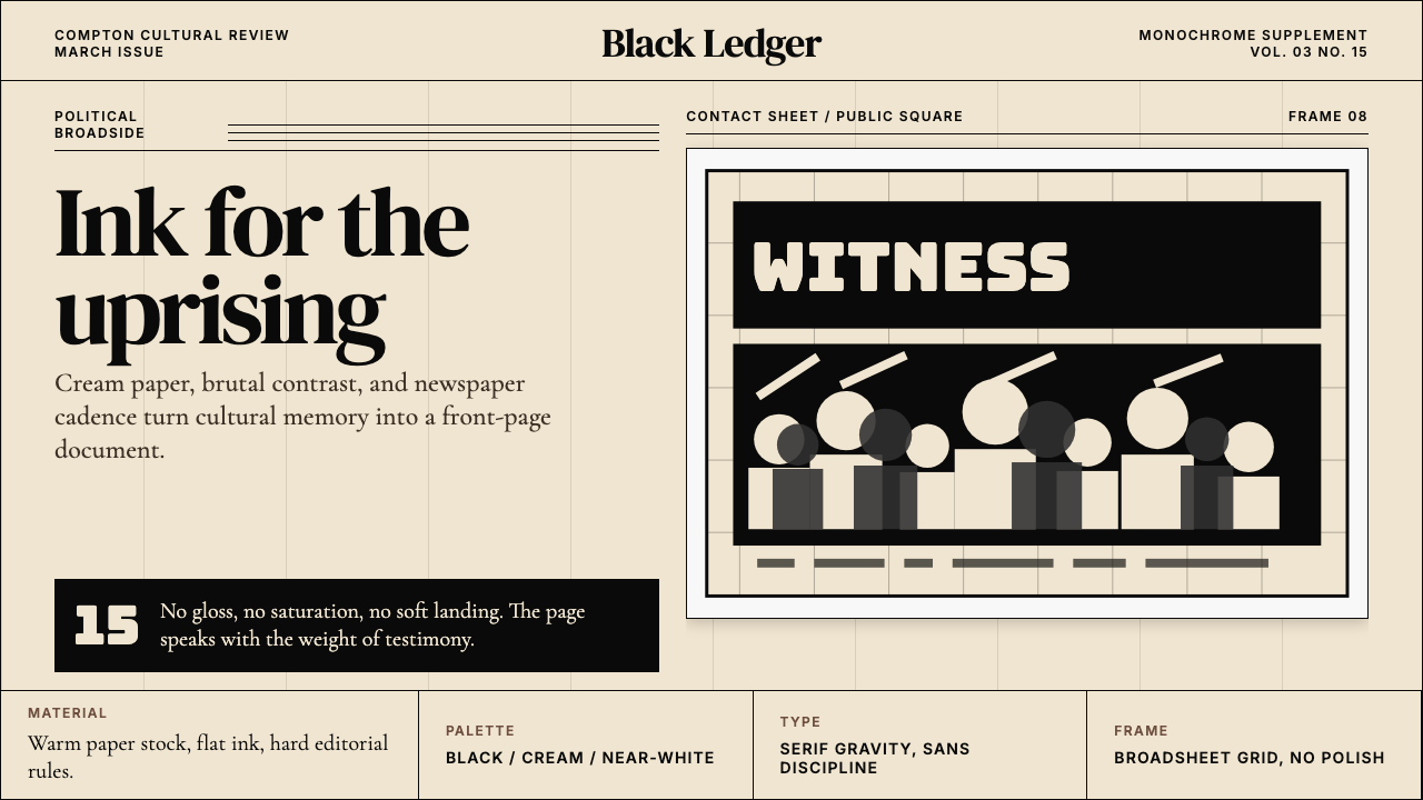 Kendrick — To Pimp a ButterflyPolitical weight, printed cold. Cream paper, hard serif type, monochrome crow…政治重量冷静落纸。米黄纸、硬衬线与黑白群像几何。
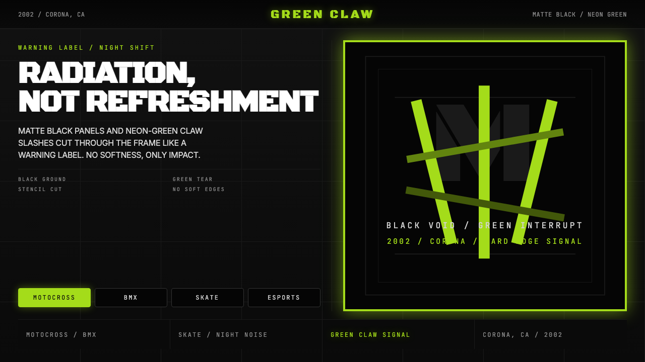 Monster Energy Claw (2002)Aggression, not refreshment. Matte black and neon-green claw slashes cut the…不是清爽,是冲击。哑黑底与霓绿爪痕撕裂画面。