What is Pojangmacha Soju Tent?
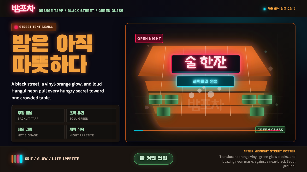
The pojangmacha tent turns a plastic-and-vinyl street stall into a nightly beacon — orange canvas glowing from within, soju-bottle green cutting through the dark, and Hangul neon humming overhead.
Pojangmacha Soju Tent in brief
Pojangmacha Soju Tent is a design system built from the visual grammar of Seoul's street-side drinking tents — folding-frame stalls, wrapped in translucent orange vinyl and lit from inside, that appear on sidewalks and under overpasses after dark. It is a night-market aesthetic rather than a daylight one: the ground is near-black, as if photographed at 11 p.m., and everything that reads as 'light' — the orange tarp glow, the green of a soju bottle catching a bulb, the flicker of a neon sign — is treated as a small, hard-won point of warmth against that darkness.
The system's defining move is contrast between an enclosing dark and a scattered, artificial glow. Unlike design languages that build warmth from soft daylight or natural materials, this one manufactures warmth industrially — through vinyl, plastic, and electric light — and does not apologize for that. Grit is part of the appeal: creased tarp, handwritten menu boards, mismatched stools. Nothing here is meant to look pristine or showroom-engineered.
Two colors do almost all of the storytelling. A saturated, lantern-like orange stands in for the tarp itself and for the general ambient glow of the tent interior. A cooler, bottle glass green — the color fixed to Korean soju packaging since the early 1990s — punctuates that orange with something crisper and more chemical, closer to a signal than a warmth. Layered over both, sharp neon accents (frequently rendered as Hangul script) supply the sense of commercial signage stacked above a street stall.
Where does Pojangmacha Soju Tent come from?
The pojangmacha (포장마차, literally something close to 'covered wagon' or 'wrapped cart') is a category of mobile or semi-permanent food stall that has operated on Korean streets for decades, but the version this design system draws on — the orange-vinyl tent with folding tables and plastic stools, serving late-night food alongside drink — reached its cultural peak roughly between the 1990s and 2010s. These tents cluster near train stations, office districts, and nightlife strips, unfolding each evening and vanishing again by morning, which is itself part of their romance: they are furniture for the night hours only.
The food is inseparable from the aesthetic. Tteokbokki (spicy stir-fried rice cakes) and odeng (fish-cake skewers simmered in broth) are the signature dishes, both associated with steam, heat, and communal eating off shared plates at close quarters. The tent is small enough that strangers often sit shoulder to shoulder, and the informal seating — plastic stools rather than chairs, folding tables rather than fixed ones — reinforces the sense of an occasion assembled quickly and taken down just as fast.
Soju, Korea's most consumed distilled spirit, supplies the system's second signature color. The green bottle is not an incidental detail: it was standardized by the major Korean distiller Jinro (진로) in 1994, and that specific bottle green has since become one of the most recognizable pieces of packaging in Korean consumer culture — as fixed an identifier of a Korean night out as the orange tent itself. Ordering soju at a pojangmacha, with its bottles catching the bulb light on a plastic table, is close to a cultural shorthand for an ordinary Korean evening among friends or coworkers.
The vendors themselves — commonly referred to respectfully as ajumma (아줌마, an older or married woman) or ajeossi (아저씨, an older man) running the stall — are largely anonymous as individuals, but collectively they are understood as central figures of Korean 야식 (yasik, 'night food') culture: a broader tradition of eating and drinking after dark that treats the late hours as their own social occasion, distinct from daytime meals, and often associated with unwinding after long office hours.
What defines the Pojangmacha Soju Tent look?
Color
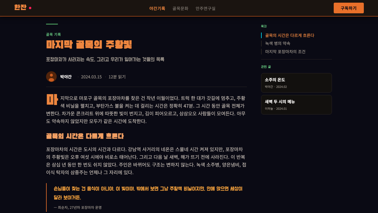
The palette runs on a deliberately small number of moves: an enveloping near-black ground, a warm saturated orange standing in for tarp and interior glow, and a cooler bottle green borrowed directly from soju packaging. Neon accent tones — often rendered as if backlit — sit on top of these two as a third, sharper layer. There is no attempt at a soft or pastel register anywhere in the system; every hue is pushed toward its most electric, sign-like version, because the visual premise is artificial light glimpsed at night, not natural color seen in daylight.
Typography
Display type leans on the weight and bluntness of hand-painted or neon-tube signage rather than refined editorial letterforms — thick strokes, high legibility at a glance from across a dark street, and a willingness to look slightly crude rather than polished. Hangul display lettering is treated as a genuine graphic element in its own right, not merely as text to be translated; its dense, blocky character shapes read as compatible with the same visual weight as the neon signs themselves. Supporting text stays plain and utilitarian, echoing handwritten menu boards rather than a considered brand type system.
Light as Structure
Because the entire premise is a lit tent against a dark street, light itself functions as the organizing device rather than layout grids or borders. Bright orange and neon elements behave like glowing signage — they draw the eye first and establish hierarchy through luminance contrast against the near-black ground, the way an actual pojangmacha reads from a distance before any detail is visible. Anything not meant to glow recedes into the dark rather than competing for attention, which keeps the system legible even though it never resorts to a clean, symmetrical grid.
Texture and Grit
Surfaces favor plastic, creased vinyl, and painted metal over anything glossy or seamless. Where texture appears, it should look handled — a tarp with visible folds, a menu board with visible brush strokes, a stool with the slight wear of daily stacking. This is a system that resists being smoothed into corporate cleanliness; the grit is not a flaw to be designed around but a central part of its late-night, street-level authenticity.
Density and Proximity
Compositions favor tight, close arrangements over generous negative space — tables crowd close together, signage stacks above eye level, and steam or glow effects overlap rather than sitting in isolation. This density mirrors the physical experience of the tent itself, where strangers sit shoulder to shoulder at shared tables. A version of this system that spreads elements out with wide, airy margins loses the sense of a small, packed, intimate space that defines the original.
Signage Layering
Neon and painted signage are treated as stacked layers rather than a single logotype — the way an actual tent accumulates a main sign, smaller hand-lettered specials, and strings of bulb lights all at once, without any single element being cleanly dominant. This layered clutter is intentional: it signals a living, operating stall rather than a designed storefront, and it gives the system a way to carry a lot of information (menu items, prices, atmosphere) without resorting to a tidy minimalist hierarchy.
Night as Default
Unlike systems that treat a dark mode as an alternate state layered on top of a light default, this one has no daylight version to speak of — near-black is the baseline, not a toggle. Every other decision, from color saturation to how signage is lit, assumes that baseline darkness. Attempting to translate this system onto a white or pale background removes the very tension between glow and dark that the whole aesthetic depends on.
Who shaped Pojangmacha Soju Tent?
Jinro is South Korea's dominant soju distiller and the company responsible for standardizing the green soju bottle in 1994 — a packaging decision that turned a specific shade of bottle glass into a near-universal visual shorthand for Korean soju, and by extension for the pojangmacha table itself. Jinro's continued market dominance means that green bottle, more than any single logo or slogan, functions as the drink's default public image across Korea and increasingly internationally.
The ajumma and ajeossi who operate pojangmacha tents are largely anonymous as named individuals, but as a collective figure they are central to the culture this design system represents. They set up and dismantle their stalls nightly, often in the same spot for years, building informal, recurring relationships with regular customers. Their labor — cooking to order on portable burners, keeping the tent lit and stocked through the night — is the lived reality behind the aesthetic's glow and warmth.
While not individual named figures, the street-food tradition around tteokbokki (spicy rice cakes) and odeng (fish-cake skewers) is inseparable from the pojangmacha's visual identity. These dishes are typically cooked and served in full view of customers, on shared hot plates or in communal broth pots — a display of process rather than a finished plate handed over, which is part of why steam and heat are such persistent visual motifs associated with the tent.
How do you use Pojangmacha Soju Tent today?
Pojangmacha Soju Tent transfers well anywhere a brand wants to signal late-night, street-level, unpretentious energy rather than daytime polish — food and beverage brands, nightlife and entertainment platforms, and any product that wants to feel lived-in rather than showroom-clean. Applying it correctly means committing fully to the near-black ground and letting only a disciplined handful of elements glow; scattering warm color everywhere flattens the very contrast the style depends on.
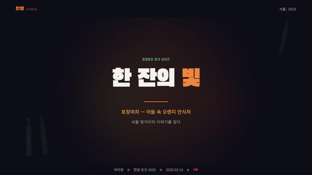
For presentation cover slides, the style works best as a single glowing focal shape — a tarp-orange panel or a soju-green accent block — placed against a dominant dark field, with bold, signage-like display type sitting directly on or beside the glow rather than floating separately in empty space. Content and data slides should keep that same discipline: dark backgrounds throughout, one or two accent colors doing all the highlighting work, and charts or callouts treated like small signs lit up against the dark rather than neutral data visualizations — a bar chart, for instance, can read like a row of tent lights rather than a generic business graphic.
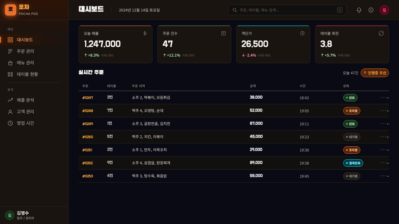
For web interfaces, dashboards and admin tools benefit from the light-as-hierarchy principle: keep the base near-black, reserve orange or neon-adjacent tones strictly for primary actions and alerts, and let everything else recede into dark, low-contrast surfaces. Pricing pages can lean into the density and signage-layering characteristics — stacking plan tiers the way a tent stacks signs, with the recommended tier picked out in the warmest glow. Restraint on the number of glowing elements is what keeps a dashboard readable rather than chaotic.
For editorial and marketing work, the style suits food culture writing, nightlife guides, and any brand story that benefits from a sense of specific place and time. Headers can borrow the layered-signage idea — a bold neon-style headline with a smaller, hand-lettered-feeling subhead beneath it, evoking a tent's signage stack rather than a conventional masthead. Marketing pages built around one hero image of glow-against-dark, with copy kept tight and grounded in real detail (a dish name, a street, an hour of night), read as more authentic than abstract nightlife imagery.
The most common mistake is treating this as a generic 'neon dark mode' and losing the specific cultural anchors — orange tarp glow and bottle-glass green — in favor of purple-and-cyan cyberpunk neon, a different aesthetic lineage entirely. A second mistake is over-brightening the composition until it no longer feels like night; the dark ground must stay dominant, with light appearing only in small, deliberate pockets, or the premise of a tent glowing against a black street collapses.
Pojangmacha Soju Tent — FAQ
Is Pojangmacha Soju Tent just a 'neon dark mode' with different colors?
No — the resemblance is superficial. Generic neon dark modes typically draw on cyberpunk or synthwave color logic (purple, cyan, magenta) and a futuristic, artificial mood. Pojangmacha Soju Tent is anchored to two very specific, real-world references — the translucent orange of a lit vinyl tarp and the particular bottle-glass green fixed by Korean soju packaging since 1994 — and its mood is nostalgic, communal, and street-level rather than futuristic. Swap in generic neon colors and the cultural specificity, which is the entire point, disappears.
Can this style work with a light or white background?
Not really, and attempting it undermines the aesthetic at its root. The entire visual premise depends on a dark, near-black ground against which orange and green elements read as glowing points of light — the way an actual tent looks lit up on a dark street. On a white background, those same colors read as flat decoration rather than light, and the sense of a nighttime scene disappears entirely. If a lighter treatment is genuinely required, it is closer to a different, related style than a variant of this one.
What is the significance of the green soju bottle in this style?
The green soju bottle is one of the two anchor colors of the entire system, alongside the orange tarp glow. It is not an arbitrary green — it derives from the specific shade Korean distiller Jinro standardized in 1994, which has since become one of the most recognizable pieces of consumer packaging in Korea. Using that particular bottle-glass green rather than a generic green signals authenticity to anyone familiar with the reference, in the same way a very specific red can signal a particular soft-drink brand rather than 'red' in general.
Does this style require literal food or drink imagery to work?
No. The style can be carried entirely through color, light behavior, texture, and type without any literal photograph of tteokbokki or a soju bottle. The characteristics that do the real work — near-black grounds, orange glow, bottle green accents, layered signage-like typography, and a dense, close composition — are transferable to dashboards, slide decks, and web pages that have nothing to do with food. Literal imagery can reinforce the reference but is not required to evoke it.
What kinds of products or brands should avoid this style?
It struggles wherever a brand needs to feel premium, corporate, or daytime-professional — enterprise software, formal financial reporting, or luxury goods generally want polish and restraint rather than grit and glow. It also struggles when a brand has no genuine connection to night-market or street-food culture; borrowing the aesthetic without an authentic link can read as costume rather than identity. It suits food and beverage, nightlife, and community-oriented products best, and fits poorly anywhere clean, daylight trustworthiness is the goal.
Related design styles
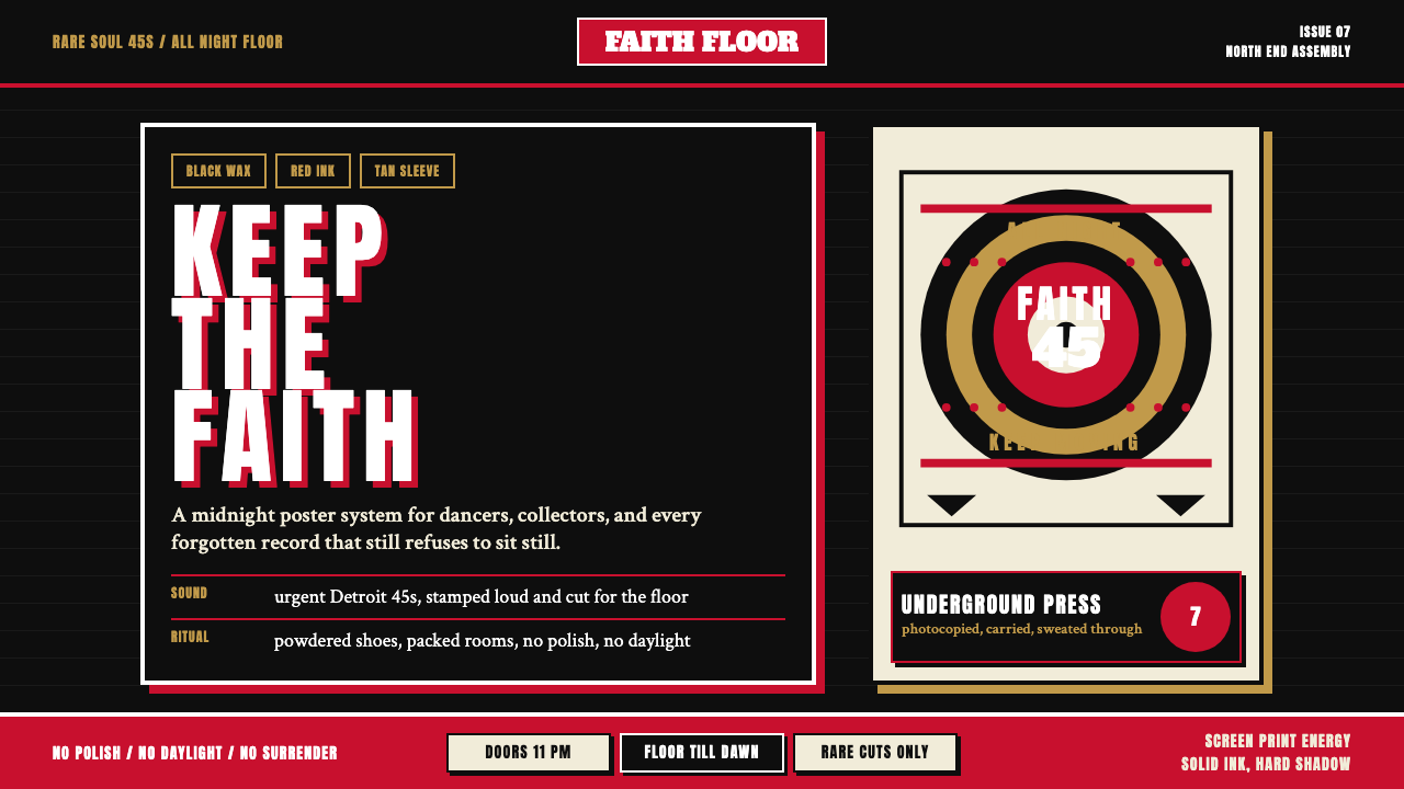 Northern Soul Wigan (1970)Underground urgency. Black ground, fist-red type, and tan vinyl rings hit lik…
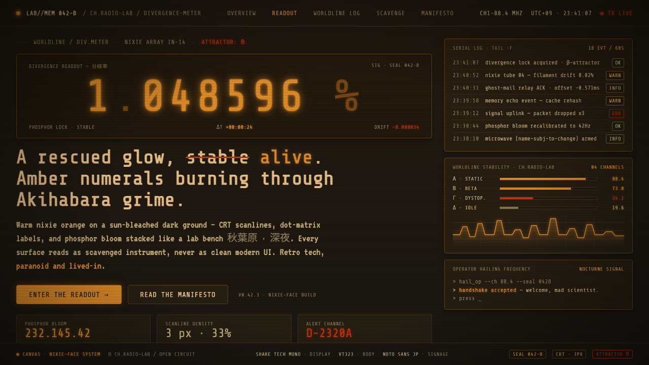 Steins;Gate CRTJunk-tech nostalgia. Nixie-amber digits glow on sun-bleached warm-black under…
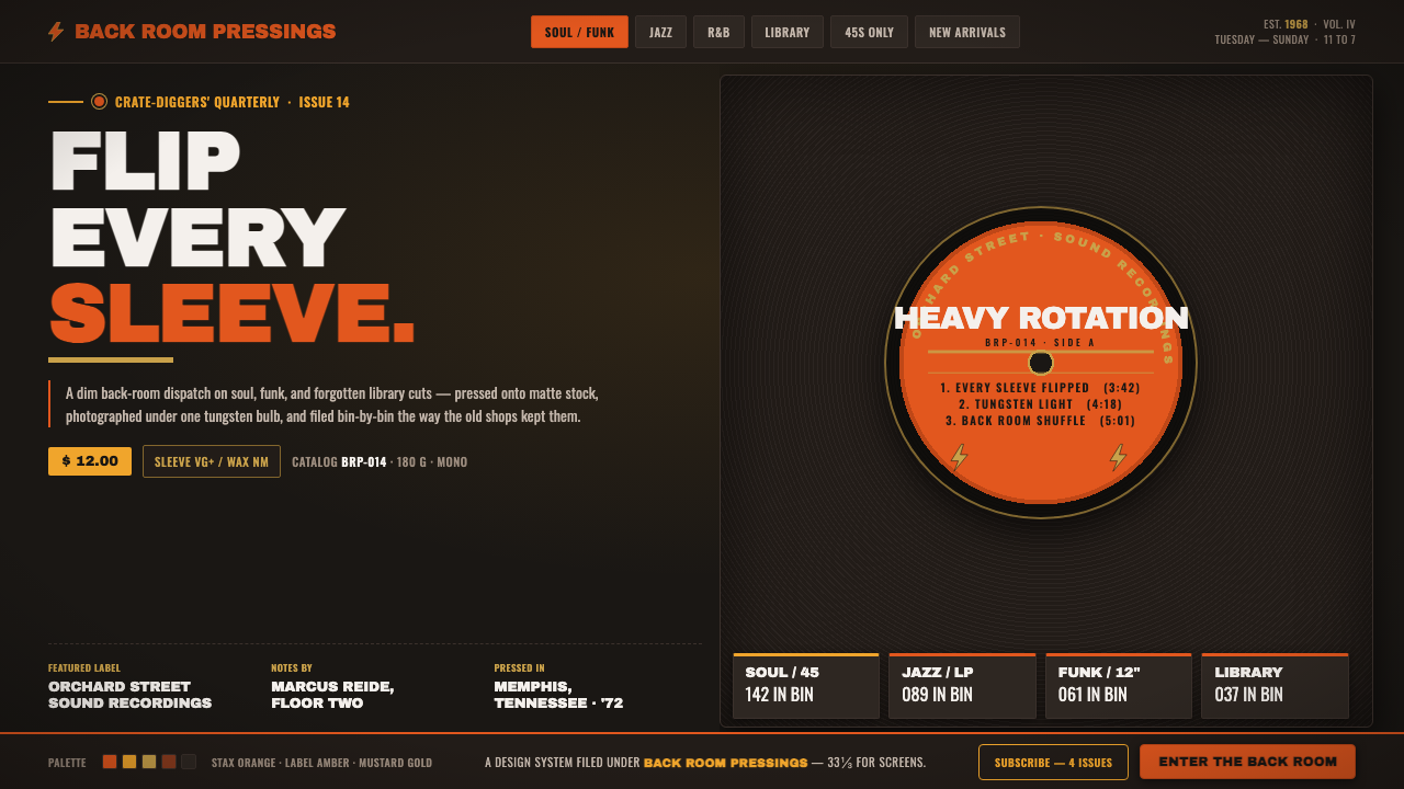 Vinyl Crate DiggingThe back room of a used record store. Stax-orange labels on near-black vinyl,…
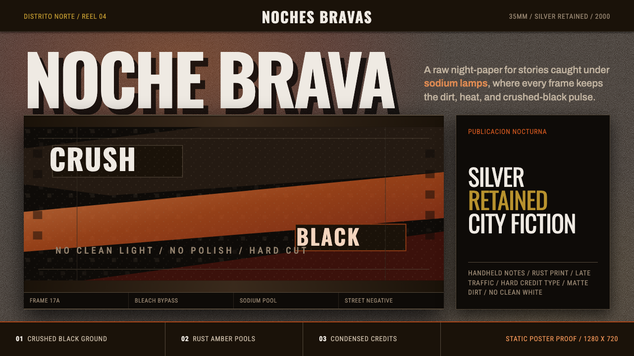 Amores Perros New WaveRaw street cinema. Crushed black, sodium amber, Oswald credits, heavy 35mm gr…
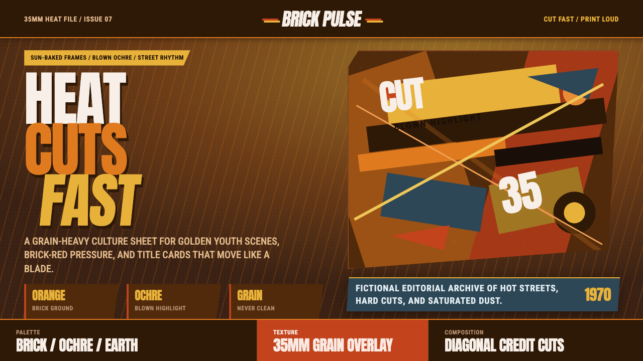 City of God FavelaHeat refuses polish. Orange brick, ochre glare, diagonal cuts, and grain do t…
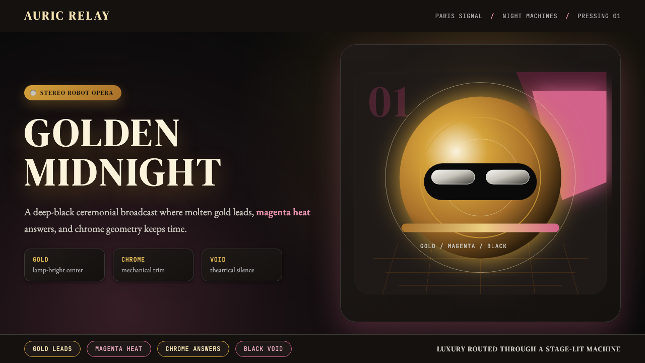 Daft Punk Discovery (Gold-Helmet)Warm sci-fi disco. Gold serif caps orbit a magenta void with chrome-disc geom…