What is Peaky Blinders (1919)?
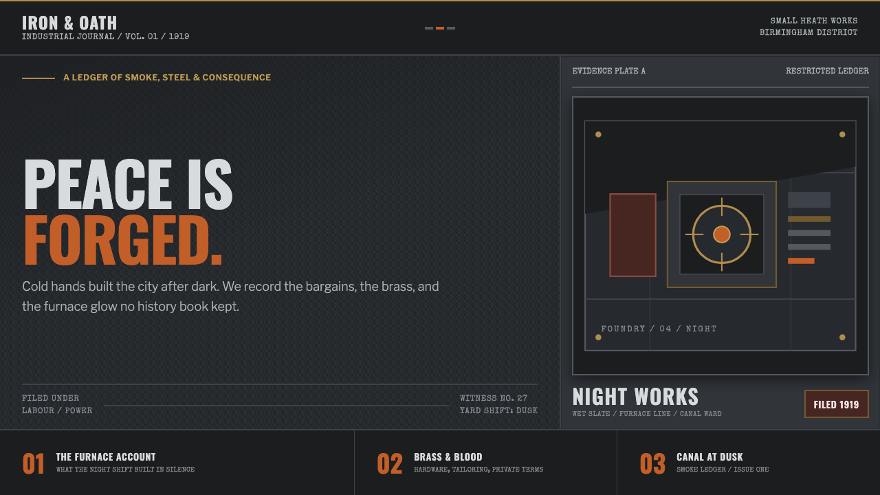
Peaky Blinders turns post-war Birmingham into a visual system of soot, steel, wet wool, and one dangerous flare of furnace light.
Peaky Blinders (1919) in brief
Peaky Blinders is a dark, industrial design language drawn from the world of Small Heath in Birmingham between 1919 and 1929. It is not nostalgic for the period’s comfort or ceremony. Instead, it foregrounds the hard surfaces and hard consequences of an industrial city after war: rain on slate, gaslight in fog, brass hardware, gunmetal tools, canal water at dusk, and tailored wool made heavy by smoke. The atmosphere is severe, controlled, and watchful.
Its visual identity works by withholding warmth. Most of the scene lives close to black-and-white: damp grays, exhausted browns, shadowed navy, dark leather, and the muted red-brown depth associated with a wool three-piece suit. Against that restraint, furnace amber or match-strike orange becomes dramatically important. A single warm point does not decorate the composition; it signals heat, risk, money, violence, or a moment of resolve.
The style combines British social realism, Edwardian industrial tailoring, and neo-noir television into one cinematic language. It frames people as if they are part of the machinery around them: a face cut by a cap brim, a hand near metal hardware, a figure swallowed by a fogged street. The result is polished but never pristine. Authority comes from material weight, composure, and the sense that every surface has already endured weather, work, and conflict.
Where does Peaky Blinders (1919) come from?
The style begins with its setting: Small Heath, Birmingham, England, in the decade after the First World War. The period places the visual world between industrial recovery and social aftermath. Factories, canals, yards, rail-adjacent spaces, workshop hardware, and working clothing are not background decoration; they define the emotional temperature of the system. Birmingham is read through its smoke, metal, dampness, and compressed light.
Its historical dress language is rooted in Edwardian industrial tailoring. The three-piece suit, wool texture, structured overcoat, leather accessory, and sharply shadowing cap create an image of discipline rather than leisure. Tailoring gives the characters a silhouette that is formal but practical, refined but physically close to labor, weather, and machinery. Dark cloth becomes a kind of armor, while brass and gunmetal details bring the industrial environment directly onto the body.
British social realism supplies the material and social pressure. Its influence appears in the attention paid to worn surfaces, workspaces, weather, smoke, and the physical reality of a working city. Nothing needs to look newly made. A room can feel valuable because of its darkness, its hardware, or the force of the people inside it, rather than because it is lavish. This is a world where texture carries biography.
The series, produced from 2013 to 2022, translates that setting through neo-noir television. Steven Knight is among the key figures associated with the work, alongside costume designer Stephanie Collie, production designer George Steel, and director Anthony Byrne. Their combined contribution gives the style its particular tension: period tailoring and industrial realism are shaped into composed, high-contrast frames whose menace is deliberate rather than accidental.
What defines the Peaky Blinders (1919) look?
Near-Monochrome Atmosphere
The base palette is drained almost to monochrome. Wet slate grays, soot-black shadows, muted zinc skies, tweed browns, dark leather, and gunmetal surfaces establish a cold visual field. This desaturation is essential because it makes the environment feel weathered, industrial, and morally compressed. The image should feel as though color has survived only where heat, blood, flame, or expensive material forces it back into view.
Furnace Ember Accent
Orange-amber light is used as a scarce event rather than a general atmosphere. It belongs to a struck match, forge glow, gaslit interior, cigarette ember, or a decisive moment in an otherwise cold scene. Because the surrounding field is so restrained, this accent carries narrative force immediately. It should appear isolated, hot, and purposeful, never spread across the composition as a cheerful decorative wash.
Industrial Materiality
Brass, gunmetal, blackened iron, damp stone, worn leather, and wool are the system’s key material references. They should feel touched, used, and exposed to smoke or rain. Surfaces are not glossy in a contemporary luxury sense; their appeal lies in tarnish, weight, friction, and age. Hardware, hinges, fasteners, rails, and tools can carry as much visual authority as a logo or illustration.
Cap-Brim Shadow
A hard diagonal shadow crossing the upper face is one of the style’s strongest framing devices. It creates concealment without fully erasing identity, turning a portrait into a negotiation between exposure and control. In broader compositions, similar diagonal cuts can be created with awnings, doorframes, railings, smoke bands, or sharply directed light. The shadow should feel like an obstacle placed between the viewer and the subject.
Foundry-Stencil Typography
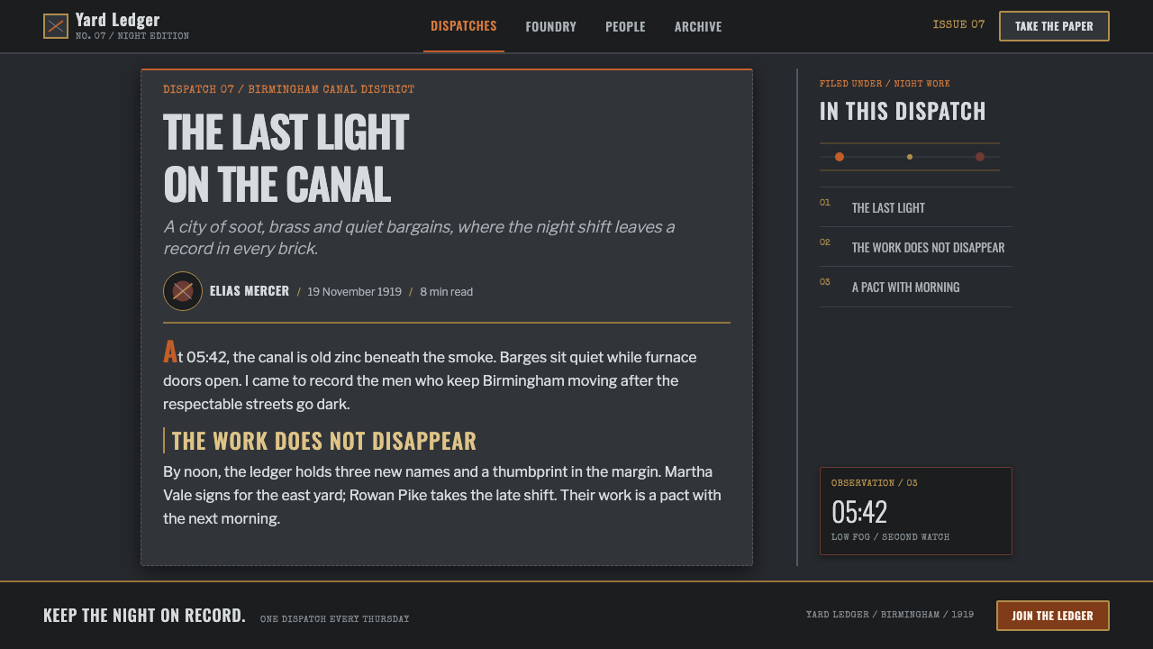
Typography should suggest factory marking, stencilled transport crates, official ledgers, or lettering struck into metal. The effect is compact, firm, and utilitarian, with a sense of physical pressure behind each word. Type should not become ornate or nostalgic in a decorative way. Its role is to label, warn, command, or declare, as if language has been made to survive a harsh working environment.
Tailored Severity
Edwardian industrial tailoring gives the system its disciplined human silhouette. Wool suiting, heavy lapels, waistcoat structure, dark coats, and restrained accessories create precision without softness. The clothes are neither costume decoration nor polished businesswear. They are social armor: formal enough to establish rank, durable enough to belong in a yard, workshop, or fogged street.

Who shaped Peaky Blinders (1919)?
Steven Knight is a key figure associated with Peaky Blinders and its post-war Birmingham setting. The system’s central visual conflict — private ambition and public industrial hardship — depends on a world where tailoring, smoke, street authority, and family power are inseparable. That framing gives the aesthetic more than period flavor: it gives each material and shadow dramatic purpose.
Costume designer Stephanie Collie is a key figure in the series’ visual world. The tailored silhouette is central to the style because it creates order inside an unstable environment. Wool, dark layering, structured garments, and controlled accessories make clothing a statement of authority while keeping it tied to the industrial conditions of Birmingham rather than to decorative period fantasy.
Production designer George Steel is associated with the built environment that makes the style persuasive: industrial texture, smoke-filled space, hardware, damp surfaces, and compressed light. The setting must feel inhabited by labor and machinery, not arranged as a clean historical display. This production-design logic is what allows a room, alley, canal edge, or yard to carry narrative threat before anyone speaks.
Director Anthony Byrne is among the key figures associated with the series’ neo-noir television language. The controlled framing, strong shadow, and selective flare of warm light are especially important to this approach. His place in the creative constellation helps explain why the style feels composed and cinematic even when it is built from mud, soot, fog, and practical industrial materials.
How do you use Peaky Blinders (1919) today?
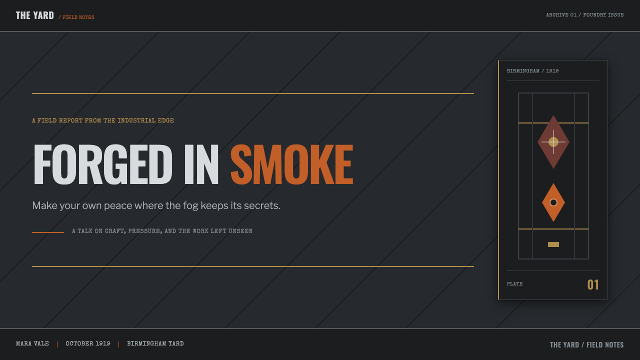
For presentation covers, treat Peaky Blinders as a tension system, not a period costume. Begin with a field of cold, weathered darkness and introduce one controlled industrial material or tailored silhouette. A title should sit with the certainty of a factory mark or a name on an official ledger. Use a single hot amber cue only when the cover needs a focal threat or a visual signal of urgency; the colder field must remain dominant.
Content slides should resemble a well-kept case file, a workshop notice, or a ledger retrieved from a dark office. Keep the reading path direct and use strong typographic hierarchy rather than ornamental dividers. For data, make charts feel engineered: muted structural marks, dark metallic bases, and one warm accent assigned only to the result that matters most. Avoid turning every series into a bright visual event, because the style depends on scarcity and controlled revelation.
For web interfaces, the language suits dashboards, operational tools, research portals, premium reporting, and pricing experiences that need authority rather than friendliness. Use dark environmental backgrounds with clear reading surfaces that feel like slate, paper, metal, or smoke-filtered glass. Navigation should feel concise and typographic. States for alerts, urgent actions, or the chosen plan can take the ember role, while ordinary controls remain restrained and industrial.
For editorial and marketing work, use close crops, fogged negative space, material-led still life, and portraiture with decisive shadow. A campaign page can alternate between dark atmospheric panels and quieter surfaces that preserve reading comfort, while wool, brass, canal imagery, tools, and weathered architecture establish the setting. The copy should be equally disciplined: short declarations, concrete nouns, and language that sounds earned rather than luxurious.
The common mistake is confusing this style with generic vintage gangster decoration. Overusing sepia, theatrical blood red, decorative flourishes, retro signage, or warm pub-like lighting makes the result sentimental and soft. Another failure is distributing orange throughout the interface until it becomes branding filler. Peaky Blinders works when cold industrial restraint remains primary and each warm flare feels dangerous because it is rare.
Peaky Blinders (1919) — FAQ
Is Peaky Blinders style simply a vintage or Edwardian look?
No. Edwardian industrial tailoring is one source, but the system depends equally on post-war Birmingham, British social realism, and neo-noir television. A merely vintage result may emphasize antiques, ornament, or nostalgic warmth. Peaky Blinders instead favors industrial pressure, dark material realism, controlled tailoring, and selective light. It should feel threatening and purposeful rather than charming.
Why is orange used so sparingly?
The furnace-orange ember works because it interrupts an otherwise desaturated world. It recalls a struck match, forge heat, or gaslight in fog, so it carries heat and consequence immediately. If it appears everywhere, the system loses its visual danger and becomes conventionally warm. Keeping it scarce lets one action, warning, number, or image detail feel charged without making the entire composition loud.
Can this style work without portraits or period clothing?
Yes. The style can be expressed through industrial materiality, dark slate-like atmosphere, hard directional shadow, foundry-like typography, and a rare furnace-light accent. A dashboard, report, or editorial layout can evoke the system through a rail, tool, brass fitting, fogged canal edge, weathered surface, or strongly structured wordmark. The key is to preserve pressure and restraint, not to reproduce a costume scene.
How should photography be treated in a Peaky Blinders-inspired layout?
Choose imagery with atmosphere and material evidence: smoke, wet street surfaces, metal, wool, brick, hands, machinery, canal light, or faces divided by shadow. Crop with intent and let darkness conceal part of the scene. Photography should support the sense of an industrial world under pressure, not provide bright documentary coverage. One isolated warm source can be powerful when the rest of the image remains cold.
Where does the style become inappropriate?
It can struggle where openness, tenderness, playfulness, or reassuring ease are essential to the product. Its strength is controlled menace, not universal warmth. It is better suited to serious editorial work, operational interfaces, premium reporting, dramatic campaigns, and narratives involving risk or authority. For a context that needs lightness or immediate emotional comfort, its shadows and industrial severity may create unnecessary distance.
Related design styles
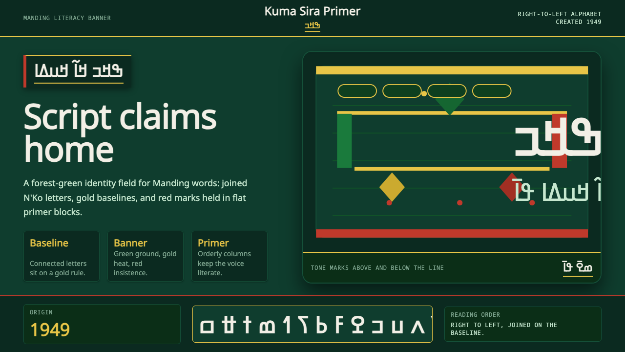 N'Ko ScriptIdentity writes itself. Forest green and gold baselines anchor joined N'Ko le…
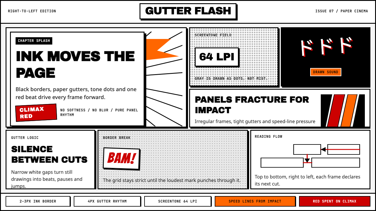 Manga Panel LayoutCinema in ink. Black panels, screentone dots, speed lines, and one red strike.
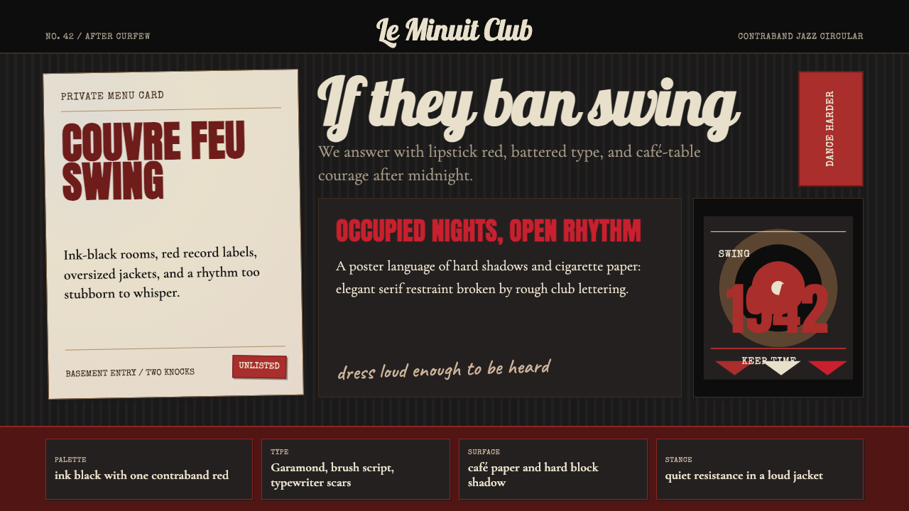 Parisian Zazou (1942)Defiance swings in the dark. Ink black, record-sleeve red, and battered typew…
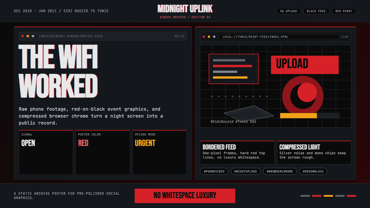 Tunisian Jasmine Revolution (2010)Raw urgency wins. Red browser grids and mono hashtags compress 3am protest in…
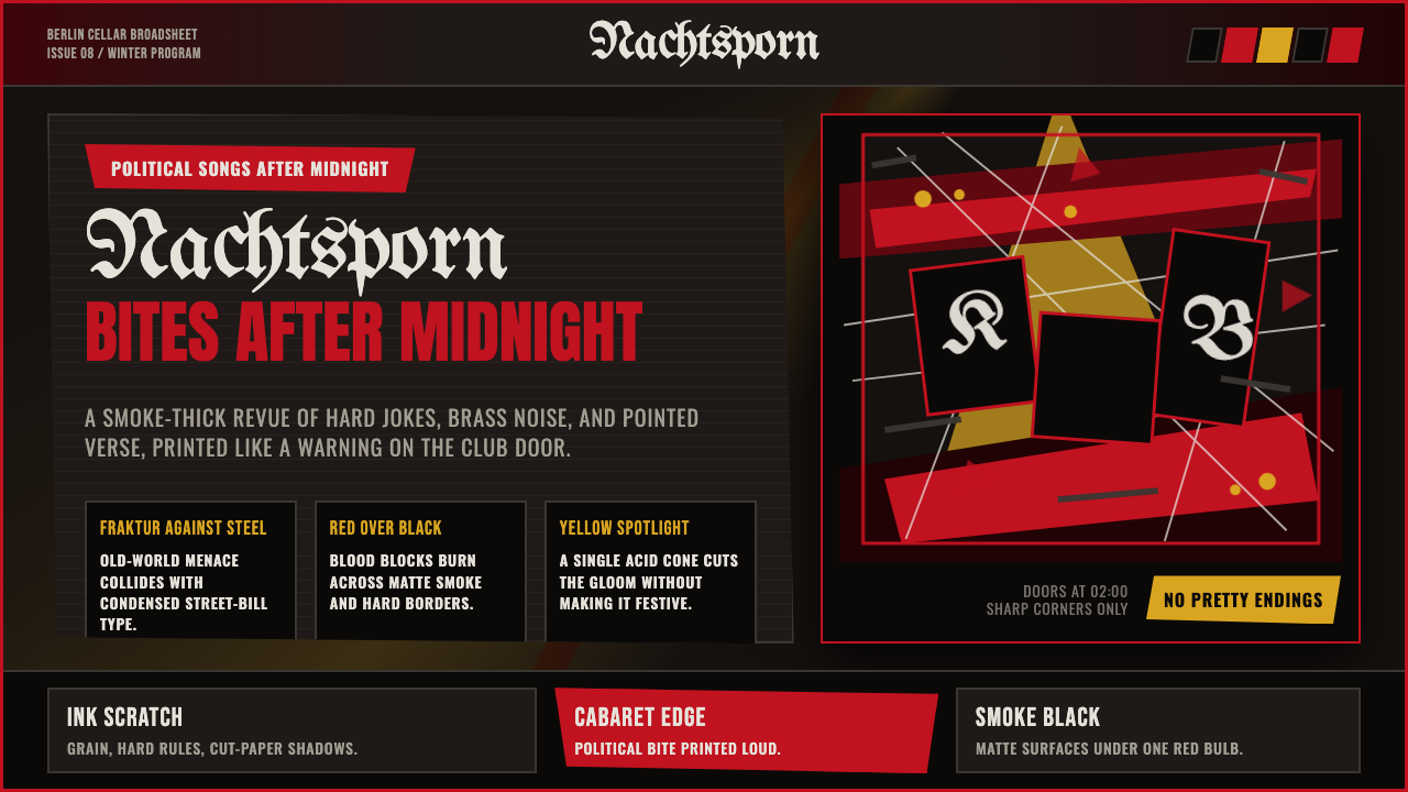 Weimar CabaretMenace at 2 a.m. Blood-red Fraktur, smoke-black grid, acid-yellow spotlight c…
 Chilean BRP Ramona Parra 1971Resistance stays alive. Blood red panels, black outlines, and stencil type re…