What is Orwell 1984 (Ministry Propaganda)?
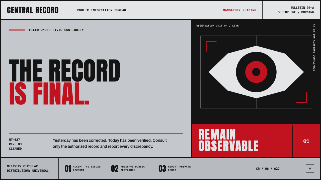
Orwell 1984 turns surveillance into a visual command: monumental black type, rationed red ink, and a cold gray grid that seems to watch the reader back.
Orwell 1984 (Ministry Propaganda) in brief
Orwell 1984, sometimes framed as Ministry Propaganda, is a fictional police-state visual language developed as a working design system. Its world is built from stencilled Party slogans, concrete-gray corridors, cheap newsprint, registration marks, and the single unblinking eye of Big Brother. Every component suggests that communication is not an invitation to think but an instruction to obey. The resulting surface feels public, institutional, and unavoidable: a bulletin posted where no citizen can decline to see it.
The system relies on flat propaganda red, printer's black, and a narrow range of hard institutional grays. Large geometric slabs organize the page; all-capital Ministry sans lettering supplies the voice; hairline rules and stamped marks make the composition feel processed, filed, and officially issued. Red is scarce by design. It is held back for warnings and a singular call to action, which makes each appearance feel less decorative than disciplinary.
Its austerity is central to the effect. There is no gloss, no warm texture, no gradient, and no comforting softness. Ink should seem pressed into rough pulp rather than polished across a premium surface. The style borrows its vocabulary from Constructivism, Soviet agitprop, wartime Ministry of Information design, and brutalist signage, then places those influences inside Orwell's dystopian Airstrip One. It is not nostalgia for bureaucracy; it is bureaucracy rendered as atmosphere.
Where does Orwell 1984 (Ministry Propaganda) come from?
The conceptual origin is George Orwell's novel, published in 1949. Its setting is Britain recast as dystopian London in Airstrip One, a place where political power is encountered through language, institutions, slogans, and constant observation. The design theme translates that literary environment into repeatable visual decisions: an eye becomes surveillance, a slogan becomes an order, and a printed notice becomes evidence that authority has already occupied public space.
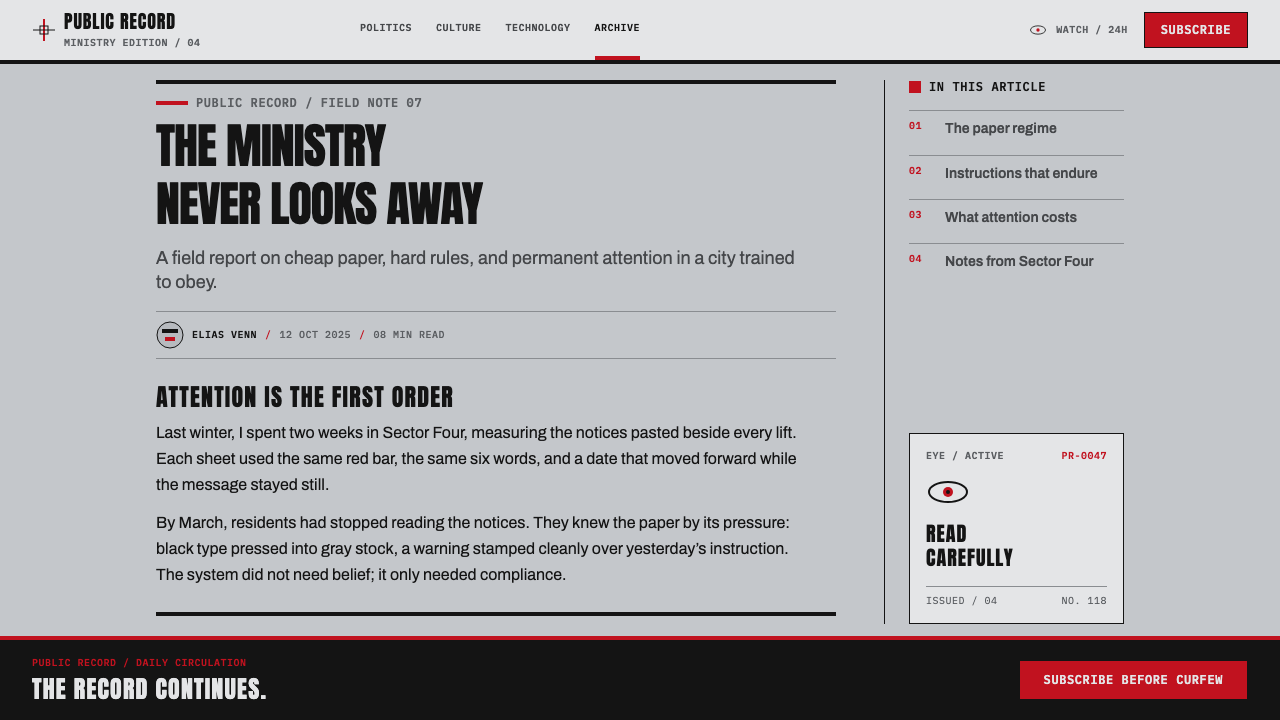
Its broader visual vocabulary spans agitprop and austerity from 1917 to 1955. Constructivism supplies emphatic geometry and forceful composition. Soviet agitprop contributes the direct address, stencil-like urgency, and public-poster logic. Wartime Ministry of Information design provides the bureaucratic tone: information must be legible, standardized, and distributed as an official necessity. Brutalist signage adds the architectural register of concrete, hard edges, and civic severity.
The cold-war atmosphere links these references without turning the system into a historical reconstruction. It takes graphic conventions associated with collective messaging and institutional control, then narrows them into a fictional apparatus of permanent propaganda. The cheap-newsprint feeling matters because it makes the message seem ubiquitous rather than precious. This is a style of mass circulation: reproduced, posted, read, and encountered again.
The listed figures provide a useful frame for the theme's cultural field: George Orwell, Eric Fraser, Michael Radford, Roger Deakins, and Shepard Fairey. Rather than treating the style as the property of a single artifact, the source places it among literary dystopia, graphic communication, cinematic interpretation, image-making, and public-poster culture. The result is a deliberately composite vocabulary whose unifying subject is authority made visible.
What defines the Orwell 1984 (Ministry Propaganda) look?
Rationed Color
The palette is intentionally narrow: propaganda red, printer's black, and institutional gray. Red must feel scarce and consequential, assigned to warnings, prohibitions, or one decisive action rather than spread evenly across the page. Black carries the voice of authority, while gray creates the corridor-like field around it. The restraint makes every red interruption read as escalation.
Monumental Type
All-capital Ministry sans turns language into architecture. Headlines should not sound conversational or expressive; they should appear issued, stamped, and impossible to negotiate with. Extreme contrast between large commands and small administrative text creates hierarchy through pressure. Type is not a friendly guide through content. It is the visible surface of an institution speaking down.
Cold Grid
The grid is orderly without becoming elegant. It resembles a filing system, a corridor plan, or a controlled distribution sheet. Thin rules divide fields with bureaucratic precision, while oversized blocks interrupt that order like walls or barricades. Alignment should feel compulsory, not refined for its own sake. The composition communicates that every message has been assigned a place.
Stamped Administration
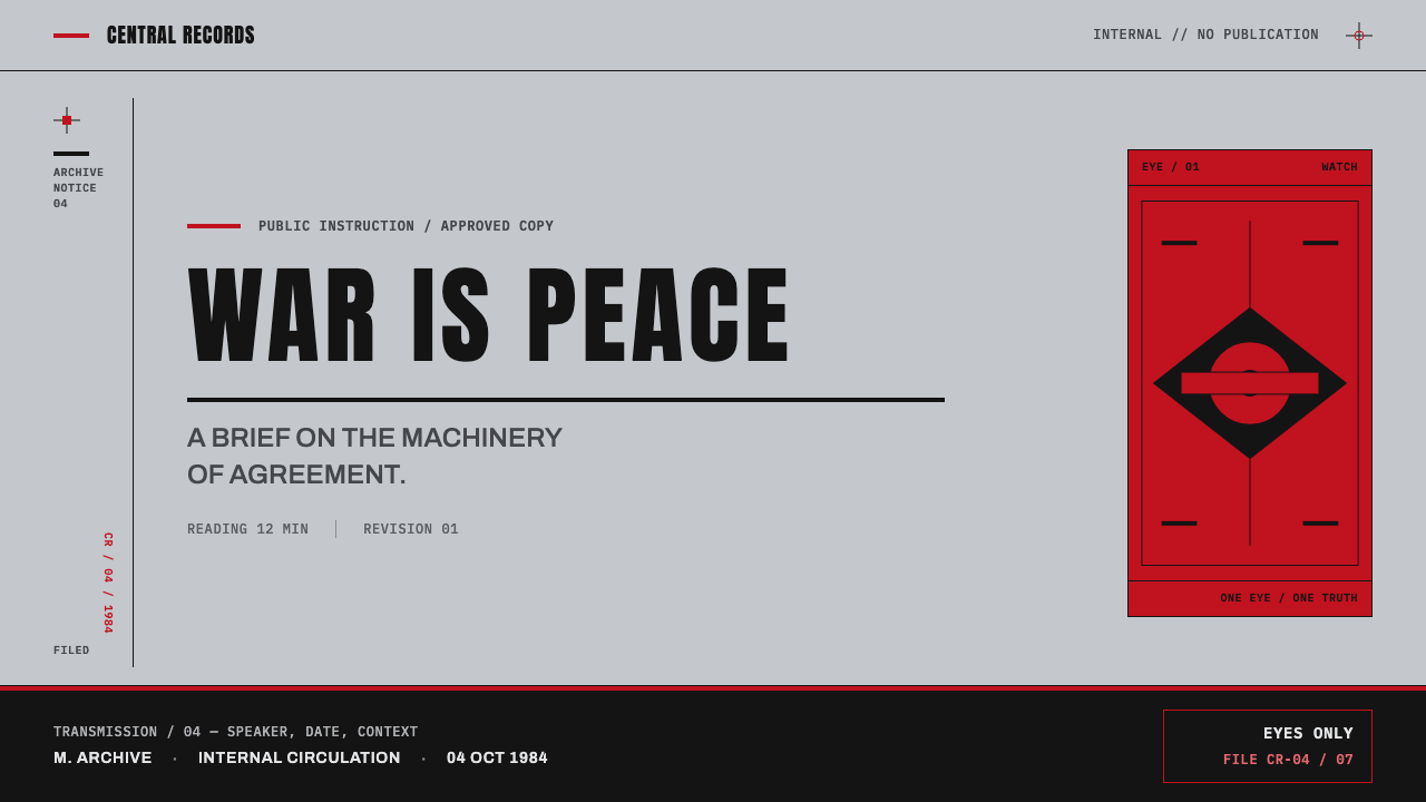
Registration marks, stencilled lettering, ruled lines, and bulletin-like framing make the image feel handled by a system before it reaches the reader. These details are not vintage decoration. They imply printing, checking, authorization, and circulation. Slightly rough edges can suggest cheap production, but the underlying layout remains controlled. Imperfection belongs to material scarcity; order belongs to power.
The Unblinking Eye
The Big Brother eye is the style's most concentrated symbol. It should not behave like a decorative logo or an illustrative flourish. Placed at commanding scale, cropped tightly, or isolated inside a field of type, it creates the sensation that observation is built into the communication itself. The eye turns a notice from a statement into a confrontation.
Cheap Ink, No Comfort
The intended material impression is cheap ink pressed hard into absorbent paper. Flat fills, blunt contrast, and dry-looking black make the page feel produced under constraint. Avoid gloss, gradients, atmospheric blur, and soft depth. The surface should not seduce the viewer; it should make reading feel compulsory. Austerity is not an absence of finish but the finish itself.
Who shaped Orwell 1984 (Ministry Propaganda)?
Orwell is the literary origin of the theme. His 1949 novel supplies the dystopian London of Airstrip One, the figure of Big Brother, and the premise that language, observation, and institutions can merge into a total environment. The design system translates those narrative pressures into typography, signage, and public notices.
Fraser appears in the source as a key figure within the theme's reference field. His presence helps position the style beside image-making and graphic interpretation, rather than limiting it to a purely typographic exercise. In this system, illustration must remain subordinate to the command structure of the page.
Radford is named as a key figure in the source material, locating the theme within a broader field of interpretation beyond the printed page. That framing is useful because Ministry Propaganda is atmospheric as much as graphic: its gray corridors, public notices, and watchful symbols imply a whole designed environment.
Deakins is included among the source's key figures. His inclusion reinforces the importance of controlled atmosphere in reading the theme: darkness is not required, but coldness, restraint, and a sense of institutional observation are. The visual language should feel staged by power, even when it is reduced to ink on paper.
Fairey is named in the source alongside the theme's other reference figures, connecting the system to public-poster culture and graphic address. The relevant lesson is not imitation but force: limited ink, direct words, emphatic scale, and an image that meets the viewer without apology.
How do you use Orwell 1984 (Ministry Propaganda) today?
For presentation covers, use the style as an announcement rather than a mood board. Let one immense black title or command occupy the field, interrupted by a single rationed red element and, where appropriate, a tightly cropped eye. Keep the ground pale and institutional. Content slides should become controlled notices: establish clear fields, use fine rules to separate evidence from instruction, and let one large statement dominate smaller explanatory copy.
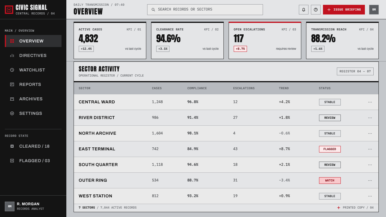
Data slides work when charts are treated as instruments of reporting, not decorative illustrations. Use black and gray for the base structure, reserve red for the one condition that needs attention, and remove visual effects that soften or dramatize the data. Labels should read like official classifications. A grid can hold tables, charts, and annotations together while oversized numerals create the feeling of a statistic elevated into policy.
For web interfaces, this language suits dashboards, administrative consoles, monitoring surfaces, and pricing pages that need strong hierarchy. Use the cold grid to divide navigation, status, and primary content. Let type establish authority; use red only for warnings, urgent changes, or a primary decision. Cards should feel like notices or files rather than friendly containers, and the eye motif should be rare enough that it remains unsettling rather than becoming a mascot.
For editorial and marketing work, the style is strongest when the message genuinely benefits from urgency, critique, or institutional tension. Feature pages can alternate dense printed fields with large blank gray areas, using rules and stamps to establish pace. Campaign-like posters can use a single command, a single symbol, and a single red interruption. The common mistake is to scatter red, distressed textures, eyes, and all-capital words everywhere. That turns disciplined propaganda logic into costume. Scarcity, hierarchy, and control are what make the system persuasive.
Orwell 1984 (Ministry Propaganda) — FAQ
Is this style simply Soviet propaganda design?
No. Soviet agitprop and Constructivism are named sources for part of its visual vocabulary, but the theme is anchored in Orwell's fictional police state and its British setting of Airstrip One. Wartime Ministry of Information design and brutalist signage are equally important to its institutional tone. It is a composite dystopian system, not a historical replica of any one government or movement.
Why is red used so sparingly?
Because red is the system's escalation signal. Against printer's black and institutional gray, a limited red mark reads as warning, prohibition, or command. If red is distributed everywhere, it loses that authority and the page becomes merely loud. The intended effect is rationing: color is a resource controlled by the institution, not a general means of visual enrichment.
Can the style work without the Big Brother eye?
Yes. The eye is the most explicit surveillance symbol, but the system also operates through monumental typography, restricted ink, controlled grids, registration marks, and bulletin-like hierarchy. Removing the eye can make a design more indirect and more adaptable, especially where institutional pressure should be suggested rather than illustrated. The remaining structure must still feel compulsory and publicly issued.
Does a dark background make the style more authentic?
Not necessarily. The source describes a cold gray grid and cheap newsprint, so a pale or gray ground is often closer to the intended institutional atmosphere. Black is powerful as type, a slab, or a field of interruption, but an all-dark layout can conceal the paper-and-ink tension that makes the system distinctive. Use darkness as pressure within the composition, not as an automatic default.
Related design styles
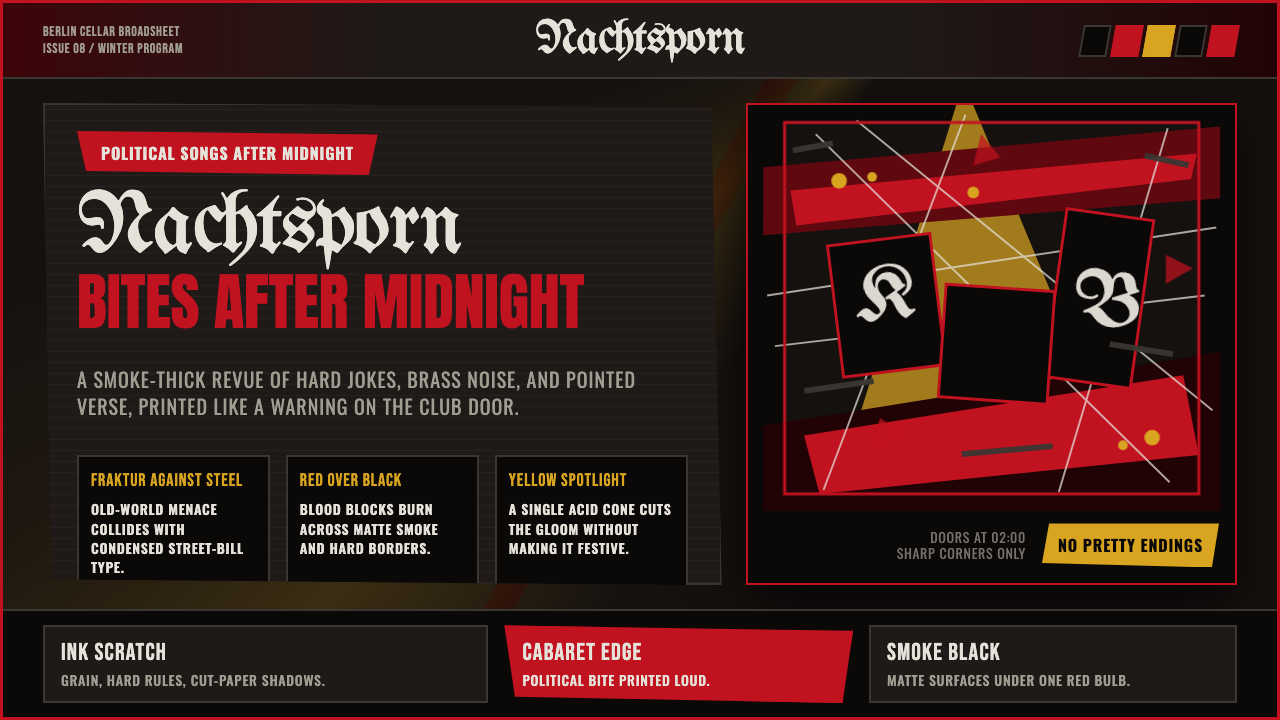 Weimar CabaretMenace at 2 a.m. Blood-red Fraktur, smoke-black grid, acid-yellow spotlight c…
 Alpine Ski PosterCold speed sells winter. Cobalt sky, snow planes, sun rays, and one resort-re…
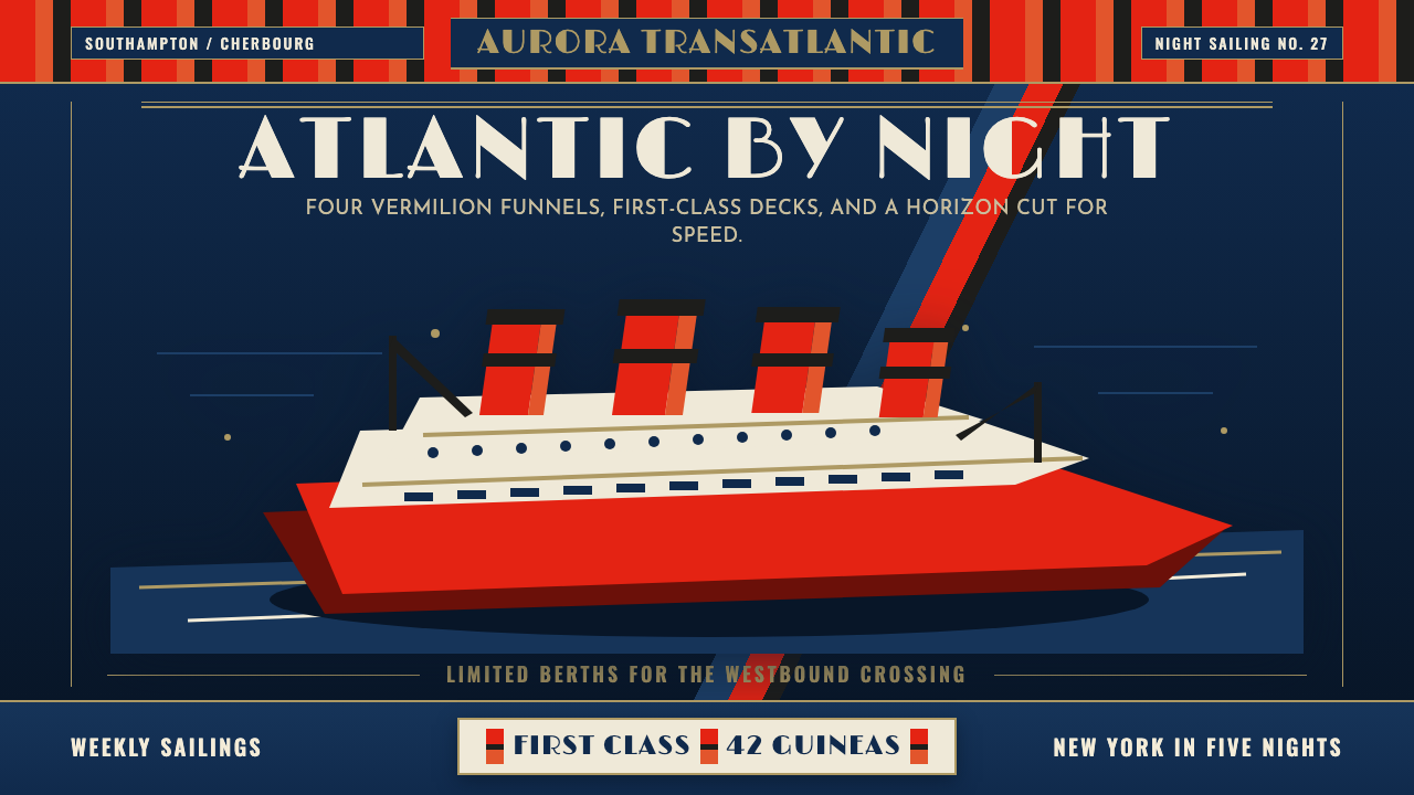 Cunard Liner PosterOceanic grandeur. Vermilion funnels, teak-gold caps, and a marine-blue poster…
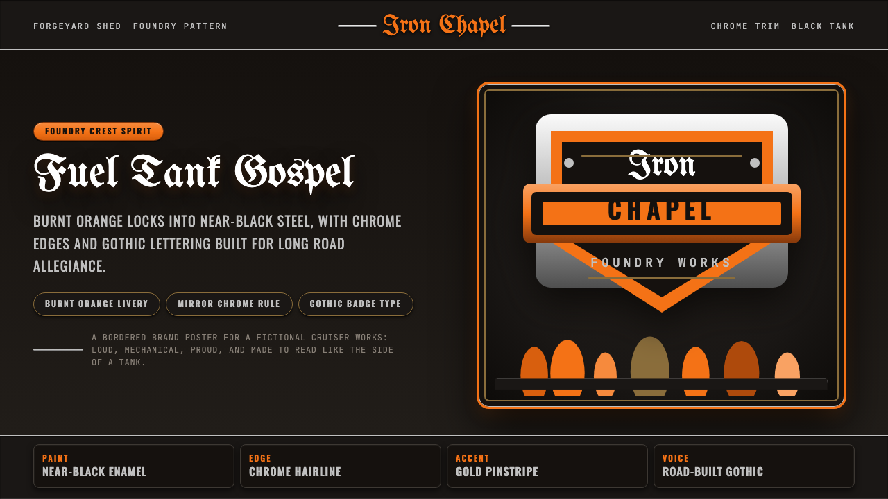 Harley Orange & BlackBuilt like a tank badge. Burnt orange, chrome hairlines, gothic type on near…
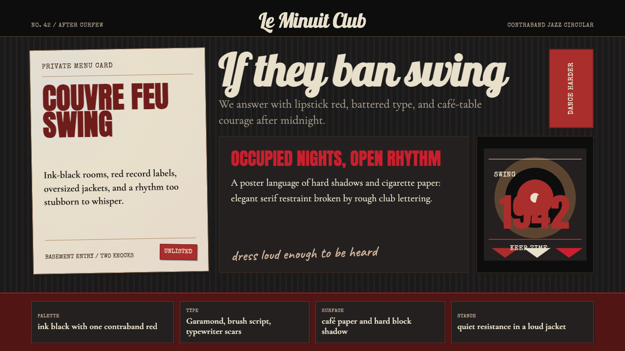 Parisian Zazou (1942)Defiance swings in the dark. Ink black, record-sleeve red, and battered typew…
 Peaky Blinders (1919)Industrial menace, struck alive. Cold slate grids meet one rare furnace-orang…