What is Muhammad Ali Fight Poster (1965)?
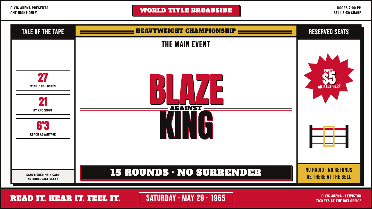
The Muhammad Ali fight poster turned promotion into combat: condensed type, blood red, dead black, and cheap paper collide with the force of a punch.
Muhammad Ali Fight Poster (1965) in brief
The Muhammad Ali Fight Poster style belongs to the loudest tradition of American boxing print: the wood-type broadside, the letterpress fight bill, and the mid-century sports advertisement designed to stop pedestrians before they reached the next storefront. Its visual language is deliberately blunt. Type is oversized, compressed, stacked, and pushed into collision. Names do not sit politely on a page; they occupy the page like rival bodies entering a ring.
The palette is brutally economical. Blood red and dead black are hammered onto cheap white poster stock, producing a field of maximum contrast with almost no visual softness. Red delivers impact, black establishes weight and authority, and white paper remains visible as the hard ground against which the information fights for attention. The result is not refined minimalism. It is controlled visual noise: every element shouts, but the shouting is organized.
The style is recognizable through its physical evidence as much as through its composition. Letterpress misregistration, rough paper edges, uneven ink coverage, and the blunt pressure of wood type create an image that feels printed rather than digitally assembled. A stacked collision of fighter names dominates the broadside, while a shouted fight detail such as “15 ROUNDS” and a hand-drawn starburst around the ticket price turn practical information into vocal performance.
Where does Muhammad Ali Fight Poster (1965) come from?
The style is rooted in nineteenth-century American wood-type broadsides, a poster tradition built for distance, speed, and public interruption. Wood type allowed printers to work with letters large enough to command a shop window or street-facing wall. The broadside was not designed for quiet reading at a desk. It was designed to be understood while passing by, often through a small number of forceful words, a recognizable name, and a visual hierarchy that could survive glare, weather, and imperfect printing.
By the 1960s, that older vocabulary had become inseparable from American boxing print culture. Fight posters had to announce opponents, stakes, rounds, venue information, and ticket details with immediate authority. The poster for Ali’s meeting with Sonny Liston in Lewiston on 25 May 1965 represents the peak of this language: a major sporting confrontation translated into a tall, aggressive public notice. Its design does not merely report the event. It stages the event before the fight begins.
The regional context is the United States, especially the letterpress shops and poster houses associated with Nashville and Baltimore. The source material names Hatch Show Print and Globe Poster Printing Corp. as key figures within this print culture. Their importance here is not presented as a single authorship claim, but as part of the broader ecosystem that made athletic spectacle legible through bold wood type, restricted ink, rough stock, and repeatable shop-floor methods.
The style also carries the logic of mid-century sports advertising: information must be immediate, emotional, and physically legible. The poster behaves like a public voice. Condensed gothic and slab capitals make the text feel packed and muscular; stacked names create rivalry; red and black establish the emotional temperature; and the starburst turns the ticket price into a cry from the street. The historical continuity is therefore clear: nineteenth-century wood-type force survives inside a 1960s boxing spectacle, intensified by the personalities of Ali and Liston and by the roughness of commercial letterpress production.
What defines the Muhammad Ali Fight Poster (1965) look?
Fighting Typography
Typography is the primary image. Condensed gothic and slab capitals are packed tightly, stacked vertically, and allowed to collide. Letterforms feel less like neutral carriers of language than physical bodies pressing against one another. The names of the fighters become the composition, while supporting information is treated as a series of shouted commands rather than quiet captions.
Blood Red and Dead Black
The color system is restricted but emotionally forceful. Blood red supplies action, danger, and the visual equivalent of a punch. Dead black supplies mass, authority, and the line that holds the composition together. Both are printed against cheap white stock, allowing the paper to function as a hard, exposed ground rather than a softened background. The palette gains its power from opposition, not variety.
Vertical Collision
The composition is tall and compressed, with the two central names stacked into a single vertical event. This arrangement creates rivalry without requiring illustration. One name presses against another; scale, alignment, and proximity do the narrative work. The poster feels like a wall of type advancing toward the viewer, turning the physical format of the broadside into a metaphor for confrontation.
Letterpress Evidence
Misregistration, uneven ink, rough edges, and the pressure of wood type are not defects to hide. They are evidence of the printing process and part of the style’s authority. The image should feel pulled from a working print shop, where ink meets paper with force and small inconsistencies survive in the final artifact. Smooth digital perfection weakens the sense of physical impact.
Hand-Drawn Shouts
The starburst around the ticket price introduces a deliberately improvised voice. Its role is not decorative refinement but interruption: it breaks the block of type and makes a practical detail feel urgent. Hand-drawn energy can appear in bursts, marks, or irregular emphasis, but it should remain subordinate to the main typographic collision. The roughness works because it sounds like a promoter calling from the street.
Cheap Stock, Maximum Force
The style depends on the tension between modest materials and oversized ambition. Cheap white poster stock is not treated as a neutral luxury surface; it is part of the public, temporary nature of the object. The limited material language forces the design to rely on scale, ink contrast, compression, and repetition. Nothing is precious, and that lack of preciousness makes the poster feel immediate, democratic, and physically available.
Who shaped Muhammad Ali Fight Poster (1965)?
Ali is the central public presence around which the poster’s visual aggression is organized. The source material places the style at the moment before his meeting with Sonny Liston in Lewiston on 25 May 1965. His name functions not merely as information but as a typographic force: a short, recognizable identity capable of carrying a giant stacked composition and turning a fight bill into a cultural announcement.
Liston is the opposing presence that gives the composition its collision. In the poster language, the rival’s name is not placed as a secondary caption; it is stacked against Ali’s as an equal block of pressure. This relationship allows typography alone to communicate contest, anticipation, and physical threat before any photograph or illustration is introduced.
Neil Leifer appears in the source material as one of the key figures associated with this cultural field. Within the article’s scope, his name helps situate the poster style beside the wider visual world of Ali-era sports imagery, where boxing was communicated through direct, memorable public images rather than restrained corporate polish.
Hatch Show Print is named as a key figure within the American letterpress environment behind this style. Its presence in the source material points to the importance of print-shop practice: wood type, restricted ink, bold hierarchy, and the ability to make a poster that could speak loudly through a storefront window.
Globe Poster Printing Corp. is another named presence in the source material’s account of American poster production. The name belongs to the network of poster houses that made commercial spectacle visible through physical print, connecting sports advertising to the broader tradition of forceful, reproducible, street-facing letterpress graphics.
How do you use Muhammad Ali Fight Poster (1965) today?
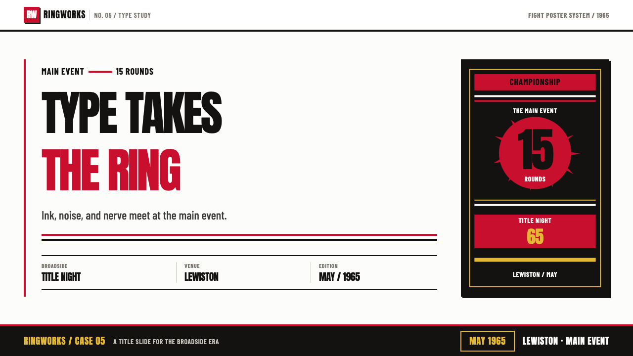
For presentation slides, use the style most aggressively on the cover and the opening of each section. Treat the title as the fight bill: stack the main words, compress the spacing, and let red and black establish an immediate contest against white paper. Content slides should keep the same typographic voice but reduce the collision enough for reading. Data slides can turn figures into shouted evidence: large numerals, blunt labels, strong bars, and a starburst-like emphasis for the single fact that matters most.
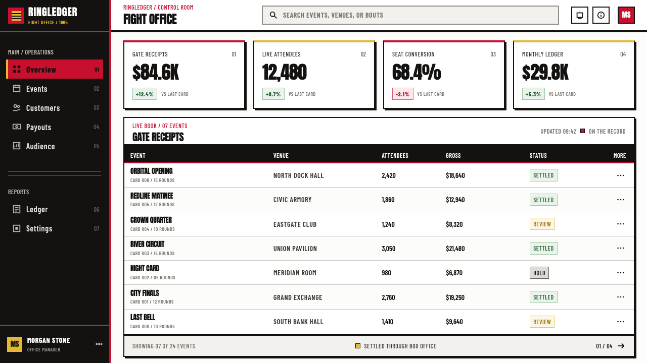
For web interfaces, this style works best in dashboards, pricing pages, event pages, and products that need to feel decisive rather than soothing. Use a white or paper-like ground, black for structural text, and red for active states, warnings, selected plans, or the primary action. Cards should feel printed and posted rather than softly floating. Tables, filters, and labels can use condensed typographic hierarchy, while the strongest emphasis should come from stacked headings, rules, and blocks of ink-like contrast.
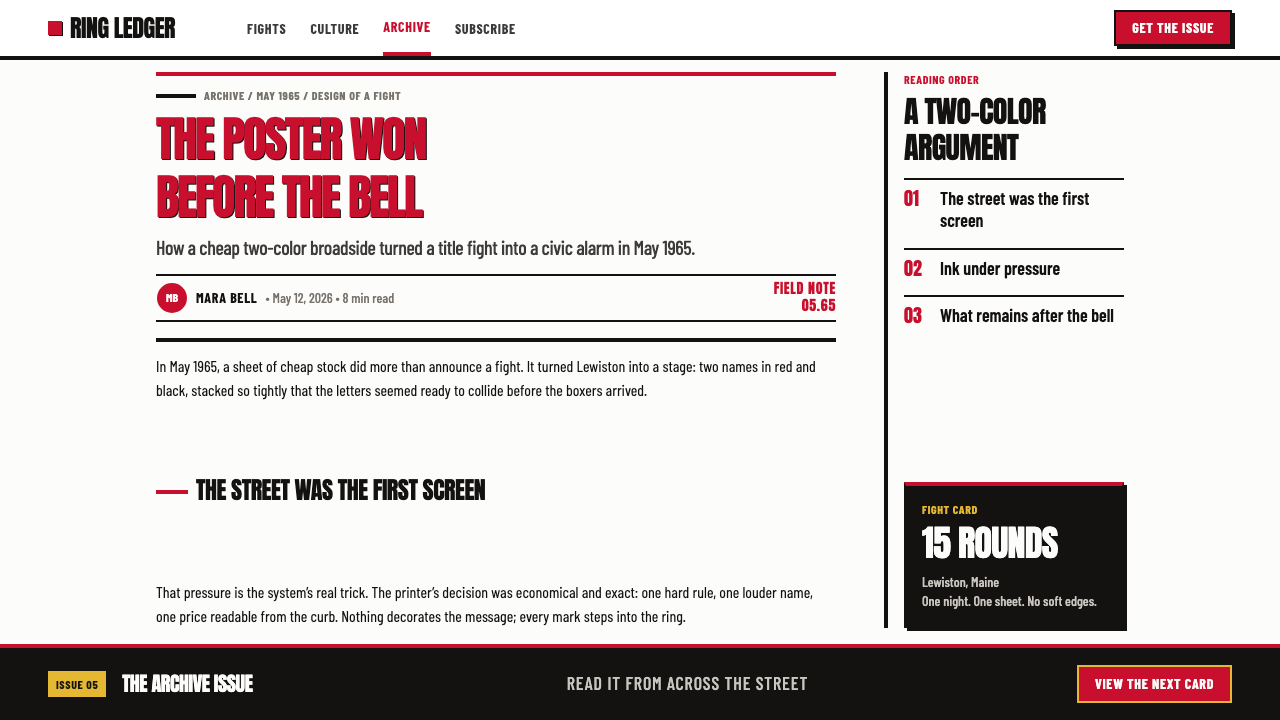
For editorial and marketing work, the fight-poster language is especially effective when the subject has urgency, rivalry, performance, or public spectacle. A feature article can open with a giant stacked headline, a narrow column of explanatory text, and one red interruption that behaves like a printed callout. Marketing pages can use a broadside rhythm: bold announcement, compressed supporting details, a price or offer inside an irregular starburst, and a final black field that gives the message the feeling of a closing bell.
The style also suits campaign graphics, cultural event notices, sports programming, and product launches that want to appear direct and memorable. Use the physical vocabulary consistently: paper-like grounds, hard ink contrast, condensed or slab display type, and occasional evidence of imperfect registration. If imagery is included, it should support the typographic confrontation rather than compete with it. The poster should still work when the image is removed and the words are left to carry the event.
The common mistake is confusing loudness with indiscriminate clutter. Using red, black, distressed texture, multiple display faces, irregular bursts, and oversized labels everywhere destroys the hierarchy that makes the style effective. Choose one dominant typographic collision, one clear accent color, and one supporting interruption. Another mistake is polishing away every trace of print evidence. The goal is not to imitate damage randomly; it is to preserve the feeling that ink, type, and paper met under pressure.
Muhammad Ali Fight Poster (1965) — FAQ
Is this style simply a retro boxing poster?
No. Boxing provides the original subject and emotional charge, but the transferable system is broader: oversized condensed type, restricted red-and-black contrast, stacked rivalry, cheap paper, and physical print evidence. It can be used for other subjects when the communication needs urgency, confrontation, or public spectacle. Without that underlying purpose, the same ingredients become costume rather than design.
Can the style work without red?
Yes, but red is the most direct source of impact in the provided system. The essential relationship is not a particular color code but the opposition between a forceful accent, a heavy structural dark, and an exposed light ground. Another accent could work if it preserves the sense of action and contrast, but a soft or numerous palette would move the design away from the fight-poster language.
How much print distress should be added?
Enough to suggest pressure, material, and production, but not enough to obscure the message. Misregistration, uneven ink, and rough edges are meaningful because they support the physical story of wood type meeting cheap paper. Random scratches or decorative grunge do not automatically create authenticity. The evidence should feel like a consequence of printing, not a texture placed on top after the fact.
Why are condensed and slab display faces so important?
They combine authority with compression. Condensed forms allow a large amount of verbal force to occupy a narrow vertical field, while slab capitals bring the blunt, structural weight associated with wood type and commercial broadsides. Together they make language feel physical. A delicate or highly ornamental face would change the voice from public confrontation to invitation or decoration.
Does this style suit calm or luxury brands?
Usually not without substantial reinterpretation. The style is grounded in cheap stock, direct public address, rough commercial production, and emotional confrontation. Those values can conflict with brands that depend on quiet refinement, softness, rarity, or sensory luxury. It can still be adapted for a premium product if the brand wants deliberate tension or cultural boldness, but the adaptation must acknowledge that the original language is public, physical, and loud.
Related design styles
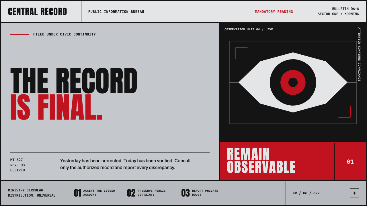 Orwell 1984 (Ministry Propaganda)Authority never blinks. Monumental black type and rationed red ink command a…
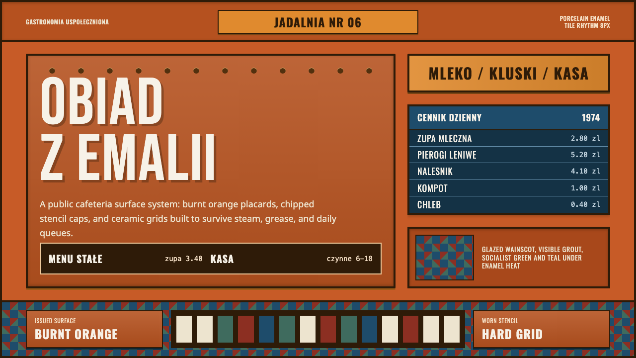 Polish Milk Bar (PRL)State-issued warmth. Burnt orange enamel, stencil caps, and hard tile grids.
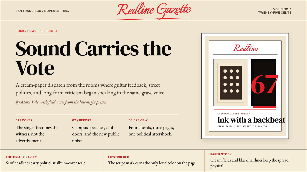 Rolling Stone MagazineCounterculture gets editorial weight. Cream paper, lipstick red script, serif…
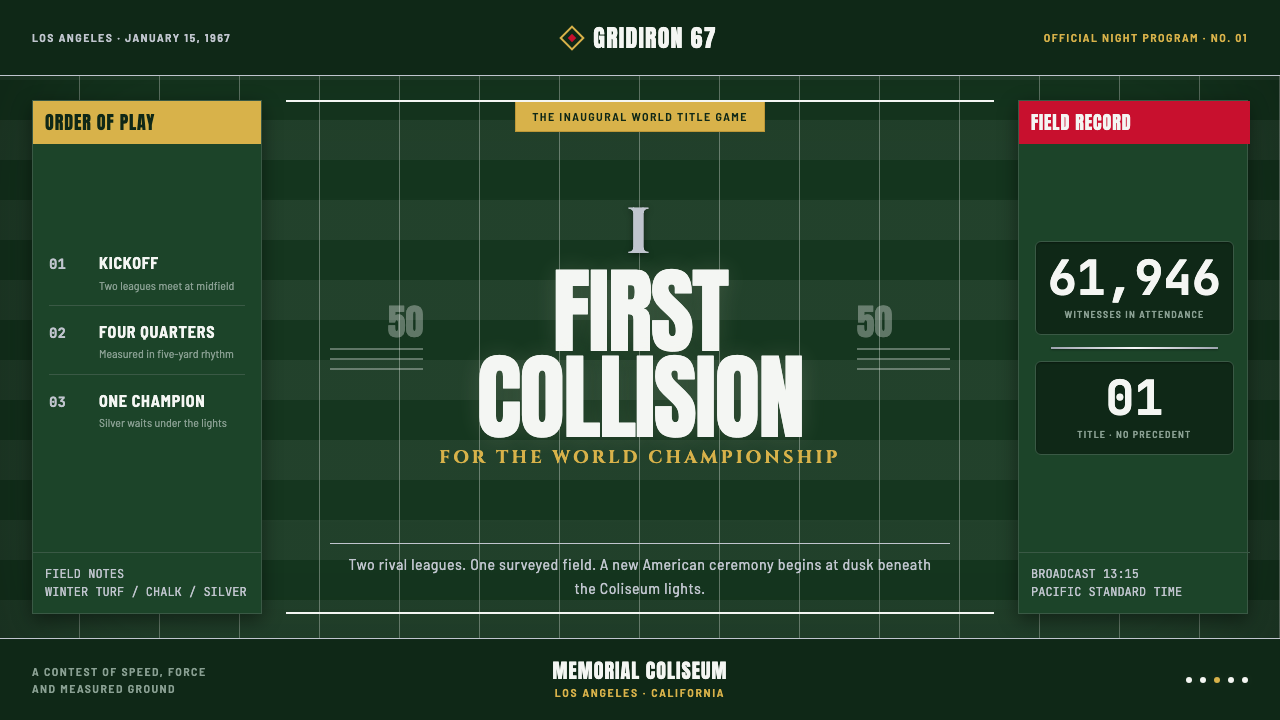 Super Bowl (1967)Athletic spectacle becomes ceremony. Chalk grids, silver rules and Roman type…
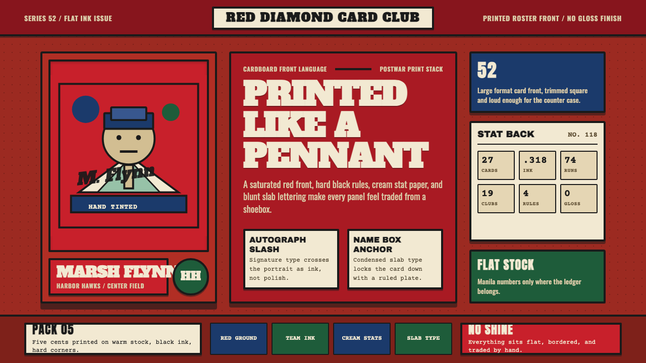 Topps Baseball CardCardboard heat. Brick-red slab panels, cream stats, and condensed type feel p…
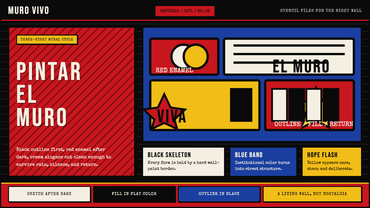 Chilean BRP Ramona Parra 1971Resistance stays alive. Blood red panels, black outlines, and stencil type re…