What is Super Bowl (1967)?
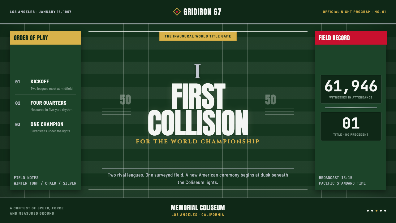
The first Super Bowl turned athletic spectacle into ceremony: chalk-white field geometry, silver rules, Roman numerals, and the dark green authority of the turf.
Super Bowl (1967) in brief
Super Bowl (1967) describes the visual language surrounding the first AFL-NFL World Championship Game, played on January 15, 1967, at the Los Angeles Memorial Coliseum. At the time, no one yet called the event the Super Bowl. Its identity comes not from a later advertising system but from the things visible on the field itself: chalked lines, deep winter turf, inscriptional numerals, white pageant lighting, and the cold metallic presence associated with Lombardi silver.
The style holds two ideas in tension. It is athletic, because its visual order comes from yard lines, jersey numerals, field markings, and the blunt energy of competition. It is ceremonial, because those same elements are treated with the gravity of an official rite. The result resembles an official game program, a varsity letter, and a heavyweight-title poster at once. Nothing is casual. Even a number seems to have been installed rather than printed.
Its visual authority depends on alignment and restraint. The field is understood as a measured grid; condensed numerals sit with the stillness of a marker at midfield; horizontal rules establish procession; Roman forms make the event feel historic before history has had time to accumulate. The overall impression is dark, formal, and highly legible: a sports identity built from turf, chalk, silver, and institutional type rather than decorative spectacle.

Where does Super Bowl (1967) come from?
The source moment is January 15, 1967, when the AFL-NFL World Championship Game was played at the LA Memorial Coliseum in Los Angeles. This was the inaugural game, and its visual world was still close to the physical conditions of the stadium. The identity was not yet separated from the field. Chalk, turf, lights, jersey lettering, and the official atmosphere of the venue supplied the raw material.
The regional and cultural setting matters. Los Angeles provided a monumental stadium context, while mid-century American sports graphics supplied the broader visual grammar: strong lettering, direct symbols, official forms, and a preference for compositions that could be read quickly from a distance. Varsity lettering contributed the athletic voice, while official game-program design contributed the sense of record, hierarchy, and occasion.
The style also draws its force from the way field markings behave. A yard line is not decoration; it is a rule made visible. A centered numeral is not merely a label; it is a public marker of position. When these elements are carried into posters, programs, covers, or interfaces, they retain that practical authority. The aesthetic works because its forms appear to have a job before they appear to have a style.
Roman-numeral branding was formalized retroactively by Super Bowl V in 1971. That later decision clarifies a visual instinct already present in the 1967 language: the event should feel numbered, monumental, and capable of belonging to a longer ceremonial sequence. The Roman numeral therefore operates as both identifier and monument. It turns a game into an edition, and an edition into an institution.
What defines the Super Bowl (1967) look?
Turf and Chalk
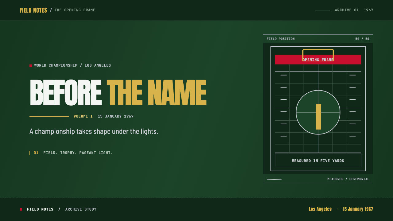
The ground is deep green and visually heavy, giving every lighter mark a strong point of contrast. Chalk lines are treated as hairline structures rather than casual field paint: thin, white, and exact. Their authority comes from repetition and alignment. On a page or screen, this translates into dark grounds, pale rules, and a disciplined use of horizontal or perpendicular marks that make the composition feel measured.
Silver Authority
Silver introduces a cold, ceremonial gleam against the dark field. It should not behave like glitter or luxury ornament. Its character is harder and more institutional: the gleam of a trophy, a rule, or a piece of engraved equipment. Use it to establish rank, frame a title, or mark a decisive boundary. Silver is most effective when surrounded by darkness and kept visually scarce.
Roman Numerals
Roman numerals give the event a monumental register. Their forms recall inscriptions, official records, and carved stone rather than casual sports labeling. They should be given room to stand alone, with enough surrounding darkness to feel carved into the composition. The numeral is not an accessory beside the title; it can be the title's central architecture, turning an edition marker into a ceremonial emblem.
Condensed Jersey Type
The athletic voice comes from condensed, upright numerals and lettering with a strong center of gravity. This is not playful collegiate nostalgia. The forms are blunt, compressed, and designed to hold together under distance and motion. Headlines should feel like jersey numbers enlarged into civic signage: direct, dense, and unmistakable. Supporting text remains quieter so the principal numeral can dominate.
Ceremonial Lighting
Hot white light cuts across the dark field and gives the style its pageant quality. The light is not soft atmosphere; it is exposure, announcement, and public attention. Bright areas should feel intentional and concentrated, with darkness doing equal compositional work around them. The contrast creates a stage without requiring theatrical ornament. Every illuminated element appears to have been called forward.
Measured Grid
The composition should feel snapped to the field's yard-based order. Rules, numerals, captions, and blocks align as if they belong to one official diagram. The grid is not visible everywhere, but its discipline should be felt in every placement. Asymmetry is possible, yet it must be controlled by the same underlying measurement. Nothing drifts. The design advances by intervals, not by improvisation.
Programmatic Formality
The style carries the authority of an official game program: titles, dates, edition markers, rules, and names are arranged as information with public consequence. Decorative flourishes are unnecessary because the event itself supplies drama. A successful composition feels archival and immediate at once, as though it records a historic contest while still hearing the crowd beyond the page.

Who shaped Super Bowl (1967)?
Lamar Hunt belongs to the foundational story of the AFL-NFL World Championship Game and the naming culture that would grow around it. In this visual system, his presence is best understood through the event's transition from a game into a repeatable public institution: something that could be numbered, staged, documented, and remembered. The design language answers that ambition with official structure rather than ornament.
Pete Rozelle represents the administrative and public-facing dimension of the championship's identity. The style's careful hierarchy, programmatic clarity, and sense of occasion all suggest an event that must communicate beyond the players on the field. Its typography behaves like an announcement system: formal enough for a record, immediate enough for a stadium audience.
Vince Lombardi is present in the source material through the cold gleam of Lombardi silver. That association gives the palette its metallic center. Silver becomes more than a neutral highlight: it carries the pressure of victory, the hardness of an award, and the formal weight of a championship object set against dark turf.
Bart Starr belongs to the athletic side of the system: the human figure represented through jersey numerals, centered marks, and the concentrated force of competition. His place in the visual narrative helps keep the style from becoming purely institutional. Behind every official line is still a player, a position, and a contest being decided in public.
Hank Stram reinforces the strategic and organized character of the field. The visual language treats the turf as a diagram of movement and decision, where lines are not background but evidence of structure. His presence belongs to that side of the style: the game as planned geometry, formal position, and visible order under pressure.
How do you use Super Bowl (1967) today?
For presentation slides, use the style most strongly on the cover and section dividers. A dark green or near-black field can carry a large Roman numeral, a silver rule, and one condensed title block with the weight of an official event poster. Content slides should preserve the same logic: one dominant field marker, clear horizontal alignment, and white or silver typography with a single athletic accent. Data slides should treat charts as field diagrams. Bars, lines, and labels should feel placed on a measured surface, not decorated as independent illustrations.
For web interfaces, the style suits dashboards, rankings, live score surfaces, and pricing pages that need authority and rapid scanning. Use the dark field as the structural ground, pale rules to separate regions, and silver to indicate premium status or decisive information. Cards should feel like panels in a stadium program rather than soft floating containers. Numbers deserve strong alignment and enough surrounding darkness to read as markers. Pricing tiers can borrow the logic of jersey numerals: each level receives a clear identity, while the page remains governed by one shared grid.
For editorial and marketing work, build pages around the contrast between archival formality and athletic immediacy. A feature article can open with a monumental numeral or centered matchup marker, then move into narrow, disciplined text columns separated by silver rules. Marketing compositions can use the visual drama of a heavyweight poster without becoming loud: dark turf, hot white type, one controlled metallic accent, and a title that feels announced rather than decorated. The strongest imagery should be cropped with purpose and treated as part of the diagram.
For event identities, schedules, and launch materials, let the official-program quality do the work. Dates, names, edition markers, and calls to action should be visibly related, as though they belong to one printed system. A field grid can organize a timetable, while Roman numerals can distinguish editions or chapters. The result should feel collectible and repeatable: each new event belongs to the same ceremony without becoming a copy of the last one.
The common mistake is confusing sports nostalgia with this specific visual language. Throwing in varsity lettering, dark green, and metallic effects is not enough. The system depends on measured alignment, restrained contrast, formal numerals, and the opposition between bright marks and deep ground. Another mistake is making silver behave like luxury foil everywhere. Silver should mark rank or boundary; if it fills every surface, the cold authority of the accent disappears and the design becomes generic spectacle.
Super Bowl (1967) — FAQ
Is this style simply vintage American football branding?
No. Football supplies the source vocabulary, but the system is broader. Its real structure comes from the relationship between a measured field, official typography, ceremonial lighting, and a dark ground. The same logic can support an editorial feature, an event identity, a dashboard, or a pricing page. What makes it specific is not the presence of sports references alone, but the way athletic marks are elevated into public ceremony.
Why are Roman numerals so important to the style?
Roman numerals change the perceived status of the event. Arabic numerals can identify a score, a date, or a jersey; Roman numerals suggest an edition, an inscription, or a formal sequence. In this context, the numeral makes the championship feel larger than one game. It belongs to the language of monuments and official records, especially after Roman-numeral branding was formalized by Super Bowl V in 1971.
Can the style work without a dark green field?
Yes, but the replacement ground must preserve the sense of depth and authority. The source language depends on bright chalk and white light appearing against a dark field, so a pale or decorative background would weaken the central contrast. A near-black, charcoal, or another visually deep ground can carry the system, provided the rules remain disciplined and the brighter accents stay scarce.
How should silver be used without making the design feel luxurious?
Treat silver as institutional metal, not jewelry. It should define a boundary, mark a rank, frame a title, or recall a trophy surface. Keep it surrounded by darkness and let it appear in rules, numerals, or small decisive accents. When silver covers every heading, card, and icon, it loses its connection to Lombardi silver and becomes generic decoration.
What makes the style feel ceremonial rather than merely athletic?
Ceremony comes from hierarchy and restraint. The event is not represented only through motion, impact, or team energy; it is also framed by edition markers, official alignment, inscriptional type, concentrated light, and the quiet authority of the dark ground. Athletic elements provide force, while formal structure gives that force public meaning. Remove the structure and the result becomes generic sports graphics; keep it, and the game becomes an occasion.
Related design styles
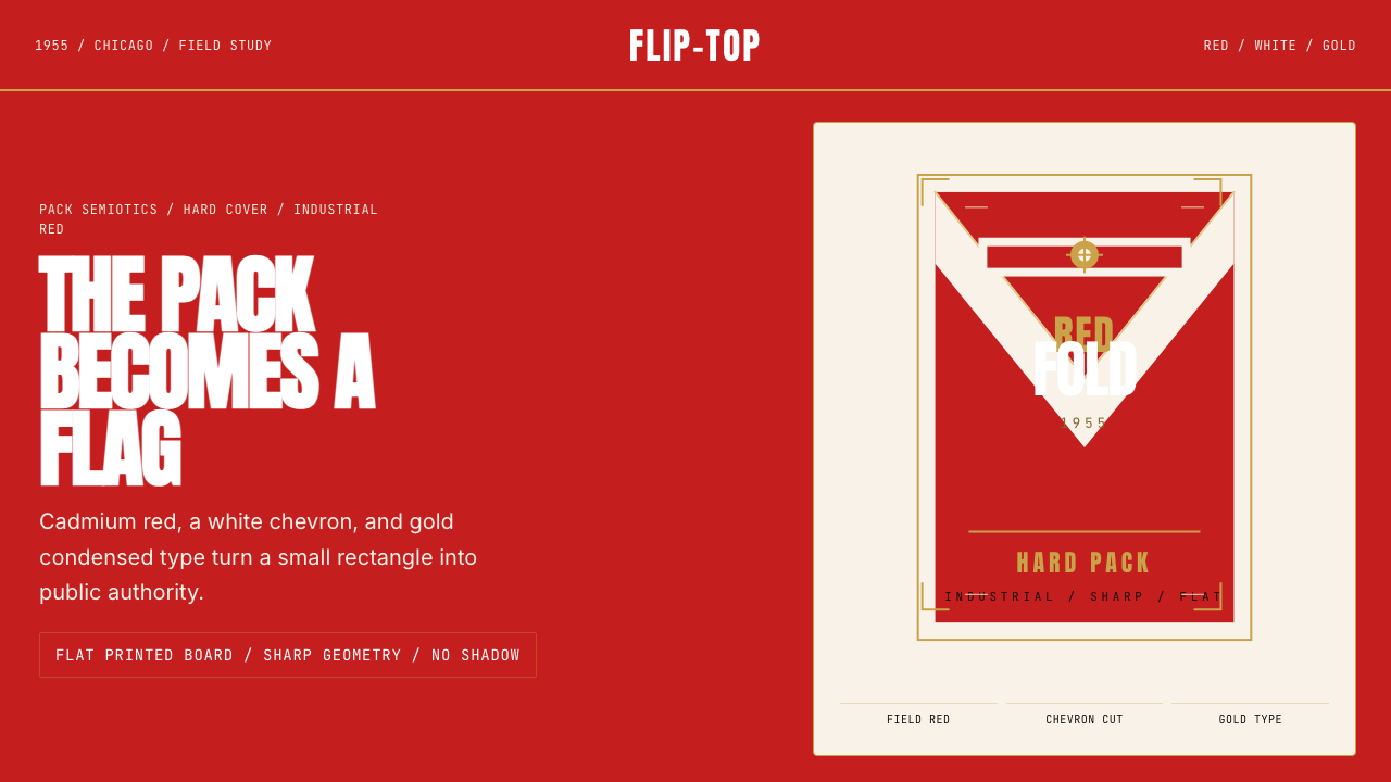 Marlboro Red Flip-Top (1955)Authority in one fold. Cadmium red, white chevron, and gold type read like a…
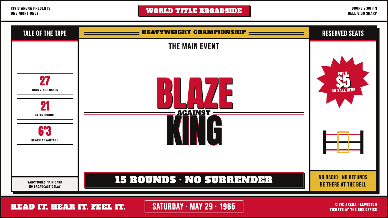 Muhammad Ali Fight Poster (1965)Type does the fighting. Blood red and dead black collide in a stacked letterp…
 Pharmacy RxThe drugstore label, documented. Pharmacy-green border, Rx seal, typewriter d…
 Amtrak Arrow (1971)Civic authority at speed. Deep navy, Helvetica lockups, and red-blue arrows.
 Cuban Malecón 1960 PosterPublic voice in flat ink. Turquoise wall, cream stock, brick red and cobalt b…
 El Al Israel AirlinesNational blue takes command. White aircraft geometry cuts a flat jet-age post…