What is Pharmacy Rx?
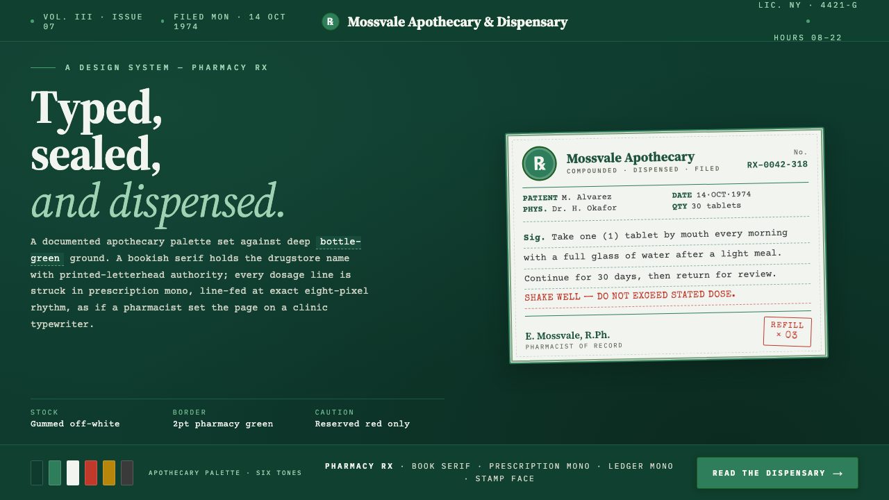
Pharmacy Rx turns the mid-century American prescription label into a dark, archival interface: a pale paper record, pharmacy-green rules, an Rx seal, and dosage text that looks deliberately struck into place.
Pharmacy Rx in brief
Pharmacy Rx is a documented revival of the green-and-white prescription label associated with independent American pharmacies and drugstores from the mid-century period through the late twentieth century. Its visual language begins with a familiar paper artifact: a pale gummed label, a ruled apothecary-green frame, a serif pharmacy name, an Rx mark, and compact dosage information set as if by a typewriter. Rather than treating that label as a nostalgic decoration, the style treats it as an information-bearing object. The label looks prepared, filed, checked, and ready to be read.
The decisive contemporary move is the background. Instead of placing this material on a conventional white page, Pharmacy Rx holds the pale label stock as a swatch against a deep apothecary-green field. That contrast makes the label feel selected from a drawer or lifted from a pharmaceutical ledger. The dark field is not a generic dark mode; it is part of the same system as the printed border, giving the composition the controlled atmosphere of a drugstore counter, a dispensing record, or a carefully maintained supply cabinet.
The type system reinforces the distinction between identity and instruction. Source Serif 4 gives names and headings the composed authority of a neighborhood pharmacy sign, while Courier Prime and IBM Plex Mono give quantities, dosage lines, and short operational details a measured typewriter character. Special Elite is used only as an imperfect accent, adding a trace of wear without turning the whole page into a theatrical prop. The result is restrained, legible, and quietly procedural: every visible mark appears to have a job.
Where does Pharmacy Rx come from?
Pharmacy Rx draws from North American apothecary and drugstore labelling, especially the independent American pharmacy tradition named in its source material. The reference period runs from 1950 to 1990, when a prescription label could condense store identity, medication directions, quantity, and practical handling information into a small printed surface. Its authority came from clarity and repetition: the same field structure could be recognized quickly across bottles, packets, and counter records.
The apothecary tradition supplies the style's most recognizable formal device: the ruled green frame. A border in this context is not merely an ornamental enclosure. It establishes the label as a bounded record, separates official information from its surroundings, and gives the eye an immediate route around the artifact. The Rx seal works similarly. It is compact, symbolic, and procedural, signaling the prescription context before the viewer has read the dosage text.
Mid-century pharmaceutical information design contributes the hierarchy. A pharmacy name is allowed a more established, serif-led presence because it represents the institution issuing the label. Dosage and quantity details are handled more mechanically, with monospaced type that suggests entries made by a dispensing system or typewriter dosage typesetter. This contrast is essential: the name identifies the source, while the typed lines communicate the instruction.
The style is therefore best understood as an interpretation of labeling practice rather than a reconstruction of one particular pharmacy. Independent pharmacists, apothecary labelling traditions, and typewriter dosage typesetters are its key figures in the broad sense: they are the roles and working methods that shaped the artifact. Pharmacy Rx preserves their visual logic while staging it on a deep green ground suited to a contemporary screen.
What defines the Pharmacy Rx look?
Pale Label on Deep Green
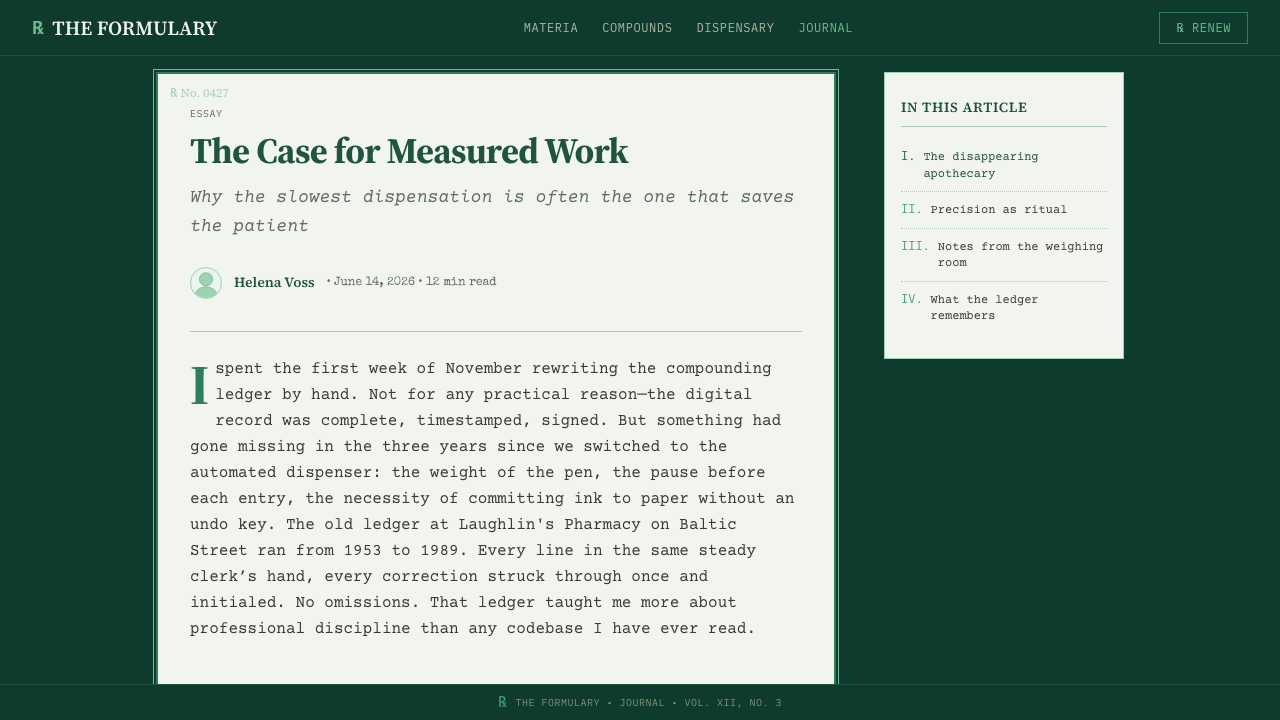
The central composition is a pale paper-like label floating on a deep apothecary-green ground. The contrast should feel deliberate and archival, as though a physical prescription record has been isolated for inspection. The pale area carries the information; the dark field supplies atmosphere, separation, and visual quiet. Let the label remain the active object rather than allowing the background to become a dramatic stage.
Ruled Apothecary Frame
A ruled pharmacy-green border gives the label its authority. It should read as printed structure, not as a decorative card outline. The frame establishes an official edge around the record and can divide identity from dosage information through restrained internal rules. Keep it even, clear, and unembellished; its power comes from making the page feel organized before any line is read.
Rx as Procedural Mark
The Rx seal is a compact visual signal rather than a logo to enlarge for spectacle. It announces the prescription-label context, anchors the artifact in pharmacy practice, and gives the layout a point of symbolic recognition. Place it where it can be found quickly, then let the surrounding text perform the explanatory work. The mark should feel stamped, printed, or designated, never glossy or ornamental.
Institutional Serif and Dosage Mono
Source Serif 4 serves pharmacy names and headings with a calm institutional voice. Courier Prime and IBM Plex Mono handle dosage, quantities, and concise entries, making instruction lines feel measured and recorded. Special Elite can add a small worn typewriter interruption, but it should not replace the clearer working faces. The typography succeeds when readers can distinguish a name, a direction, and a record at a glance.
Documentary Hierarchy
Pharmacy Rx favors fields, lines, and short entries over broad promotional copy. A pharmacy name, an Rx marker, a dosage line, a quantity, and a reference-like detail should each occupy visibly different roles without competing for attention. The layout should resemble a record designed to be consulted under practical conditions. White space is not luxury here; it is the pause that keeps instructions from blending together.
Controlled Wear, Not Nostalgia
A trace of typewriter irregularity can make the system feel handled and human, especially through a limited Special Elite accent. But the style should remain documented rather than distressed. Avoid stains, torn-paper theater, excessive grain, or imitation age effects that obscure information. Pharmacy Rx is strongest when it suggests a well-kept working label: used in practice, preserved in memory, and still fully readable.

Who shaped Pharmacy Rx?
Independent pharmacists are the human center of the style's reference world. Pharmacy Rx draws on the small-scale drugstore setting in which a label had to identify the issuing pharmacy while remaining practical at the point of dispensing. The prominent pharmacy name and disciplined information fields preserve that relationship between local institution and everyday instruction.
The apothecary labelling tradition supplies the frame, seal-like notation, and record-oriented composition. It treats the label as a compact operating surface, where boundaries and printed divisions improve recognition. In Pharmacy Rx, that tradition prevents the dark presentation from becoming merely atmospheric: the page remains a legible artifact with a defined administrative purpose.
Typewriter dosage typesetters represent the system's mechanical voice. Their influence appears in monospaced dosage lines, compact quantities, and the impression that details have been entered rather than composed for display. Pharmacy Rx uses that quality to separate operational information from the more formal serif voice of the pharmacy name.
How do you use Pharmacy Rx today?
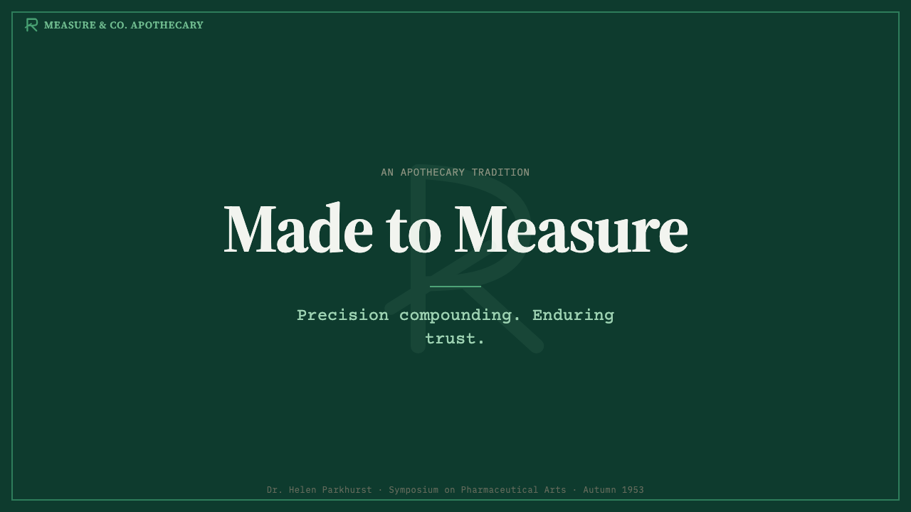
For presentation slides, treat the cover as a single prescription artifact placed on a deep green field. A serif title can carry the issuing-name role, while an Rx mark and a brief monospaced line establish the document logic. On content slides, keep headings, notes, and short callouts inside a restrained field system. On data slides, translate labels, legends, and values into dosage-like entries, allowing the chart itself to remain plain and easy to inspect rather than disguising it as vintage packaging.
For web interfaces, Pharmacy Rx suits dashboards, account areas, order records, inventory views, and pricing pages where users benefit from a feeling of traceability. Use a dark apothecary-green canvas with pale information panels that read like records pulled forward for review. Cards should behave as labels, not soft decorative containers. Monospaced text is especially useful for identifiers, quantities, status details, and compact metadata, while the serif face should be reserved for named sections and product-level identity.
For editorial and marketing work, the style is effective when a brand needs to communicate care, process, provenance, or collected knowledge. An article can use the pale label as a metadata panel beside more conventional reading text; a campaign can build feature sections as successive labeled records. Keep the copy concise and evidence-led. The style supports a drugstore atmosphere best when the information architecture remains plausible, as though each caption, heading, or feature line could have been printed for a real counter record.
The common mistake is to reduce Pharmacy Rx to green plus a typewriter font. That loses the style's essential division of labor between paper, frame, seal, institutional name, and operational detail. Another mistake is over-aging the work with noise or fake damage, which weakens the clarity that labels require. Use the worn typewriter note sparingly, protect the pale label from overcrowding, and let the deep green ground create context rather than visual drama.
Pharmacy Rx — FAQ
Is Pharmacy Rx simply a vintage pharmacy style?
No. Vintage reference is present, but the style is organized around prescription-label logic rather than general nostalgia. Its essential elements are the pale label stock, ruled apothecary-green frame, Rx marker, institutional serif name, and typewriter-like operational lines. If those elements do not clarify what the viewer should recognize or read, the result may look retro but it is no longer Pharmacy Rx.
Why is the background dark when prescription labels are pale?
The deep apothecary-green background makes the pale label read as an object rather than a page. It turns the label stock into a visible swatch and gives the system a documented, intentional dark presentation. The contrast also preserves the importance of the printed green frame, which could disappear if the entire interface remained pale. The background supports the label; it should not compete with it.
How should the three type families be divided?
Use Source Serif 4 for the pharmacy name and headings, where a composed and established voice is useful. Use Courier Prime or IBM Plex Mono for dosage, quantities, identifiers, and short record-like details. Use Special Elite as a limited accent when a worn typewriter note is needed. The system becomes less convincing when every line uses the distressed face, because instructions then lose their procedural clarity.
What kinds of products are a poor fit for Pharmacy Rx?
It is a poor fit when the product needs exuberance, softness, or a strongly playful emotional tone. The style communicates procedure, documentation, and measured care, so it is more natural for records, structured commerce, catalogues, and information-heavy experiences than for entertainment-first or highly expressive branding. It can still be used in a warm product, but the label logic must support the product story rather than impose a medical atmosphere without reason.
Related design styles
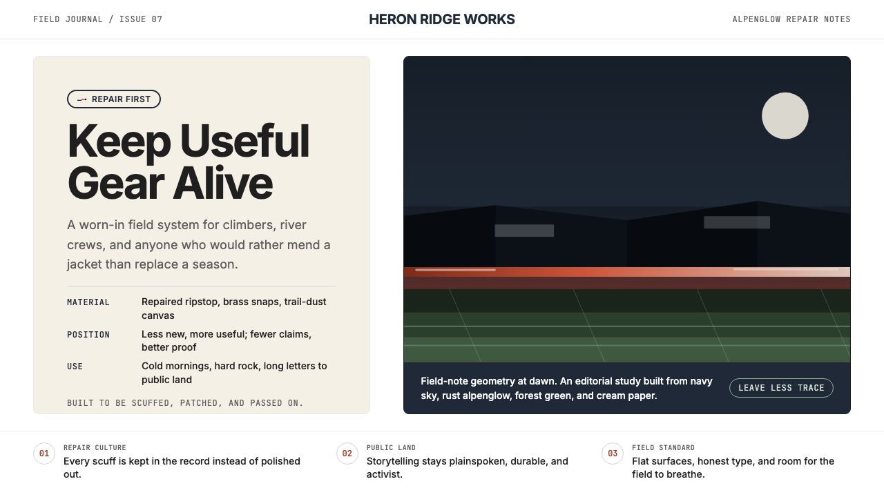 PatagoniaField-worn clarity. Deep navy, rust alpenglow, and cream editorial space carr…
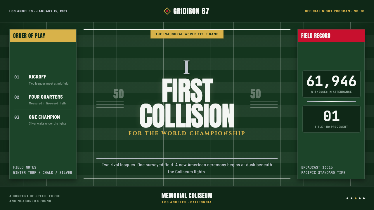 Super Bowl (1967)Athletic spectacle becomes ceremony. Chalk grids, silver rules and Roman type…
 Microfiche ArchiveRecords as lit frames in a matrix. Cyan-blue back-lit panel, glowing mono typ…
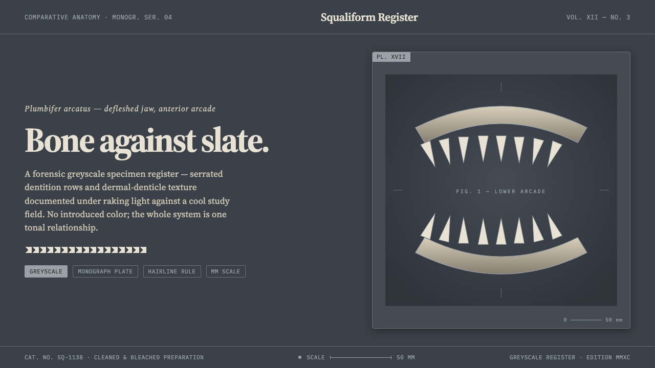 Shark Jaw & DentitionForensic and strictly greyscale. Bone-white serrated dentition floats on a co…
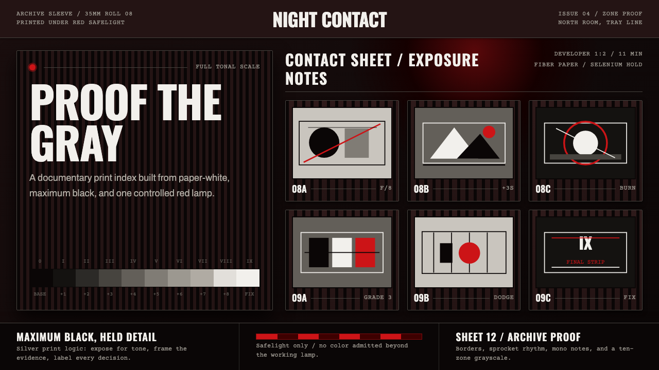 Silver Gelatin DarkroomTonality is the craft. Safelight red, contact grids, and ten-zone grays hold…
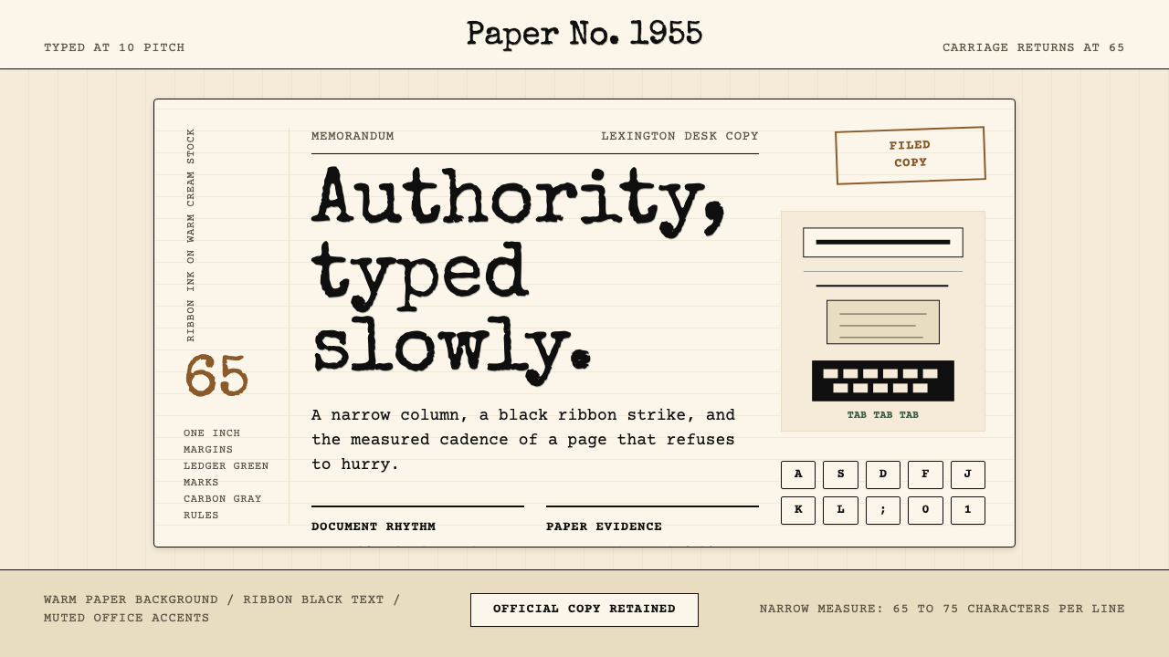 Typewriter Courier (1955)Unhurried authority. Cream paper, ribbon-black monospace, and bordered 65-cha…