What is Elevator Certificate?
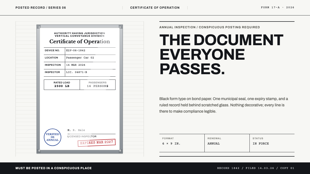
The elevator inspection certificate is compliance made visible: plain black form type, one blue seal, one red stamp, and a heavy aluminium frame that holds all the material richness.
Elevator Certificate in brief
Elevator Certificate is a light design style drawn from an object almost everyone has seen and almost no one has read: the framed certificate of operation that hangs inside a passenger elevator. A small bond-paper certificate sits behind scratched glass in a heavy aluminium frame, screwed to the cab wall at eye height, renewed every year and posted in a conspicuous place because the regulations use exactly that word. It is a document the law requires to be visible, and the style takes its entire character from that obligation.
The paper itself is deliberately plain. Black form type sits on white stock in ruled label-and-value rows, with a boxed table that gives the cab's capacity. Only two inks break the monochrome: the municipal seal in blue and the rubber-stamped expiry date in red. Everything else is set in the even, mechanical spacing of a typewriter or a form printer. There is nothing lyrical on the sheet, and nothing that is there only to look good.
The visual interest lives in the frame. Standard finishes include black anodised metal, white-painted metal, brushed aluminium and brushed gold, each cut with mitred corners and held to the wall by visible screws, with a diagonal streak of reflection crossing the glass. The style is therefore two things at once: a flat, strictly functional document, and a slightly worn, tactile hardware object around it. Its subject is not decoration. It is a legally required notice that must be seen and read.
Where does Elevator Certificate come from?
The style's period is the 1950s through the 1990s, the era of municipal elevator inspection regimes in which a certificate in the car became the visible proof that a machine had been examined. The jurisdictions it draws on are New York City, California and Illinois, along with equivalent state-level authorities elsewhere; the region is effectively global, because the framed certificate of operation is a convention that travelled wherever elevators and inspectors did. It is still posted today, in nearly the same form, which is part of what makes it so familiar and so quickly overlooked.
The institutions named in the style's background are specific. The New York City Department of Buildings regulates the city's elevators, the California Division of Occupational Safety and Health is the state body concerned with elevator safety there, and the Illinois State Fire Marshal appears among the authorities behind the form. Behind each of them stand the licensed elevator inspectors who actually examine the equipment and sign the paper. The certificate is therefore not an invention of designers. It is the end product of a process, and its look is an accident of that process rather than a plan.
Three design traditions meet in the object. The first is regulatory signage, the family of notices whose job is to be seen and obeyed rather than admired. The second is government forms typography, with its ruled rows, fixed label positions, boxes for numeric entries and a preference for utilitarian type that fits any printing machine on hand. The third is engraved metal nameplate work, which supplies the frame and, in many cases, the embossed seal: a notion that official information belongs on a durable object, fixed to a wall, rather than on a flimsy sheet.
What makes the combination distinctive is its restraint. No one set out to give the certificate a style, so the style is a by-product of constraint: limited colours because stamps and seals come in few inks, plain type because forms need to be filled in quickly, a heavy frame because the object must survive years of passengers, keys and cleaning. The theme observes that constraint and keeps it. Its sensibility is not retro nostalgia for the 1950s. It is the quiet authority of a document that needs no marketing.
What defines the Elevator Certificate look?
Form typography
Type is black, plain and mechanical, set at the even spacing of a typewriter or a form printer. Labels are short and capitalised, filled values are set in the same neutral face, and nothing is emphasised by flourish. Hierarchy comes from the position in the form and from what the box is for, not from size. The effect is the voice of an administrative record: calm, unhurried, and impossible to misread.
Label-and-value ruling
Information is organised in ruled rows with labels at the left and the filled value at the right. A boxed table in the middle gives the capacity and number of passengers. The rules are thin and dark, the rows are evenly spaced, and nothing wanders off the grid of the form. It is a layout that can be scanned in two seconds, which is the point: a passenger should be able to confirm compliance at a glance.
A two-ink economy
Apart from black, only two colours appear: the municipal seal in blue and the rubber-stamped expiry date in red. The two have different jobs. Blue says an authority has officially recognised the document, and red marks the date by which it must be replaced. Each colour is rare enough to carry meaning, which is why the style resists adding a third. Colour is a stamp, not a theme.
The aluminium frame
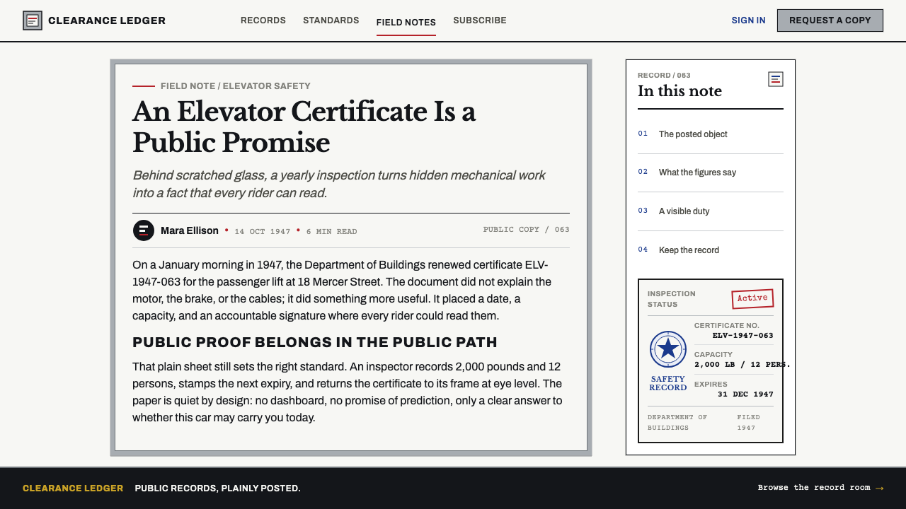
The frame is where the style keeps its material richness. Four standard finishes are typical: black anodised, white painted, brushed aluminium and brushed gold. Corners are mitred, the profile is deep and heavy, and the screws are visible, since the frame is meant to feel permanently fixed. In digital work the frame becomes a border with a real edge, a subtle bevel and a sense of thickness, not a thin decorative outline.
Glass and glare
The certificate sits behind scratched glass, and one slanted streak of reflection crosses the surface. This single highlight is the style's only effect, and it is used sparingly to remind the viewer that the paper is behind something. It must not become a general glossy finish. A diagonal glare and a few fine scratches suggest years of wear and tell the reader the notice has been there, doing its job, long before they stepped in.
Placement and permanence
The object is fixed at eye height, in a conspicuous place, and stays there until it is replaced. That gives the style a habit of fixed positioning: key information sits where the eye naturally arrives, in the same place every time. The impression is of something installed rather than published, with the stability that comes from being bolted to a wall rather than floating on a screen.
Who shaped Elevator Certificate?
The New York City Department of Buildings regulates elevators in the city, and New York is the first jurisdiction the style cites. Its inspection and certification regime is the model of an urban system in which every car carries visible proof of examination. For the style it stands for the idea that the certificate belongs to a public process, which is why the paper looks like an administrative record rather than a brand artefact.
California's Division of Occupational Safety and Health is the state agency named in the style's sources for elevator safety. It represents a state-level regime in which the same kind of certificate is posted in cars across a large and varied territory. Its place in the background underlines that the object is not local: its structure of ruled rows, seals and expiry stamps is a shared vocabulary of compliance.
The Illinois State Fire Marshal is the third authority cited in the style's background. Fire authorities have a long association with building safety, and their presence here is a reminder that the certificate belongs to the world of life-safety documentation. It shows the style's roots in a family of notices where the question is not whether a design is attractive, but whether the information is plainly and permanently visible.
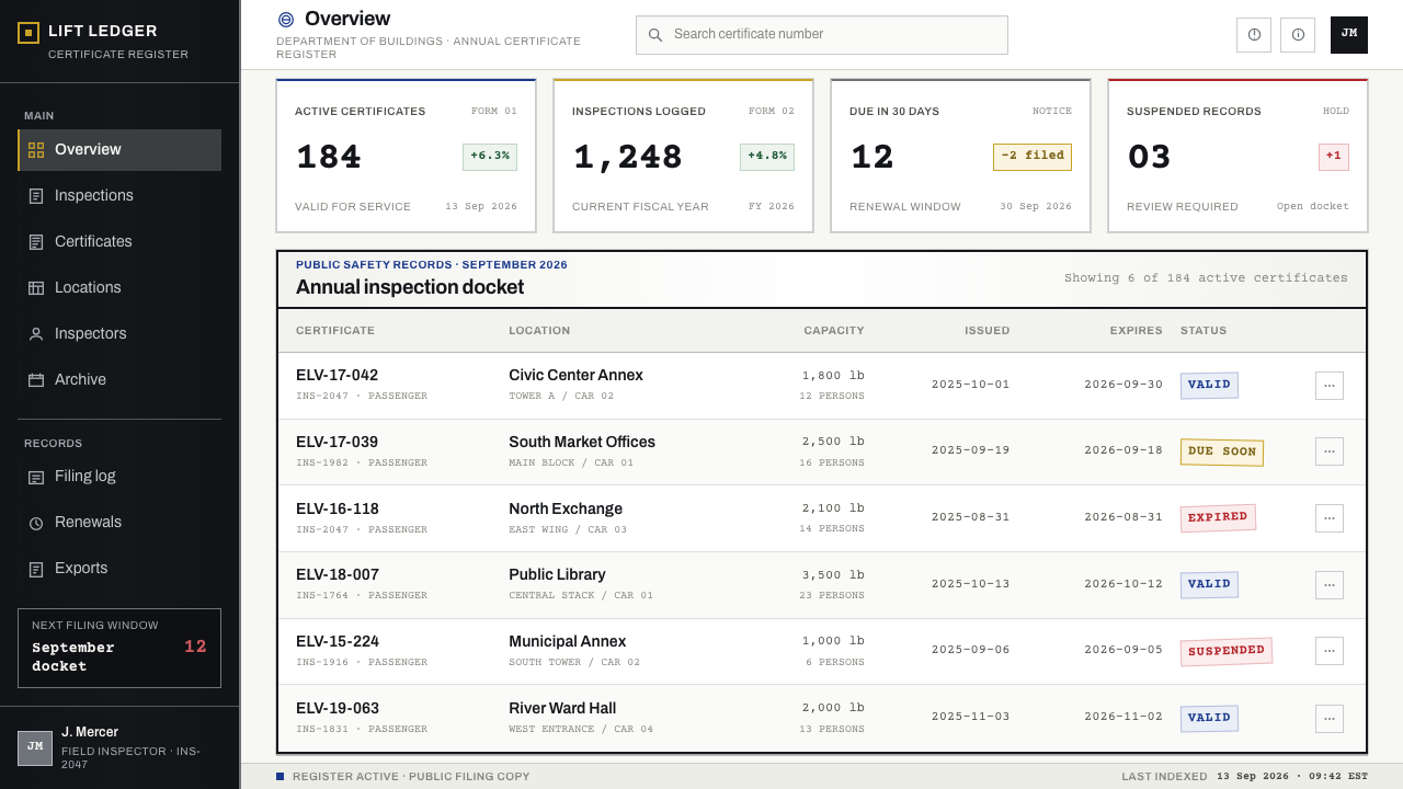
Behind every certificate stands a licensed elevator inspector, the person who examines the equipment and whose signature turns a piece of paper into evidence. The style gives them a place among its key figures because the inspector's role explains its tone: the paper is brief and plain because it records a finding, and a finding does not need ornament. They are the unseen authors of the object.
How do you use Elevator Certificate today?
The style fits subjects in which trust is built by showing that a check has been done: compliance dashboards, safety and certification products, audit tools, legal and regulatory services, building and facilities software, and brands that want to present themselves as officially accountable rather than exciting. It also works as a deliberate counterpoint in consumer design, where its sober, notice-like voice can feel refreshing.
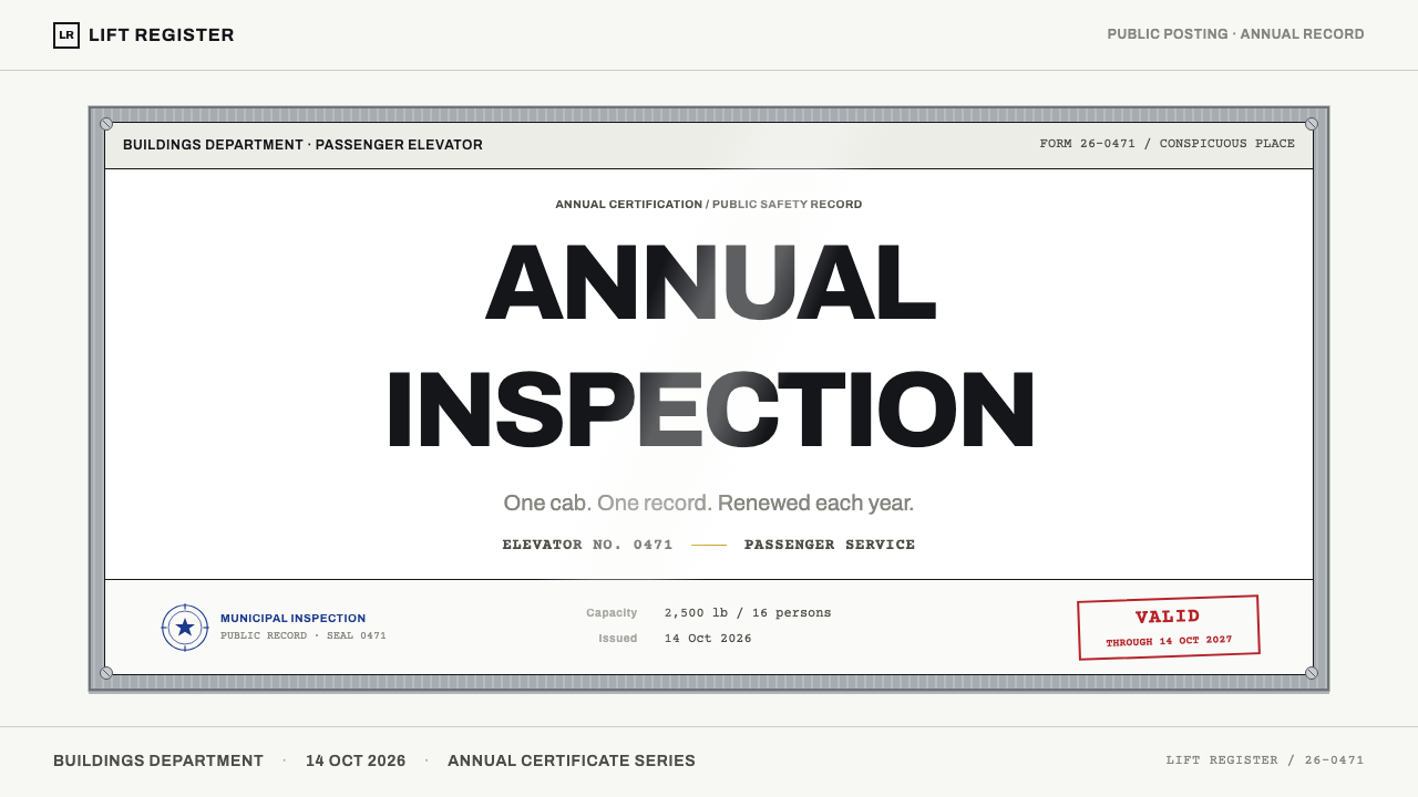
On slides, a cover can read like the certificate itself: a plain white field, a single ruled title block in black type, a blue seal mark at one corner and a red date stamp at the other, all inside a heavy framed border. Content slides should be organised as forms, with labels at left and values at right, and a boxed table for the key figure. Data slides work as ruled tables and plain bar charts, using blue and red only as stamps to signal approval and deadline.
In web interfaces, the style suits status pages, permit trackers, inspection schedules and compliance portals. Present records as ruled label-and-value rows, give the main summary a boxed table, and keep the frame as a distinctive container for the one item the user must not miss. Reserve blue for verified or approved states and red for expiry or action required. Navigation can be as plain as a form index, with no icon decoration and no animation beyond what the content needs.
For editorial and marketing work, the certificate frame is a memorable visual device for pieces about safety, regulation, infrastructure and the hidden systems that make cities work. A page can place a single framed notice at the centre of a hero, use the form layout for key facts, and keep the tone as matter-of-fact as a posted notice. Campaigns benefit from the unexpected authority of understatement.
The most common mistake is to treat the blue and red as a general accent palette, spreading them across buttons, headings and backgrounds until they stop meaning anything. In this style they are stamps, and each should appear rarely and in a place where an official mark would go. A second mistake is to make the frame thin and decorative; it should feel thick and fixed. A third is to over-polish the glass with heavy glossy effects, which turns a worn, trusted object into a shiny gadget.
Elevator Certificate — FAQ
Why base a design style on something as dull as an elevator certificate?
Because its dullness is deliberate and functional. The certificate has to be read by anyone, on a moving or crowded car, in poor light, and so every decision serves legibility and trust. That clarity is exactly what many digital products struggle to achieve. The object also has an unusual combination of flat, strict paperwork and tactile, worn hardware that is rare in design references and easy to translate into interface patterns.
Does the style have to use the blue seal and red stamp?
They are central to its identity, since they are the only colours on the page, but they matter because of how they are used. Blue marks recognition by an authority and red marks a deadline. If a project needs other colours, keep that economy: each colour must have one job, appear rarely, and be placed where an official mark would sit. Spreading them as brand accents defeats the purpose.
Is the frame necessary, or can I use the paper style alone?
The paper alone gives you a form-based, document-like look, which is useful in its own right. But the frame is what separates this style from a generic government form: the heavy edge, mitred corners and visible fixings give it presence and permanence. If you remove the frame, you lose the tactile side of the style, and the result is closer to ordinary administrative paperwork than to this theme.
Which kinds of products should avoid this style?
Products built on delight, play or sensory richness will find it too austere: entertainment, children's brands, lifestyle and food. It is also a poor fit where the message depends on softness or emotional warmth. The style speaks in the voice of a notice, so it should be used when the audience wants to be told something clearly and to trust that it has been checked.
How should it be adapted for dark mode?
The paper is white and the type is black, so the style is rooted in a light ground. A dark mode is possible if you treat the frame as the dominant element and invert the paper carefully, keeping type legible and the blue and red marks scarce. The safest approach is to keep the certificate itself light, even inside a dark page, so that it still reads as a physical notice hung on a wall.
Related design styles
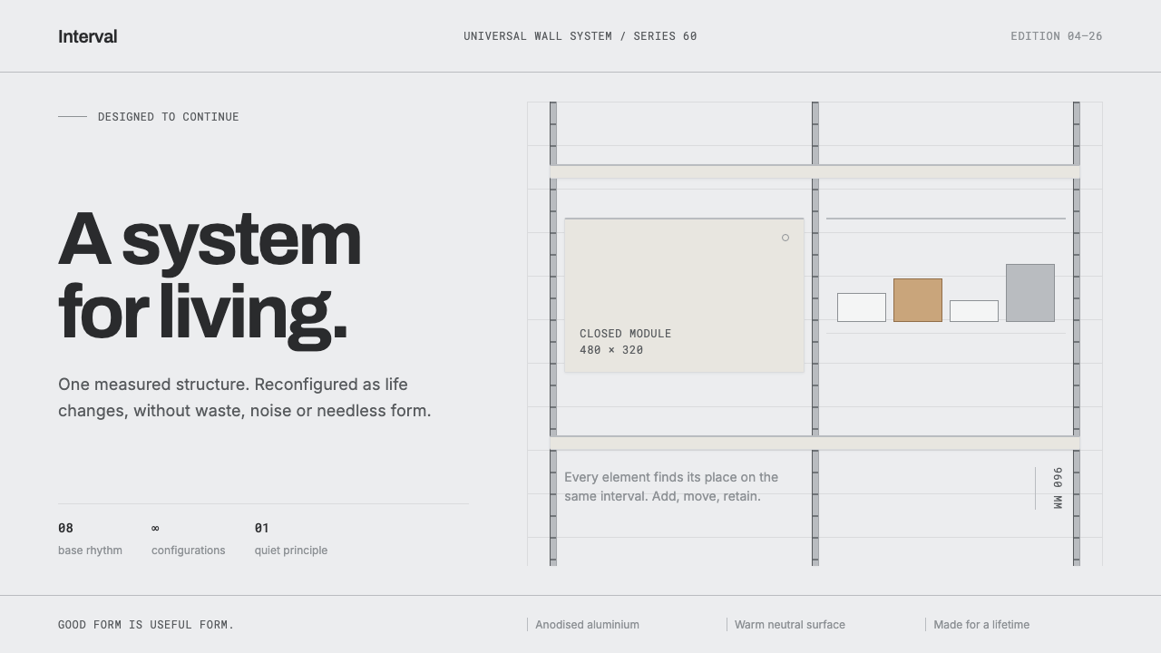 Vitsœ 606 ShelvingQuiet form, built to endure. Brushed silver rails impose rhythm on cool plast…
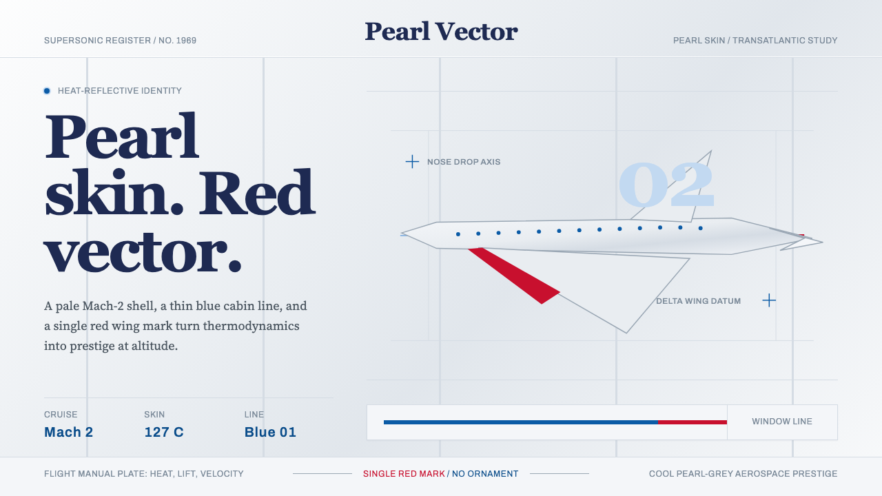 Concorde SupersonicPhysics made prestige. Pearl grey, sky-blue window line, and one red wing vec…
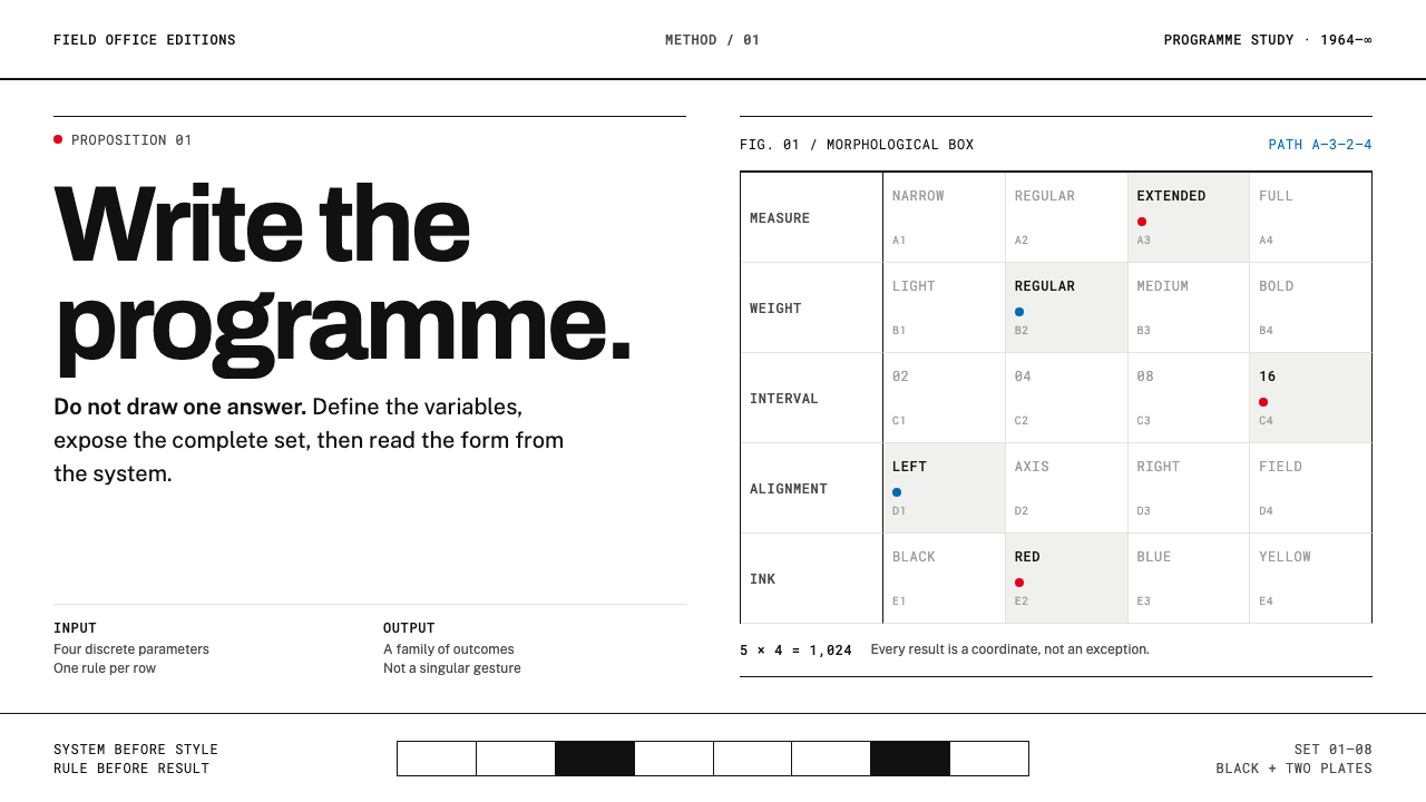 Karl Gerstner ProgrammesDesign becomes a programme. Black hairlines and a strict matrix turn paramete…
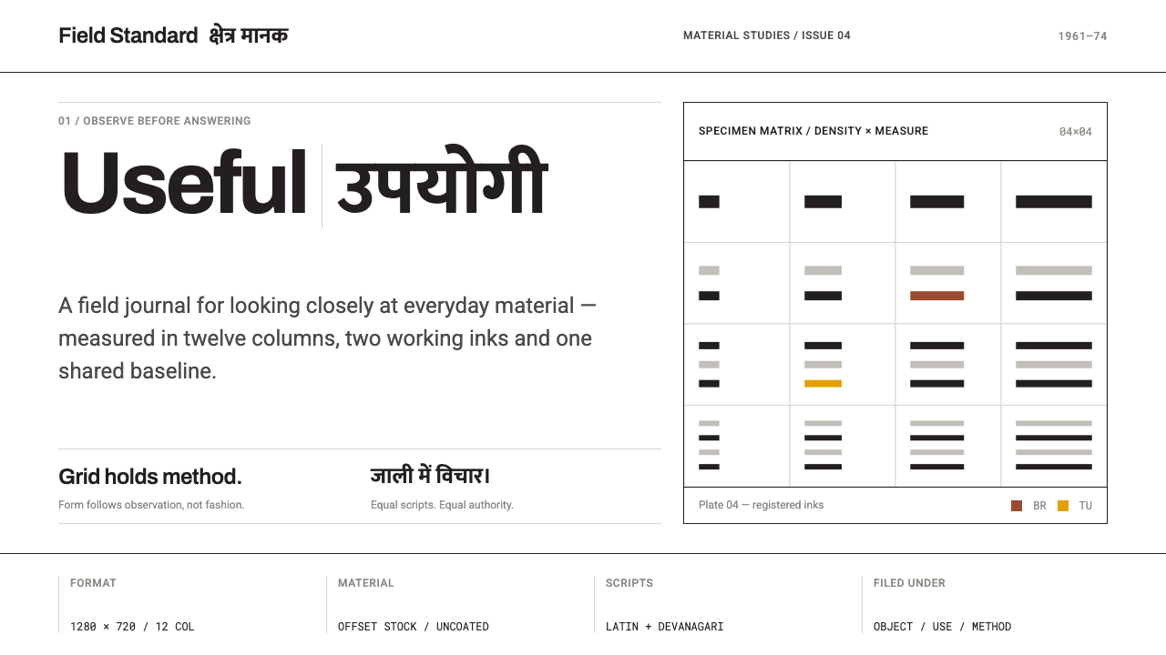 NID Ahmedabad ModernismStructure earns trust. Black rules and equal-weight scripts hold craft color…
 Pharmacy RxThe drugstore label, documented. Pharmacy-green border, Rx seal, typewriter d…
 Shark Jaw & DentitionForensic and strictly greyscale. Bone-white serrated dentition floats on a co…