What is Museum Accession Tag?
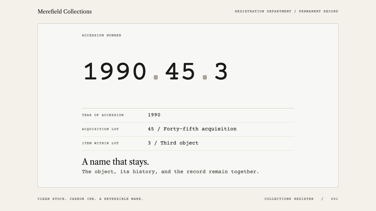
The museum accession tag makes an object's permanent name the whole point of the page — a carbon-black number on clean paper, held in place by hairline rules and wide margins.
Museum Accession Tag in brief
Museum Accession Tag is a design language drawn from one of the smallest documents in any institution: the white paper tag that hangs from an object in a collections store, bearing an accession number such as 1990.45.3. The three segments are year, lot and item — when the object arrived, which group it arrived with, and where it sits within that group. That number is the object's permanent name in the registrar's records, and it is the one fact a collections office will not let go of through every move, loan, rehousing and recataloguing.
The marking practice behind the tag is deliberate and physical. Conservators write the number in carbon-black acrylic over a barrier coat of Paraloid B-72, then seal it with a second coat. The requirements are demanding in both directions: the mark has to remain legible for a century, and yet it has to lift off the object without leaving a trace. A style that grows out of that brief inherits its values — permanence of the record, reversibility of the intervention, and a refusal to let the mark damage what it names.
Visually, the result is quiet and exact. The stock is clean, with no staining or fake ageing; hairline rules divide the page; a two-column field list puts labels on the left and values on the right; and there is enough air around the number that nothing competes with it. Where a poster asks to be noticed, this is a document that asks to be found, read and trusted — an archive, not a campaign.

Where does Museum Accession Tag come from?
Giving every object in a collection its own number is a foundation of museum registration, and the style's lineage is placed in museum and archive practice from the late 1800s onward. The reason is practical. A description of an object changes as scholarship changes: a vase is re-dated, a maker is re-attributed, a material is re-identified. A number assigned at the moment of acquisition does not change. The year-lot-item structure captures the one thing that is always true — the circumstances of arrival — and lets every later fact be attached to it.
The method of writing that number onto the object itself was standardised from the 1970s as the Paraloid B-72 marking protocol. Apply a barrier coat so the mark never touches the original surface; write the number in carbon-black acrylic; seal it with a second coat. Each layer has a job, and the whole stack can be taken off again. This is the conservation ethic of minimal, reversible intervention expressed as a recipe, and it is the reason the number in this style is treated with such respect.
The sources name three strands that meet in this practice. Museum registration and collections management supply the idea of the permanent identifier. Preventive conservation — which aims to keep objects from deteriorating through handling, storage and environment rather than repairing them afterwards — supplies the discipline of doing as little to the object as possible. Reversible marking practice joins the two: a label that can be applied safely and undone safely. The visual language borrows one thing from each: a name that never changes, surfaces left undisturbed, and a layout that adds nothing it would be unwilling to give up.
Unlike most styles in a design library, this one has no single country, workshop or designer. The region is described simply as global museum and archive practice, and the reference points named are organisations and practitioners rather than authors: the Northern States Conservation Center, University Products, and the conservation staff of the Minnesota Historical Society. The look is the sum of thousands of storerooms arriving at the same answer to the same problem — an anonymous, institutional, entirely functional tradition, closer to a filing convention than to an art movement.
What defines the Museum Accession Tag look?
Carbon on Paper
The palette is almost nothing: carbon black for the number and the type, clean pale paper for the ground, and the same black or a lighter tone of it for the rules. The black is the colour of the acrylic used on real objects, so it carries the sense of a record rather than decoration. The paper is neutral and unaged; this style never tints its ground to look vintage. If any further colour appears, it is a muted functional signal, never an ornament.
The Accession Figure
The number is the hero of every composition. It is set larger and darker than anything around it, in plain, even numerals that cannot be misread, with the dots between year, lot and item treated as real structure. It sits in its own block with generous space on every side. Nothing is underlined, boxed in colour or ornamented; the figure is trusted to be enough.
Hairline Rules
Separation is done with the lightest possible line. Hairline rules divide field from field and record from record, running the width of a column rather than enclosing boxes. There are no heavy borders, no filled panels and no card shadows. The rules behave like the ruled lines of a register: they organise the reading without ever becoming a feature.
Two-Column Field List
Information is laid out as a field list, with the label at the left and the value at the right. Labels are quiet and consistent; values are plain statements. The structure echoes an object record — what it is, where it came from, what it is made of, where it is kept — and the reader learns it once and then reads every record the same way.
Margin and Air
Margins are wide and white space is treated as hierarchy. The number gets a field to itself, surrounded by blank paper, so that it reads before anything else. Spacing between fields is even and unhurried. The emptiness is not minimalist taste; it is the physical fact of a small tag with a lot of paper around a mark that must not be crowded.
Clean, Unaged Surface
The surface is flat, matte and honest. There is no paper-texture overlay, no coffee-stain ageing, no torn edge and no soft shadow — the paper stays clean rather than distressed. A museum tag is new when it is made, because it is a working tool. The only physical gesture permitted is the tag itself: a small rectangle of paper, perhaps with a string hole, hung from cotton thread.
Archival Voice
The wording is part of the style. Labels are short and literal, values are stated without adjectives, and dates, numbers and units are written consistently. Copy never sells. The tone of the page is that of a registrar who has seen every mistake that a loose description can cause, and who prefers a fact.

Who shaped Museum Accession Tag?
Named in the style's sources as a reference point for the marking method. The Paraloid B-72 routine of barrier coat, carbon-black mark and sealing coat is the practical procedure this design language visualises, which is why its tone is procedural and calm rather than expressive.
Another reference name from the sources, associated with archival supplies. Its place in the lineage is as one of the channels through which the marking method reaches ordinary collections: the materials and the instructions for using them travel together.
The in-house practitioners in the source list. They stand for the working end of the practice: staff who apply numbers to real objects in a working collection, who must live with the result for decades, and whose standard — legible for a century, removable without a trace — sets the quality bar for the visual language.
Not a named person but the role the whole style serves. The introduction singles out the registrar as the person who will not let go of the accession number, and the visual language is organised around that stubbornness: the number first, the record second, everything else later or not at all.
How do you use Museum Accession Tag today?
Museum Accession Tag is among the most transferable of the documentary styles, because it is built from needs — identification, traceability, legibility over time — that recur in any product that has to keep track of things. It suits work where trust matters more than excitement.
For presentation slides, a cover works well as a single large number or title set in dark ink on a clean light field, with a short two-column strip of metadata beneath: author, date, version. Content slides should read as records: a heading, a hairline rule, then label-and-value pairs, with no decorative dividers or background imagery. Data slides take naturally to tables with ruled rows and the key figure set apart in its own field; charts should be thin-lined and monochrome, with at most one muted highlight.
For web interfaces, the style fits inventories, asset registers, document libraries, research archives, order histories and any admin screen where each row is an identified thing. Use a restrained light ground, dark text, hairline separators between rows and a left-hand label column on detail pages. Identifiers such as order numbers, SKUs and record IDs should be treated the way the accession number is: given space, set in clear numerals, never buried. Buttons and inputs stay plain and bordered by hairlines, not filled with colour.
For editorial and marketing work, the style supports catalogue entries, provenance notes, finding aids, specimen sheets and credibility-led brochures for archives, libraries, conservation firms and collections software. A page might hold a single identified object, a number, a short factual caption and a lot of paper. It is poor at urgency and persuasion, so call-to-action blocks should be small, literal and consistent with the rest of the record.
The common mistake is to borrow the paper and lose the discipline: adding a sepia tint, torn corners, scanned stains or a typewriter face to look 'archival'. The real thing is clean, and the tag is new. A second error is competing with the number — a coloured badge, an icon or a large photograph placed beside the identifier so that the eye no longer lands on it first. If the number is not the first thing read, the style has stopped doing its job.

Museum Accession Tag — FAQ
What does an accession number such as 1990.45.3 mean?
It is a three-part identifier separated by dots: year, lot and item. The first segment records the year the object entered the collection, the second the lot or group it arrived with, and the third the item within that group. The system gives every object a permanent name that is independent of its description, which can change as scholarship does. In the style, the three segments are set as one unbroken figure, with the dots kept visible as part of its structure.
Is this just minimalism?
Not quite. Minimalism is usually a taste for emptiness; here the emptiness has a job. The wide margins protect the number, the hairline rules do the work of dividers without adding weight, and the absence of ornament is a consequence of the marking protocol, in which nothing may be added that cannot be removed. The look is sparse because of a rule, not because of fashion.
Can I use colour in this style?
Sparingly. The core is carbon black on clean pale paper. A single muted accent for status, such as flagged, on loan or needs review, is consistent with the style because it carries information. A tinted or saturated ground is not, and neither is a vintage sepia wash: the paper is kept clean rather than aged.
Does it work on a dark background?
It is a light-ground style by origin: the number is black ink on pale stock, and the tag is white. A dark inversion is possible for dark-mode interfaces but loses the argument that gives the style its logic. If one is needed, keep the same hairlines, margins and field structure, use a soft off-white for the number rather than pure white, and avoid any glow or colour in the figure.
Where does the style struggle?
It struggles wherever warmth, excitement or persuasion is the point: entertainment, children's products, lifestyle brands and promotional landing pages. Its voice is that of a record, and a record does not try to charm. It is strongest where the user needs to find, verify and trust something specific.
Related design styles
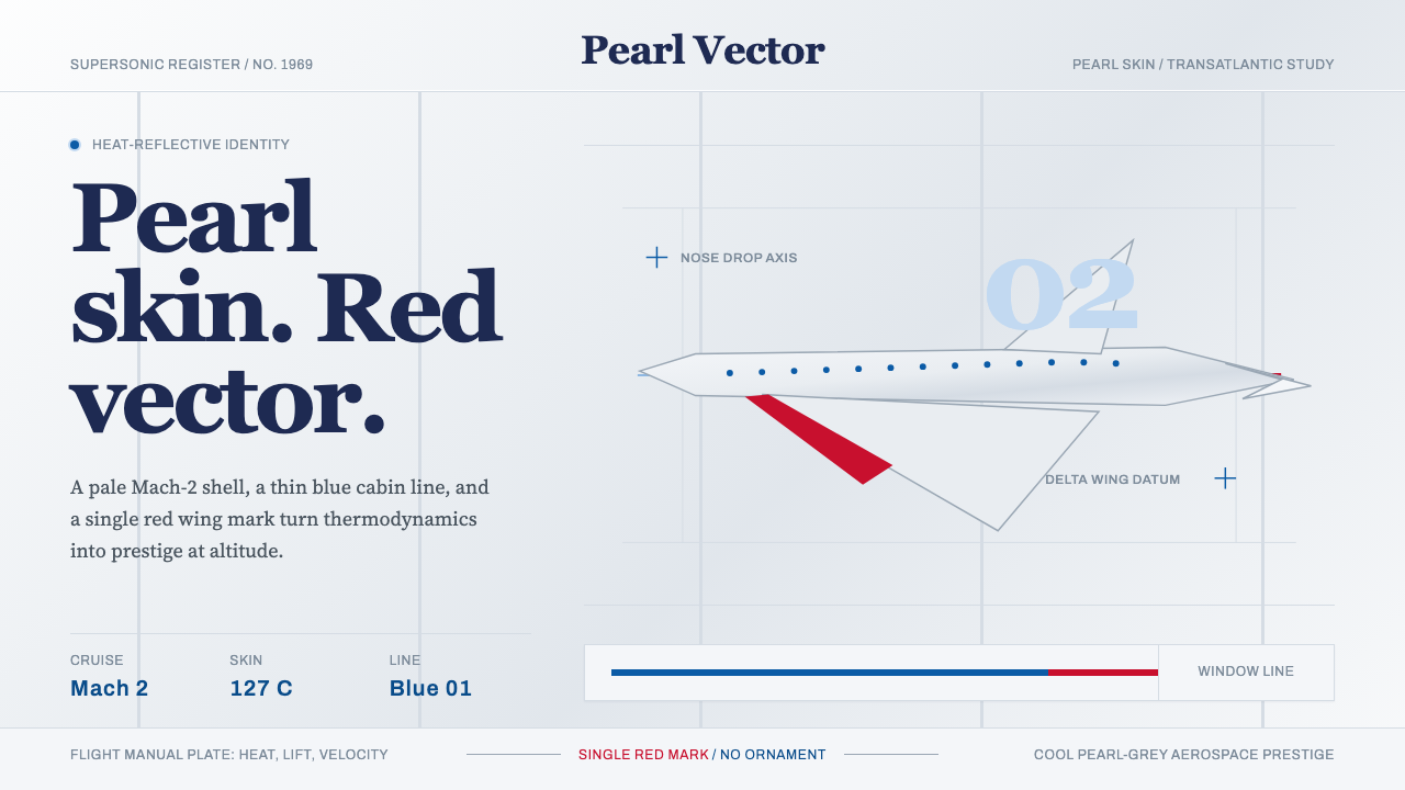 Concorde SupersonicPhysics made prestige. Pearl grey, sky-blue window line, and one red wing vec…
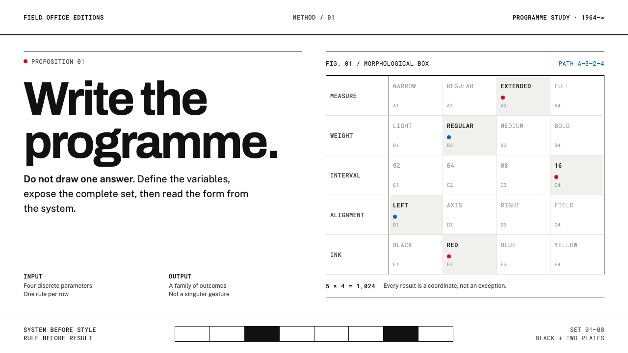 Karl Gerstner ProgrammesDesign becomes a programme. Black hairlines and a strict matrix turn paramete…
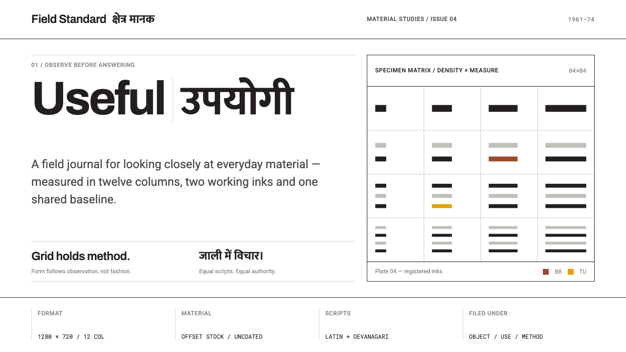 NID Ahmedabad ModernismStructure earns trust. Black rules and equal-weight scripts hold craft color…
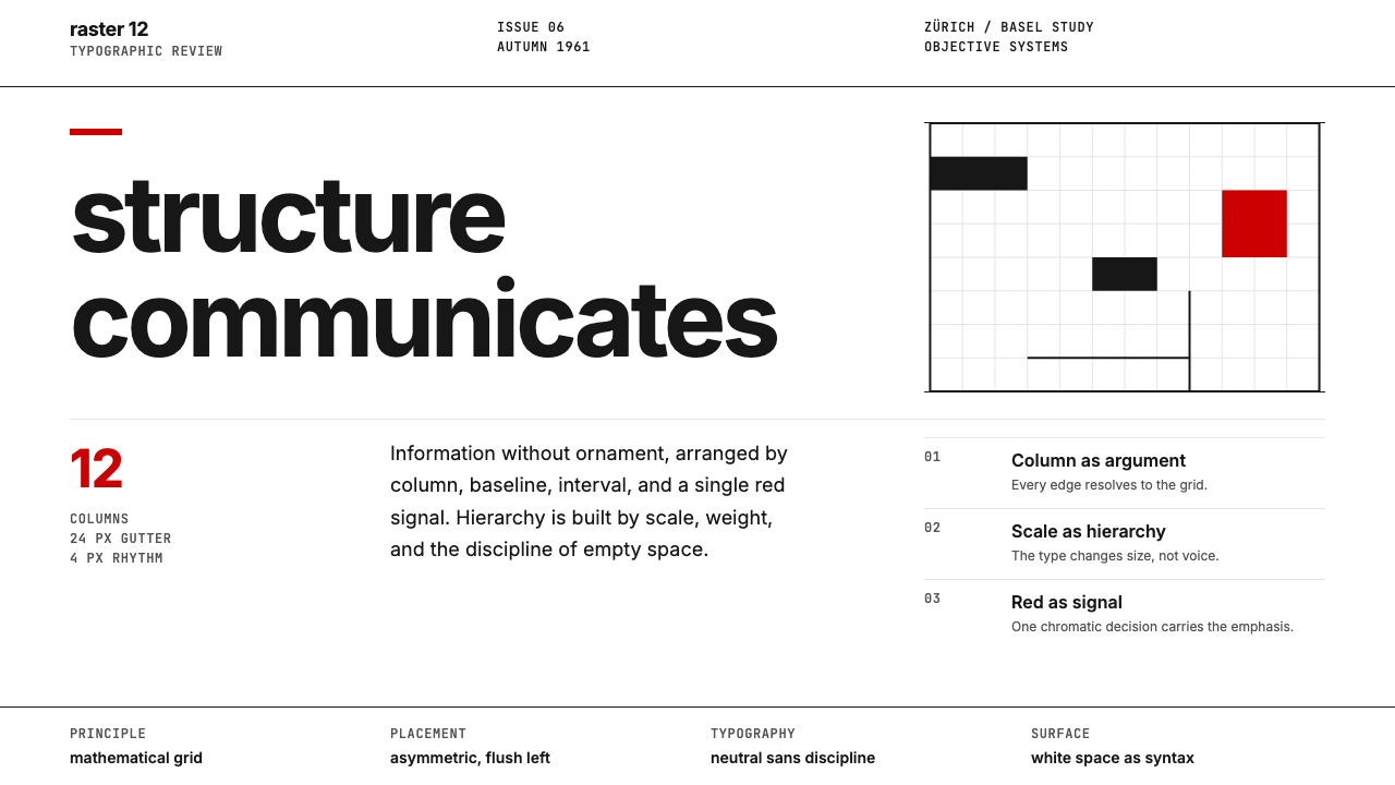 Swiss International StyleObjectivity made visible. Inter scale, white space, and one red block expose…
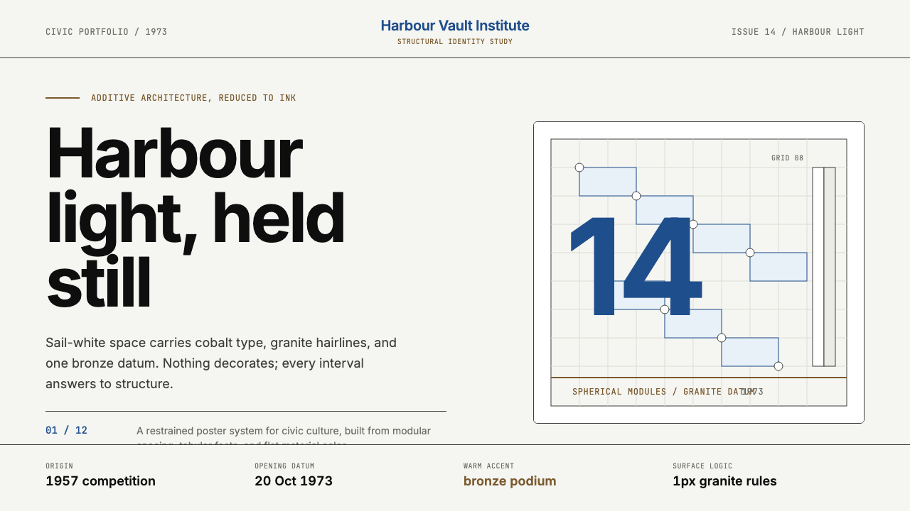 Sydney Opera House (Utzon, 1973)Civic restraint in harbour light. Sail-white space, cobalt type, bronze datum.
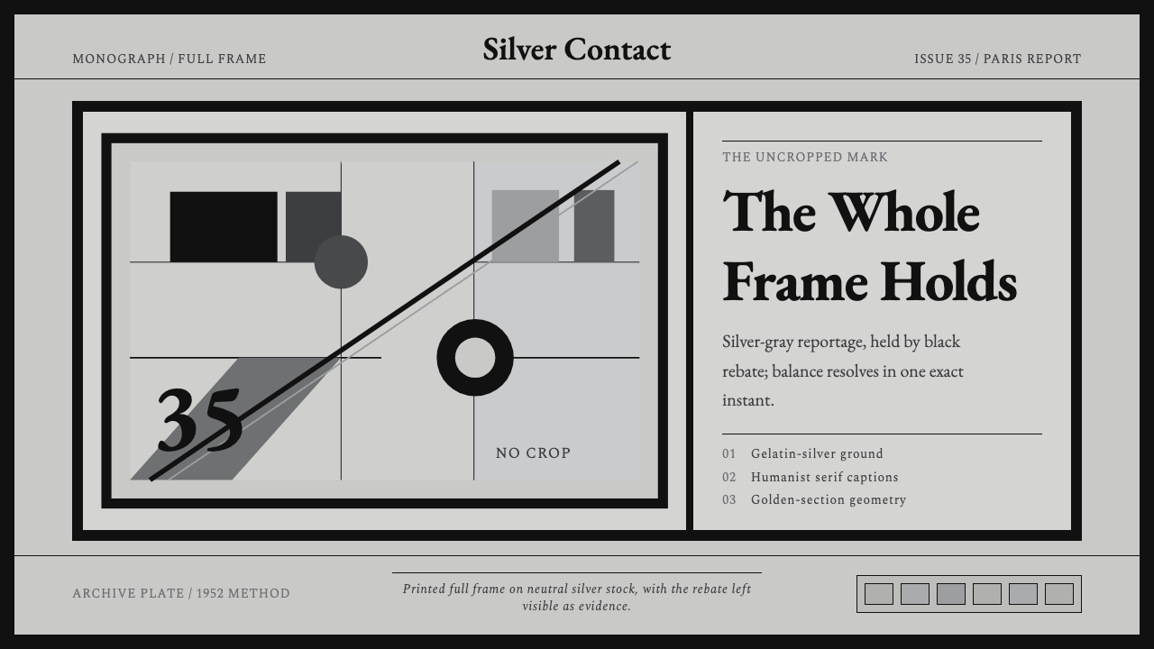 Cartier-Bresson Decisive MomentNever cropped. Silver-gray tonality is locked by a dead-black film rebate.