About Pharmacy Rx
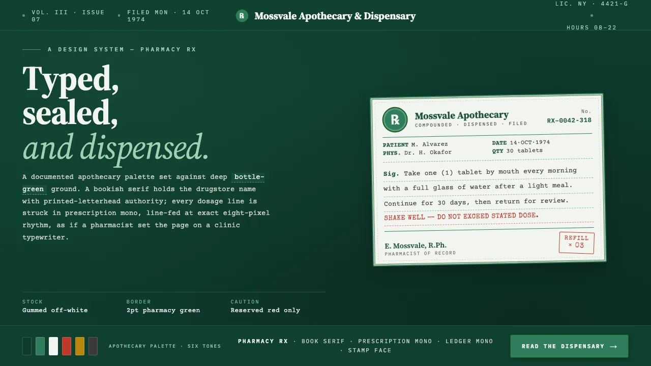
Pharmacy Rx revives the green-and-white prescription label of the mid-century American drugstore: a ruled apothecary-green frame, the Rx seal, a serif drugstore name, and typewriter-struck dosage lines on pale gummed paper. Here the white label stock is held as a swatch and floated on a deep apothecary-green ground, so the whole system reads as a documented, intentional dark presentation rather than a lazy white page.
- Origin
- North America — United States independent pharmacies and drugstores
- Era
- 1950–1990 (mid-century American drugstore / apothecary labelling)
- Key figures
- Independent pharmacists · Apothecary labelling tradition · Typewriter dosage typesetters
- Movements
- Apothecary style · Mid-century pharmaceutical information design · Monospace typewriter labelling
Pharmacy Rx design spec
Colors
Background
Surface
Primary
Secondary
Accent
Text
Typography
Source Serif 4Headings
Courier PrimeBody
IBM Plex MonoMono
Unlock for 1 credit
The other 11 sections — buttons, cards, spacing, motion, techniques and more — open once you unlock. Download the DESIGN.md or send it to your AI in one click. Unlock once, yours forever.
Sign up nowHave an account? Sign in
Styles similar to Pharmacy Rx
Also inspired by print & type, with a close feel.
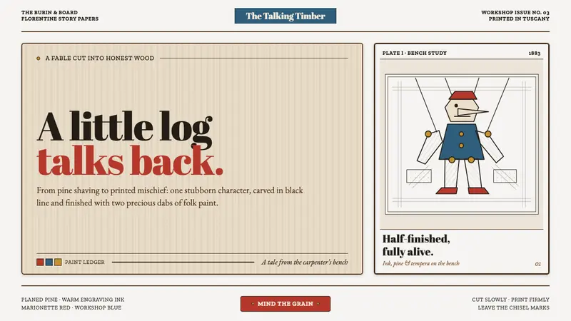 Pinocchio (1883 Marionette Workshop)Carved from honest timber. Red, blue and ochre punctuate crisp engraved lines.
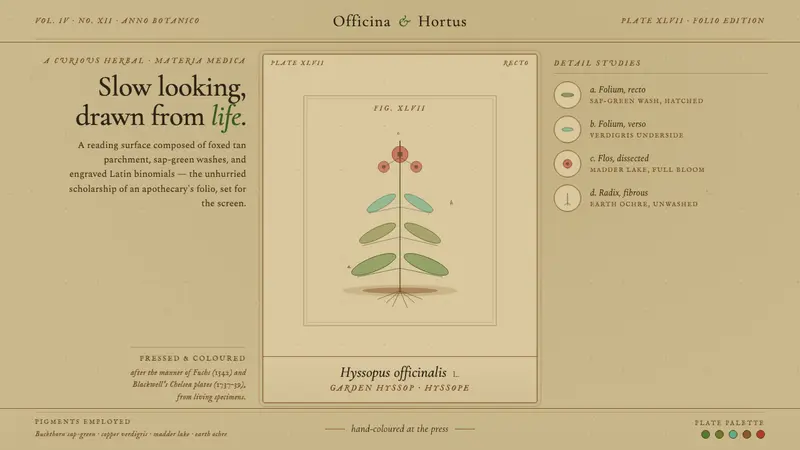 Herbal PharmacopoeiaSlow scholarship of the apothecary folio. Foxed tan parchment, sap-green washes, italic Latin names.
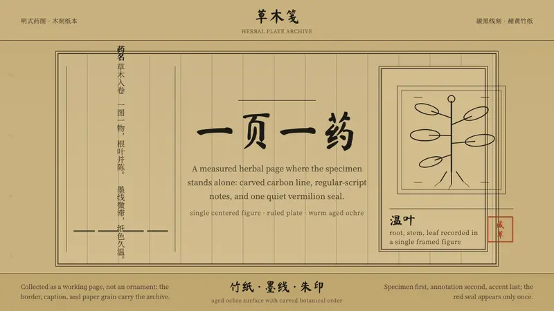 本草纲目 HerbalAncient paper breathes. Ochre ground, carbon-black woodcut lines, one vermilion seal.
 Cherokee SyllabaryLiteracy as inked record. Carbon type, muted red rules, and syllabary on tan newsprint.