What is El Al Israel Airlines (1959)?
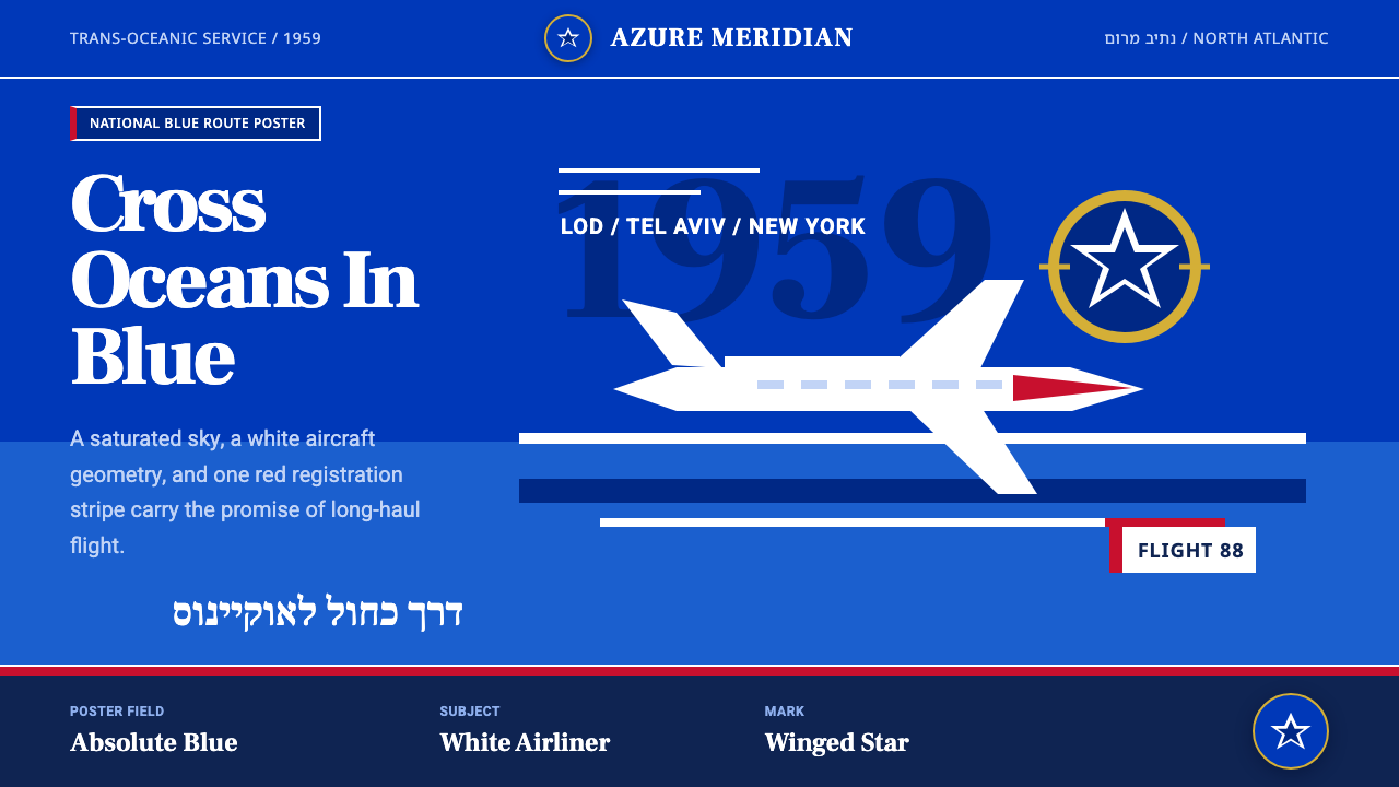
El Al turned national blue into a jet-age horizon, where white aircraft, bilingual geometry, and open sky made long-distance flight feel both modern and unmistakably Israeli.
El Al Israel Airlines (1959) in brief
The El Al identity of 1949–1990 is a national airline language shaped by mid-century travel-poster modernism. Its defining image is simple and commanding: a saturated blue sky crossed by a white airliner, often accompanied by a horizon band and the winged Magen David tail mark designed by Franz Krausz in 1949. The image linked Israel’s national colors to the promise of trans-oceanic travel aboard Constellations and 707s.
This is not merely a blue-and-white color scheme. Blue supplies the atmosphere, scale, and emotional authority of the composition, while white cuts through it as aircraft, lettering, insignia, or a narrow division between fields. The broad areas of flat color recall printed posters and luggage labels rather than naturalistic views of the sky. An aircraft is presented less as a detailed machine than as a bright geometric presence moving decisively through space.
Typography completes the system by pairing Hebrew and Latin scripts through a shared geometric, sans-serif temperament. The two writing systems remain visibly different, but similar weight, direct construction, and controlled spacing allow them to inhabit the same modern identity. The result balances national specificity with international legibility: an Israeli voice prepared to speak across borders.
Where does El Al Israel Airlines (1959) come from?
The identity emerged in 1949, at the beginning of El Al’s long 1949–1990 visual era. Its regional center was Israel, particularly Lod and Tel Aviv, but its subject was movement beyond the region. As a national airline, El Al needed to represent a place while promising passage away from it. The blue-and-white system answered both needs: it carried national association while opening that association into an expansive image of sky, distance, and international connection.
Franz Krausz’s winged Magen David tail mark, designed in 1949, gave the airline a compact symbol for this union of origin and flight. The Magen David established national identification, while the wings converted a static emblem into an aviation sign. Placed on an aircraft tail or incorporated into printed promotion, the mark could function as destination, signature, and promise at once. Its direct silhouette suited the limited means and immediate recognition demanded by posters and luggage labels.
The system matured during the mid-century jet age as Constellation and 707 service made trans-oceanic travel its central narrative. Travel imagery of the period did not need to explain aviation technically; it needed to make speed, range, and confidence visible. El Al’s flat skies, white aircraft forms, and disciplined negative space did this through reduction. The airplane became a clean directional shape, and the uninterrupted blue around it made the journey appear open, controlled, and almost limitless.
Krausz, Otte Wallish, and Treuman & Him are the key figures and design names associated with the source material for this identity. Together, their presence situates the system within Israeli national branding, geometric sans-serif typography, and jet-age poster modernism. Across its long period of use, the identity remained coherent because these strands reinforced one another: national color supplied recognition, poster reduction supplied impact, and bilingual typography connected local identity to international travel.
What defines the El Al Israel Airlines (1959) look?
National Blue
Blue is the governing field rather than a minor accent. It appears saturated, deep, and uninterrupted, allowing the entire composition to read as sky, flag, and brand at once. White is introduced selectively, so the blue retains visual command. The effect depends on confidence in a narrow palette: adding numerous supporting hues would weaken both the national association and the poster’s immediate force.
White Aircraft Geometry
Aircraft are reduced to bright, legible masses that slice across the blue ground. Wings, fuselage, and tail remain recognizable, but mechanical detail is subordinated to silhouette and direction. White makes the machine feel swift and almost weightless. The plane is not simply pictured in the sky; its geometry actively organizes the surrounding negative space.
Bilingual Modernism
Hebrew and Latin lettering are paired through geometric sans-serif construction rather than forced into identical shapes. Their shared qualities are firmness, economy, and a lack of ornamental flourish. Careful alignment lets each script preserve its character while contributing to one hierarchy. This makes bilingualism part of the visual identity, not an administrative translation added after the design is complete.
Poster-Flat Space
Depth is suggested through overlap, cropping, and directional placement rather than gradients or atmospheric rendering. Sky and horizon behave as flat bands; the aircraft reads as a cut form laid across them. This printing-minded simplicity makes every relationship explicit. Foreground and distance are communicated without sacrificing the graphic unity of the surface.
Disciplined Negative Space
Open space is expansive but never neutral. Large blue areas make the aircraft appear isolated against a vast route, amplifying both motion and ambition. White space is used more cautiously because too much would dissolve the identity’s defining blue atmosphere. The composition feels uncluttered not because it is empty, but because every occupied area has a clear navigational role.
Winged National Mark
The winged Magen David joins a fixed national symbol to the directional language of aviation. Its value lies in immediate recognition and conceptual compression: country, carrier, and flight are expressed in one mark. It works best with generous surrounding space and firm contrast, where the wings remain readable and the emblem does not compete with secondary decoration.
Who shaped El Al Israel Airlines (1959)?
Krausz designed the winged Magen David tail mark in 1949. The emblem condensed El Al’s national and aviation identities into a single reproducible silhouette, equally suited to aircraft tails, posters, and luggage labels. Its combination of a familiar national sign with wings established one of the system’s clearest links between Israel and international flight.
Wallish is identified in the source material as one of the key figures associated with the identity’s origins. His inclusion places the visual language within the broader field of Israeli national branding. In reading the system, that context matters: its blue, white, bilingual lettering, and national emblem operate as coordinated public identity rather than as isolated airline decoration.
Treuman & Him is listed among the key design names connected with the identity. Within the documented framework, the name belongs to the system’s intersection of jet-age poster modernism, Israeli national branding, and geometric sans typography. That intersection explains why the work can feel promotional and institutional at the same time: it sells the excitement of travel while maintaining the authority of a national carrier.
How do you use El Al Israel Airlines (1959) today?
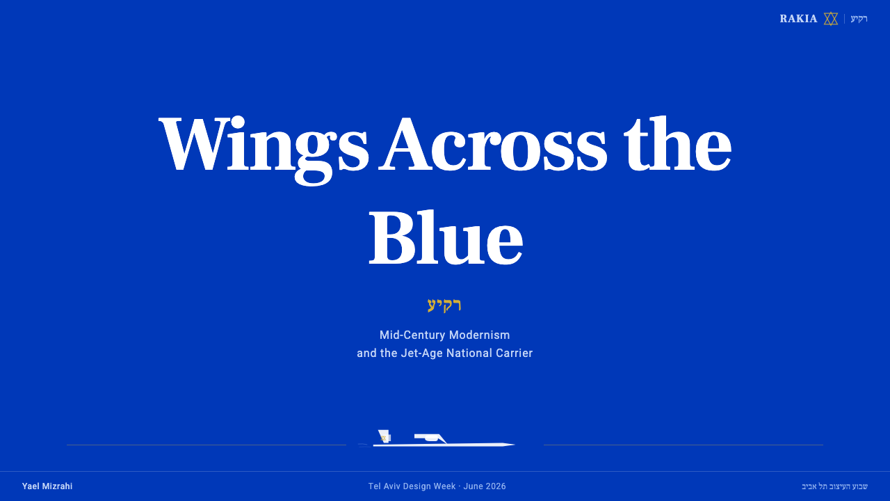
For presentation slides, the style is strongest when the blue field is treated as the environment of the deck rather than as occasional decoration. A cover can place a cropped white aircraft form on a broad blue ground, with the title aligned like a destination label and the winged mark held apart as a signature. Content slides should preserve the same directional calm: concise text groups, firm bilingual headings where required, and ample blue space that prevents information from becoming visually congested.
Data slides should translate the aviation vocabulary into clear trajectories rather than literal airplane illustrations everywhere. A rising route, a long horizontal band, or a small white marker crossing a blue field can organize comparisons and sequences. Charts should remain flat and strongly contrasted, with labels integrated into the composition. White can identify the primary series while quieter blue variations separate supporting information, provided the dominant national-blue atmosphere remains intact.
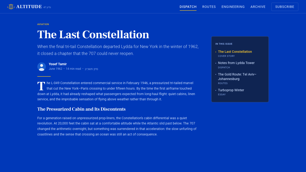
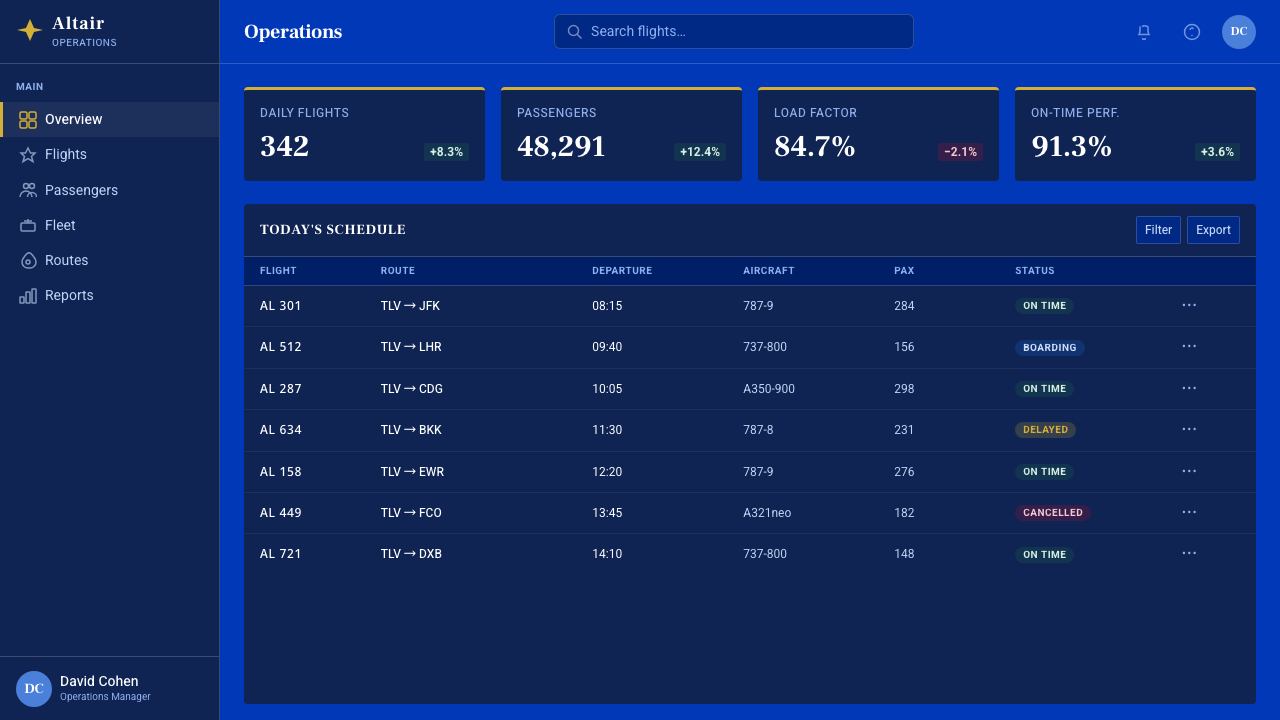
For web interfaces, the system suits dashboards, route tools, and pricing pages that benefit from authority and quick scanning. A blue application shell can establish identity, while white panels behave like aircraft geometry cutting into the field. Navigation should rely on clear words and disciplined alignment; bilingual labels need enough separation to remain readable without appearing like unrelated interfaces. Pricing tiers can be distinguished through proportion, borders, or blue intensity rather than a collection of competing accent colors.
Editorial and marketing applications should borrow the travel poster’s narrative economy. A feature page can begin with one decisive image, a short destination-like headline, and a horizon band that carries metadata or calls to action. Long-form editorial pages may reverse the relationship by placing readable text on lighter fields while reserving deep blue for section openings, quotations, and route-like dividers. Campaign materials work best when each piece presents one journey, one aircraft gesture, or one promise instead of assembling a collage of travel clichés.
The common mistake is reducing the identity to generic patriotic blue and white. Filling every surface with white cards, adding detailed aircraft photography, or scattering national emblems across the layout destroys the disciplined scale that gives the system authority. Another error is treating Hebrew and Latin text as interchangeable decoration. The authentic approach preserves the blue field, uses aircraft and insignia sparingly, and builds a deliberate bilingual hierarchy in which both scripts remain legible and structurally related.
El Al Israel Airlines (1959) — FAQ
Is this style simply an application of Israel’s national colors?
No. National blue and white provide the recognizable foundation, but the identity depends equally on jet-age poster reduction, white aircraft geometry, bilingual sans-serif typography, and controlled negative space. Without those structural qualities, blue and white alone produce a national color scheme, not the El Al visual language of 1949–1990.
Why is the aircraft usually white against blue?
The contrast makes the aircraft immediately legible while preserving blue as the dominant atmosphere. White also suppresses distracting mechanical detail, turning the plane into a clean sign of speed and direction. Because the form appears to cut across the field, it organizes the poster rather than merely illustrating a flight.
How should Hebrew and Latin typography be combined?
They should be related through visual temperament rather than made artificially identical. Geometric sans-serif forms, firm weight, economical spacing, and clear alignment can give both scripts a shared modern rhythm. Each script should retain its natural structure, with hierarchy determined deliberately so that neither looks like a decorative subtitle.
Can the style use photography?
Photography can be used, but it should support the poster logic rather than replace it. An aircraft image benefits from decisive cropping, strong silhouette, limited visual noise, and integration with broad blue fields or horizon bands. A detailed documentary scene filled with clouds, airport activity, and competing colors will usually weaken the identity’s flat, emblematic clarity.
Where does this identity work best today?
It is particularly effective for travel presentations, route dashboards, transport interfaces, pricing systems, destination campaigns, and editorial stories about movement or national infrastructure. It is less suited to experiences that require softness, intimate warmth, or abundant product imagery. Its strongest qualities are confidence, distance, direction, and institutional clarity.
Related design styles
 Amtrak Arrow (1971)Civic authority at speed. Deep navy, Helvetica lockups, and red-blue arrows.
 Kuwait Oil-Era ModernismOil-boom optimism in concrete. Petrol-and-sky tower stripes band warm desert-…
 Ethiopian Airlines 1960sJet-age confidence, drawn flat. Yellow bands and red hairlines cut across whi…
 Israeli Bezalel ModernismForm follows the state. Hard Bauhaus discs and ochre bars on absolute blue, H…
 Estonian Song FestivalCivic monumentality sings. Blue-black-white bands meet a concrete arch.
 Gulf Racing LiverySpeed made disciplined. Powder blue, orange stripe, black roundel, strict gri…