What is Estonian Song Festival (Laulupidu)?
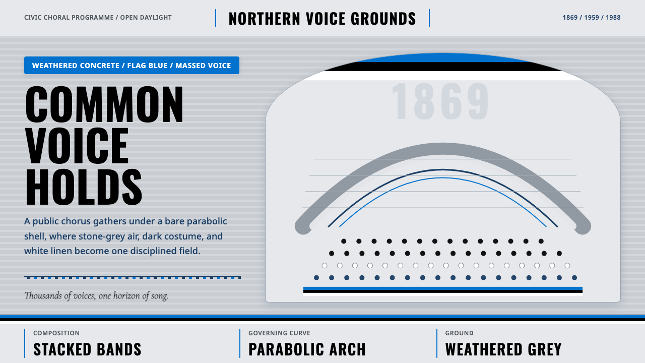
At Laulupidu, civic monumentality does not stand silent: it rises from a weathered concrete arch, horizontal bands of blue, black, and white, and a human landscape assembled to sing.
Estonian Song Festival (Laulupidu) in brief
The Estonian Song Festival, or Laulupidu, is a national choral tradition begun in 1869 and centered in its iconic modern form on Tallinn's Lauluväljak. Tens of thousands of singers gather in folk costume beneath a vast parabolic concrete shell, transforming an architectural stage into a collective civic image. The festival endured across the Soviet decades and continued into national independence, giving its visual language unusual historical weight: mass participation, national identity, endurance, and public space are inseparable.
As a design style, Laulupidu is defined by a restrained blue-black-white tricolour set against weathered stone-grey concrete. Its governing form is the parabola of the song-stage shell, while broad horizontal bands recall both the Estonian flag and the layered ranks of a massed choir. Dark costume and white linen create a living pattern beneath the pale arch; open daylight keeps the spectacle public, exposed, and monumental rather than theatrical or enclosed.
The resulting aesthetic combines civic scale with disciplined simplicity. It does not imitate folk costume ornament by ornament, nor does it reduce national identity to decorative flag display. Instead, it builds meaning through repetition, gathering, and contrast: many voices become one field, individual garments become rhythmic texture, and a single architectural curve holds the entire composition together. Monumentality comes from collective presence rather than imperial grandeur.
Where does Estonian Song Festival (Laulupidu) come from?
The festival tradition began in 1869 within Estonia's national-romantic choral culture. Its foundational act was collective rather than architectural: people gathered to sing, and the assembled chorus became a public expression of cultural belonging. This origin matters to the style because its most important unit is never the isolated emblem. Meaning accumulates through rows of participants, recurring bands, repeated contrasts, and the sense that many distinct presences have entered a shared structure.
The visual identity now associated most strongly with Laulupidu took architectural form in Tallinn when the iconic song-stage shell was built in 1959. Designed by Henno Sepmann and Alar Kotli, the structure is dominated by its great parabolic concrete arch. The shell does more than shelter or frame performers. Its curve gathers the choir into a single legible body, making architecture and assembly appear mutually dependent: the stage seems incomplete without singers, while the singers acquire monumental coherence beneath the stage.
Between 1950 and 1990, the festival existed across the Soviet decades while carrying an Estonian national tradition that predated them. The source of the aesthetic's gravity lies in this continuity. Blue, black, and white are not merely a convenient palette, and massed singing is not merely entertainment; together they evoke a national identity maintained through collective cultural practice. Weathered concrete intensifies that reading. Its exposed age suggests duration, pressure, and survival rather than polished novelty.
The Singing Revolution era brought the relationship between song, gathering, and national independence into especially sharp focus. Within the design language, this history produces a distinctive form of civic monumentality: open rather than enclosed, participatory rather than remote, and voiced rather than silent. The style therefore carries two historical scales at once. It reaches back to the choral tradition begun in 1869, while its modern visual center remains the concrete shell built in 1959 and the public assemblies that continued beneath it.
What defines the Estonian Song Festival (Laulupidu) look?
Tricolour Restraint
Blue, black, and white form the identifying palette, but they work best as broad, disciplined fields rather than a scatter of patriotic accents. Blue brings open-air clarity, black supplies gravity and visual mass, and white recalls linen, daylight, and the bright intervals within a dark-clad choir. Weathered stone-grey acts as the stabilizing ground, allowing the tricolour to carry civic meaning without becoming decorative spectacle.
The Governing Arch
The parabola of the Tallinn song-stage shell is the style's defining curve. It should appear as a structural gesture that gathers content, not as a casual decorative flourish. A broad rising arc can frame a title, contain a field of faces, or organize information beneath a shared canopy. Its power comes from continuity and span: one confident curve holds many smaller elements in relation.
Horizontal Choral Rhythm
Broad horizontal bands echo both the Estonian flag and the ranks of a massed choir. These bands establish tempo through recurrence: dense and quiet passages, dark and light intervals, filled and open zones. They should feel cumulative rather than striped for decoration. Each layer adds another voice to the composition until the page or screen reads as a coordinated civic field.
Concrete Monumentality
The architectural ground is bare, weathered, and stone-grey. Its appeal lies in exposed endurance rather than luxurious finish. Surfaces may suggest age and outdoor use, but they should remain restrained enough that texture does not overpower structure. Concrete gives the palette gravity and prevents the tricolour from feeling weightless; it is the silent mass against which the human chorus becomes vivid.
Human Mass as Pattern
Dark folk costume and white linen turn the assembled choir into a patterned landscape without erasing its humanity. Repetition is central, but perfect mechanical uniformity is not. Small variations in clothing and placement keep the field alive, while the overall grouping remains legible from a distance. The aesthetic depends on the tension between individual presence and collective form.
Open-Daylight Clarity
Laulupidu belongs visually to open daylight. Illumination should feel broad and public, revealing the concrete arch and the scale of the gathering without theatrical mystery. Strong dark-light contrast may organize the composition, but the atmosphere remains clear rather than nocturnal. This daylight quality distinguishes civic assembly from stage fantasy and gives even monumental compositions a sense of accessibility.
Collective Scale
Scale is communicated through accumulation: many singers, long bands, an expansive arch, and generous areas of sky or concrete. A single oversized symbol cannot substitute for this effect. The composition should let viewers sense both the immense whole and the repeated human units that create it. Grandeur is therefore earned through participation, not imposed through heraldic ornament or remote authority.

Who shaped Estonian Song Festival (Laulupidu)?
Henno Sepmann was one of the designers of the iconic song-stage shell built in Tallinn in 1959. Within the Laulupidu visual tradition, his significance rests on the architecture's ability to turn an immense choir into a coherent civic image. The parabolic concrete form became more than a backdrop: it supplied the governing curve through which mass participation, modern construction, and national memory could be seen together.
Alar Kotli shared authorship of the 1959 song-stage shell with Henno Sepmann. The structure associated with their work anchors the festival's modern identity: a bare concrete span open to daylight and filled, during the gathering, by dark costume and white linen. Its enduring recognizability demonstrates how a single architectural form can become inseparable from a recurring cultural act.
The tens of thousands of singers are the festival's essential collective figure. Their folk costume, white linen, ordered ranks, and shared performance give the concrete shell its living scale. In design terms, the choir embodies the system's central principle: identity emerges through coordinated difference. No participant needs to dominate the image; the civic monument is produced by their simultaneous presence.
How do you use Estonian Song Festival (Laulupidu) today?
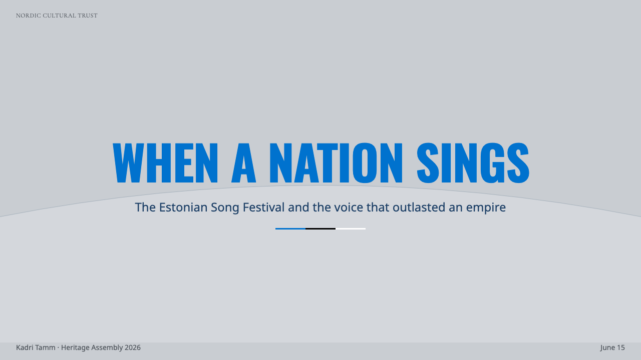
For presentation slides, the style is strongest when the cover behaves like a civic poster rather than a decorated title page. Let one broad parabolic arc frame the composition, place the title within an open field of daylight white or concrete grey, and use a single blue or black band to establish direction. Content slides should preserve the same architecture: information gathered beneath a curve, divided into calm horizontal registers, with ample open ground preventing the monumental language from becoming heavy.
Data slides benefit from the choir metaphor. Repeated bars, rows, or grouped marks can read as coordinated voices, while blue, black, and white distinguish categories without turning the chart into a flag illustration. Use broad grouping and clear intervals to reveal accumulation. The most important total should feel like a mass assembled from visible parts. Avoid ornamental curves inside the chart; reserve the parabola for framing or summarizing the whole.
For web interfaces, Laulupidu suits dashboards, public-information portals, membership systems, and pricing pages that need institutional confidence without corporate gloss. A dashboard can use a stone-grey ground, dark information bands, and restrained blue indicators, with major sections held beneath shallow arch-like headers. On pricing pages, horizontal tiers can suggest choral ranks, while white space maintains daylight clarity. Interactive emphasis should remain selective so that the tricolour retains civic gravity.
Editorial and marketing layouts should foreground gathering, continuity, and public scale. An article opener may pair an expansive arch image with a narrow column of text, followed by horizontal sections that move like successive choral passages. Campaign pages can alternate human-density imagery with quiet fields of concrete or sky, allowing collective presence to breathe. The style works especially well when the message concerns cultural memory, participation, national continuity, or institutions built around a shared public purpose.
The common mistake is to treat the theme as a generic Estonian flag skin. Filling every section with equal blue, black, and white bands removes hierarchy and reduces a historically charged civic language to surface branding. Another error is using the arch as a repeated decorative badge. The authentic approach is more structural: one governing curve, a restrained tricolour, broad horizontal rhythm, and enough human repetition to communicate that monumentality comes from an assembled public.
Estonian Song Festival (Laulupidu) — FAQ
Is the Laulupidu style simply an application of the Estonian flag?
No. The blue-black-white tricolour is essential, but the style also depends on the weathered concrete shell, the governing parabola, horizontal choral rhythm, open daylight, and the visual mass of assembled singers. Without those relationships, the result is merely national-color branding. Laulupidu becomes distinctive when flag, architecture, and collective presence operate as one system.
Why is the parabolic arch so important to the visual system?
The arch is the form that makes the immense gathering legible. It spans above many singers and visually gathers them into one body without concealing their number. In design applications, the curve performs the same task: it relates separate elements to a shared whole. Used structurally, it communicates shelter, assembly, and continuity; used as a small repeated ornament, it loses that force.
Can the style work without photographs of the festival?
Yes, provided that the composition preserves the system's deeper relationships. Repeated typographic rows can stand in for choral ranks, broad bands can establish collective rhythm, and a single parabolic frame can organize the whole. Concrete grey, blue, black, and white can carry the atmosphere, but some form of visible accumulation is still necessary. Without repetition or gathering, the design loses its civic scale.
How should folk costume influence a contemporary layout?
Folk costume should influence texture and human contrast rather than supply a library of copied ornaments. The source image emphasizes dark costume against white linen, producing a varied but coherent field beneath the pale concrete shell. A contemporary layout can echo that relationship through alternating dark and light content, repeated small elements, and controlled variation. Literal costume motifs are unnecessary unless the material itself concerns them.
What kinds of projects are poorly suited to Laulupidu aesthetics?
The style is less suitable when a project depends on private intimacy, playful excess, or luxurious refinement. Its strongest values are public participation, cultural endurance, disciplined identity, and collective scale. Applying its concrete gravity and massed rhythm to a delicate personal service or a deliberately whimsical product may make the experience feel institutional. The style works best when the subject genuinely has a shared civic or cultural dimension.
Related design styles
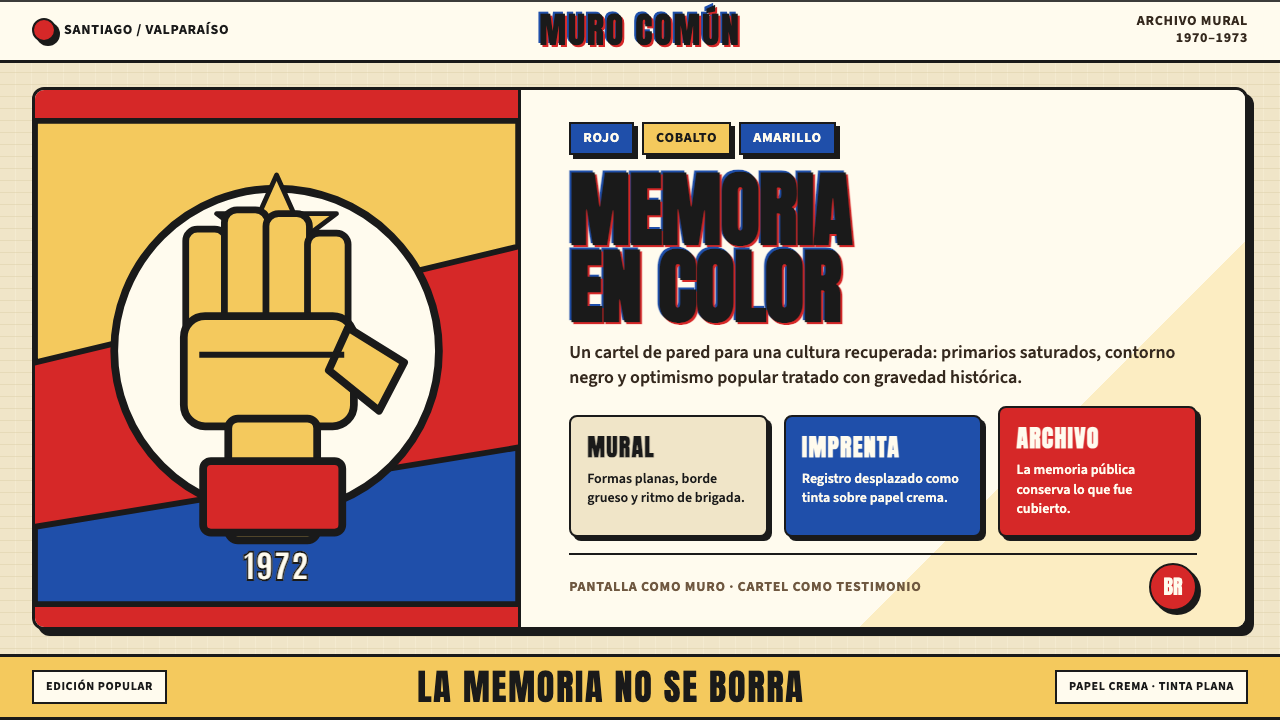 Chilean Allende-Era Propaganda (1972)Solemn revolution. Red, cobalt and yellow lock into thick black mural geometr…
 El Al Israel AirlinesNational blue takes command. White aircraft geometry cuts a flat jet-age post…
 Gotham / Obama Hope Poster (2008)Public trust, made visible. Cream, navy, and red grid the poster.
 Israeli Bezalel ModernismForm follows the state. Hard Bauhaus discs and ochre bars on absolute blue, H…
 Olympic Poster Berlin (1936)Monumental and legible. Green-gray, cream, and gold turn type into architectu…
 Olympics Five Rings (1912)Ceremony without noise. Saturated five-ring color on pure white, locked to a…