What is Olympic Poster Berlin (1936)?什么是 Olympic Poster Berlin (1936)?
Berlin 1936 turned the Olympic poster into architecture — compressed type stacked like parade banners, monumental silhouettes, and a muted lithographic palette engineered for legibility at a distance.1936年柏林将奥运海报变成了建筑——超窄字体如阅兵横幅般垂直堆叠,纪念碑式剪影,以及专为远距离可读性设计的沉稳石版印刷色调。
Olympic Poster Berlin (1936) in briefOlympic Poster Berlin (1936) 速览
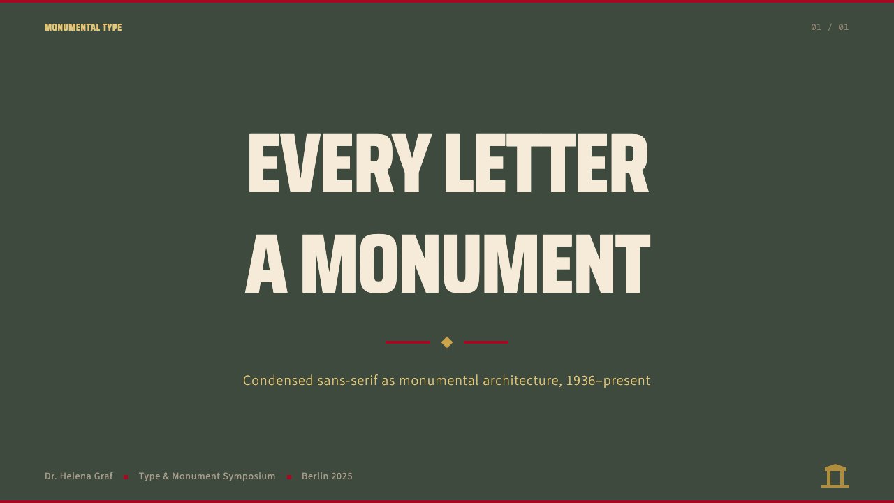
The Berlin 1936 Olympic poster style is a visual system derived from the official graphic identity of the XI Summer Olympiad, held in Berlin under the Nazi government. Its defining characteristics are heavy condensed sans-serif headlines stacked vertically in the manner of parade lettering, monumental architectural silhouettes anchoring the lower register of a composition, and a muted lithographic palette built from deep green-gray, Olympic gold, and cream paper. Every element is calibrated for maximum legibility at distance — treating typography as load-bearing architecture rather than decorative surface.1936年柏林奥运会海报风格是一套源自第十一届夏季奥林匹克运动会官方视觉识别系统的设计语言。其决定性特征包括:厚重窄体无衬线标题以阅兵字母的方式垂直堆叠,纪念碑式建筑剪影锚定构图下方区域,以及由深绿灰、奥运金与奶油纸色构成的沉稳石版印刷调色板。每一个元素都为百米外的最大可读性而校准——将字体排印视为承重建筑而非装饰表面。
Stripped of its political context, the system's pure design merit is both specific and transferable. Compression and verticality give headlines enormous presence in small spaces. The green-gray ground reads as atmospheric and serious without resorting to black, while gold accents communicate ceremony and measured prestige. The rectilinear panel structure — mimicking the flat planes of a lithograph sheet — imposes order without ornament. Taken together, these elements produce a visual language of engineered monumentality: purposeful, legible, and authoritative.剥离政治语境,这套系统纯粹的设计价值既具体又可移植。压缩与垂直性赋予标题在狭小空间内巨大的存在感。绿灰底色在不借助黑色的情况下呈现出大气而严肃的质感,金色点缀则传递着仪典感与克制的尊贵。矩形面板结构——模拟石版印刷纸张的平面——在无需装饰的前提下制造秩序。这些元素合力产生了一套工程化纪念碑感的视觉语言:目的明确、易于辨读、权威有力。
The style belongs to a broader lineage of monumental athletic poster design that the 1936 games helped establish and that subsequent Olympic host cities — London 1948, Melbourne 1956, Tokyo 1964, Munich 1972 — each interpreted through their own visual culture. The Berlin iteration is the foundational reference: the moment a purpose-built event identity became a replicable design grammar.这种风格属于更广泛的纪念碑式体育海报设计谱系。1936年的柏林奥运会协助确立了这一谱系,此后各届东道主城市——1948年伦敦、1956年墨尔本、1964年东京、1972年慕尼黑——各自通过本国视觉文化对其加以诠释。柏林版本是奠基性参照:这是一个专为特定事件构建的视觉识别系统转变为可复制设计语法的历史时刻。
See the Olympic Poster Berlin (1936) design system查看 Olympic Poster Berlin (1936) 完整设计系统
Where does Olympic Poster Berlin (1936) come from?Olympic Poster Berlin (1936) 从何而来?
The 1936 Summer Olympics were awarded to Berlin in 1931, two years before the Nazi seizure of power. When Adolf Hitler came to office in 1933, the games became an instrument of international image projection. Joseph Goebbels's Propaganda Ministry and the Reich Sports Office, led by Carl Diem — a career sports administrator and the games' chief organizer — worked in concert to project an image of German efficiency, classical order, and physical supremacy. The official poster commissioned from graphic artist Franz Würbel became the most visible expression of that ambition: a monumental Olympic bell tower rendered in precise architectural silhouette, surmounted by a stylized eagle and flanked by compressed vertical lettering.1936年夏季奥运会于1931年获授柏林承办权,彼时距纳粹夺权尚有两年。1933年希特勒执政后,奥运会成为对外形象投射的工具。戈培尔领导的宣传部与由卡尔·迪姆主持的国家体育局——迪姆是职业体育行政官员,也是本届运动会的总组织者——协同运作,致力于投射德国效率、古典秩序与身体至上的形象。委托给平面艺术家弗朗茨·维尔贝尔的官方海报成为这一野心最显眼的表达:一座奥运钟楼以精确建筑剪影呈现,顶部是程式化鹰徽,两侧是压缩的垂直字体排印。
Franz Würbel's design synthesized two currents that ran through 1930s German graphic culture. The first was a tradition of condensed, vertically stacked poster lettering inherited from nineteenth-century commercial lithography and carried forward by the German publicity poster movement of the 1920s. The second was a monumental classicism — heavy, symmetrical, derived from Greco-Roman architectural sources — that the regime was actively promoting as the aesthetic face of its ideology. Würbel navigated these two registers skillfully, producing work that read simultaneously as modern (in its compressed sans-serif lettering) and ancient (in its architectural gravitas), satisfying both the modernist poster canon and the regime's classicist ambitions.弗朗茨·维尔贝尔的设计综合了1930年代德国平面文化中并行的两股潮流。其一是继承自19世纪商业石版印刷的窄体垂直堆叠字体传统,并经由1920年代德国宣传海报运动延续至今。其二是一种纪念碑式古典主义——厚重、对称、取法希腊罗马建筑来源——彼时政权正积极将其推广为意识形态的美学外衣。维尔贝尔熟练地在这两种语调之间游走,创作出一件同时读来既现代(压缩的无衬线字体)又古老(建筑式庄严感)的作品,既符合现代主义海报规范,又满足了政权的古典主义诉求。
The palette was partly technological and partly ideological. Lithographic printing in the 1930s favored limited, saturated separations, and the combination of a dominant cool ground tone, a warm metallic accent, and a neutral light field was a practical solution to the constraint of limited ink runs. But the specific choice of a deep green-gray — rather than a neutral gray or a warm tan — gave the work its distinctive atmospheric quality: the color of weathered bronze and aged stone, materials associated with permanence and monumental architecture. Gold reinforced the Olympian register. The cream field, evoking uncoated paper, kept the composition accessible and legible.色板的形成一半出于技术,一半出于意识形态考量。1930年代的石版印刷工艺偏好有限的、饱和的色彩分离,主导性冷调底色、暖金属质感强调色与中性浅色调的组合,是有限油墨次数约束下的务实解决方案。然而特意选择深绿灰——而非中性灰或暖褐色——赋予了作品独特的大气质感:那是风化青铜与历经岁月石材的颜色,令人联想到永恒与纪念碑建筑的材料。金色强化了奥林匹亚的崇高基调。奶油色调——唤起未涂布纸张的质感——保持了构图的亲近感与可读性。
Leni Riefenstahl's documentary films of the games — Olympia, released in two parts in 1938 — extended the visual grammar of the poster into motion. Her techniques of extreme foreshortening, low-angle heroic framing, and the reduction of athletic bodies to geometric silhouettes against open sky were cinematic equivalents of Würbel's poster composition. Together, poster and film established an aesthetic template for athletic monumentalism that outlasted its political context and was selectively absorbed by subsequent Olympic design programs. The Japanese graphic designer Yusaku Kamekura, who designed the celebrated Tokyo 1964 Olympic poster, acknowledged the Berlin visual tradition as part of the lineage he was working within and departing from — a measured inheritance that shaped the broader Olympic poster canon stretching through to contemporary games.莱妮·里芬斯塔尔记录本届运动会的纪录片——《奥林匹亚》,于1938年分两部发行——将海报的视觉语法延伸至运动影像。她的技法——极度透视压缩、低角度英雄式取景、将运动员身体简化为对抗开阔天空的几何剪影——是维尔贝尔海报构图的电影等价物。海报与电影共同确立了一套体育纪念碑美学模板,这套模板超越了其政治语境而延续,并被此后的奥运设计项目有选择地吸收。设计了广受赞誉的1964年东京奥运会海报的日本平面设计师龟仓雄策,承认柏林视觉传统是他所承继又所偏离的谱系组成部分——一份有分寸的遗产,塑造了绵延至当代的奥运海报整体规范。
What defines the Olympic Poster Berlin (1936) look?Olympic Poster Berlin (1936) 的视觉特征是什么?
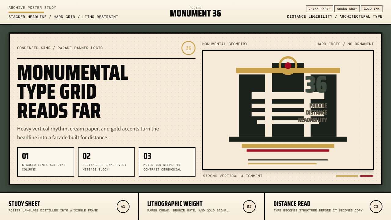
Condensed Vertical Typography压缩垂直字体
Headlines are set in heavy condensed sans-serif letterforms with tight vertical spacing, stacking words like parade banners. The extreme compression concentrates visual weight into a narrow column, creating a tower of text that reads as architectural mass rather than language. This technique maximizes legibility at distance while conferring a sense of official proclamation to even ordinary informational copy.标题采用厚重窄体无衬线字形,行间距极紧,以阅兵横幅般的方式逐词垂直堆叠。极度的压缩将视觉重量集中于一条窄柱,形成一座文字之塔,读来更像建筑体量而非语言。这一技法在远距离保证可读性的同时,为哪怕最普通的信息文案也赋予了官方公告的庄重感。
Atmospheric Ground Tone大气底色调
The dominant background color is a deep, desaturated green-gray — not quite olive, not quite slate — that evokes weathered bronze, aged stone, and the atmospheric haze over a stadium on an overcast morning. This tone distinguishes the style from neutral-gray or black-ground compositions by carrying geological and monumental associations. It functions as a complete mood field rather than a neutral backdrop, and the specific character of the hue cannot be achieved by simply darkening gray.主导背景色是一种深邃、去饱和的绿灰——既不全是橄榄色,也不全是石板灰——令人联想到风化青铜、历经岁月的石材,以及阴云天气下体育场上空的大气薄雾。这种色调通过承载地质感与纪念碑感,将这种风格与中性灰或黑色底面构图区分开来。它作为一个完整的情绪场域而发挥作用,而非中性背景——其特定色相品质不能靠单纯加深灰色来实现。
Architectural Silhouette建筑剪影
Representational imagery is reduced to precise flat silhouette — typically a tower, stadium colonnade, or monumental gateway rendered as a single-value shape against the ground tone. No gradation, no internal line detail, no cast shadow within the silhouette itself. The reductive technique gives figurative imagery the same visual weight as a geometric form, integrating it seamlessly with the typographic architecture of the composition rather than treating it as a separate illustrative element.具象图像被简化为精准的平面剪影——通常是钟楼、体育场柱廊或纪念碑式门廊,以单一色值形态呈现于底色之上。无色阶过渡,轮廓内部无线条细节,剪影内部无投影。这种简化技法赋予具象图像与几何形相同的视觉分量,使其与构图的字体排印建筑融为一体,而非作为独立插图元素存在。
Olympic Gold Accent奥运金色点缀
A warm metallic gold functions as the composition's prestige marker. It appears selectively — applied to a title word, a dividing band, or an emblem — never as a dominant field color. The restraint is essential: gold used too broadly becomes decoration; used as a focused accent against the green-gray ground, it signals ceremony, achievement, and official status. The warmth of the gold in contrast with the coolness of the ground produces a subtle visual tension that keeps the eye engaged.温暖的金属金色作为构图的尊贵标志符而存在。它的使用是选择性的——施于一个标题词、一条分隔带或一枚徽章——绝不作为主导色域出现。这种克制至关重要:金色使用过多则沦为装饰;作为聚焦性强调色置于绿灰底面之上,它传递仪典感、成就感与官方地位。金色的温暖与底色的冷调之间的对比,产生了一种微妙的视觉张力,持续吸引目光。
Rectilinear Panel Structure矩形面板结构
Compositions are organized around hard-edged rectangular panels that evoke the flat planes of a lithograph printing sheet. Text blocks, image zones, and color fields align to a strict orthogonal grid, with no diagonal elements, no rounded corners, and no overlapping regions that blend. Each panel is a discrete plane. This structural rigidity gives the style its architectural character — the layout behaves like a facade, with weight distributed across load-bearing horizontals and verticals.构图围绕硬边矩形面板组织,唤起石版印刷纸张平面的质感。文字块、图像区域与色彩场域对齐严格的正交网格,无斜线元素,无圆角,无相互融合的叠加区域。每个面板是一个独立平面。这种结构上的刚性赋予该风格以建筑性格——版面的行为方式如同一面立面,重量分布于承重横线与竖线之间。
Cream Field for Legibility奶油色区域与可读性
The green-gray ground is consistently paired with a cream or warm off-white zone — typically the area reserved for secondary information, event details, or subheadings. This light field does not compete with the monumental ground tone; it serves as the legibility zone where smaller type can be read clearly. The contrast between the two ground tones — deep atmospheric and pale luminous — creates a natural visual hierarchy without any additional graphic devices.绿灰底色始终与奶油色或暖白色区域相配——通常是保留给次要信息、赛事详情或副标题的区域。这个浅色场域并不与纪念碑式底色形成竞争;它作为可读性区域而存在,使较小的字体能被清晰辨读。两种底色调之间的对比——深邃大气与浅淡明亮——无需任何额外图形装置,即可形成自然的视觉层级。
Monumental Scale Contrast纪念碑式尺度对比
The relationship between the largest and smallest typographic elements is extreme — the primary headline may be four to six times the visual weight of supporting text. This scalar distance is not simply a hierarchy signal; it is a deliberate technique borrowed from architectural proportion, where the difference in scale between a column and a door handle signals their different structural roles. In this system, scale carries the organizational logic that other styles delegate to color or decorative framing.主标题与辅助文字之间最大与最小排印元素的关系极为悬殊——主标题的视觉分量可能是支撑性文字的四至六倍。这种尺度距离不仅仅是层级信号;它是一种刻意从建筑比例中借用的技法,正如柱子与门把手之间的尺度差异标示着各自不同的结构角色。在这套系统中,尺度承载着其他风格委托给色彩或装饰框架来完成的组织逻辑。

See the Olympic Poster Berlin (1936) design system查看 Olympic Poster Berlin (1936) 完整设计系统
Who shaped Olympic Poster Berlin (1936)?谁塑造了 Olympic Poster Berlin (1936)?
Würbel was the German graphic artist commissioned to design the official poster for the XI Summer Olympiad. His composition — a monumental bell tower silhouette surmounted by an eagle, flanked by heavy condensed lettering on a deep ground — became the defining visual document of the Berlin games and the template against which all subsequent Olympic poster design would be implicitly measured. The work demonstrated that a single poster image could function simultaneously as civic symbol, tourist advertisement, and ideological projection, and the formal decisions he made — palette, type treatment, silhouette reduction — proved durable enough to influence sports communication design for decades.维尔贝尔是受委托设计第十一届夏季奥林匹克运动会官方海报的德国平面艺术家。他的构图——一座纪念碑式钟楼剪影顶部饰以鹰徽,两侧于深色底面上配以厚重窄体字体——成为柏林奥运会最具定义性的视觉文献,也是此后所有奥运海报设计都会被隐性参照的模板。这件作品证明,单张海报图像可以同时作为市民符号、旅游广告与意识形态投射而运作;他所做的形式决策——色板、字体处理、剪影简化——被证明足够持久,影响了数十年的体育传播设计。
Diem served as the secretary-general and chief organizer of the 1936 Berlin Olympics and was the primary force behind the games' comprehensive visual and ceremonial program. He revived and institutionalized the torch relay — now a fixture of every modern Olympic games — as a designed spectacle connecting ancient Olympia to Berlin. His organizational thinking extended to every aspect of event identity, from signage systems and printed programs to stadium graphics, establishing a model of total visual coordination for large-scale international sporting events that influenced all subsequent Olympic host committees.迪姆担任1936年柏林奥运会秘书长及总组织者,是推动运动会全面视觉与仪典项目的核心力量。他复兴并制度化了火炬传递——如今已成每届现代奥运会的固定仪式——将其作为一场设计性奇观,将古代奥林匹亚与柏林相连接。他的组织理念延伸至赛事视觉识别的每个层面,从指示牌系统与印刷手册到体育场平面设计,为大型国际体育赛事建立了一套全面视觉协调的模型,影响了此后所有奥运东道主委员会。
Riefenstahl directed Olympia, the two-part documentary film of the 1936 games, released in 1938. While not a poster or print designer, her contribution to the visual language associated with Berlin 1936 is inseparable from the poster style's legacy. Her cinematic techniques — extreme foreshortening, low-angle heroic framing, the reduction of athletic figures to pure geometric silhouettes against sky — are the moving-image equivalents of Würbel's poster composition, and together they established the aesthetic vocabulary of athletic monumentalism that endured across the twentieth century in both advertising and sports photography.里芬斯塔尔执导了记录1936年奥运会的纪录片《奥林匹亚》,该片分两部于1938年发行。尽管她并非海报或印刷设计师,但她对与柏林1936年相关联的视觉语言的贡献,与海报风格的遗产密不可分。她的电影技法——极度透视压缩、低角度英雄式取景、将运动员身体简化为对抗天空的纯粹几何剪影——是维尔贝尔海报构图的运动影像等价物。两者共同确立了一套体育纪念碑美学词汇,在整个二十世纪的广告与体育摄影领域延续不衰。
Kamekura designed the iconic poster for the Tokyo 1964 Olympics — widely regarded as one of the greatest in the Olympic poster canon — and in doing so both acknowledged and transformed the Berlin visual inheritance. Where Würbel's work was monumental and atmospheric, Kamekura's was precise and solar: a photographic sun disk in Olympic red against a field of pure white, with condensed vertical lettering below. The structural decisions — hierarchy through scale, a dominant single symbol above, compressed type stacked below — are clearly in dialogue with the Berlin grammar even as the palette and cultural register are entirely Japanese and modernist. Kamekura's work demonstrates how deeply the Berlin 1936 formal logic had penetrated the global Olympic design language.龟仓雄策设计了1964年东京奥运会的标志性海报——广泛被视为奥运海报规范中最伟大的作品之一——在此过程中既承继又转化了柏林的视觉遗产。维尔贝尔的作品纪念碑式、大气磅礴,而龟仓的作品则精准、充满阳光感:奥运红的摄影太阳圆盘置于纯白底面之上,下方是压缩的垂直字体排印。其结构决策——通过尺度建立层级、上方单一主导符号、下方堆叠的压缩字体——显然与柏林语法处于对话之中,尽管色板与文化基调完全属于日本且具有现代主义特色。龟仓的作品证明了柏林1936年的形式逻辑已深入渗透进全球奥运设计语言的程度。
Although Bayer is primarily associated with Bauhaus typography, his work in the 1930s — including exhibition and information design produced for the German government during the same period as the Berlin games — represents a crucial parallel track in the development of the monumental-condensed-typographic aesthetic. Bayer had left the Bauhaus by 1928 and worked as a commercial typographer and exhibition designer in Berlin, where his layouts combined the compressed vertical type treatment with architectural spatial thinking in ways directly adjacent to the poster grammar of Berlin 1936. His later emigration to the United States helped transmit aspects of this visual culture into American corporate and institutional design.尽管拜耶主要与包豪斯字体设计相关联,他在1930年代的工作——包括与柏林奥运会同期为德国政府制作的展览与信息设计——代表了纪念碑式压缩字体美学发展中的一条关键平行轨迹。拜耶于1928年离开包豪斯,在柏林作为商业字体设计师与展览设计师工作,其版面将压缩垂直字体处理与建筑空间思维相结合,与柏林1936年的海报语法直接相邻。他后来流亡美国,协助将这种视觉文化的某些面向传递进美国企业与机构设计之中。
How do you use Olympic Poster Berlin (1936) today?今天怎么用 Olympic Poster Berlin (1936)?
The Berlin 1936 poster style is best understood as a grammar of engineered monumentality rather than a period costume. Applying it correctly means internalizing its organizing logic — typography as architecture, scale as hierarchy, a restrained atmospheric palette carrying emotional weight — not simply overlaying condensed type on a dark background. The style works because every element has a structural role; pastiche fails when decorative additions dilute the compression.1936年柏林海报风格最好被理解为一套工程化纪念碑感的语法,而非一件时代服装。正确应用它意味着内化其组织逻辑——字体排印即建筑,尺度即层级,一套克制的大气色板承载情绪重量——而非简单地将压缩字体叠加在深色背景上。这种风格奏效是因为每个元素都承担结构性角色;当装饰性添加物稀释了压缩感,仿制便告失败。
For presentation slides, the style performs exceptionally well on both cover and content pages. A cover benefits from the full grammar: a dominant condensed headline stacked vertically occupies the upper two-thirds of the field, a reduced architectural or organizational silhouette anchors the lower register, and a gold accent isolates a key word or subtitle. Content slides should inherit the rectilinear panel logic — body text contained in a well-defined light field, section headers in heavy condensed type against the green-gray ground, data callouts treated as discrete panels. Avoid filling the slide with green-gray; the deep tone works as a structural zone, not a wallpaper.在演示文稿中,这种风格在封面页与内容页上均表现出色。封面适合运用完整语法:垂直堆叠的主导压缩标题占据版面上方三分之二区域,简化的建筑或组织性剪影锚定下方区域,金色点缀隔离出关键词或副标题。内容页应继承矩形面板逻辑——正文置于界定清晰的浅色区域,章节标题以厚重压缩字体置于绿灰底色上,数据标注作为独立面板处理。避免将整张幻灯片填充为绿灰色;深色调作为结构性区域而奏效,而非壁纸。
For data slides and dashboards, the style offers a distinctive alternative to soft-shadow, rounded-card conventions. Charts and metrics become geometric objects in a rectilinear grid — bar graphs take on the visual weight of architectural elevations, and the gold accent functions as a highlight for the most important value. Navigation and label type should be set in condensed weight to maintain the compression register. The palette's limited range — deep ground, light field, gold accent — forces hierarchy decisions that are often left ambiguous in default dashboard styles, resulting in layouts that are genuinely easier to read.对于数据幻灯片与仪表板,这种风格提供了软阴影、圆角卡片惯例之外的一种独特替代方案。图表与指标成为矩形网格中的几何对象——柱状图呈现出建筑立面的视觉分量,金色点缀作为最重要数值的高亮标记。导航与标签文字应采用压缩字重以保持压缩调性。色板的有限范围——深色底面、浅色场域、金色点缀——迫使做出层级决策,而这些决策在默认仪表板风格中往往留于模糊,最终产生真正更易阅读的版面。
For editorial and marketing work, the style supports a strong poster-like boldness that suits launch communications, event announcements, and institutional statements. A full-page feature layout uses the vertical stack of condensed type for the main headline, with a narrower roman weight for standfirst and body. Color-block sections alternate between the deep green-gray and the cream field. Marketing pages work well when they commit to the monumental register throughout — feature blocks presented as architectural panels, calls to action isolated in gold-accented type, body copy in a clean light-weight roman on cream. The temptation to relieve the severity with soft gradients or rounded elements should be resisted; the style's authority depends on its structural integrity.对于编辑与营销内容,这种风格支持强劲的海报式大胆感,适合发布传播、活动公告与机构声明。全页特性版面以压缩字体的垂直堆叠作为主标题,以较窄的正体字重用于导语与正文。色块章节在深绿灰与奶油色场域之间交替。营销页面在全程保持纪念碑式基调时效果最佳——特性区块呈现为建筑面板,行动号召以金色点缀字体独立呈现,正文在奶油色底上以清晰的细字重罗马体排版。用柔和渐变或圆角元素来缓解严肃感的诱惑应当加以抵制;这种风格的权威性依赖于其结构完整性。
A common mistake when applying this style is treating the condensed headline as the only design decision and leaving everything else in a neutral default state. The style is a system: the condensed type requires the deep atmospheric ground to deliver its full effect; the ground requires the cream field to create hierarchy; the cream field requires the gold accent to signal priority. A second frequent error is using the deep tone as a continuous background across every surface — the green-gray is a load-bearing zone, not a universal fill. Used sparingly as a structural panel, it reads as monumental; used everywhere, it becomes oppressive and illegible.应用这种风格时最常见的错误是将压缩标题视为唯一的设计决策,其余一切留在中性默认状态。这种风格是一套系统:压缩字体需要深邃的大气底色才能发挥完整效果;底色需要奶油色场域来创造层级;奶油色场域需要金色点缀来标示优先级。第二个常见错误是将深色调作为每个表面的连续背景——绿灰色是承重区域,而非通用填充。作为结构性面板克制使用时,它读来纪念碑感十足;无处不在时,它变得压抑且难以辨读。
See the Olympic Poster Berlin (1936) design system查看 Olympic Poster Berlin (1936) 完整设计系统
Olympic Poster Berlin (1936) — FAQOlympic Poster Berlin (1936) · 常见问题
Is it appropriate to use a style associated with the 1936 Berlin Olympics?使用与1936年柏林奥运会相关的风格是否合适?
This is a legitimate question that deserves a direct answer. The design language distilled here is the formal grammar — condensed type, monumental silhouette, atmospheric palette — not the political content or emblems of the regime. Similar questions attach to other historical design traditions that operated under or alongside authoritarian contexts. The approach taken here is consistent with how design history treats the material: analyze and document the formal properties, set aside the political application, and allow designers to make their own contextual judgments. The style is employed by sports organizations, cultural institutions, and editorial designers worldwide precisely because its formal properties — compression, legibility, monumentality — have genuine utility independent of their original political deployment.这是一个值得直接回应的合理问题。此处提炼的是形式语法——压缩字体、纪念碑式剪影、大气色板——而非政权的政治内容或象征符号。类似问题也附着于其他在威权语境下运作或与之并行的历史设计传统之上。此处所采取的处理方式与设计史学界处理该材料的方式一致:分析并记录形式特性,搁置政治应用,允许设计师做出各自的情境判断。全球的体育组织、文化机构与编辑设计师之所以采用这种风格,正是因为其形式特性——压缩、可读性、纪念碑感——具有独立于其原始政治部署的真实实用价值。
How does this style differ from generic sports design?这种风格与通用体育设计有何不同?
Generic contemporary sports design typically relies on dynamic diagonal compositions, gradient fills, high-saturation accent colors, and rounded letterforms — a visual language built around energy and motion. The Berlin 1936 grammar is the opposite: static, orthogonal, compressed, and atmospheric. The shared ancestry is the poster tradition, but the tonal register is entirely different. Where contemporary sports design performs excitement, Berlin 1936 performs authority and permanence. This makes it particularly well-suited to institutional contexts — awards, championships, commemorative communications — where gravitas is more appropriate than energy.当代通用体育设计通常依赖动感的斜向构图、渐变填充、高饱和度强调色与圆润字形——一套围绕能量与运动感构建的视觉语言。柏林1936年语法与之完全相反:静态、正交、压缩、大气。共同的祖先是海报传统,但调性基调截然不同。当代体育设计表演的是兴奋感,柏林1936年表演的是权威性与永恒感。这使它特别适合机构性语境——颁奖典礼、锦标赛、纪念性传播——在那些场合中,庄重感比能量感更为恰当。
Can the style work in a lighter, more open layout, or does it require dark backgrounds?这种风格能用于更轻盈开放的版面吗,还是必须使用深色背景?
The deep ground tone is not mandatory — it is the dominant register, but the style has a light-field mode. In this mode, the cream or warm off-white becomes the primary background, the condensed type is set in the deep green-gray, and gold accents operate as before. This inversion reads as a lighter, more editorial version of the same grammar, appropriate for body-text-heavy contexts like long-form articles, printed programs, or annual reports. The key is to retain the compression of the type, the rectilinear panel structure, and the limited palette even in the light version — the style's authority comes from its structural discipline, not exclusively from its dark ground.深色底面调并非强制性要求——它是主导语调,但这种风格存在浅色场域模式。在这一模式下,奶油色或暖白色成为主要背景,压缩字体以深绿灰色排印,金色点缀如常运作。这种反转读来是同一语法的更轻盈、更编辑感的版本,适合正文内容较多的语境,如长篇文章、印刷手册或年度报告。关键是在浅色版本中依然保持字体的压缩性、矩形面板结构与有限的色板——这种风格的权威性来自于结构纪律,而不仅仅来自于深色底面。
What kinds of projects are a poor fit for this style?哪些类型的项目不适合这种风格?
The style's monumental severity makes it a poor fit for contexts that require warmth, playfulness, or organic human connection — consumer food brands, children's products, wellness platforms, personal creative portfolios, or any product positioning itself around intimacy and approachability. The compressed type and architectural compositions communicate authority and formality; they resist the softness and conversational register that those contexts require. The style also struggles at very small scales where the compressed letterforms lose legibility, and in richly illustrated contexts where the flat silhouette approach conflicts with detailed photographic or illustrative content.这种风格的纪念碑式严肃感使其不适合需要温暖感、趣味性或有机人文连接的语境——消费类食品品牌、儿童产品、健康类平台、个人创意作品集,以及任何将自身定位于亲密感与平易近人的产品。压缩字体与建筑式构图传递权威性与正式感;它们抵制那些语境所需要的柔和感与对话性调性。这种风格在极小尺寸下也表现欠佳,因为压缩字形在那里会丧失可读性;同样,在图像内容丰富的语境中,平面剪影方式与详尽的摄影或插图内容也会产生冲突。
How should gold accents be used without tipping into kitsch?如何使用金色点缀而不滑向俗气?
Gold becomes kitsch when it is used for its own decorative sake — as a border, a background shimmer, or a fill applied to show luxury rather than to signal meaning. In the Berlin 1936 grammar, gold is a precision instrument: it appears at exactly one or two points in the composition, where it marks the single most important word, number, or emblem. The restraint is structural — gold should feel earned, not sprinkled. A useful test: if removing the gold accent does not change what the viewer reads as most important, it is decorative; if removing it collapses the hierarchy, it is structural. Only structural gold belongs in this system.金色在为装饰而装饰时沦为俗气——作为边框、背景闪光或为展示奢华而非传递意义而施加的填充色。在柏林1936年语法中,金色是一件精密仪器:它出现在构图中恰好一到两个点位,在那里标示出单一最重要的词语、数字或徽章。这种克制是结构性的——金色应当感觉是赢得的,而非撒上的。一个有用的检验:如果去除金色点缀不改变观者所认为最重要的内容,它是装饰性的;如果去除它导致层级崩溃,它是结构性的。只有结构性的金色才属于这套系统。
Related design styles相关设计风格
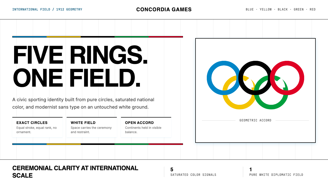 Olympics Five Rings (1912)Ceremony without noise. Saturated five-ring color on pure white, locked to a…无噪声的典礼感:纯白场域上饱和五色环,严密栅格定调。
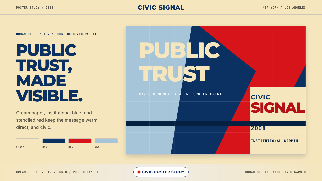 Gotham / Obama Hope Poster (2008)Public trust, made visible. Cream, navy, and red grid the poster.公共信任,清晰可见。奶油底、海军蓝和红色网格构成海报。
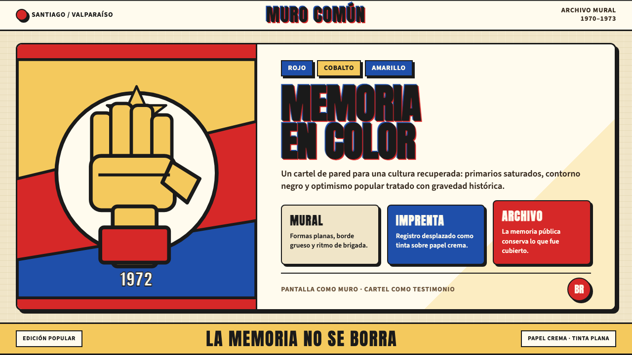 Chilean Allende-Era Propaganda (1972)Solemn revolution. Red, cobalt and yellow lock into thick black mural geometr…庄重的革命感:红、钴蓝与黄被黑色粗线锁进壁画几何。
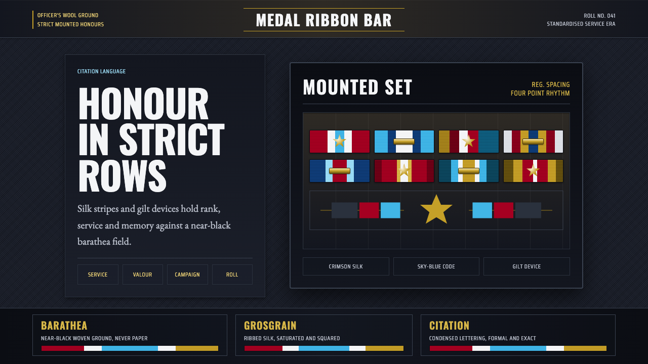 Medal Ribbon BarDiscipline worn as color. Crimson, sky-blue and gilt bars lock onto black woo…军规化为色彩:绯红、天蓝与鎏金绶带钉在黑呢上。
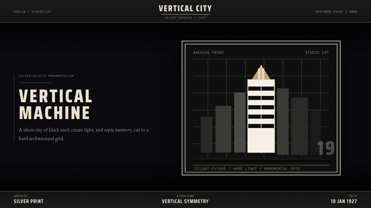 Metropolis (Fritz Lang, 1927)Monumental and severe. Black grid, cream type, sepia shadows.庄严而冷峻。黑底网格、奶白字与赭色阴影。
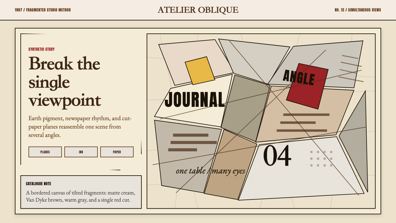 Picasso CubismSingle sight is shattered. Cream collage paper fractures brown-gray planes wi…单一视角被击碎:奶油拼贴纸上,褐灰棱面被一刀红色刺穿。