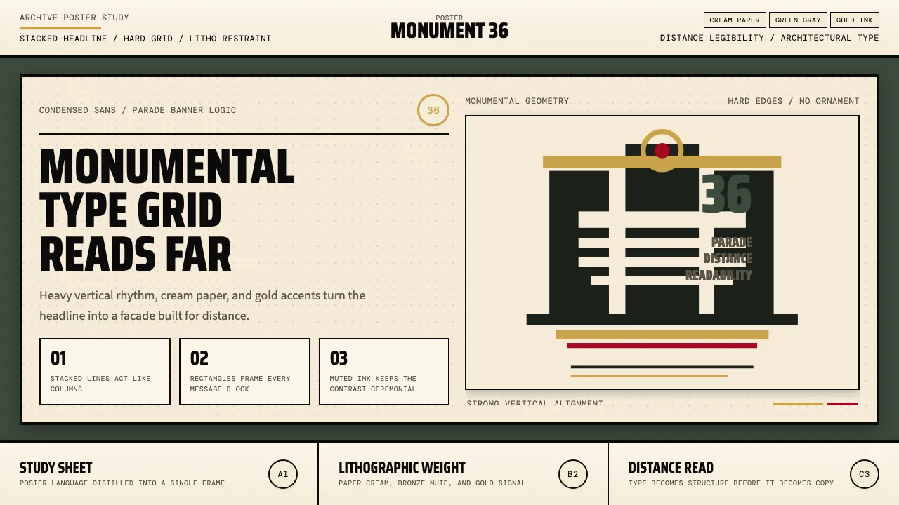
About Olympic Poster Berlin (1936)
The Berlin 1936 Olympic poster established a visual grammar that echoed through decades of athletic identity design — compressed sans-serif headlines stacked vertically like parade banners, monumental architectural silhouettes anchoring the composition, and a muted lithographic palette of deep green-gray, Olympic gold, and cream paper. Every element is engineered for maximum legibility at distance, treating typography as architecture.
This system distills that monumental poster language into a functional design toolkit: heavy condensed headings, rectilinear card panels evoking lithograph sheets, gold medal accents, and the atmospheric green-gray that defined Berlin's Olympic visual identity. The political context is set aside; the pure design merit — compression, monumentality, engineered readability — is what endures.
- Origin
- Berlin, Germany
- Era
- 1936 Berlin Summer Olympics; poster heritage lineage 1948–2024
- Key figures
- Franz Würbel · Carl Diem · Leni Riefenstahl · Yusaku Kamekura
- Movements
- 1930s German poster design · Olympic poster canon · monumental-athletic-poster heritage
Olympic Poster Berlin (1936) design spec
Colors
Typography
The other 11 sections — buttons, cards, spacing, motion, techniques and more — open once you unlock. Download the DESIGN.md or send it to your AI in one click. Unlock once, yours forever.
Sign up nowStyles similar to Olympic Poster Berlin (1936)
Also inspired by print & type, with a close feel.
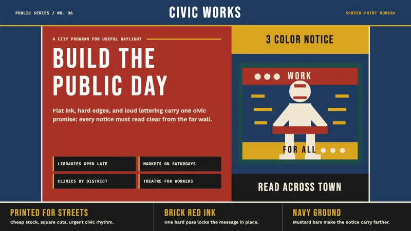 WPA Poster (Federal Art Project, 1936)Civic urgency in ink. Navy, brick red, mustard bands and Bebas Neue shout across the platform.
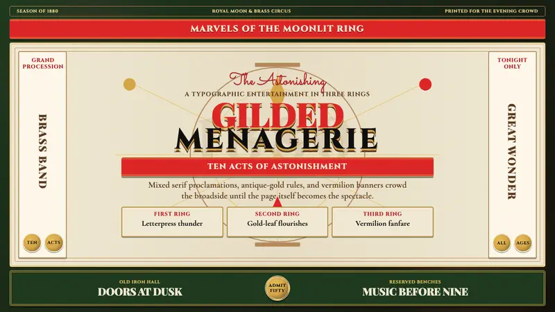 Victorian Circus Poster (1880)Spectacle leaves no inch quiet. Forest green, antique gold borders, mixed serifs, vermilion sash.
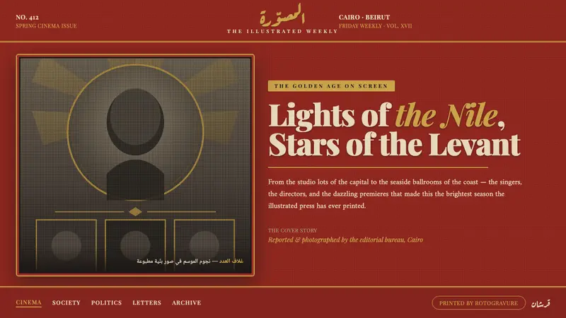 Pan-Arab Illustrated MagazineMid-century Arab press glamour. Brick-red fields, sepia halftone montage, gold Deco frames.
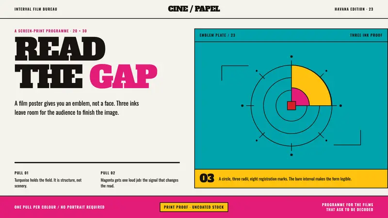 ICAIC Film PosterMetaphor wins the screen. Magenta and turquoise flat inks frame a measured emblem on bare paper.