What is Kuwait Oil-Era Modernism?
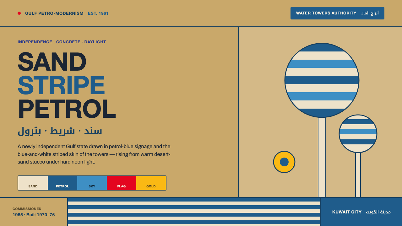
Kuwait Oil-Era Modernism made oil wealth visible as civic optimism: blue-and-white water-tower stripes rising from sun-warmed concrete, with bilingual type making public identity clear.
Kuwait Oil-Era Modernism in brief
Kuwait Oil-Era Modernism is the visual language of a newly independent Gulf state building its civic identity through oil-funded modernity. Rooted in Kuwait City and the Persian Gulf, it belongs to the broad period from 1950 to 1990 and joins Gulf petro-modernism, post-independence civic modernism, and mid-century corporate identity. Its emotional register is optimistic, public, and decisively daytime.
The signature image is the Kuwait Water Tower: a monumental blue-and-white striped skin rising from a warm desert-sand stucco base. The system translates that relationship into a broader vocabulary of reinforced concrete, flat modernist surfaces, petrol-blue and sky-blue bands, flag-red punctuation, and flat-gold accents. Nothing is treated as a dark oil-field cliché. The visual world is bright, civic, and grounded in the warmth of sand.
Typography completes the identity. Clean Helvetica capitals carry Latin headlines and public labels; Noto Kufi Arabic gives the bilingual signage a compact, architectural presence; Archivo serves grotesque body text and interface copy. The result is not decorative regionalism but a system of legibility: concrete establishes permanence, stripes provide recognition, blue connects infrastructure to sky and water, and two writing systems make the public realm inclusive.
Where does Kuwait Oil-Era Modernism come from?
The style emerges from the period between 1950 and 1990, with Kuwait's independence in 1961 as its defining political context. A newly independent state was articulating a modern civic presence while oil revenue made large-scale construction possible. Architecture, signage, and corporate identity therefore carried more than functional responsibility: they made prosperity visible and gave national development a coherent public image.
Oil wealth funded a wave of reinforced-concrete civic architecture across Kuwait. The material was modern, durable, and suited to the scale of public infrastructure, while desert-sand stucco connected new construction to its physical setting. The Kuwait Water Towers became the clearest emblem of this condition. Commissioned in 1965 and built from 1970 to 1976, they joined essential infrastructure with a memorable architectural silhouette.
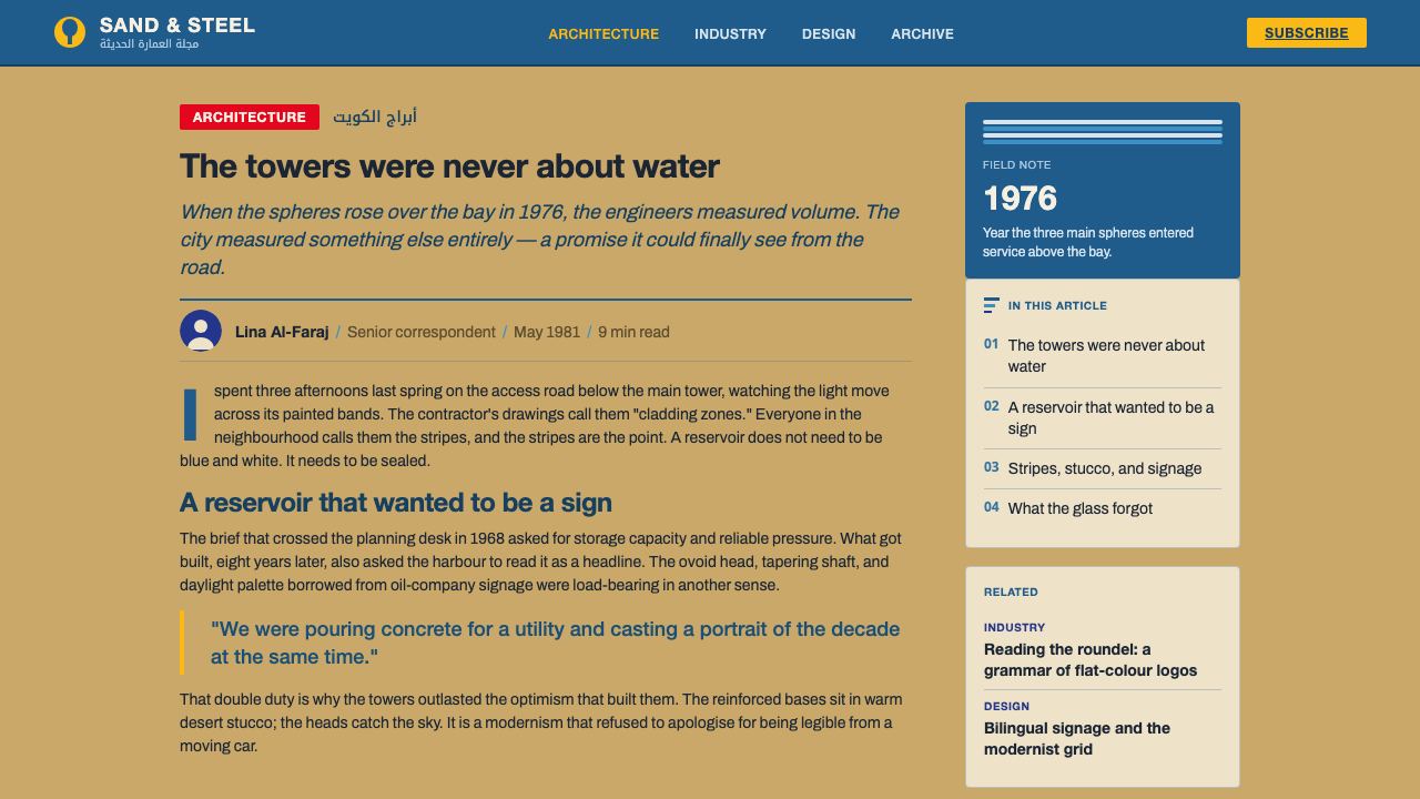
The towers' blue-and-white stripes gave the movement its most transferable visual device. Their bands are not surface decoration added after the fact; they organize the tower's identity from a distance and make infrastructure into a civic landmark. In the wider system, petrol blue and sky blue repeat that logic, while warm sand bases prevent the composition from becoming weightless or purely technological.
Kuwait Oil-Era Modernism also belongs to the history of communication. Crisp bilingual signage placed Arabic and Latin scripts inside the same modernist public language, while the Kuwait Oil Company identity team and Kuwait Petroleum International represent the corporate dimension of the era. The named figures and institutions sit at the meeting point of Gulf petro-modernism, public architecture, and mid-century identity practice: a visual culture in which national development, infrastructure, and enterprise could share one vocabulary.
What defines the Kuwait Oil-Era Modernism look?
Sand and Blue
The palette begins with warm desert-sand stucco and builds upward through petrol blue and sky blue. Blue is not merely an accent; it is the dominant identity carrier, connecting water infrastructure with open sky. Flag red and flat gold appear as controlled punctuation, adding civic emphasis without disturbing the daylight warmth of the system.
Concrete Permanence
Reinforced concrete gives the style its civic weight. Surfaces feel structural, durable, and built for collective use rather than private display. The material is softened by sand stucco and energized by blue bands, producing a balance between permanence and optimism. Newness is expressed through construction, not through gloss or ornament.
Tower Stripes
Blue-and-white bands are the central recognition device. They create horizontal rhythm across a vertical civic form and make essential infrastructure visually memorable. Applied to layouts, panels, or architectural references, the stripe should remain purposeful: it can establish identity, divide information, or direct the eye, but should not become a repeated pattern without meaning.
Modernist Type
Latin display type is clean Helvetica in capitals, with a direct and institutional presence. Archivo handles grotesque body and interface text, keeping long reading and functional labels within the same rational family. Type should feel engineered for public clarity: open, firm, and free from nostalgic display flourishes.
Bilingual Legibility
Arabic and Latin are treated as equal parts of the public system. Noto Kufi Arabic gives Arabic signage a geometric density that can stand beside Helvetica without imitation. The two scripts should share hierarchy and intent while keeping their distinct forms visible. Bilingual design here is not an afterthought; it is part of the civic identity.
Daylight Optimism
The style is bright by conviction. Sand, white, and blue describe a public world under Gulf daylight, while red and gold provide moments of civic punctuation. It avoids the theatrical darkness associated with generic oil imagery, along with metallic gloss, smoky gradients, and ornamental luxury. Its confidence comes from visibility and order.
Who shaped Kuwait Oil-Era Modernism?
Sune Lindström is one of the key figures named in the history of Kuwait Oil-Era Modernism. His place in the system is understood through the water-tower image: a civic structure made memorable through proportion, concrete presence, and the disciplined contrast of blue and white. The figure represents the human authorship behind an architecture that came to stand for national optimism.
VBB is the institutional name associated with the water-infrastructure side of the story. In Kuwait Oil-Era Modernism, infrastructure is never visually neutral: the water tower becomes a recognizable civic object, and its stripes turn utility into public identity. VBB therefore anchors the relationship between engineering purpose and the architectural image that made the system transferable.
The Kuwait Oil Company identity team represents the corporate-identity strand of the movement. Its inclusion among the key figures shows that the style was not confined to civic buildings. The same qualities of clarity, modernist typography, blue-led color, and public confidence could organize an enterprise identity as well as a city landmark.
Kuwait Petroleum International carries the outward-facing corporate dimension of the oil era. Within this visual language, petroleum is framed as a source of development, infrastructure, and international presence rather than as a dark industrial fantasy. The name belongs to a system that turns the economic force of oil into a bright, legible, modern public image.
How do you use Kuwait Oil-Era Modernism today?
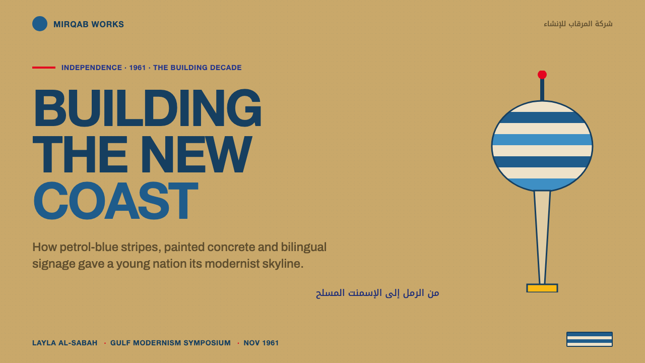
For presentation slides, use the tower logic as the organizing structure. A cover can place a strong blue-and-white banded form against a sand or white field, with the title in clean Helvetica capitals and a restrained red or gold accent. Content slides should remain civic and legible: sand grounds, blue section markers, clear bilingual labels, and concrete-like blocks of information. Data slides should treat charts as infrastructure diagrams, using blue for the main system and red or gold only where emphasis is necessary.
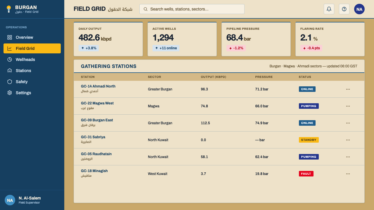
For web interfaces, the style suits dashboards, public-service tools, infrastructure products, and pricing pages that need confidence without corporate darkness. Use a warm sand or light ground, petrol blue for navigation and primary actions, sky blue for supporting states, and flag red for important alerts. Keep cards and panels flat or structurally defined rather than softly atmospheric. Bilingual labels should be planned from the beginning, with Helvetica, Noto Kufi Arabic, and Archivo assigned clear roles.
For editorial and marketing work, build pages from broad horizontal bands and strong civic blocks. A feature story can begin with a sand-colored introduction, a blue architectural divider, and a large bilingual title before moving into dense but orderly Archivo text. Marketing pages can use the water-tower silhouette or stripe rhythm as a framing device, while red and gold mark calls to action, announcements, or moments of national emphasis. The tone should feel confident and public, never luxurious or nocturnal.
The common mistake is to reduce the style to blue stripes plus oil symbolism. A dark background, metallic effects, smoky gradients, black petroleum imagery, or excessive gold immediately shifts the language toward generic energy branding. Another failure is treating Arabic as a secondary translation beneath Latin text. The system works when sand, concrete, blue, bilingual legibility, and daylight optimism operate together; removing any of those principles weakens the identity.
Kuwait Oil-Era Modernism — FAQ
Is Kuwait Oil-Era Modernism the same as generic Gulf petro-modernism?
No. Gulf petro-modernism is the broader regional context, while Kuwait Oil-Era Modernism is a more specific visual system rooted in Kuwait City and the Persian Gulf. Its defining combination is the blue-and-white water-tower stripe, warm desert-sand stucco, reinforced-concrete civic architecture, and crisp Arabic-Latin signage. A generic petroleum aesthetic can become dark, metallic, or luxurious; this system remains bright, civic, and grounded in daylight.
Why are the water towers so central to the style?
The water towers unite infrastructure and civic image. They are essential public structures, yet their blue-and-white striped skins make them visually memorable and architecturally distinctive. Their warm stucco bases and blue vertical rise also contain the entire palette logic: sand below, water and sky above, with concrete holding the composition together. They provide a model for using recognition as structure rather than decoration.
Can this style work on a dark background?
It can be adapted, but darkness is not its natural setting. The source system is explicitly light-ground and rejects the dark oil-field atmosphere associated with generic petroleum branding. A dark variant would need to preserve the essential commitments to blue-led identity, sand warmth, flat accents, and bilingual clarity. If darkness becomes the mood rather than a limited framing choice, the result no longer feels like Kuwait Oil-Era Modernism.
How should Arabic and Latin type be balanced?
Treat them as parallel public voices, not as a primary language and a caption. Helvetica capitals can provide the Latin modernist register, while Noto Kufi Arabic supplies a geometric Arabic counterpart. Their forms do not need to match literally. What should match is their hierarchy, prominence, and communicative purpose, so that neither script feels appended after the visual system has already been designed.
What makes the red and gold accents effective?
They work because they remain accents rather than competing with the blue-and-sand foundation. Flag red can create a moment of civic urgency or emphasis, while flat gold adds warmth and distinction without introducing metallic luxury. Both colors should punctuate information, actions, or identity moments. When they spread across the entire composition, the system loses the calm daylight hierarchy that makes its optimism convincing.
Related design styles
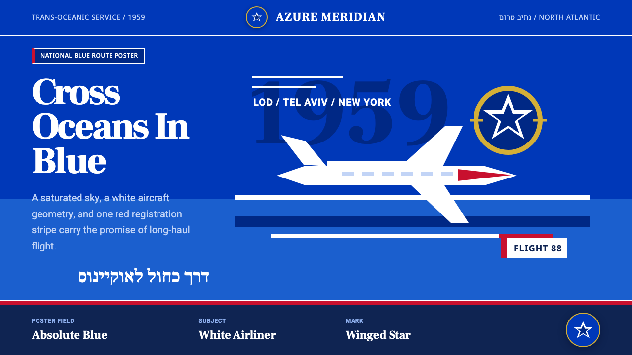 El Al Israel AirlinesNational blue takes command. White aircraft geometry cuts a flat jet-age post…
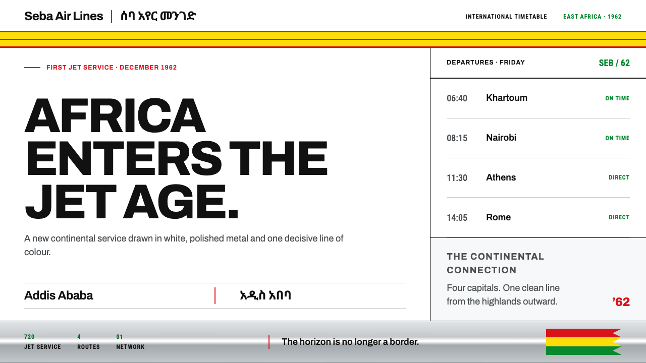 Ethiopian Airlines 1960sJet-age confidence, drawn flat. Yellow bands and red hairlines cut across whi…
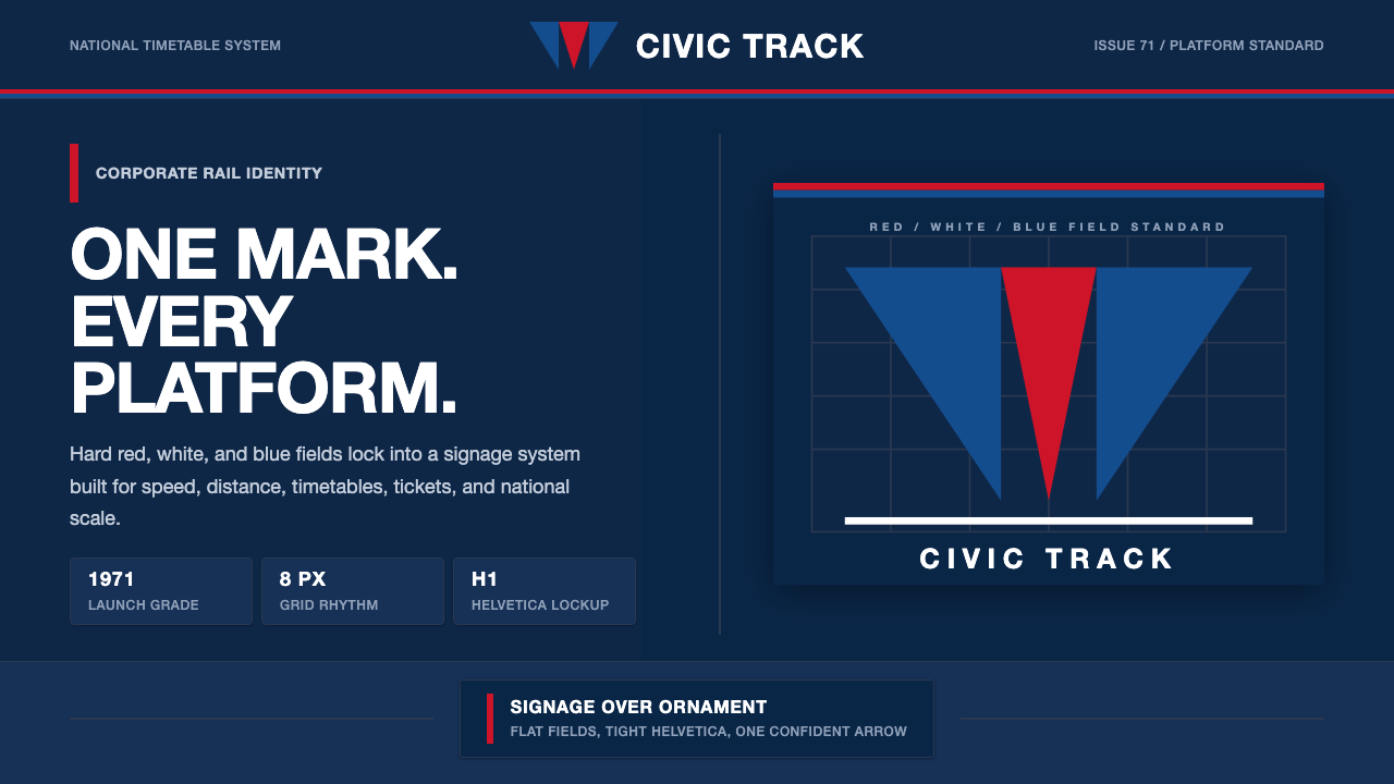 Amtrak Arrow (1971)Civic authority at speed. Deep navy, Helvetica lockups, and red-blue arrows.
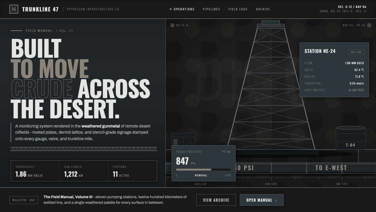 Gulf Oil Derrick IndustrialEngineered, not decorative. Soot-darkened gunmetal, derrick lattice, condense…
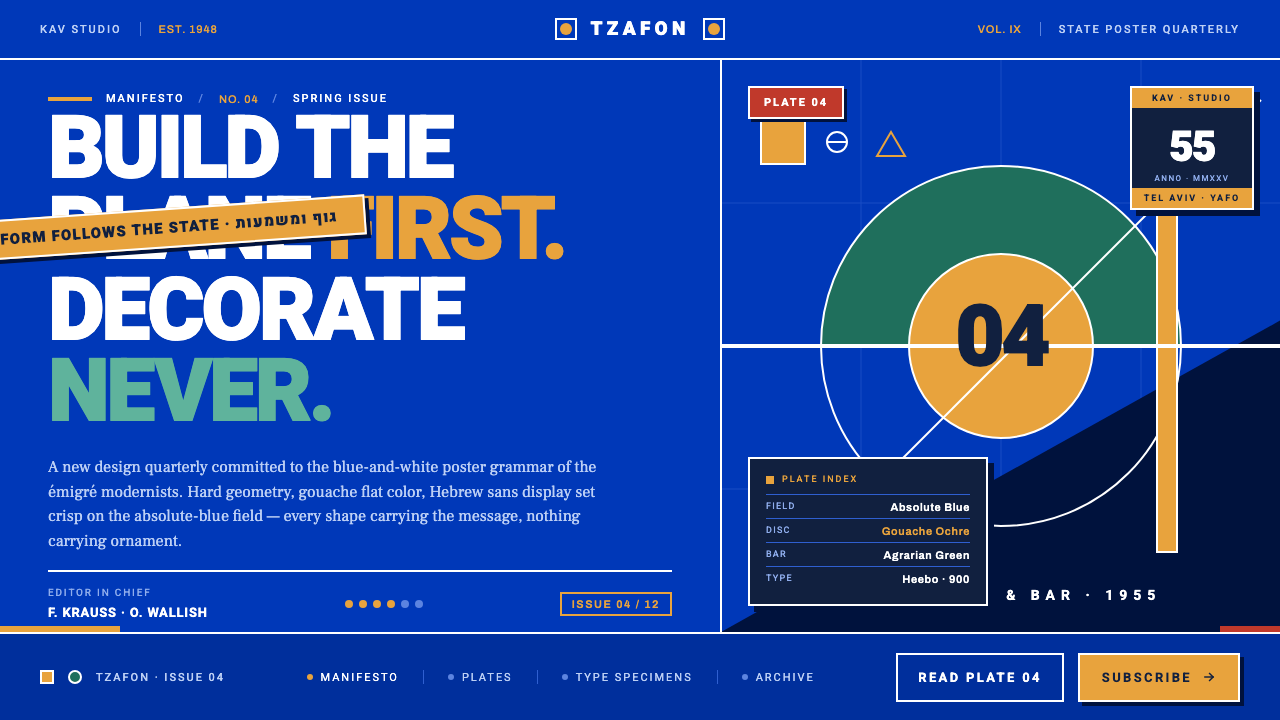 Israeli Bezalel ModernismForm follows the state. Hard Bauhaus discs and ochre bars on absolute blue, H…
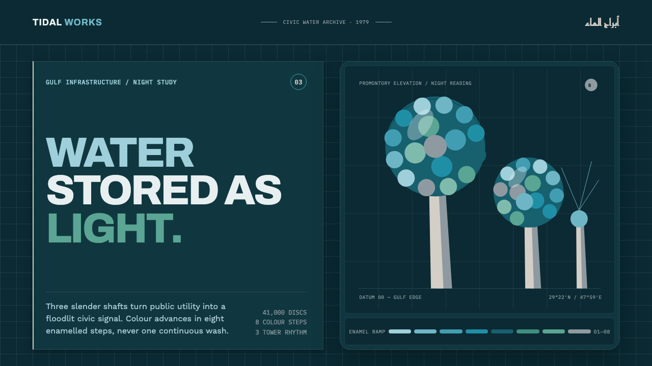 Kuwait Water TowersInfrastructure becomes a night monument. Eight enamel steps spiral across a d…