What is HDB Void Deck?
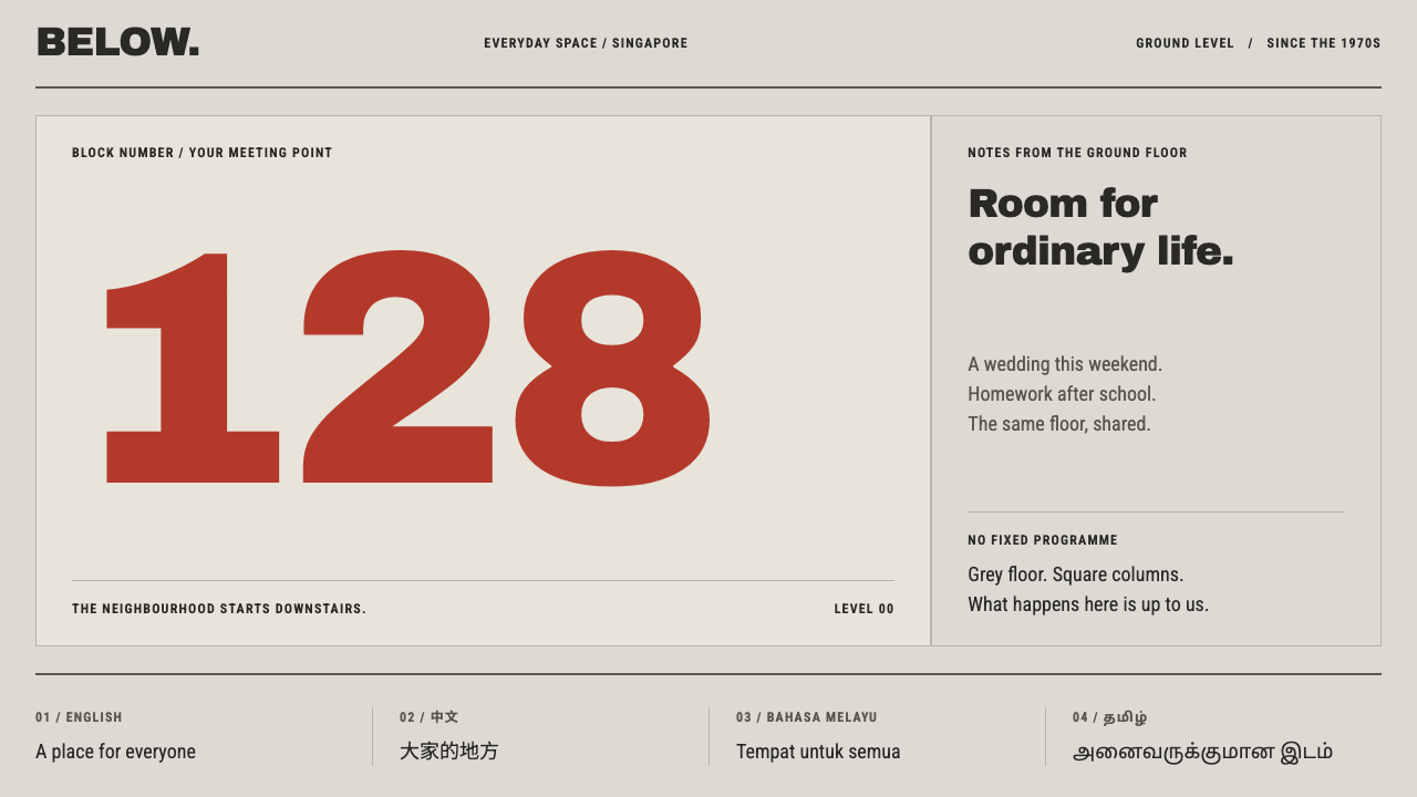
The void deck is the most generous room in Singapore's public housing because nothing was built there: a grey, column-lined floor where life happens, and one giant painted numeral that tells you where you are.
HDB Void Deck in brief
HDB Void Deck is a design style drawn from the ground storey of Singapore's public housing blocks. From the 1970s the Housing and Development Board stopped building on that floor of its slab blocks, and what was left became known as the void deck: a covered, column-lined slab of bare cement and terrazzo under whitewashed walls, fitted with letter boxes, bicycle racks, dustbins and lift landings, and little else. The visual language that follows is concrete-grey on a square grid, a sparse and hard-edged layout, and a giant painted numeral that anchors everything.
The defining idea is that emptiness is a feature. A void deck has no fixed programme, and so it can host nearly anything. Weddings, wakes, kindergartens, football and homework all take turns on the same grey floor. The design system translates this into a layout philosophy: leave the structure fixed, leave the space open, and let the content arrive in small, definite pieces. White space is not leftover; it is the room that makes the rest usable.
Visually the style is austere but never cold. Colour is rationed and arrives in small square pieces, like mosaic tiles on a table top or the green of a table-tennis surface. Type is large and hard, because the main job of a block number is to be read from far away. Four languages sit side by side with equal weight. The result is a style with the authority of civic infrastructure and the warmth of a place people actually use.

Where does HDB Void Deck come from?
The void deck belongs to the history of post-independence Singapore public housing. After independence the state undertook to house its population in high-rise estates, and the Housing and Development Board became the builder and planner of those estates. The source dates the void deck as a standard feature of HDB slab-block design from the 1970s onward, and places it in estates such as Toa Payoh, Ang Mo Kio, Queenstown and Bedok. It is the architecture of a country that planned its communities from the ground up.
Architecturally, the void deck descends from the idea of the building raised on columns, known as pilotis, adapted to a tropical climate. Lifting the block off the ground and leaving the lowest storey open gives shade, lets air pass through, and keeps the base of a tall building from feeling like a wall. The source calls this tropical modernist pilotis. It is a sensible response to heat and rain, and it turned out to have a social side effect that the planners cultivated rather than designed in detail: an open, sheltered, shared floor beneath every block.
That floor became a stage for community life. The same bare cement and terrazzo, under whitewashed walls, hosts wedding banquets one week and funeral wakes another; it holds a kindergarten in the morning and a football game in the evening, with homework spread across a table in between. The source describes this as state-planned community space, and the phrase is exact: the state provided the room, and residents supplied the programme. Colour arrived afterward, in pieces: mosaic-tiled round tables, one marked out as a chess board, green table-tennis tops, and the painted block number that tells a resident which of a thousand near-identical towers is home.
The block number deserves its prominence. It is applied through a stencil in a large, hard-edged hand, and in an estate where buildings look alike it is the one coordinate that matters. The source lists the Housing and Development Board's architects and planners as the principal authors, with the National Library Board and the National Heritage Board among the key figures that document and preserve this vernacular. The design system follows the same rules the place does: columns cannot be moved, colour comes only as small square tiles, four languages sit side by side with equal weight, the type is large and hard, and the rest is left empty.
What defines the HDB Void Deck look?
Concrete-Grey Grid
The base is the grey of bare cement and terrazzo, and the structure is a grid of square columns that cannot move. In layout terms this means a strict, regular grid whose lines are visible and respected: modules are square or near-square, gutters are constant and alignments are exact. The grey is cool, matte and slightly flecked, a surface that has been walked on, which gives the page a lived-in practicality rather than a showroom polish.
Whitewashed Walls
Above the grey floor, the walls are whitewashed with a roller, not painted with a sprayed or glossy finish. In design terms this gives a matte, slightly uneven white used for large background planes, panels and spaces between elements. It is a plain white that reads as architecture rather than paper. Because it is so quiet, everything placed against it, particularly the numeral and the tile colours, gets noticed.
Colour in Small Squares
Colour is allowed, but only in small square pieces, like mosaic tiles on a round table or the green of a table-tennis top. It never floods a surface. Swatches, tags, status squares and small blocks of tone act as accents against the grey, and they accumulate slowly, as they did on the real deck. The rule keeps the page from turning into a colour field and gives each patch a sense of having been added by someone.
The Painted Block Number
The hero element is a giant numeral, stencil-painted in a bold hand and rendered in a strong red. It is large enough to be read from across an estate and is treated as architecture, anchoring the grid the way the real number anchors the building. In a layout it works as a headline, a section marker or a primary identifier, and it should appear once, scaled to dominate. Its hard-edged, stencil quality means no soft curves and no decorative flourish.
Four Languages, Equal Weight
English, Chinese, Malay and Tamil appear side by side and carry the same visual weight: the same size, the same strength, the same alignment, with none demoted to a footnote. This is a typographic statement about who the space belongs to. In layouts it means multilingual labels, notices and navigation are designed as parallel columns or stacked lines of equal standing, and the type system must handle several scripts gracefully.
Big, Hard Type
Type is large and hard-edged because its function is public legibility. Headlines, numerals and labels use a heavy, plain letterform that survives distance, bad light and quick glances. There is no delicacy and no contrast between fine and thick strokes. Hierarchy comes from scale and weight rather than from ornament, and body text stays simple. The effect is that of signage designed to work for everyone at once.
Emptiness as Function
Most of the layout is deliberately left empty, because the empty floor is what makes the void deck useful. Content is concentrated in a few clear places, and the rest is open ground. Furniture-like elements, such as letter-box rows, rack-like repeating lists and small utility icons, supply a modest, practical vocabulary. The emptiness is not unfinished; it is a space waiting for use.

Who shaped HDB Void Deck?
The collective authors of the void deck as a standard feature of the HDB slab block. Their decision to leave the ground storey open, supported on columns, created the empty room that residents then filled with weddings, wakes, schools and games. For the design system they stand for the principle that the best structure sets up conditions and then steps back.
A Singapore public body that maintains the national library network and collects documentary records of the country's life. In the source it appears among the key figures as one of the institutions that keep the memory of everyday places like the void deck. Its presence is a reminder that this vernacular, though ordinary, has become part of the documented heritage.
The Singapore body responsible for national museums and the stewardship of the country's heritage. Its inclusion signals that the void deck is no longer only a utility; it is treated as part of the national story, a place where social life and state planning meet. For design it validates taking a humble, utilitarian space as a serious source of visual language.
How do you use HDB Void Deck today?
HDB Void Deck is a strong choice when content needs to feel public, practical and shared. It suits civic, community, education, logistics and utility products, and anything where clarity at a distance matters more than polish. It rewards structure and restraint, and punishes decoration.
For presentation slides, a cover can show one giant numeral or word in strong red, scaled to dominate a concrete-grey grid, with the title set in heavy plain type and everything else left empty. Content slides use a visible square grid, with information placed in a few clear modules and generous empty ground between them. Data slides suit bold, flat charts with a restricted palette in which small square swatches carry the colour; a multilingual legend with equal-weight lines fits naturally.
For web interfaces the style fits community platforms, public-service portals, booking and scheduling tools, notice boards and dashboards for facilities. Panels are flat, with square corners and no shadows. Navigation is a row of large, plain labels. Tags and status markers appear as small coloured squares against the grey. Pricing or plan pages work well when each option sits in a clearly gridded column and the key number is huge. Multilingual interfaces should show languages in parallel, not tuck secondary ones behind a toggle.
For editorial and marketing work the style suits reports on housing, cities, community and public life, as well as campaigns for neighbourhood services. A strong layout opens with one giant numeral or word, follows with a plain grid of text and images, and uses tile-like squares for captions and data callouts. Photography of everyday shared spaces fits well, shot flat and frontal rather than moodily.
The common mistake is to treat the emptiness as a problem to fill. Adding illustrations, gradients or decorative icons into the open ground defeats the point. The second mistake is to spread colour into large fields rather than small squares, which turns the concrete-grey system into a bright, unrelated palette. A third is to rank languages, with one large and the others small. Keep the grid visible, keep colour in small pieces, keep one numeral dominant, and let the rest of the space stay open.

HDB Void Deck — FAQ
What is a void deck?
It is the open ground storey of a Singapore public housing block. From the 1970s the Housing and Development Board left that floor free of flats, so what remains is a covered, column-lined slab of bare cement and terrazzo under whitewashed walls, with letter boxes, bicycle racks, dustbins and lift landings. Residents use it for weddings, wakes, kindergartens, sport and homework, which is why emptiness is the point.
Why does the style use small squares of colour rather than big fields?
Because colour on a real void deck arrives in small, added pieces: mosaic tiles on a table, a green table-tennis top, a painted numeral. Spreading colour into large fields would change the character of the system from a concrete-grey public floor into a bright decorative scheme. Small squares let colour accumulate slowly and keep the grey in charge.
Why must the four languages have equal weight?
Because equal weight is part of the meaning of the space. A void deck belongs to a multilingual public, and its signs and notices speak to all of it. In design, ranking one language above the others changes that message. Equal size, equal alignment and equal contrast keep the interface honest to its source and also make it easier to scan for a reader of any language.
Can the style be used outside housing and civic subjects?
Yes, as long as the content benefits from a fixed grid, parallel information and a single dominant identifier. Facility booking, event listings, transit information, inventory dashboards and multilingual directories all work. It is a poor fit for brands that depend on luxury, softness or sensory richness, because the system is built around plainness and shared use.
Does it work with a dark background?
It is conceived as a light, daylight style: whitewash, grey concrete and a bright painted numeral. A dark version would lose the sense of an open, shaded public floor. If you must use one, keep the grey structure and the square grid, use the red numeral as the single bright element and keep colour in small tiles.
Related design styles
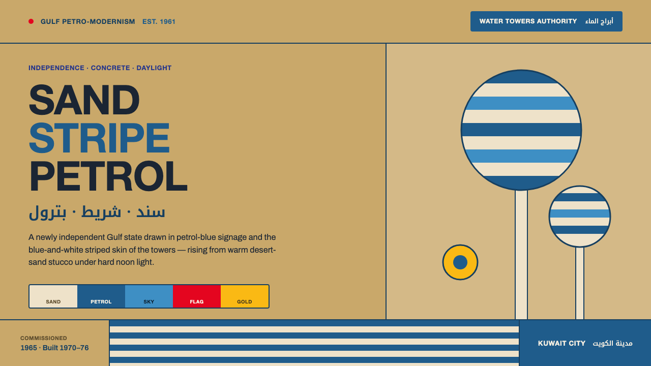 Kuwait Oil-Era ModernismOil-boom optimism in concrete. Petrol-and-sky tower stripes band warm desert-…
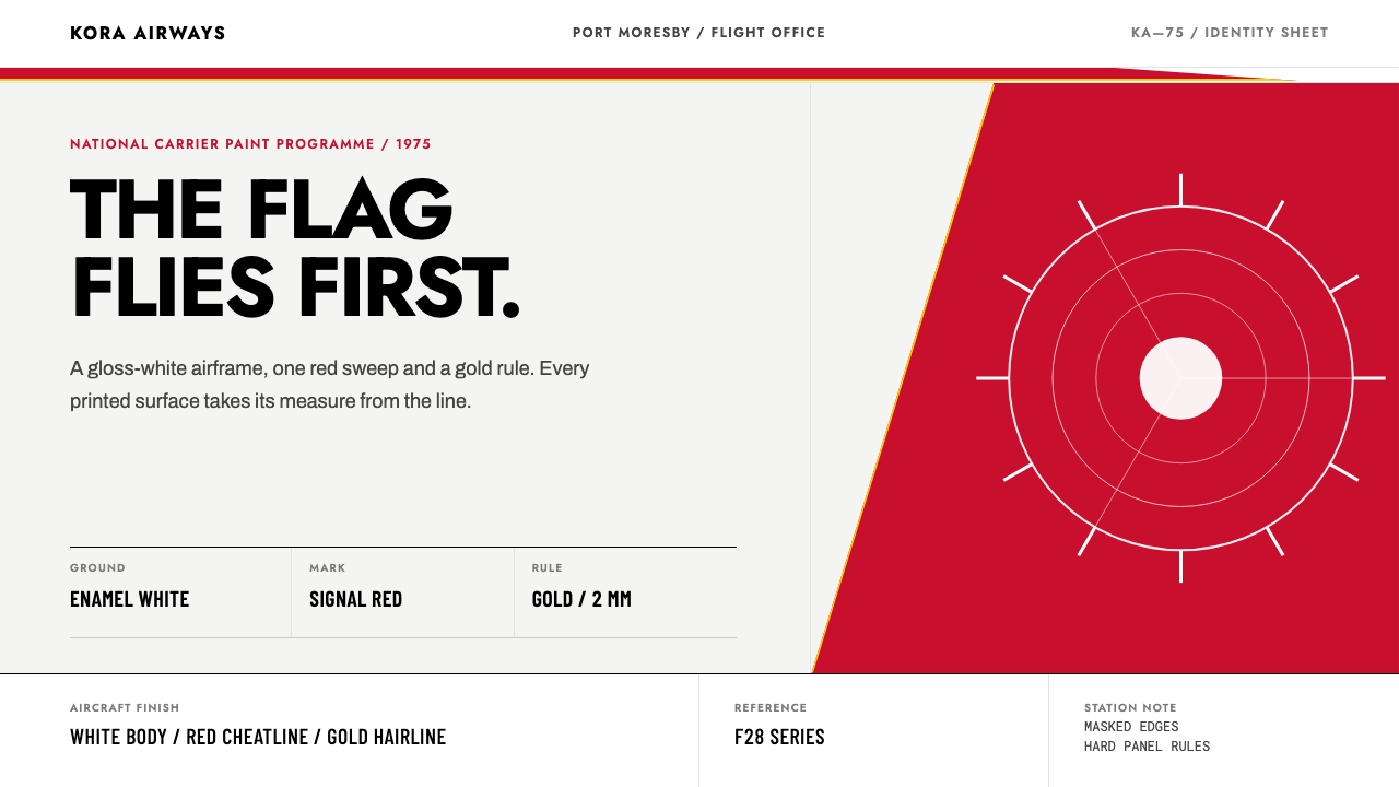 Air Niugini Livery 1975A flag engineered for flight. Signal red sweeps across enamel white, underlin…
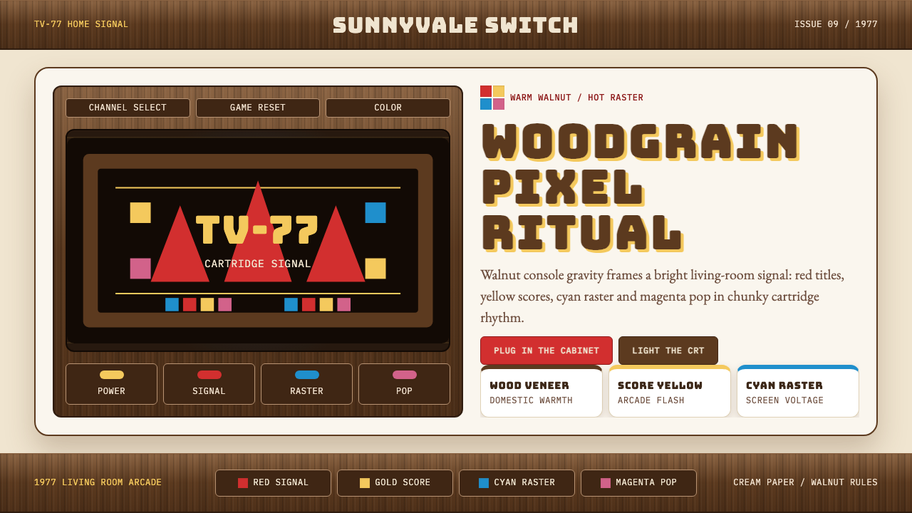 Atari 2600 (Woodgrain)Woodgrain meets raw pixels. Walnut panels frame Bungee type and CMYK raster b…
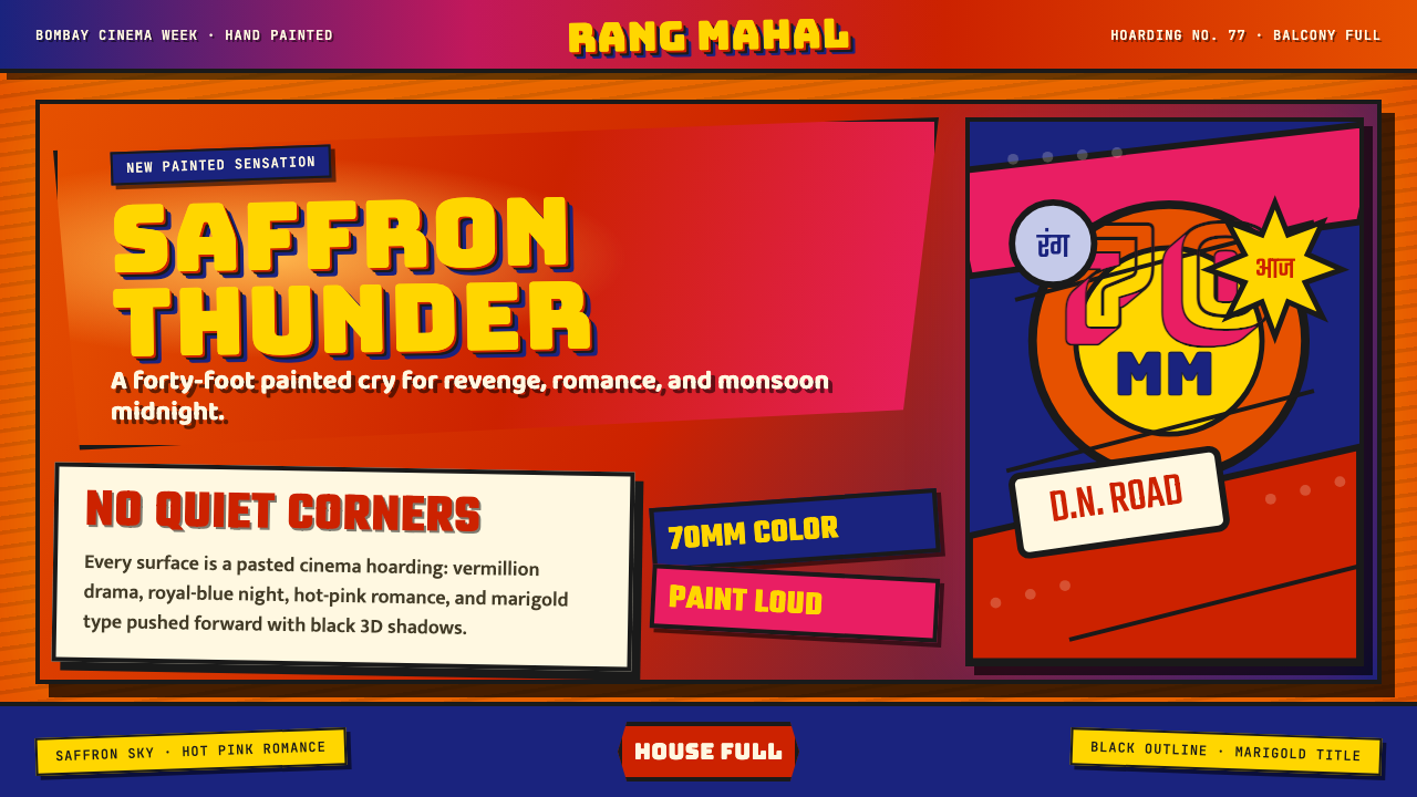 Bollywood Poster Art (1970s)Subtlety is unaffordable. Saffron fields, Bungee shadows, diagonal hoarding d…
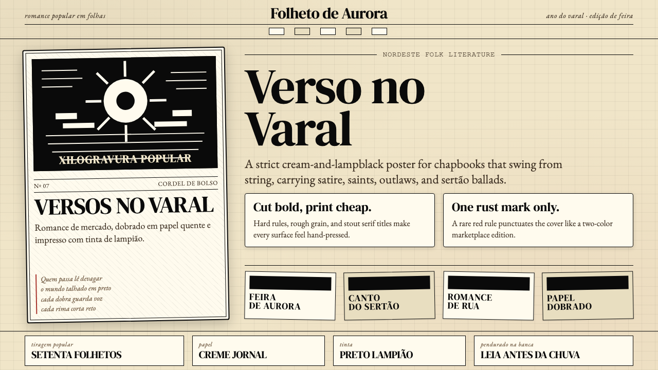 Brazilian Cordel (Northeast Folk Literature)Folk poetry, cut in lampblack. Cream newsprint, bordered chapbooks, one rust-…
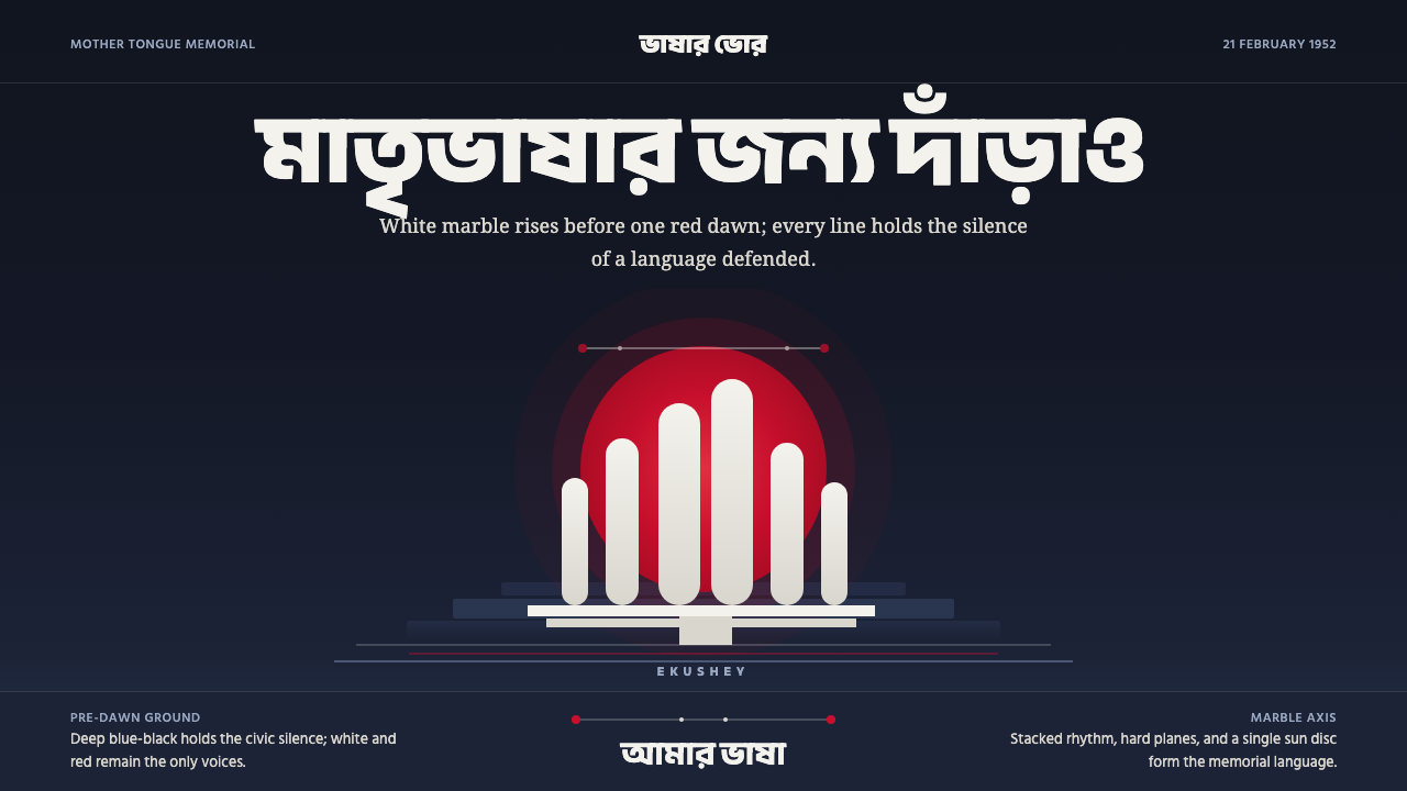 Dhaka Shaheed MinarSolemn before dawn. Marble columns and one red sun hold the page in civic sil…