What is Air Niugini Livery 1975?
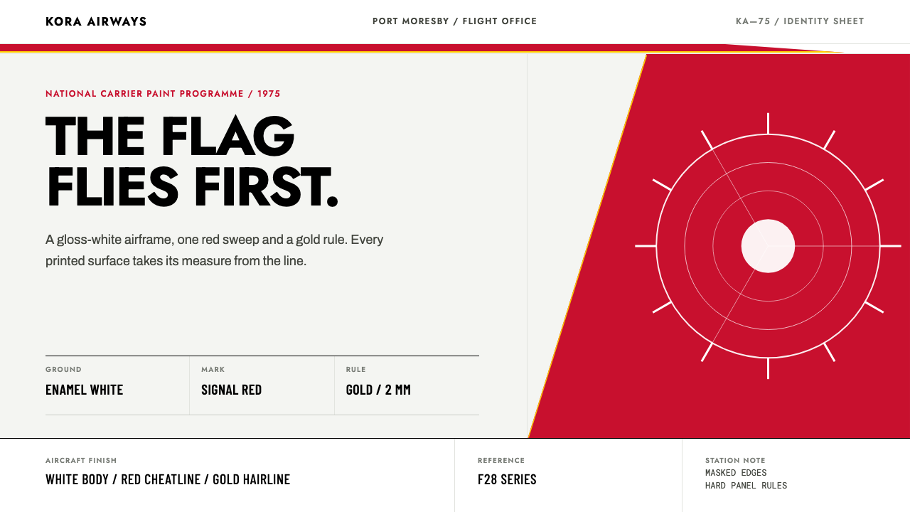
Air Niugini took a national flag apart and repainted it on an aeroplane: a red tail, a white bird-of-paradise cut out of it, a gold hairline, and one sweeping line that everything else obeys.
Air Niugini Livery 1975 in brief
The Air Niugini livery of 1975 is a paint scheme, not a mood board. It describes how the colours of a young nation's flag were engineered for an aircraft: polished enamel white across the fuselage, signal red sweeping over the tail, a white bird-of-paradise reversed out of that red, a gold hairline running beneath the cheatline, and the airline's name set in heavy black capitals on the forward body. Four colours, one bird, one line. Nothing else is allowed on the aeroplane.
What makes it a distinct design language is that structure comes before decoration. A cheatline — the long stripe that runs the length of the body — travels from the nose toward the tail and sweeps upward into the fin. Every other element aligns to it: the title, the hairline, the edge of the red, the placement of the bird. In layout terms the cheatline is a spine, and the system is what you get when a single gesture is allowed to organise an entire surface. The bird itself is a flat silhouette with a crest, a hooked beak and trailing plumes, and no illustration beyond that.
The surface is deliberately new. The livery is shown as fresh gloss paint, with highlights across the fuselage and faint seams where the metal skin panels meet, but with none of the weathering, fading or distressing that a later decade would add. It is the aeroplane as it looked in 1975, not as nostalgia would remember it forty years on. That distinction matters: this is a system about confidence and clarity at the moment of launch, when a new country's airline wanted to be read from the far side of an airfield.
Where does Air Niugini Livery 1975 come from?
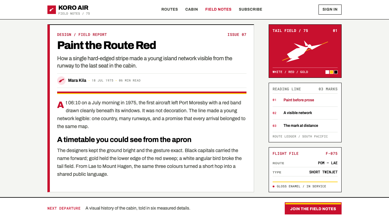
Air Niugini began flying in 1973, three years after Papua New Guinea adopted a national flag drawn by a fifteen-year-old schoolgirl, Susan Karike Huhume. Rather than starting from a new corporate mark, the airline took that flag apart and put it on an aeroplane. The flag's palette of red, gold, black and white defines the whole system, and its bird-of-paradise — long associated with the country — becomes the single figurative element of the livery. For a national carrier, nothing is more direct than painting the country's own colours on its own aircraft.
The date and the place anchor the style. The scheme documented here is the F28 and F27 livery as flown from 1975, from a base in Port Moresby. It belongs to a family of 1970s jet-age liveries, in which an airline's identity was applied directly to the aircraft's skin as large flat shapes: a tail colour, a cheatline, a name. At a time when an aeroplane was arguably the most visible object an airline owned, the paint scheme was its logo, its signage and its flag at once.
The second movement named in the source, post-independence national identity, explains the content. A country that has recently taken on a flag and a national airline needs a way to appear on airport aprons around the region. The livery solves this by being legible within seconds and from a distance: the tail reads as red with a white bird, the stripe as a gold-edged sweep, the name as black capitals. The bird, simplified into a reversed silhouette, is in effect the national emblem at aircraft scale, stripped of every detail that would vanish at a distance.
Susan Karike Huhume's role is the quiet centre of the story. A schoolgirl drew the flag; the flag became a livery; the livery put a fifteen-year-old's design on a fuselage carrying passengers across Papua New Guinea. The source material does not name a livery designer, and this article does not invent one. What it records is the chain of translation: from a schoolgirl's flag, to an airline's paint scheme, to a system of flat shapes governed by a single sweeping line.
What defines the Air Niugini Livery 1975 look?
The Cheatline as Spine
A single long band runs the length of the body and, at its far end, sweeps upward into the tail. It is the organising axis of the whole scheme: the title, the gold hairline and the edge of the red are all set in relation to it. The line does not decorate the aircraft so much as decide where everything else may sit. Take it away and the remaining shapes lose their relationship to each other.
Signal-Red Tail
Red is treated as a field, not an accent. It floods the tail as a single flat, saturated area and sweeps back along the body in the cheatline. Because the tail is the part of an aircraft seen first and from furthest away, putting the brand's strongest colour there makes the livery readable at distance. The edge of the red is a clean, decisive curve, never feathered into the white.
Reversed Bird Silhouette
The bird-of-paradise is not painted on top of the red; it is cut out of it, so that the white of the aeroplane shows through as the bird. Its elements are limited to a crest, a hooked beak and trailing plumes. There is no interior drawing, no feather detail, no gradient. The shape works at a distance because it has a clear outline and a recognisable posture, which is all a livery asks of an emblem.
Four-Colour Flag Palette
The palette is the flag's own: red, gold, black and white. Each colour has a single job. White is the polished enamel body and the bird; red is the tail field and the sweep; gold is the hairline; black is the type. The colours are not mixed or tinted, and they are never given equal weight — white and red carry the mass, while gold and black work as fine, controlled accents.
Gold Hairline
A thin gold line is set beneath the cheatline like an underscore. It is the finest element in the scheme, and it behaves like a ruled line in print: it separates, it underlines, and it shows that the surface has been drawn with precision. The line follows the same sweep as the stripe above it, rising with it at the tail. It is a reminder that restraint, not abundance, signals quality.
Black Capitals
The airline name, AIR NIUGINI, is set in heavy black capitals on the forward fuselage. The letters are plain, evenly spaced and large; they are meant to be read from the apron, not admired from the seat. Capitals are used because they hold their shape at distance and keep a steady rhythm along the body. The type never competes with the bird or the tail; it simply states the name.
New Gloss Surface
The surface is fresh, high-gloss paint. Highlights run along the fuselage, and the faint seams between metal skin panels are acknowledged, but there is no weathering, no exhaust staining, no sun-faded red. The system is explicit that it depicts 1975 as it looked then, rather than applying a vintage filter. The gloss and the flatness of the shapes sit together: the colours are flat, the finish is polished.
Who shaped Air Niugini Livery 1975?
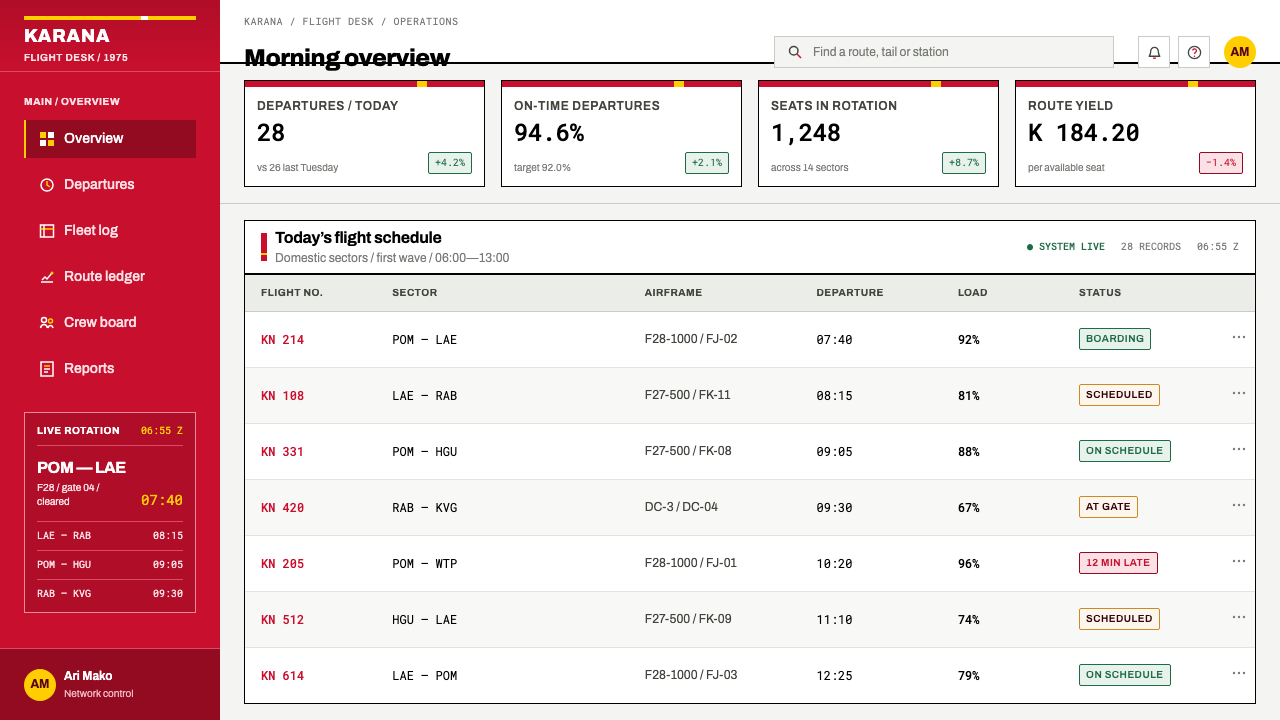
Huhume drew the Papua New Guinea flag as a fifteen-year-old schoolgirl, three years before Air Niugini began flying in 1973. Her flag supplied both the palette and the bird that the airline later repainted onto its aircraft. She is the only named person in this system's source material, and the chain she begins — a student's design, a national symbol, an aircraft livery — is what gives the scheme its particular sense of national ownership.
The airline began flying in 1973 and took the national flag apart to build its livery: red tail, white bird-of-paradise, gold hairline, black capitals. Its contribution was an act of engineering rather than invention — translating a flat flag into a paint scheme that works along a three-dimensional body and reads from far away. The source credits no individual designer, so the airline itself stands as the author of the scheme.
The flag is the system's raw material. Its red, gold, black and white fix the palette, and its bird-of-paradise becomes the reversed silhouette on the tail. The livery does not reproduce the flag's layout; it takes the flag apart and rearranges the pieces around a cheatline. Understanding that the flag is source material rather than a template is essential to applying the style correctly.
The scheme is documented as it was flown on the F28 and F27 aircraft from 1975. The airframes matter because a livery is designed for a specific body: the long fuselage that carries the cheatline, the tail that carries the red and the bird. Seeing the scheme as applied to these aircraft explains why the line sweeps where it does and why the bird is simplified as it is.
How do you use Air Niugini Livery 1975 today?
The livery is a good model for any design that must carry a national or institutional identity at a distance, within seconds, using very few parts. Its method is to choose a single organising line and let it settle every other decision. Applying it well means committing to that line, not merely borrowing the four colours.
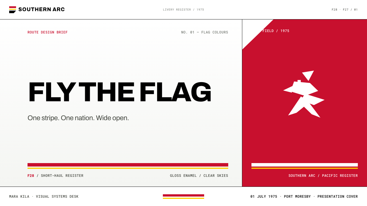
For presentation slides, a cover can place a deep red field on one side with a white reversed silhouette cut out of it, a thin gold line beneath, and the title in heavy black capitals on a clean white field. Content slides work best with one sweeping horizontal line across the slide at a consistent height, with all text and images aligned to it. Data slides can use red bars on white with a gold baseline, black numerals, and almost nothing else; the chart should feel like painted shapes, not like a spreadsheet.
For web interfaces, the style suits transport, logistics, travel and public-sector products that need quick recognition. A header can carry the sweeping line and the gold hairline, and a hero section can use a single red field with a reversed emblem. Because red is the brand colour, it should not double as an error colour; use black, gold or a change of shape for warnings and failures. Pricing pages can distinguish tiers by the position and length of the line rather than by adding new colours.
For editorial and marketing work, the livery translates into timetables, tickets, signage, vehicle graphics and national or regional brand materials. One bird and one line are enough for a campaign. Photographs sit best against the enamel-white ground with generous space around them, and the red field is reserved for the single message that matters. The same discipline applies to merchandise and wayfinding: if an element cannot be tied to the line or the palette, it does not belong.
The most common mistake is to add age, depth or detail. Weathering filters, gradients across the red, drop shadows on the tail, or an illustrated bird with feather-by-feather rendering all contradict a system built on new gloss paint and flat reversed shapes. Using all four colours at equal weight is another error; white and red must carry the mass. Finally, resist scattering the line: the cheatline should organise the layout, not appear as one more decoration among many, and a second typeface will quickly undermine the single voice of the black capitals.
Air Niugini Livery 1975 — FAQ
What is a cheatline, and why is it central to this style?
A cheatline is the long stripe that runs along an aircraft's body and gives the paint scheme its direction. In this system it also acts as the layout's organising axis: it sweeps to the tail, and every other element aligns to it. The practical effect is cohesion, because one gesture decides where the title, the gold hairline, the edge of the red and the bird sit. Remove it and what remains is a set of unrelated shapes.
Why a flat silhouette rather than an illustrated bird?
Because a livery is read at a distance, and detail disappears. The source describes the bird as a flat, reversed silhouette with a crest, a hooked beak and trailing plumes, and nothing else — no illustration, no gradient. The reduction also suits paint: a flat shape with a clear edge is easy to apply, repeat and keep consistent across several airframes.
Is this a reproduction of the national flag?
No. The airline took the flag's palette and its bird and re-engineered them as a paint scheme. The system uses red, gold, black and white, but arranges them by the logic of an aircraft body — a tail, a stripe, a title — rather than by the flag's own layout. Treat the flag as source material, not as artwork to copy.
Can the style be weathered or given a retro look?
The system explicitly rejects it. The surface is fresh gloss paint with highlights and panel seams, and the source states that it carries no ageing and no distress filter. It represents 1975 as it looked then, not four decades later. If a vintage feeling is wanted, it should come from the flat shapes and the restrained palette, not from simulated wear.
Does the style work on dark backgrounds?
The system is built on an enamel-white ground, which is why the red tail and the white bird read so strongly. A dark ground inverts that relationship: the white bird would no longer be cut out of the red, and the gold hairline would lose its role as an underline. If a dark layout is unavoidable, keep the white body as a panel and let dark appear only as the surround.
Related design styles
 Ethiopian Airlines 1960sJet-age confidence, drawn flat. Yellow bands and red hairlines cut across whi…
 Kuwait Oil-Era ModernismOil-boom optimism in concrete. Petrol-and-sky tower stripes band warm desert-…
 Amtrak Arrow (1971)Civic authority at speed. Deep navy, Helvetica lockups, and red-blue arrows.
 El Al Israel AirlinesNational blue takes command. White aircraft geometry cuts a flat jet-age post…
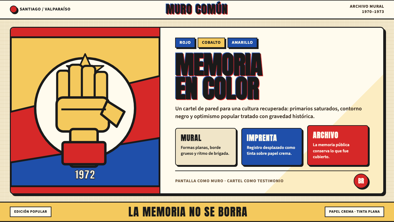 Chilean Allende-Era Propaganda (1972)Solemn revolution. Red, cobalt and yellow lock into thick black mural geometr…
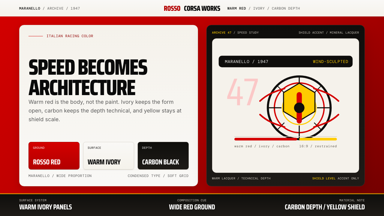 Ferrari Rosso Corsa (1947)Speed becomes architecture. Racing red, warm ivory, and carbon-black panels.