What is Ethiopian Airlines 1960s?
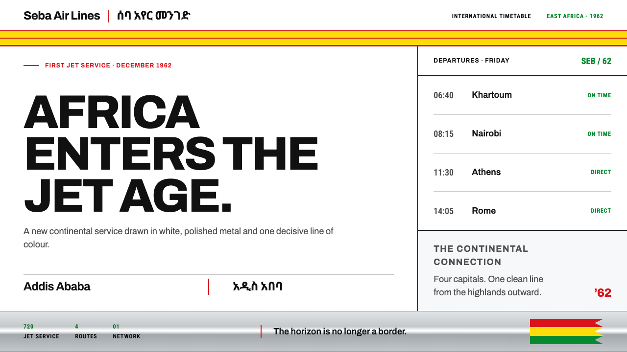
A white crown, a bare-metal belly and a thick yellow band edged in thin red: the identity Ethiopian Air Lines wore into the jet age in 1962, and printed just as flat on every timetable.
Ethiopian Airlines 1960s in brief
Ethiopian Airlines in the 1960s is a livery and a printed identity that fit together as a single system. In 1962 the carrier, then styled Ethiopian Air Lines, began jet service with the Boeing 720B, which the style's source material frames as putting an African carrier on jets first. That aircraft wore the identity the airline is still built on: a white crown, a polished bare-metal belly, and a thick yellow cheatline outlined in thin red running the length of the fuselage. On the tail, feather-tip triangles in red, yellow and green gave the national colours a place; a flat standing lion sat behind the cockpit.
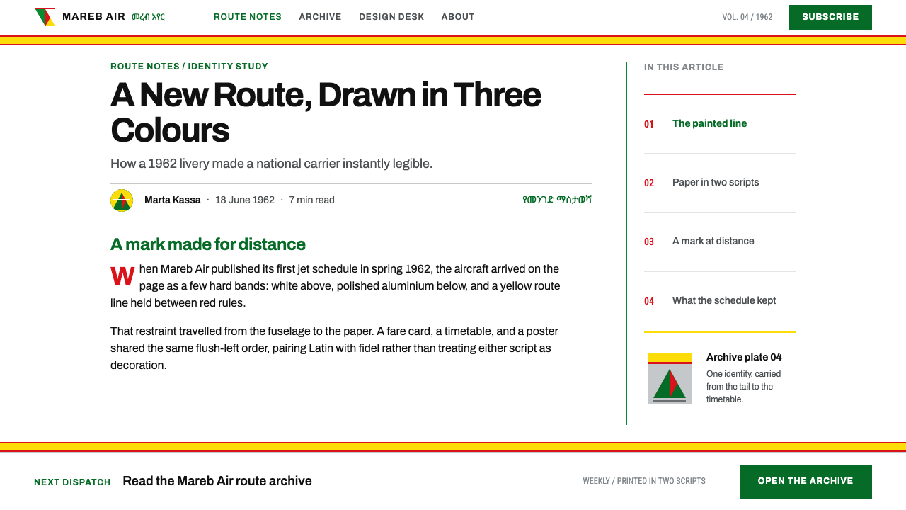
The paper side matched the metal. Timetables, fare tariffs and the 'This Is Ethiopia' travel poster series set the same identity in clean European sans-serif type on white stock, with Latin and Ge'ez fidel carrying equal weight and neither script treated as decoration for the other. The airline's printed pages and its aircraft look like the work of one hand, which is the point of any good identity.
As a design style, the 1960s Ethiopian Airlines identity is a discipline of bands, hairlines, flush-left grids and flat ink. Yellow and red cover the large areas, while green is kept for markers and for the tail. There are no gradients, no soft shadows and no artificial ageing, because 1960s offset printing was clean and crisp by nature. The look is confident, orderly and optimistic, the visual voice of an airline that wanted to be seen as modern.
Where does Ethiopian Airlines 1960s come from?
The airline was founded in 1945 in Addis Ababa, and its first jet service began in 1962. The livery and print identity the style draws on run through the 1960s into the 1970s, so the design system covers a period rather than a single date, but its centre of gravity is the moment when the Boeing 720B arrived. That aircraft turned the airline's identity from a paint scheme into a promise: the carrier was now part of the jet age, and the way it looked on the apron and on the page was meant to say so.
Three movement labels sit beside the style in its references: post-independence Pan-African self-representation, jet-age airline identity and European commercial modernism. The first places the identity in a period when African institutions were presenting themselves to the world on their own terms, and an airline is among the most visible forms that presentation could take. The second explains the vocabulary: a long band along the fuselage, bare metal, a strong tail mark, all part of an international language of jet-age travel. The third explains the printed pages: the clean sans-serif type and flush-left grids of European commercial design.
What distinguishes this identity from a generic mid-century airline look is the way those international vocabularies are applied to Ethiopian content. The tail carries national colours in feather-tip triangles; the lion stands flat and unornamented behind the cockpit; the typography sets Latin and Ge'ez fidel at equal weight; and the 'This Is Ethiopia' poster series addresses travellers in the same clean idiom. Borrowed modernism becomes a local statement, because nothing about the structure forces the content to be anything other than itself.
The style's reference list names Haile Selassie I, Trans World Airlines and Boeing among the key figures. The emperor places the identity in the context of national self-presentation, in which an airline is also a national symbol. The American carrier and the American aircraft maker are a reminder that the jet-age airline world was international and interdependent, and that the visual vocabulary this style uses travelled across it. A design system that borrows from this identity borrows from that meeting point, not from a single source.
What defines the Ethiopian Airlines 1960s look?
The Cheatline Band
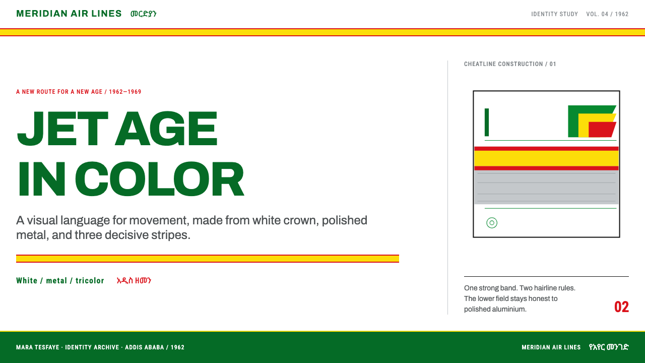
A thick yellow band, outlined above and below in thin red, runs the full length of the fuselage and becomes the skeleton of the whole system. In layout terms, it is a horizontal band that organises a page: a header strip, a section divider, a rule that gives structure to everything above and below it. The band is bold enough to be the identity on its own, which is why the style can afford to keep almost everything else restrained.
White and Bare Metal
The ground is white on the crown of the aircraft and the natural finish of polished metal beneath it. Nothing is painted over to hide the material, which gives the identity its honest, engineered feel. On paper, the same pairing becomes white stock and cool metallic neutrals used flat. The effect is clean and bright, with colour arriving only where it is placed on purpose, so the bands read like signals instead of decoration.
Hairlines Against Weight
The thin red lines that outline the yellow band are a deliberate counterweight to its mass. This contrast between a heavy band and an almost invisible line is the system's central tension, and it recurs on printed pages as fine rules separating rows, columns and sections. Hairlines let a dense timetable or tariff stay orderly without boxes or fills, and they give the page the precise, engineered edge that suits a flight operation.
Flush-Left Grids
Timetables, fare tariffs and posters are set on grids with text aligned flush left, in clean European sans-serif on white stock. The typography is functional first: hierarchy comes from size, weight and position, not from decoration. Flush-left setting also gives each column a firm vertical edge, which reads as discipline and makes data easy to scan, a quality that suits information-heavy pages.
Bilingual Parity
Latin letters and Ge'ez fidel carry equal weight on the printed pages. Neither script is a decoration for the other, and neither is shrunk into a caption. The effect is a layout that speaks to two readerships at once, each treated as primary. For design practice, it means the second script deserves its own typographic care, set at comparable size and weight in a layout that gives it genuine room.
Tricolour Discipline
Yellow and red take the large areas: the cheatline, the hairlines, the major fields. Green is held back for markers and the tail, where the three colours appear together in feather-tip triangles. This rationing keeps the palette from turning into a flag pattern. Each colour has a role, and green's rarity is what makes it register when it does appear, whether on an aircraft tail or as a status marker in an interface.
Flat, Clean Ink
There are no gradients, no soft shadows and no artificial ageing texture. The identity was made for clean offset printing and bare aluminium, and the look depends on edges that are sharp and colours that are flat. Anything that tries to add nostalgia with grain, scratches or faded tones would misrepresent a style whose real character is crisp modernity: the future as it looked in the 1960s, with no apology.
Who shaped Ethiopian Airlines 1960s?
The carrier itself, founded in 1945 in Addis Ababa, is the identity's real author. In 1962 it began jet service and put the livery on a Boeing 720B: white crown, bare-metal belly, thick yellow cheatline with thin red outlines. The same discipline carried through to timetables, tariffs and the 'This Is Ethiopia' posters, which is why the style reads as one coherent system rather than a paint job.
Named in the style's reference list, the emperor places the identity in the setting of national self-presentation, in which an airline is as much a symbol of the state as a transport business. The visual lesson is that a confident, modern, orderly look was part of how the country chose to appear on the world's runways and in its printed materials.
The American carrier is listed in the style's references among the key figures. Its presence is a reminder that the jet-age airline world was international. The visual vocabulary this style uses, a bold band, flat colour and bare metal, was shared across that world, and the Ethiopian identity stands out by pointing it at its own content, colours and scripts.
The manufacturer of the 720B, the aircraft that carried the airline into the jet age in 1962 and wore the identity the style describes. A polished bare-metal belly makes sense only on a metal aircraft, and the long fuselage is what gives the cheatline its length. The livery is therefore a response to the object as much as a graphic idea, which is a good model for design that grows out of its material.
How do you use Ethiopian Airlines 1960s today?
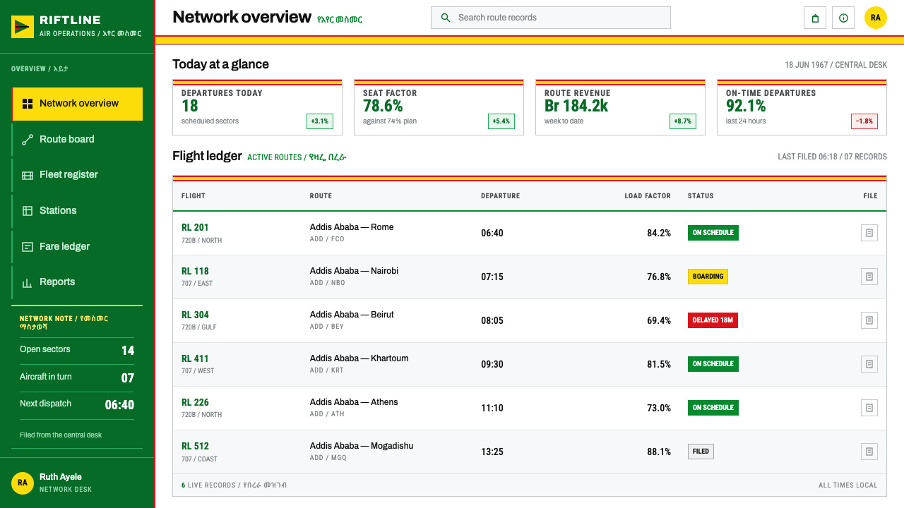
The 1960s Ethiopian Airlines identity is a good fit for information-rich work that wants to feel confident and orderly. Its strength is structure: band, hairline, grid. Applying it well means letting those three elements organise the page, rather than treating yellow and red as a colour scheme to be sprinkled on top.
On a presentation cover, use a white field with a single wide yellow band, outlined above and below by thin red lines, running across the slide, and set the title flush left against it in a clean sans-serif. Content slides work like timetable pages: a firm grid, left-aligned headings, fine rules between rows, and the band reserved for section changes. Data slides are natural territory. Horizontal bars in yellow with red hairline axes, tidy tables in place of decorative charts, and green held back for a status marker or a single highlighted figure.
For web interfaces, the style suits dashboards, booking and scheduling tools, tariff and pricing tables, logistics and any product where the user is scanning rows of data. Keep the background white, use the yellow band for the header or a section divider, thin red rules for table separation, and flat colour for buttons and badges. Navigation is typographic and flush left. Resist drop shadows and rounded gradients, which belong to a different era and would undercut the crispness that makes the look work.
In editorial and marketing work the style turns into a travel poster or an information leaflet: a large image or illustration, one band, and a short block of flush-left type set at equal weight in two scripts where the audience calls for it. Use the band as the constant that ties a campaign together across formats, and let the rest of the page stay white. Photography and illustration should be clean and flat in treatment, with plenty of white around them.
The most common mistake is to treat bare metal as an excuse for chrome gradients, brushed textures or glossy highlights; the metal here is a flat neutral, not a rendered surface. A second is spreading green everywhere so that the palette reads as a flag, when its job is to mark and punctuate. A third is adding retro grain or faded colours to signal the 1960s. The style is clean offset printing and should look sharp, as if freshly printed.
Ethiopian Airlines 1960s — FAQ
Is this a retro or nostalgic style?
It comes from a specific period, but it is not nostalgic in its own terms. The original work was clean offset print and bare aluminium, confident about the jet age and the future. Reproducing it faithfully means keeping edges sharp and colours flat, and not adding grain, scratches or faded tones. The result looks period-appropriate because it is crisp, not because it has been aged.
How do I show bare metal without gradients or textures?
Treat it as a flat, cool neutral set against white, the way a printed page would represent unpainted metal with a single flat ink. The polished belly of the aircraft is part of the palette, not a surface to be rendered. A flat metallic grey beside white is enough to carry the idea, and the yellow band against it does the rest.
How should two scripts be handled in a layout?
The original printed material set Latin and Ge'ez fidel at equal weight, with neither used as decoration for the other. In practice that means choosing a type family with proper support for the second script, setting both at comparable size and weight, and giving each its own line or column. Avoid shrinking one into a caption or tinting it as secondary, because the parity is part of the identity.
Where does the green go?
Green is rationed. Yellow and red take the large areas, while green leads on markers and on the tail, where the three colours meet in feather-tip triangles. In a layout that means small status indicators, tags, or a single highlight, not large fields or backgrounds. If green is everywhere, the palette stops reading as a disciplined system and starts to look like a flag.
Can I use this style for something other than an airline?
Yes. The system of bands, hairlines, flush-left grids and flat ink suits timetables, logistics, public information, reports, tariffs and any product that needs to feel precise and optimistic. Borrow the structure and the colour logic, not the airline's own marks: the lion, tail symbol and logo belong to the carrier, and the style is better served by your own content set inside its discipline.
Related design styles
 Kuwait Oil-Era ModernismOil-boom optimism in concrete. Petrol-and-sky tower stripes band warm desert-…
 Amtrak Arrow (1971)Civic authority at speed. Deep navy, Helvetica lockups, and red-blue arrows.
 El Al Israel AirlinesNational blue takes command. White aircraft geometry cuts a flat jet-age post…
 Paul Rand / IBM Corporate IdentityCorporate modernism stays exact. Blue 8-bar stripes, high-contrast serif, har…
 Saul Bass CorporateAuthority distilled. Deep blue geometry, tight Inter lockups, and white space…
 UCLA Bruin Purple & Gold (1919)Pacific authority in motion. True Blue panels, gold stripes, condensed athlet…