What is Ferrari Rosso Corsa (1947)?什么是 Ferrari Rosso Corsa (1947)?
Since 1947, Ferrari's warm racing red has been the world's most recognizable signal that speed, passion, and precision have been fused into a single object.自1947年起,法拉利那抹温暖的赛车红成为全球最具辨识度的符号——速度、激情与精准在此凝为一体。
Ferrari Rosso Corsa (1947) in briefFerrari Rosso Corsa (1947) 速览
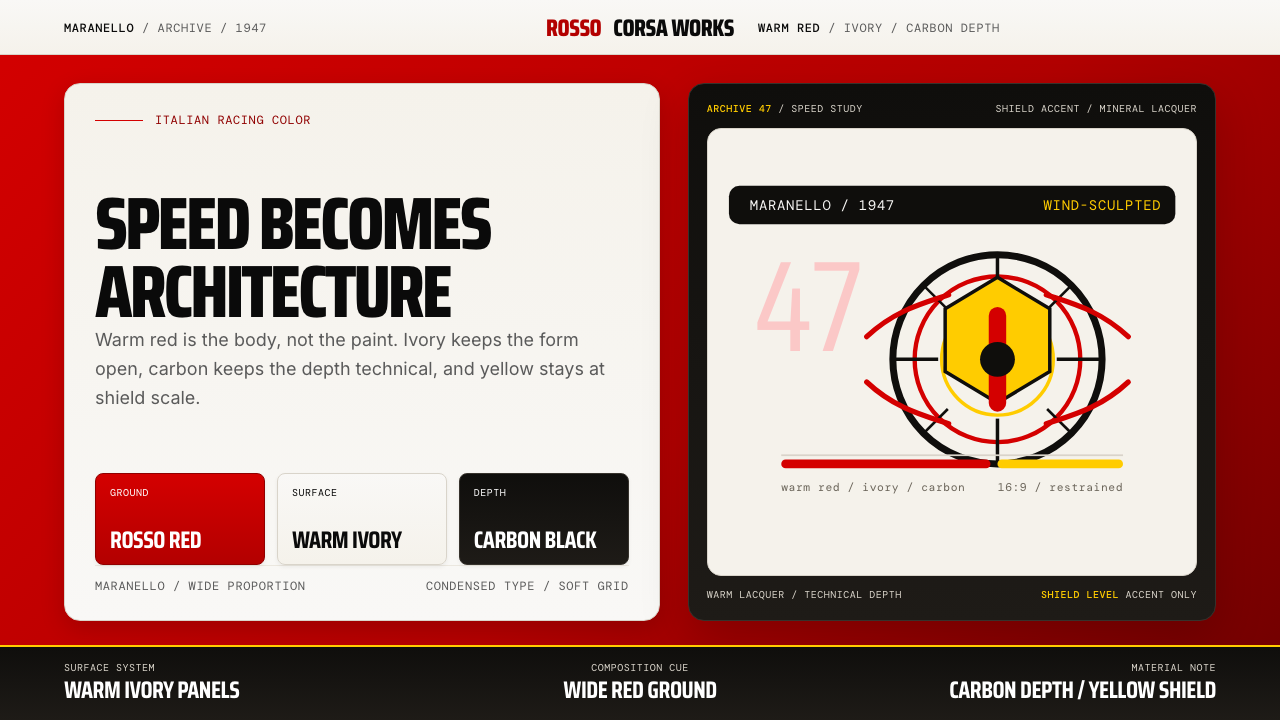
Ferrari Rosso Corsa is a design system rooted in the visual identity of the Maranello marque as it crystallized in the postwar decades following Enzo Ferrari's founding of the company in 1947. Its palette revolves around a warm, slightly orange-shifted racing red — a hue carrying national and sporting provenance — counterpoised with pristine warm-white content surfaces, a signature Maranello yellow reserved for shield-level accents, and deep carbon-black panels that evoke technical precision and mechanical depth.法拉利赤焰红设计系统植根于马拉内罗品牌的视觉基因——那是1947年恩佐·法拉利建立公司后,在战后数十年间逐渐结晶成形的视觉语言。其色板以一种温暖、微偏橙调的赛车红为核心,这一色调承载着民族与赛车运动的双重渊源,与温润奶白的内容面板相互映衬;马拉内罗黄仅用于盾徽级强调,深邃的碳黑面板则赋予整体以技术精准感与机械纵深。
The system's aesthetic logic is sculptural rather than graphic. Every element — the swell of a color field, the taper of a typographic hierarchy, the controlled restraint of yellow accents — echoes the aerodynamic discipline of coachbuilt bodywork: nothing is arbitrary, nothing is decorative for decoration's sake. Red is the primary ground, white is the working surface, black is structural depth, and yellow is the rarest, most loaded note — used with the same parsimony that Maranello applies to its prancing-horse badge.这套系统的美学逻辑是雕塑性的,而非平面性的。每一个元素——色块的饱胀感、字体层级的收束、黄色强调的克制——都回响着手工定制车身的空气动力学纪律:无一随意,无一为装饰而装饰。红是主底色,白是工作面,黑是结构深度,黄是最稀少、分量最重的音符——使用时的吝惜程度,堪比马拉内罗对那枚跃马徽标的珍视。
Visually, the system is bold without being loud. The red is warm enough to feel physical and inviting rather than aggressive; white surfaces give content room to breathe; carbon panels anchor the composition with technical gravitas. The overall impression is one of confident Italian luxury engineering: high-performance values expressed through material restraint and formal exactness rather than maximalist decoration.从视觉上看,这套系统大胆而不喧嚣。红色足够温暖,令人感到真实可触而非咄咄逼人;白色面板给内容以充分的呼吸空间;碳黑面板以技术重量感锚定整体构图。整体印象是一种自信的意式豪华工程美学:高性能价值通过材料克制与形式精确表达,而非最大化的装饰叠加。
See the Ferrari Rosso Corsa (1947) design system查看 Ferrari Rosso Corsa (1947) 完整设计系统
Where does Ferrari Rosso Corsa (1947) come from?Ferrari Rosso Corsa (1947) 从何而来?
The racing red associated with Italian motorsport predates Ferrari by four decades. In the early years of international grand prix racing, the governing bodies informally assigned national racing colors by convention: France raced in blue, Britain in green, Germany in white and later silver, and Italy in red. The exact shade varied from car to car and year to year — early Italian reds were sometimes vivid crimson, sometimes brick-toned — but the national identity of Italian racing as 'red' was firmly established by the time the Formula One World Championship launched in 1950. Ferrari, as the dominant Italian constructor, became the primary carrier of that color, and through decades of championship victories it fused the identity of racing red with the identity of the Maranello brand itself.与意大利赛车运动相关联的赛车红,早在法拉利诞生之前四十年便已存在。在国际大奖赛的早期岁月,各主管机构以惯例非正式地为各国分配赛车颜色:法国用蓝,英国用绿,德国用白(后改银色),意大利用红。具体色调因车而异、因年而变——早期意大利红有时鲜艳如胭脂,有时沉稳似砖红——但「意大利赛车=红色」的民族身份认同,在1950年一级方程式世界锦标赛启动时已牢固确立。法拉利作为主导性的意大利车队,成为这一颜色的首要承载者,数十年的冠军荣耀将赛车红的身份与马拉内罗品牌的身份彻底融为一体。
Enzo Ferrari founded Scuderia Ferrari as a racing team in 1929, initially running Alfa Romeo cars, and established Auto Avio Costruzioni — the manufacturing entity that would become Ferrari — in Maranello in 1943. The first true Ferrari, the 125 S, was completed in 1947. From the very beginning, the cars wore the Italian racing red, and the prancing horse badge — derived from the personal emblem of World War One flying ace Francesco Baracca, given to Enzo Ferrari by Baracca's mother — was placed on a yellow shield, the yellow drawn from the civic colors of Modena. That pairing of red body and yellow badge became the visual anchor of the brand's entire subsequent identity.恩佐·法拉利于1929年创立法拉利车队,最初驾驶阿尔法·罗密欧赛车参赛,并于1943年在马拉内罗建立了汽车航空建造公司——即后来的法拉利汽车公司的制造实体。第一辆真正意义上的法拉利——125 S——于1947年竣工。从一开始,车身便披挂意大利赛车红,而那枚跃马徽标——源自一战王牌飞行员弗朗切斯科·巴拉卡的私人纹章,由其母亲赠予恩佐·法拉利——则置于一面黄色盾形上,黄色取自摩德纳的市政旗帜色彩。红色车身与黄色盾徽的组合,成为品牌此后全部视觉身份的锚点。
The coachbuilding tradition of Emilia-Romagna and the broader Italian carrozzeria culture shaped the formal aesthetic that Ferrari would come to represent. Bodywork was not mass-produced but hand-formed — each panel beaten and shaped by craftsmen who understood the car as a continuous sculptural form. Battista 'Pinin' Farina established Carrozzeria Pininfarina in Turin in 1930, and his studio's partnership with Ferrari — formalized in 1952 — produced some of the most celebrated automotive silhouettes of the twentieth century. Pininfarina's sensibility was one of sensual precision: curvature that appeared effortless but was aerodynamically justified, surfaces that caught light as though they were themselves a kind of performance.艾米利亚-罗马涅的车身定制传统,以及更广泛的意大利「卡罗泽里亚」(Carrozzeria,车身制作工坊)文化,塑造了法拉利所代表的形式美学。车身并非批量生产,而是手工成形——每一块面板由工匠捶打塑造,他们将赛车理解为一个连续的雕塑整体。巴蒂斯塔·「皮宁」·法利纳于1930年在都灵创立宾尼法利纳公司,其工作室与法拉利的合作——于1952年正式化——催生了二十世纪最受赞誉的若干汽车轮廓。宾尼法利纳的审美感性是一种官能性的精准:曲率看似毫不费力,却有空气动力学依据;曲面捕捉光线,仿佛本身便是一种表演。
Flavio Manzoni, who became Ferrari's head of design in 2010, continued and codified this visual philosophy for the contemporary era. Under Manzoni, Ferrari's design language was articulated as a coherent system — not just the shape of individual cars but the architecture of showrooms, the typography of communications, the proportions of branded objects. The Rosso Corsa design system, as it is understood today, is the distillation of that long institutional process: a century of Italian racing identity, four decades of Pininfarina collaboration, and a deliberate contemporary effort to translate automotive values into a rigorous and transferable visual language.弗拉维奥·曼佐尼于2010年出任法拉利设计总监,将这一视觉哲学延续并系统化至当代语境。在曼佐尼主导下,法拉利的设计语言被阐释为一套连贯的体系——不仅是单辆赛车的造型,也包括展厅的空间架构、传播物料的字体排印、品牌物件的比例关系。今日所理解的赤焰红设计系统,正是这一漫长机构积淀的蒸馏:一个世纪的意大利赛车身份认同、四十年的宾尼法利纳合作,以及一次将汽车价值观转译为严密可移植视觉语言的当代自觉实践。
What defines the Ferrari Rosso Corsa (1947) look?Ferrari Rosso Corsa (1947) 的视觉特征是什么?
Color Architecture色彩架构
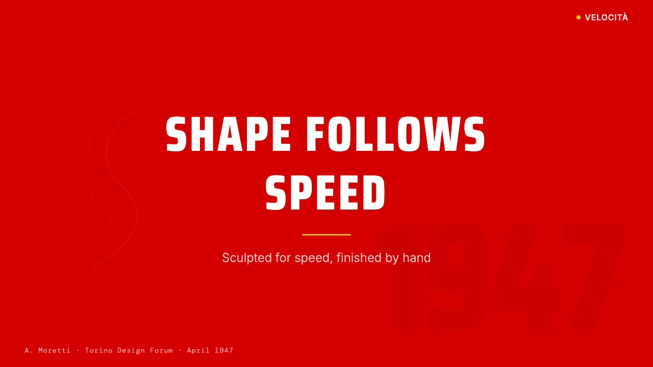
The palette is organized as a strict four-role hierarchy. Rosso Corsa — warm, orange-shifted Italian racing red — functions as the primary page ground or hero surface, not merely an accent. Warm white serves as the primary content surface, ensuring readability and breathing room. Maranello yellow, the color of the prancing-horse badge's shield, is reserved exclusively for the highest-priority accents: active states, primary calls to action, and key indicators. Carbon black anchors technical panels and structural dividers. No additional hues enter the system; the power of the palette comes from its discipline.色板按严格的四角色层级组织。赤焰红(Rosso Corsa)——温暖、偏橙调的意大利赛车红——用作主页底色或英雄面,而非仅充当强调色。暖白色作为主内容面,确保可读性与呼吸空间。马拉内罗黄——跃马盾徽之色——仅保留给最高优先级强调:激活状态、主行动号召与关键指标。碳黑锚定技术面板与结构分隔线。系统内不引入额外色相;色板的力量来自其纪律性。
Surface Contrast面层对比
The system achieves depth through stark juxtaposition of surfaces rather than gradients or blending. A deep red zone meets a crisp white panel with a clean, hard edge — no soft transition, no ambient shadow feathering the boundary. Carbon-black panels sit as discrete, weighted elements. This hard-surface logic reflects the language of coachbuilt bodywork: panels are distinct objects, meeting at precisely defined lines, not merging into one another. The effect is both visually commanding and technically legible.系统通过面层的强烈并置而非渐变或混融来实现深度。深红区域以干净、硬朗的边缘与洁白面板相遇——无柔和过渡,无环境阴影羽化边界。碳黑面板作为离散的、有重量感的元素存在。这种硬面逻辑呼应了手工定制车身的语言:各面板是彼此分明的对象,在精确界定的线条处相遇,而非融合。效果既具视觉震撼力,又保持技术可读性。
Typography Scale字体层级
Typographic hierarchy is expressed through dramatic scale contrast — headline type operates at a significantly larger scale than body text, with the size difference itself performing the organizational function that decorative borders or rules might otherwise serve. Type set against red grounds is kept to single-weight white, maintaining maximum legibility. On white surfaces, a dark color carries body text, with hierarchy established through weight and size alone. The typographic sensibility is Italian industrial: confident, precise, unhurried.字体层级通过戏剧性的尺度对比表达——标题字以远大于正文的尺度运作,尺度差异本身承担着装饰性边框或分隔线可能担负的组织功能。在红色底面上排列的文字保持单一字重的白色,以维持最高可读性。在白色面上,深色正文以字重与尺寸建立层级。整体排印气质是意式工业风:自信、精准、从容。
Yellow as a System Signal黄色作为系统信号
Maranello yellow operates as a precise semantic marker rather than a decorative color. Its function is analogous to the yellow shield on which the prancing horse sits: it designates something of singular importance. In interface applications, yellow marks the single most critical interactive element per view — the primary button, the tier differentiator, the live indicator. When yellow appears more than once in a composition, its signal strength is diluted. The discipline of using it sparingly — even when restraint feels visually insufficient — is what preserves its authority.马拉内罗黄作为精确的语义标记运作,而非装饰色。其功能类比跃马所踞的黄色盾牌:它指定某一具有独特重要性的事物。在界面应用中,黄色标记每个视图中最关键的单一交互元素——主按钮、档位区分器、实时指示器。当黄色在一个构图中出现超过一次,其信号强度即被稀释。克制使用它的纪律——即便克制感觉视觉上还不够——正是维护其权威的方式。
Sculptural Negative Space雕塑性留白
Negative space in this system is not emptiness — it is the white body panel between two red sections, the breath between a headline and its subtext, the deliberate pause that gives speed its legibility. Pininfarina's design philosophy held that the space around a form is as designed as the form itself; that a silhouette is defined as much by what is absent as by what is present. Applied to layout, this means generous margins, unhurried spacing between elements, and a refusal to fill every available zone with content.这套系统中的留白并非空洞——它是两段红色之间的白色车身面板,是标题与副标题之间的呼吸,是赋予速度以可读性的刻意停顿。宾尼法利纳的设计哲学认为,形体周围的空间与形体本身同样经过设计;轮廓由缺席之物与在场之物共同界定。应用于版面,这意味着宽裕的边距、元素间从容的间距,以及拒绝用内容填满每一个可用区域的自律。
Material Texture and Finish材质质感与光洁度
The system evokes a specific material vocabulary: lacquered body panels, brushed or anodized aluminum, matte carbon fiber, polished glass. These are not literal textures applied to digital surfaces but tonal qualities — the depth and saturation of the red suggests lacquer, the clean flatness of white panels suggests polished paint, the carbon sections feel dense and light-absorbing. This material suggestion is achieved through color choice and surface treatment rather than simulated grain or texture overlays.这套系统唤起一套特定的材质词汇:清漆车身面板、拉丝或阳极氧化铝材、亚光碳纤维、抛光玻璃。这些并非字面上叠加于数字面的纹理,而是色调特质——红色的深度与饱和度令人联想到清漆,白色面板的干净平整感如同抛光车漆,碳黑区段感觉密实而吸光。这种材质暗示通过色彩选择与面层处理来实现,而非模拟颗粒感或纹理叠加。
Formal Precision形式精准性
Every compositional decision in the system is made with the exactness of an engineering tolerance. Alignment is not approximate — elements sit on an invisible but strictly observed grid. Color zones are defined by clean, resolved edges rather than soft transitions. The yellow accent appears once, in the right place, at the right scale. This precision is the visual correlate of the engineering culture that produces the machinery itself: obsessive, iterative, intolerant of the merely adequate.这套系统中的每一个构图决定都以工程公差的精确性作出。对齐不是大概——元素落在一个隐形但被严格遵守的网格上。色块以干净、明确的边缘界定,而非柔和过渡。黄色强调色出现一次,在正确位置,以正确的尺度。这种精准是制造机械的工程文化在视觉上的对应物:执着、迭代、对于仅仅凑合不予容忍。
See the Ferrari Rosso Corsa (1947) design system查看 Ferrari Rosso Corsa (1947) 完整设计系统
Who shaped Ferrari Rosso Corsa (1947)?谁塑造了 Ferrari Rosso Corsa (1947)?
Enzo Ferrari (1898–1988) founded Scuderia Ferrari in 1929 and established the Ferrari automobile company in Maranello in 1943. A former racing driver and Alfa Romeo team manager, he approached car manufacturing with an obsessive, often ruthless devotion to performance. His decision to house the prancing horse badge — borrowed from the family crest of fallen World War One ace Francesco Baracca — on a yellow shield against the Italian racing red body established the brand's visual DNA in its first year. Ferrari remained the controlling force behind the company's identity until his death, and his conviction that racing success and commercial identity were inseparable shaped the Rosso Corsa visual system as a philosophy, not merely a color.恩佐·法拉利(1898—1988年)于1929年创立法拉利车队,并于1943年在马拉内罗建立法拉利汽车公司。作为前赛车手和阿尔法·罗密欧车队经理,他以偏执、往往不近人情的方式追求性能极致。他在品牌第一年做出的决定——将借自一战阵亡王牌飞行员弗朗切斯科·巴拉卡家徽的跃马置于黄色盾形上,衬以意大利赛车红车身——确立了品牌的视觉DNA。法拉利直至去世都是公司身份的主导力量,他坚信赛车胜利与商业身份不可分割,这一信念将赤焰红视觉系统塑造为一种哲学,而非仅仅一种色彩。
Battista 'Pinin' Farina (1893–1966) founded Carrozzeria Pininfarina in Turin in 1930 and formalized a design partnership with Ferrari in 1952 that would define the visual character of Maranello's road cars for decades. His aesthetic philosophy centered on what he called 'organic elegance' — curves justified by aerodynamics and engineering logic, not by fashionable decoration, surfaces that looked as though they had been shaped by wind rather than by a stylist's pencil. This philosophy is the formal ancestor of the Ferrari Rosso Corsa visual system's sculptural logic: beauty as a consequence of precision rather than an addition to it.巴蒂斯塔·「皮宁」·法利纳(1893—1966年)于1930年在都灵创立宾尼法利纳车身公司,并于1952年与法拉利正式建立设计合作关系,由此主导马拉内罗公路跑车的视觉气质数十年之久。他的美学哲学以他所称的「有机优雅」为核心——曲线以空气动力学与工程逻辑为依据,而非时髦装饰,曲面看起来像是被风塑造,而非被造型师的画笔勾勒。这一哲学是赤焰红视觉系统雕塑性逻辑的形式源头:美是精准的结果,而非其附加物。
Sergio Pininfarina (1926–2012) succeeded his father at the helm of Carrozzeria Pininfarina and deepened the studio's relationship with Ferrari across the most celebrated decades of the marque's road car production. Under Sergio, Pininfarina delivered some of the most iconic silhouettes in automotive history — shapes whose formal discipline and sensual precision became inseparable from the idea of Ferrari red in the popular imagination. His tenure demonstrated that the red was not simply a color but a system: it was readable only in conjunction with the proportions and surfaces it clothed.塞尔吉奥·宾尼法利纳(1926—2012年)接掌父亲在宾尼法利纳车身公司的职位,在马拉内罗公路跑车生产最辉煌的数十年间深化了工作室与法拉利的合作关系。在塞尔吉奥主导下,宾尼法利纳交付了汽车史上最具标志性的若干轮廓——其形式纪律与官能精准,在大众想象中与法拉利红的概念已不可分割。他的任期证明,这抹红色不仅仅是一种颜色,更是一套系统:它只有与所披覆的比例和曲面相结合,才能被充分解读。
Flavio Manzoni joined Ferrari as Senior Vice President of Design in 2010 and undertook the systematic articulation of Ferrari's design language as a comprehensive, transferable visual identity — extending beyond individual car models to encompass branded spaces, communications, and objects. Under his direction, Rosso Corsa was codified not merely as a historical color but as the structural foundation of a design system with defined roles for each color, defined typographic hierarchies, and defined spatial principles. Manzoni represents the moment when the brand's intuited aesthetic became an explicit, scalable design architecture.弗拉维奥·曼佐尼于2010年以设计高级副总裁身份加入法拉利,着手将法拉利的设计语言系统化阐释为一套完整可移植的视觉身份——延伸至单一车型之外,涵盖品牌空间、传播物料与品牌物件。在他主导下,赤焰红不再仅仅是一种历史色彩,而被编码为一套设计系统的结构基础:每种颜色有明确角色,字体有明确层级,空间原则有明确界定。曼佐尼代表着品牌凭直觉积累的美学转化为明确、可规模化设计架构的时刻。
Francesco Baracca (1888–1918) was Italy's leading World War One flying ace, credited with thirty-four aerial victories before his death in combat in June 1918. His personal aircraft carried a prancing horse emblem on its fuselage. After the war, his mother Countess Paolina Baracca gave Enzo Ferrari permission to use the emblem, suggesting it would bring him luck. Ferrari placed the horse on a yellow shield — yellow being the color of Modena, his hometown — and set it against the red of his cars. Baracca's emblem thus became one of the most recognized brand symbols in the world, linking the Rosso Corsa identity to a lineage of Italian courage and aeronautical mastery that predates the automobile itself.弗朗切斯科·巴拉卡(1888—1918年)是意大利一战头号王牌飞行员,在1918年6月阵亡前取得三十四次空战胜利。他的座机机身上绘有一匹跃马纹章。战后,其母保利娜·巴拉卡伯爵夫人允许恩佐·法拉利使用这枚徽标,称它将为他带来好运。法拉利将跃马置于黄色盾形上——黄色取自他的故乡摩德纳的市政旗帜色——衬以赛车的红色车身。巴拉卡的徽章由此成为世界上最具辨识度的品牌符号之一,将赤焰红的身份认同与一脉意大利勇气和航空技艺的传承相连接——那一传承甚至早于汽车本身的诞生。
How do you use Ferrari Rosso Corsa (1947) today?今天怎么用 Ferrari Rosso Corsa (1947)?
Ferrari Rosso Corsa is among the most demanding historical design systems to apply correctly in contemporary work, precisely because its power depends on restraint. The visual system operates as a hierarchy of four materials — red, white, black, yellow — and its authority comes from keeping each in its assigned role. Applying it well requires understanding not just what the elements are but what each one is for: red is ground, white is surface, black is structure, yellow is the one unmistakable signal.法拉利赤焰红是当代实践中最难正确应用的历史设计系统之一,恰恰是因为其力量依赖克制。这套视觉系统作为四种「材质」的层级运作——红、白、黑、黄——其权威性来自将各元素维持在各自指定角色上。正确应用它,需要理解的不仅是这些元素是什么,更是每一种各自承担什么功能:红是底,白是面,黑是结构,黄是唯一无可混淆的信号。
For presentation slides, the system delivers exceptional impact on cover pages and section openers. A cover built on a full-bleed red ground with white display type and a single yellow accent for the marque or subtitle carries the visual authority of a race car livery — bold, unambiguous, purposeful. Content slides shift to white as the primary surface: body text in a dark tone, headline hierarchy expressed through scale contrast alone, data callouts in yellow used sparingly (at most one per slide). Data visualization slides treat charts as engineered objects — clean bar charts, precise line graphs — without decorative frames or gradient fills. Carbon-black panels work well as slide backgrounds for technical specifications or comparative tables, where their material gravity reinforces the precision of the data.在演示文稿中,这套系统在封面页与章节起始页上带来卓越的视觉冲击力。以全出血红色底面构建的封面,配以白色展示字体和单一黄色强调用于品牌名或副标题,呈现出赛车涂装的视觉权威感——大胆、明确、有目的。内容页以白色为主面:深色正文,标题层级仅通过尺度对比表达,数据强调语以黄色克制使用(每页最多一处)。数据可视化页将图表作为工程对象处理——干净的柱状图、精准的折线图——无装饰性框架或渐变填充。碳黑面板适合作为技术规格或对比表格的幻灯片背景,其材质重量感强化了数据的精准性。
For web interfaces, the system is ideally suited to dashboards, pricing pages, and high-performance product landing pages where hierarchy and immediate scannability are the primary design objectives. The recommended approach is a rigorously maintained grid with white or very light warm surfaces as the default background for content zones, reserving red for hero sections or navigation bars where brand impact is needed at full strength. Yellow appears at most once per viewport — on the primary call-to-action button or the active plan indicator in a pricing table. Carbon-black panels serve as footers, technical specification sections, or secondary navigation. Shadow on interactive components should be hard-edged and offset rather than soft and diffuse, reinforcing the material logic of the system.在网页界面中,这套系统最适合仪表板、定价页面和高性能产品落地页——在这些场景中,层级与即时可扫描性是首要设计目标。推荐方案是严格维护的网格,以白色或接近白色的暖色面作为内容区的默认背景,将红色保留给需要全力展现品牌冲击力的英雄区或导航栏。黄色每个视口最多出现一次——用在主行动号召按钮或定价表中的当前套餐指示器上。碳黑面板用于页脚、技术规格区段或次级导航。交互组件上的阴影应当是硬边偏移,而非柔和漫射,以强化系统的材质逻辑。
For editorial and marketing work, the system's inherent poster logic — bold color fields, strong typographic scale contrast, controlled accent — translates naturally to campaign materials, feature stories, and brand-led print and digital advertising. An editorial spread works well alternating full-bleed red pages with white content pages, using the color itself as the structural break between sections. Marketing pages benefit from the system's ability to signal premium positioning without relying on photographic luxury cues: a red hero, a white body section with generous margins, a yellow primary button, and a carbon specification section communicates high-performance intent with typographic and color means alone. The system pairs naturally with motorsport imagery — race cars, pit-lane photography, circuit detail — but does not require it; the color vocabulary carries enough identity on its own.在编辑与营销内容中,系统固有的海报逻辑——大色块、强烈的字体尺度对比、受控的强调色——自然地转化为活动物料、专题报道,以及品牌主导的印刷与数字广告。编辑跨页适合以全出血红色页面与白色内容页交替使用,以颜色本身作为章节之间的结构性分隔。营销页面受益于这套系统传递高端定位的能力,无需依赖摄影奢华信号:一个红色英雄区、一个宽裕留白的白色正文区、一个黄色主按钮、一个碳黑规格区段,仅凭字体与色彩手段即可传递高性能意图。这套系统与赛车影像——赛车、维修站摄影、赛道细节——天然契合,但并不依赖这些;色彩词汇本身已承载了足够的身份认同。
A common and costly mistake when applying this system is treating the yellow as a secondary accent color deployed freely wherever visual energy is needed. Yellow in this system is not an energizing accent — it is a singular marker of the one thing that matters most in any given view. Using it on two or three elements simultaneously collapses the hierarchy the entire palette is built to create. A related error is softening the system's hard-edge material logic with gradients, soft shadows, or blended color transitions — these read as inconsistent with the system's formal precision and dilute the sense of engineered certainty that is its primary emotional register. The palette's power is multiplicative when its discipline is maintained, and rapidly diminishing when its rules are loosened.应用这套系统时最常见且代价最高的错误,是将黄色视为次级强调色,在任何需要视觉能量的地方自由使用。在这套系统中,黄色不是提振活力的强调色——它是对任意给定视图中最重要的那一件事的唯一标记。同时将其用在两三个元素上,会瓦解整套色板赖以构建的层级。一个相关的错误是以渐变、柔和阴影或混融色彩过渡来软化系统的硬边材质逻辑——这些处理与系统的形式精准性显得不一致,会稀释那种经过工程验证的确定感——而这正是系统的主要情感基调。这套色板的力量在纪律被维护时是乘法效应,在规则被放松时则迅速递减。
See the Ferrari Rosso Corsa (1947) design system查看 Ferrari Rosso Corsa (1947) 完整设计系统
Ferrari Rosso Corsa (1947) — FAQFerrari Rosso Corsa (1947) · 常见问题
Is Ferrari Rosso Corsa appropriate for non-automotive and non-luxury contexts?赤焰红设计系统适合用于非汽车、非奢侈品的场景吗?
It can be, but the context needs to support the values the system projects: performance, precision, confidence, and a degree of emotional intensity. It works well for financial platforms emphasizing high performance, sports technology products, professional tools where authority is a desired quality, and any brand where the aspiration is to communicate that it takes its domain as seriously as Ferrari takes speed. It struggles in contexts requiring approachability, warmth, or playfulness — the palette's inherent boldness and severity can feel exclusionary in consumer contexts that depend on broad emotional accessibility. Before applying it, ask whether the product's core promise is performance and precision; if yes, the system will reinforce that promise. If the product's promise is warmth, community, or ease, choose differently.可以,但场景需要支撑这套系统所投射的价值观:性能、精准、自信,以及一定程度的情感张力。它适合强调高性能的金融平台、体育科技产品、权威性是期望品质的专业工具,以及任何品牌抱负是传递「在自身领域的严肃程度堪比法拉利对待速度」的品牌。它在需要亲和力、温暖感或趣味性的场景中则力不从心——色板固有的大胆与严肃感,在依赖广泛情感可及性的消费者场景中可能令人感到疏离。在应用之前,先问一问产品的核心承诺是否是性能与精准;若是,这套系统将强化那一承诺。若产品的承诺是温暖、社群或轻松,则应另作选择。
How does this system differ from a generic 'red and white' brand palette?这套系统与普通的「红白」品牌色板有何不同?
The distinction is in the specific character of each element and the rigidity of their roles. Generic red-and-white palettes typically treat red as a brand accent applied to buttons, highlights, and hero images over a predominantly white layout. Ferrari Rosso Corsa inverts that logic: red is the ground, not the accent. White is the working surface that content lives on, not the background the brand color sits against. Yellow performs the accent function that red plays in most systems — but with extreme parsimony. And carbon black provides a fourth structural tone that generic two-color systems lack entirely. The result is a system with significantly more formal complexity and visual authority than a standard red-accent identity.区别在于每个元素的具体特质以及其角色的严格性。普通的红白色板通常将红色视为品牌强调色,应用于按钮、高亮和英雄图像,覆盖在以白色为主的版面上。赤焰红颠覆了这一逻辑:红色是底,不是强调色。白色是内容栖居的工作面,不是品牌色所依附的背景。黄色承担大多数系统中红色扮演的强调功能——但以极度节制的方式使用。碳黑则提供了普通双色系统完全缺失的第四种结构性色调。结果是一套在形式复杂性和视觉权威性上显著高于标准红色强调身份系统的体系。
Can this system work effectively in dark mode or on dark backgrounds?这套系统能在深色模式或深色背景下有效运作吗?
The system has a natural dark-mode pathway through its carbon-black component. A dark-mode inversion works best when carbon black replaces the primary background role that red occupies in light mode, with warm white shifting to a slightly softened off-white for body text and content surfaces, and red taking the role of a strong section accent or hero element rather than a continuous ground. Yellow retains its singular signal function in either mode. The key risk in dark-mode application is allowing red to lose its identity against the dark ground — it must remain clearly warm and distinct from the carbon tone, not slide toward a generic dark-red that reads as muted or unconfident.这套系统通过碳黑元素提供了自然的深色模式路径。深色模式反转最有效的做法是:碳黑取代浅色模式中红色承担的主背景角色,温暖白色转为略微柔和的米白色用于正文和内容面,红色则转变为强烈的区段强调色或英雄元素,而非连续的底色。黄色在两种模式中都保持其唯一信号功能。深色模式应用中的关键风险在于让红色在深色背景中失去辨识度——它必须保持清晰的温暖感,与碳色调明确区分,不能滑向读起来沉闷或缺乏自信的普通深红色。
What kinds of imagery pair well with this design system?什么类型的图像与这套设计系统相配?
The system is strongly compatible with photography and imagery characterized by precision, motion, and material beauty: close-up engineering details, aerodynamic forms, controlled motion blur, high-contrast light on curved surfaces. Imagery that emphasizes craftsmanship — a welder's arc, a machined component, stitched leather — also fits the system's material logic. What works less well is lifestyle imagery centered on human warmth, soft natural settings, or organic textures, which read against the system's precision-and-performance register. In editorial use, treating photographs with high contrast and controlled cropping — rather than as ambient, atmospheric images — keeps them coherent with the system's formal discipline.这套系统与以精准、运动感和材质美为特征的摄影及图像高度相容:工程细节特写、空气动力学造型、受控的动态模糊、曲面上的高对比度光线。强调工艺美的图像——焊接弧光、机加工零件、手工缝制皮革——也契合系统的材质逻辑。相对不适配的是以人文温暖、柔和自然环境或有机质感为中心的生活方式图像,这些与系统的精准与性能基调相悖。在编辑应用中,以高对比度和经过考量的裁切处理照片——而非作为环境性、氛围性图像使用——能使其与系统的形式纪律保持连贯。
How should the yellow accent be handled in multipage or multiscreen applications?在多页面或多屏幕应用中,黄色强调色应如何处理?
The governing principle is one dominant yellow element per view, not per application. In a multipage application, yellow can appear on every screen, but each screen should have at most one element carrying yellow — the element that represents the most important action or the most critical status in that context. Across a multi-section website, yellow can mark each section's primary call to action without dilution, because the user's eye encounters each in a discrete visual context. The error is using yellow as a decorative accent — hover effects, icon fills, decorative dividers — where it accumulates without semantic purpose. Each use should be defensible as 'this is the one thing on this screen that matters most right now'.核心原则是每个视图一个主导黄色元素,而非整个应用只能有一个。在多页面应用中,黄色可以出现在每个屏幕上,但每个屏幕最多只有一个元素承载黄色——代表该场景中最重要行动或最关键状态的元素。在多区段网站中,黄色可以标记每个区段的主行动号召而不稀释其效力,因为用户的目光在每个离散视觉场景中分别遭遇它。错误在于将黄色用作装饰性强调——悬停效果、图标填充、装饰性分隔线——在此之下它无语义目的地积累。每一次使用都应能以「这是此刻这个屏幕上最重要的那件事」为正当理由。
Related design styles相关设计风格
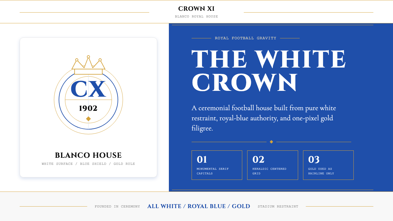 Real Madrid (Blanco)Royal restraint wins. Pure white, royal blue panels, and 1px gold filigree ca…皇家克制取胜:纯白底、皇家蓝面板与1px金线托起王冠感。
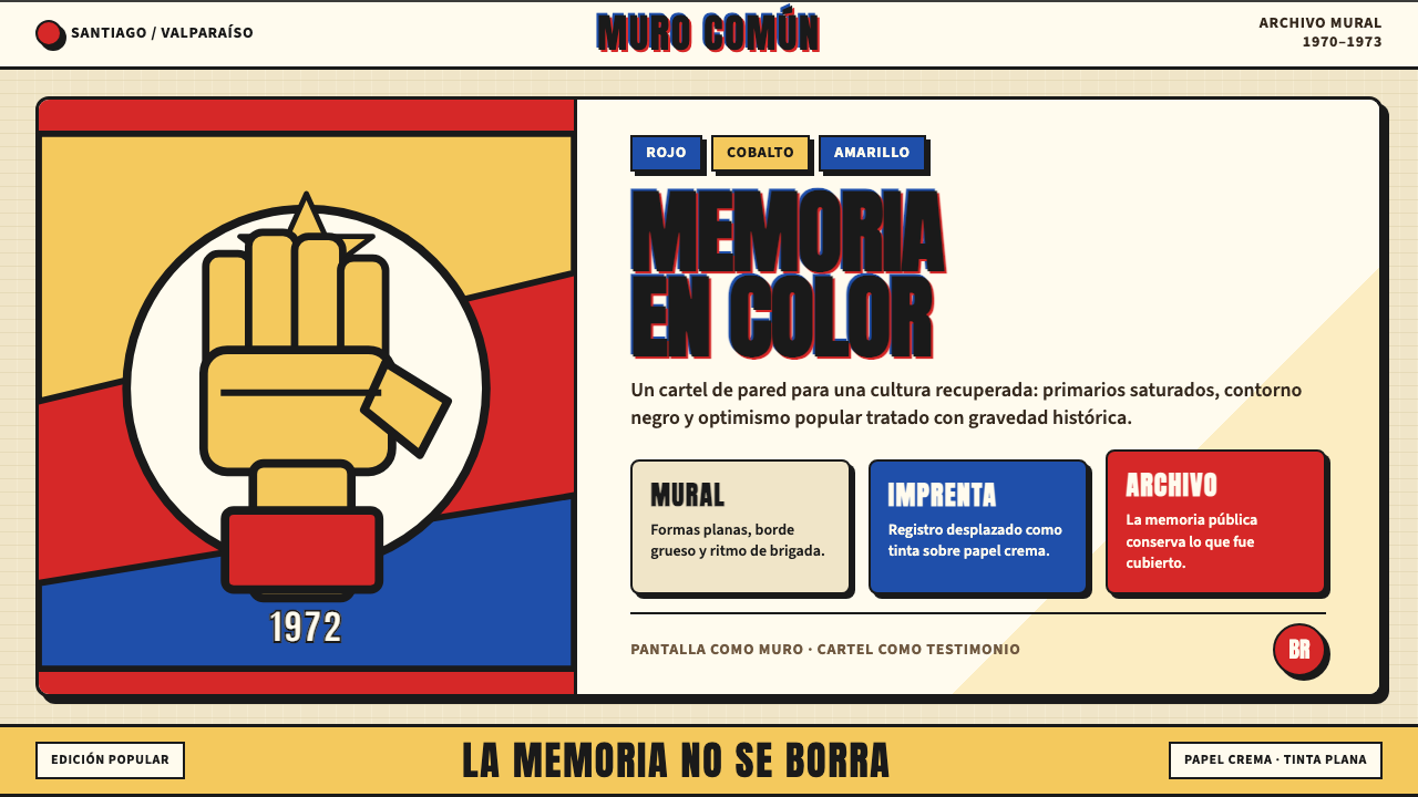 Chilean Allende-Era Propaganda (1972)Solemn revolution. Red, cobalt and yellow lock into thick black mural geometr…庄重的革命感:红、钴蓝与黄被黑色粗线锁进壁画几何。
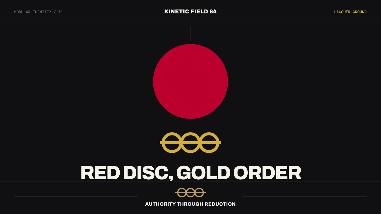 Tokyo 1964 (Kamekura)Ceremony reduced to a mark. Crimson disc and gold rings lock to a black axial…庄重被压缩成标记:黑色轴线网格锁定红日与金环。
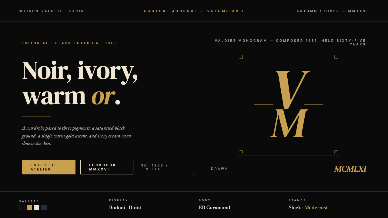 Yves Saint Laurent (YSL)Couture chiaroscuro. Saturated black ground, warm gold accent, Didot serif at…高级时装的明暗对照法:饱和深黑底色、暖金点缀、Didot 衬线大字号——克制即…
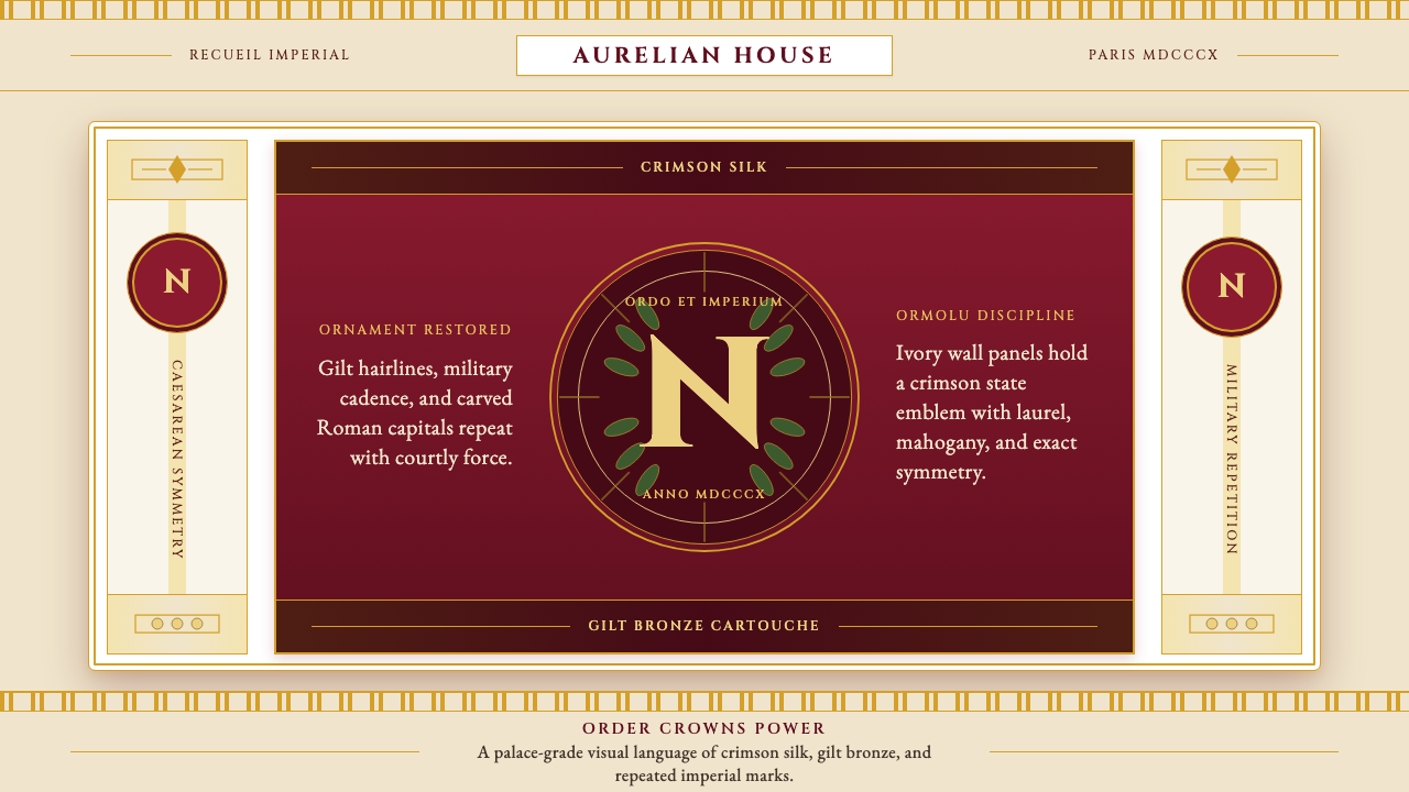 Napoleonic Empire StyleImperial order speaks. Crimson silk, gilt hairlines, and strict symmetry fram…帝国秩序发声:深红丝绸、鎏金细线与对称框架托起 N 印。