What is Yves Saint Laurent (YSL)?什么是 Yves Saint Laurent (YSL)?
Yves Saint Laurent distilled haute couture into its most severe and glamorous form — saturated black, warm gold, and the conviction that restraint is the ultimate luxury.圣罗兰将高级时装提炼至最严峻也最迷人的形态——饱和深黑、暖金点缀,以及克制即是终极奢华的坚定信念。
Yves Saint Laurent (YSL) in briefYves Saint Laurent (YSL) 速览
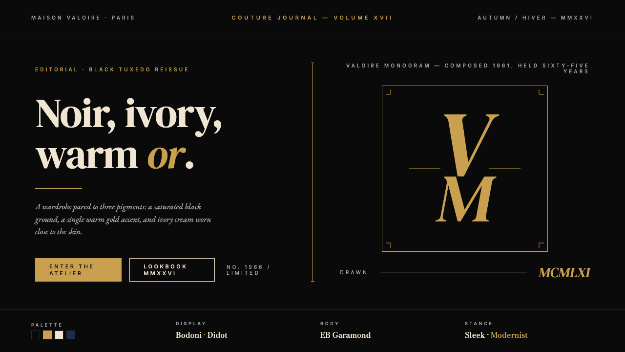
Yves Saint Laurent (YSL) is a French luxury house whose visual identity is one of the most immediately recognizable systems in global fashion: saturated black grounds, warm gold accents, ivory or cream type, and the vertically interlocked YSL monogram that graphic master A. M. Cassandre drew in 1961. The entire palette is a study in chiaroscuro — the dramatic interplay of deep dark and high-contrast light that painters from Caravaggio to Rembrandt used to command attention and suggest depth. YSL translates that technique into graphic and product design with absolute economy.圣罗兰(YSL)是法国高级时装屋,其视觉识别系统是全球时尚界辨识度最高的体系之一:饱和深黑底色、暖金点缀、象牙或奶白色文字,以及平面设计大师 A. M. Cassandre 于 1961 年绘制的纵向交叠 YSL 字母组合标识。整套色调是一次明暗对照法的研究——卡拉瓦乔、伦勃朗等画家用以支配视线、暗示深度的深色与高对比亮色之间的戏剧性交织。圣罗兰以绝对的经济性将这一技法转化为平面与产品设计。
The house's visual language is built on hierarchy through contrast rather than hierarchy through complexity. Where many luxury brands accumulate detail to signal richness, YSL reduces. The typeface choices lean toward Didot and Bodoni — high-contrast French serifs whose hairline strokes and swelling curves carry an inherent tension between fragility and weight. Letter-spacing is generous to the point of architectural deliberateness, each character given room to breathe as though set in stone rather than on paper. The overall effect is billboard-scale confidence at any size.品牌的视觉语言建立在通过对比制造层级,而非通过复杂性制造层级的基础上。许多奢侈品牌以积累细节来暗示富贵,圣罗兰却做减法。字体偏好 Didot、Bodoni 一类的高对比法式衬线——发丝般的细笔画与鼓胀的曲线之间,本身就携带着一种脆弱与厚重之间的张力。字距慷慨而富有建筑感,每个字符都被赋予充裕的空间,仿佛刻在石头上而非印在纸张上。整体效果是在任何尺寸下都呈现出广告牌级别的气场。
Under creative director Anthony Vaccarello, who took the house's reins in 2016, the visual identity has sharpened into what might be called dark-mode luxury. The photographic vocabulary is cooler and more severe — high-gloss surfaces, gold hardware catching hard light, silhouettes cut with mathematical precision. The brand's entire system communicates through absence as much as presence: everything that is not deep black, warm gold, or ivory cream is excluded by design.自 2016 年 Anthony Vaccarello 接任创意总监后,品牌视觉识别进一步锐化为一种可被称作深色模式奢华的立场。影像语汇更冷峻、更严峻——高光泽表面、金色硬件在硬光中捕光,轮廓以数学般的精确度切割。品牌整个系统通过缺席与在场同等程度地传达信息:一切不属于深黑、暖金或象牙奶白的元素,均被设计性地排除在外。
See the Yves Saint Laurent (YSL) design system查看 Yves Saint Laurent (YSL) 完整设计系统
Where does Yves Saint Laurent (YSL) come from?Yves Saint Laurent (YSL) 从何而来?
Yves Henri Donat Mathieu-Saint-Laurent was born in 1936 in Oran, Algeria, then a French territory, and arrived in Paris at seventeen with a portfolio of sketches that won him a position at Christian Dior. When Dior died suddenly in 1957, Saint Laurent — then twenty-one — was named head designer of the house, launching with a collection that was celebrated as saving Dior from irrelevance. The experience gave him direct access to the grammar of Parisian haute couture at its most institutionalized and taught him, paradoxically, how to dismantle that grammar productively.伊夫·亨利·多纳·马蒂厄-圣罗兰 1936 年生于阿尔及利亚奥兰——彼时是法国领土——十七岁时携一卷素描稿抵达巴黎,由此赢得了在克里斯汀·迪奥门下的职位。1957 年迪奥猝然离世,年仅二十一岁的圣罗兰被任命为品牌首席设计师,其首个系列被誉为将迪奥从没落边缘拯救出来。这段经历让他近距离接触了巴黎高级时装最制度化的语法,也悖论式地教会了他如何有效地拆解这套语法。
In 1960, Saint Laurent presented a collection inspired by Left Bank bohemia — leather jackets, turtlenecks, the wardrobe of Parisian intellectuals — that conservative Dior clients rejected and that resulted in his departure from the house, partly engineered by the house's financial backers. In 1961, he and his life and business partner Pierre Bergé founded the Maison Yves Saint Laurent. That same year, Adolphe Jean-Marie Mouron, known professionally as A. M. Cassandre and already celebrated as the greatest French poster artist of the twentieth century, designed the YSL monogram: three letters, interlocked and stacked vertically, which have remained essentially unchanged ever since. The monogram is a masterclass in letterform economy — three individual characters resolved into a single, self-contained architectural object.1960 年,圣罗兰发布了一组受左岸波西米亚启发的系列——皮夹克、高领毛衣、巴黎知识分子的衣橱——遭到保守的迪奥客户拒绝,最终在品牌金融支持者的推动下离开了迪奥。1961 年,他与终身伴侣兼商业伙伴 Pierre Bergé 共同创立了伊夫圣罗兰时装屋。同年,以 A. M. Cassandre 为职业署名、已被公认为二十世纪最伟大法国海报艺术家的 Adolphe Jean-Marie Mouron 设计了 YSL 字母组合标识:三个字母纵向交叠堆叠,此后几乎从未更改。这枚标识是字形经济性的大师课——三个独立字符被解析为一个单一、自足的建筑性对象。
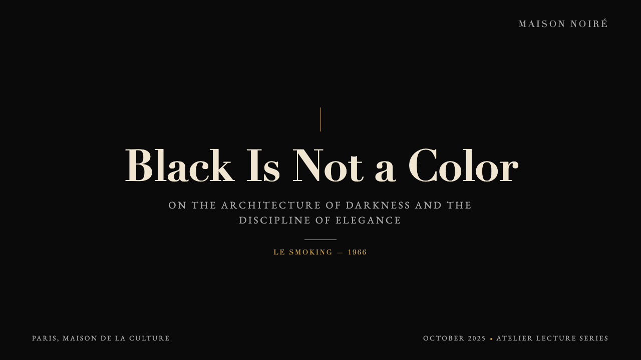
The 1960s were the decade that defined the house's cultural position. In 1965, Saint Laurent presented the Mondrian collection — shift dresses whose color-block panels directly quoted Piet Mondrian's grid paintings — to worldwide acclaim. The collection demonstrated that fashion could function as applied art history, and established the house's intelligence and visual literacy as core brand values. In 1966, Saint Laurent presented Le Smoking: a tuxedo suit designed for women, which challenged the most fundamental conventions of gendered dress. Le Smoking was not merely a fashion statement; it was a philosophical argument about female authority and bodily autonomy made through tailoring, and it transformed the silhouette of couture permanently.1960 年代是确立品牌文化地位的十年。1965 年,圣罗兰发布了蒙德里安系列——直接引用皮特·蒙德里安网格画作的色块连衣裙——举世赞誉。该系列证明了时装可以作为应用艺术史而运作,并将品牌的智识性与视觉素养确立为核心品牌价值。1966 年,圣罗兰发布了 Le Smoking:一套为女性设计的燕尾西装,挑战了性别化着装最根本的惯例。Le Smoking 不仅仅是一个时尚声明,更是一个关于女性权威与身体自主权的哲学论点——以裁剪为语言——永久性地改变了高级时装的轮廓。
The brand entered a new chapter in 1999 when Gucci Group (later absorbed into Kering) acquired it, and a further chapter in 2012 when creative director Hedi Slimane controversially rebranded the ready-to-wear line as Saint Laurent Paris. Slimane's tenure stripped the aesthetic to its most severe rock-and-roll severity. When Vaccarello succeeded Slimane in 2016, he retained the severity but deepened the glamour — restoring warmth to the gold accents, enriching the photographic palette, and steering the visual language toward what it is today: a system so confident in its own reductiveness that the entire luxury vocabulary fits inside three tones and one monogram.1999 年,古驰集团(后被开云集团收购)收购了该品牌,品牌由此进入新篇章;2012 年,创意总监 Hedi Slimane 争议性地将成衣线重新命名为 Saint Laurent Paris,开启了另一个篇章。斯里曼的任期将美学剥落至最严峻的摇滚气质。2016 年 Vaccarello 接任时,他保留了这份严峻,却深化了魅力——恢复了金色点缀的温度,丰富了影像调色板,将视觉语言引向今日的形态:一套对自身简约如此笃定的系统,以至于整个奢华词汇得以容纳在三种色调与一枚字母组合之中。
What defines the Yves Saint Laurent (YSL) look?Yves Saint Laurent (YSL) 的视觉特征是什么?
Palette色彩体系
The YSL palette is among the most restrictive in luxury branding: saturated black as the dominant ground, warm gold as the sole accent, and ivory or cream as the primary typographic tone. Deep navy occasionally makes an appearance as a secondary dark. The system derives its power from the severity of this limitation — no pastel softening, no earth-tone approachability, no rainbow seasonal variation. The black is not charcoal or dark grey; it is full-depth, light-absorbing, cinematic black. The gold is warm-spectrum — closer to old amber than to bright yellow — and reads as precious metal rather than highlight.圣罗兰的色板是奢侈品牌中限制最严格的之一:饱和深黑作为主导底色,暖金作为唯一点缀,象牙或奶白作为主要文字色调。深海军蓝偶尔以次要深色身份出现。这套系统的力量源于这种限制的严苛性——没有柔和的粉彩,没有贴近大地的亲切色调,没有彩虹般的季节性变奏。黑色不是炭灰或深灰,而是全深度的、吸光的、电影感的黑。金色属于暖光谱——更接近旧琥珀而非明黄——读来是贵金属质感而非高光效果。
Typography字体排印
YSL's typographic choices consistently favor high-contrast serif letterforms in the French Didot and Bodoni tradition — typefaces characterized by an extreme contrast between thick stroke and hairline thin stroke, with delicate bracketed serifs and an almost mathematical elegance to their proportions. These are typefaces designed to be read at scale, and YSL deploys them at scale: wordmarks and headline treatments at sizes where individual letterform details become architectural features. Letter-spacing is a defining element — set wide enough to give each character sovereignty over its surrounding space, creating a cadence that feels measured and deliberate. Body text, when it appears, tends to be sparse.圣罗兰的字体选择始终偏向法国 Didot、Bodoni 传统中的高对比衬线字形——这类字体的特征是粗笔画与发丝细笔画之间的极端对比,配以纤细的括号型衬线和近乎数学般优雅的比例。这些字体天生为大字号阅读而生,圣罗兰也正是在大字号下使用它们:标志与标题处理在足够大的尺寸下,单个字形的细节成为建筑性特征。字距是一个定义性元素——足够宽,让每个字符在其周围空间中享有独立,制造出一种从容而刻意的节奏感。正文出现时,往往也是稀疏的。
Monogram and Logo字母组合与标志
The 1961 Cassandre monogram remains one of the most studied logo designs of the twentieth century. Its genius lies in spatial efficiency: three letters — Y, S, L — are resolved into a single compact vertical form through a system of interlocking and overlapping that allows each character to remain legible while the whole reads as a unified geometric object. The monogram functions at any scale without adjustment, from the face of a perfume bottle to a building-height advertisement. Its construction is entirely rational yet the result feels irreducibly elegant — a hallmark of Cassandre's method.1961 年 Cassandre 设计的字母组合至今仍是二十世纪研究最多的标志设计之一。其天才之处在于空间效率:Y、S、L 三个字母通过一套交叠穿插系统被解析为单一紧凑的纵向形体,每个字符保持可识读性的同时,整体又读作一个统一的几何对象。这枚标识在任何尺寸下均无需调整即可运作,从香水瓶面到楼宇高度的广告皆然。其构造完全理性,结果却显得不可化约地优雅——这正是 Cassandre 方法的标志。
Photography and Light影像与光线
YSL's photographic language is defined by hard, directional light — the kind that creates sharp shadows, emphasizes surface gloss, and gives gold hardware a near-incandescent quality. Backgrounds are typically pure black or very deep neutral tones, against which subjects emerge with the clarity of objects lit for a museum case. Skin tones are cool or neutral rather than warm and flattering. The editorial stance is confrontational rather than inviting: the camera does not flatter; it examines. This approach aligns the brand's visual language with art photography and cinema rather than commercial lifestyle imagery.圣罗兰的影像语言以硬质定向光为定义——这种光制造锐利阴影,强调表面光泽,赋予金色硬件近乎白炽的质感。背景通常是纯黑或极深的中性色调,主体在其间浮现的清晰度如同博物馆展柜中被专灯照亮的展品。肤色处理偏冷或中性,而非温暖奉承。编辑立场是对抗性的而非邀请性的:镜头不是在阿谀,而是在审视。这一取向将品牌的视觉语言与艺术摄影、电影语言对齐,而非商业生活方式影像。
Spacing and Silence留白与静默
YSL layouts use negative space as a primary compositional element rather than as leftover area between content blocks. A perfume advertisement may commit the majority of its area to pure black, with the product and wordmark occupying a small, precisely positioned zone. This asymmetric weighting is deliberate: in a visual landscape cluttered with competing bids for attention, a brand that is willing to leave space demonstrates the confidence of established authority. The silence in a YSL composition carries as much meaning as the marks.圣罗兰的版面将留白作为主要构图元素,而非内容块之间的剩余区域。一幅香水广告可能将大部分版面献给纯粹的黑色,产品与品牌标志仅占据一个小而精确定位的区域。这种非对称的分量分配是刻意的:在一个充斥着竞相争夺注意力的视觉景观中,一个愿意留出空间的品牌,展示的是确立权威者的自信。圣罗兰构图中的静默,与其中的标记承载着同等的意义。
Silhouette and Structure廓形与结构
From the garments to the graphic design, YSL is obsessed with clean silhouette. In fashion, this means shoulders that are either precisely squared or precisely softened — never ambiguous — and proportions where every seam placement is a structural decision. In graphic design, this translates to hard edges, sharp corners, and geometric cropping. Nothing bleeds or feathers. The YSL design vocabulary has no room for organic or hand-drawn elements; everything resolves to an edge.从服装到平面设计,圣罗兰对干净廓形有着一贯的执着。在时装中,这意味着精确方正或精确柔和的肩线——从不模糊——以及每一条缝线位置都是结构性决定的比例关系。在平面设计中,这转化为硬边、锐角与几何裁切。没有任何东西渗出或羽化。圣罗兰的设计词汇中没有有机或手绘元素的容身之地;一切都以一条边线收束。
Restraint as Luxury Signal克制作为奢华信号
Where some luxury brands communicate through accumulation — of pattern, of hardware, of signature print — YSL communicates through elimination. The brand has no house check, no loud monogram repeat across fabric, no seasonal color story layered over a base identity. The identity is the base, and the base never changes. This discipline functions as a luxury signal in a specific way: it presupposes an audience sophisticated enough to read absence as richness. You do not need to be told this is expensive. The restraint tells you.一些奢侈品牌通过积累来传达身份——积累图案、硬件、标志性印花——圣罗兰则通过消除来传达。品牌没有格纹,没有遍布面料的响亮字母重复,没有叠加在基础识别之上的季节性色彩叙事。识别系统本身就是基础,而基础从不改变。这种自律以一种特定方式发挥奢华信号的作用:它预设了一个成熟到足以将缺席读作丰盛的受众。你不需要被告知这件东西昂贵。克制本身就在告诉你。
See the Yves Saint Laurent (YSL) design system查看 Yves Saint Laurent (YSL) 完整设计系统
Who shaped Yves Saint Laurent (YSL)?谁塑造了 Yves Saint Laurent (YSL)?
Born in Oran in 1936, Saint Laurent arrived at Dior as a teenager and became head of the house at twenty-one following Dior's death. His foundational contributions — the Mondrian dress of 1965, Le Smoking of 1966, the Saharan jacket, the peasant blouse, the tuxedo-for-women — were not merely trend-setting but paradigm-shifting. Each proposed a different relationship between the dressed body and social authority. Saint Laurent retired in 2002 at a ceremony at the Centre Pompidou, declaring that he had belonged to a world that no longer existed. He died in 2008.圣罗兰 1936 年生于奥兰,青少年时期即进入迪奥,二十一岁因迪奥猝逝而成为品牌首席设计师。他的奠基性贡献——1965 年的蒙德里安裙、1966 年的 Le Smoking、萨哈拉夹克、农妇衬衫、女性燕尾西装——不仅仅是引领潮流,更是范式转移。每一件都提出了一种被着装的身体与社会权威之间的全新关系。圣罗兰于 2002 年在蓬皮杜中心举行的仪式上宣告退休,称自己曾属于一个已不复存在的世界。他于 2008 年辞世。
Bergé was Saint Laurent's life partner and the business architect of the Maison. Where Saint Laurent provided creative vision, Bergé provided financial discipline, political acumen, and the organizational structures that turned an atelier into a global luxury group. He co-founded the house in 1961, navigated the transitions through multiple ownership structures, and managed the brand's intellectual property and legacy with meticulous care. Bergé was also an important patron of arts and letters in France, and his personal collection — auctioned at Christie's Paris in 2009 after Saint Laurent's death — was among the most significant private collections of the twentieth century.Bergé 是圣罗兰的终身伴侣,也是时装屋的商业设计者。圣罗兰提供创意愿景,Bergé 则提供财务纪律、政治手腕与组织架构,将一间工作室转变为全球奢侈品集团。他于 1961 年共同创立了时装屋,历经多次股权结构转变,对品牌的知识产权与遗产进行了一丝不苟的管理。Bergé 也是法国艺术与文学界的重要赞助人,他的私人藏品——于圣罗兰 2008 年辞世后于 2009 年在巴黎佳士得拍卖——是二十世纪最重要的私人收藏之一。
Adolphe Jean-Marie Mouron, who worked under the name Cassandre, was the pre-eminent French commercial poster artist of the twentieth century, responsible for such canonical works as the Normandie ocean-liner poster of 1935 and the Dubonnet triptych. His design of the YSL monogram in 1961 was one of his last major commissions. Cassandre brought to the monogram the same principles that governed his poster work: strict geometric construction, optical clarity at any scale, and the resolution of complex information into an irreducible visual unit. The fact that the monogram has required no substantive revision in more than sixty years is a measure of how completely Cassandre solved the problem.Adolphe Jean-Marie Mouron,以 Cassandre 为职业署名,是二十世纪法国最杰出的商业海报艺术家,创作了 1935 年诺曼底游轮海报与杜宝内三联画等经典作品。1961 年他为圣罗兰设计字母组合标识,是其晚年最重要的委托之一。Cassandre 将支配其海报创作的原则带入了这枚标识:严格的几何构造、在任何尺寸下的视觉清晰度,以及将复杂信息解析为不可化约的视觉单元。这枚标识六十余年来几乎无需实质性修改,正是 Cassandre 解题之彻底的度量。
Vaccarello succeeded Hedi Slimane as creative director in 2016, a transition that returned warmth to the gold register while preserving the severity of the overall system. His collections have consistently explored the YSL archetype — the tuxedo, the sequined evening dress, the power-shouldered jacket — through a contemporary lens that emphasizes polish and gloss over raw edge. Under Vaccarello, the brand's visual communications — advertising campaigns, packaging, store environments — have achieved a rare consistency: every touchpoint expresses the same three-tone vocabulary with equal conviction.Vaccarello 于 2016 年接替 Hedi Slimane 出任创意总监,这一交接在保留整体系统严峻感的同时,为金色调带回了温度。他的系列持续以当代视角探索圣罗兰原型——燕尾西装、亮片晚礼服、强调肩部的权力感夹克——强调光泽与抛光而非原始棱角。在 Vaccarello 主导下,品牌的视觉传播——广告运动、包装、门店环境——实现了罕见的一致性:每一个触点都以同等的笃定表达着同一套三色词汇。
Slimane served as creative director from 2012 to 2016 and is responsible for one of the most discussed rebrands in recent fashion history: renaming the ready-to-wear line Saint Laurent Paris and stripping the visual identity to its most severe and confrontational state. His campaigns relied on deep contrast, hard light, and a rock-and-roll vernacular that polarized opinion. Many longtime clients and critics protested the erasure of the YSL monogram from ready-to-wear communications; others argued Slimane had identified the latent severity at the core of the brand's identity and made it explicit. The debate illuminates how much interpretive range exists within the three-tone system.斯里曼于 2012 年至 2016 年间担任创意总监,主导了近年时尚史上讨论最多的品牌重塑之一:将成衣线重命名为 Saint Laurent Paris,并将视觉识别剥落至最严峻、最具对抗性的状态。他的广告运动依赖深度对比、硬质光线与摇滚语汇,引发两极化的评价。许多长期客户与评论者抗议 YSL 字母组合从成衣传播中的消失;另一些人则认为斯里曼识别出了品牌身份核心的潜在严峻感并将其显影化。这场争论揭示了这套三色系统内部蕴含的阐释空间有多宽广。
How do you use Yves Saint Laurent (YSL) today?今天怎么用 Yves Saint Laurent (YSL)?
The YSL visual system is among the most transferable luxury aesthetics for contemporary design work precisely because its rules are simple to state and demanding to execute. The system works through extreme reduction: if an element cannot be justified as deep black, warm gold, or ivory-cream, it does not belong. Applying the style correctly requires internalizing this as a discipline, not borrowing its surface markers — the serif headline and the black background — while retaining the decorative complexity the system was built to exclude.圣罗兰的视觉系统是当代设计工作中可移植性最强的奢华美学之一,恰恰因为它的规则简单陈述、难以执行。这套系统通过极端简化运作:若一个元素无法以深黑、暖金或象牙奶白为由而正当存在,它便不属于这里。正确应用这种风格,需要将其内化为一种纪律,而不是借用其表面标记——衬线标题与黑色背景——同时保留该系统刻意排除的装饰复杂性。
For presentation slides, the YSL system is most powerful on high-stakes covers and executive summary pages. A cover in this mode commits the majority of the frame to pure black, with a large serif wordmark or title in ivory at generous letter-spacing occupying a carefully weighted portion of the field. A single gold rule or accent element marks the structure without decorating it. Content slides should treat information with the same economy: one organizing hierarchy, body text sized for breath rather than density, data expressed in the fewest possible marks. Charts and graphs take on a diagrammatic clarity when rendered in the brand's three tones — gold bars on black grounds, cream axis labels — and resist the temptation of gridlines, drop shadows, or color variety.在演示文稿中,圣罗兰系统在高风险封面页与执行摘要页上最为有力。这种模式下的封面将大部分画幅献给纯黑色,象牙色的大号衬线标题以慷慨的字距精确地占据画面中一块经过权衡的区域。一条金色细线或点缀元素标记结构而不装饰它。内容页应以同样的经济性处理信息:一套组织层级,正文字号以呼吸感而非密度为尺度,数据以最少的标记来表达。图表在品牌三色渲染下呈现出示意图式的清晰感——黑底金色柱条、奶白色坐标轴标签——并抵制加入网格线、投影或色彩变化的诱惑。
For web interfaces, the YSL visual language is most appropriate for luxury product pages, high-end editorial sites, and premium membership or pricing presentations where gravitas matters more than approachability. The approach begins with the background: full-depth black or very deep off-black for the primary surface, cream or ivory for typographic hierarchy, and gold reserved exclusively for interactive emphasis — hover states, primary calls to action, tier differentiation in pricing tables. Navigation is typographic and sparse. No icon libraries, no illustrated elements, no gradient overlays. The spacing budget is generous: sections breathe, cards do not touch. Dashboard applications in this system benefit from the clarity of extreme contrast — white type on near-black grounds reads with surgical precision.对于网页界面,圣罗兰视觉语言最适合奢侈品产品页面、高端编辑站点,以及气度比亲切感更重要的高端会员或定价呈现。方法从背景开始:主界面用全深度黑色或极深的近黑色,文字层级用奶白或象牙,金色专门保留给交互强调——悬停状态、主要行动号召、定价表中的等级区分。导航是字体性的、稀疏的。没有图标库,没有插图元素,没有渐变叠加。留白预算慷慨:板块呼吸,卡片不相触。这套系统下的仪表板应用得益于极端对比的清晰度——近黑底面上的白色文字以手术般的精确度可读。
For editorial and marketing work — campaign pages, lookbooks, brand identity presentations, event materials — the YSL system functions like a controlled theatrical vocabulary. Full-bleed black sections alternate with cream or ivory sections, establishing a rhythm that feels authoritative rather than monotonous. Typography leads: headlines in a high-contrast serif at large scale, set with wide tracking, require no supporting imagery to carry the frame. When photography is used, it follows the house's photographic logic: hard directional light, high contrast, dark or neutral backgrounds, gold hardware in focus. Avoid lifestyle imagery with warm tones, soft focus, or natural light — these undermine the system's entire register.对于编辑与营销工作——活动页面、品牌手册、品牌识别呈现、活动物料——圣罗兰系统像一套受控的戏剧性词汇那样运作。全出血黑色板块与奶白或象牙板块交替,建立起一种权威而非单调的节奏。排版领衔:大字号的高对比衬线标题,配以宽字距,无需配图即可撑起画面。使用摄影时,遵循品牌的影像逻辑:硬质定向光、高对比度、深色或中性背景、金色硬件在焦点中。避免使用暖色调、柔焦或自然光的生活方式影像——这些会从根本上破坏这套系统的整体基调。
A common mistake when working in the YSL mode is treating the gold as a generous accent rather than a disciplined point. The moment gold becomes a fill, a background, or a large-area element, it stops reading as accent and starts reading as excess — and excess is precisely what the YSL system is designed to eliminate. A second frequent error is substituting a warm dark brown or charcoal for black, in an attempt to soften the severity. The severity is not incidental to the system; it is the system. A third error is using multiple serif typefaces, or mixing serif with sans-serif, in search of visual variety. The YSL typographic vocabulary is a monologue, not a conversation: one typeface family, varied only in weight and scale.以圣罗兰模式工作时最常见的错误,是将金色当作慷慨的点缀而非受约束的点。一旦金色成为填充色、背景色或大面积元素,它便停止作为点缀而开始作为过度——而过度正是圣罗兰系统设计来消除的东西。第二个常见错误是以暖棕或炭灰替代黑色,试图柔化严峻感。严峻感对这套系统而言并非偶然;它就是系统本身。第三个错误是使用多种衬线字体,或将衬线与无衬线混搭,以求视觉变化。圣罗兰的排印词汇是独白,而非对话:一个字体家族,仅在字重与字号上变化。
See the Yves Saint Laurent (YSL) design system查看 Yves Saint Laurent (YSL) 完整设计系统
Yves Saint Laurent (YSL) — FAQYves Saint Laurent (YSL) · 常见问题
How is YSL different from other French luxury house aesthetics like Chanel or Hermès?圣罗兰的美学与香奈儿、爱马仕等其他法国奢侈品牌有何区别?
The three houses represent three distinct philosophies of luxury communication. Chanel builds its visual identity around the interplay of black, white, and camellia-cream with a double-C monogram, gold chain hardware, and a vocabulary that emphasizes Parisian femininity and historical continuity. Hermès centers on warmth — its signature orange, the hand-stitched leather vocabulary, equestrian heritage, and a craft narrative that foregrounds artisan process. YSL's system, by contrast, is the most theatrical and confrontational of the three: it leans into drama rather than warmth, chiaroscuro rather than balanced tone, and an architecture of absence rather than a richness of material detail. Chanel invites; Hermès tells a story; YSL commands.三个品牌代表了奢华传播的三种截然不同的哲学。香奈儿以黑、白、山茶奶白三色的交织为基础构建视觉识别,配以双 C 标志、金色链条硬件,以及强调巴黎女性气质与历史传承的词汇。爱马仕以温度为核心——标志性橙色、手缝皮革词汇、马术遗产,以及将工匠过程置于前景的工艺叙事。相比之下,圣罗兰的系统是三者中最戏剧性、最具对抗性的:它依靠戏剧感而非温度,明暗对照而非平衡色调,以及缺席的建筑感而非材质细节的丰盛。香奈儿在邀请,爱马仕在讲故事,圣罗兰在发号令。
Can the YSL palette work with photography that includes people, or is it primarily a graphic system?圣罗兰色板能配合包含人物的摄影使用吗,还是它主要是一套平面系统?
Photography is central to the YSL system, but the photographic language must conform to the palette's logic rather than the reverse. YSL campaigns use human subjects extensively, but the lighting and post-production approach ensures that the image reads within the brand's tonal range: hard directional light that pulls skin toward cool neutrality, backgrounds that are pure black or very deep neutral, and gold hardware that functions as the warm accent element in an otherwise desaturated or monochromatic frame. When flesh tones appear, they are treated as a fourth neutral — present but not warm. Soft-light portraiture, golden-hour natural light, and richly saturated color photographs are incompatible with the system.摄影是圣罗兰系统的核心,但影像语言必须服从色板逻辑,而非反其道行之。圣罗兰的广告运动大量使用人物主体,但打光与后期处理方式确保图像在品牌的色调范围内被阅读:将肤色拉向冷中性的硬质定向光,纯黑或极深中性的背景,以及在去饱和或接近单色的画面中作为暖色点缀元素的金色硬件。当肤色出现时,它被处理为第四种中性色——在场但不温暖。柔光人像、黄金时段自然光、以及色彩饱和的照片,均与这套系统不相容。
Is the YSL visual system suitable for digital dark-mode interfaces?圣罗兰视觉系统适合数字深色模式界面吗?
The YSL system is natively a dark-mode system — its default ground is full-depth black rather than the dark-grey of most digital dark-mode implementations, which makes it unusually well-suited to dark-background digital environments. The important adaptation is in the gold: on screen, a warm gold must be carefully calibrated to avoid reading as either orange (too casual) or bright yellow (too garish). The gold should read as a precious-metal tone — luminous but controlled. Cream and ivory text on black grounds will render with high legibility at appropriate size. The main risk in digital application is over-applying the gold as interactive highlight; it should remain exceptional.圣罗兰系统本质上是一套深色模式系统——其默认底色是全深度黑,而非大多数数字深色模式实现中的深灰,这使它在深色背景数字环境中具有非同寻常的适配性。重要的调适在于金色:在屏幕上,暖金色必须被仔细校准,以避免读作橙色(过于随意)或亮黄(过于刺眼)。金色应读作贵金属质感——明亮但受控。黑底上的奶白或象牙文字在适当字号下将具有高可读性。数字应用中的主要风险是过度将金色用作交互高亮;它应当保持例外性。
What types of brands or products are the best and worst fit for the YSL aesthetic?哪类品牌或产品最适合、哪类最不适合圣罗兰美学?
The YSL system communicates authority, severity, and a specific kind of Parisian glamour that reads as aspirational in luxury fashion, high-end jewelry and watchmaking, premium spirits, exclusive real estate, and certain categories of financial services and private banking where gravity and discretion are valued. It works well for brands that want to signal that they are for a self-selecting audience, not for everyone. It is poorly suited to any context requiring warmth, playfulness, or accessibility: children's products, food and beverage outside the premium spirits segment, healthcare, consumer technology aimed at mass adoption, or any brand whose primary promise is approachability. The severity that makes YSL compelling in its correct context makes it alienating in the wrong one.圣罗兰系统传达权威、严峻与一种特定的巴黎式魅力,这种魅力在奢华时装、高端珠宝与腕表、高端烈酒、稀缺房地产,以及某些重视庄重与低调的金融服务与私人银行领域中具有吸引力。它适合那些想要传递「我们属于自我筛选的受众,而非所有人」的品牌。它则不适合任何需要温度、趣味性或亲近感的场景:儿童产品、高端烈酒细分之外的食品饮料、医疗健康、面向大众普及的消费科技,或任何核心承诺是易于接近的品牌。使圣罗兰在正确语境中引人入胜的严峻感,在错误的语境中则会制造疏离。
How should the Cassandre monogram be used relative to the wordmark in contemporary applications?在当代应用中,Cassandre 字母组合标识应如何与文字标志配合使用?
The YSL monogram and the wordmark serve different functions and should not be treated as interchangeable. The monogram functions as a symbol — compact, heraldic, immediately readable at small scales — and is most appropriate on product surfaces, hardware, embossing, packaging, and contexts where a full wordmark is impractical or too forward. The wordmark — SAINT LAURENT in wide-tracked uppercase — functions as a declarative statement and works best in advertising, editorial, and brand identity contexts where space and size allow the letter-spacing to breathe. Using both simultaneously in a single layout risks redundancy; typically one anchors the composition while the other, if present at all, is subordinate in scale. In digital contexts, the monogram often functions as an avatar or favicon equivalent while the wordmark leads in communications.YSL 字母组合标识与文字标志服务于不同功能,不应被视为可互换。字母组合作为符号运作——紧凑、纹章式、在小尺寸下即刻可读——最适合用于产品表面、硬件、压花、包装,以及完整文字标志不实际或过于突显的场景。文字标志——宽字距大写的 SAINT LAURENT——作为宣示性陈述运作,最适合在空间与尺寸允许字距充分呼吸的广告、编辑与品牌识别场景中使用。在单一版面中同时使用两者有重复冗余之虞;通常一个锚定构图,另一个(若出现)则在尺寸上处于从属地位。在数字场景中,字母组合通常作为头像或网站图标的等价物,而文字标志则在传播中领衔。
Related design styles相关设计风格
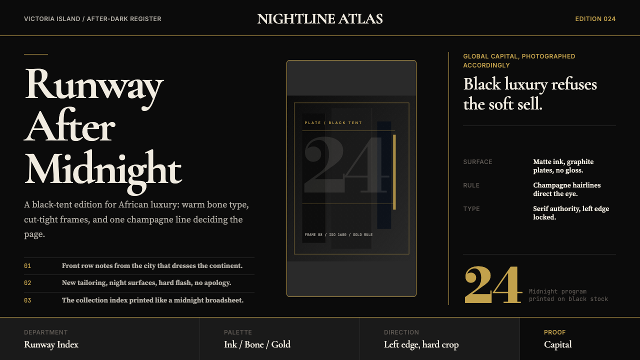 Lagos Fashion WeekBlack luxury speaks plainly. Matte ink, bone serif, and one gold hairline set…黑色奢华直截了当:哑光墨底、骨白衬线与一道金色发丝线定调。
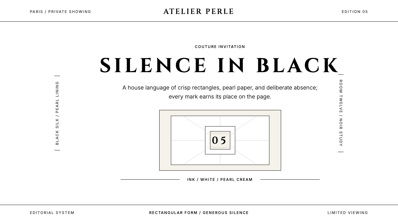 ChanelLuxury needs no color. Black on white, pearl-cream warmth, geometric capitals…百年宣言:真正的奢华无需色彩。纯黑配纯白,唯一的偏移是珍珠乳白——克制即气场。
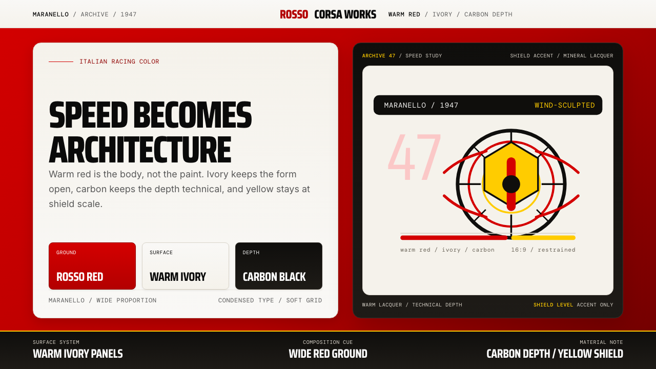 Ferrari Rosso Corsa (1947)Speed becomes architecture. Racing red, warm ivory, and carbon-black panels.速度化为建筑。赛车红、暖白面板与碳黑层次。
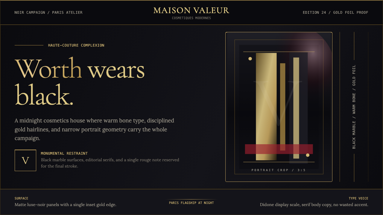 L'Oréal Paris CosmeticsMonumental restraint. Black marble fields, gold Didone type, and narrow portr…纪念碑式克制:黑色大理石场域、金色Didone字与窄幅肖像几何。
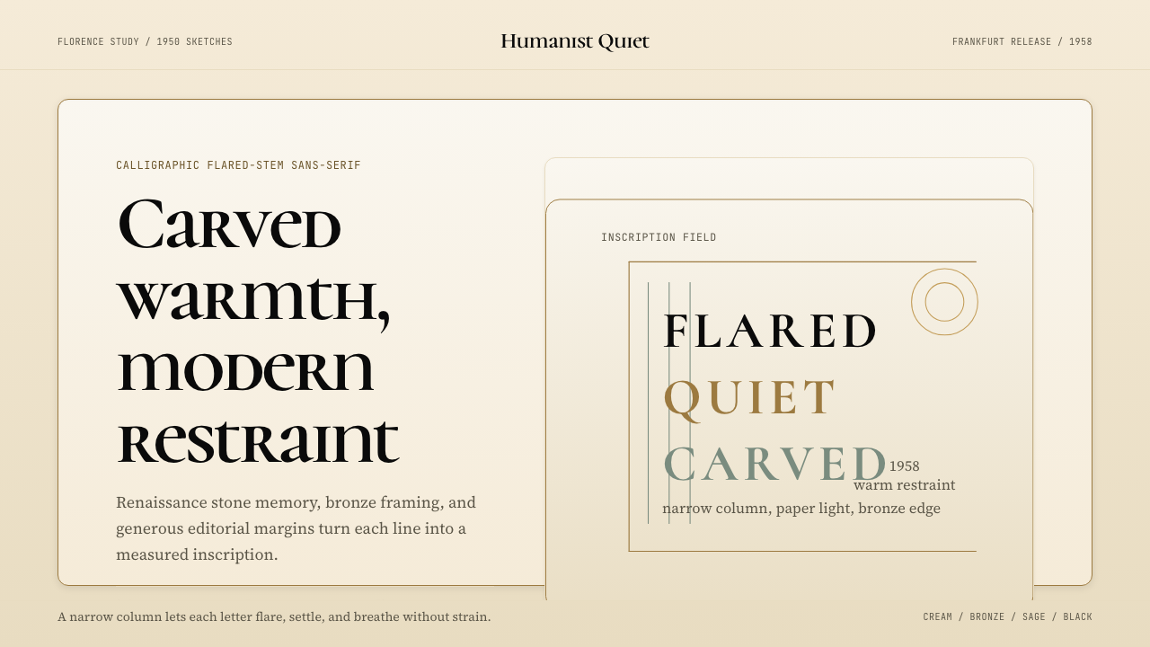 Optima (Hermann Zapf, 1958)Calligraphic calm, cut in cream and bronze. Narrow margins let the letters br…书法般的宁静。奶油底、青铜点缀、窄栏留白让字形呼吸。
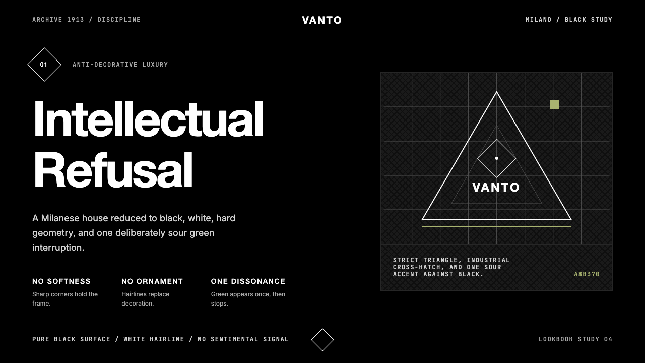 Prada Milan MinimalistLuxury refuses ornament. Pure black, austere sans, and one sour green hairlin…奢华拒绝装饰:纯黑、冷峻无衬线与一根涩绿细线。