What is Lagos Fashion Week?什么是 Lagos Fashion Week?
Lagos Fashion Week fuses African luxury and editorial restraint into an ink-black visual language where a single gold hairline says everything ornament never could.拉各斯时装周将非洲奢华与编辑克制熔于一炉,以墨黑视觉语言诉说一切——而那道金色发丝线,胜过所有装饰所能言说的。
Lagos Fashion Week in briefLagos Fashion Week 速览
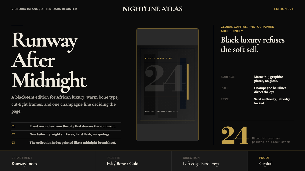
Lagos Fashion Week is both an annual fashion event and a fully realized visual identity — a design language that distils the energy of Africa's most closely watched fashion calendar into an editorial register of ink-black surfaces, bone-white text, and brushed champagne-gold hairlines. The aesthetic reads like a luxury broadsheet printed at midnight on Victoria Island: authoritative, tightly cropped, and free of anything that does not earn its place on the page.拉各斯时装周既是一年一度的时装盛事,也是一套完整的视觉语言体系——将非洲最受瞩目的时装日程所蕴含的能量,浓缩为墨黑底面、骨白文字与拉丝香槟金发丝线构成的编辑语言。这套美学如同在维多利亚岛午夜付印的奢华大报:权威、紧裁,毫无赘余。
The visual system is built on deliberate restraint. Where most fashion-week identities compete for attention through color and spectacle, Lagos Fashion Week operates through contrast and precision. Dark grounds carry warm, legible type. A single metallic accent — drawn as a hairline rather than a filled shape — organizes the eye without decorating the space. Runway photography is cropped hard, foregrounding fabric and silhouette rather than venue atmosphere. The result is a presentation language that treats Lagos as a global capital deserving the same rigorous editorial treatment as Paris or Milan.这套视觉系统建立在刻意的克制之上。大多数时装周视觉识别依赖色彩与奇观争夺注意力,拉各斯时装周却以对比与精准为武器。深色底面承载温暖可读的文字;单一金属质感的强调色——以发丝线而非填充形状呈现——引导视线却不装点空间。T台摄影硬切裁剪,令面料与廓形而非场馆氛围走上前台。最终呈现出一套视觉语言,将拉各斯视为配得上巴黎、米兰同等严苛编辑标准的全球都市。
Crucially, the style is not simply a dark version of a generic luxury template. It carries a specific cultural posture: confident, unhurried, and aware of its own significance. The warmth of the bone-white text against the matte-black ground avoids the cold sterility of many high-fashion identities. The gold accent is restrained enough to feel earned rather than decorative. This balance — between cool editorial authority and warm human presence — is what distinguishes the Lagos Fashion Week aesthetic from its peers.关键在于,这种风格并非通用奢侈模板的深色版本,而携带着特定的文化姿态:自信、从容,对自身分量了然于胸。骨白文字在哑光黑底上散发的温暖,规避了许多高级时尚视觉识别惯有的冷峻疏离。金色强调色的克制令它显得有所担当,而非纯粹装饰。这种平衡——编辑权威的冷静与人文在场的温度之间——正是拉各斯时装周美学有别于同类的所在。
See the Lagos Fashion Week design system查看 Lagos Fashion Week 完整设计系统
Where does Lagos Fashion Week come from?Lagos Fashion Week 从何而来?
Lagos Fashion Week was founded in 2011 by Omoyemi Akerele, a fashion entrepreneur and advocate whose central conviction was that West African designers deserved the same international platform as those in London, New York, or Tokyo. In its early years the event operated primarily as a showcase and networking vehicle, bringing together Lagos-based designers, buyers, press, and an emerging class of African fashion consumers who were increasingly looking to their own cities rather than to Europe for style authority. The visual identity of these early editions was relatively conventional — a professional but not yet distinctive presence on the global fashion calendar.拉各斯时装周由时装企业家与倡导者奥莫耶米·阿科雷莱于2011年创立,其核心信念是:西非设计师理应享有与伦敦、纽约或东京设计师同等的国际平台。活动创办初期主要作为展示与交流平台,汇聚拉各斯本地设计师、买手、媒体,以及日益壮大的非洲时装消费群体——这批消费者越来越多地转向本土城市,而非欧洲,寻找风格权威。早期几届的视觉识别相对传统,在全球时装日程上的存在称得上专业,却尚未形成独特面貌。
Between 2018 and 2024 the visual identity underwent a sustained consolidation that produced the bold matte-black editorial language the event is now known for. This shift reflected a broader maturation in Lagos creative culture. The city's art, music, and fashion communities — centred on the neighborhoods of Victoria Island, Lekki, and Ikoyi — had developed a self-assured visual vocabulary that no longer needed to borrow from European templates. Diaspora-editorial photography, which staged Nigerian designers' work in the same uncompromising documentary register as global luxury brands, became the dominant visual mode. The decision to anchor the identity in an ink-black ground was itself a statement: luxury in Lagos does not need white space and natural light to assert its credentials.2018年至2024年间,视觉识别经历了持续的整合与演进,形成了如今广为人知的大胆哑光黑色编辑语言。这一转变折射出拉各斯创意文化的整体成熟。这座城市的艺术、音乐与时装社群——以维多利亚岛、莱基、伊科伊为中心——已发展出一套自信的视觉词汇,无需再借鉴欧洲模板。侨民编辑摄影以与全球奢侈品牌同等严苛的纪录风格呈现尼日利亚设计师的作品,成为主导视觉模式。以墨黑底面锚定视觉识别,本身便是一种宣言:拉各斯的奢华,不需要借助白色空间和自然光来证明自身的分量。
The event's visual evolution also tracked the rise of post-Afropolitan visual culture — a sensibility that moves past celebrations of African heritage toward a fully contemporary, globally connected urban aesthetic rooted in African cities on their own terms. Where Afropolitanism of the early 2010s often negotiated between African cultural specificity and Western legibility, the post-Afropolitan moment asserts that Lagos, Nairobi, Accra, and Abidjan are themselves the reference points. The Lagos Fashion Week aesthetic embodies this confidence: it does not explain itself or invite translation. It assumes fluency.这场视觉演进同样追踪着后非都市主义(post-Afropolitan)视觉文化的兴起——这种感性超越了对非洲文化遗产的颂扬,走向以非洲城市自身为坐标系的完全当代、全球联结的都市美学。2010年代初期的非都市主义(Afropolitanism)往往在非洲文化特殊性与西方可读性之间斡旋调和;而后非都市主义时刻则断然声明:拉各斯、内罗毕、阿克拉、阿比让本身就是参照点。拉各斯时装周的美学体现了这种自信:它不作解释,不寻求翻译,它假定观者已具备流利的理解能力。
The designers who have shown at Lagos Fashion Week over its history have shaped the aesthetic as much as any deliberate identity decision. Kenneth Ize, whose hand-woven aso-oke textiles were later carried by global stockists and worn by international celebrities, brought a commitment to surface depth and material specificity that informed how the event's photography framed fabric and texture. Tokyo James developed a sharp-shouldered, deliberately architectural tailoring that translated into the hard-lined, high-contrast editorial framing the identity now favors. Lisa Folawiyo's jewel-toned Ankara print work established the premise that African textile traditions could support unambiguous luxury positioning. Together, these designers built the visual argument that the identity's graphic language then articulated in print and digital form.历届在拉各斯时装周展示作品的设计师,对这套美学的塑造不亚于任何刻意的视觉识别决策。肯尼思·伊泽以手工编织的阿索-奥克(aso-oke)面料享誉国际,其作品后来在全球门店上架、被国际名流穿着,他对表面深度与材料特异性的执着,影响了活动摄影呈现面料与质感的方式。东京·詹姆斯以利落肩线、刻意强调建筑感的剪裁闻名,这种硬朗线条转化为视觉识别现在所青睐的高对比度编辑框架。丽莎·福拉维约的宝石色调安卡拉印花作品,确立了非洲纺织传统完全可以支撑毫不妥协的奢侈品定位这一命题。这些设计师共同建立起视觉论点,而视觉识别的图形语言则在印刷与数字形式中将其清晰表达。
What defines the Lagos Fashion Week look?Lagos Fashion Week 的视觉特征是什么?
Ink-Black Ground墨黑底面
The dominant surface is a deep, matte black — not a near-black or dark navy, but a fully saturated ink tone with no warmth or coolness added to soften it. This ground establishes the editorial register immediately: it reads as deliberate and luxurious rather than simply dark. All other elements are deployed against this ground, and the ground itself is treated as an active compositional element rather than neutral negative space. It absorbs decoration and returns authority.主导底面是深沉的哑光黑——并非接近黑的深色或深海军蓝,而是完全饱和的墨色调,不添加任何暖色或冷色来柔化它。这一底面立即确立了编辑语言的基调:它读来是刻意的、奢华的,而非单纯的深暗。所有其他元素均在此底面上展开,底面本身被视为主动的构图元素,而非中性的负空间。它吸收装饰,还之以权威。
Gold Hairline Accent金色发丝线强调
The single most distinctive mark of the visual system is a fine metallic line — drawn at the narrowest weight a medium can reliably reproduce — in a brushed champagne-gold tone. This line never fills shapes or forms backgrounds; it functions solely as a directional or structural device, separating text blocks, underlining headings, or framing a photographic crop. The restraint with which it is used is essential: one hairline carries more authority than a gold field precisely because it costs something compositionally to deploy it.这套视觉系统最具辨识度的标志,是一根极细的金属质感线条——以媒介可稳定再现的最细线重绘制,呈拉丝香槟金色调。这根线条从不填充形状或构成背景,仅作为方向性或结构性装置:分隔文字块、为标题加下划线,或框定照片裁切边界。克制地使用它至关重要:一根发丝线所承载的权威,恰恰源于在构图中运用它需要付出的代价。
Bone-White Typography骨白衬线字体
Body text and supporting copy are set in a warm off-white — closer to bone than to pure white — that prevents the glare and visual fatigue of full-contrast white-on-black reading. Headlines use a high-contrast serif with pronounced stroke variation: thick verticals, thin horizontals, bracketed serifs. These letterforms carry a broadsheet authority that pure sans-serif could not achieve. Alignment is consistently hard left; centered text is absent except in the most formal single-line contexts.正文与辅助文案以温暖的非纯白色排版——更接近骨白而非纯白——以避免纯黑白高对比阅读带来的刺眼感与视觉疲劳。标题采用高对比度衬线字体,笔画粗细变化显著:粗重竖笔、纤细横笔、带托脚的衬线。这些字形承载着纯无衬线字体无法达到的大报权威感。对齐方式始终为硬左对齐;居中文本仅出现在最为正式的单行场合。
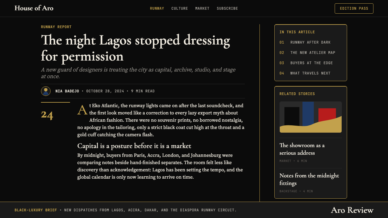
Hard-Cropped Runway Photography硬切裁剪的T台摄影
Photography is treated as a primary design element rather than an illustrative supplement. Images are cropped aggressively — often cutting off hands, feet, or background entirely — to isolate the garment's silhouette, textile surface, and construction detail. The editorial framing is close and deliberate, treating runway photography with the same exacting compositional logic applied to a still-life or a sculpture. The dark ground and the photography operate in tension: the image provides warmth and specificity, the ground provides authority and frame.摄影被视为主要设计元素而非说明性补充。图像被激进裁切——往往完全截去双手、双脚或背景——以隔离服装廓形、织物表面与工艺细节。编辑框架紧凑而刻意,以对待静物或雕塑同等严苛的构图逻辑处理T台摄影。深色底面与摄影之间形成张力:图像提供温度与特异性,底面提供权威与框架。
Restrained Metallic Warmth克制的金属温度
The gold accent introduces a temperature into the palette — a warmth that prevents the identity from reading as merely cold or corporate. The specific tone is champagne rather than yellow-gold or rose-gold: desaturated enough to read as metallic and material rather than as a bright color, warm enough to suggest luxury and occasion. This single temperature note does the emotional work that a secondary color might do in a more expansive palette, but it achieves it through restraint rather than addition.金色强调色为色板注入了一种温度——一种令视觉识别免于沦为冷峻或企业化的温暖。这个特定色调是香槟金,而非正黄金或玫瑰金:去饱和度足以令其读来像金属质感与材质,而非明亮的色彩;温暖程度足以暗示奢华与场合。这单一的温度音符完成了更丰富色板中的次要色所要承担的情感工作,但它以克制而非叠加来实现。
Left-Anchored Editorial Layout左锚定编辑版面
Layouts are organized with a strong left axis: headlines, standfirsts, captions, and credits all root to the same left margin, creating a reading path that the eye follows without instruction. The right side of the composition is used for photographic area or open ground rather than competing text. This hard-left architecture gives the system its broadsheet quality and allows headline type to run large without the composition becoming chaotic. It also communicates confidence: a layout that left-aligns everything trusts its content to hold attention without theatrical framing.版面以强劲的左轴组织:标题、导语、图注与出处行统一根植于同一左边距,形成视线无需指引便能追随的阅读路径。构图右侧留给摄影区域或开阔底面,而非竞争性文字。这种硬左对齐的架构赋予系统大报气质,并允许标题文字以大号呈现而不使构图陷入混乱。它同样传递出一种自信:将所有内容左对齐的版面,相信自己的内容足以在无需戏剧性框架的前提下抓住注意力。
Zero Decorative Ornament零装饰纹样
There are no borders, no repeated patterns, no floral or geometric decorative motifs, no textured backgrounds, no watermark graphics. Every element present has a structural or communicative justification. The gold hairline is not decoration — it is punctuation. The matte ground is not a stylistic choice alone — it is a surface that forces the eye to the content. This discipline is harder to maintain than it appears: the temptation in luxury design is always to add, to layer, to signal richness through accumulation. The Lagos Fashion Week aesthetic signals richness through removal.没有边框,没有重复图案,没有花卉或几何装饰纹样,没有纹理背景,没有水印图形。每个存在的元素都具备结构性或传达性依据。金色发丝线不是装饰——它是标点。哑光底面不仅仅是风格选择——它是一个迫使视线聚焦于内容的表面。这种自律比看起来更难维持:奢侈品设计的诱惑始终是添加、叠加、以积累来传递丰盛感。拉各斯时装周的美学则以删减来传递丰盛。
See the Lagos Fashion Week design system查看 Lagos Fashion Week 完整设计系统
Who shaped Lagos Fashion Week?谁塑造了 Lagos Fashion Week?
Akerele founded Lagos Fashion Week in 2011 and has served as its creative and strategic director ever since. Her background in fashion business and advocacy — she also founded Style House Files, a fashion business development organization — shaped the event's dual identity as both a commercial platform and a cultural statement. Her conviction that African fashion deserved international parity, not merely international curiosity, is embedded in the editorial seriousness of the visual identity she oversaw. Under her leadership the event grew from a regional showcase to a fixture on the global fashion calendar.阿科雷莱于2011年创立拉各斯时装周,此后一直担任其创意与战略总监。她在时装商业与倡导领域的背景——她同时创立了时装商业发展机构Style House Files——塑造了这场活动的双重身份:既是商业平台,也是文化宣言。她相信非洲时装理应获得国际对等地位,而非仅仅引发国际好奇,这一信念嵌入在她所主导的视觉识别的编辑严肃性之中。在她的领导下,这场活动从地区性展示成长为全球时装日程上的固定节点。
Ize is among the Lagos Fashion Week alumni most associated with the event's international breakthrough. His work centers on hand-woven aso-oke — a traditional West African textile — reimagined in contemporary silhouettes and presented through a visual language that refuses to frame it as craft or folk art. The meticulous surface quality of his textiles, and the way they photograph against dark grounds, directly influenced the identity's emphasis on tight-cropped, texture-focused runway imagery. His later collaborations with international houses and his consistent presence on European fashion media demonstrated that the Lagos Fashion Week platform could generate designers with genuine global footprint.伊泽是与拉各斯时装周国际突破最为紧密相连的校友之一。他的作品以手工编织的阿索-奥克——西非传统面料——为核心,以当代廓形重新演绎,并通过拒绝将其定义为工艺品或民间艺术的视觉语言呈现。他织物精细的表面质感,以及它们在深色底面前的摄影效果,直接影响了视觉识别对紧裁剪、以质感为焦点的T台影像的强调。他后来与国际时装屋的合作以及在欧洲时装媒体上的持续曝光,证明了拉各斯时装周平台能够培育具有真实全球影响力的设计师。
James built a reputation for architectural tailoring — sharp shoulders, precise construction, an insistence on garments that hold their form without the body inside them. His runway presentations at Lagos Fashion Week were among the most photographically striking, because the strong silhouettes and controlled color work translated directly into the high-contrast editorial framing that became the event's visual signature. His work also demonstrated that Nigerian menswear could carry the same conceptual weight and commercial ambition as tailoring traditions associated with London or Milan.詹姆斯以建筑感剪裁闻名——利落肩线、精准工艺、执着于即便无人穿着也能保持形态的服装。他在拉各斯时装周的T台展示是摄影效果最为震撼的一批,因为强劲的廓形与受控的色彩直接转化为活动视觉标志性的高对比度编辑框架。他的作品同时证明,尼日利亚男装完全可以承载与伦敦或米兰裁缝传统同等的概念分量与商业抱负。
Folawiyo's label Jewel by Lisa established a new visual grammar for Ankara — the brightly colored wax-print cotton fabric common across West Africa — by pairing it with intricate embellishment, precise tailoring, and a presentation language borrowed from European luxury. Her work was instrumental in shifting the conversation about African textiles away from cultural preservation and toward unambiguous luxury positioning. The visual richness of her textiles, and the restraint with which they were presented against clean, dark grounds in Lagos Fashion Week photography, helped establish the principle that African surface pattern could coexist with editorial cool.福拉维约的品牌Jewel by Lisa为安卡拉——西非常见的鲜艳蜡染棉质面料——建立了一套新的视觉语法:将其与繁复装饰、精准剪裁,以及借鉴自欧洲奢侈品的呈现语言相结合。她的作品在推动有关非洲面料的对话从文化保护转向明确奢侈品定位方面居功至伟。她织物的视觉丰富性,以及在拉各斯时装周摄影中将其克制地呈现于干净深色底面前的方式,帮助确立了非洲表面图案可以与编辑式冷静并存的原则。
How do you use Lagos Fashion Week today?今天怎么用 Lagos Fashion Week?
Lagos Fashion Week is among the most legible dark-ground editorial styles available to contemporary designers, because its logic is clear and its constraints are productive. Applying it correctly requires understanding what each element is doing: the matte-black ground establishes authority; the bone-white text provides warmth and readability; the gold hairline provides structure without decoration; the tight-cropped photography provides specificity and texture. Remove or dilute any one of these, and the system starts to drift toward generic dark luxury.拉各斯时装周是当代设计师可用的最易读深色底面编辑风格之一,因为它的逻辑清晰,它的限制富有生产力。正确应用它,需要理解每个元素的功能:哑光黑底面确立权威;骨白文字提供温度与可读性;金色发丝线提供结构而不装点空间;硬切裁剪的摄影提供特异性与质感。削弱或稀释其中任何一个,整个系统便开始向通用深色奢华飘移。
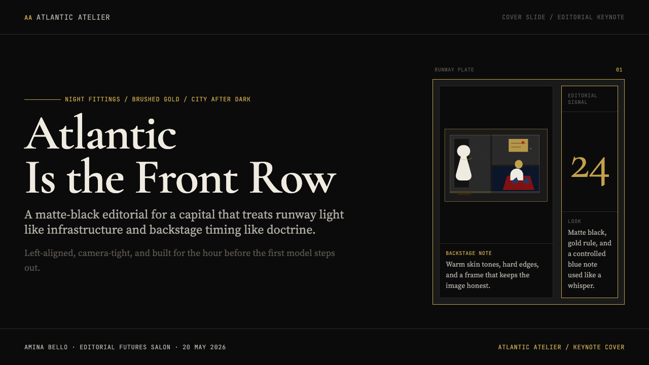
For presentation slides, the style works powerfully on both cover and content pages. A cover built in this register should use the full dark ground, set the event or project title in a large serif with strong weight contrast — heavier strokes, lighter crossbars — aligned hard left, with a single gold hairline separating the title from a subtitle or date. Content slides should resist the temptation to add color: hierarchy is established through scale and weight alone. A section heading runs large; supporting text runs small; a hairline separates them. Data slides — bar charts, comparison tables — should treat the chart elements as editorial objects, using the bone-white and gold tones for data marks against the dark ground, with no decorative gridlines beyond those that carry quantitative meaning.对于演示文稿,这种风格在封面页与内容页上都具有强烈感染力。以此语言构建的封面应使用完整的深色底面,以笔画粗细对比强烈的大号衬线字体——粗重竖笔、纤细横笔——硬左对齐排列活动或项目标题,以一根金色发丝线将标题与副标题或日期隔开。内容页应抗拒添加色彩的诱惑:层级仅凭尺寸与字重建立。章节标题以大号排布;支持性文字以小号跟随;发丝线在两者之间分隔。数据页——柱状图、对比表格——应将图表元素视为编辑对象,以骨白与金色调在深色底面上标记数据,除承载量化意义的线条外不添加任何装饰性网格线。
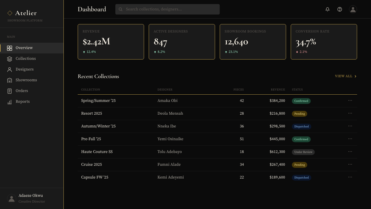
For web dashboards and pricing pages, the style demands discipline. A dark-ground interface built in this register should use the bone-white for all primary copy, reserve the gold exclusively for the single most important interactive or navigational element on any given view — a primary button, an active tab indicator, a pricing tier marker — and use no secondary accent colors. The absence of soft shadows and rounded corners is important: card components should have hard edges or be defined by hairline borders rather than depth simulation. Navigation should be typographic, with generous spacing between items and no icon decoration beyond minimal geometric indicators.对于网页仪表板与定价页面,这种风格要求严格自律。以此语言构建的深色底面界面,应将骨白用于所有主要文案,将金色专门保留给任意给定视图中最重要的单一交互或导航元素——主要按钮、活跃标签指示符、定价等级标记——且不使用任何次要强调色。避免柔和阴影与圆角至关重要:卡片组件应具有硬边,或以发丝线边框而非深度模拟来定义边界。导航应当是字体性的,各项目之间留有充裕间距,除最小限度的几何指示符外不添加图标装饰。
For editorial and marketing applications, the style is most powerful when it trusts negative space. A Lagos Fashion Week-inspired editorial layout gives the headline room to breathe: large, high-contrast serif type against the dark ground, with nothing competing in the same zone. Pull quotes are set in a slightly warmer or lighter weight to differentiate from headlines without introducing a new color. Marketing pages work well when they alternate between a full dark-ground section featuring photography and a lighter section — bone or deep charcoal rather than white — for text-heavy content. The gold hairline recurs as a consistent structural device across both: same weight, same color, same positioning logic.对于编辑与营销应用,当这种风格信任留白时最具力量。受拉各斯时装周启发的编辑版面为标题留出呼吸空间:大号高对比度衬线字体在深色底面上铺展,同一区域内没有任何竞争性元素。引用文字以略微更温暖或更轻的字重排布,以区别于标题而不引入新的色彩。营销页面在特色深色底面摄影区块与较浅区块——骨白或深炭灰而非白色——之间交替,处理文字密集的内容时效果最佳。金色发丝线在两者之间作为一贯的结构性装置反复出现:相同线重、相同色调、相同的定位逻辑。
The most common mistake when applying this style is treating the gold accent as a general highlight color rather than a precision instrument. Once gold appears on more than one or two elements per composition, it loses its authority and starts to feel like gilded decoration rather than editorial punctuation. A related error is choosing a yellow-gold or bright metallic rather than the specific champagne-brushed tone: too warm and it reads as opulent excess; too cool and it reads as silver, which carries an entirely different register. A third failure mode is allowing photography to skew light or colorful: imagery that introduces bright backgrounds or saturated secondary colors will fight the dark ground rather than sit within it.应用这种风格时最常见的错误,是将金色强调色视为通用高亮色而非精准仪器。一旦金色在每个构图中出现超过一两处,它便失去权威,开始给人以镀金装饰而非编辑标点的观感。相关的错误是选用正黄金或明亮的金属色而非特定的香槟拉丝色调:过暖则读来是奢华的过度堆砌;过冷则读来是银色,承载着完全不同的语境。第三种失败模式是允许摄影偏向明亮或色彩丰富:引入明亮背景或高饱和次要色彩的图像,将与深色底面相互抵触,而非融入其中。
See the Lagos Fashion Week design system查看 Lagos Fashion Week 完整设计系统
Lagos Fashion Week — FAQLagos Fashion Week · 常见问题
Is this style only appropriate for fashion-related projects?这种风格只适合时装相关项目吗?
No. The Lagos Fashion Week aesthetic is a visual system built on contrast, restraint, and editorial authority — qualities that transfer readily to finance, technology, culture, and luxury goods. Any project that wants to communicate seriousness, global ambition, and a refusal to court easy approval will find the style well-suited. Where it does not fit is in contexts that require warmth, accessibility, or bright visual energy: consumer-facing applications with broad demographic reach, children's products, and brands whose identity depends on approachability will find the style's authority register alienating rather than reassuring.并非如此。拉各斯时装周的美学是一套建立在对比、克制与编辑权威之上的视觉系统——这些品质可以轻易迁移至金融、科技、文化与奢侈品领域。任何希望传达严肃性、全球抱负以及拒绝讨好易得认可的项目,都会发现这种风格颇为合适。它不适合的场景包括:需要温暖感、易达性或明亮视觉能量的场合——面向宽泛受众的消费者应用、儿童产品,以及品牌认同依赖亲切感的项目,会发现这种风格的权威感令人疏离而非安心。
How do you introduce warmth without breaking the dark editorial register?如何在不打破深色编辑语言的前提下引入温度感?
The key is working within the palette's existing warmth rather than adding a new warm color. The bone-white text already carries warmth relative to pure white; the champagne-gold hairline carries warmth relative to silver or cool gray. Within photography, selecting images that feature warm skin tones, natural fabrics, or warm studio lighting introduces human temperature without disrupting the compositional logic. Increasing the weight or size of the bone-white type relative to the dark ground also adds warmth through presence. What breaks the register is adding a tertiary color — any brown, warm red, or terracotta — because it signals a different design system entirely.关键在于挖掘色板自身已有的温度,而非引入新的暖色。骨白文字相对于纯白已经携带温度;香槟金发丝线相对于银色或冷灰也携带温度。在摄影选择上,优先选用呈现温暖肤色、天然面料或暖调棚拍光线的图像,可在不干扰构图逻辑的前提下引入人文温度。相对于深色底面增大骨白字体的字重或尺寸,也能通过存在感增添温度。破坏语言体系的操作是添加第三种色彩——任何棕色、暖红或赤陶色——因为这会传递出截然不同的设计系统信号。
Can this style work in a light-background version?这种风格能以浅色背景版本呈现吗?
A light inversion is possible but requires significant adjustment. The matte-black ground is not simply a container — it is the source of the aesthetic's authority and its luxury register. On a light ground, that authority must come from different means: strong weight contrast in the typography, hard-edged composition, and a very controlled use of the gold accent on a cream or warm white surface rather than black. The result will be closer to a traditional luxury broadsheet than to the Lagos Fashion Week register specifically. If a light variant is required, it is better to think of it as a complementary system — used for long-form text or print applications — while preserving the dark version as the primary identity expression.浅色反转版本是可能的,但需要大幅调整。哑光黑底面不仅仅是一个容器——它是这套美学的权威感与奢华语境的来源。在浅色底面上,这种权威必须借助不同手段来实现:字体排印中强烈的字重对比、硬边构图,以及在奶油色或暖白色底面上对金色强调色极其克制的使用。结果将更接近传统奢华大报,而非拉各斯时装周特有的视觉语言。若需要浅色变体,更好的做法是将其视为互补系统——用于长篇文字或印刷应用——同时保留深色版本作为主要的视觉识别表达。
What makes a gold accent feel editorial rather than decorative or ostentatious?怎样让金色强调色呈现编辑感而非装饰感或炫耀感?
Three factors determine whether gold reads as editorial or as excess. First, the tone: a desaturated, slightly warm metallic — champagne or antique gold — reads as material and considered; a bright or highly saturated gold reads as costume jewelry. Second, the form: a hairline or thin rule reads as punctuation; a filled shape, gradient, or textured gold reads as decoration. Third, the frequency: gold that appears once per composition reads as a decision; gold that appears repeatedly reads as a motif, which shifts the register from editorial to ornamental. Applying all three disciplines — correct tone, linear form, single deployment — is what keeps the accent within the system's logic.三个因素决定金色读来是编辑性的还是过度的。其一是色调:去饱和的、略微偏暖的金属色——香槟金或古董金——读来像材质与考量;明亮或高饱和的金色读来像廉价首饰。其二是形态:发丝线或细线条读来像标点;填充形状、渐变或纹理质感的金色读来像装饰。其三是频率:在每个构图中出现一次的金色读来像一个决定;反复出现的金色读来像一种纹样母题,这将语境从编辑性转向装饰性。同时遵守这三项原则——正确色调、线性形态、单次运用——才能让强调色保持在系统逻辑之内。
How does this style relate to other African visual aesthetics?这种风格与其他非洲视觉美学有何关联?
The Lagos Fashion Week visual identity is deliberately not a celebration of African visual heritage in the conventional sense. It does not draw on Adinkra symbols, kente geometry, or the bright color palettes associated with West African textile traditions. Instead, it represents a post-Afropolitan position: a visual language developed by and for a globally connected African urban creative class that takes its own sophistication for granted. This is a significant cultural distinction. The style's relationship to African aesthetics is one of confidence rather than reference — it assumes its audience needs no translation or explanation, just as a Milan-based fashion identity assumes fluency in the conventions of European luxury without citing them.拉各斯时装周的视觉识别刻意不是对非洲视觉遗产的传统意义上的颂扬。它不援引阿丁克拉(Adinkra)符号、肯特(kente)几何图案,或与西非纺织传统相关联的明亮色板。相反,它代表了一种后非都市主义立场:一套由全球联结的非洲都市创意阶层为自身发展的视觉语言,它将自身的精致视为理所当然。这是一个重要的文化区分。这种风格与非洲美学的关系是自信而非引用——它假定受众无需任何翻译或解释,正如一个米兰时装视觉识别假定受众已对欧洲奢华惯例了然于胸,无需加以引证。
Related design styles相关设计风格
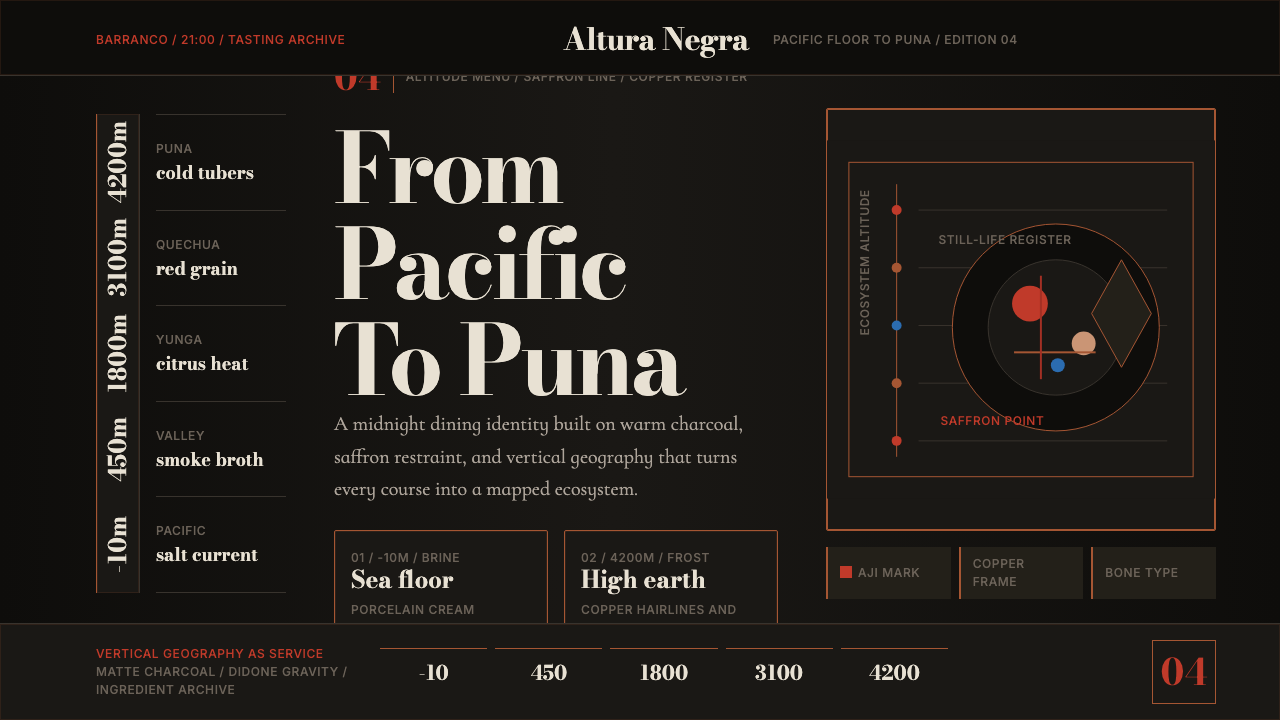 Lima Nuevo Andino CuisineAltitude turns luxurious. Charcoal fields, copper hairlines, and saffron-red…奢华来自海拔:炭黑底、铜发丝线与藏红花红纵向节奏。
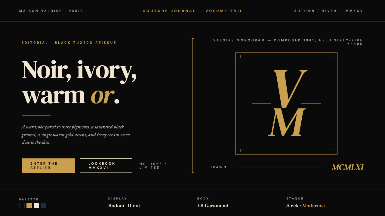 Yves Saint Laurent (YSL)Couture chiaroscuro. Saturated black ground, warm gold accent, Didot serif at…高级时装的明暗对照法:饱和深黑底色、暖金点缀、Didot 衬线大字号——克制即…
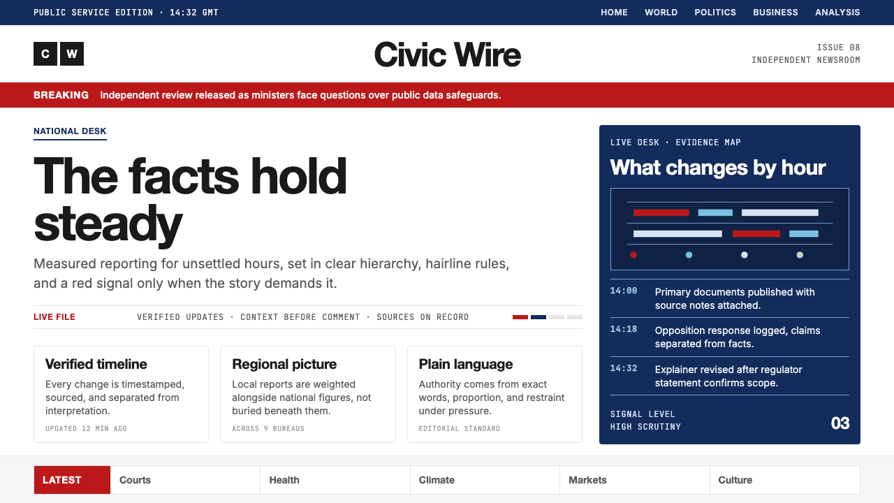 BBC NewsPublic trust, stripped bare. Red alerts, deep navy and hairline grids make ur…公共信任被剥至纯粹:红色警示、深海军蓝与发丝网格,让紧迫保持事实感。
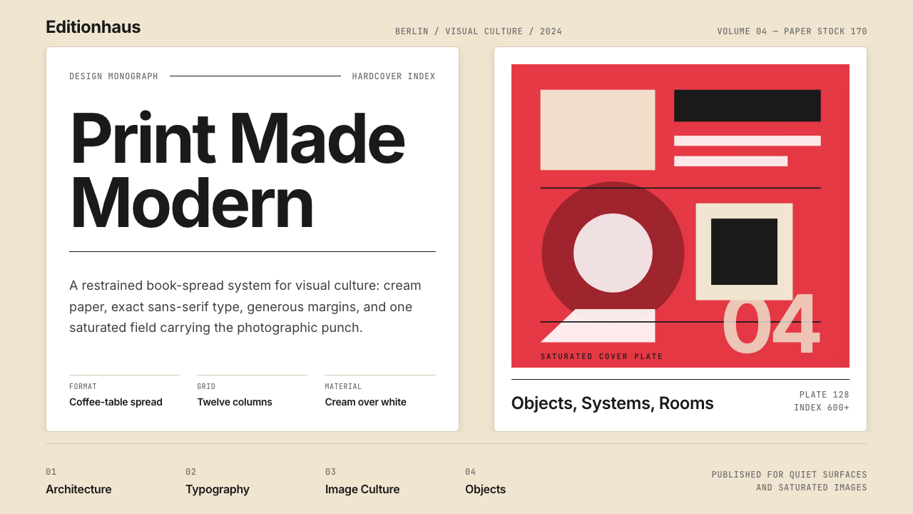 Gestalten Design BookCoffee-table calm. Cream paper, tight sans, one saturated block, and a strict…咖啡桌式冷静。奶油纸、紧凑无衬线、单一高饱和色块与严格网格。
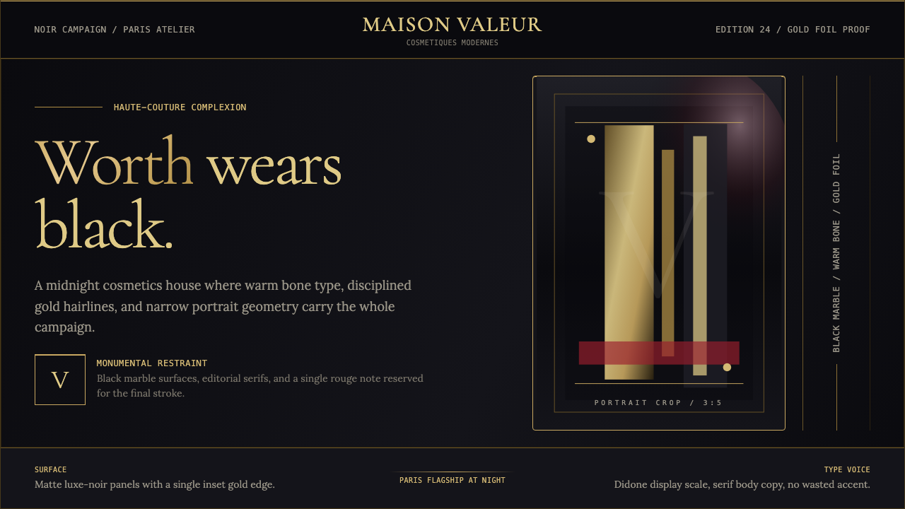 L'Oréal Paris CosmeticsMonumental restraint. Black marble fields, gold Didone type, and narrow portr…纪念碑式克制:黑色大理石场域、金色Didone字与窄幅肖像几何。
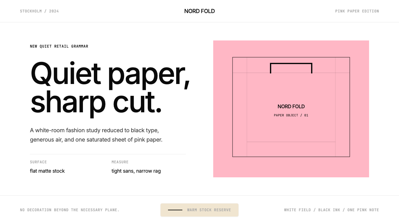 Acne Studios Pink-PaperQuiet luxury in one pink plane. Inter type floats on white with a bag-like re…粉色平面定义安静奢华:Inter 黑字漂浮于白场,像一只纸袋。