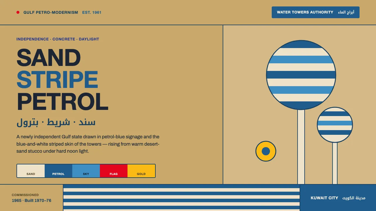
About Kuwait Oil-Era Modernism
Kuwait Oil-Era Modernism captures the optimism of a newly independent Gulf state in the 1960s and 70s — when oil revenue funded a wave of reinforced-concrete civic architecture and crisp bilingual signage set in flat modernist sans. The visual language is the blue-and-white striped skin of the Kuwait Water Towers rising from warm desert-sand stucco bases.
The system pairs petrol-blue and sky-blue stripe bands with the daylight warmth of sand stucco, punctuated by flag-red and flat-gold accents. Type is clean Helvetica caps for Latin, Noto Kufi Arabic for the bilingual signage, and Archivo for grotesque body and UI.
- Origin
- Middle East — Kuwait City, Persian Gulf
- Era
- 1950–1990 (independence 1961; Kuwait Water Towers commissioned 1965, built 1970–76)
- Key figures
- Sune Lindström · VBB (Vattenbyggnadsbyrån) · Kuwait Oil Company identity team · Kuwait Petroleum International
- Movements
- Gulf petro-modernism · Mid-century corporate identity · Post-independence civic modernism
Kuwait Oil-Era Modernism design spec
Colors
Typography
The other 11 sections — buttons, cards, spacing, motion, techniques and more — open once you unlock. Download the DESIGN.md or send it to your AI in one click. Unlock once, yours forever.
Sign up nowStyles similar to Kuwait Oil-Era Modernism
Also inspired by architecture & places, with a close feel.
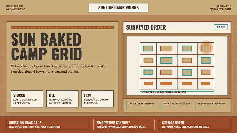 Dhahran Aramco Camp ModernismDesert order, sun-baked. Ochre stucco fields, terracotta bands, turquoise trim.
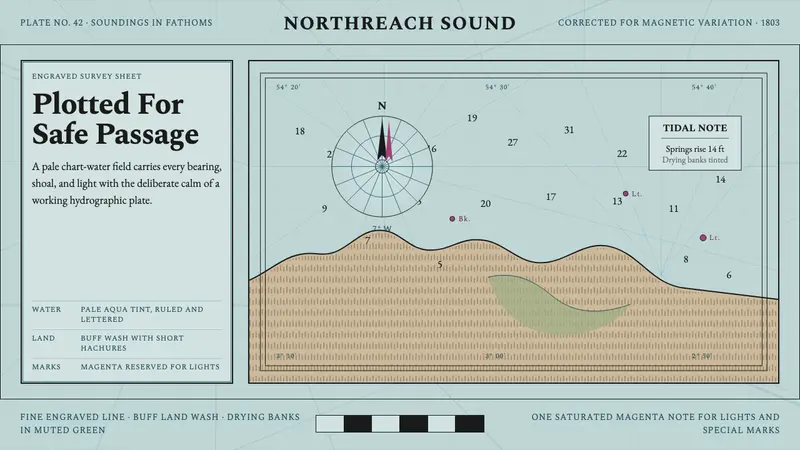 Admiralty Sea ChartSurvey authority, engraved. Aqua chart water, black soundings, buff land, one magenta mark.
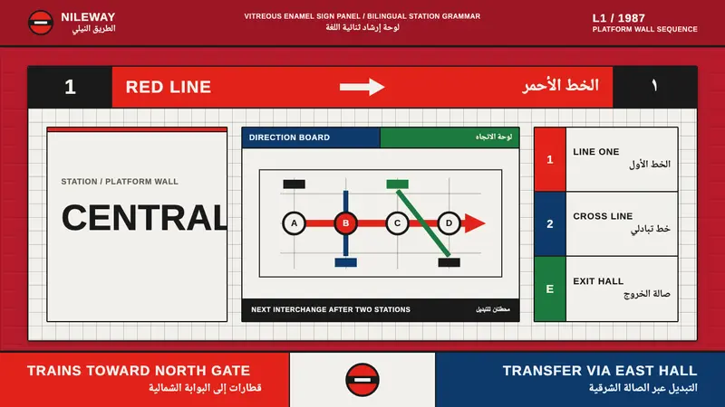 Cairo Metro WayfindingAuthority at speed. Enamel red, Arimo grids, and co-equal Arabic signage.
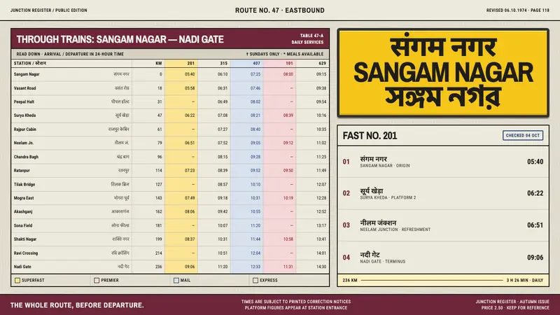 Indian Railways TimetableDensity becomes direction. Hairline tables on grey pulp meet signal-yellow enamel type.