What is Java Tourism Poster 1930?
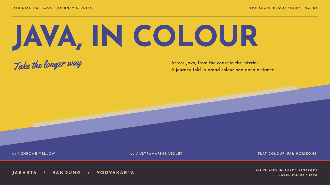
A 1930s travel poster sold distance as colour: a yellow sky, a violet temple, a silver aircraft on the diagonal, and not a single shadow.
Java Tourism Poster 1930 in brief
Java Tourism Poster 1930 is a design style modelled on the work of Jan Lavies, who drew posters for the Dutch East Indies travel trade between the mid 1920s and the end of the 1930s. Its reference sheet is a 1938 poster, Fly to Java, for the airline K.N.I.L.M.: a top half filled with chrome yellow, the temple of Borobudur cut as a single flat ultramarine-violet shape, and a chromed aircraft crossing the picture on the diagonal.
The poster is a lesson in how much can be done without modelling. Nothing on the sheet is shaded, outlined or lit. Every form is a contour filled with one flat offset ink, and the whole image is assembled from a handful of such shapes. Depth is produced by scale, overlap and the temperature of the colours, with warm yellow advancing and cool violet withdrawing, so that distance is made by arrangement rather than by drawing perspective.
The lettering follows the same discipline and arrives in two registers. A monoline script is laid at an angle across the colour field, like handwriting on a postcard, while geometric capitals are set wide in a solid band at the foot, like the plate on a machine. As a design system, the style keeps all of this: flat colour, diagonal movement, four inks and no more, and lettering that does one job at a time.

Where does Java Tourism Poster 1930 come from?
Jan Lavies began drawing for the Dutch East Indies travel trade in 1925. The project record lists his clients in order: first the shipping line KPM, the Koninklijke Paketvaart-Maatschappij, then the hotel association, and finally the airline K.N.I.L.M. That sequence is a map of the way a visitor reached Java and stayed there: by ship, by hotel, and later by air. The period the style draws on runs from 1925 to 1940.
The 1938 sheet, Fly to Java, is the reference for the style. Its composition is simple enough to describe in a sentence and exact enough to copy: the sky as a field of chrome yellow occupying the upper half, the temple of Borobudur reduced to one ultramarine-violet silhouette, an aircraft in a bright metallic tone cutting across it from corner to corner. The message is the airline's, which is speed, but the picture does not show speed with blur or streaks. It shows it with a diagonal and a clean flat shape.
Behind the poster is a Dutch commercial modernism. Designers of the interwar Netherlands, working in the tradition known as Nieuwe Zakelijkheid, or New Objectivity, moved applied art toward clarity: geometric lettering, reduced shapes, plain colour and a preference for the factual over the ornamental. Commercial posters were one of the main places where that approach met the public, because a poster has a few seconds to deliver a message. Lavies belongs to that world, and his work shows how a modern, functional language could still be seductive.
The medium shapes the look as much as the movement does. These posters were printed by lithography, in which each ink is printed from its own plate and the colour areas are flat and hard-edged. A designer working this way thinks in separate layers of colour and draws shapes that can be printed cleanly, without gradations. It is also worth noting the context: the posters were made for the travel trade of a colonial territory and show Java as a destination for visitors. A design system that borrows the look should keep that viewpoint in mind.
What defines the Java Tourism Poster 1930 look?
Chrome yellow sky
The upper half of the sheet is a single, saturated chrome yellow, warm and slightly heavy, with the density of a pigment rather than the lightness of a screen glow. It acts as sky, sun and heat all at once, and it sets the emotional temperature of the whole image. Because it is flat and large, it has no need for clouds or gradients. In a layout it works as the dominant field, which everything else must read against.
Ultramarine-violet silhouettes
Against the yellow, forms are cut as flat shapes in a cool ultramarine-violet. The temple is a single mass with a recognisable outline, its tiers read as steps in the silhouette and not as modelled stone. The cool colour is the counterweight to the warm field: it recedes, it anchors the image, and it gives type something dark to sit on. Only the outline carries information, so the shape must be strong and instantly readable.
The diagonal
Movement comes from the diagonal. The aircraft crosses the picture from corner to corner, ultramarine planes are cut at oblique angles, and the script lettering is laid at a slant. A level horizon would suggest stillness, so the composition avoids it. The diagonal is the poster's way of saying travel, and in a layout it organises the eye: entry at one corner, exit at the opposite, with the destination placed in between.
Contours filled with one ink
Each shape is a contour filled with a single flat ink. There are no strokes around the shapes, no shadows beneath them, no highlights on top. Edges are crisp because the colour simply stops. This is the logic of lithographic printing, and it makes every object read as a clean cut-out. A screen interpretation should avoid outlines, blurs and glows altogether, and let the boundary between two colours do the work of drawing.
Monoline script at an angle
The first lettering register is a script written in a line of even thickness, like pen or brush drawn with constant pressure. It is laid across the colour field at an angle, in the way someone might write across a photograph. It carries the warm, personal part of the message, such as the invitation or the destination name. Because the stroke does not vary in weight, it remains simple and lively at once, and it sits comfortably on a flat field.
Geometric caps in a solid band
The second register is a line of geometric capitals, set wide and placed in a solid band across the foot of the sheet. Letters are built from circles, straight lines and clean angles; the spacing is generous and even; and the band behind them is a flat block of colour that ends the composition like a base. This register carries the factual information, such as the carrier and the place, and its calm regularity balances the energy above it.
Four inks and flat space
The whole poster is held to four flat inks, and the restriction is the point. Distance is built from the arrangement of those inks: warm against cool, large against small, overlapping against separate. Where a photograph would show haze, the poster uses a change of colour. Every additional colour would erode the clarity, so variety comes from shape and scale. In a digital system, the palette is small, named and used consistently.

Who shaped Java Tourism Poster 1930?
Jan Lavies is the designer behind the style. According to the project record, he began drawing for the Dutch East Indies travel trade in 1925, working for the shipping line, the hotel association and the airline in turn. His 1938 Java sheet is the reference. What he shows is how far a few flat shapes, a small palette and well-placed lettering can go, and he did it in a medium that left no room for decoration.
The airline for which the 1938 poster was made, named in the record alongside Lavies. A poster for an airline has a particular job, which is to make a long journey feel short and attractive. The aircraft crossing the sheet on the diagonal is the carrier's proposition in a single gesture. For the style, the airline is the origin of its sense of speed and its clean, metallic, forward-looking shapes.
The Royal Packet Navigation Company was the shipping line that gave Lavies his first major client in the travel trade. Its place in the story is the sea route, one leg of the journey that the hotel association and the airline completed. The same hand drawing for all three is part of why the style reads as a whole travel system and not a single advertisement.
How do you use Java Tourism Poster 1930 today?
Java Tourism Poster 1930 is a style for selling a journey, an event or a place with confidence and good humour. It is bright, optimistic and very legible, and it suits any subject that benefits from the feeling of departure. The principles to carry across are flat colour, diagonal movement and lettering with clear jobs. Used with discipline, it can make a page feel like a poster even on a screen.
For presentation slides, the cover is the natural home: a large yellow field filling the upper part of the slide, a single flat violet shape as the subject, a script title laid at an angle, and a band of wide-set capitals at the bottom. Content slides keep the band as a footer and use the field above for a short statement. Data slides use flat bars and wedges in the four inks, with the diagonal used as a trend line, and no outlines or shadows on any shape.
For web interfaces, the style fits travel, airlines, hospitality, events and destination services. A landing page can split its hero into a large yellow field and a violet silhouette, with the headline script slanted across them. Pricing tiers become flat coloured bands, each with a capital-letter label, and buttons are solid blocks with square corners. Navigation sits in the foot band or a thin top band, and icons are reduced to flat silhouettes in the same ink.
For editorial and marketing work, it supports travel features, itineraries, event posters, tourism campaigns and brochures. Images work best as flat silhouettes or cut-outs, and photographs should be treated as duotone shapes. Headlines in the angled script should be short, and the factual information goes into the capital band. The tone is welcoming and direct, and it is worth thinking carefully about whose point of view the imagery takes, so that destinations are presented with respect.
A common mistake is to add outlines, drop shadows or gradients to the shapes, which at once turns the poster into a generic vector illustration. Others are using more than four colours, centring everything, and setting the script in small sizes where it becomes hard to read. Mixing the two lettering registers at random, so that capitals appear in the script and script in the band, also removes the logic. The strongest versions are bold, simple and a little spare, with plenty of flat colour left alone.

Java Tourism Poster 1930 — FAQ
What is Nieuwe Zakelijkheid, and how does it relate to this style?
Nieuwe Zakelijkheid is the Dutch term for New Objectivity, a current in the interwar period that favoured the factual, the functional and the clear over ornament and sentiment. The project record lists it among the movements behind the style. In practice it means geometric lettering, simplified shapes and plain colour, and in a poster it explains why Lavies reduces a famous temple to one flat silhouette. The style is a commercial application of that way of thinking.
How can flat colour create a sense of distance?
With three tools: temperature, scale and overlap. Warm colours advance and cool colours recede, so a yellow field with a violet shape reads as sky behind a form. Larger shapes read as nearer than smaller ones. One shape overlapping another reads as in front of it. A poster in four flat inks can therefore feel deep without any shading. Add a diagonal and the eye travels through that depth rather than resting on a surface.
Why does the poster use two lettering registers?
Because the two registers do different jobs. The slanted monoline script is personal and expressive, and it speaks in the voice of invitation. The wide geometric capitals are impersonal and factual, and they name the carrier and the place. Keeping the jobs separate is what gives the sheet its clarity. In a layout, use the script for one short phrase at an angle, and reserve the capital band for the information a reader needs to act on.
Can the style work with a dark background?
Yes, with care. The reference is a light, warm poster in which a yellow sky does the work of daylight. A dark version can reverse the roles: let the ultramarine-violet become the field, treat the yellow as a sun or a band of light, and keep the shapes flat. The risk is that the sense of heat and openness is lost. Keep the colours saturated, the shapes simple, and the diagonal strong, and avoid adding glows.
How should I handle the colonial context of the original posters?
Acknowledge it. The originals were made for the travel trade of the Dutch East Indies and present Java from a visitor's point of view. The design language itself, with flat colour, diagonals and clean lettering, is transferable, but the imagery of people and places needs thought. Show destinations with respect, avoid exoticising stereotypes, and, where possible, work with local voices and images. Borrow the form, and be deliberate about the story it tells.
Related design styles
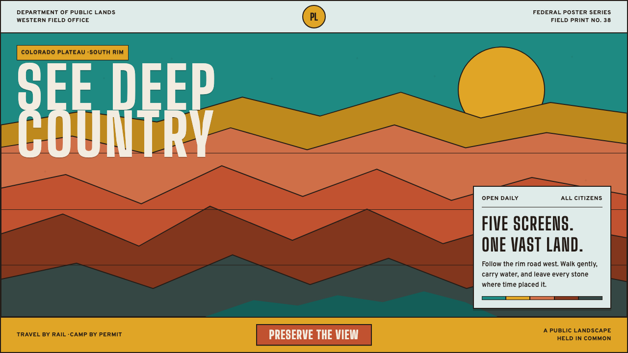 Grand Canyon WPA (1938)Public grandeur in five screens. Turquoise, ochre and terracotta stack in har…
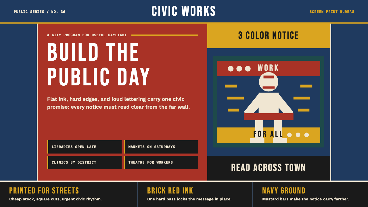 WPA Poster (Federal Art Project, 1936)Civic urgency in ink. Navy, brick red, mustard bands and Bebas Neue shout acr…
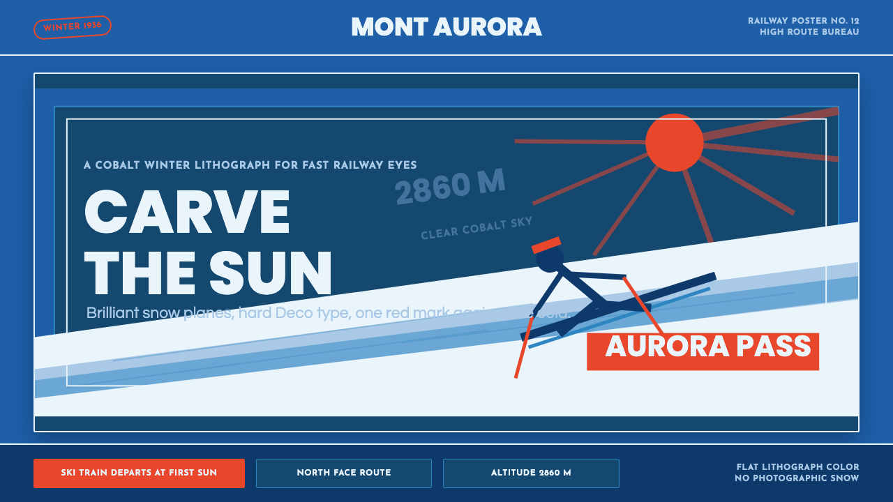 Alpine Ski PosterCold speed sells winter. Cobalt sky, snow planes, sun rays, and one resort-re…
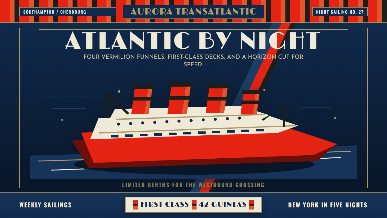 Cunard Liner PosterOceanic grandeur. Vermilion funnels, teak-gold caps, and a marine-blue poster…
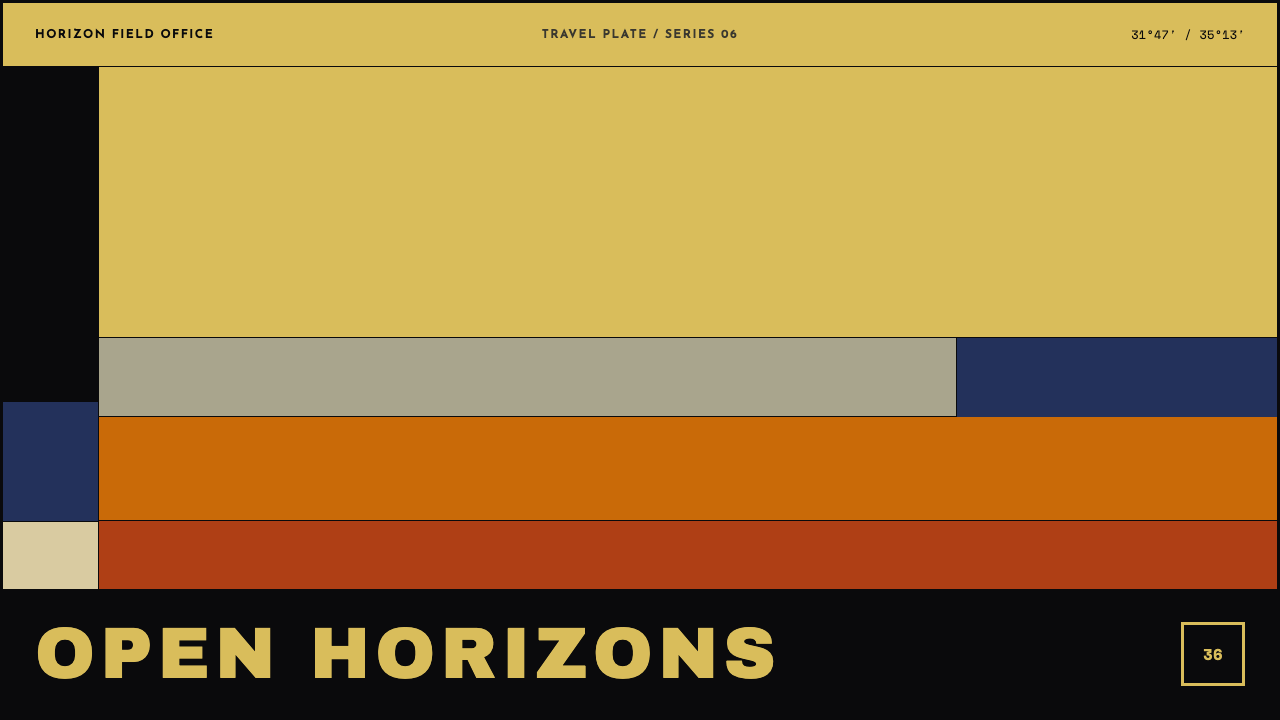 Eretz Israel Tourism PosterLandscape, reduced to conviction. Six flat litho planes cross a vast golden-o…
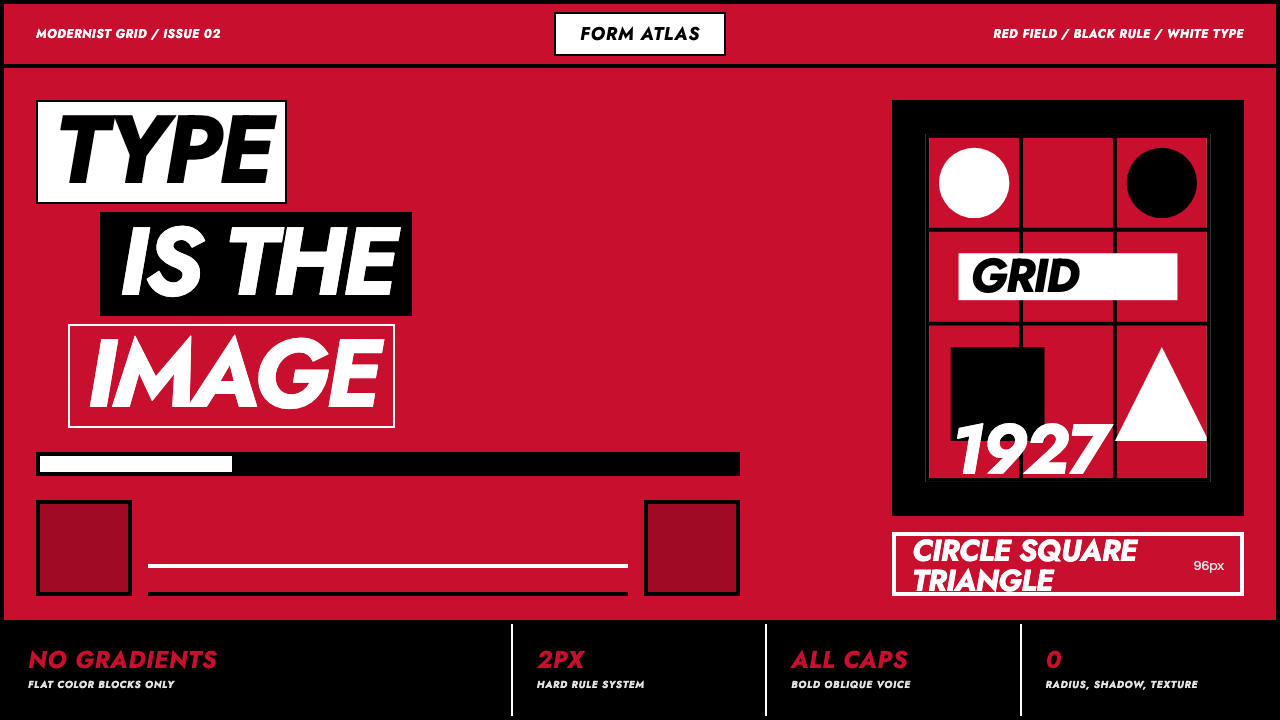 Futura Geometric PosterType becomes image. Red grid, white oblique Jost, black rules at poster scale.