What is Grand Canyon WPA (1938)?
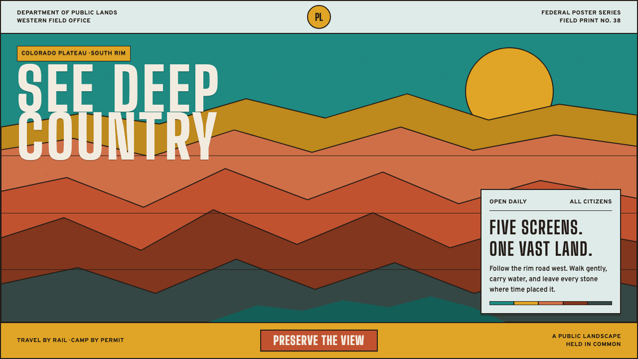
Grand Canyon WPA cuts one of the world's largest landscapes into five flat screens of unblended ink — public grandeur made cheap enough to print for every citizen and tack to a train-station wall.
Grand Canyon WPA (1938) in brief
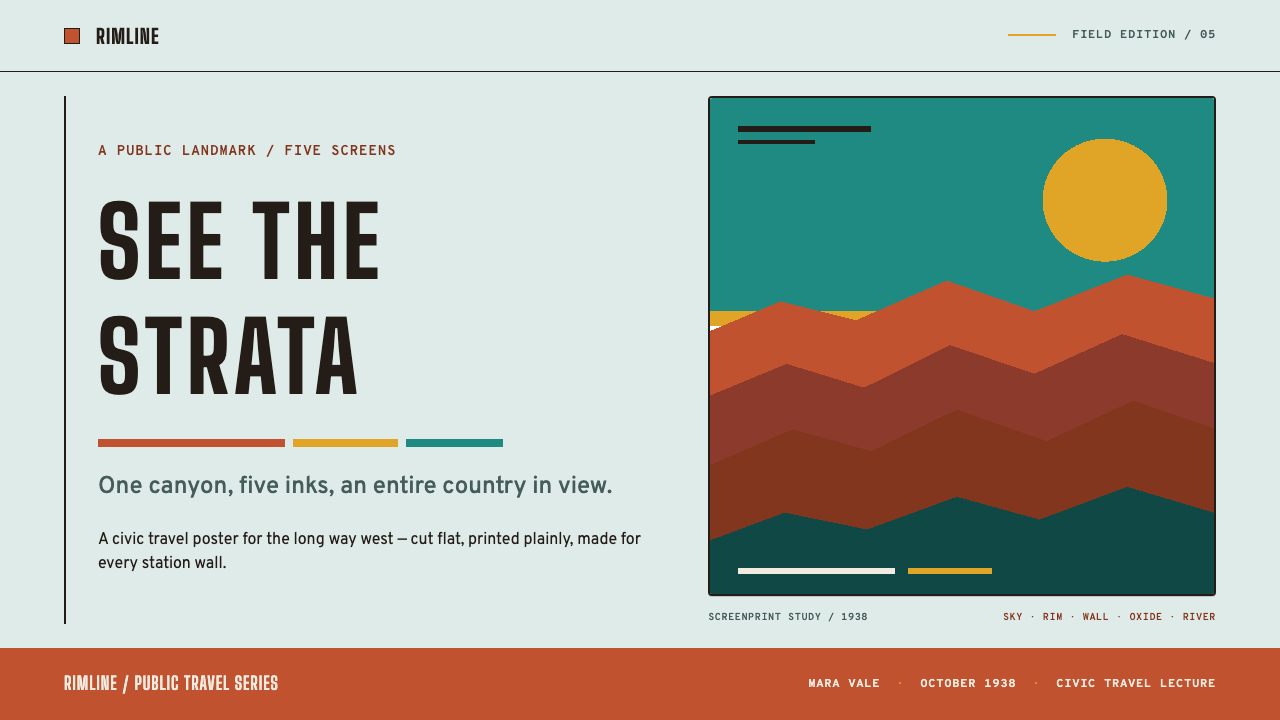
This is a system built from flat, unblended color printed in discrete layers rather than photographed or painted with continuous tone. A turquoise sky, an ochre canyon rim, and terracotta walls dropping through rust and mauve to a shadowed river are each their own printed screen — there is no gradient anywhere, because the medium itself, silkscreen printing, physically cannot produce one without another pass of the squeegee.
Every edge is a decision rather than an accident. Where one flat color layer ends and the next begins, the boundary is knife-clean, the exact mark left behind when a squeegee finishes one pass and lifts before the next color goes down. The canyon's geological strata become a structural metaphor for the printing process itself: the landscape is already made of stacked, discrete layers, and the medium simply reproduces that logic honestly.
Over the stacked color sits lettering built for public, civic legibility rather than elegance — condensed, all-caps, monumental, the kind of routed wood lettering found on a national park entrance sign. A single imperative verb typically anchors the composition, turning the image from a scenic view into a public call to action.
Where does Grand Canyon WPA (1938) come from?
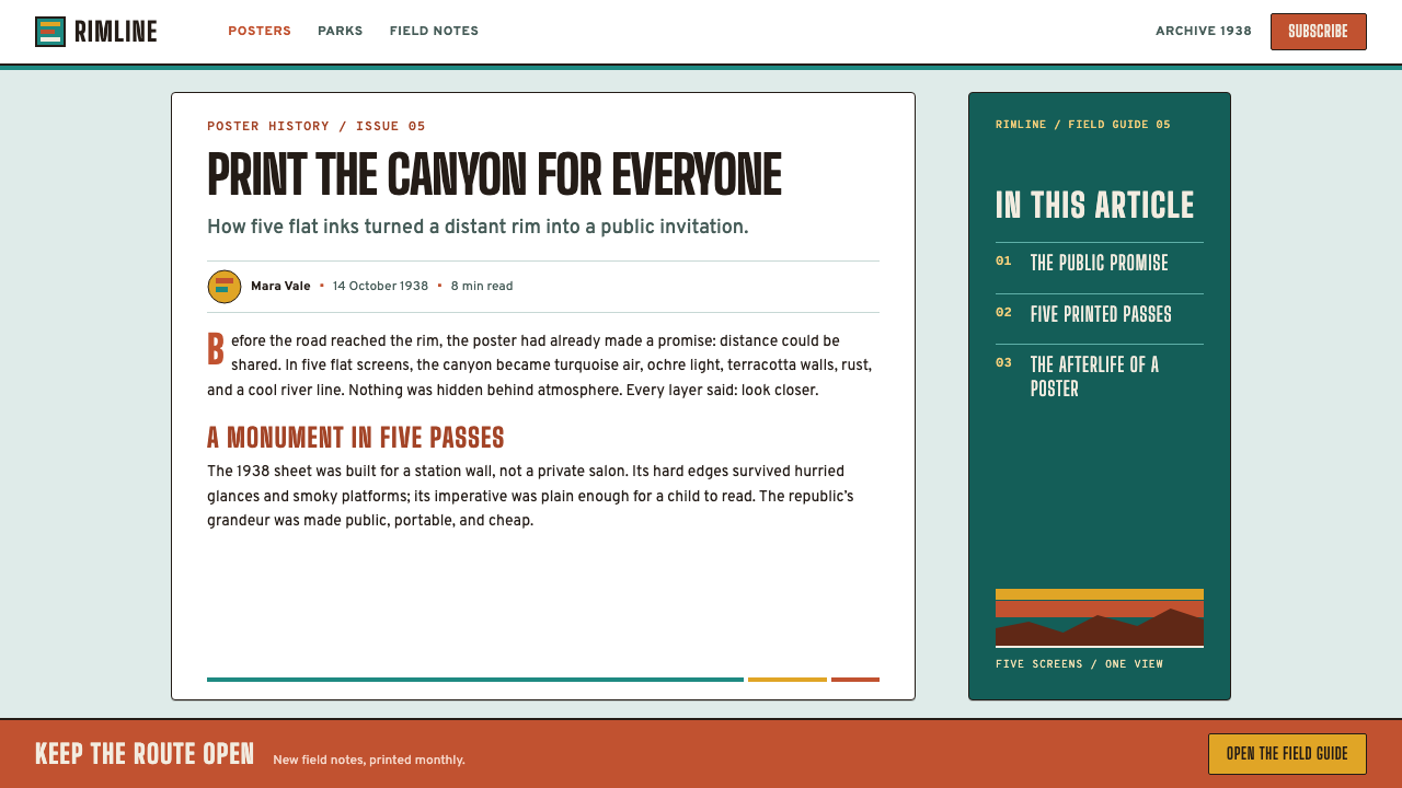
This system comes from the WPA Federal Art Project's poster division, active from 1935 to 1943 as part of the broader New Deal effort to employ artists during the Great Depression. The Grand Canyon 'See America' poster, produced in 1938, was one of hundreds of national park and public-works posters created by the program, all designed and printed in New York silkscreen workshops for distribution to the National Park Service and other government agencies.
Anthony Velonis pioneered the use of silkscreen printing as a fine-art and commercial-poster medium within the Federal Art Project, developing techniques and training other artists in a process that had previously been used mainly for signage and textiles. His advocacy for the medium is the direct reason these posters exist as flat, layered color rather than as painted or photographic images — silkscreen was cheap, fast to reproduce in quantity, and ideally suited to bold, simplified imagery.
Dorothy Waugh and Vera Bock were among the artists who worked within this program producing National Park Service posters, applying the silkscreen medium's flat-color logic to specific American landscapes. The project's broader administrative direction came from Holger Cahill, who ran the Federal Art Project and shaped its mission of bringing accessible, high-quality public art to ordinary citizens rather than treating art as an elite commodity.
The posters fell into obscurity after the program ended and were largely forgotten for decades, until park ranger Doug Leen rediscovered surviving examples and led an effort to restore, reprint, and popularize the National Park poster series later in the twentieth century — a revival that reintroduced this flat, screen-printed visual language to a contemporary audience and cemented its status as an iconic American public-design style.
What defines the Grand Canyon WPA (1938) look?
Stacked Flat Color
Turquoise sky, ochre rim, and terracotta walls descending through rust and mauve are each printed as their own discrete, unblended layer. There is no gradient anywhere in the system — every transition between colors is a hard edge, never a soft fade.
Knife-Clean Edges
Where one printed color layer ends and the next begins, the boundary is sharp and deliberate — the literal mark of a squeegee finishing one pass before the next color is applied. This is a structural feature of the medium, not a stylistic flourish added afterward.
Geological Palette
Colors are drawn directly from the canyon's own strata — turquoise, ochre, terracotta, rust, and mauve — rather than an invented decorative scheme. The palette reads as documentary rather than fanciful, even though the flat printing technique is highly stylized.
Ranger-Station Lettering
Type is condensed, all-caps, and monumental — the look of routed wood lettering found on a national park entrance sign. It is built for distance and public legibility, not for editorial elegance or personality.
Imperative Address
A single command verb typically anchors the composition, turning the image from passive scenery into an active civic message — the poster is addressing the viewer directly, not simply depicting a view for quiet contemplation.
Public Cheapness as Virtue
The system deliberately favors a small number of flat printed layers over expensive, detailed illustration, because it was designed to be reproduced cheaply and distributed widely. This economy of means is treated as a design virtue rather than a limitation — grandeur made accessible rather than exclusive.

Who shaped Grand Canyon WPA (1938)?
Velonis pioneered silkscreen printing as a fine-art and poster medium within the Federal Art Project, developing the flat-color, layered technique that defines this entire system and training other artists to use it for public-works imagery.
Waugh worked within the Federal Art Project's poster division producing National Park Service imagery, applying the program's flat, screen-printed visual language to specific American landscapes for public distribution.
Bock, another artist working within the Federal Art Project's poster program, contributed to the body of National Park Service posters produced through the same silkscreen workshops that produced the Grand Canyon image.
Cahill directed the Federal Art Project and shaped its broader mission of bringing accessible, high-quality public art to ordinary citizens rather than treating art as an elite commodity — the administrative philosophy behind this system's cheap, mass-reproducible format.
Leen, a park ranger, rediscovered surviving examples of the WPA National Park poster series decades after the program ended and led the effort to restore, reprint, and popularize them, reintroducing this flat, screen-printed style to a contemporary audience.
How do you use Grand Canyon WPA (1938) today?
This system rewards work that wants to feel public, civic, and accessible rather than exclusive or precious — applying it well means committing to a small number of flat, stacked color layers with hard edges rather than adding gradients or photographic detail.
For presentation slides, the style is strongest on cover pages built around a single flat-color landscape or geometric scene, condensed all-caps title text anchoring the composition like a park sign. Content slides should hold to a limited number of discrete color fields per slide, treating each as its own printed layer rather than blending; data slides work well as stacked horizontal bands of flat color, echoing the canyon's own geological strata.
For web interfaces, the palette and flat-layer logic suit civic, educational, environmental, and public-sector products where trust and accessibility matter more than luxury polish. A limited palette of earth tones with hard-edged color blocks for sections or cards reads as forthright and public-minded; condensed all-caps headers reinforce the civic, sign-like tone.
For editorial and marketing work, the system suits travel writing about national parks and public lands, environmental and conservation campaigns, and any brand storytelling built around civic pride and public access. Treat a hero image as a small number of flat color bands rather than a detailed photograph, and let a single imperative headline — a call to visit, to act, to see — anchor the composition the way it anchors the original poster.
The most common mistake is adding gradients, photographic texture, or a wide decorative color range in an attempt to make the image feel more 'natural.' Authentic WPA poster design depends on its flatness and hard edges — softening either one turns public poster grandeur into generic travel-brochure illustration.
Grand Canyon WPA (1938) — FAQ
Why does this system have no gradients anywhere?
The flatness is inherited directly from silkscreen printing itself: each color is applied as its own discrete screen pass, and producing a gradient would require additional, more expensive passes that the WPA program's cheap, mass-reproducible format was not built for. The hard edges are a feature of the medium, not a stylistic choice layered on top of it.
Why do the colors follow the canyon's actual geological strata?
The turquoise, ochre, terracotta, rust, and mauve tones are drawn from the canyon's real rock layers, giving the flat, stylized printing technique a documentary grounding. This keeps the poster's grandeur tied to an actual place rather than reading as an abstract or arbitrary color scheme.
Why is the lettering so plain and condensed compared to more decorative poster styles?
The lettering follows the logic of a national park entrance sign — routed wood letters meant to be read at a distance by the general public, not an elegant typographic flourish meant to be admired up close. This civic legibility is part of the program's broader mission of making public art genuinely accessible.
How is this different from generic vintage travel-poster styling?
Generic vintage travel posters often use a wider, more decorative color range and softer illustrative technique aimed at romanticizing a destination. This system is stricter: a small number of flat, unblended screen-printed layers with hard edges, drawn from a specific New Deal-era public-works program rather than a general nostalgic aesthetic.
Does this style suit modern commercial products, or is it strictly for civic and educational content?
It transfers well beyond strictly civic content to any brand that wants to signal accessibility, public-mindedness, or an outdoors and conservation ethos — travel gear, environmental products, cooperative or nonprofit organizations. It is a poor fit for luxury or premium-positioned products, since the entire system's value comes from looking cheap-to-produce and widely distributable rather than exclusive.
Related design styles
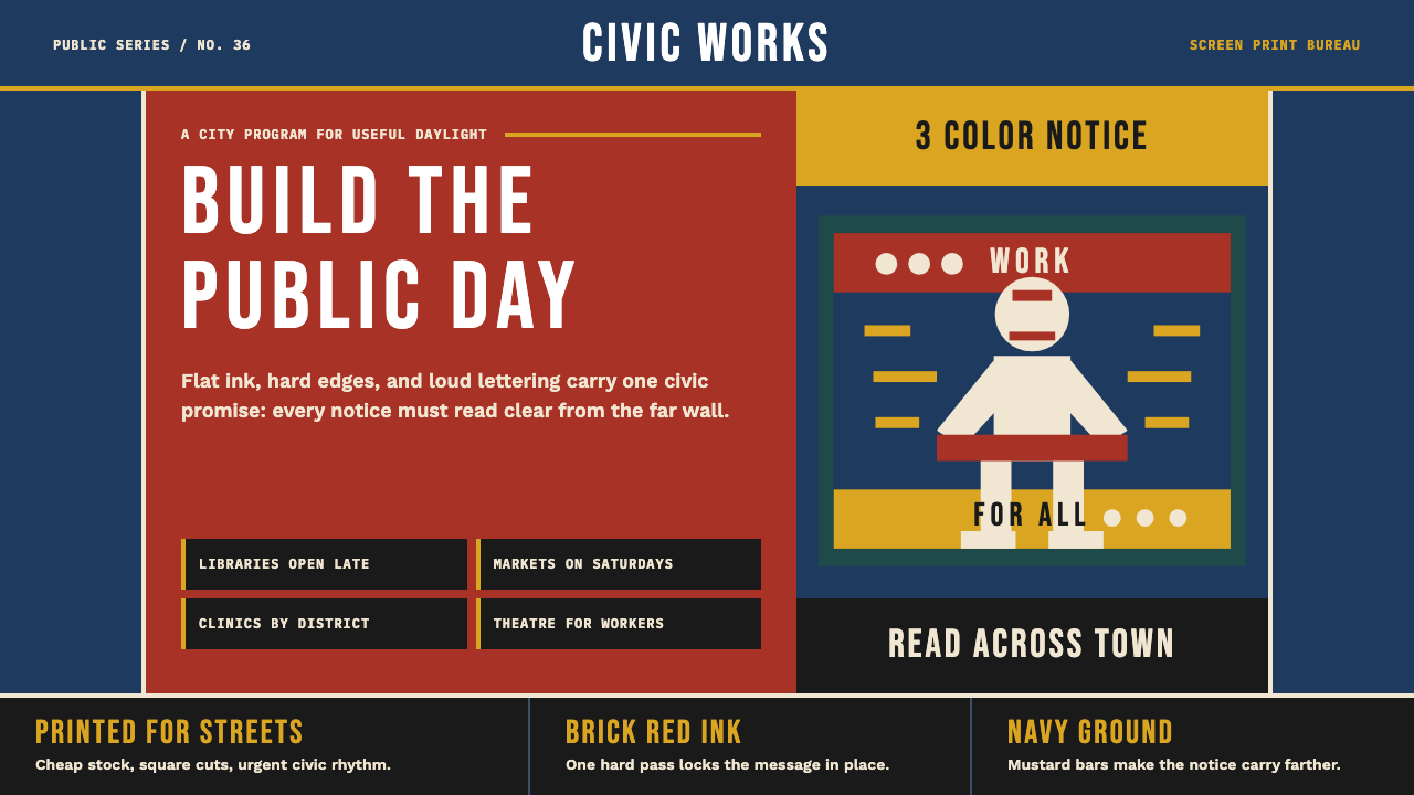 WPA Poster (Federal Art Project, 1936)Civic urgency in ink. Navy, brick red, mustard bands and Bebas Neue shout acr…
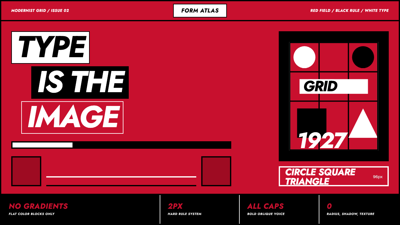 Futura Geometric PosterType becomes image. Red grid, white oblique Jost, black rules at poster scale.
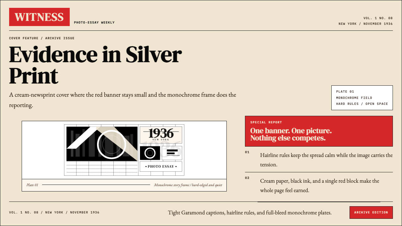 LIFE Magazine (Red-Banner)Photojournalism stripped bare. One red banner, cream newsprint, stark black p…
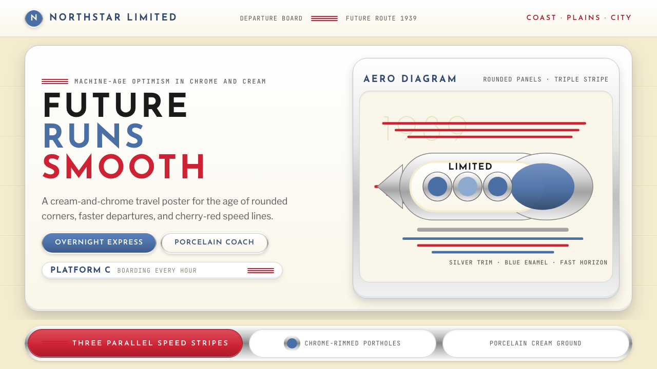 Streamline Moderne (1930s)Optimism made aerodynamic. Cream ground, chrome ovals, and cherry stripes dri…
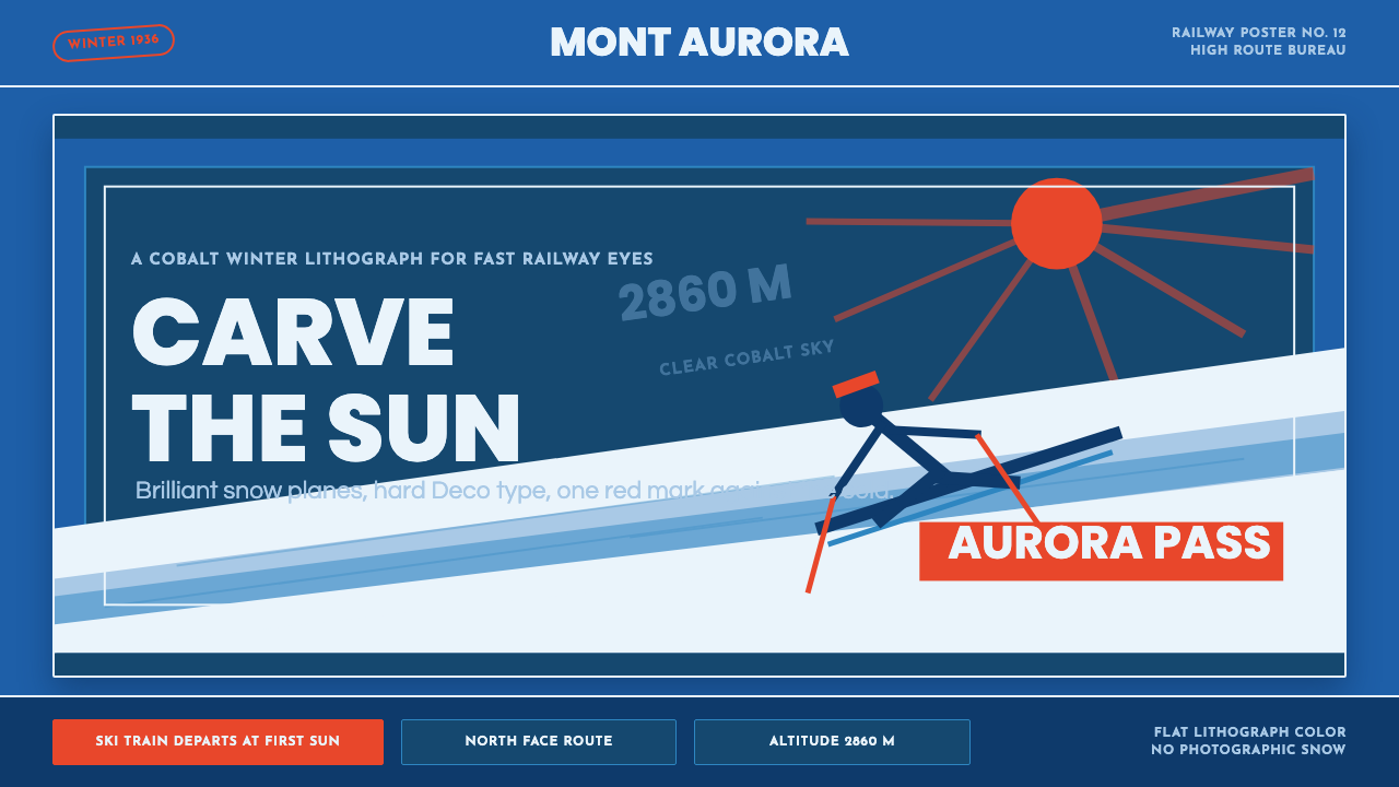 Alpine Ski PosterCold speed sells winter. Cobalt sky, snow planes, sun rays, and one resort-re…
 Cunard Liner PosterOceanic grandeur. Vermilion funnels, teak-gold caps, and a marine-blue poster…