What is Futura Geometric Poster?
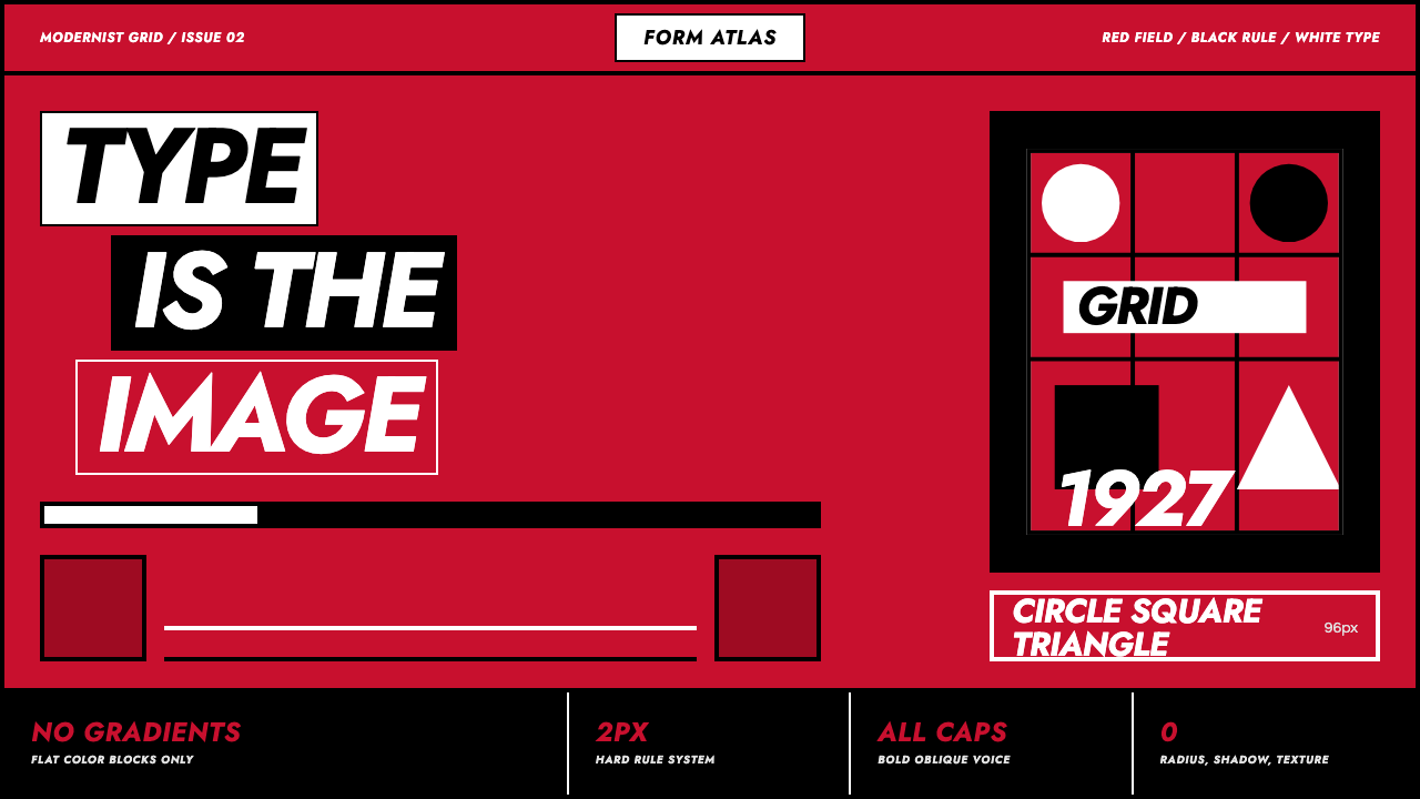
Futura Geometric Poster turns language into architecture — immense geometric letters, white oblique force, black rules, and a saturated red field compressed into one uncompromising image.
Futura Geometric Poster in brief
Futura Geometric Poster is a modernist poster idiom built around a simple proposition: type does not accompany the image; type is the image. Its vocabulary comes from Paul Renner’s Futura, the geometric sans associated with the New Frankfurt project and designed in 1927. Circles, triangles, squares, straight strokes, and sharply controlled curves give the letterforms the constructed appearance of objects drafted with compass and ruler.
The canonical composition places bold, oblique, often all-capital lettering on a saturated red field, with pure white providing immediate visibility and pure black supplying rules, blocks, or counterweight. The red is not a decorative accent around a neutral page. It is the dominant presentation surface, dense enough to behave like darkness while remaining chromatically intense. Large letters cross the grid like beams, and hard rules divide or fasten the verbal units.
Nothing atmospheric mediates the encounter. There are no gradients, shadows, textures, or modeled surfaces. Depth comes instead from scale, overlap, cropping, direction, and the tension between red, white, and black. Barbara Kruger’s use of white Futura Bold Oblique on flat red demonstrates the idiom’s later rhetorical power: geometric typography can act simultaneously as statement, image, and visual command.
Where does Futura Geometric Poster come from?
The typographic foundation appeared in Germany in 1927, when Paul Renner designed Futura in connection with the New Frankfurt project. The typeface belonged to the broader current of Western European geometric modernism associated with Bauhaus thinking and the New Frankfurt environment. Rather than preserve the irregularities of handwriting or historical ornament, its forms drew authority from elementary geometry: the circle, triangle, square, straight line, and disciplined curve.
This construction made Futura particularly compatible with modernist poster design. A poster had to organize words at public scale, and geometric sans typography allowed letters to behave as compositional material. A capital could become a vertical support, a round character could echo a perfect circle, and an oblique word could establish movement without illustration. Between 1900 and 1950, the modernist poster idiom increasingly treated the printed field as an active grid rather than a passive sheet carrying pictures and captions.
In the Futura Geometric Poster language, that modernist inheritance is concentrated into a severe red, white, and black system. Saturated red becomes the field; white lettering cuts through it; black rules impose order or interruption. Boldness makes words occupy physical territory, all-capital setting removes conversational softness, and obliqueness introduces pressure and direction. The result is not merely a specimen of a geometric typeface but a poster grammar in which reading and seeing occur at the same moment.
Barbara Kruger’s later use of white Futura Bold Oblique on flat red demonstrates how the idiom continued beyond its early European setting. Her treatment preserves the essential mechanism described by the style: assertive language, geometric sans lettering, sharp contrast, and a red field that turns text into an event. The continuity is visual rather than nostalgic. The poster does not imitate an old surface or reproduce period texture; it renews modernist directness by keeping the typography flat, oversized, and rhetorically unavoidable.
What defines the Futura Geometric Poster look?
Red as the Field
Saturated red occupies the role normally assigned to black or another dark ground. It fills the visual field rather than appearing as a small accent, giving the poster both chromatic heat and a dense presentation surface. White lettering gains maximum urgency against it, while black remains visibly distinct enough to act as a structural interruption. Weak, dusty, or ornamental reds dissolve this defining pressure.
Type as Image
Headlines are not labels placed above an illustration. They are the principal shapes in the composition. Oversized capitals may be cropped by the edge, split across zones, or arranged so that counters and stems become circles, bars, and wedges. Meaning remains readable, but the first encounter is spatial: the viewer sees a constructed mass before completing the sentence.
Geometric Sans Construction
Letterforms derive their character from circles, triangles, squares, straight strokes, and controlled curves. Futura’s compass-and-ruler appearance makes typography feel engineered rather than handwritten. The effect depends on clean silhouettes and decisive joins. Decorative flourishes, calligraphic contrast, or visibly organic irregularity weaken the relationship between alphabet and geometry.
Oblique Momentum
Oblique setting turns a static statement into a directional force. The letters seem to press forward across the grid, especially when rendered in bold capitals and extended into a long horizontal phrase. This inclination should feel structural and consistent, not playful or casually italicized. It supplies motion without animation, perspective, or pictorial action.
Unforgiving Grid
Every element appears locked to an underlying order. Alignment, repetition, and hard division determine where language begins, stops, and collides. The grid may produce asymmetric compositions, but it never feels casual. Empty areas remain active because their boundaries correspond to the same structure governing the letters and rules.
Black Rules and Blocks
Pure black functions as punctuation at poster scale. A rule can divide statements, halt the movement of an oblique headline, or bind separate units into one system. Black blocks provide counterweight to expanses of white type without simulating depth. Their edges remain hard, and their purpose is organizational rather than decorative.
Absolute Flatness
The surface contains no gradients, shadows, texture, or atmospheric modeling. Visual depth arises from scale changes, cropping, overlap, and color opposition alone. Perfect circles and rectangular fields remain plainly geometric rather than pretending to be physical objects. This flatness keeps attention on verbal force and compositional structure.
Who shaped Futura Geometric Poster?
Paul Renner designed Futura in 1927 in connection with the New Frankfurt project. His geometric sans provided the essential alphabet for this poster language: characters shaped by elementary circles, triangles, squares, straight strokes, and controlled curves. In poster use, those constructed forms can expand beyond ordinary reading scale and become the architecture of the page itself.
Barbara Kruger exemplifies the later rhetorical life of the idiom through white Futura Bold Oblique placed on flat red. In this treatment, language does not recede into neutral captioning. Its weight, inclination, contrast, and placement turn it into a direct visual address. Her use demonstrates how the geometric modernist mechanism can carry confrontation and urgency without abandoning flatness.
Bauhaus and New Frankfurt geometric modernism form the broader intellectual and visual setting for Futura Geometric Poster. Their shared emphasis on elementary form, geometric-sans typography, rational organization, and the rejection of surface embellishment made it possible for type to assume structural authority. The poster idiom concentrates those principles into a particularly forceful red, white, and black expression.
How do you use Futura Geometric Poster today?
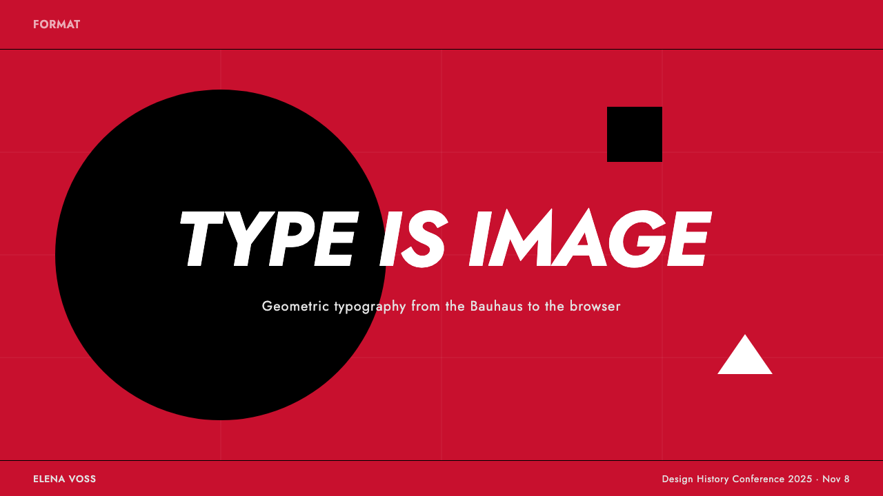
For presentation covers, allow one brief title to dominate the entire field. Set it in bold oblique capitals, crop or stagger it with purpose, and use a black rule or geometric circle to establish counterweight. The red ground should feel continuous and assertive. A subtitle, date, or speaker line must remain subordinate rather than competing with the headline’s image-like scale.
Content slides require more restraint but should preserve the same grammar. Use the grid to divide the slide into a large verbal claim and a compact supporting text zone. Maintain a clear contrast between oversized display type and quieter explanatory copy. Hard black rules can separate sections, while white space inside the red field prevents density from becoming confusion. Data slides should reduce charts to flat geometric forms, direct labels, and strong positional comparison, avoiding decorative depth or pictorial embellishment.
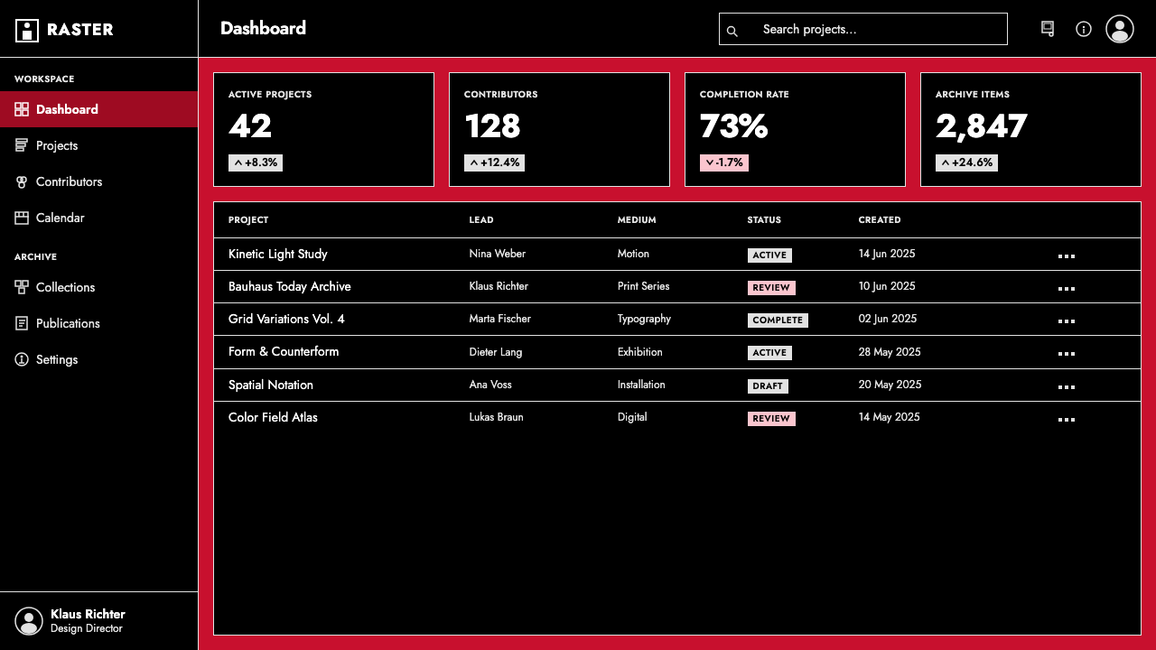
For dashboards and pricing interfaces, the idiom works best as a hierarchy system rather than an uninterrupted poster effect. Let saturated red define major surfaces or decisive states, use white for primary information, and reserve black for boundaries and structural emphasis. Pricing tiers can be differentiated through typographic scale, oblique headings, and flat blocks. Controls should be direct and geometrically contained; too many equally loud red panels will erase the scanning order that the grid is meant to create.
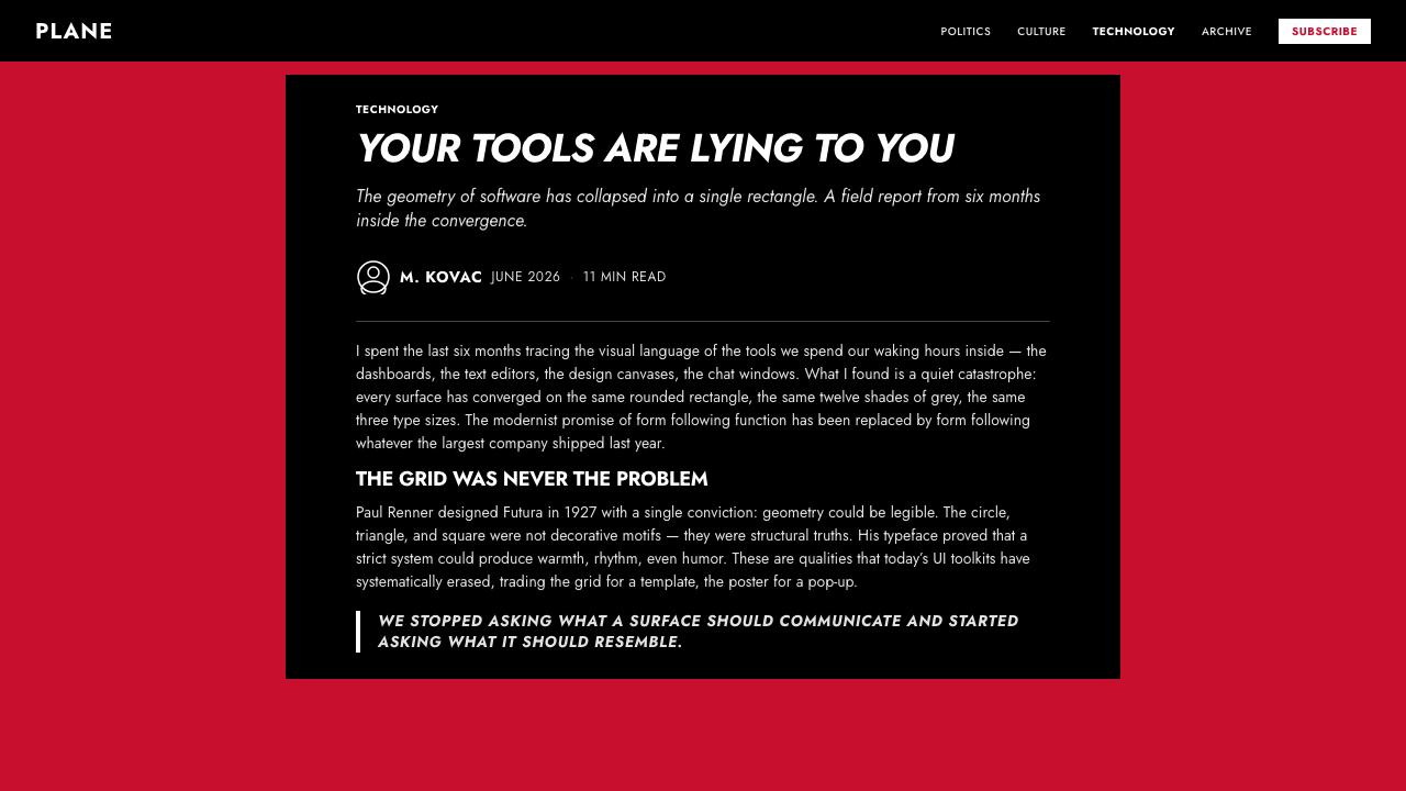
Editorial and marketing layouts benefit from the style’s ability to turn a statement into a visual event. Open an article or campaign with an immense headline, then move into calmer reading zones governed by the same alignments. Pull quotations can reintroduce white oblique type on red, and black rules can mark transitions without ornament. Product messages should remain concise because long promotional prose loses force when every line is treated as a monumental shape.
The common mistake is to imitate only the palette. Red, white, and black do not produce this idiom unless typography controls the composition. Adding photography, soft shadows, distressed texture, gradients, decorative icons, and several competing typefaces turns the result into a themed collage. Begin instead with the words, construct a strict grid around their shapes, and add circles, rules, or blocks only when they reinforce direction, separation, or balance.
Futura Geometric Poster — FAQ
Is Futura Geometric Poster simply any poster that uses Futura?
No. The typeface is the foundation, but the idiom also depends on poster-scale typography, a strict grid, saturated red as the dominant field, pure white and black contrast, oblique momentum, and complete flatness. A conventional layout can use Futura without turning type into image. The defining shift occurs when letterforms become the principal geometry and every other element supports their structure.
Why is red treated as a dark presentation surface?
Because the red is saturated, expansive, and visually dense. It does not behave like a light accent placed on white; it surrounds and carries the lettering as a dark ground would. White type therefore appears luminous and urgent, while black rules remain legible as even denser structural marks. This unusual relationship gives the poster heat without sacrificing the severity associated with a dark field.
Can photographs or illustrations be added to the style?
The source language is explicitly typographic: type is the entire image. Photographs and representational illustrations introduce a second image system that can quickly displace the geometric letters from their central role. If additional imagery is unavoidable, it should remain subordinate to the typographic structure. The most faithful application needs no pictorial scene at all; circles, rules, blocks, and letterforms provide the complete visual vocabulary.
How is this idiom related to Bauhaus modernism?
It belongs to the broader environment of Bauhaus and New Frankfurt geometric modernism, sharing their reliance on elementary form, geometric-sans typography, rational organization, and rejection of embellishment. It is not a summary of every Bauhaus practice. It is a concentrated poster expression in which Futura, the red field, black rules, white oblique capitals, and uncompromising flatness carry those modernist principles.
What most often makes a contemporary adaptation feel inauthentic?
The usual failure is decorative accumulation. Designers retain red and a geometric typeface but add gradients, shadows, texture, atmospheric lighting, numerous icons, or several unrelated type families. These additions weaken the direct equation between word and image. Authenticity comes from subtraction: one disciplined grid, a few flat colors, hard structural marks, and typography strong enough to carry the entire composition.
Related design styles
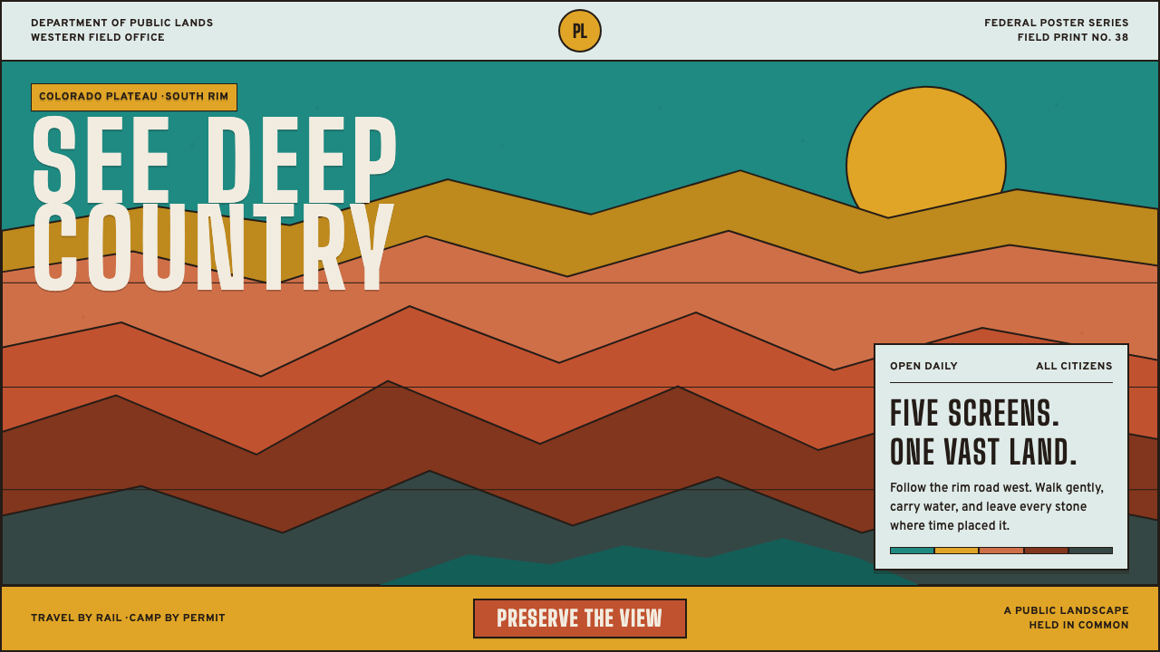 Grand Canyon WPA (1938)Public grandeur in five screens. Turquoise, ochre and terracotta stack in har…
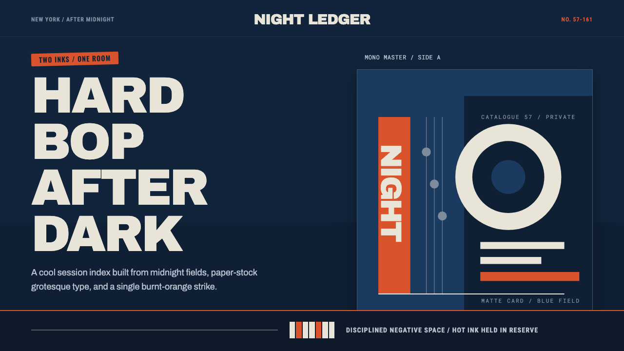 Blue Note JazzCool intelligence, printed flat. Midnight blue, paper type, and one burnt-ora…
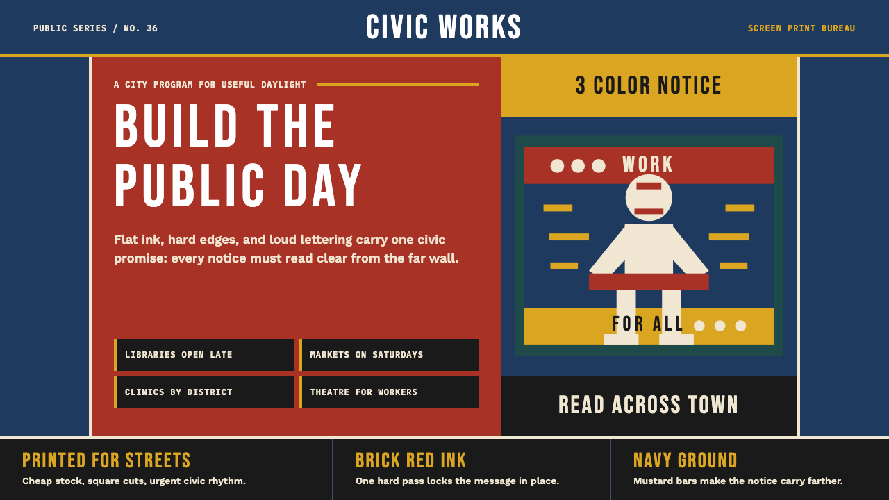 WPA Poster (Federal Art Project, 1936)Civic urgency in ink. Navy, brick red, mustard bands and Bebas Neue shout acr…
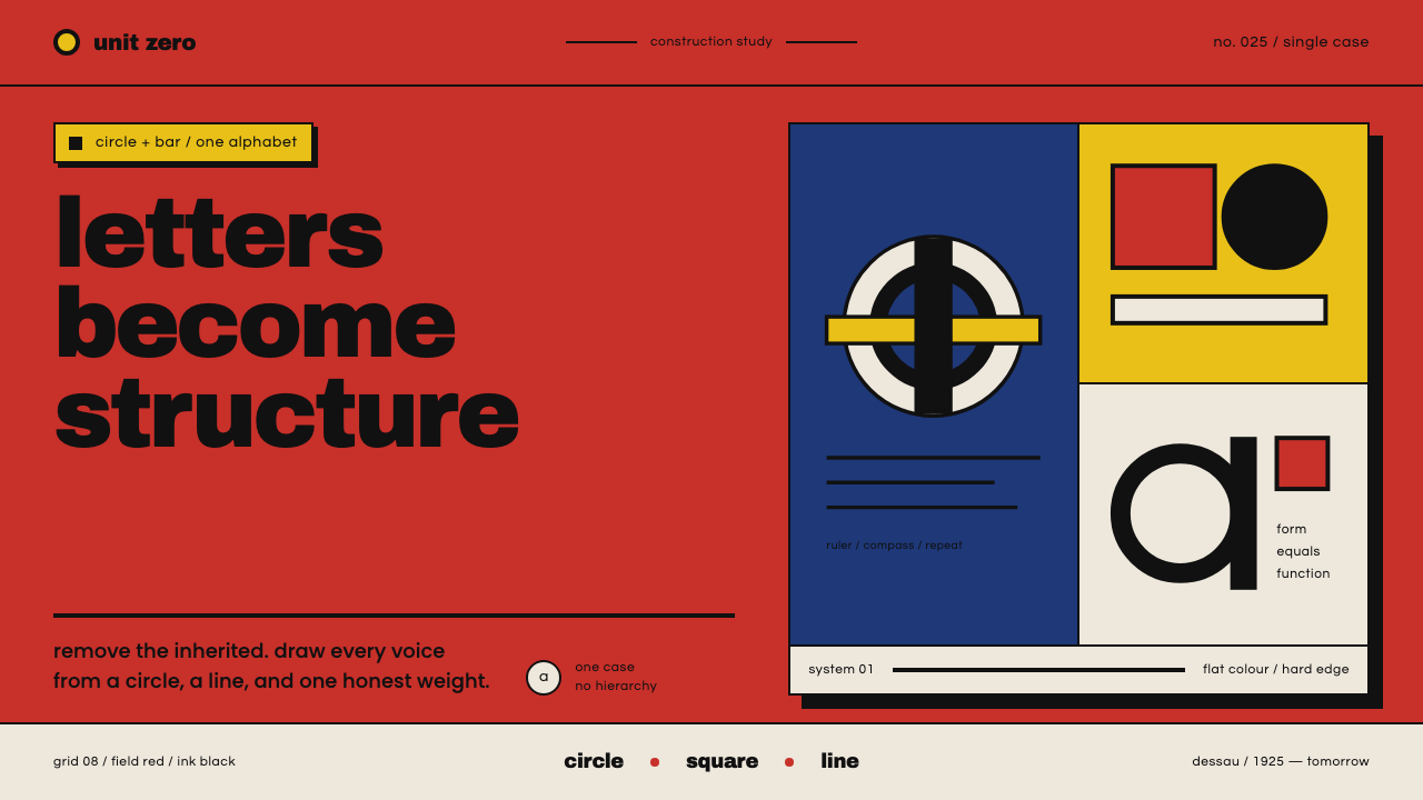 Bayer Universal BauhausLetters become structure. Bauhaus red, primary blocks, and black circle-bar f…
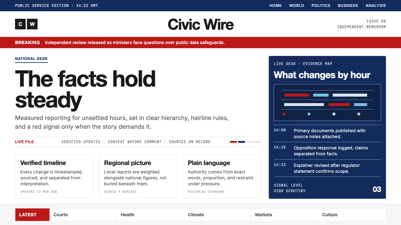 BBC NewsPublic trust, stripped bare. Red alerts, deep navy and hairline grids make ur…
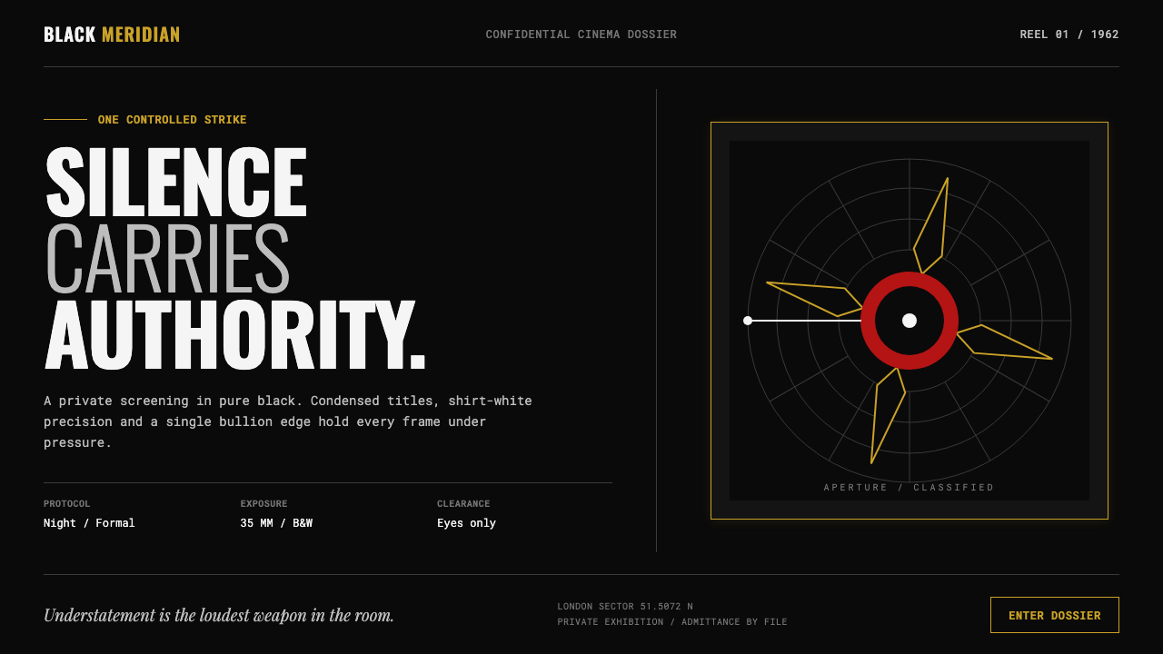 James Bond 007 (1962)Understatement carries authority. Pure black, condensed white type and one pr…