What is Bayer Universal Bauhaus?
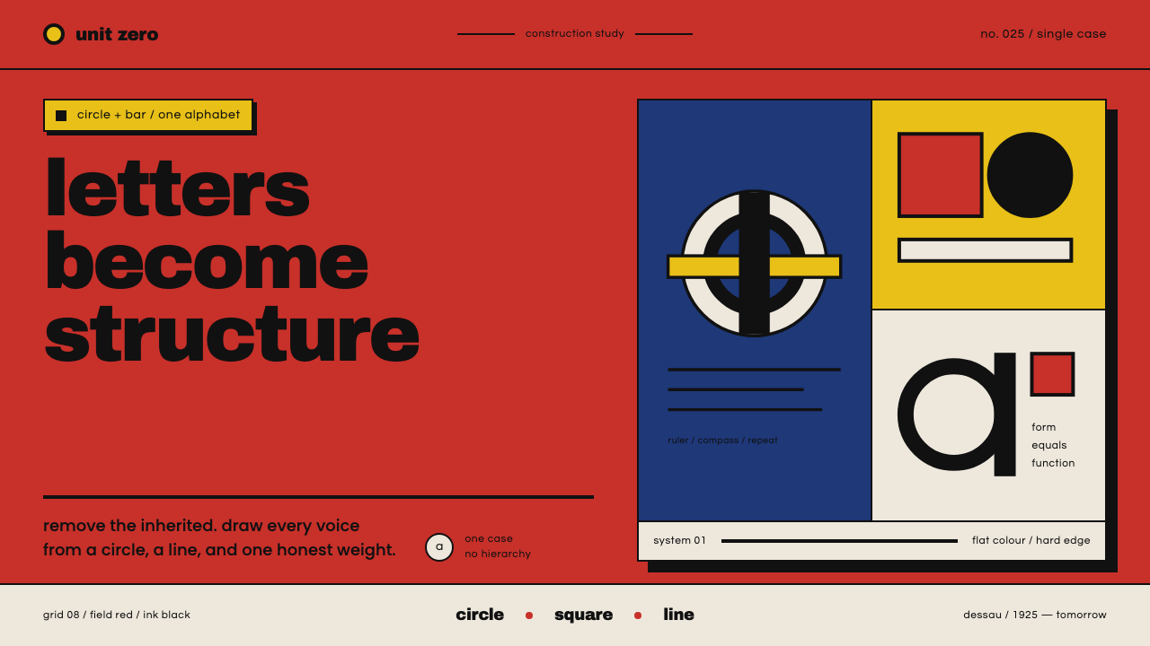
Bayer Universal turns the alphabet into architecture, joining lowercase geometry, Bauhaus primary fields, and black structural forms in a disciplined dark system.
Bayer Universal Bauhaus in brief
Bayer Universal Bauhaus is a typographic design system built around Herbert Bayer’s Universal alphabet, drawn at the Bauhaus Dessau in 1925. The alphabet uses a single case, lowercase only, and reduces letters to geometric essentials constructed with circle and horizontal bar logic. Set against flat fields of Bauhaus red, primary blue, and primary yellow, the black forms behave less like handwriting than a small architectural kit. The result is not a decorative revival of Bauhaus; it is a system in which the alphabet itself carries the movement’s faith in order, utility, and visual economy.
Universal’s force comes from repetition. Curves, bars, counters, and joins recur across the alphabet, giving words a consistent internal rhythm even when letters differ. Because every character belongs to the same constructed family, typography can become layout: a word can act as a band, a block, a label, or a directional marker. The primary fields do not merely color the surface. They establish zones, separate structural planes, and make the black circle-bar forms legible as objects with weight. Hard edges and flat fills keep the composition direct.
The style has a useful tension between severe construction and vivid color. The proof sheet for Universal is black ink on white, but its native home is Bauhaus flat-colour graphic language, where black lettering sits on pure primary grounds. That distinction matters. A faithful application preserves the alphabet’s mechanical clarity while letting red, blue, and yellow operate as structure rather than confetti. It also keeps decoration out: no ornamental letterforms, no softened geometry, and no effect added merely to make the surface richer. Every visible choice should reinforce the reading of letters as built forms.

Where does Bayer Universal Bauhaus come from?
The defining moment is 1925 at Bauhaus Dessau in Dessau, Germany, when Herbert Bayer drew Universal. The source describes it as a single-case alphabet built with ruler and compass, using the circle and horizontal bar as its generative vocabulary. This is important historically and visually: Universal is not simply a typeface selected to suggest modernism. It is a deliberate reduction of lettering to a repeatable construction method. The alphabet’s identity lies as much in how its forms are made as in how they look when assembled into words.
The lowercase-only condition gives the system a continuous visual register. There is no upper-case companion to introduce a second voice or a ceremonial hierarchy; the letters remain within one constructed family. In a design context, this makes the alphabet feel level, persistent, and almost diagrammatic. A title, caption, or navigation label can change through scale, placement, and color field, but not through a shift into a separate capital alphabet. The discipline is therefore structural: hierarchy comes from composition, not from ornamental variation.
Universal belongs to a wider cluster named in the source: Bauhaus, New Typography, and geometric constructivist lettering. These affiliations clarify its position without turning it into a generic historical collage. Bauhaus supplies the flat-colour ground and the conviction that form should be reduced to essentials. New Typography supports the use of lettering as an active component of composition. Geometric constructivist lettering reinforces the sense that a word can be engineered from elementary shapes. Bayer’s alphabet is the point where those tendencies become a coherent letter system.
The color context is equally central. The system treats Bauhaus red, primary blue, and primary yellow as structural fields, while black provides the linear and typographic counterforce. The source specifically places Itten and Kandinsky’s theory of primary colors behind this decision: color is used as an organizing principle, not a finishing accent. The proof sheet’s black-on-white appearance is therefore a document of the alphabet’s construction, not a limit on its visual home. In application, the honest ground is flat, saturated, and sharply bounded.
What defines the Bayer Universal Bauhaus look?
Single Case
Universal uses one case only, and that case is lowercase. The decision produces a continuous alphabetic voice: letters do not switch into a taller or more ceremonious register when they become headings. Hierarchy must instead be built through placement, surrounding field, scale, and contrast. This makes the system particularly strong when a page needs every word to feel like part of one constructed apparatus.
Circle and Bar
Circle and horizontal bar are the core parts from which the letters are drawn. They are not occasional motifs applied around ordinary type; they are the alphabet’s actual construction logic. Curves establish round bodies and counters, while bars create stems, joins, and directional pressure. Repeated parts make neighboring letters feel related, turning a line of text into a sequence of assembled forms.
Monoline Geometry
The forms are single-weight and geometric, with a consistent visual pressure from one letter to the next. Ruler-and-compass discipline replaces calligraphic modulation, so the alphabet reads as built rather than written. In practice, this favors clean spacing, clear silhouettes, and careful attention to joins. Any irregularity should come from arrangement or scale, not from casually changing the internal anatomy of a character.
Flat Primary Fields
Red, blue, and yellow appear as flat primary fields rather than blended atmosphere. Each field can define a panel, support a word, or separate one structural condition from another. Their value is organizational: color helps establish where a message sits and how it relates to adjacent forms. Saturation should feel deliberate and complete, with edges that remain firm and visibly decided.
Black Structural Forms
Black lettering supplies the system’s strongest counterweight to the colored ground. The circle-bar forms read as solid, legible structures, allowing the alphabet to hold its presence even when placed over vivid color. Black can also extend into rules, blocks, or geometric separators, but it should remain part of the same formal vocabulary. The aim is visual authority through construction, not through effects.
Dark Presentation
The system is marked as dark, which gives its Bauhaus color fields a concentrated, poster-like intensity. A dark treatment should preserve the same hard geometry and direct contrast rather than introducing atmospheric glow or soft modeling. The darkness is a condition for focus: it gathers attention around the red ground, the primary blocks, and the black forms while keeping the composition spare.
No Decoration
Nothing is added merely to make the interface or page feel finished. The system rejects decorative texture, ornamental type treatment, softened edges, and visual noise that does not clarify structure. Flat color, circle-bar anatomy, and disciplined placement already provide character. Restraint is therefore not an empty background; it is the active method that lets each letter and field remain visible as an intentional part.

Who shaped Bayer Universal Bauhaus?
Herbert Bayer is the central figure because Universal is his alphabet. At Bauhaus Dessau in 1925, he drew a single-case, lowercase-only system from circle and horizontal bar forms, using ruler and compass to reduce lettering to geometric essentials. His contribution is not only a recognizable alphabetic appearance but a method: the letter can be designed as a repeatable construction, and a word can therefore function as a structural object within a composition.
Johannes Itten is named in the source as part of the primary-color theory carried into this system. In Bayer Universal Bauhaus, that role is practical rather than ornamental: primary color becomes an organizing ground for the black alphabet. Red, blue, and yellow are treated as distinct structural conditions, giving fields and blocks a clear visual identity. Itten’s relevance here is the idea that color can carry system-level meaning.
Wassily Kandinsky is likewise named as a source for the primary-color logic behind the visual system. His relevance here is not a separate illustration style but the principle that color can participate in structure. In this adaptation, the primary fields help stage the geometric alphabet, while the black forms provide definition and counterforce. The result keeps color active without allowing it to overpower the constructed letterforms.
How do you use Bayer Universal Bauhaus today?
Bayer Universal Bauhaus works best when the design problem benefits from a strong organizing voice: identity systems, posters, title treatments, interface shells, and editorial covers that need to feel intentional at a glance. Begin with the alphabet as the main material. Let the circle and bar logic govern labels, headings, and display words, then let the primary fields establish structural zones around them. The style becomes convincing when type, color, and geometry appear to have been planned together from the beginning.
For presentation slides, use the system to make the cover feel like a constructed poster and the content pages feel like ordered boards. On a cover, place a short title in lowercase and let one large red field or primary block carry the visual weight, with black lettering set against it or against a clean opposing ground. Content slides should preserve the same alphabetic voice while using clear bands, rules, and generous open areas to separate ideas. On data slides, treat charts as geometric companions to the type: primary fields can distinguish categories, while black circle-bar labels, bars, and rules keep the information legible and unified.
For web interfaces, the style suits dashboards and pricing pages where users need to scan categories, states, and choices quickly. Use lowercase labels consistently, reserve the primary fields for meaningful groups or actions, and let black geometry define cards, dividers, controls, and status markers. A dark presentation can give the interface a concentrated stage, but the colored blocks must still explain structure rather than decorate it. Pricing tiers can be separated by fields and placement, while headings, labels, and numerical content remain part of the same typographic apparatus.
In editorial and marketing work, the system can turn a headline into an object with poster-like presence. Set display words as compact lowercase constructions, use a red field as a decisive anchor, and bring blue or yellow in only when a new plane or message needs to be distinguished. Articles benefit from a clear reading column, strong section breaks, and black rules that echo the letter anatomy. Campaign graphics can carry the same language across covers, announcements, and social panels, provided every color block and geometric interruption has a communicative job.
The common mistake is to borrow the Bauhaus colors while leaving the typography generic. A red block behind an unrelated typeface does not make Bayer Universal Bauhaus; the alphabet’s circle-bar construction must be visible in the letterforms or in a carefully chosen typographic treatment. Another mistake is to use every primary color at once, add soft depth, or scatter geometric shapes as decoration. Keep the system edited: lowercase structure first, one clear color relationship, hard edges, and enough open ground for the forms to read.

Bayer Universal Bauhaus — FAQ
What makes this style different from a generic Bauhaus treatment?
It centers the alphabet rather than using Bauhaus as a loose mood. Generic Bauhaus borrowing may combine primary blocks, asymmetry, and geometric shapes around ordinary typography. Bayer Universal Bauhaus makes the letterforms themselves structural: lowercase only, single-case, monoline, and derived from circle and horizontal bar construction. The color fields then support that typographic system. If the letters could be replaced without changing the design’s identity, the application has probably stopped being specifically Bayer Universal.
Why are the letters lowercase only?
Lowercase-only is a defining property of Universal in the supplied source, not an optional styling trick. It keeps the alphabet within one continuous register and prevents capitals from creating a second, more ceremonial form language. That constraint shifts hierarchy into composition: titles can become prominent through position, surrounding color, contrast, or scale, while the underlying letter anatomy remains consistent. The result is a calm but insistent visual voice.
Can the system use a white background?
Yes. The Universal proof sheet is described as black ink on white, so a light ground is part of the documented presentation. But the source also identifies flat primary-color graphics as the alphabet’s native home. A white version should therefore feel like a clear working sheet, while red, blue, and yellow versions carry the fuller Bauhaus identity. In either case, preserve the black forms, hard geometry, and absence of decoration.
How should red, blue, and yellow be balanced?
Treat them as structural fields, not a required trio of simultaneous accents. One color can establish the principal ground, another can define a neighboring plane or category, and the remaining color can be withheld until it has a clear job. Black lettering should remain the stable counterforce. The test is functional: if removing a color changes no hierarchy, separation, or direction, that color is probably being used as decoration.
What should be avoided when adapting Bayer Universal Bauhaus?
Avoid uppercase substitutions, mixed typographic voices, soft gradients, simulated texture, and geometric shapes that have no relationship to the letter system. Avoid making the dark presentation atmospheric or glossy; the source calls for flat colour, hard geometry, and no decoration. The strongest adaptation is edited and legible. It lets the constructed alphabet, the primary blocks, and the black forms do all the expressive work.
Related design styles
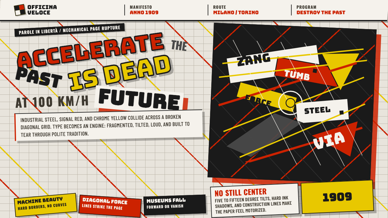 Italian Futurism (Marinetti 1909)Speed murders tradition. Signal red and chrome yellow slash a broken diagonal…
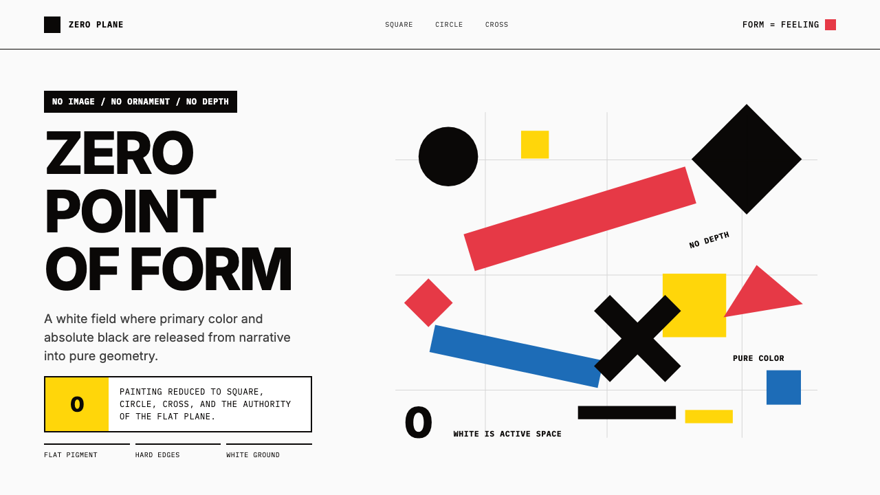 Malevich SuprematismGeometry declares zero. Red, yellow, blue and black blocks float on active wh…
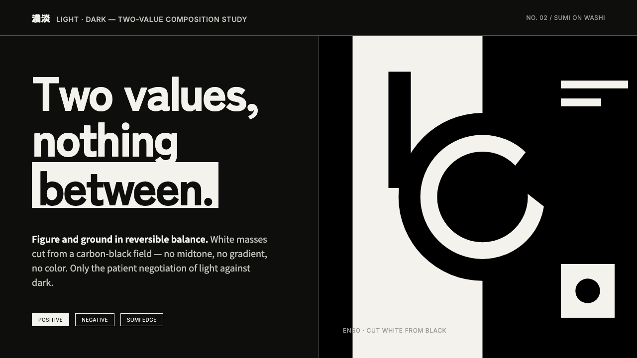 Notan Light-DarkTwo values, nothing between. White masses cut from a carbon-black field, figu…
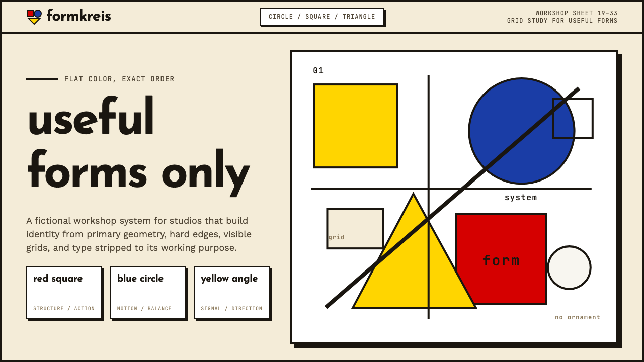 Bauhaus WeimarForm follows revolution. Primary red-blue-yellow on cream, hard shadows, no o…
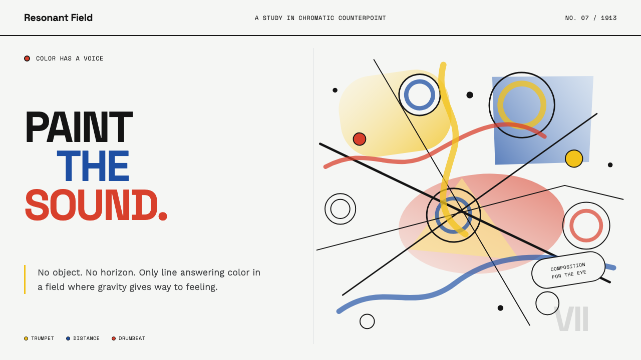 Kandinsky Composition (1913)Color becomes sound. Primary washes, hollow circles, and black diagonals coll…
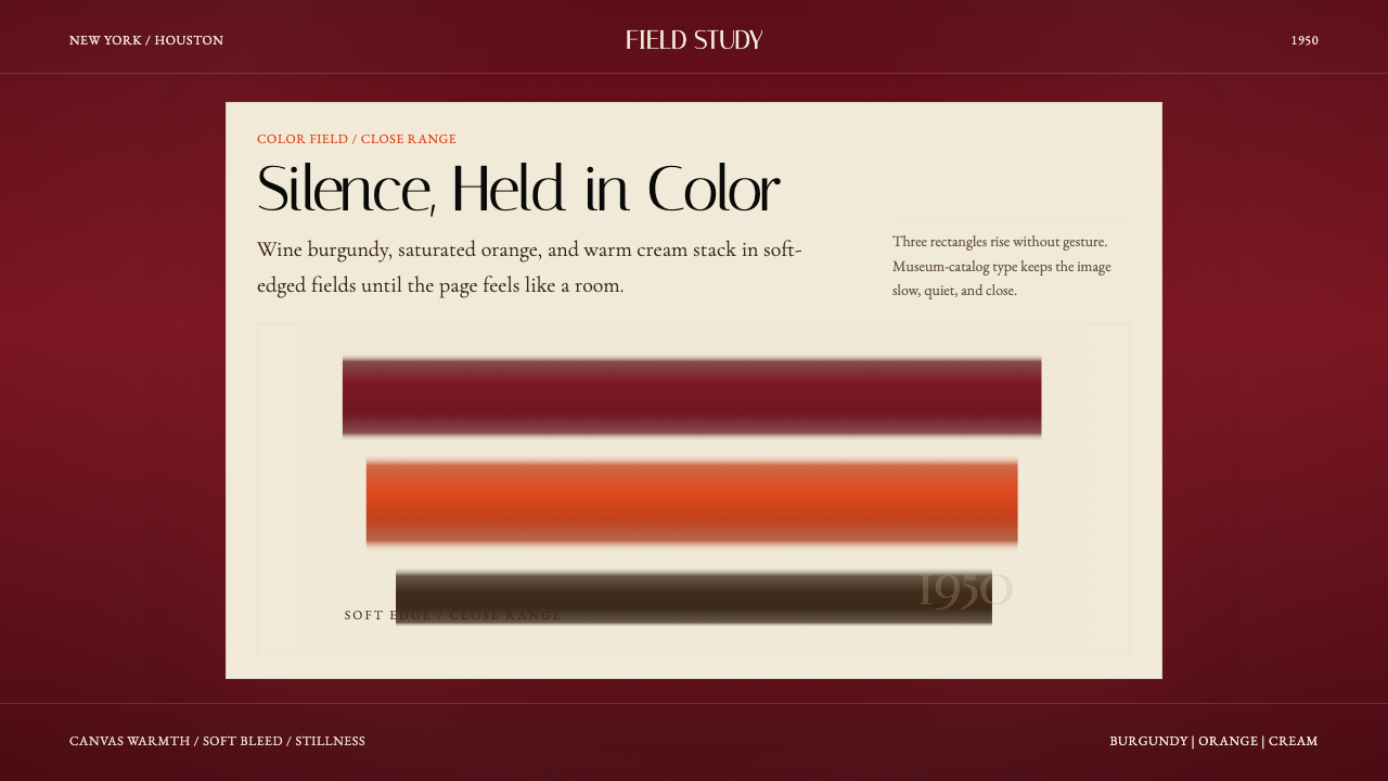 Mark Rothko Color Field (1950)Silence made visible. Burgundy, orange, and cream stack in soft-edged fields.